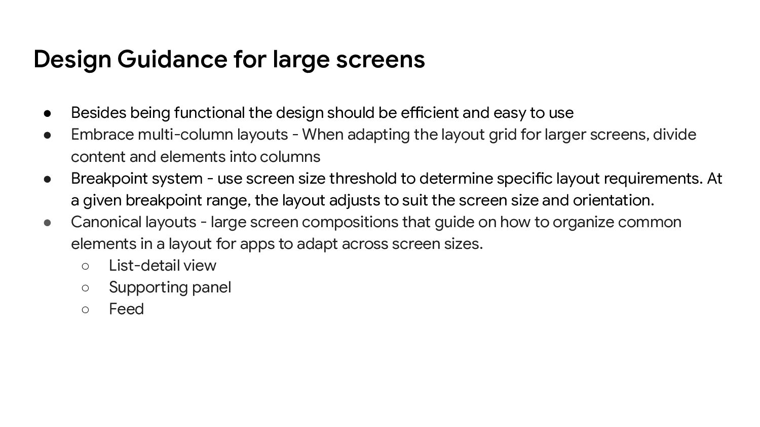
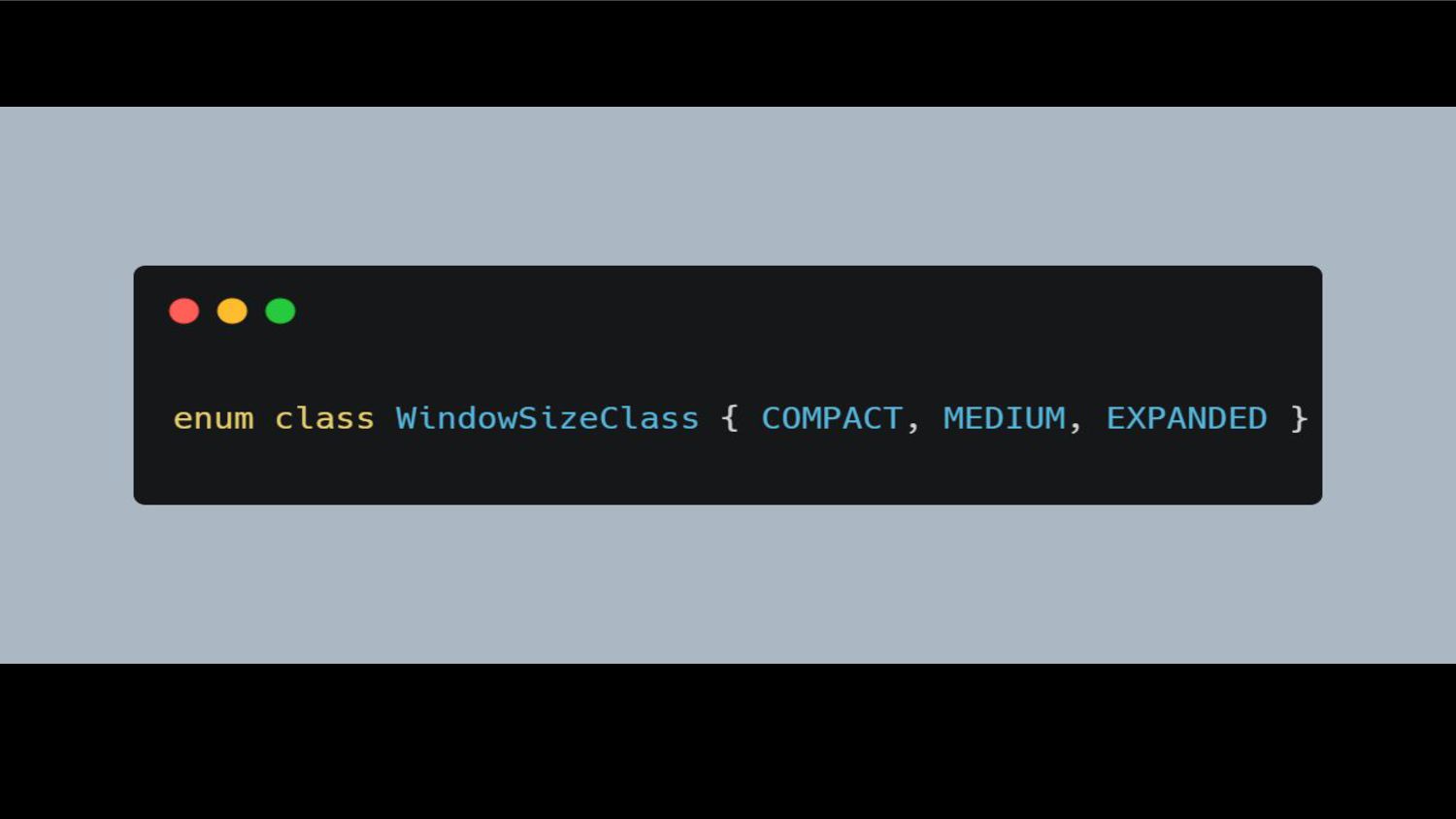
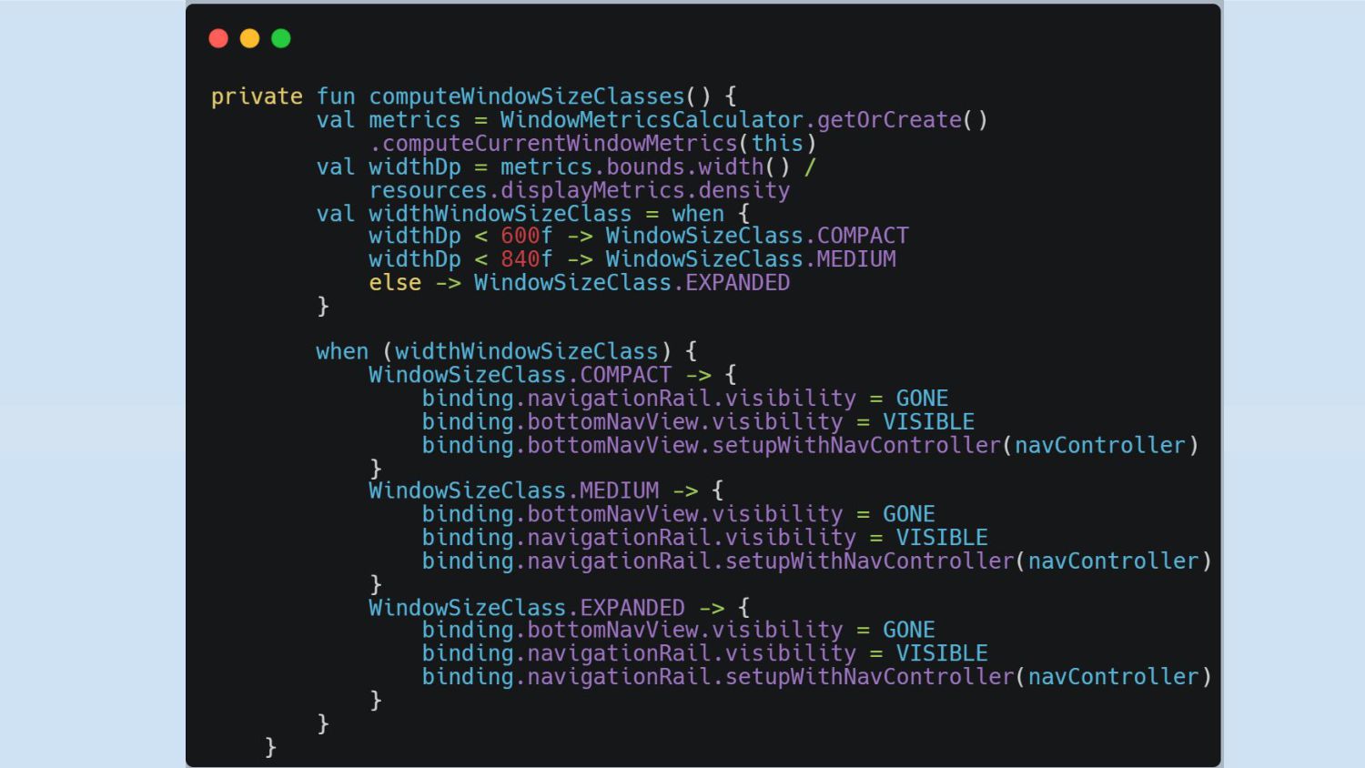
design should be efficient and easy to use • Embrace multi-column layouts - When adapting the layout grid for larger screens, divide content and elements into columns • Breakpoint system - use screen size threshold to determine specific layout requirements. At a given breakpoint range, the layout adjusts to suit the screen size and orientation. • Canonical layouts - large screen compositions that guide on how to organize common elements in a layout for apps to adapt across screen sizes. ◦ List-detail view ◦ Supporting panel ◦ Feed
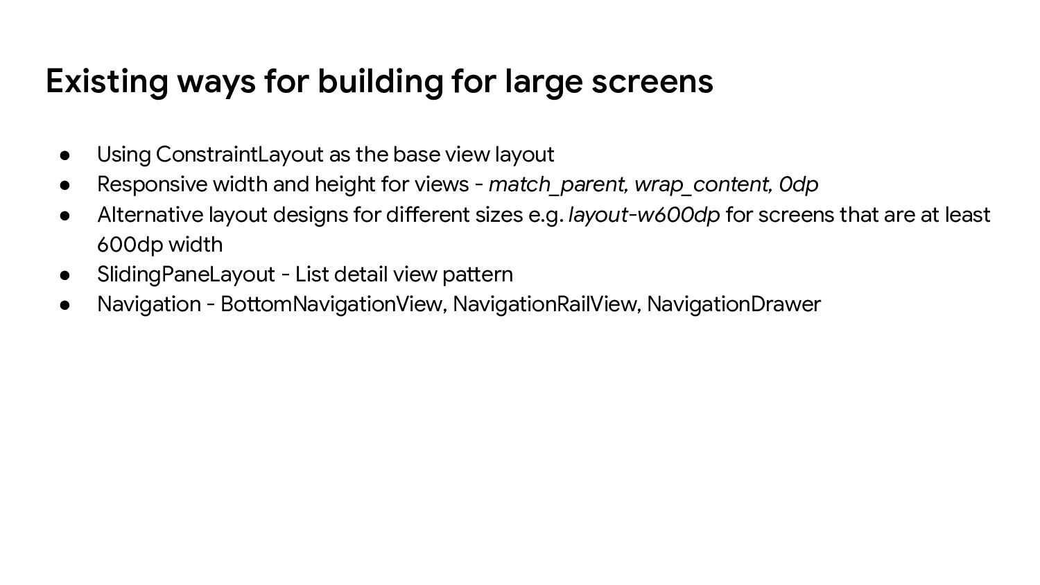
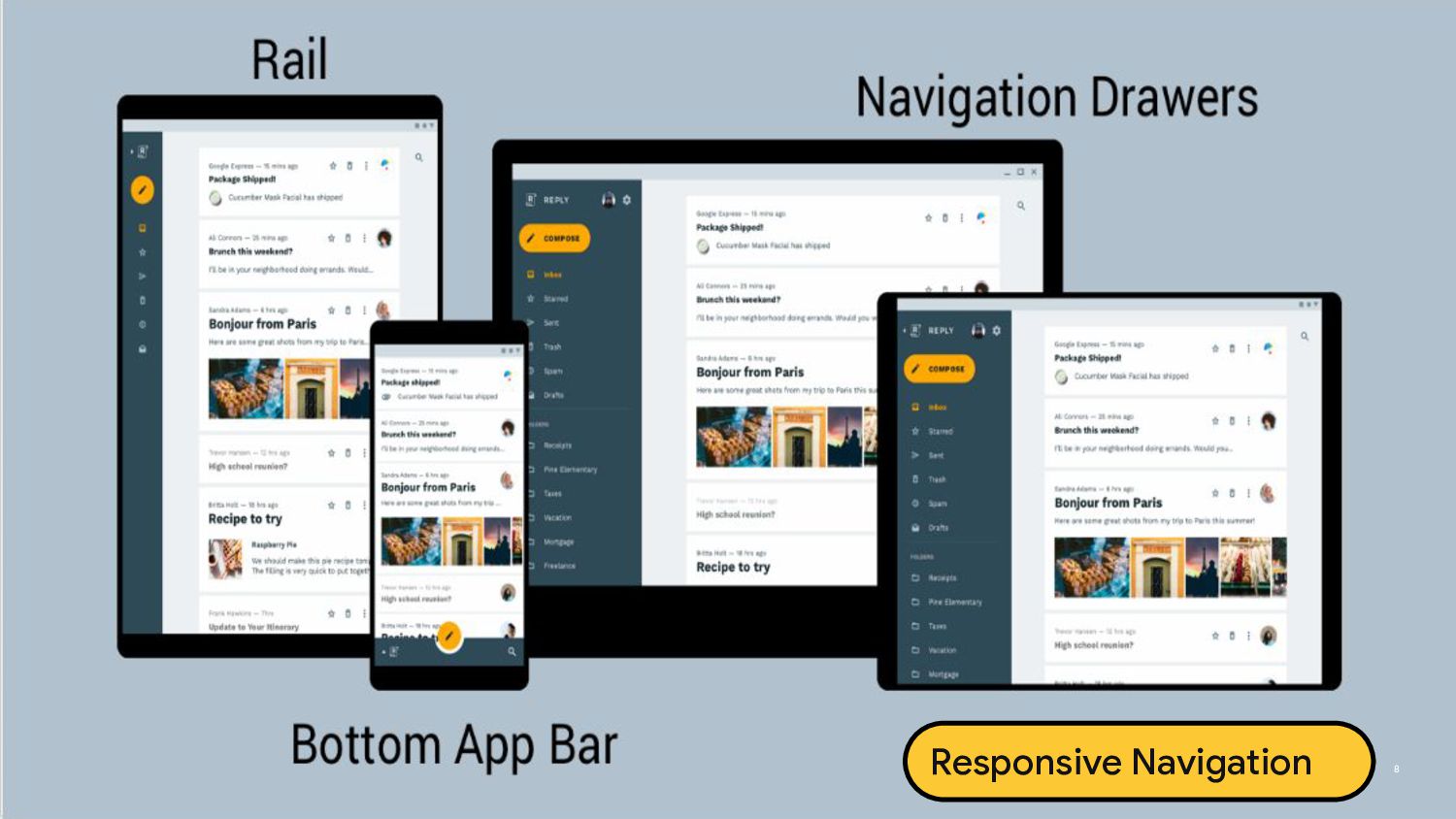
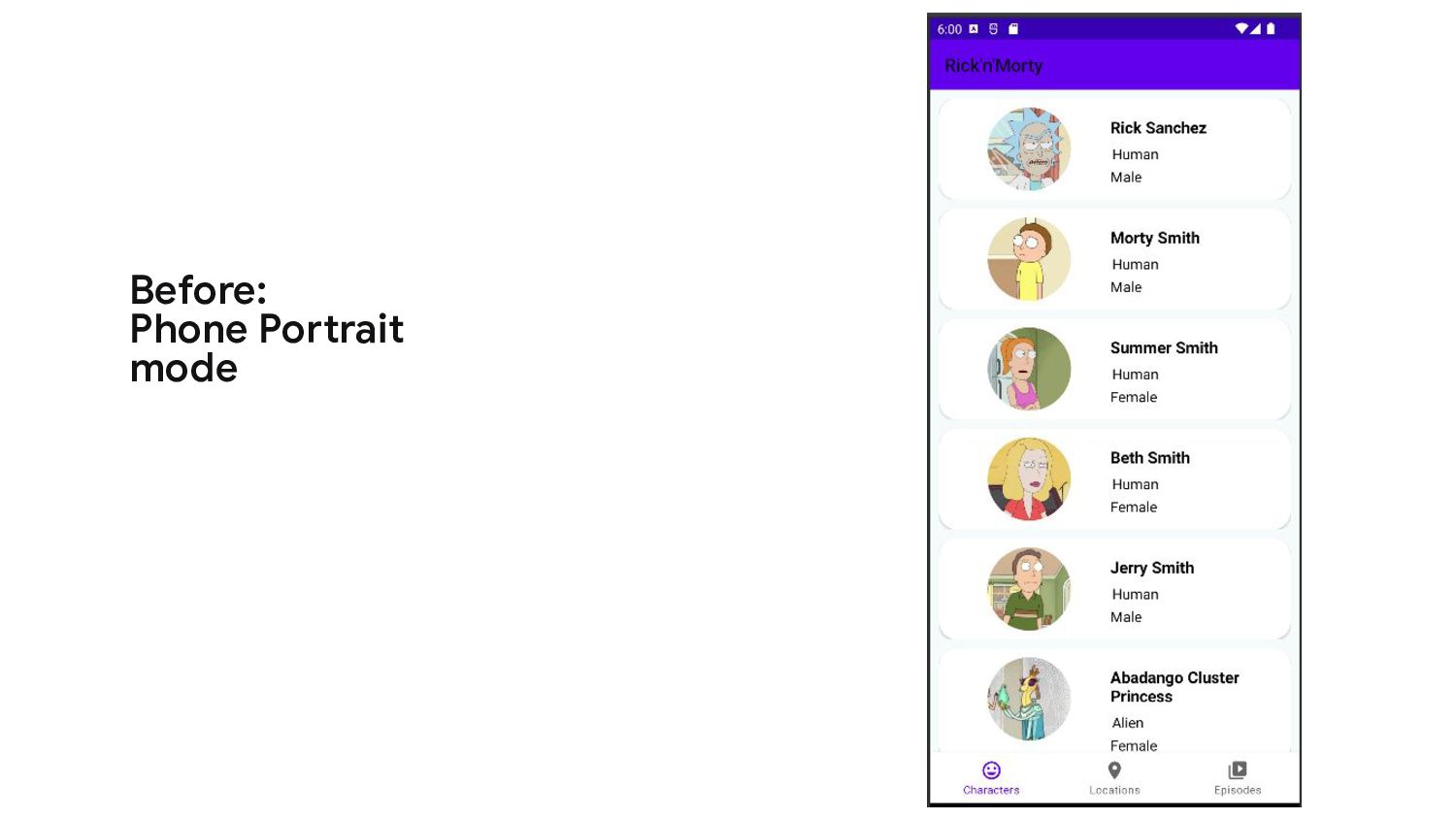
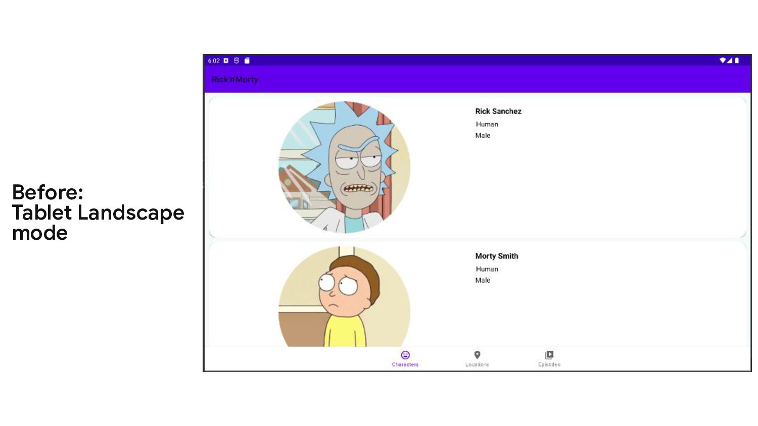
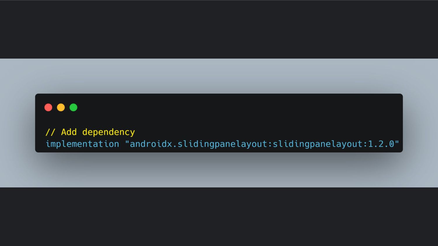
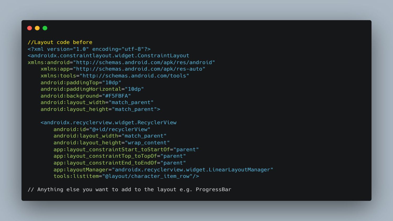
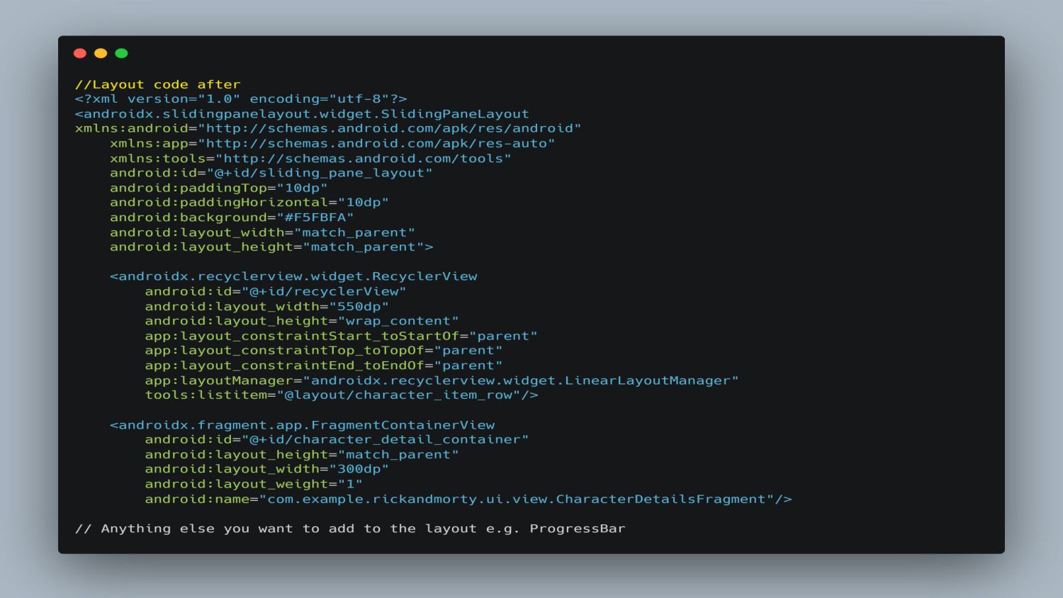
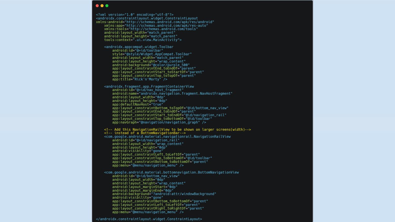
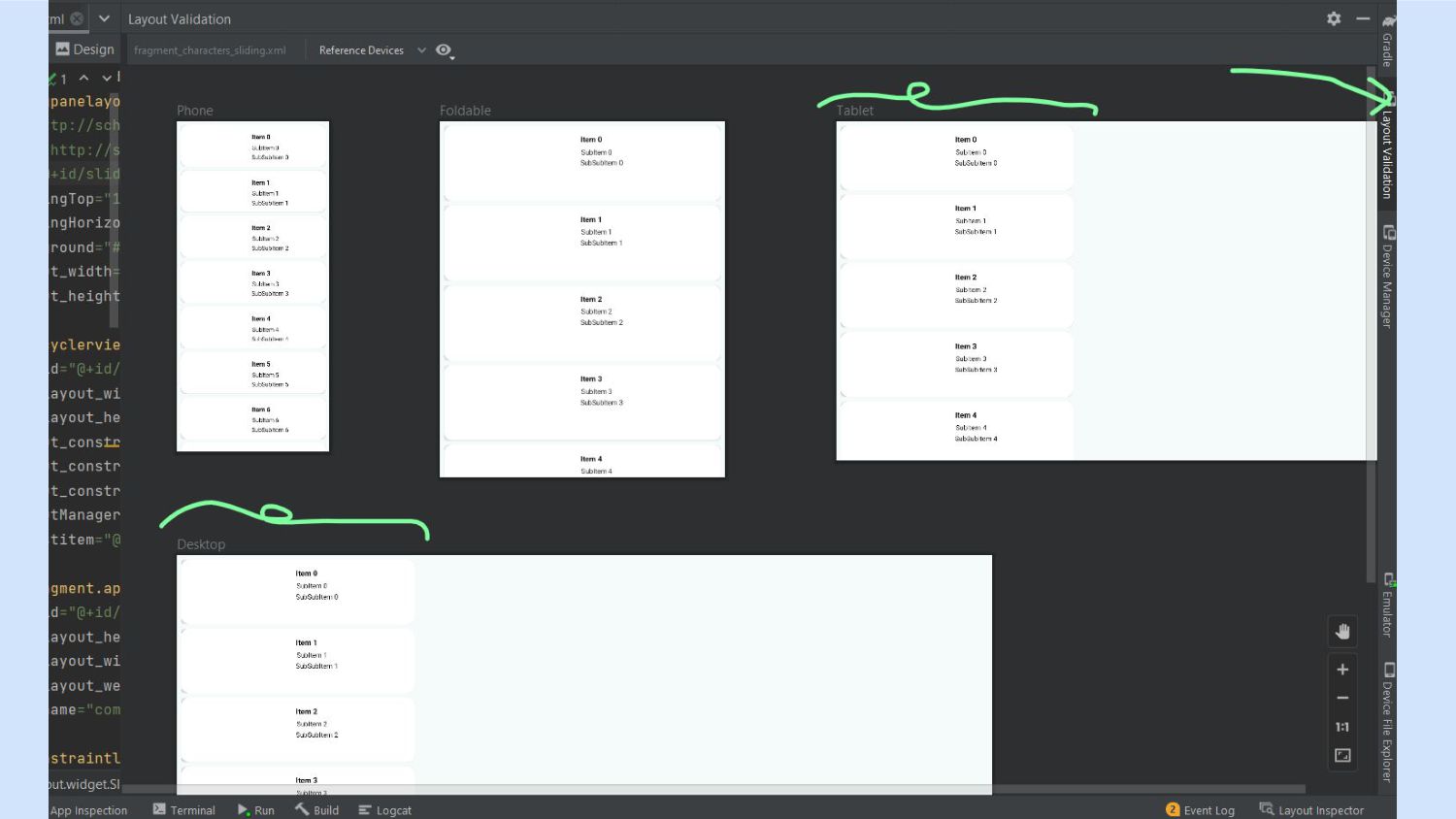
as the base view layout • Responsive width and height for views - match_parent, wrap_content, 0dp • Alternative layout designs for different sizes e.g. layout-w600dp for screens that are at least 600dp width • SlidingPaneLayout - List detail view pattern • Navigation - BottomNavigationView, NavigationRailView, NavigationDrawer
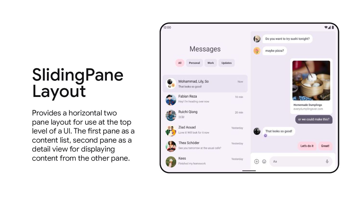
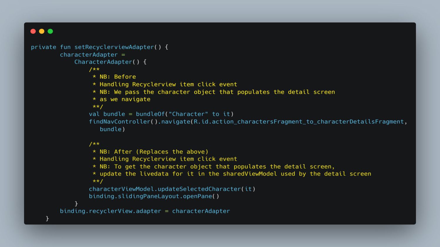
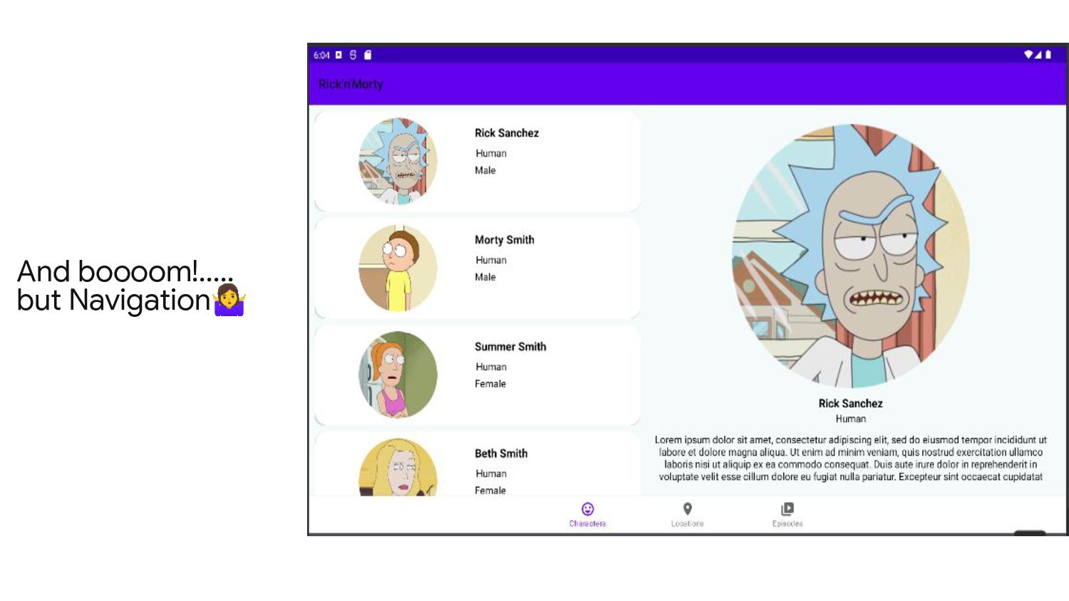
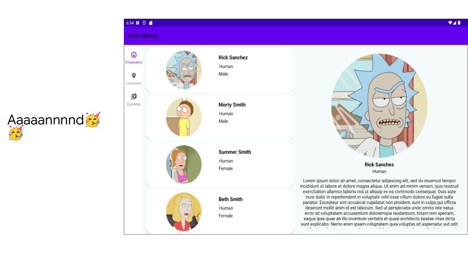
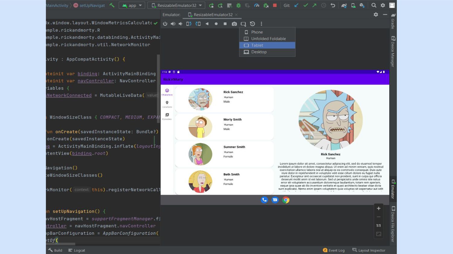
at the top level of a UI. The first pane as a content list, second pane as a detail view for displaying content from the other pane. SlidingPane Layout
 annunziatakinya
 mhrtech
 rakus_dev
 news_it_enj
 fkmy
fkmy
 miyukki
 alchemy1115
 smt7174
 eiei114
 kaonavi
 yuuka51
 segavvy
 k_adachi_01
 yeseniaperezcruz
 chrislema
 marktimemedia
 techseoconnect
 inesmontani
 cromwellryan
 uxyall
 frankvandijk
 deanohume
 lara
lara