Upgrade to Pro — share decks privately, control downloads, hide ads and more …

UX design for every screen

UX design for every screen

In this session, we will explore the how the recent explosion of devices has disrupted the process of designing a website that we've crafted over the past decade.

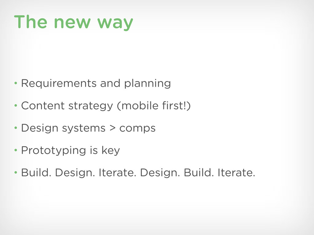
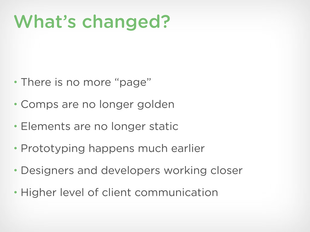
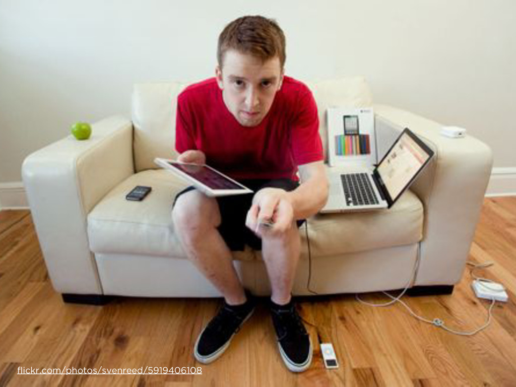
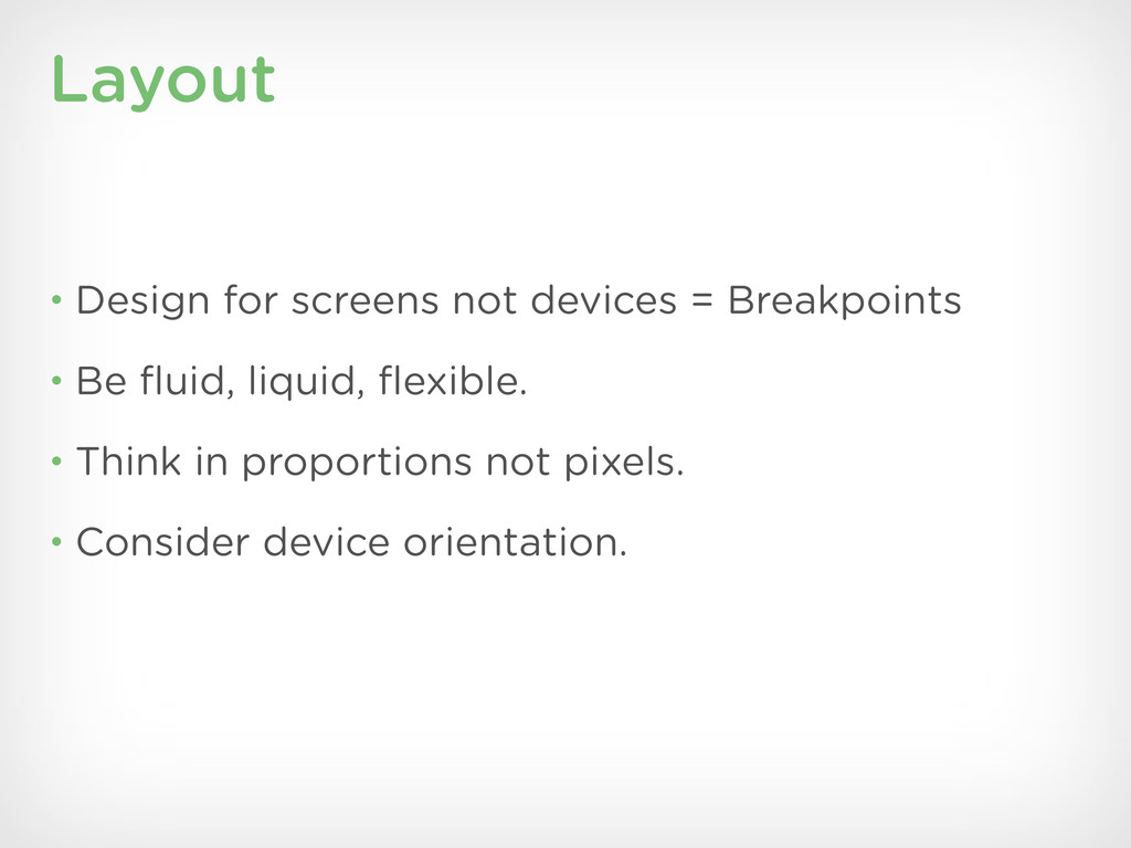
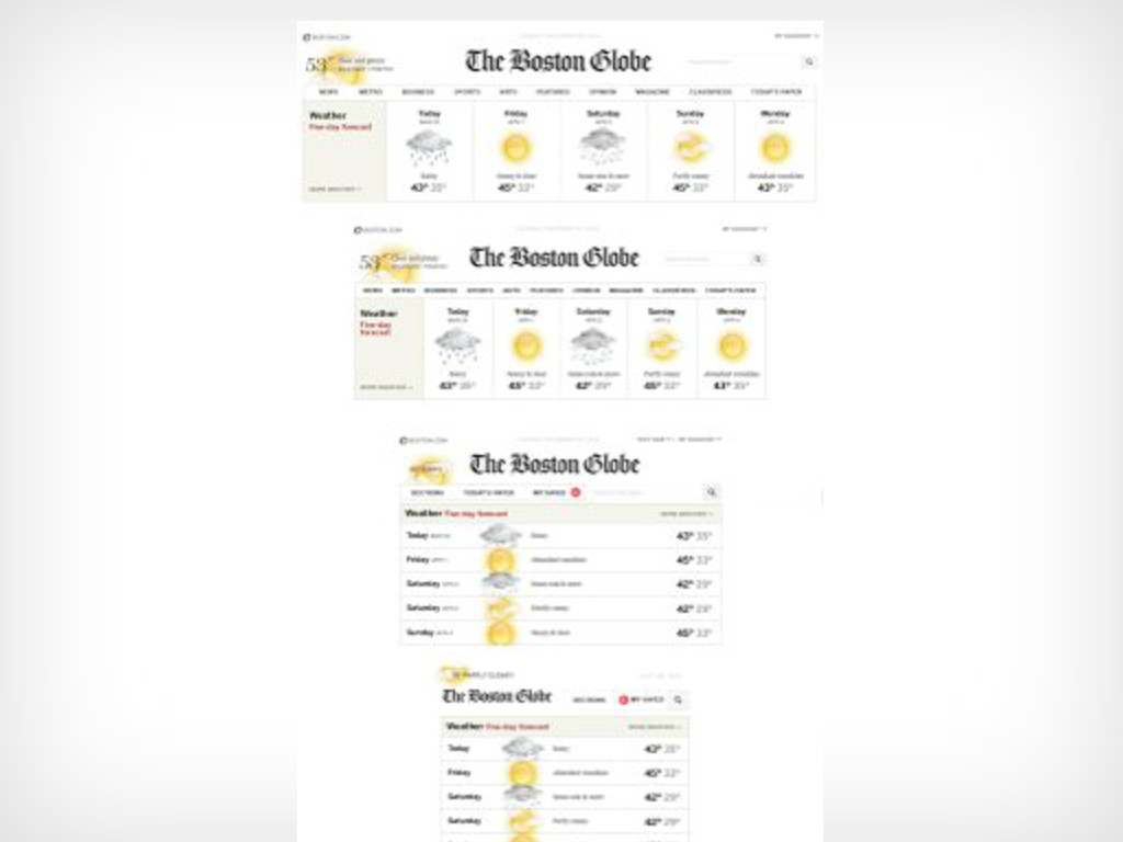
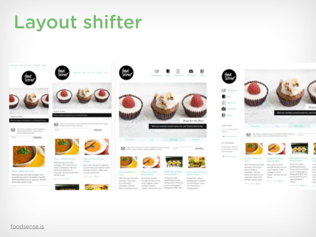
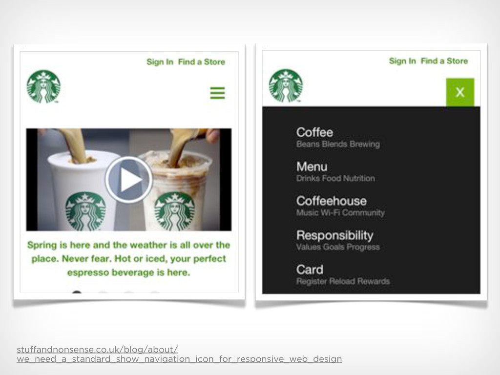
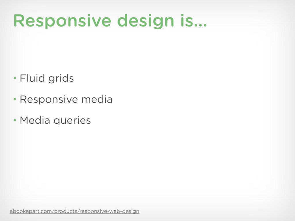
When designers only have one instance of website (i.e., desktop) to design, the layout is uniform. The header, content area, sidebar, and footer all remain static. Furthermore, the elements are relatively uniform as well. Buttons, navigation, typography, and images are all basically the same across across the various pages. But if you are designing a responsive website – one whose look and feel adapts depending whether you're using a phone, laptop, or tablet – then these elements and especially the layout begin to diverge.

First presented at DrupalCon Denver 2012

Aaron Stanush

March 21, 2012
Tweet

More Decks by Aaron Stanush

Other Decks in Design

Transcript

  1. trentwalton.com/2012/02/02/redefined Trent Walton To design responsive websites e ectively and

    responsibly, I had to completely rede ne the way I view the web.
  2. How we’ve been doing it for the last decade •

    Requirements and planning • Site maps, user workflows, wireframes • Comps • Build and style the website
  3. The new way • Requirements and planning • Content strategy

    (mobile first!) • Design systems > comps • Prototyping is key • Build. Design. Iterate. Design. Build. Iterate.
  4. What’s changed? • There is no more “page” • Comps

    are no longer golden • Elements are no longer static • Prototyping happens much earlier • Designers and developers working closer • Higher level of client communication
  5. • There is no mobile web • the-haystack.com/2011/01/07/there-is-no-mobile-web • The

    myths of mobile context • globalmoxie.com/jhc/prez/mobile-context-myth-fowd.pdf
  6. alistapart.com/articles/future-ready-content Future friendly content • What are the types of

    content and why? • Make it modular • What’s really important? • How will the tool organize this stu ?
  7. Responsive UX design • Workflows aim for the best user

    experience. • Wireframes can help organize layout and convey content flow. • Design systems save time and create patterns. • Prototypes help the team fail faster. They can also provide client value.
  8. Workflows and wireframes • Responsive is all about providing the

    best experience. • These can di er between devices. • Wireframes are (probably) still necessary • Making sense of this “no more page” nonsense.
  9. Design systems • styletil.es (@SamanthaToy) • Build a style guide/pattern

    library • A comp is (probably) still necessary, but not for every page at every viewport. • Goal: Get the design into the browser quickly.
  10. Prototyping • The browser is where the responsive magic happens.

    • A “living” design allows for richer discussions between developers and designers. • Clients will “get it” sooner. • Fail fast. Succeed fast.
  11. Mobile First, Luke W. Mobile UX priorities • Understand how

    people use their devices and why. • Content > navigation • Best experience doesn’t necessarily mean limiting choices. • Maintain clarity and focus.
  12. mobilewebbestpractices.com What makes for a good experience? • Make it

    readable. • Make it relevant. • Keep forms to a minimum. • Avoid modal overlays. • Make it snappy.
  13. Layout • Design for screens not devices = Breakpoints •

    Be fluid, liquid, flexible. • Think in proportions not pixels. • Consider device orientation.
  14. ?

  15. Navigation • Content > Navigation • Don’t try to make

    your dropdowns a work of art. • Put fixed toolbars at the top. • Consider OS and hardware buttons.
  16. Responsive images • How do your images scale for various

    widths and orientations? • Reduce the number of images if you can. • Be careful of using huge images.
  17. Mobile text • Make it readable. • Consider the flow

    of text. • Be aware of typeface characteristics. • Use font hosting services wisely.
  18. globalmoxie.com/blog/buttons-inspired-ui-hack.shtml Gestures • Buttons are a hack. • Make gestures

    obvious. • Current conventions: Tap and swipe (pull down?) • Don’t: Make your users read a manual. • Do: Use visual cues like coachmarks.
  19. Gestures • There is a need for universal conventions. •

    Consider competing OS and browser gestures. • Provide alternatives to gestures.
  20. Designing for touch • Design for humans, embrace the physicality

    of touch. • Size and space elements appropriately (40px rule) • Not every device is touch capable.
  21. Viewports = Media queries @media'screen'and'(max*device*width:2480px)'{ .column'{ float:'none; } } ‣

    Media type: screen (desktop, phone, tablet) ‣ Query for media feature: width, height, orientation, pixel density
  22. Responsive UX process • Users > content > mobile •

    Focus creates clarity and usability • Use design systems • Get to prototypes quickly • Cohesive designer/developer unit • Iterate with the client early and often
  23. Luke Wroblewski, Mobile First If you start to hear customers

    asking for your desktop web experience to be more like the simple, easy-to- use mobile one—you’re doing it right.
  24. Credits Consider this • The desktop-only era is over. •

    The power of the URL. • Why not provide the best experience to your users?
  25. All content in this presentation, except where noted otherwise, is

    Creative Commons Attribution- ShareAlike 3.0 licensed and copyright 2010 Four Kitchen Studios, LLC.