to maintain •All links work as expected •Recommended for Google SEO •Less resources necessary •Lean = improved velocity •No more device detection redirects User Experience
</head> Visual viewport (device width) Layout viewport NOTE: The viewport meta tag lets us control the layout viewport and scaling of many devices. with viewport without viewport
@media (min-width: 600px) { html { font: normal 100% Special Elite, Helvetica; } } @media (min-width: 860px) { html { font: normal 100% Condiment, Helvetica; } } </style> TIP: With embedded stylesheets all conditional media queries are downloaded but you gain the advantage of only one HTTP request.
queries get downloaded even if the media query is not applied. The rationale for this is that if the browser window size is changed, those styles are ready. However, there is a solution to this problem as shown in the next example. NOTE: Modern browsers will download the CSS that currently applies first (this is a blocking request). Then after the initial page load, the browser will download the non-essential CSS.
}); </script> TIP: eCSSential, by Scott Jehl (https:/ /github.com/scottjehl/eCSSential), will only download the stylesheet if the media query could evaluate to true
driven breakpoints for a more future-friendly design. TIP: You can also set breakpoints with JavaScript with matchmedia.js • Effective Media Queries • How to choose breakpoints
into a fluid layout. 2) The solution for this “Mostly Fluid” layout can be found at RWD/exercises/ex1/fluid.html. Exercise #1: Building a fluid Layout Static Fluid Fluid formula: target / context = result
fluid layout that you created in the prior example so it is responsive. 2) Choose a breakpoint that is most applicable for your content. 3) The solution for the exercise can be found at RWD/exercises/ex2/index.html. Is your media query mobile first?
alt="pic" /> srcset: set of sources with w (width) or x (resolution) descriptors. 1x (150 x 150 px) 2x (300 x 300 px) 3x (450 x 450 px) CAUTION: srcset can be defined with w (width) or x (resolution) descriptors but not both. They do not mix. src: fallback ing if srcset is not supported. http://www.smashingmagazine.com/2014/05/14/responsive-images-done-right-guide-picture-srcset/
alt=“pic" /> Use Case: fluid image Variable Known by browser when it’s loading the page? viewport dimensions yes image size relative to viewport yes via sizes screen density yes source files’ dimensions yes via srcset NOTE: We tell the browser the rendered size of our images and the browser picks the preferred image for it’s container. Very Cool! sizes: can be absolute (px or em), relative to the viewport (vw), or dynamic calc(.333 * 100vw -12em) http://ericportis.com/posts/2014/srcset-sizes/
33.3vw, 100vw” src="small.jpg" alt="pic" /> Use Case: variable-sized image sizes=“[media query] [length], [media query] [length], [length] If no media query it is the default size
sizes="33.3vw" /> <source srcset="cropped-large.jpg 2x, cropped-small.jpg 1x" /> <img src="images/small.jpg" alt="pic" /> </picture> TIP: Prefer picture element for art-directed and type- switching use cases. Use Case: art direction Load art-directed (cropped) images when below 36ems http://scottjehl.github.io/picturefill/#ie9
alt=“logo" /> </picture> If the browser doesn’t find a compatible source type it will fallback to the img Use Case: type-switching http://blog.cloudfour.com/responsive-images-101-part-7-type/
also a great solution for both high-resolution displays and images that scale across screen sizes. SVG has reliable browser support too: http:/ /caniuse.com/svg TIP: SVG offers all the advantages of icon-based vectors and also have the added benefit of supporting multiple colors, gradients, opacity and all kinds of other visual goodness that icon fonts can’t match.
manipulation, and linkability. 45 Dynamically show, hide, and bind data. Sharp at any resolution or size. SVG = Awesome Dynamically simulate a loading indicator.
the prior example and add a responsive image with the Picturefill library. You may use any image you prefer. However, if you need different sized images you can use the images found at /RWD/exercises/images. 2) Add a map of your favorite city in Block C with an intrinsic ratio. 3) The solution for the exercise can be found at RWD/exercises/ex3/index.html. Exercise #3: Responsive Media large image small image map with intrinsic ratio
Layouts Lazy Loading TIP: The mobile experience deserves just as much content as the desktop experience. On mobile, use teaser and collapsible techniques to avoid downloading the full content on initial page load. TIP: Prefer to use actual content instead of Lorem ipsum in wire frames to get a more accurate breakpoint indicator early in the design process. Responsible Fonts
these new devices have a high pixel density, so a 16px font would look quite small. Most browsers get around this by reporting a different resolution to browsers. TIP: Prefer em or rem-based breakpoints. These flexible units will automatically update your media queries based on font-size adjustments.
is between 45 and 70 characters for ideal readability. Elastic layouts as shown above help ensure the ideal line length regardless of the font size or zoom. Elastic layouts adjust based on the size of the browser’s font size.
Google’s Web Font Loader! https://github.com/typekit/webfontloader 1. Show a fallback font while the custom fonts asynchronously load. Use a fallback font that appears similar to the custom font to avoid a Flash Of Unstyled Text (FOUT). 2. The layout will progressively enhance to the custom fonts after they are loaded. Console logs show font loading events
If you don’t want to use real content Lorem ipsum will suffice. Update your fonts so they are flexible (accessible) with either an em-based or rem- based solution. 2) Import a custom font for Block B on larger displays using eCSSential. 3) Lazy load the map in Block C using Ajax-include. 4) The solution for the exercise can be found at RWD/exercises/ex4/index.html. Exercise #4: Responsive Typography custom font regular font lazy load map What happens to your breakpoint as you zoom in?
Tab menu navigation has the benefit of continuous visibility. And when the nav bar is collapsed it’s still visible with hidden items available in the overflow menu.
layout. Choose either the toggle or off-canvas flyout navigation from Filament Group’s Responsive Navigation Pattern Repository. 2) The solution for the toggle navigation can be found at RWD/exercises/ex5/toggle.html and the off-canvas solution can be found at RWD/exercises/ex5/off-canvas.html Exercise #5: Responsive navigation
about the browser, device, OS and what is supported. •If the detection is server-side, you can eliminate unnecessary resources from being loaded in the browser. TIP: WURFL also has a client-side alternative (WURFL.js) Example: http:/ /mobilehtml5.org/chevron/view.php?id=CippOm5rTbffT7cCehPQ Cons: •User agents can be spoofed. •Getting detailed information requires third-party service.
enhancement based on supported features. •It does not rely of the user agent string. Cons: •Feature detection is not 100% accurate. TIP: Device databases also provide feature support. WURLFs supported features: http:/ /wurfl.sourceforge.net/help_doc.php
(ImageOptim, PNG Crush). •Load visible content first or defer everything else. •Minify and merge JavaScript assets. •Prefer sprites or use Data URI for images. •Use CDNs when available. •Avoid geolocation on initial home screen. •Dedicate time for performance testing. •Web storage. •Networks and devices will eventually get faster. Performance tips “86% of sites listed on mediaqueri.es weighed roughly the same when loaded in the smallest window, compared to the largest one. In other words, the m-dot site is still downloading the full website content.” -- Guy Podjarny
JavaScript assets loaded in the head via <link> and <script> tags are blocking requests - they block the document from appearing until all assets are loaded. HTML Traditional Request Loading Cell tower DNS Server
Performance Critical CSS Async JS Loader HTML Critical CSS Async JS Loader TIP: Deliver the critical CSS and JavaScript inline on initial page request and lazy load non-critical assets for optimal page load performance! • Enhance.JS • Critical CSS Bookmarklet • Grunt-CriticalCSS Critical CSS - The minimal CSS necessary to render a particular page. It’s a subset of the full CSS. HTML contains all the assets to render the initial page in a single request. Asynchronously load the non- critical assets after initial page load via enhance.js Cell tower DNS Server Full JS Full Fonts Goal: one-second perceived load time
token uniquely identifies the response (data) Request #1 Request #2 The response hasn’t change and as a result the ETags match. Response is 304 (no data)
using gzip in Chrome developer tools. Click “Network” tab and do a refresh on the page. Click on the top document entry in the list and select “Headers” on the right side. If you find “Content-Encoding: gzip” in the list, then the page is gzip-compressed.
# v1.0.0 CACHE: cache.css http://code.jquery.com/mobile/1.4.3/jquery.mobile-1.4.3.min.css http://code.jquery.com/jquery-1.11.1.min.js http://code.jquery.com/mobile/1.4.3/jquery.mobile-1.4.3.min.js http://code.jquery.com/mobile/1.4.3/images/ajax-loader.gif # The NETWORK section below specifies that the file "cache-no.png" should never be cached, and will not be available offline NETWORK: cache-no.png http://caniuse.com/appcache Examples: •bonus/html5/cache.html http://en.wikipedia.org/wiki/Cache_manifest_in_HTML5
the ultimate goal. Or verify your site is 20% faster than the competition. Speed Index is the ideal measurement for perceived performance. Shoot for a Speed Index of 1000. The average is 4493.
test to validate your build is within a certain SpeedIndex or render time. Verify the SpeedIndex (perceived performance) is within our goal of 1.2 seconds Verify the site starts rendering with the goal of one-second
Are you connected to a trusted WIFI network? Or are you connected to a malicious StarBuks_FREE_WIFI network? Even if you connect to a site that uses SSL a MiTM may strip the SSL from every request exposing your credentials. The MiTM can forward your HTTP request to their malicious site and capture your credentials.
A single HTTP request can compromise your entire SSL site. The attacker now communicates to the victim via HTTP and hijacks your data (SSL stripping). The attacker communicates to the server via HTTPS and strips the SSL before sending the response back to the victim.
a newer security solution that forces the browser to send its initial request to your site as HTTPS. This is the primary defense against SSL Stripping and other MiTM attacks. We can see if your site is using this solution by inspecting HTTP headers (DEMO). Site-wide SSL enforces confidentiality (encryption) and integrity (trusted certificates). The browser will warn you if you are communicating with an untrusted party (DEMO). TIP: Google SEO ranks SSL sites with a higher ranking!
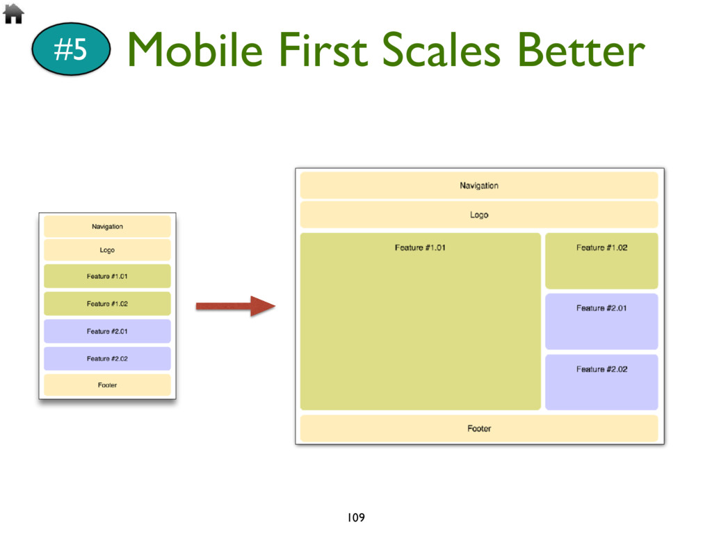
mobile (small screen, low bandwidth, etc), then progressively enhances the experience to take advantage of available screen space, features, and more.” Mobile-First Responsive
and interactive Simple sketching is also effective to get a conversation started TIP: Prefer low-fidelity wireframing tools that work well on agile teams where rapid changes may occur.
Download the Bootstrap starter template 2. Review the Bootstrap responsive breakpoints 3. Add a Bootstrap responsive grid. If you’re not sure what pattern to build try recreating the mostly fluid pattern. 4. Add a Bootstrap responsive navigation bar Exercise #6: RWD with Bootstrap
 bbroulik
 nomizone
 tooppoo
 tsuda7
 estie
estie
 izumii19
 hiranabe
 tokai235
 laysakura
 ryooob
 seosoft
 bata_24
 gotok365
 lara
lara
 nmsamuel
 bethany
 letsgokoyo
 denniskardys
 tmiket
 retrage
 sferik
 nonsquared
 ivargrimstad
 addyosmani
 thirion
![Training Express Slides: bit.ly/rwd-training Responsive Web Development @BradBroulik | [email protected]](https://files.speakerdeck.com/presentations/67e1a0b642274fb797d044f048b99831/slide_0.jpg)
![19 #3 Media Queries @media [not|only]? <media_type> [and (<media_feature>: value)]*](https://files.speakerdeck.com/presentations/67e1a0b642274fb797d044f048b99831/slide_18.jpg)
![38 Use Case: device-pixel-ratio <img srcset=“[email protected] 1x, [email protected] 2x" src=“[email protected]”](https://files.speakerdeck.com/presentations/67e1a0b642274fb797d044f048b99831/slide_37.jpg)
![130 Thank You! @BradBroulik BradBroulik.blogspot.com [email protected] Slides: bit.ly/rwd-training](https://files.speakerdeck.com/presentations/67e1a0b642274fb797d044f048b99831/slide_129.jpg)