Upgrade to Pro — share decks privately, control downloads, hide ads and more …

Freaky Fast Delivery - Responsive Performance Strategies

Freaky Fast Delivery - Responsive Performance Strategies

Want to learn how to build freaky fast sites that load within the mythical one-second barrier? In this talk, we’ll explore the latest techniques we can apply to create responsible sites the achieve this goal. Topic discussed will include:
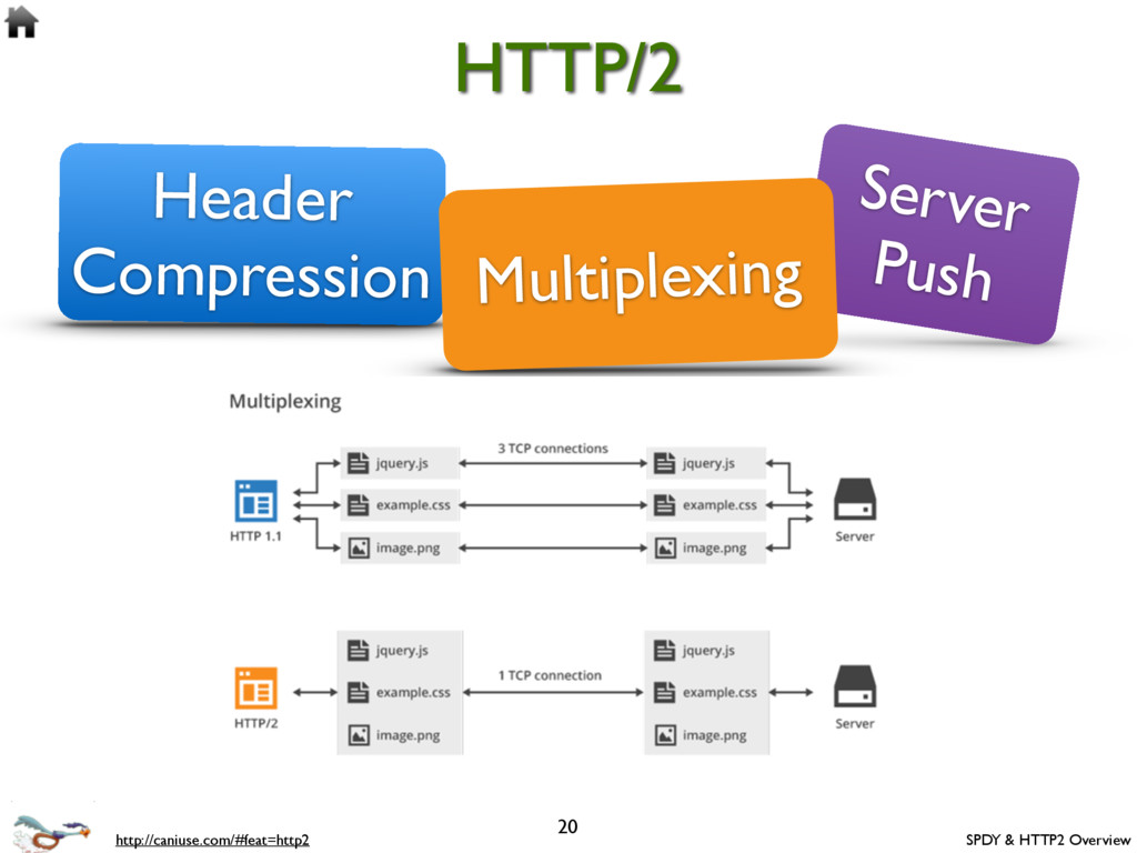
-Traditional vs enhanced page loading techniques
-Loading JavaScript, CSS, fonts and content asynchronously
-Compression techniques for requests, images, and assets
-Caching techniques via Browser cache and Web storage
-Performance budgets, anti-patterns, and monitoring tools

Brad Broulik

April 15, 2016
Tweet

More Decks by Brad Broulik

Other Decks in Technology

Transcript

  1. 3 Responsive Performance http://www.guypo.com/mobile/performance-implications-of-responsive-design-book-contribution/ http://blog.kissmetrics.com/loading-time/?wide=1 •Fewer HTTP requests. •Compress images

    (ImageOptim, PNG Crush). •Load visible content first or defer everything else. •Minify and merge JavaScript assets. •Prefer sprites or use Data URI for images. •Use CDNs when available. •Avoid geolocation on initial home screen. •Dedicate time for performance testing. •Web storage. •Networks and devices will eventually get faster. Performance tips “86% of sites listed on mediaqueri.es weighed roughly the same when loaded in the smallest window, compared to the largest one. In other words, the mobile site is still downloading the full website content.” -- Guy Podjarny
  2. 4 HTML CSS CSS JS JS Blocking CAUTION: CSS and

    JavaScript assets loaded in the head via <link> and <script> tags are blocking requests - they block the document from appearing until all assets are loaded. HTML Traditional Request Loading Cell tower DNS Server
  3. 5 Full CSS Lazy load non- critical assets HTML Responsible

    Performance Critical CSS Async JS Loader HTML Critical CSS Async JS Loader TIP: Deliver the critical CSS and JavaScript inline on initial page request and lazy load non-critical assets for optimal page load performance! • Enhance.JS • Critical CSS Bookmarklet • Grunt-CriticalCSS Critical CSS - The minimal CSS necessary to render a particular page. It’s a subset of the full CSS. HTML contains all the assets to render the initial page in a single request. Asynchronously load the non- critical assets after initial page load via enhance.js Cell tower DNS Server Full JS Full Fonts Goal: one-second perceived load time
  4. 7 Download and Hide #1 reason for bloat Desktop Article

    hidden in DOM TIP: Instead of hiding unnecessary markup in the DOM with display:none don’t even download it!
  5. 8 http://filamentgroup.com/lab/ajax_includes_modular_content/ NOTE: Entertainment articles are lazy loaded after page

    load NOTE: Technology articles are only loaded when min-width: 30em Lazy Loading
  6. 9 Download and Shrink #2 reason for bloat Large desktop

    image scaled down TIP: Instead of shrinking large image assets within small viewports, download the optimized smaller images!
  7. 11 Scott Jehl: https://github.com/scottjehl/picturefill TIP: Picturefill is a responsive image

    polyfill for <picture>, srcset, sizes, and more that you may begin using today!
  8. 12 Use Case: device-pixel-ratio <img srcset=“[email protected] 1x, [email protected] 2x" src=“[email protected]

    alt="pic" /> srcset: set of sources with w (width) or x (resolution) descriptors. 1x (150 x 150 px) 2x (300 x 300 px) 3x (450 x 450 px) CAUTION: srcset can be defined with w (width) or x (resolution) descriptors but not both. They do not mix. src: fallback ing if srcset is not supported. http://www.smashingmagazine.com/2014/05/14/responsive-images-done-right-guide-picture-srcset/
  9. 13 <img srcset="large.jpg 1024w, medium.jpg 640w, small.jpg 320w" sizes=“100vw" src="small.jpg"

    alt=“pic" /> Use Case: fluid image Variable Known by browser when it’s loading the page? viewport dimensions yes image size relative to viewport yes via sizes screen density yes source files’ dimensions yes via srcset NOTE: We tell the browser the rendered size of our images and the browser picks the preferred image for it’s container. Very Cool! sizes: can be absolute (px or em), relative to the viewport (vw), or dynamic calc(.333 * 100vw -12em) http://ericportis.com/posts/2014/srcset-sizes/
  10. 14 <img srcset="large.jpg 1024w, medium.jpg 640w, small.jpg 320w" sizes="(min-width: 36em)

    33.3vw, 100vw” src="small.jpg" alt="pic" /> Use Case: variable-sized image sizes=“[media query] [length], [media query] [length], [length] If no media query it is the default size
  11. 15 Art direction This technique allows us to use smaller

    images that appear larger on smaller viewports by cropping the subject of the photo.
  12. 16 <picture> <source media="(min-width: 36em)" srcset="large.jpg 1024w, medium.jpg 640w,small.jpg 320w"

    sizes="33.3vw" /> <source srcset="cropped-large.jpg 2x, cropped-small.jpg 1x" /> <img src="images/small.jpg" alt="pic" /> </picture> TIP: Prefer picture element for art-directed and type- switching use cases. Use Case: art direction Load art-directed (cropped) images when below 36ems http://scottjehl.github.io/picturefill/#ie9
  13. 17 <picture> <source type="image/svg+xml" srcset="logo.svg"> <source type="image/png" srcset="logo.png"> <img src="logo.gif"

    alt=“logo" /> </picture> If the browser doesn’t find a compatible source type it will fallback to the img Use Case: type-switching
  14. 19 Chrome developer tools Compress with GZip TIP: Verify you’re

    using gzip in Chrome developer tools. Click “Network” tab and do a refresh on the page. Click on the top document entry in the list and select “Headers” on the right side. If you find “Content-Encoding: gzip” in the list, then the page is gzip-compressed.
  15. 20 HTTP/2 SPDY & HTTP2 Overview Header Compression Server Push

    Multiplexing http://caniuse.com/#feat=http2
  16. 21 Responsible Fonts TIP: Load fonts asynchronously and progressively with

    Google’s Web Font Loader! https://github.com/typekit/webfontloader 1. Show a fallback font while the custom fonts asynchronously load. Use a fallback font that appears similar to the custom font to avoid a Flash Of Unstyled Text (FOUT). 2. The layout will progressively enhance to the custom fonts after they are loaded. Console logs show font loading events
  17. 23 Browser Caching https://developers.google.com/speed/docs/insights/LeverageBrowserCaching Cache response for 120 seconds ETag

    token uniquely identifies the response (data) Request #1 Request #2 The response hasn’t change and as a result the ETags match. Response is 304 (no data)
  18. 25 Web Storage Examples: •bonus/html5/webstorage.html localStorage // Store localStorage.setItem("lastName", "Peterson");

    // Retrieve $("#lastName").html(localStorage.getItem("lastName")); // Remove localStorage.removeItem("lastName"); 25 http://caniuse.com/#search=localstorage http://en.wikipedia.org/wiki/Web_storage sessionStorage
  19. 27 Perceived Performance http://www.webpagetest.org/ TIP: A one-second page load is

    the ultimate goal. Or verify your site is 20% faster than the competition. Speed Index is the ideal measurement for perceived performance. Shoot for a Speed Index of 1000. The average is 4493.
  20. 28 Perceived Performance https://sites.google.com/a/webpagetest.org/docs/using-webpagetest/scripting logger off logger on TIP: A

    one-second page load is the standard goal. Verify your site is 20% faster than the competition.
  21. 29 Performance Budget http://timkadlec.com/2014/05/performance-budgeting-with-grunt/ TIP: Setup an automated performance budget

    test to validate your build is within a certain SpeedIndex or render time. Verify the SpeedIndex (perceived performance) is within our goal of 1.2 seconds Verify the site starts rendering with the goal of one-second
  22. 30 Chrome developer tools Safari Web Inspector Browser Testing Tools

    http://devtoolsecrets.com/ http://webperformance.io/devtools-filmstrip