Upgrade to Pro — share decks privately, control downloads, hide ads and more …

Building Adaptive iOS & Android Apps

Building Adaptive iOS & Android Apps

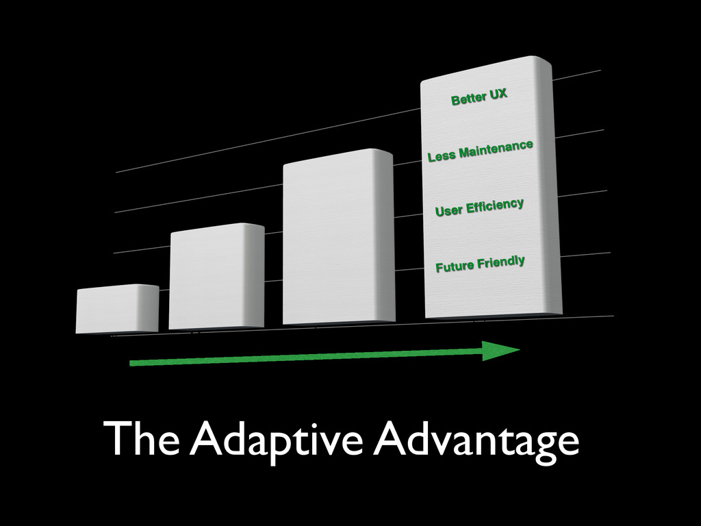
Want to learn how to create adaptive iOS and Android apps that are optimized for both small and large devices? In this talk, we’ll explore the latest iOS and Android techniques we can apply to create universal apps that adapt their content for all device sizes.

Brad Broulik

April 18, 2015
Tweet

More Decks by Brad Broulik

Other Decks in Technology

Transcript

  1. Slides: bit.ly/adaptive-apps Building Adaptive iOS & Android Apps @BradBroulik |

    [email protected] BradBroulik.blogspot.com iOS Code: github.com/BradBroulik/iOS-adaptive-demos Android Code: github.com/BradBroulik/android-adaptive-demos
  2. 7 iOS 100 Universal iOS Apps TIP: By default, iOS

    apps are configured to be universal. Developers must explicitly choose to restrict this behavior.
  3. 8 Vertical Size Class (height) Horizontal Size Class (width) iPhone

    4, 5, 6 Portrait Regular Compact iPhone 4, 5, 6 Landscape Compact Compact iPhone 6 Plus Portrait Regular Compact iPhone 6 Plus Landscape Compact Regular iPad Portrait/ Landscape Regular Regular # Size Classes NOTE: A size class coarsely categorizes available space horizontally and vertically SplitViewController compatible
  4. 9 Size Classes Images via WWDC 2014 - View Controller

    Advancements in iOS 8 Split View Controller
  5. 10 Trait Collections Set images based on trait collections Images

    via WWDC 2014 - Building Adaptive Apps with UIKit NOTE: A trait collection provides characteristics of a view controller which manages the views of your UI.
  6. 11 # Responsive Layouts Compact Regular NOTE: Is it adaptive

    or responsive? Responsive is a single template that responds based on a size class (iOS). Adaptive is multiple templates - one for each size class (Android).
  7. 13 Master/Detail NOTE: The entire Adaptive iOS Demos app runs

    within a SplitViewController and responds to regular and compact sizes. Master Detail NOTE: SplitViewControllers are “split” by default in horizontally regular displays.
  8. 15 TIP: Collection Views automatically adapt their flow layout based

    on the available container size. Toggle for full-screen (refer to UIViewControllerExtensions.swift) Grids
  9. 16 TIP: With Auto Layout you may configure your UI

    to be responsive for any size class. Mostly Fluid Multi-column when regular Single-column when compact
  10. 17 TIP: Setup Auto Layout constraints by size class for

    a responsive and fluid user interface. View Xcode constraints by size class Manage constraints by size class Auto Layout
  11. 19 Use Case: Image by size class TIP: Xcode allows

    us to set the corresponding size class for our UIImages iPad regular iPhone compact Any width Compact width
  12. 20 Use Case: Art direction Art direction allows us to

    use smaller images that appear larger on smaller devices by cropping the subject of the photo.
  13. 21 Use Case: Vector icons https://github.com/Createful/pdf-vector-icons TIP: The images are

    black to simplify template rendering. This allows you to set the image color at runtime or in Interface Builder. Set the Types to “Vectors” before dragging vector PDF into Xcode Set Render As to “Template Image” to render the image in any color NOTE: The SVGs must be sized @1x and Xcode will manage the generation of the various sized PNGs.
  14. Popovers TIP: Use a UIPopoverPresentaionController to present your popover. It

    allows you to adjust the popover for the display environment. Horizontally regular environments display as popovers and horizontally compact environments adapt to your choice of UIModalPresentationStyle (FullScreen, FormSheet, etc). 23 Popover appears as “FullScreen” in compact width Popover appears as “Popover” in regular width NOTE: Alerts and action sheets are also adaptive objects. Popover appears as “FormSheet” in compact height (new in iOS 8.3)
  15. 24 protocol UIAdaptivePresentationControllerDelegate: @availability(iOS, introduced=8.3) adaptivePresentationStyleForPresentationController(_: traitCollection:) Coming Soon? Adapt

    via TraitCollection. Previously the adaptive rule only applied to a compact-width size constraint. Maybe a new size class at WWDC 2015 - The latest iOS 8.3 API now allows Adaptive Presentation Controllers to adapt by TraitCollection.
  16. 25 Self-sizing Cells NOTE: Self-sizing cells were introduced in iOS

    8. Verify layouts are font size friendly and accessible
  17. 26 1) tableView.estimatedRowHeight = 68.0 2) tableView.rowHeight = UITableViewAutomaticDimension 1)

    Allow row height to grow (FlexibleFontsTableViewController.swift) 2) Use text style font for accessibility (body, headline etc) 3) Set line length to zero to enable multi-lines 4) Test UI with different font sizes NOTE: Dynamic type was introduced in iOS 7 . Dynamic Type Dynamic Type Simulator
  18. 27 TIP: You can adjust font attributes based on size

    constraints. Here, we increase the font-size on regular width layouts. Adaptive
  19. 30 TIP: View different UIs simultaneously in Xcode’s new assistant

    preview editor. Preview Multiple Layouts https://developer.apple.com/library/ios/recipes/xcode_help-interface_builder/chapters/PreviewingLayouts.html
  20. 31 Toggle Double-Length Pseudolanguage Preview Alternate Font Lengths TIP: In

    the assistant preview you can see how your UI adapts for double-length text.
  21. 32 Android TIP: By default, Android apps are universal. Developers

    must explicitly choose to restrict this behavior. http://developer.android.com/guide/practices/screens-distribution.html
  22. 33 # Size Qualifiers Configuration Qualifier Description Smallest Width sw

    Smallest possible width for a screen (preferred when supporting 3.2+) Available Width w Minimum available width for a screen Screen Size small normal large xlarge Resources by size (pre Android 3.2) Orientation land port Resources by orientation Density ldpi mdpi hdpi xhdpi xxhdpi xxxhdpi Resources by density http://developer.android.com/guide/topics/resources/providing-resources.html#AlternativeResources
  23. 34 TIP: The layout alias allow us to swap in

    alternate layouts for different size qualifiers. 2) Bind the “large” layout to our activity_mostly_fluid alias 1) When layout is sw600dp Size Qualifiers 3) Load the layout by alias name: http://developer.android.com/training/multiscreen/screensizes.html#TaskUseAliasFilters
  24. 35 # Adaptive Layouts Small large NOTE: Is it adaptive

    or responsive? Responsive is a single template that responds based on a size class (iOS). Adaptive is multiple templates - one for each size class (Android).
  25. 37 TIP: Creating master/detail layouts is very quick in Android

    Studio. Select New, Activity, Master/Detail Flow. That’s it - you’ll have a master/detail layout template setup in a few seconds! https://developer.android.com/design/patterns/multi-pane-layouts.html Master/Detail
  26. 38 TIP: GridView automatically adapts its flow layout based the

    the available container size. GridView https://developer.android.com/guide/topics/ui/layout/gridview.html TIP: CardViews are also adaptive friendly widgets.
  27. 39 NOTE: This UI shows the multi-column template when the

    smallest-width is at least 600dp (sw600dp). Each template is a separate XML layout file. Mostly Fluid Multi-column template for sw600dp layout (activity_mostly_fluid_large.xml) Single-column template (activity_mostly_fluid.xml)
  28. 41 Art direction allows us to use smaller images that

    appear larger on smaller devices by cropping the subject of the photo. Use Case: Art direction
  29. 42 Use Case: Vector drawables CAUTION: Vector Drawables are only

    available in Android 5.0 (API level 21) and above. AppCompat support is not currently available. TIP: Victor converts SVGs to PNGs at build time and doesn’t pollute the source code. https://github.com/trello/victor Android Icon Generator works with SVGs
  30. 43 Use Case: Tinted drawables CAUTION: Tinted Drawables are available

    only in Android 5.0 (API level 21) and above. AppCompat support is not currently available. https://developer.android.com/training/material/drawables.html#DrawableTint TIP: One drawable - many colors. You may tint any image type. DevBytes: Android Vector Graphics
  31. Action Bars 45 TIP: Action bar items adapt to large

    and small devices automatically when setup with an “ifRoom” attribute. http://developer.android.com/guide/practices/tablets-and-handsets.html#ActionBar Action bars automatically collapse if there isn’t enough room
  32. Tabs 46 http://developer.android.com/guide/topics/ui/actionbar.html#Tabs TIP: ActionBar tabs adapt to small and

    large screen widths automatically. They appear as a “stacked action bar” or alongside the action buttons depending on available space. CAUTION: The new Toolbar Widget in Android L is not adaptive out-of-the-box but it can be customized to support any size qualifier.
  33. Scaleable Fonts Verify layouts are font size friendly and accessible

    Test UI with different font sizes http://developer.android.com/guide/practices/screens_support.html#screen-independence TIP: Use scale-independent pixels (sp) for font sizes. This unit of measure adjusts for both screen density and the users font-size setting. 47
  34. Slides: bit.ly/adaptive-apps Thank You! @BradBroulik | [email protected] BradBroulik.blogspot.com iOS Code:

    github.com/BradBroulik/iOS-adaptive-demos Android Code: github.com/BradBroulik/android-adaptive-demos