Upgrade to Pro — share decks privately, control downloads, hide ads and more …

Bearfaced Studio Brand Guidelines

Bearfaced Studio Brand Guidelines

Test presentation

Avatar for Bearfaced Studio

Bearfaced Studio

March 21, 2020
Tweet

Other Decks in Design

Transcript

  1. BRAND GUIDELINES U P D A T E D 2

    0 1 9 HELLO This short guide is intended to assist you when creating communications for Bearfaced Studio. We are keen to ensure that everyone that interacts with the Bearfaced Studio brand understands it and knows how to use it effectively. Please take a moment to read through. This way we can ensure our client material is always consistent and in line with our brand. Thank you.
  2. BRAND GUIDELINES U P D A T E D 2

    0 1 9 Bespoke branding and graphical support to help your business grow. KEYWORDS: GROWTH | STARTUP | SUPPORT | YOUR | BRANDING OUR BRAND STATEMENT
  3. BRAND GUIDELINES U P D A T E D 2

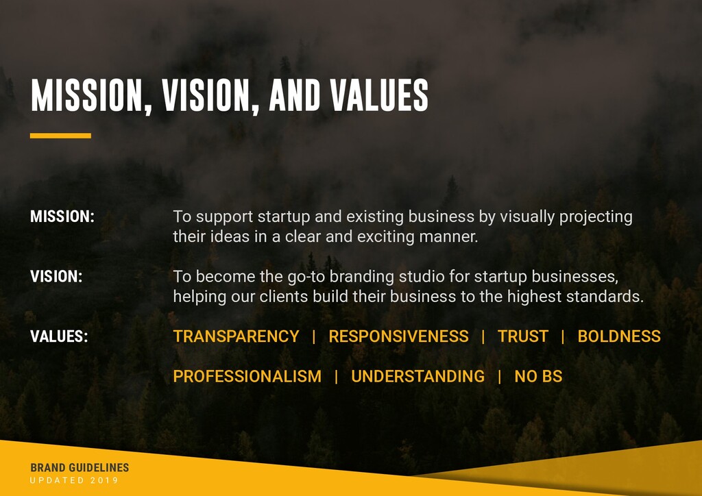
    0 1 9 MISSION: VISION: VALUES: To support startup and existing business by visually projecting their ideas in a clear and exciting manner. To become the go-to branding studio for startup businesses, helping our clients build their business to the highest standards. TRANSPARENCY | RESPONSIVENESS | TRUST | BOLDNESS PROFESSIONALISM | UNDERSTANDING | NO BS MISSION, VISION, AND VALUES
  4. BRAND GUIDELINES U P D A T E D 2

    0 1 9 COLOURS Our core colours are: Grizzly Grey and Honey Yellow. These should be used predominantly on collateral. We opt for a darker overall colour scheme, using lighter text for legibility and emphasising the Honey Yellow. Grizzly Grey CMYK: 67/57/54/60 RGB: 59/59/60 Hex: #3b3b3c CMYK: 00/35/94/00 RGB: 249/177/13 Hex: #f9b10d Honey Yellow
  5. BRAND GUIDELINES U P D A T E D 2

    0 1 9 TYPEFACES HEADINGS: SUB-HEADINGS: BODY: BODY ALT: GO BOLD REGULAR ABCDEFGHIJKLMNOPQRSTUVWXYZ ROBOTO CONDENSED BOLD ABCDEFGHIJKLMNOPQRSTUVWXYZ Roboto Bold abcdefghijklmnopqrstuvwxyz Roboto Regular abcdefghijklmnopqrstuvwxyz
  6. BRAND GUIDELINES U P D A T E D 2

    0 1 9 PRIMARY LOGO This version of our logo is the default and should be used as widely as possible. Additional versions are also available and are explored on the next page. 1. Stretching Please leave a clearance zone the height of the ‘B’ for logo clarity. 2. Changing the colour 3. Rotating Here are examples of how the logo should not be used:
  7. BRAND GUIDELINES U P D A T E D 2

    0 1 9 SECONDARY LOGOS Reversed To be used on light backgrounds Text Only To be used when there is limited height Marque To be used when there is limited height
  8. BRAND GUIDELINES U P D A T E D 2

    0 1 9 “GRRR” For further advice please contact: Reiss McLeod — [email protected]