Upgrade to Pro — share decks privately, control downloads, hide ads and more …

Refresh Richmond, Responsive Web Design

Refresh Richmond, Responsive Web Design

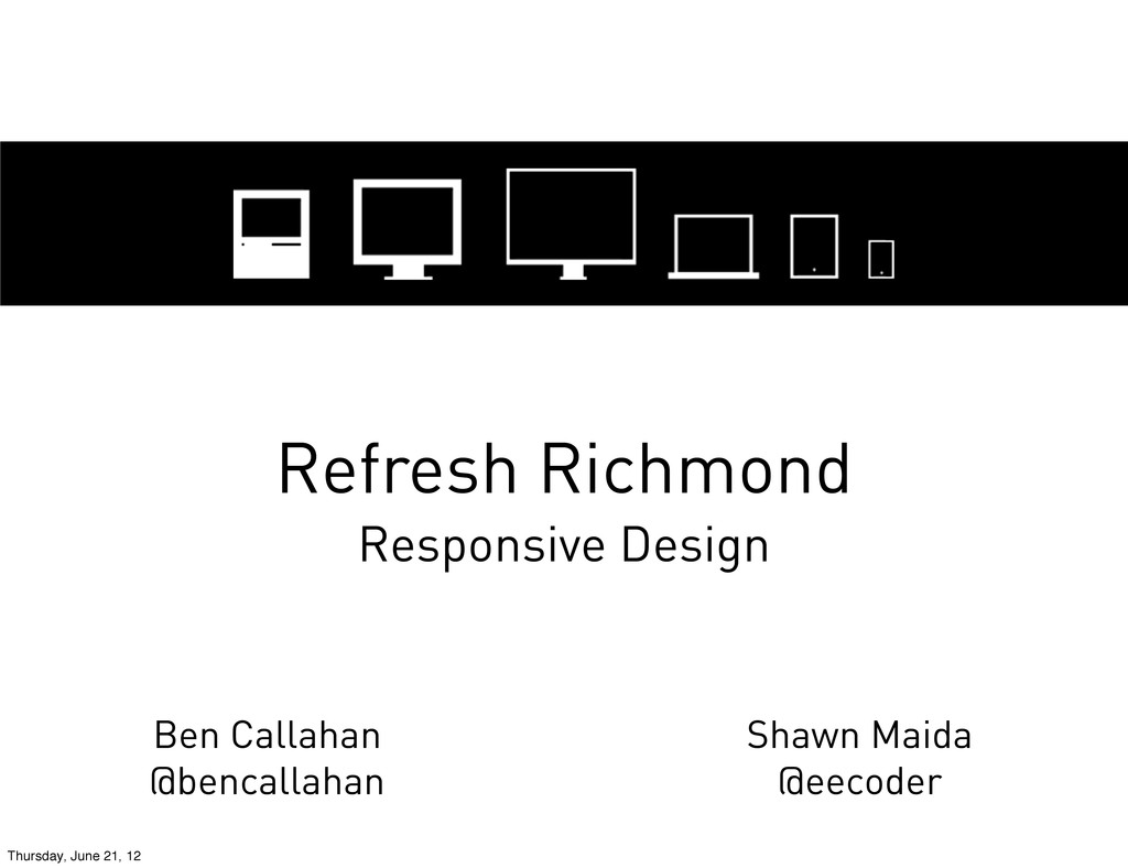
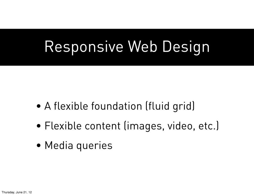
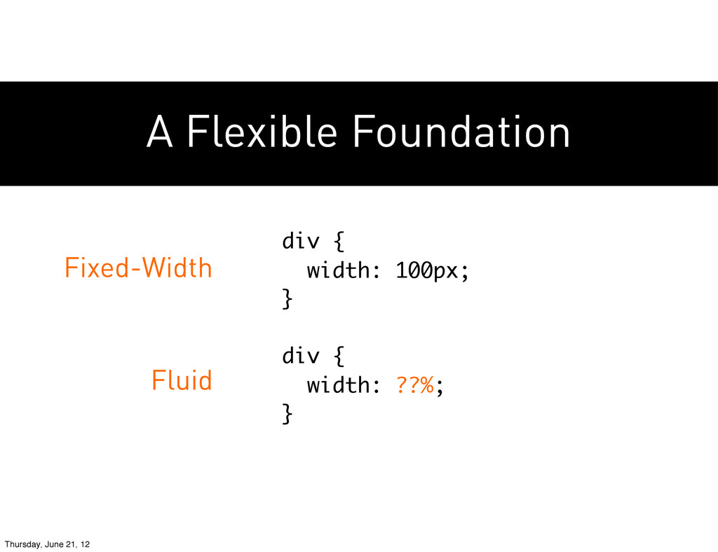
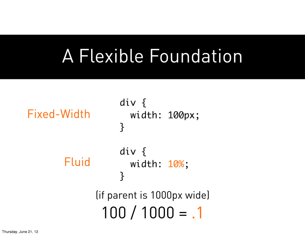
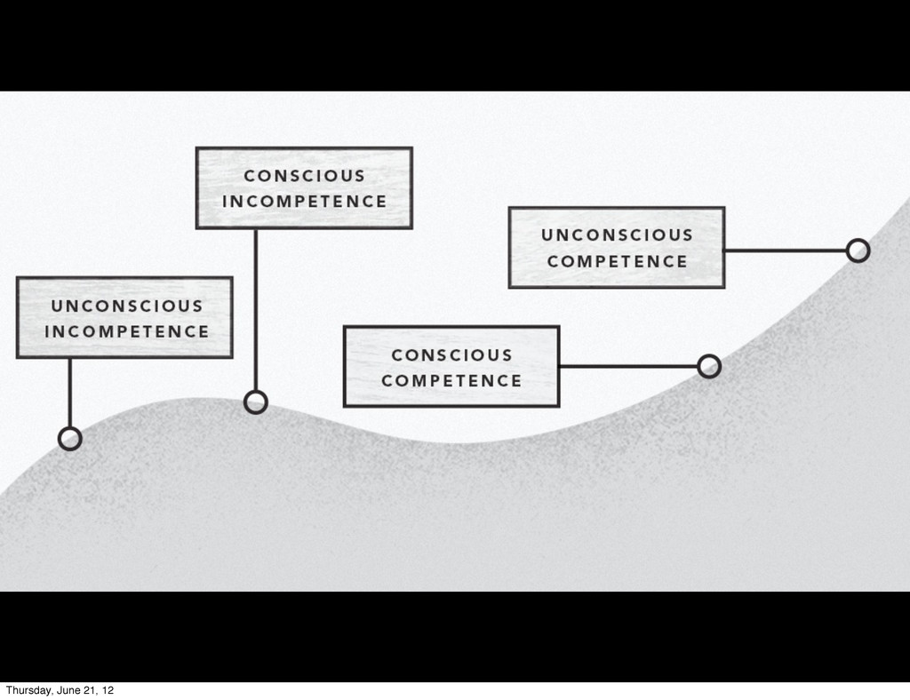
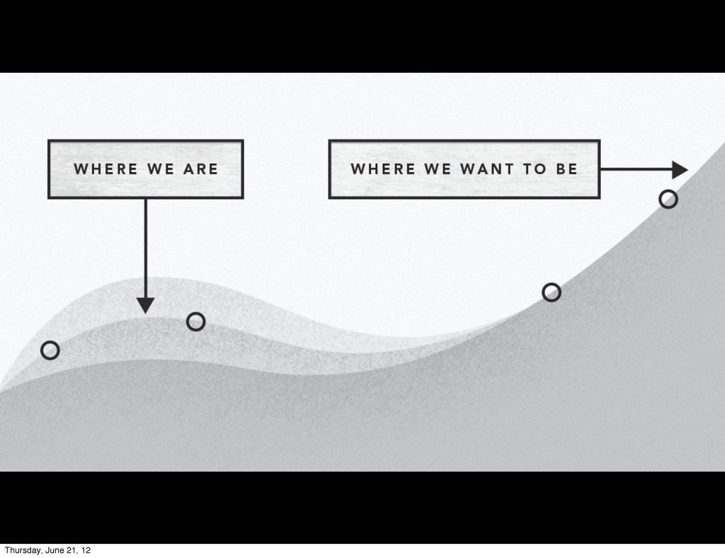
Deck from @eecoder and I's presentation on Responsive Web Design at Refresh Richmond in June of 2012.

Ben Callahan

June 21, 2012
Tweet

More Decks by Ben Callahan

Other Decks in Design

Transcript

  1. The shift to mobile Over 60% of new handset sales

    are smartphones. Thursday, June 21, 12
  2. There are more mobile phones on the planet than there

    are TVs. The shift to mobile Thursday, June 21, 12
  3. 91% of US consumers have their mobile device within reach

    24/7. The shift to mobile Thursday, June 21, 12
  4. Mobile devices account for 8.5% of global web traffic. The

    shift to mobile Thursday, June 21, 12
  5. 25% of US mobile web users are mobile-only web users.

    The shift to mobile Thursday, June 21, 12
  6. Apple sold around 13 million iPads in Q4 of 2011.

    The shift to mobile Thursday, June 21, 12
  7. Amazon sold over 4 million Kindle Fires in December of

    2011. The shift to mobile Thursday, June 21, 12
  8. Flexibility is the new norm. Mobile internet usage is predicted

    to overtake desktop in the next two years. Thursday, June 21, 12
  9. Flexibility is the new norm. People are trying to browse

    your websites on these devices, today. Thursday, June 21, 12
  10. Responsive Web Design • A flexible foundation (fluid grid) •

    Flexible content (images, video, etc.) • Media queries Thursday, June 21, 12
  11. Responsive Web Design • A flexible foundation (fluid grid) •

    Flexible content (images, video, etc.) • Media queries Thursday, June 21, 12
  12. A Flexible Foundation Fixed-Width Fluid div { width: 100px; }

    div { width: ??%; } Thursday, June 21, 12
  13. A Flexible Foundation div { width: 100px; } div {

    width: 10%; } Fixed-Width Fluid (if parent is 1000px wide) 100 / 1000 = .1 Thursday, June 21, 12
  14. Flexible Content http://www.netmagazine.com/tutorials/create-fluid-width-videos • set width to 100%, remove height

    • add a wrapper to maintain aspect ratio • use JS to detect and maintain size Thursday, June 21, 12
  15. Media Queries • width, height • device-width, device-height • orientation

    • aspect ratio • several others http://www.w3.org/TR/css3-mediaqueries/ Thursday, June 21, 12
  16. Media Queries @media all and (min-width: 600px) { /* styles

    for 600px and up here small-rez first */ } @media all and (max-width: 600px) { /* styles for 600px and down here large-rez first */ } Thursday, June 21, 12
  17. Media Queries Large Resolution First PRO: IE works by default

    CON: Smallest devices load all assets Small Resolution First PRO: More logical (build up vs tear down) CON: IE support is tricky Thursday, June 21, 12
  18. Process Design & planning deliverables become very difficult to define

    when so many resolutions are supported. http://bit.ly/M6TOlF Thursday, June 21, 12