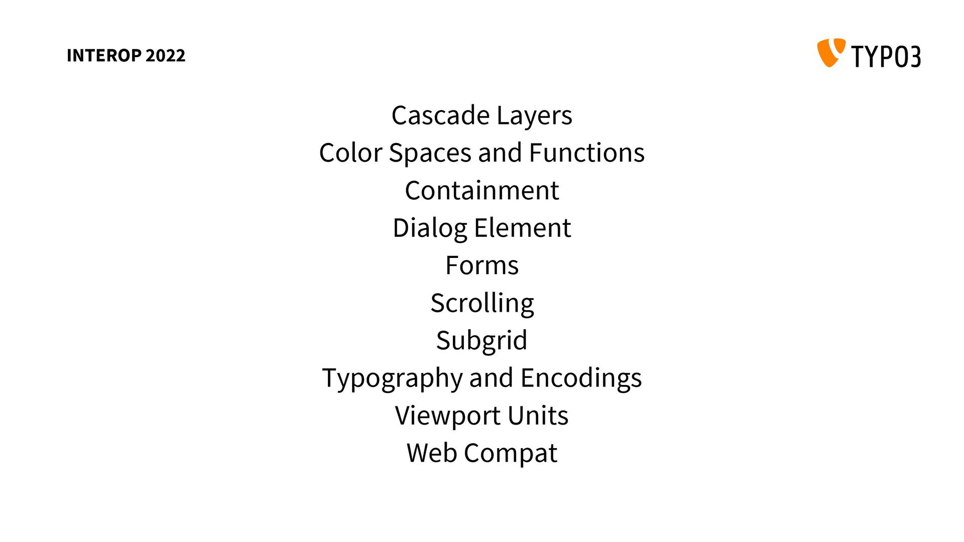
Browser interoperability of CSS features was always a problem in the past. But that started to change when browser vendors started to agree on focus areas, enough to be hyped about it.
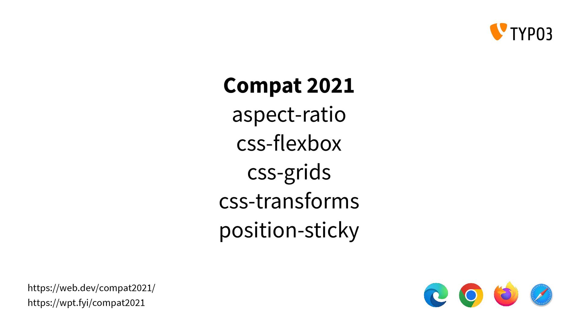
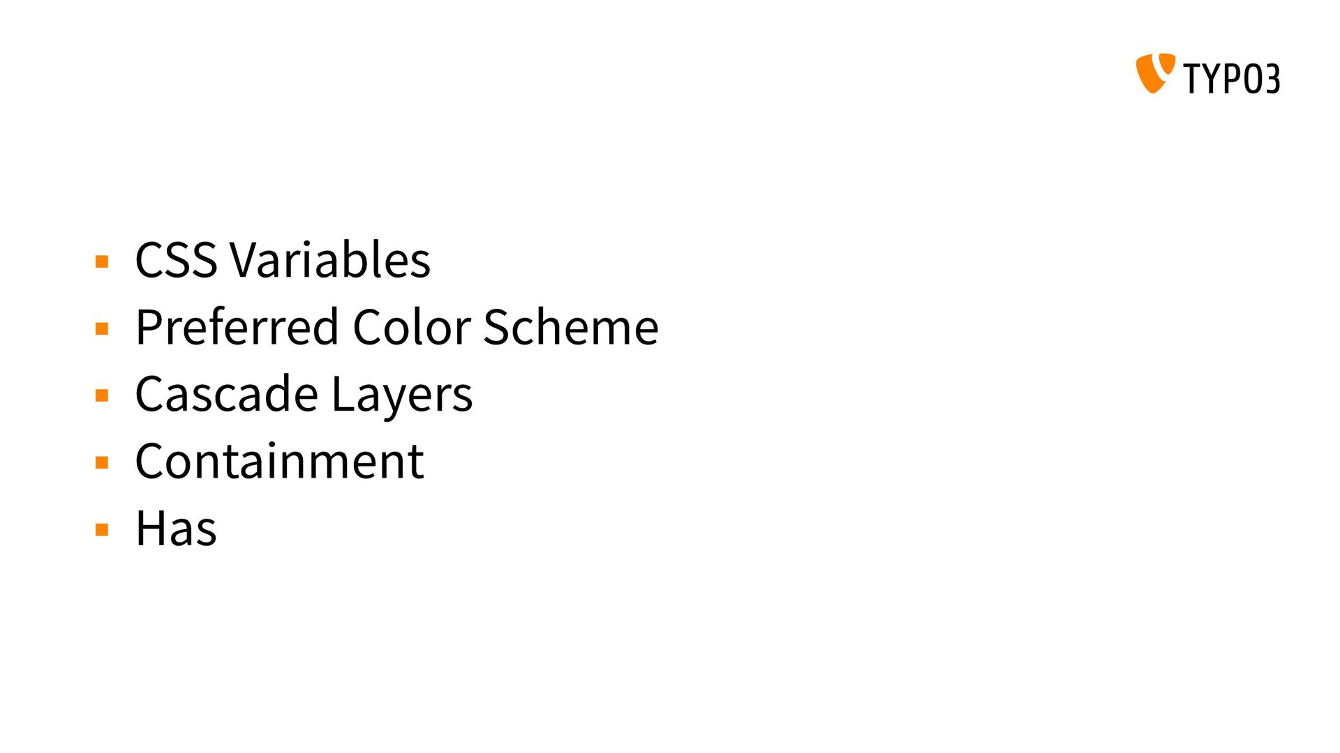
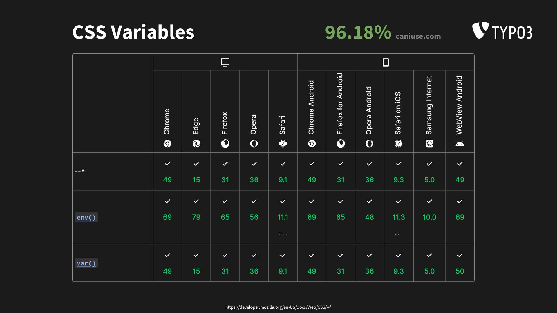
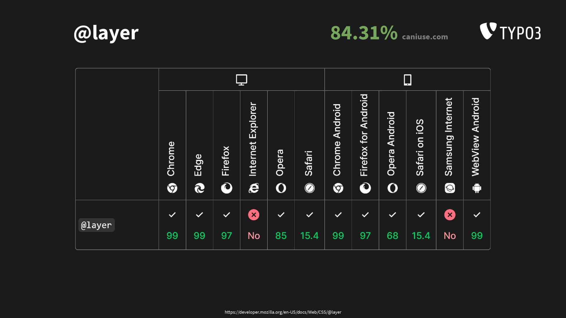
The CSS landscape is now rapidly changing, CSS variables, grids, flexbox and transforms are stable and production ready for a while now. While the features are nice, the potential shines when you start combining them.
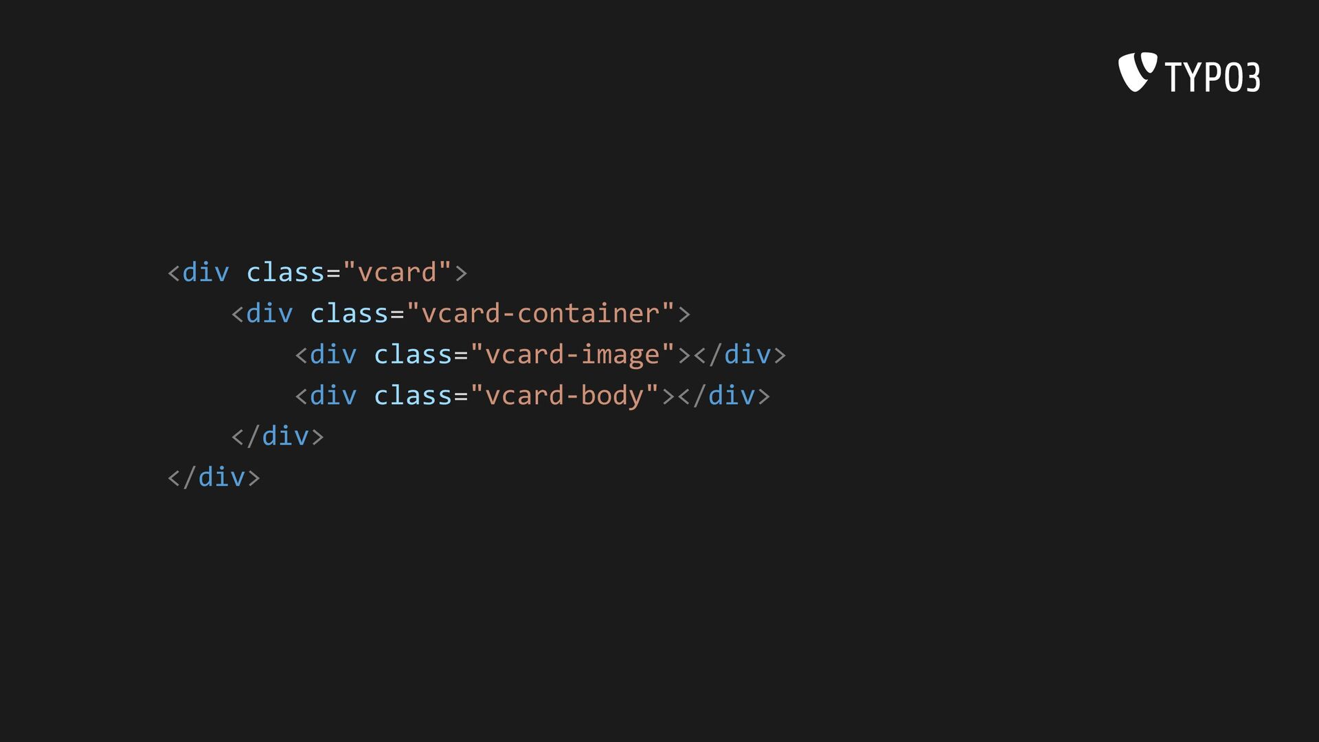
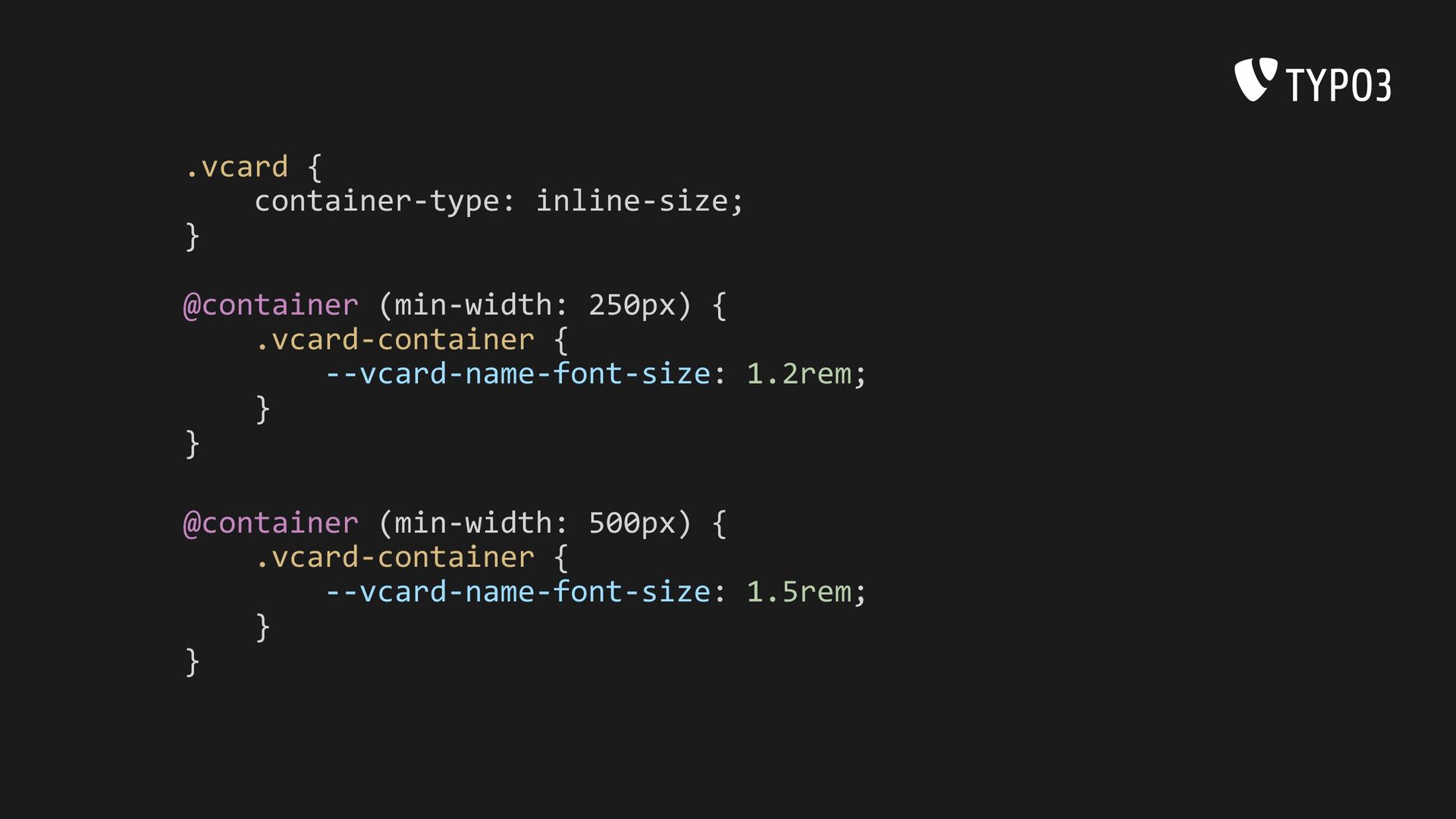
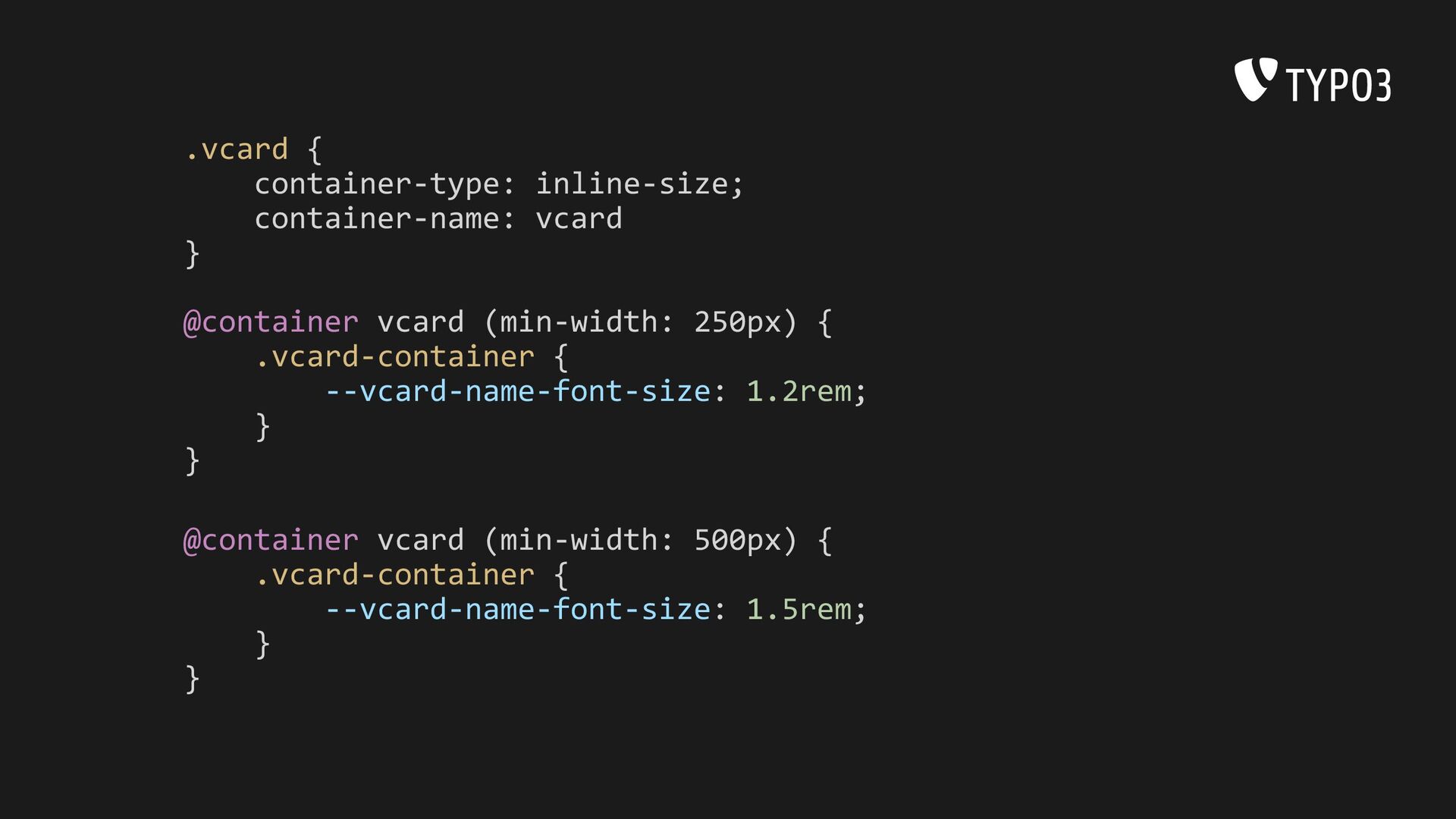
We will have a look at legacy CSS components and see how we can improve them with modern CSS features. Answer the question if CSS pre-processing is still a thing and we will talk about upcoming CSS features and evaluate the impact.
 benjaminkott
 rollbear
 sushichan044
 naoya
naoya
 hanhan1978
 konokenj
 tonkotsuboy_com
 tomoyakitaura
 tatsuhiro
 yug1224
 findyinc
 suguruooki
 niftycorp
 michielstock
 bryan
bryan
 katiecoart
 bkeepers
 nwiizo
 techseoconnect
 addyosmani
 aemeredith
 smashingmag
 mfonobong
 chrisshort
 akashhashmi
![MODERN CSS Benjamin Kott [email protected] @benjaminkott State of CSS 2022](https://files.speakerdeck.com/presentations/92020c151fbd4ce1a150c0655d43ea53/slide_0.jpg)
![A CARDS JOURNEY TYPO3 [email protected] @typo3 Modern CSS](https://files.speakerdeck.com/presentations/92020c151fbd4ce1a150c0655d43ea53/slide_11.jpg)