Upgrade to Pro — share decks privately, control downloads, hide ads and more …

State of CSS 2024

State of CSS 2024

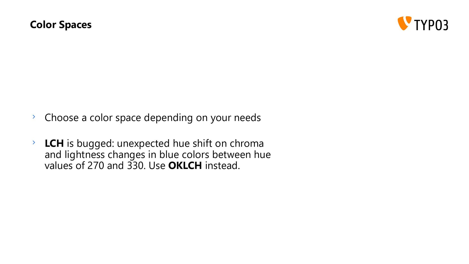
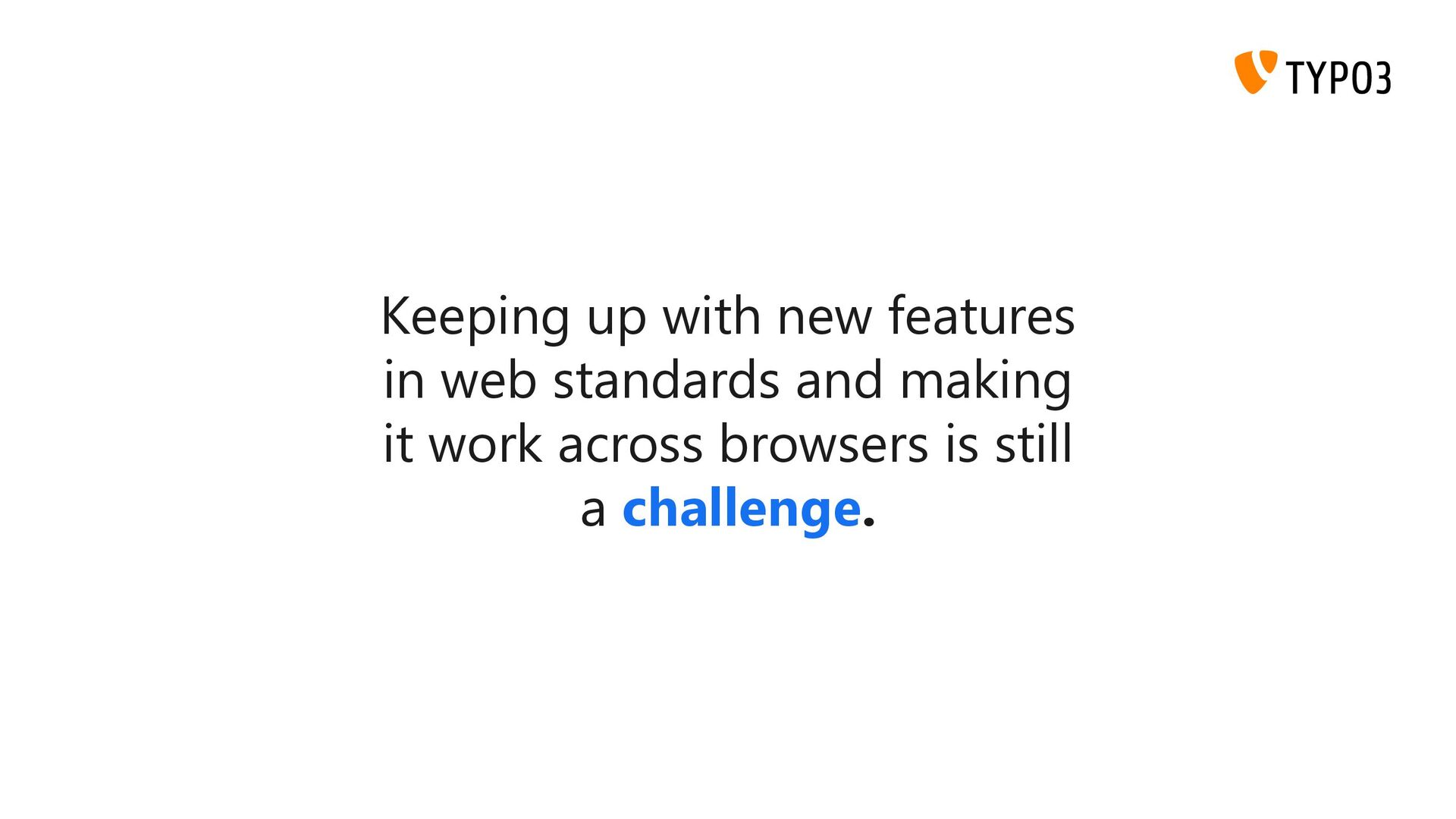
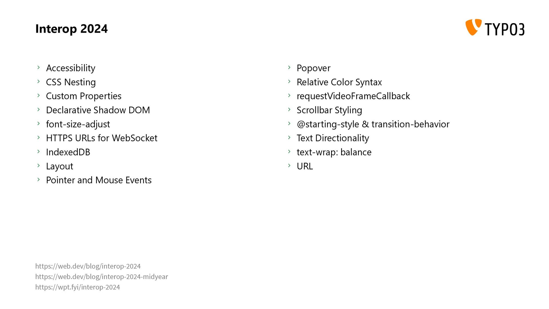
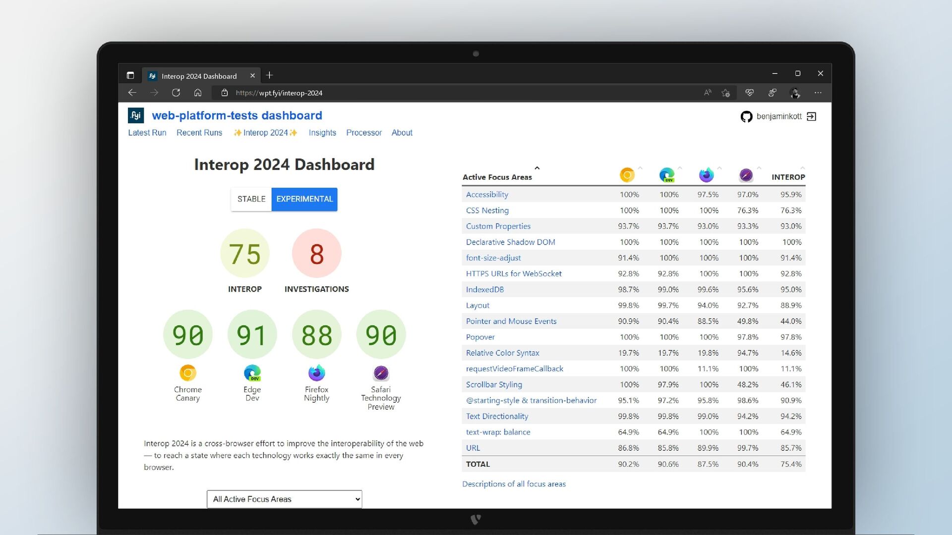
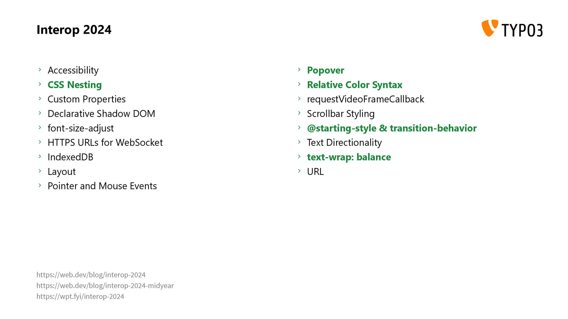
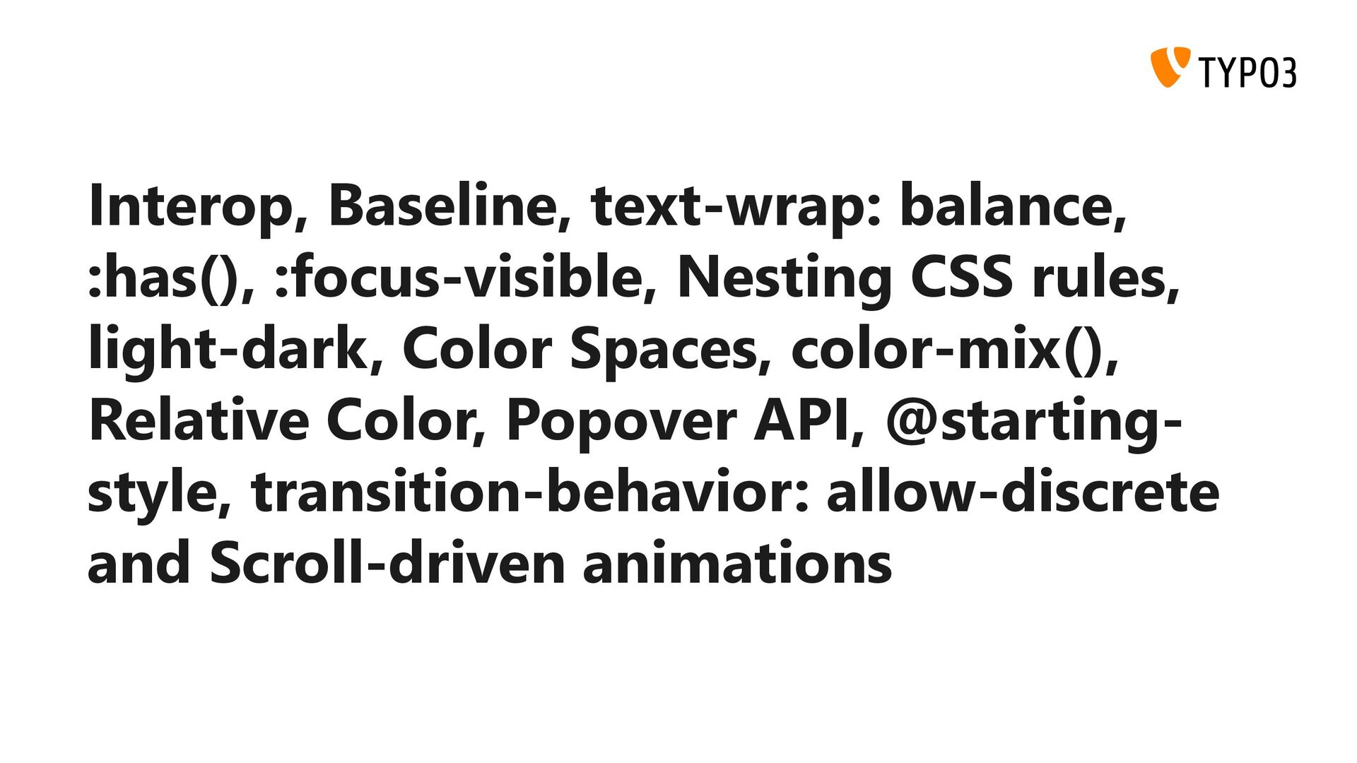
The web platform has evolved rapidly in recent years, with browser vendors modernizing CSS and introducing long-overdue features to enhance web development and interoperability. Thanks to evergreen browsers, we can adopt these new features today.

In this session, we'll explore the latest CSS capabilities and their practical applications. You'll learn how to utilize these new features through practical examples. We'll also discuss upcoming features that will soon be available in browsers.

Avatar for Benjamin Kott

Benjamin Kott

August 01, 2024
Tweet

More Decks by Benjamin Kott

Other Decks in Programming

Transcript

  1. Disclaimer: The information provided is subject to change and is

    intended to summarize current available information as of the presentation date. Please verify all details independently and conduct your own research. The views expressed are my own.
  2. Interop 2022 Cascade Layers Color Spaces and Functions Containment Dialog

    Element Forms Scrolling Subgrid Typography and Encodings Viewport Units Web Compat https://web.dev/interop-2022 https://wpt.fyi/interop-2022
  3. Interop 2023 Border Image in CSS Color Spaces and Functions

    in CSS Container Queries in CSS Containment in CSS CSS Pseudo-classes Custom Properties in CSS Flexbox Font Feature Detection and Palettes Forms Grid :has() Inert Masking in CSS Math Functions in CSS Media Queries 4 Modules in Web Workers Motion Path in CSS Animations Offscreen Canvas Pointer and Mouse Events Scrolling Subgrid Transforms URL Web Compat 2023 Web Codecs (video) Web Components https://web.dev/interop-2023 https://wpt.fyi/interop-2023
  4. Keeping up with new features in web standards and making

    it work across browsers is still a challenge.
  5. Baseline Web Platform Baseline tries to bring clarity to information

    about browser support for web platform features. https://web.dev/baseline
  6. Newly available Limited availability Widely available The feature becomes supported

    by all of the core browsers. 30 months have passed since the newly interoperable date. The feature has just become available in some core browsers.
  7. Interop 2024 Accessibility CSS Nesting Custom Properties Declarative Shadow DOM

    font-size-adjust HTTPS URLs for WebSocket IndexedDB Layout Pointer and Mouse Events Popover Relative Color Syntax requestVideoFrameCallback Scrollbar Styling @starting-style & transition-behavior Text Directionality text-wrap: balance URL https://web.dev/blog/interop-2024 https://web.dev/blog/interop-2024-midyear https://wpt.fyi/interop-2024
  8. Interop 2024 Accessibility CSS Nesting Custom Properties Declarative Shadow DOM

    font-size-adjust HTTPS URLs for WebSocket IndexedDB Layout Pointer and Mouse Events Popover Relative Color Syntax requestVideoFrameCallback Scrollbar Styling @starting-style & transition-behavior Text Directionality text-wrap: balance URL https://web.dev/blog/interop-2024 https://web.dev/blog/interop-2024-midyear https://wpt.fyi/interop-2024
  9. :( Your PC ran into a problem and needs to

    restart. We're just collecting some error info, and then we'll restart for you. 110% complete For more information about this issue and possible fixes, visit http://windows.com/stopcode If you call a support person, give them this info: Stop code: CRITICAL_PROCESS_DIED
  10. Disclaimer: I am not sure if I am stupid or

    really smart. I cannot guarantee that you will be able to follow the presentation after this section. Individual understanding may vary. We will not perform any live debugging. The content will be presented as-is, and any issues will be addressed later.
  11. text-wrap: balance balance Text is wrapped to balance the number

    of characters per line, improving layout and readability. Due to the computational cost of counting characters and balancing lines, this feature is supported only for text blocks up to six lines in Chromium and ten lines in Firefox.
  12. :has() :root { --article-color: #313131; --article-bg: #fff; } .article {

    color: var(--article-color); background: var(--article-bg); } .article:has(.article-image) { --article-color: #fff; --article-bg: #9c27b0; }
  13. :focus-visible .button { display: inline-block; outline: 0; border: 1px solid

    white; } .button:focus { border-color: red; } .button:focus-visible { outline: 1px solid green; }
  14. :focus-visible It´s all about keyboard accessibility. The focus ring is

    usually removed by authors as it is considered „ugly“. This introduced an A11Y problem for keyboard users, as it was hard to know what element is currently focused. To allow dedicated styling for keyboard users :focus-visible was introduced. Use :focus for pointer interactions (mouse, touch) Use :focus-visible for keyboard interactions
  15. Nesting .nesting > .is > .awesome { color: deeppink; }

    .nesting { > .is { > .awesome { color: deeppink; } } }
  16. Nesting .demo .triangle, .demo .square { opacity: .25; filter: blur(25px);

    } /* grouped with :is() */ .demo :is(.triangle, .square) { opacity: .25; filter: blur(25px); }
  17. Nesting Concatenation is not possible. Nesting became available in all

    browsers in August 2023 with Firefox's release. This initial support allowed only simple nesting, requiring all rules to be prefixed with "&". In December 2023, baseline support was announced, making the "&" selector optional and introducing "@rule" nesting support. This overlap complicates matters, as documentation only briefly mentions these changes. Note that this minor difference excludes all iOS 16 devices, so ensure you do not mix them up. https://webkit.org/blog/14154/webkit-features-in-safari-16-5/
  18. color: light-dark() :root { --vcard-color: #313131; --vcard-bg: #fafafa; } @media

    (prefers-color-scheme: dark) { :root { --vcard-color: #fafafa; --vcard-bg: #313131; } }
  19. color: light-dark() … needs color-scheme to be set … is

    a <color> function … gets treated the same as currentColor … hard to debug … makes it hard to follow definitions … has no equivalent for anything else
  20. color: light-dark() :root { color-scheme: light dark; --modifier-hover-light: 0.9; --modifier-hover-dark:

    1.1; --vcard-bg: light-dark(#fafafa, #313131); --vcard-bg-hover: light-dark( hsl(from var(--vcard-bg) h s calc(l * var(--modifier-hover-light))), hsl(from var(--vcard-bg) h s calc(l * var(--modifier-hover-dark))) ); }
  21. color: light-dark() :root { color-scheme: light dark; --modifier-hover-light: 0.9; --modifier-hover-dark:

    1.1; --vcard-bg-light: #fafafa; --vcard-bg-dark: #313131; --vcard-bg: light-dark(#fafafa, #313131); --vcard-bg-hover: light-dark( hsl(from var(--vcard-bg-light) h s calc(l * var(--modifier-hover-light))), hsl(from var(--vcard-bg-dark) h s calc(l * var(--modifier-hover-dark))) ); }
  22. color: light-dark() :root { color-scheme: light dark; --modifier-hover-light: 0.9; --modifier-hover-dark:

    1.1; --vcard-bg-light: #fafafa; --vcard-bg-dark: #313131; --vcard-bg: light-dark(#fafafa, #313131); /* ... */ --vcard-bg-image-light: url(./light.svg); --vcard-bg-image-dark: url(./dark.svg); --vcard-bg-image: ???; }
  23. color: light-dark() :root { /* ... */ --vcard-bg-image-light: url(./light.svg); --vcard-bg-image-dark:

    url(./dark.svg); --vcard-bg-image: var(--vcard-bg-image-light); @media (prefers-color-scheme: dark) { --vcard-bg-image: var(--vcard-bg-image-dark); } } article { color-scheme: light only; background-image: var(--vcard-bg-image); }
  24. color: light-dark() light-dark() gets hard to use when you need

    to change more than colors light-dark() is currently bugged in relative color syntax Bugs and missing equivalents make light-dark() hard to use. You will end up in a mixed set of rules that react to @media (prefers-color-scheme) and color-scheme. If bugs are fixed and equivalents available, it should definetly be the way forward. For now, consider it carefully.
  25. Color Spaces srgb Standard RGB srgb-linear Standard RGB Linear hsl

    Hue, Saturation, Lightness hwb Hue, Whiteness, Blackness lch Hue, Chroma, Luminance oklch Uniform Hue, Chroma, Luminance lab Perceptual lightness, Chroma, Hue oklab Uniform Perceptual lightness, Chroma, Hue
  26. Color Spaces srgb Standard RGB hsl Hue, Saturation, Lightness oklch

    Uniform Hue, Chroma, Luminance oklab Uniform Perceptual lightness, Chroma, Hue
  27. Color Spaces Choose a color space depending on your needs

    LCH is bugged: unexpected hue shift on chroma and lightness changes in blue colors between hue values of 270 and 330. Use OKLCH instead.
  28. Color Spaces: Link Collection Color Spaces: Do YOU know the

    difference between sRGB, LAB and CIE XYZ? https://www.youtube.com/watch?v=cGyLHxn16pE High definition CSS color guide https://developer.chrome.com/docs/css-ui/high-definition-css-color-guide OKLCH Color Picker & Converter https://oklch.com/ OKLCH in CSS: why we moved from RGB and HSL https://evilmartians.com/chronicles/oklch-in-css-why-quit-rgb-hsl New functions, gradients, and hues in CSS colors (Level 4) https://developer.mozilla.org/en-US/blog/css-color-module-level-4/
  29. color-mix() :root { --text-color-1-value: #00aaff; --text-color-1-percent: 50%; --text-color-2-value: #ffaa00; --text-color-2-percent:

    50%; } .block { background: color-mix( in srgb, var(--text-color-1-value) var(--text-color-1-percent), var(--text-color-2-value) var(--text-color-2-percent) ); }
  30. Relative Color .token { --lightness: 100%; --basecolor: #0055cc; } .token-item--hsl

    { background: hsl(from var(--basecolor) h s var(--lightness)); } .token-item--lch { background: lch(from var(--basecolor) var(--lightness) c h); } .token-item--oklch { background: oklch(from var(--basecolor) var(--lightness) c h); } .token-item--lab { background: lab(from var(--basecolor) var(--lightness) a b); } .token-item--oklab { background: oklab(from var(--basecolor) var(--lightness) a b); }
  31. IMPORTANT: Adjusting the lightness or luminance of a color is

    not the same as lighten() / darken() known from preprocessors like SASS.
  32. Relative Color :root { --base-color: orange; } .color-low { background:

    oklch(from var(--base-color) calc(l + 20) c h); } .color-base { background: var(--base-color); } .color-high { background: oklch(from var(--base-color) calc(l - 20) c h); }
  33. Relative Color: Link Collection CSS relative color syntax https://developer.chrome.com/blog/css-relative-color-syntax Using

    relative colors https://developer.mozilla.org/en-US/docs/Web/CSS/CSS_colors/Relative_colors
  34. Relative Color https://developer.mozilla.org/en-US/docs/Web/CSS/CSS_colors/Relative_colors Newly Available Baseline since 2024-07-09 Implementation based

    on older spec version. As a result, calculations with h channel values do not work correctly, requiring values to be specified with units (deg).
  35. Popover API: Demo <button type="button" popovertarget="mypopover"> Open </button> <div id="mypopover"

    popover> <button type="button" popovertarget="mypopover" popovertargetaction="hide"> Close </button> <p>...</p> </div>
  36. Popover API: Attributes popover="<auto|manual>" Add the popover attribute to the

    element that could contain your popover content. Optionally, you can set the value to auto or manual. The auto options equals a „light dismiss“, the popup will be closed as soon as you click outside the popover. With manual you need to control the state yourself. popovertarget="mypopover" Add the popovertarget attribute with the matching id to your popover element to a button and you can toggle the popover. popovertargetaction="<hide|show|toggle>" The popovertargetaction can be used to control the action the button should trigger.
  37. Popover API Declarative API Automatic top layer promotion Does not

    set the page to inert like <dialog> Should be used for menus, notifications, content pickers … Default closed popover is set to display: none Default opened popover is set to display: block Animations through @starting-style and transition-behavior Positioning will be handled in the future through anchor() Only one popover can be shown at a time This rule can be avoided by nested popovers and manual popovers.
  38. The @starting-style CSS at-rule is used to define starting values

    for properties set on an element that you want to transition from when the element receives its first style update, i.e. when an element is first displayed on a previously loaded page. https://developer.mozilla.org/en-US/docs/Web/CSS/@starting-style
  39. @starting-style .modal { /* ... */ display: none; top: 50%;

    opacity: 1; scale: 1; @starting-style { top: 100%; opacity: 0; scale: 0.25; } &.show { display: block; } }
  40. Animation type: Discrete The property's values are not additive, and

    interpolation swaps from the start value to the end value at 50%. Specifically, denoting by the progress value: If progress < 0.5, then value_result = value_start. If progress ≥ 0.5, then value_result = value_end. Examples for discrete properties: display and content-visibility
  41. transition-behavior allow-discrete Allows to swap the values of discrete properties

    during the keyframe animation instead of swapping them at 50%. When not set to a key-frame the property will swap at 0 or 100% of the animation progress. normal Discrete properties will swap at 50% of the animation progress.
  42. transition-behavior .modal { display: none; transition-property: opacity, display; transition-duration: 0.5s;

    transition-behavior: allow-discrete; opacity: 0; /* ... */ &.show { display: block; opacity: 1; @starting-style { opacity: 0; } } }
  43. Scroll-driven animations Animations without JavaScript based on progression of a

    scroll-based timeline Unsupported Browsers will get the default experience, capable browsers get enhanced animations. Can be combined with prefers-reduced-motion media queries
  44. Scroll-driven animations: Reading animation @keyframes readinganimation { from { width:

    0; } to { width: 100%; } } .reading-indicator-progress { animation: readinganimation linear; animation-timeline: scroll(); }
  45. Scroll-driven animations: Appearing cards @keyframes appear { from { scale:

    .85; opacity: 0; } to { scale: 1; opacity: 1; } } .vcard { animation: appear linear; animation-timeline: view(); animation-range: entry contain 25%; }
  46. Scroll-driven animations: animation-timeline animation-timeline: <none|auto|scroll()|view()> scroll() An anonymous scroll progress

    timeline is provided by some ancestor scroller of the current element. The function parameters allow you to select the scroller, and the scrolling axis the timeline will be measured along. view() An anonymous view progress timeline is provided by the subject that animation-timeline: view(); is set on. The function parameters allow you to select the scrollbar axis along which timeline progress will be tracked and an inset that adjusts the position of the box in which the subject is deemed to be visible.
  47. Scroll-driven animations: animation-range animation-range: normal 25%; animation-range: 25% normal; animation-range:

    25% 50%; animation-range: entry exit; animation-range: cover cover 200px; animation-range: entry 10% exit; animation-range: 10% exit 90%; animation-range: entry 10% 90%;
  48. Scroll-driven animations: Link Collection Unleash the power of Scroll-Driven Animations

    https://youtu.be/5noL_qFobm0?list=PLNYkxOF6rcICM3ttukz9x5LCNOHfWBVnn Scroll-driven Animations Demos https://scroll-driven-animations.style/ MDN Documentation https://developer.mozilla.org/en-US/docs/Web/CSS/CSS_scroll-driven_animations
  49. Keeping up with new features in web standards and making

    it work across browsers is still a challenge.
  50. Interop, Baseline, text-wrap: balance, :has(), :focus-visible, Nesting CSS rules, light-dark,

    Color Spaces, color-mix(), Relative Color, Popover API, @starting- style, transition-behavior: allow-discrete and Scroll-driven animations