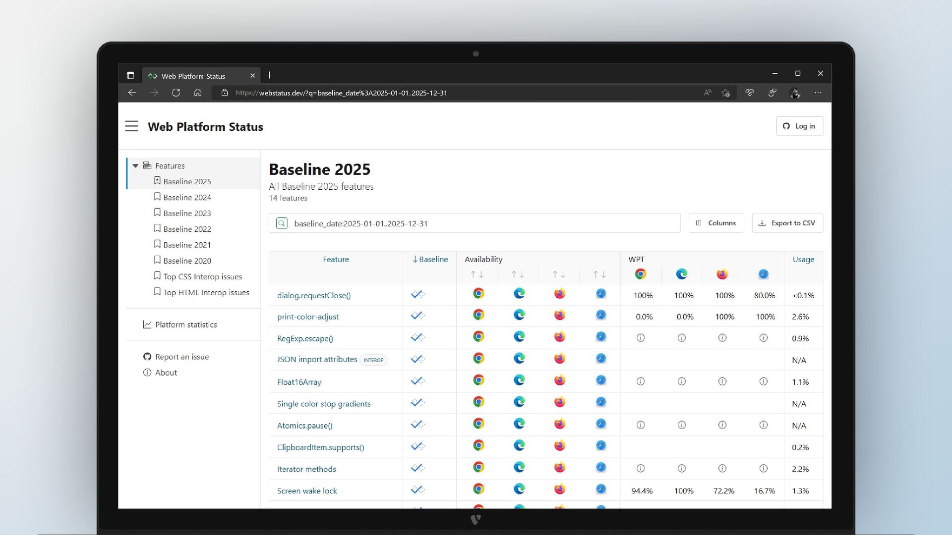
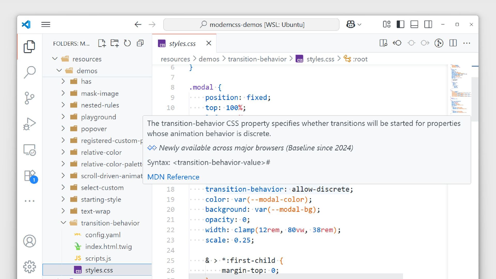
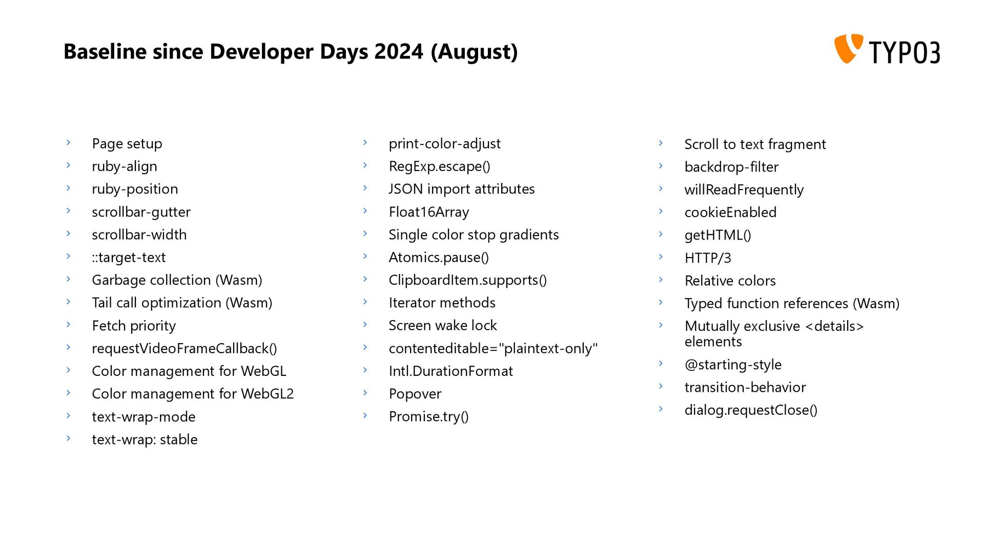
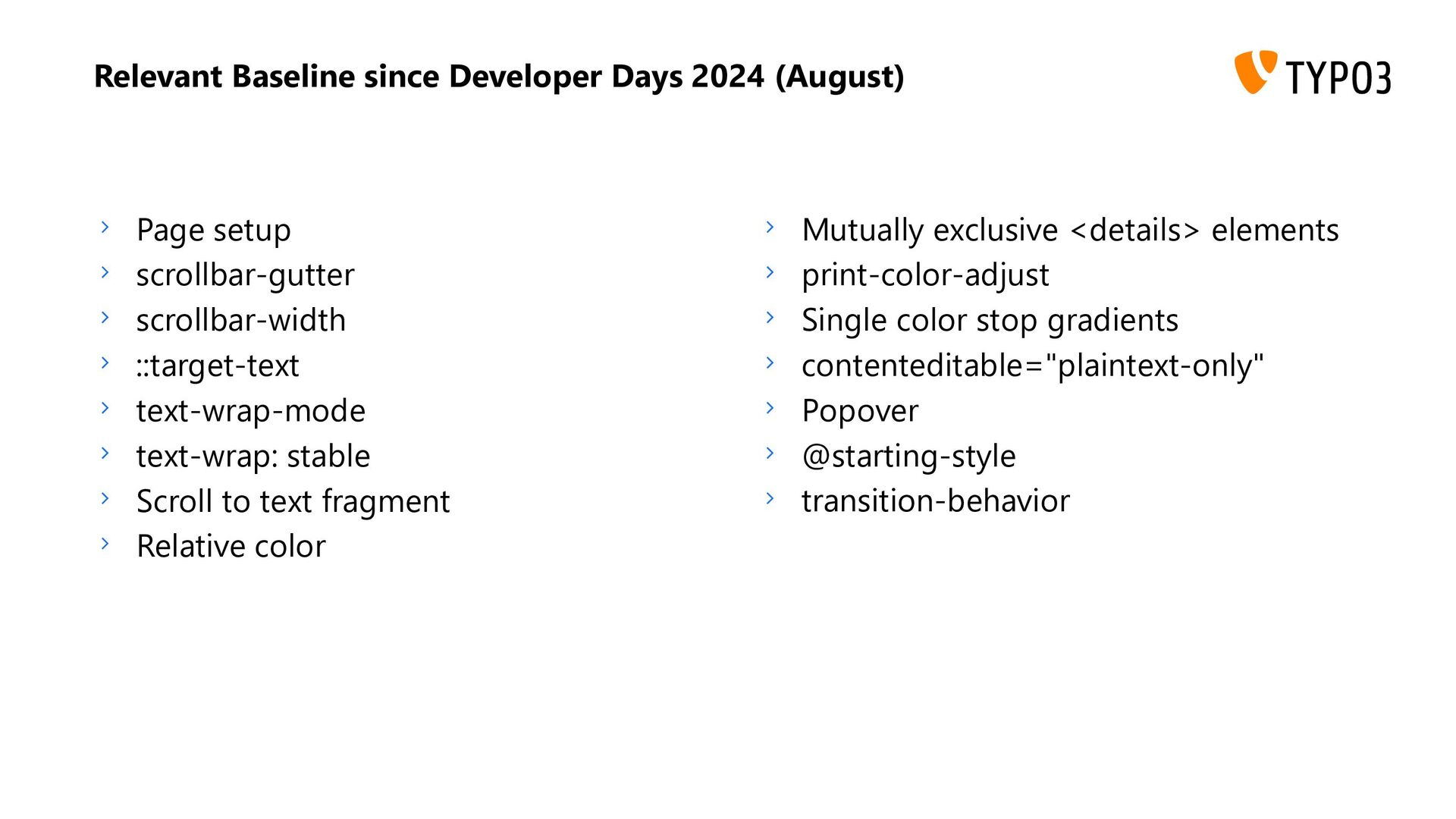
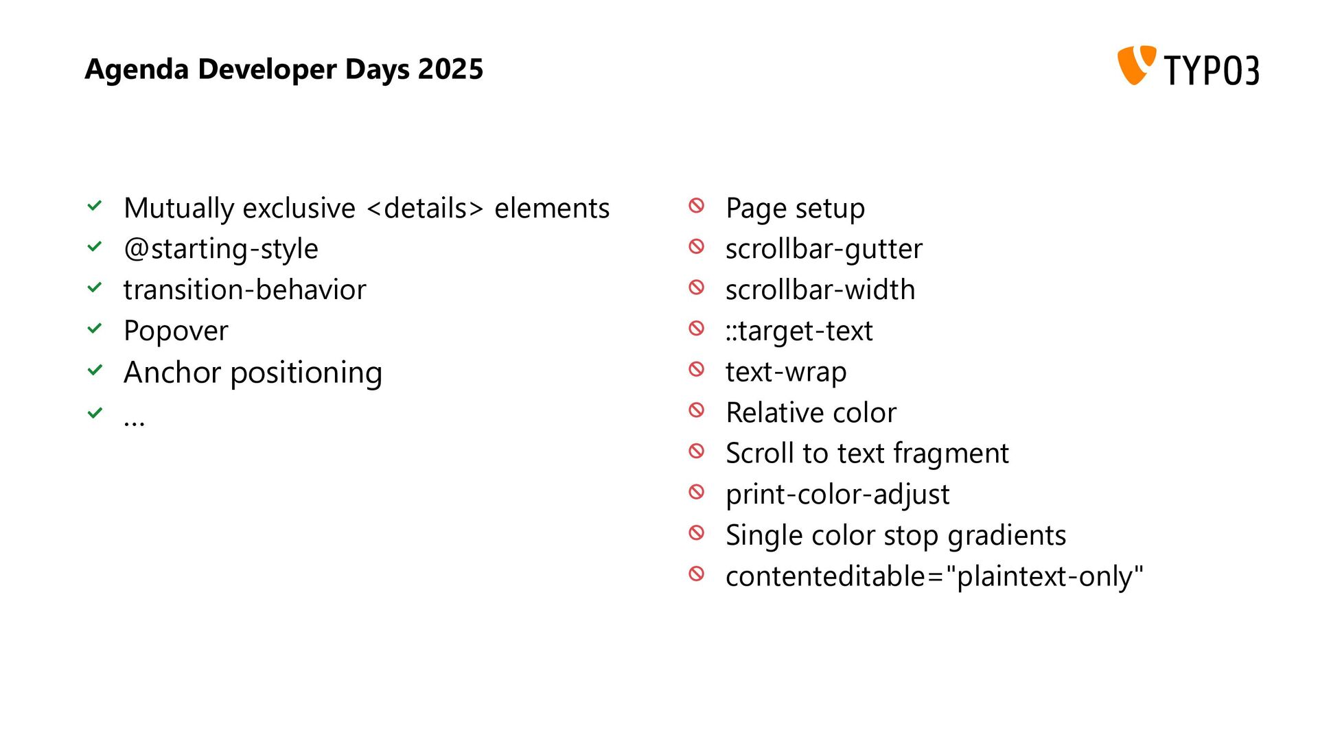
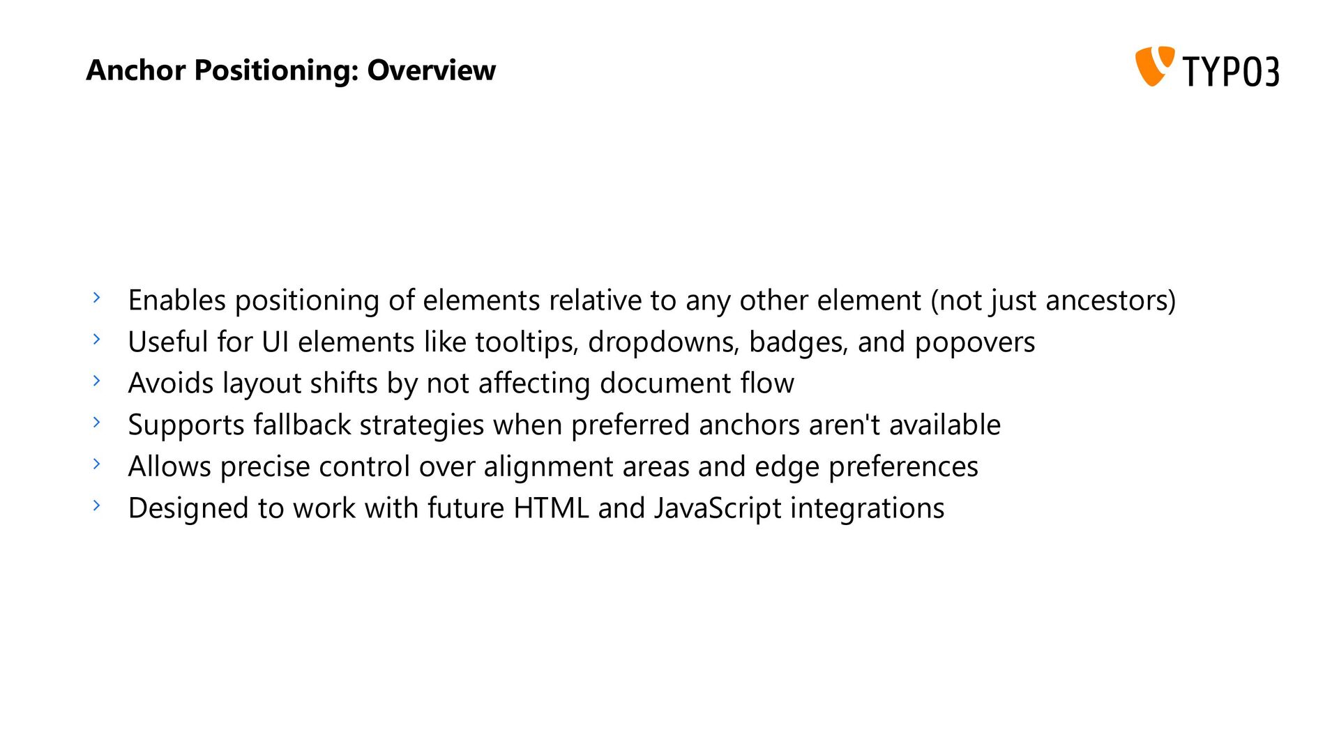
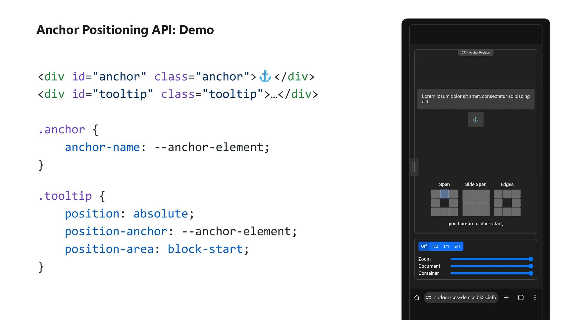
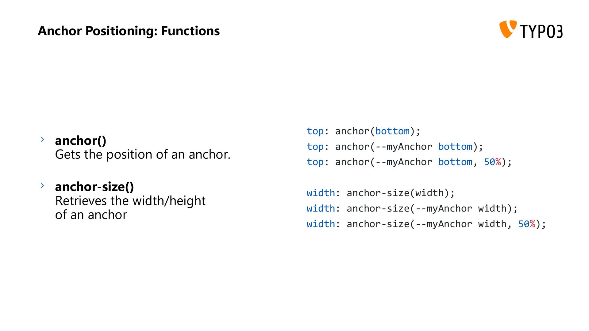
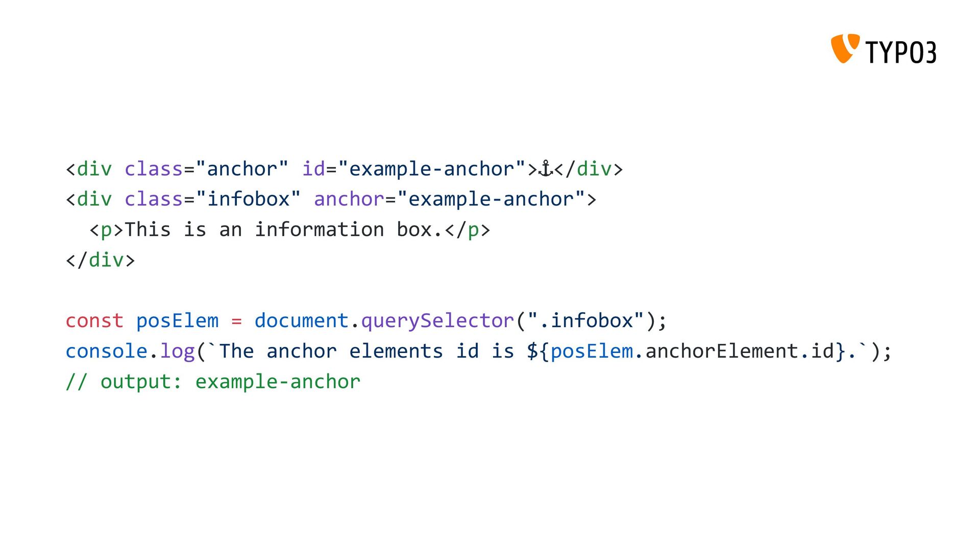
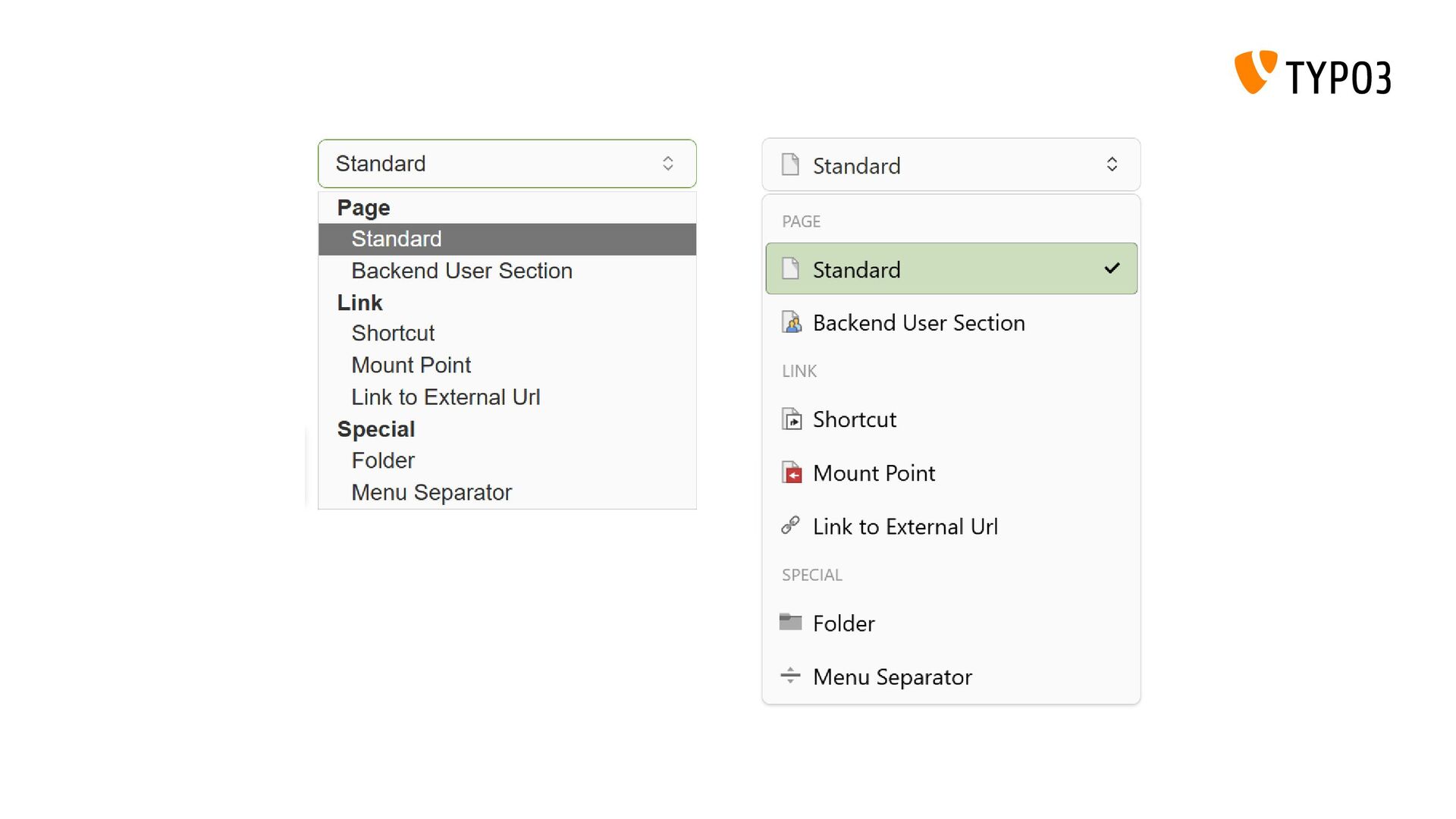
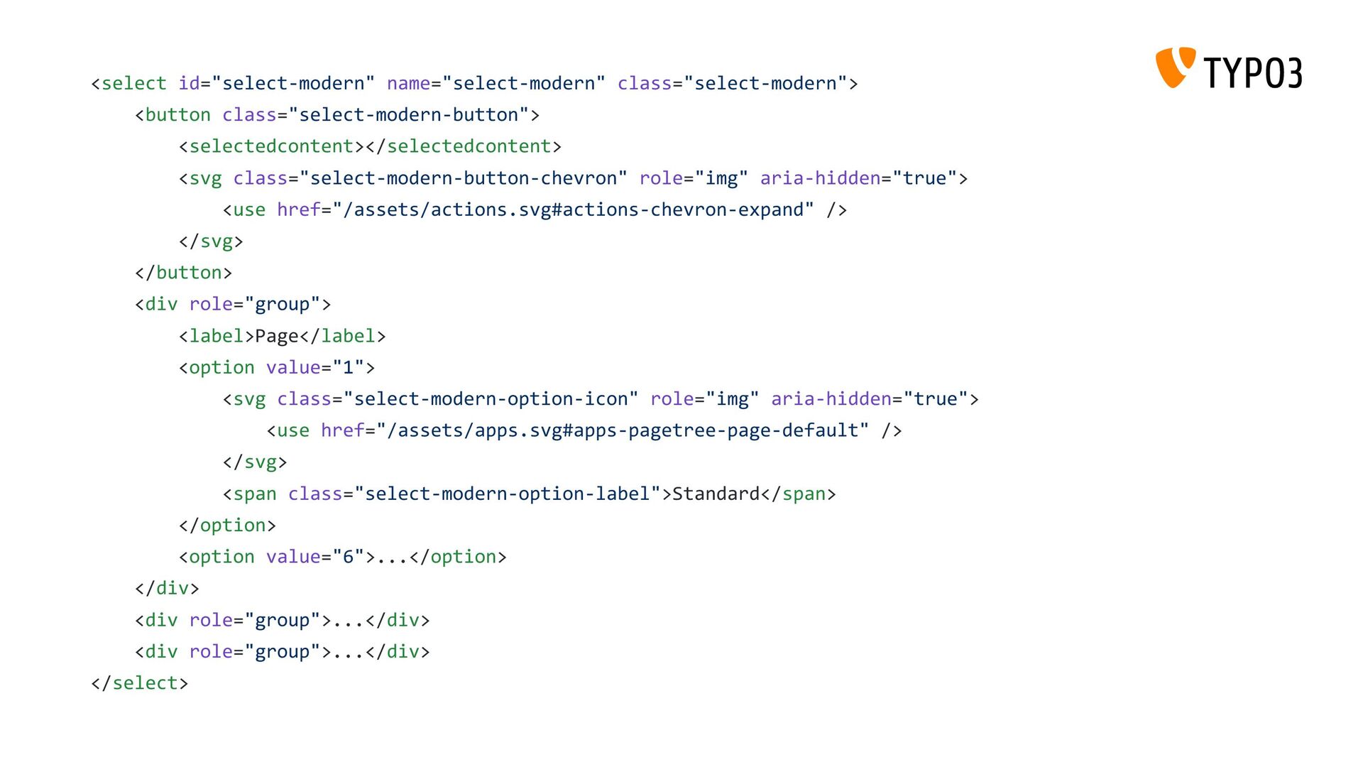
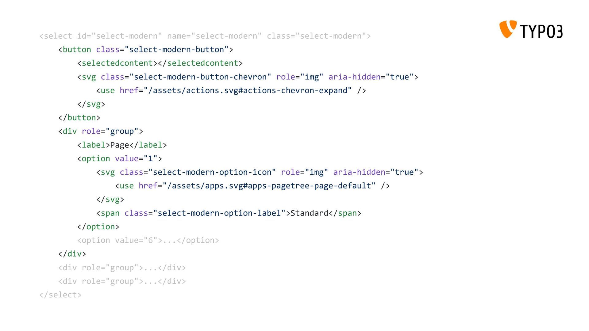
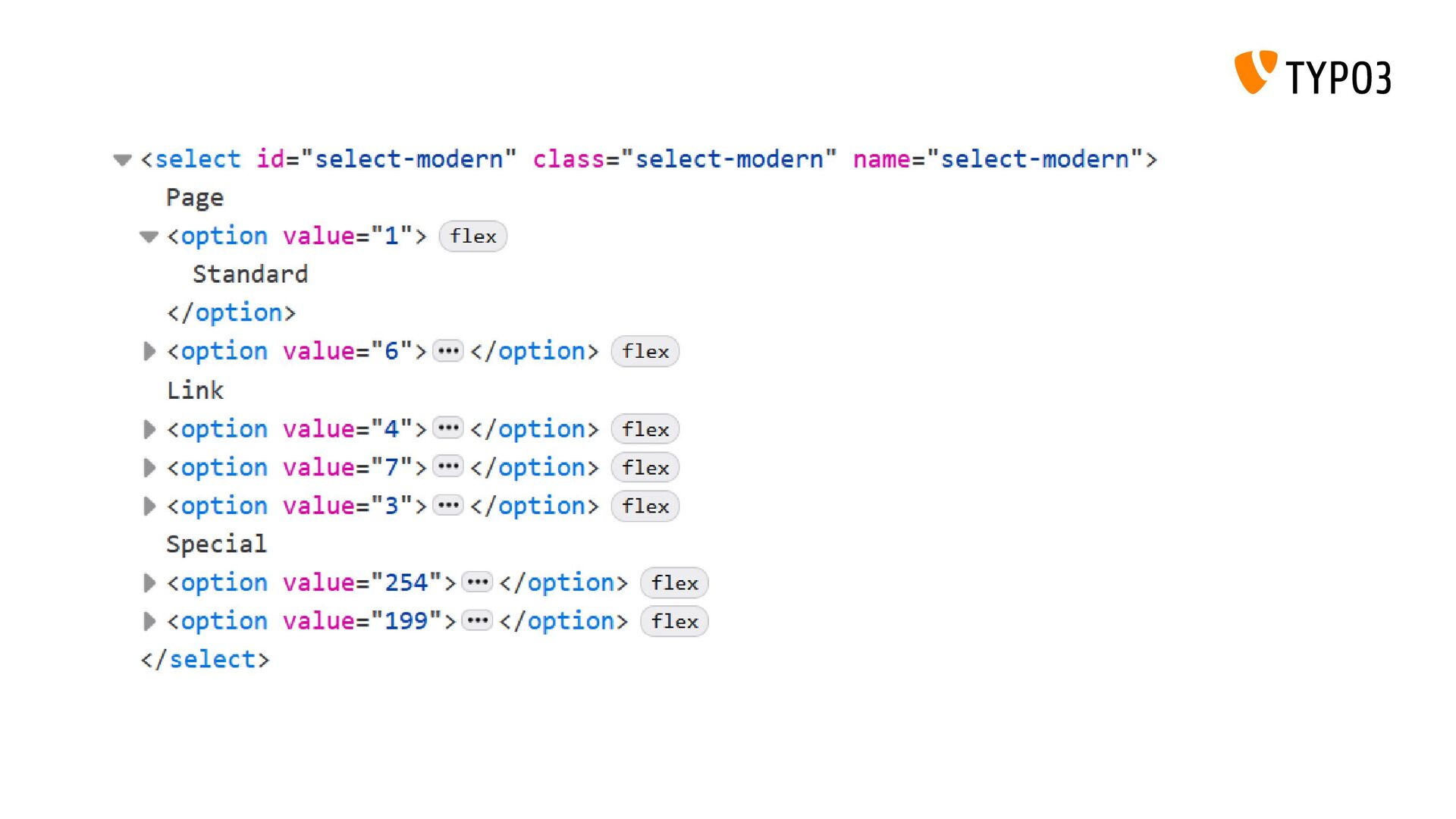
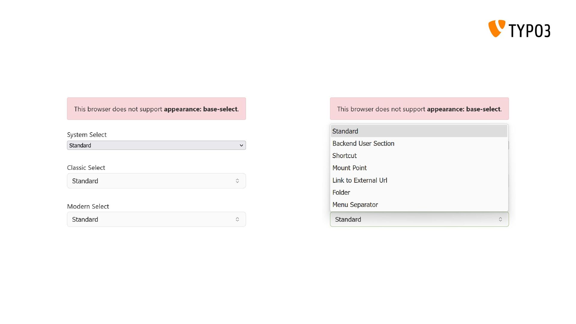
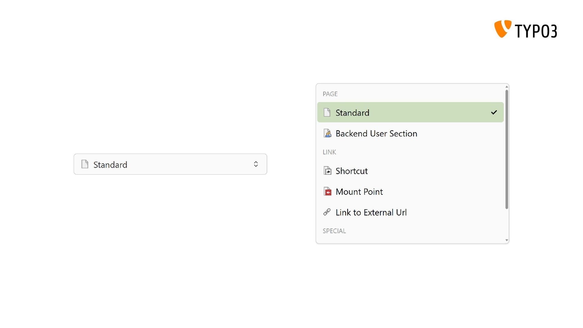
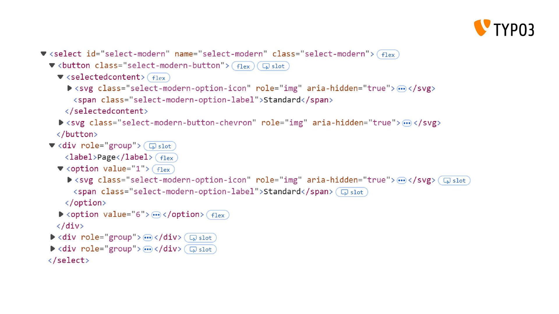
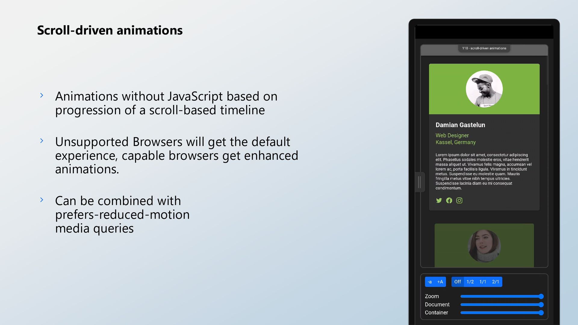
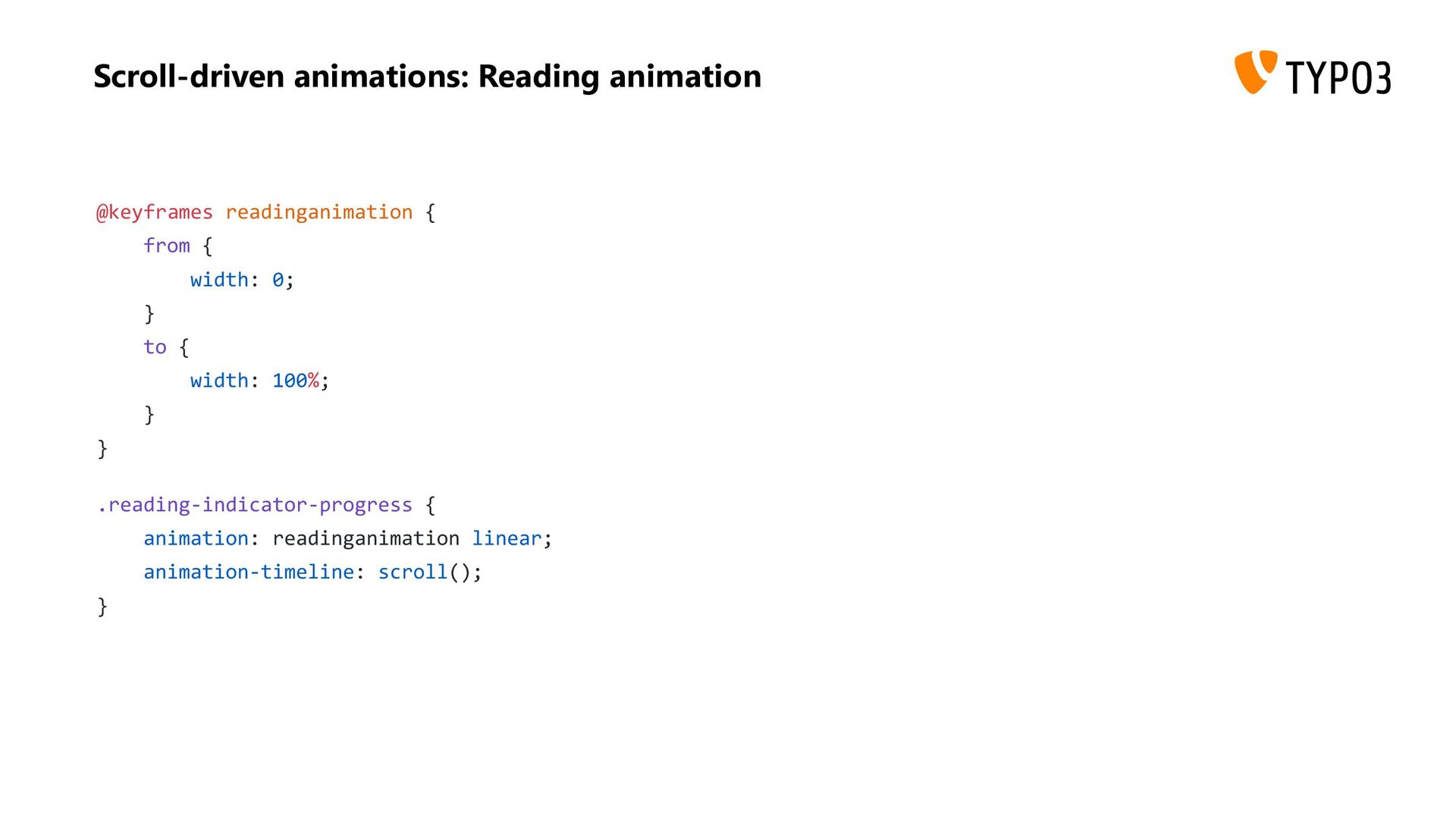
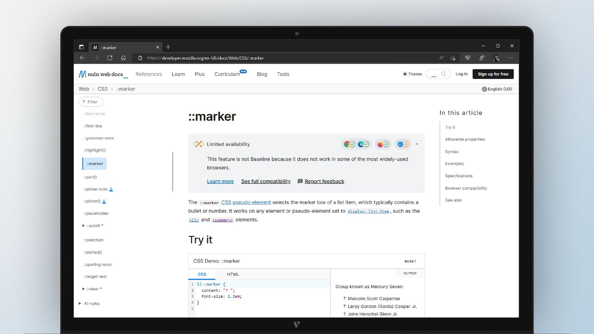
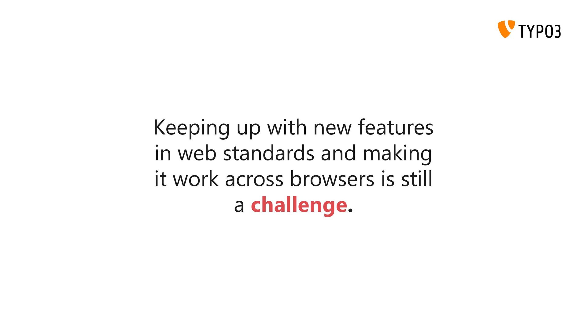
The web platform has evolved rapidly in recent years, with browser vendors modernizing CSS and introducing long-overdue features to enhance web development and interoperability. Thanks to evergreen browsers, we can adopt these new features today.
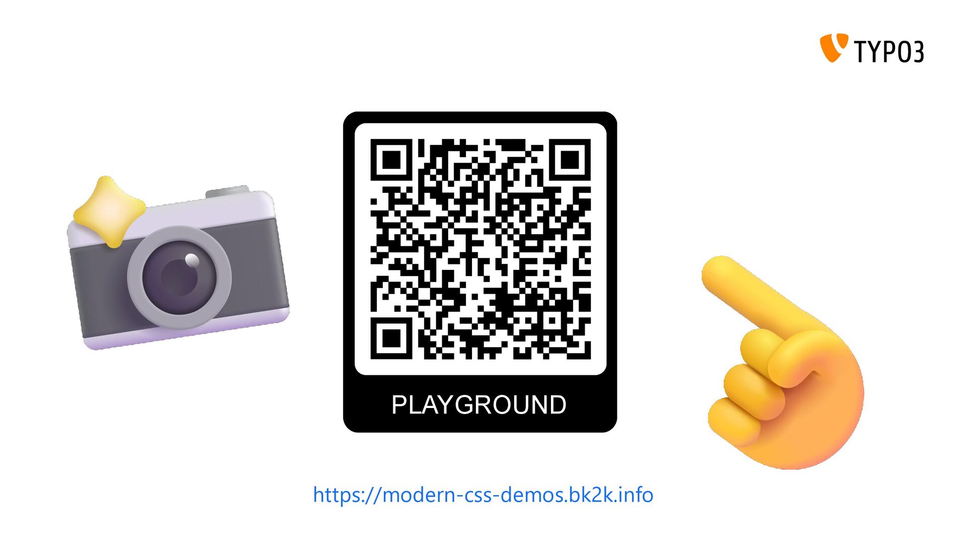
In this session, we'll explore the latest CSS capabilities and their practical applications. You'll learn how to utilize these new features through practical examples.
 benjaminkott
 supurazako
 philipschwarz
 rollbear
 har1101
 sumedhbala
 tk3fftk
 gotok365
 raiga0310
 77web
77web
 tomoyk
.png) takahirom
takahirom
 pauljervisheath
 mkilby
 katiecoart
 sarafernandez
 sstephenson
 jakevdp
 sugarenia
 lemiorhan
 dugsong
 csswizardry
 baasie
 axbom
axbom
![State of CSS 2025 Benjamin Kott [email protected] @benjaminkott Interoperability of](https://files.speakerdeck.com/presentations/65f127d58d7e4c498ed630e531e95aab/slide_0.jpg)
![Benjamin Kott Frontend Developer Core Merger Consultant @benjaminkott [email protected]](https://files.speakerdeck.com/presentations/65f127d58d7e4c498ed630e531e95aab/slide_1.jpg)
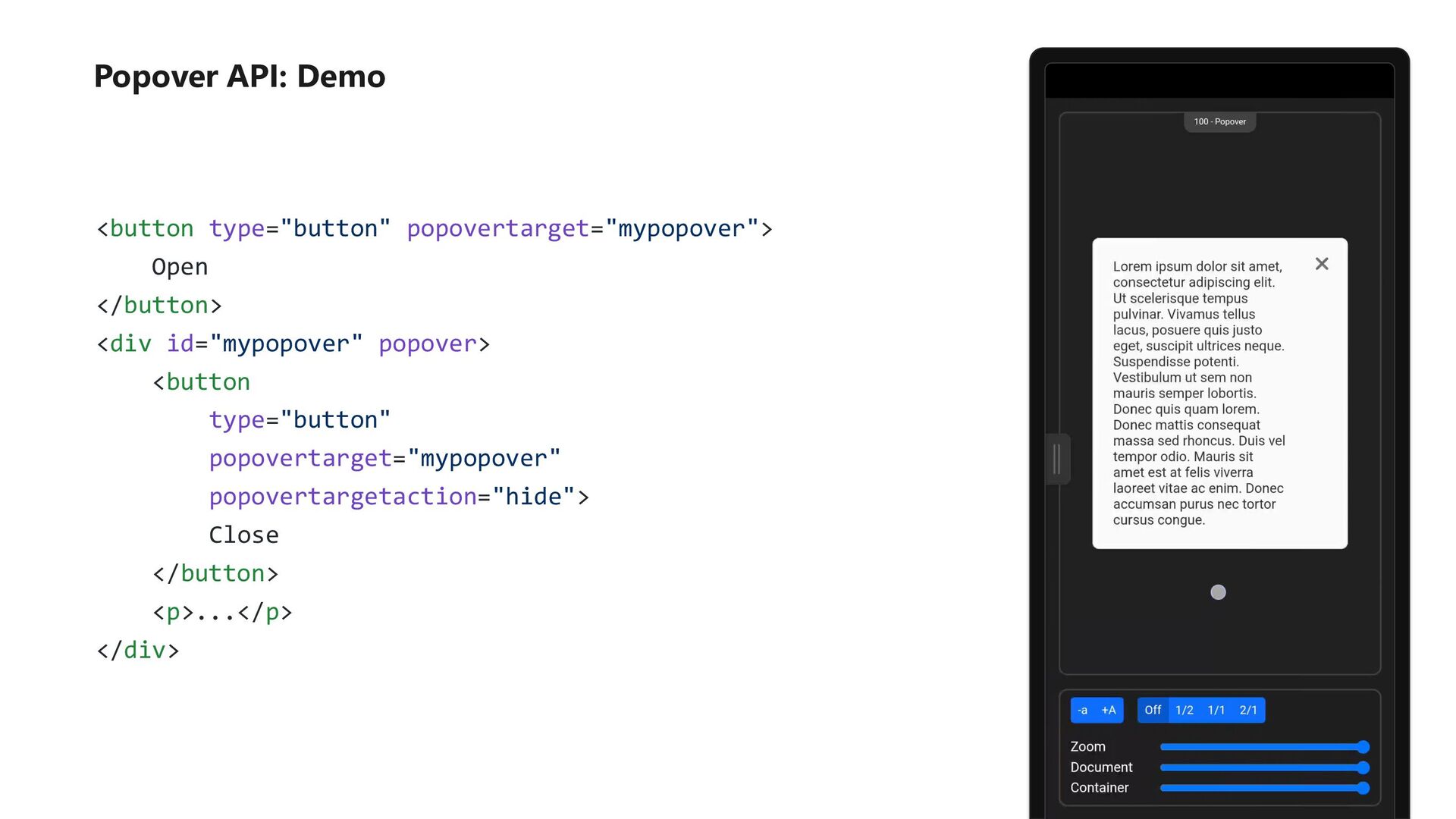
![Popover API: Demo [popover]:popover-open { /* ... */ } [popover]::backdrop](https://files.speakerdeck.com/presentations/65f127d58d7e4c498ed630e531e95aab/slide_61.jpg)