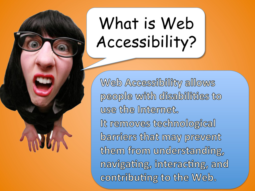
A high level talk I was asked to give internally to the UX team to help them understand accessibility and how they can be more inclusive in their designs.
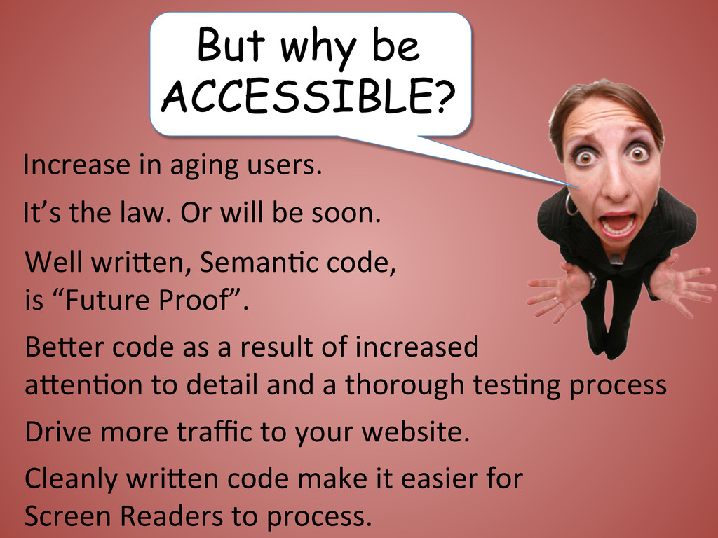
Increase in aging users. It’s the law. Or will be soon. Well wriPen, Seman6c code, is “Future Proof”. BePer code as a result of increased aPen6on to detail and a thorough tes6ng process Cleanly wriPen code make it easier for Screen Readers to process.
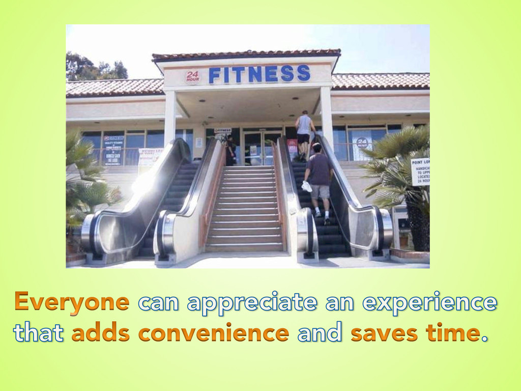
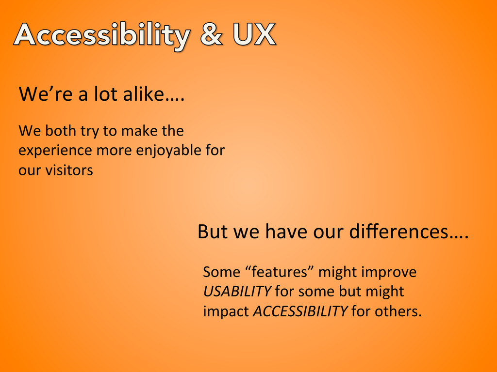
the experience more enjoyable for our visitors But we have our differences…. Some “features” might improve USABILITY for some but might impact ACCESSIBILITY for others.
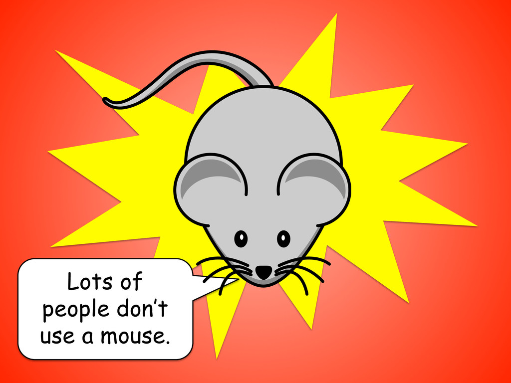
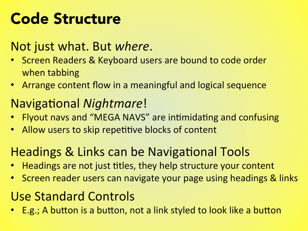
Readers & Keyboard users are bound to code order when tabbing • Arrange content flow in a meaningful and logical sequence Naviga6onal Nightmare! • Flyout navs and “MEGA NAVS” are in6mida6ng and confusing • Allow users to skip repe66ve blocks of content Headings & Links can be Naviga6onal Tools • Headings are not just 6tles, they help structure your content • Screen reader users can navigate your page using headings & links Use Standard Controls • E.g.; A buPon is a buPon, not a link styled to look like a buPon
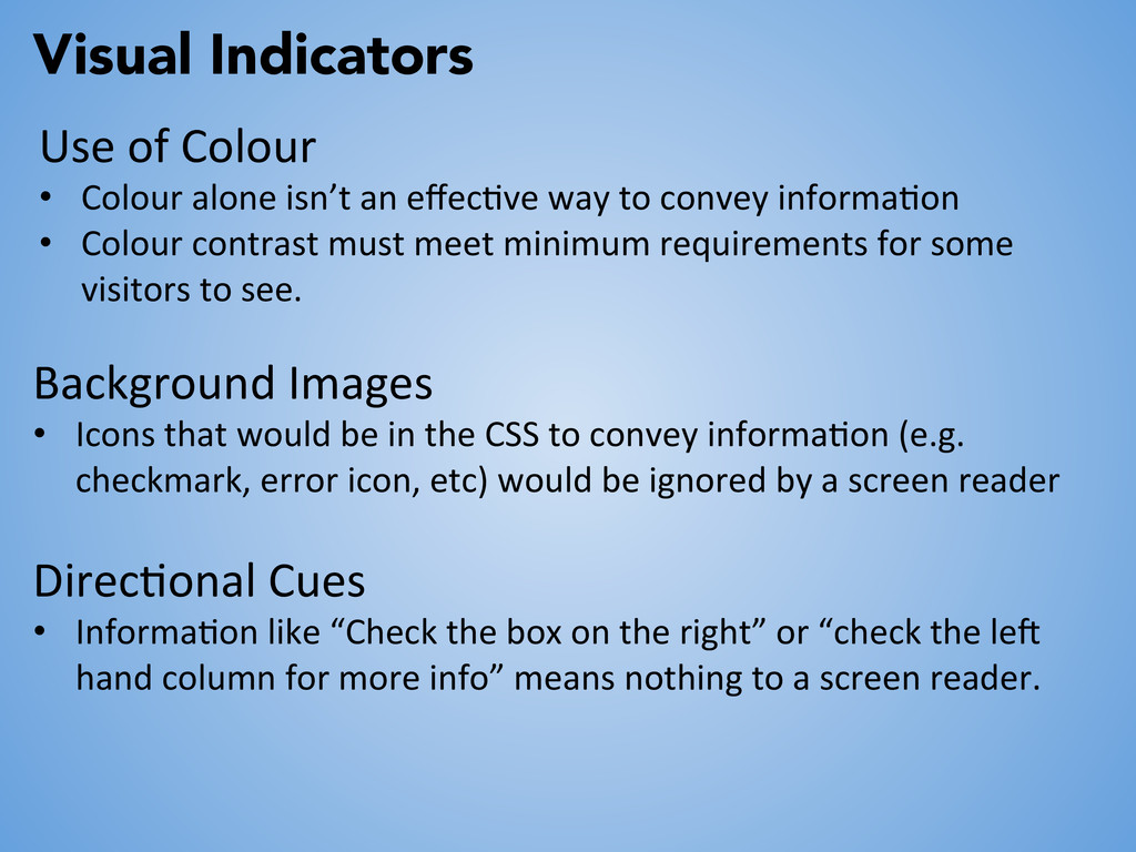
an effec6ve way to convey informa6on • Colour contrast must meet minimum requirements for some visitors to see. Background Images • Icons that would be in the CSS to convey informa6on (e.g. checkmark, error icon, etc) would be ignored by a screen reader Direc6onal Cues • Informa6on like “Check the box on the right” or “check the lec hand column for more info” means nothing to a screen reader.
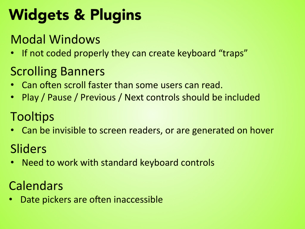
properly they can create keyboard “traps” Scrolling Banners • Can ocen scroll faster than some users can read. • Play / Pause / Previous / Next controls should be included Tool6ps • Can be invisible to screen readers, or are generated on hover Sliders • Need to work with standard keyboard controls Calendars • Date pickers are ocen inaccessible
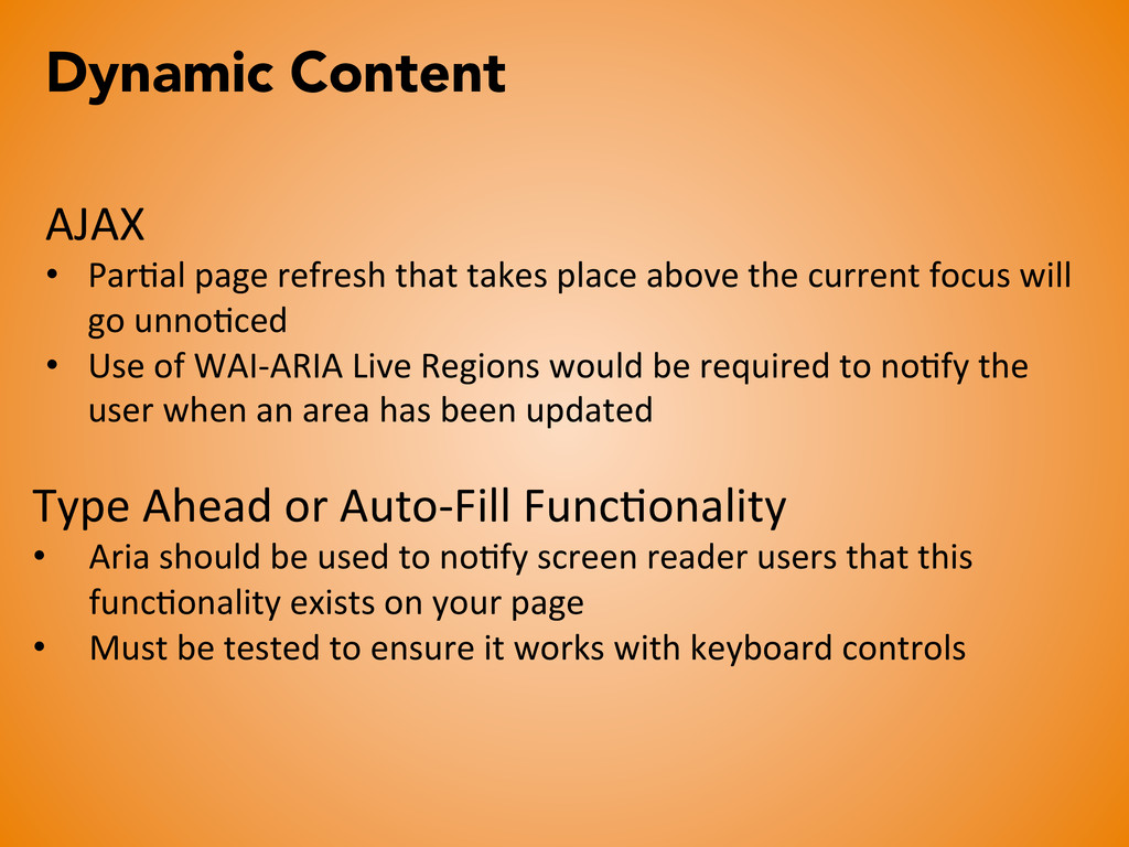
place above the current focus will go unno6ced • Use of WAI-‐ARIA Live Regions would be required to no6fy the user when an area has been updated Type Ahead or Auto-‐Fill Func6onality • Aria should be used to no6fy screen reader users that this func6onality exists on your page • Must be tested to ensure it works with keyboard controls
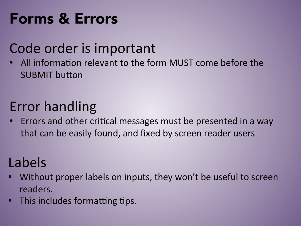
informa6on relevant to the form MUST come before the SUBMIT buPon Error handling • Errors and other cri6cal messages must be presented in a way that can be easily found, and fixed by screen reader users Labels • Without proper labels on inputs, they won’t be useful to screen readers. • This includes formahng 6ps.
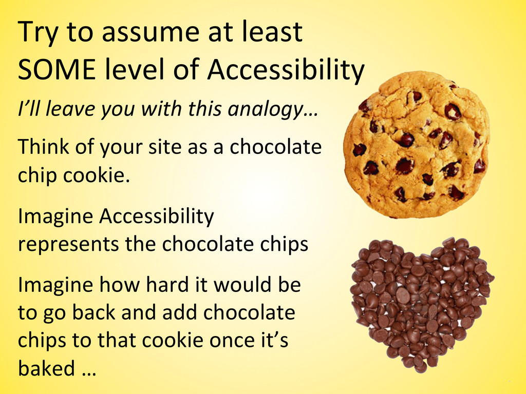
Accessibility Imagine how hard it would be to go back and add chocolate chips to that cookie once it’s baked … I’ll leave you with this analogy… Think of your site as a chocolate chip cookie. Imagine Accessibility represents the chocolate chips