Upgrade to Pro — share decks privately, control downloads, hide ads and more …

V2_Experiment.pdf

Boring Money
November 26, 2018

 V2_Experiment.pdf

Boring Money

November 26, 2018
Tweet

Other Decks in Design

Transcript

  1. Question: Could the Tribes + Tags content architecture and card

    UI concepts developed for Owls apply to BMV2?
  2. Quick re-visit of Owls concept work Card UI with lateral

    nav across tribes in large header area. Content is tagged and served according to context.
  3. Quick re-visit of Owls concept work Side content nav at

    detail level. Classic responsive framework (very mobile friendly)
  4. What to explore? • Can we make Tribes easily navigable,

    whether or not someone is ‘in’ a tribe? • Could the content architecture, navigation and tribe/tag logic provide a personalised experience to support marketing, engagement and growth for the business? • Can the card UI accommodate the breadth of visual styles and content on MB without breaking down? • Can a card UI provide a framework that anchors the experience and make the brand feel more coherent?
  5. Process • 1 day
 - Open exploration grabbing content and

    applying to Owl templates - this wasn’t very successful because the breadth of visual styles used for ‘real’ BM content required more fundamental consideration of how the card device works to bring content together coherently. It looked a bit of a mess, basically. • Day 2: 
 - References sought - Diverse content (Brands within Brand) within a card UI. Responsive sites from brands that will have thoroughly usability-tested templates with a wide audience: BBC - - iPlayer web app and South Bank Centre shown in this doc.
 - Ground-up work on navigation for unknown and referred/sign in users, the card UI and behaviour.
 - User journey through content levels. • Still to come:
 - Navigation at mobile resolution and second round of Owls concept work incorporating UI from this round.
  6. Navigation Same content, different points of access. A nav bar

    is opened when the user taps on the nav option. User can pick a channel…
  7. Navigation …or a Category of content. This is super simple

    and easy to use. The BBC will have tested this to death. Something similar would be a safe option for us given limited timescale for design, testing and dev.
  8. Brands within Brands (+ diverse content) Same structure, differentiated feel

    via colour and background image. Southbank Centre does the same, hosting dramatically branded festival content within the main site, using a stable layout and content logic. Standardised patterns for element behaviour and typography support the experience here.
  9. First sketches for BM generic* home • Open/Close nav concept

    for Tribes • Tribes are colour-branded • Generic landing intros the BM brand and service, but the Tribes menu is pre-opened and on top. *User is not signed in / User has not come via a Tribe or Tag-relevant referral link / No cookie data
  10. Note: • Images and content have been grabbed or assembled

    and are not recommended ‘final’ UI or look and feel. - in particular, the pic of Holly on the generic landing page! • Same goes for copy. However, the length and complexity of copy is indicative of what I recommend in the context of the screen being sketched out.
  11. Generic landing page • Open Tribe nav • Brand/Site intro

    (anim) • Prominent prompt to find tribe (eg. Quiz) • Content cards + 2 columns of links
  12. Generic landing page • Intro anim example: Background is stable,

    text and graphic elements animate over the top.
  13. Universal nav: Tribes • Lateral scrolling, visually impactful (colour coded)

    nav can be opened or closed at any point • Search and Sign in or Profile are also always visible
  14. Universal nav: Behaviour of Tribes nav cards on mouseover •

    From 80% to 100% opacity • Underline Tribe name • Short description
  15. Top level filters • On pages serving content via Tribe

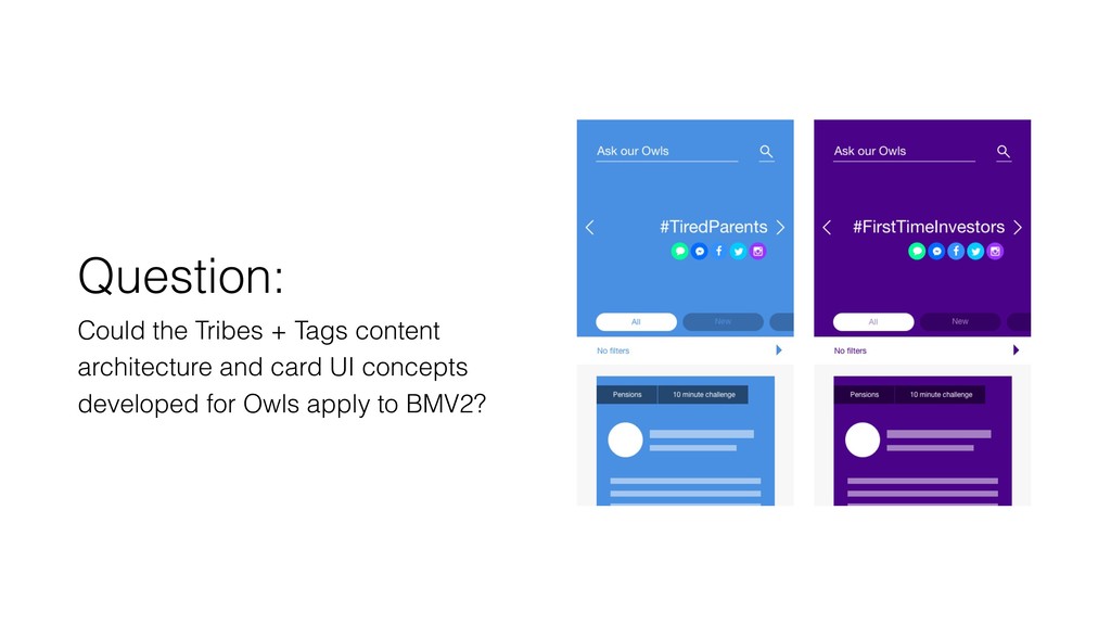
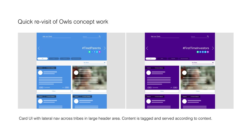
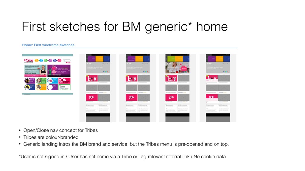
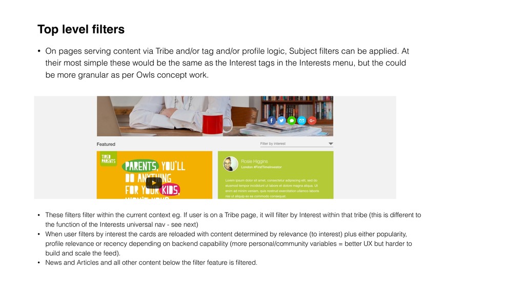
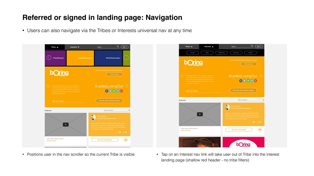
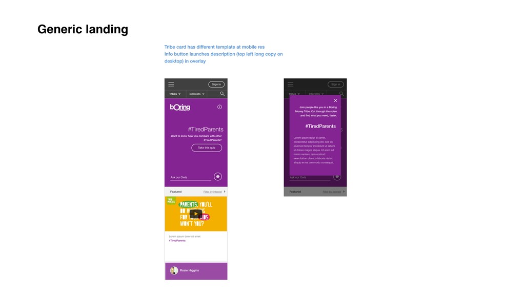
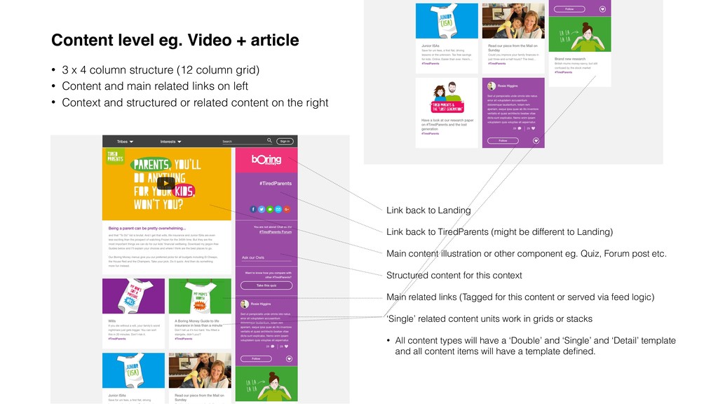
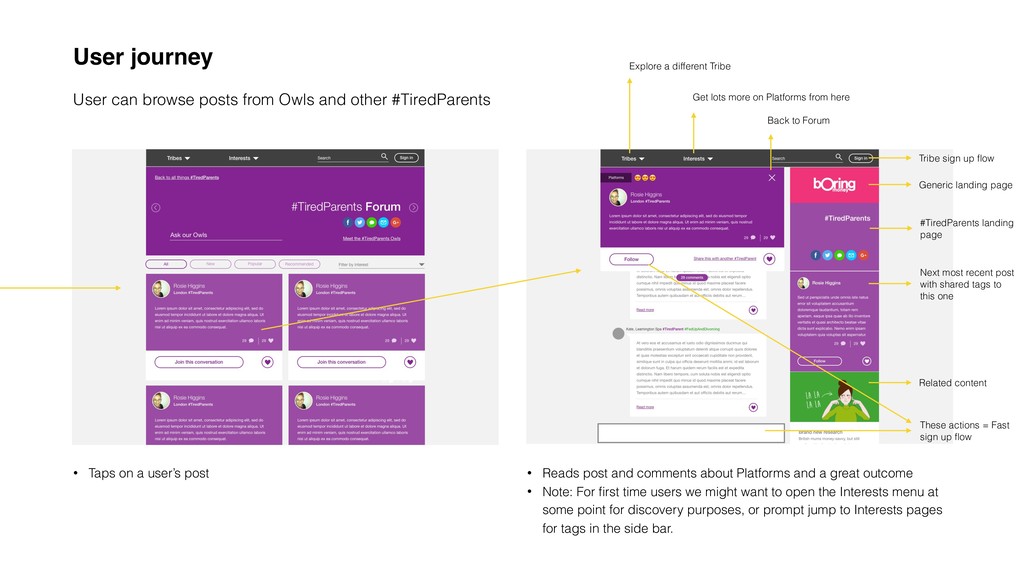
    and/or tag and/or profile logic, Subject filters can be applied. At their most simple these would be the same as the Interest tags in the Interests menu, but the could be more granular as per Owls concept work. • These filters filter within the current context eg. If user is on a Tribe page, it will filter by Interest within that tribe (this is different to the function of the Interests universal nav - see next) • When user filters by interest the cards are reloaded with content determined by relevance (to interest) plus either popularity, profile relevance or recency depending on backend capability (more personal/community variables = better UX but harder to build and scale the feed). • News and Articles and all other content below the filter feature is filtered.
  16. Interests nav and content • Interests menu can be opened

    or closed at any time. • User can select one interest at a time. • Loads landing page for that Interest • User is kept within this Interest (over-riding Tribe logic) until they change Interest, switch to Tribe or start a new session. • Interests header is shallow and BM Red. • All content items are tagged with Tribes and Interests (plus any more granular tags that are used in filters). Content will be timestamped. It’s possible content could also carry a ‘score’ for popularity based on user engagement over time and have a ‘Recommended’ status that can be switched on and off by admin.
  17. Referred or signed in landing page • User lands in

    Tribe. • Tribe menu is closed • Cards and Links are relevant to Tribe context
  18. Referred or signed in landing page: Top area Dedicated area

    for profiling (‘How do I compare?’) question or data feedback based on profile Colour, not image, defines the top area UI (not cluttered) Tribe intro, or latest recommended content for long-standing community members Owls features are promoted Filters work within context ie. ‘Platforms’ will load Platforms content most relevant to/tagged for this Tribe
  19. Referred or signed in landing page: Top area • Users

    can move laterally across tribes using the arrows either side of the top area (these mirror the arrows in the Tribes universal nav bar) • Content is re-loaded, but structure remains the same • Opportunity to do some lovely work with transitions here • Very mobile-friendly
  20. Referred or signed in landing page: Navigation • Users can

    also navigate via the Tribes or Interests universal nav at any time • Positions user in the nav scroller so the current Tribe is visible • Tap on an Interest nav link will take user out of Tribe into the interest landing page (shallow red header - no tribe filters)
  21. Card templates and their behaviour: Video • Video thumbnail (all

    images in the these Card UI wireframes are based on standard video aspect ratio) • Description • Tribe tag if applicable • Follow ‘usual’ pattern for YouTube/Vimeo links on Mouseover - Example here shows overlay + Underlined link + Red Play icon
  22. Card templates and their behaviour: User/Owls post • Creator, Post

    (truncated if required), Comment and Like count • Big link button • Colour references Tribe (BM Red if applies to all Tribes or has no Tribe tag) • Bottom area expands on mouseover • Link/like buttons change state on mouseover within the ‘activated’ card
  23. Card templates and their behaviour: Article • Image • Title

    (truncated if required) • Tribe tag if applicable • Bottom area expands on mouseover, Title link is underlined, and intro or first x characters of the article is shown
  24. Card templates and their behaviour: Download • Image • Big

    download button with CTA (coloured for Tribe if applicable) • Social share > Posts image + CTA (editable content) and BM brand/link to user’s social media • Bottom area expands on mouseover • Download button and social media button change state on mouseover within the ‘activated’ card
  25. Card templates and their behaviour: Blog • Image • Sign

    up CTA • Date • Title • Bottom area expands on mouseover, Sign up link is underlined (click takes user to sign up flow specific to blog). • First x characters of blog content are shown. Click on title or content takes user to blog with sign up in side bar.
  26. Card templates and their behaviour: Link or article • Title

    (1 or 2 lines then truncated) • First x characters of article/intro copy (1 line or 2 lines, both truncated with ellipses) • On mouseover title highlights in BM Red and is underlined
  27. Content level eg. Video + article • 3 x 4

    column structure (12 column grid) • Content and main related links on left • Context and structured or related content on the right Link back to Landing Link back to TiredParents (might be different to Landing) Main content illustration or other component eg. Quiz, Forum post etc. Structured content for this context Main related links (Tagged for this content or served via feed logic) ‘Single’ related content units work in grids or stacks • All content types will have a ‘Double’ and ‘Single’ and ‘Detail’ template and all content items will have a template defined.
  28. Content level eg. Forum* • Dedicated forum page - or

    users can go directly to Posts via the Tribe landing page • Forum page can be sorted - Defaults to all *Note: Post detail screen would have comment input field at the bottom • 80% to 100% opacity on mouseover card • Card, Like and Join buttons change state on mouseover as previously described • Follows Owl concept work: Top tags are visible / Close returns user to previous level / Follow or Like / Specific share prompt / Jump to start of the conversation from ’24 comments’ hovering link • Structured and related content on the right
  29. User journey User arrives on Boring Money generic landing page

    without referrer / cookie data or profile • User mouses over Tribe card in top nav • User taps on Tribe nav
  30. User journey We have an non-registered user exploring #TiredParents •

    Checks out a video… • Uses the side bar to navigate to the “Chat on the #TiredParents Forum”
  31. User journey User can browse posts from Owls and other

    #TiredParents • Taps on a user’s post • Reads post and comments about Platforms and a great outcome • Note: For first time users we might want to open the Interests menu at some point for discovery purposes, or prompt jump to Interests pages for tags in the side bar. Back to Forum Get lots more on Platforms from here Explore a different Tribe Generic landing page #TiredParents landing page Next most recent post with shared tags to this one Related content These actions = Fast sign up flow Tribe sign up flow
  32. Outcome… • Can we make Tribes easily navigable, whether or

    not someone is ‘in’ a tribe?
 Yes we can - Mobile solution TBC but will be fine • Could the content architecture, navigation and tribe/tag logic provide a personalised experience to support marketing, engagement and growth for the business?
 Yes - but needs proper end to end UX work • Can the card UI accommodate the breadth of visual styles and content on MB without breaking down?
 Yes - Detailed requirements work needed but I think the UI concept looks solid • Can a card UI provide a framework that anchors the experience and make the brand feel more coherent?
 I think so, but my understanding of the visual brand is sketchy, so needs core team evaluation