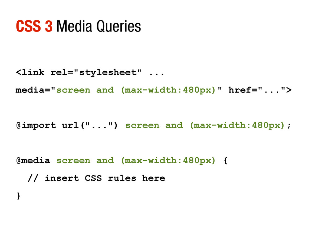
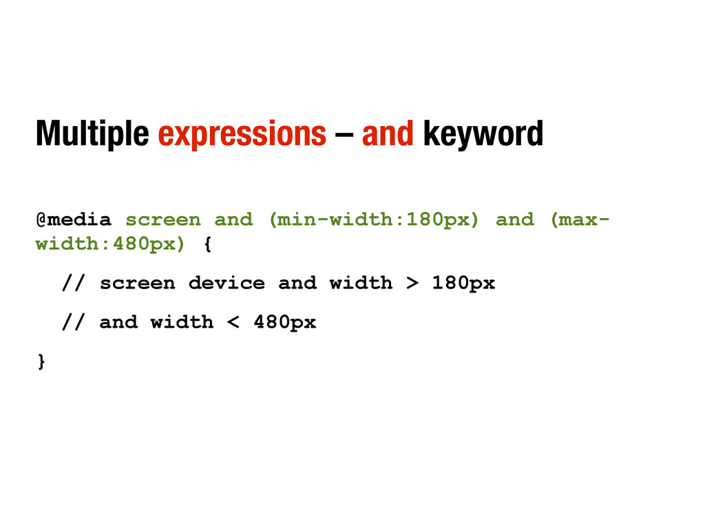
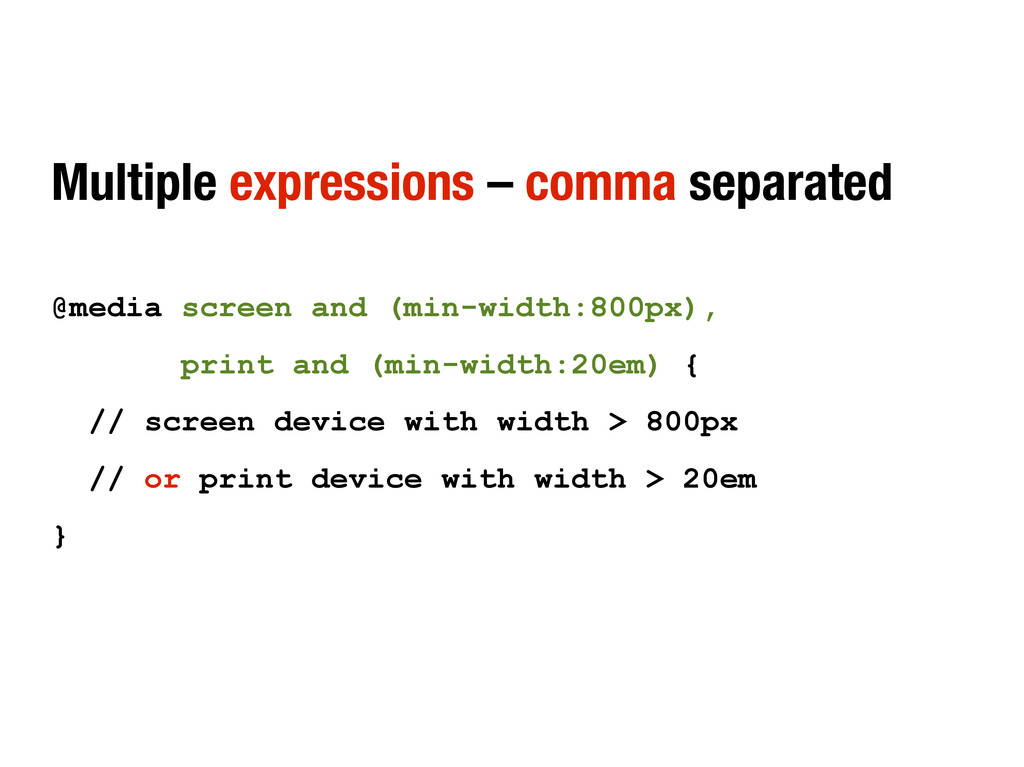
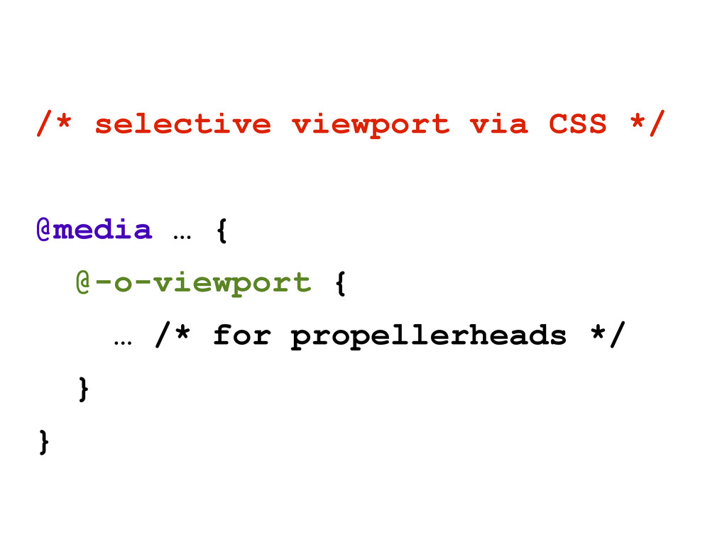
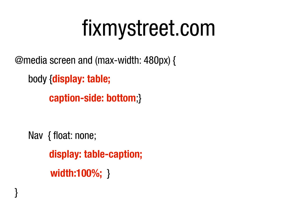
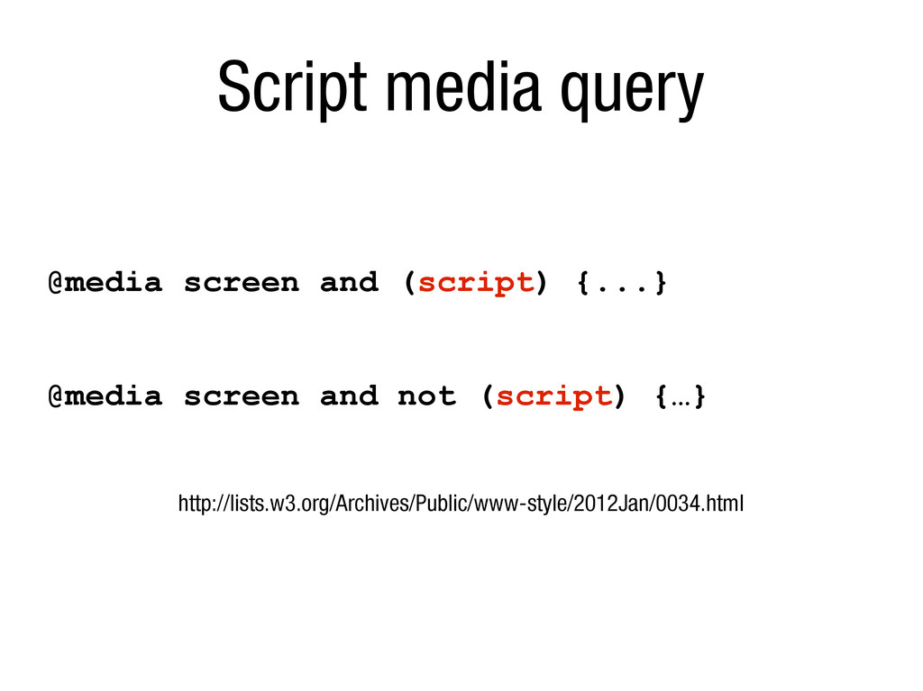
is the first media query” Bryan Rieger */ @media screen and (max-width:480px) { // screen device and width < 480px } @media screen and (max-width:980px) { // screen device and width < 980px } @media screen and (min-width:980px) { // screen device and width > 980px }
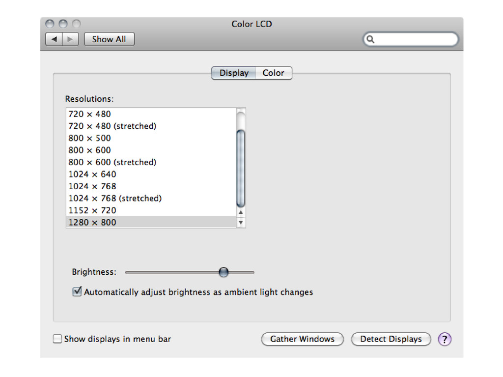
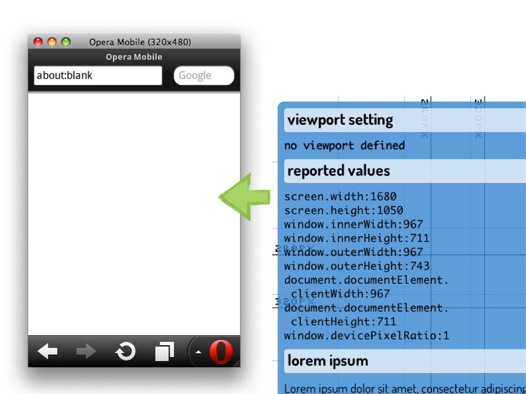
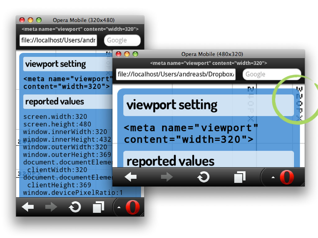
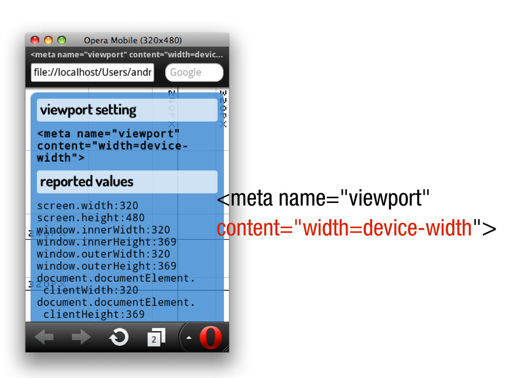
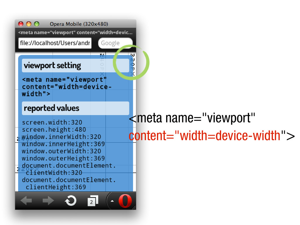
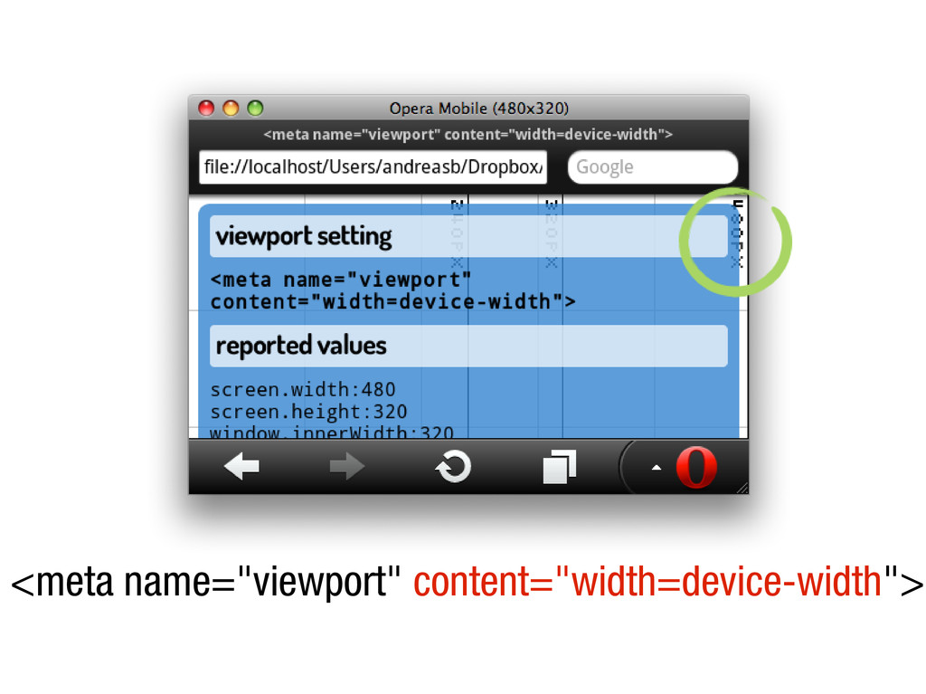
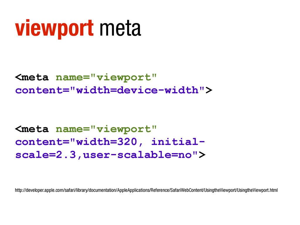
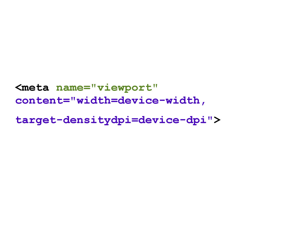
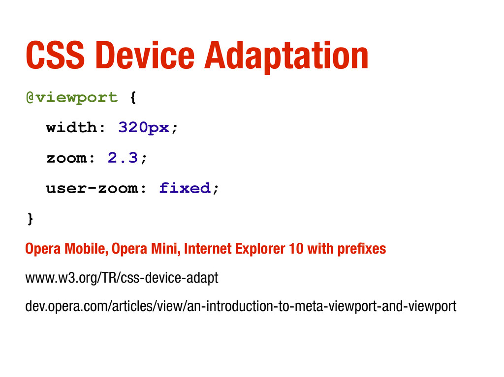
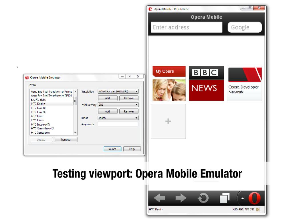
fixed; } Opera Mobile, Opera Mini, Internet Explorer 10 with prefixes www.w3.org/TR/css-device-adapt dev.opera.com/articles/view/an-introduction-to-meta-viewport-and-viewport
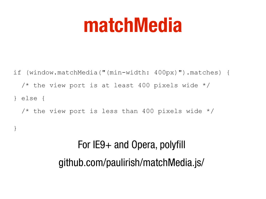
at least 400 pixels wide */ } else { /* the view port is less than 400 pixels wide */ } For IE9+ and Opera, polyfill github.com/paulirish/matchMedia.js/
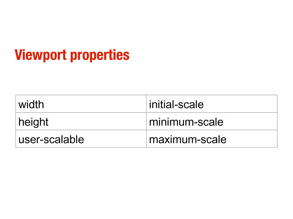
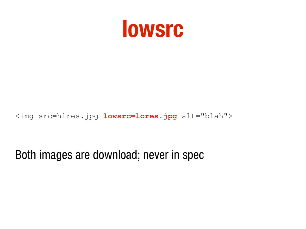
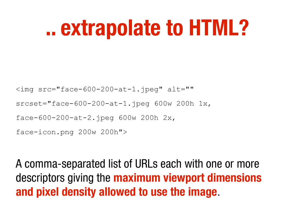
1x, face-600-200-at-2.jpeg 600w 200h 2x, face-icon.png 200w 200h"> A comma-separated list of URLs each with one or more descriptors giving the maximum viewport dimensions and pixel density allowed to use the image.
then picks the most appropriate image. If the viewport dimensions or pixel density changes, the user agent can replace the image data with a new image on the fly.
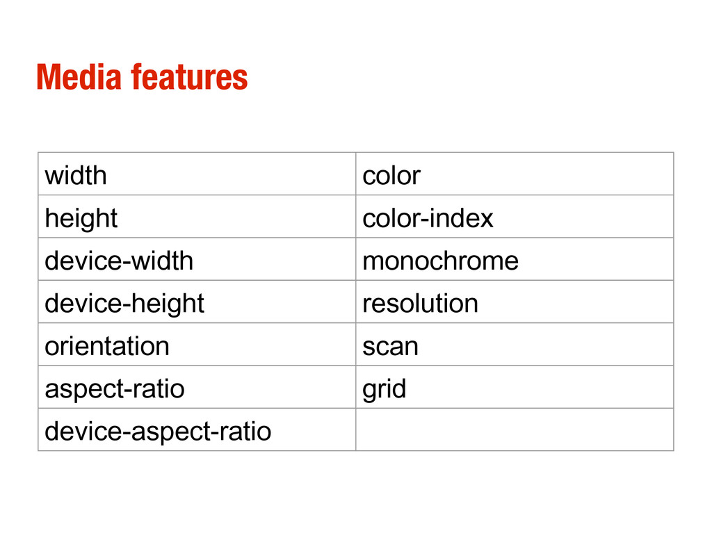
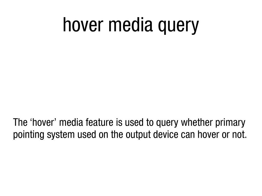
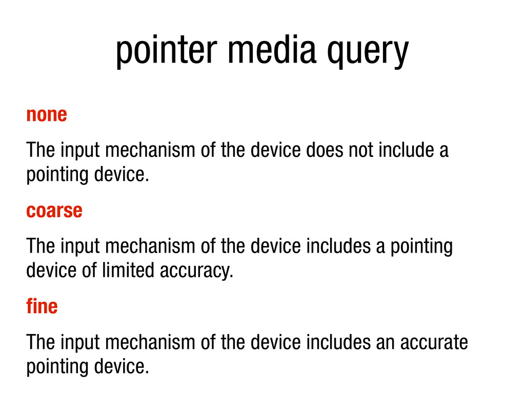
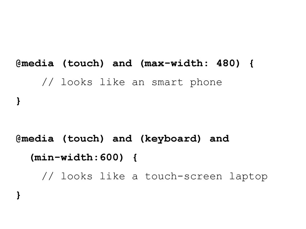
does not include a pointing device. coarse The input mechanism of the device includes a pointing device of limited accuracy. fine The input mechanism of the device includes an accurate pointing device.
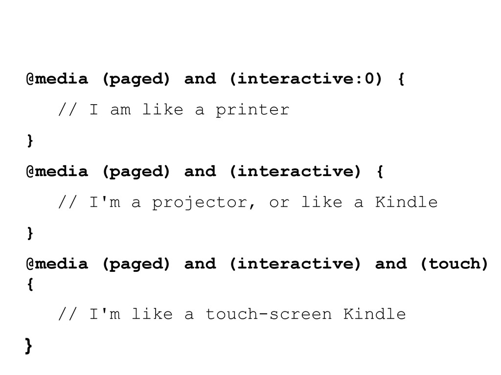
printer } @media (paged) and (interactive) { // I'm a projector, or like a Kindle } @media (paged) and (interactive) and (touch) { // I'm like a touch-screen Kindle }
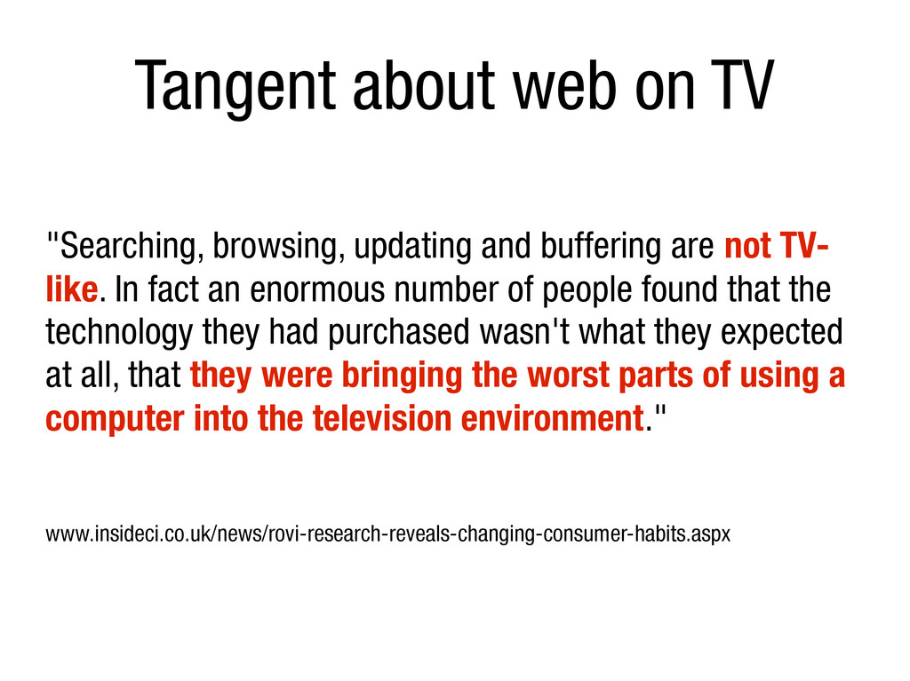
are not TV- like. In fact an enormous number of people found that the technology they had purchased wasn't what they expected at all, that they were bringing the worst parts of using a computer into the television environment." www.insideci.co.uk/news/rovi-research-reveals-changing-consumer-habits.aspx
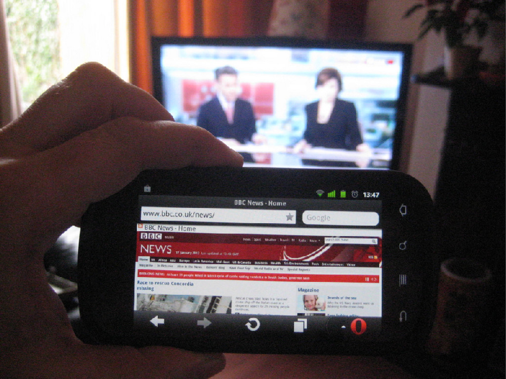
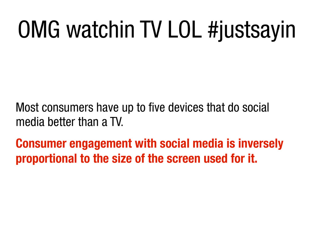
five devices that do social media better than a TV. Consumer engagement with social media is inversely proportional to the size of the screen used for it.
people agree that it would be cool, nobody has a clue about how to spec it in a way that is useful and implementable. If you find people with a clue, encourage them to submit proposals to me or to [email protected]. Use [css4-mediaqueries] in the subject line, and read lists.w3.org/Archives/Public/www- style/2012Mar/0691.html first."
 brucel
 quiver
 jitera
 kaonavi
 mineo_matsuya
 hacobu
 flatt_security
 segavvy
 kazzpapa3
 twada
twada
 oracle4engineer
 subroh0508
 akosma
 inesmontani
 kneath
 aleyda
 rkaga
rkaga
 swwweet
 ryanjones
 bkeepers
 trishagee
![[email protected] opera.com/developer www.brucelawson.co.uk @brucel](https://files.speakerdeck.com/presentations/4fcb4ea574669a0189000c28/slide_101.jpg)