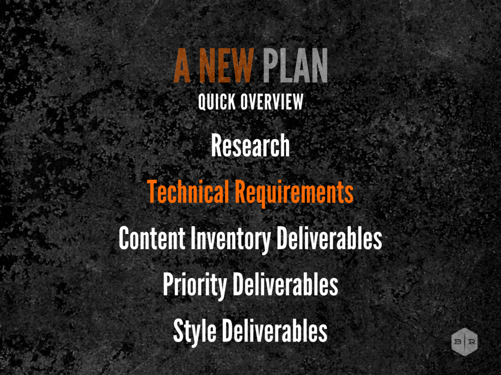
The first day of content from our 2012 Midwest Tour in Columbus, Cleveland, Pittsburgh, and Grand Rapids. Includes RWD 101, Planning and Design, and Getting a Good Start.
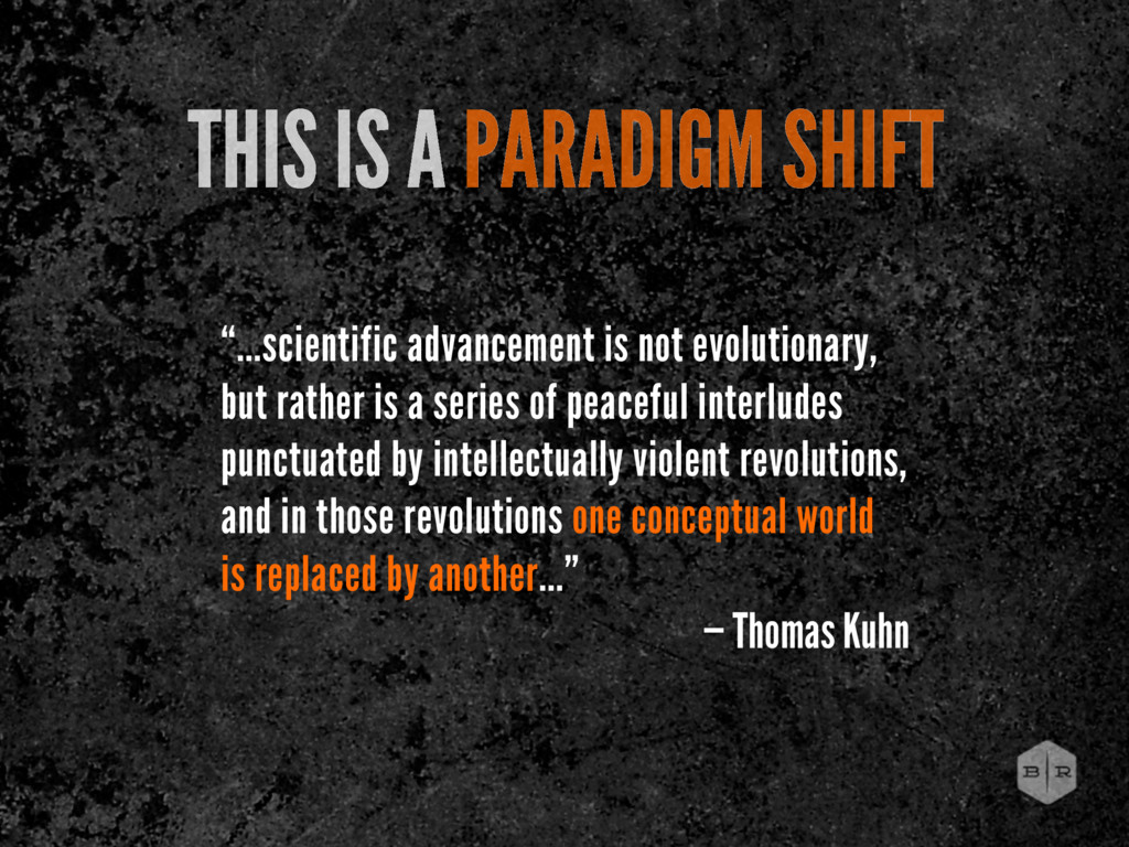
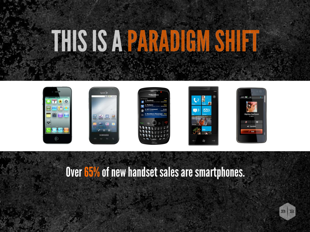
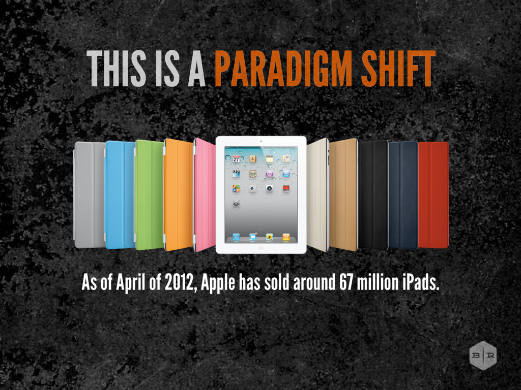
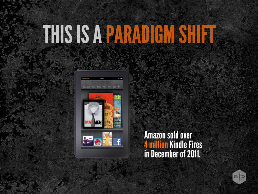
but rather is a series of peaceful interludes punctuated by intellectually violent revolutions, and in those revolutions one conceptual world is replaced by another...” — Thomas Kuhn
2007 2008 2009 2010 2011 2012 2013 2014 2015 Mobile Users Desktop Users Global Mobile vs Desktop Internet User Projection Source: Morgan Stanley Research
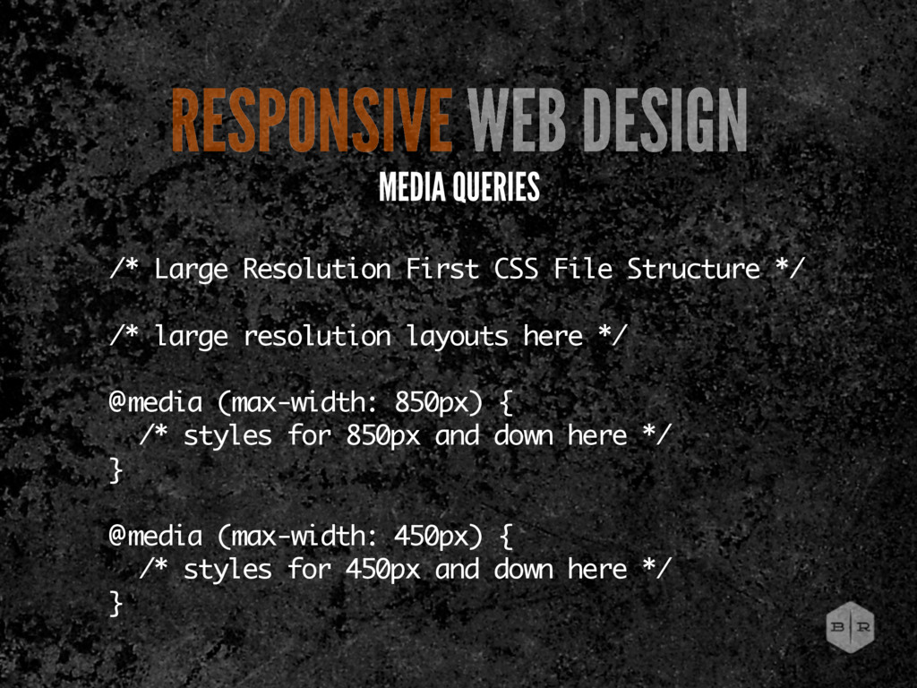
resolution layouts here */ @media (max-width: 850px) { /* styles for 850px and down here */ } @media (max-width: 450px) { /* styles for 450px and down here */ } RESPONSIVE WEB DESIGN MEDIA QUERIES
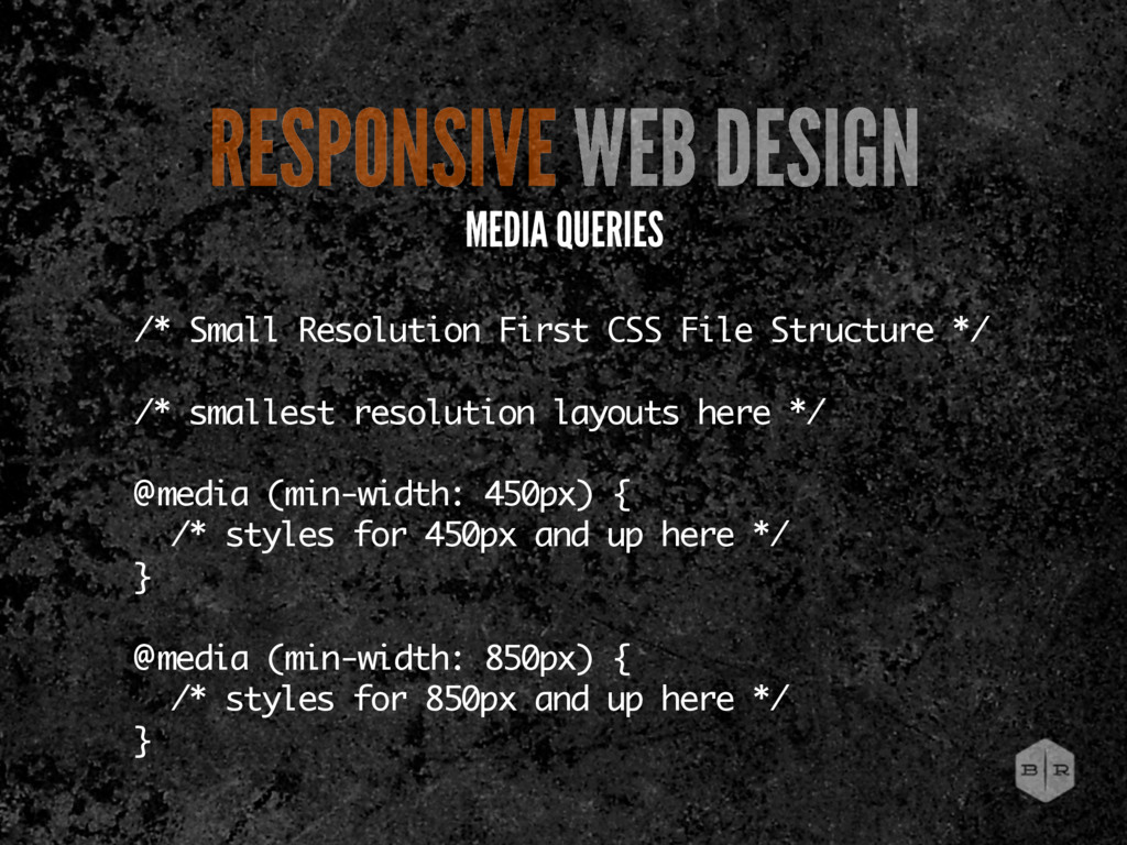
resolution layouts here */ @media (min-width: 450px) { /* styles for 450px and up here */ } @media (min-width: 850px) { /* styles for 850px and up here */ } RESPONSIVE WEB DESIGN MEDIA QUERIES
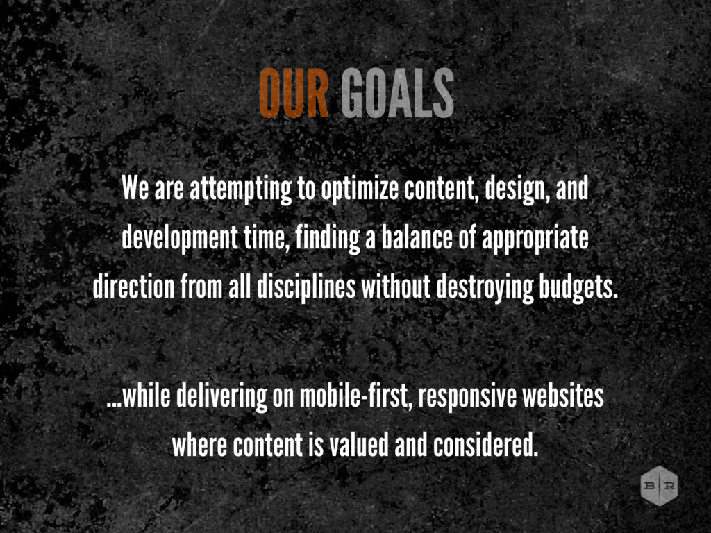
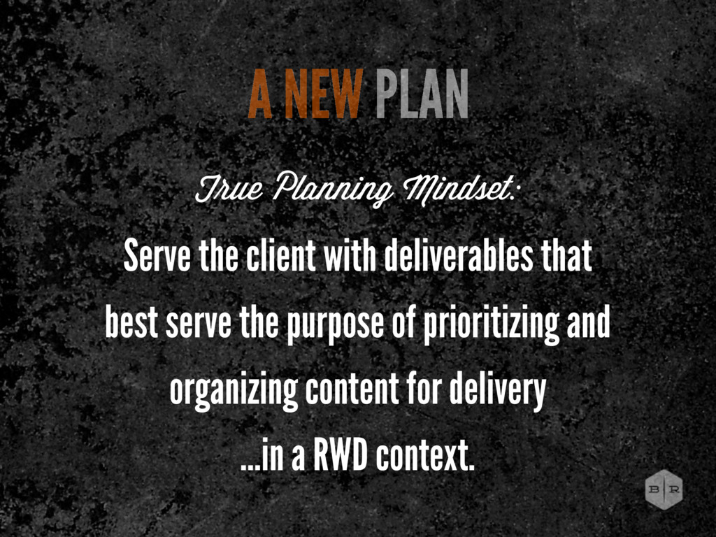
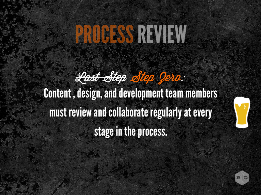
finding a balance of appropriate direction from all disciplines without destroying budgets. ...while delivering on mobile-first, responsive websites where content is valued and considered. OUR GOALS
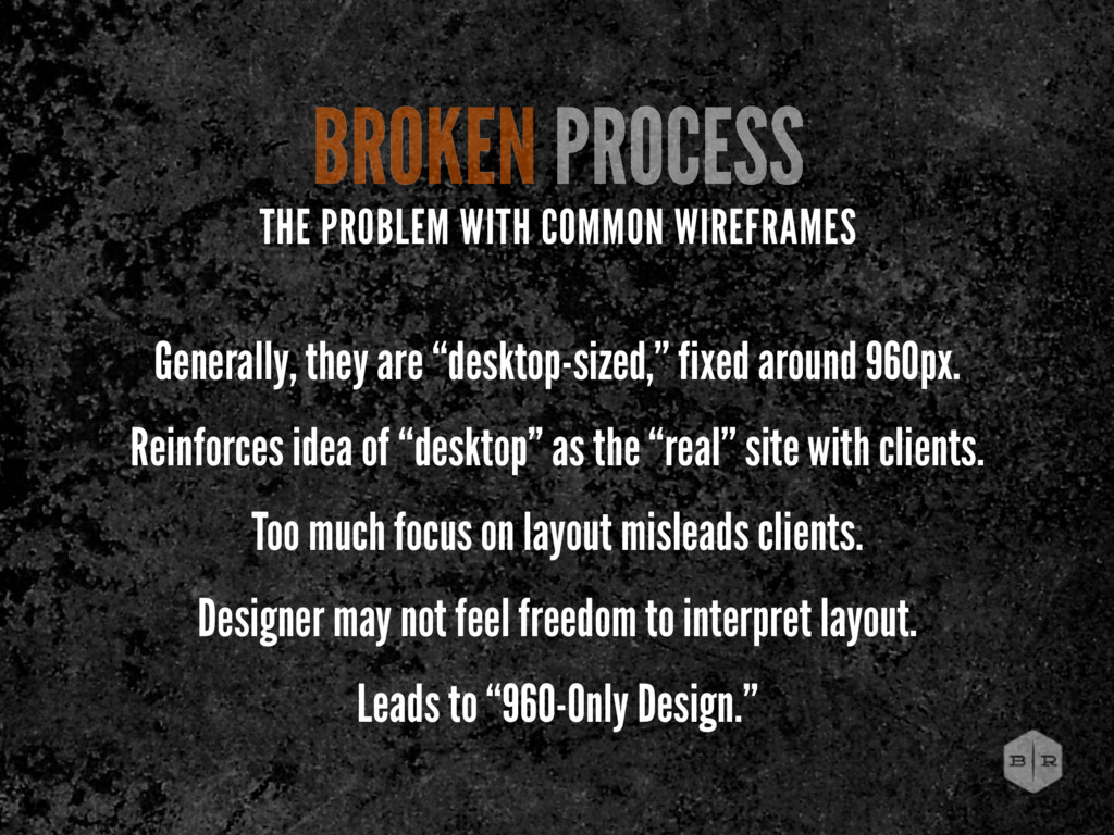
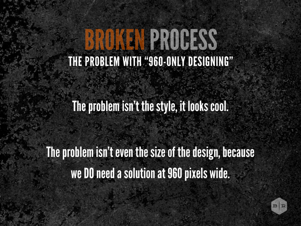
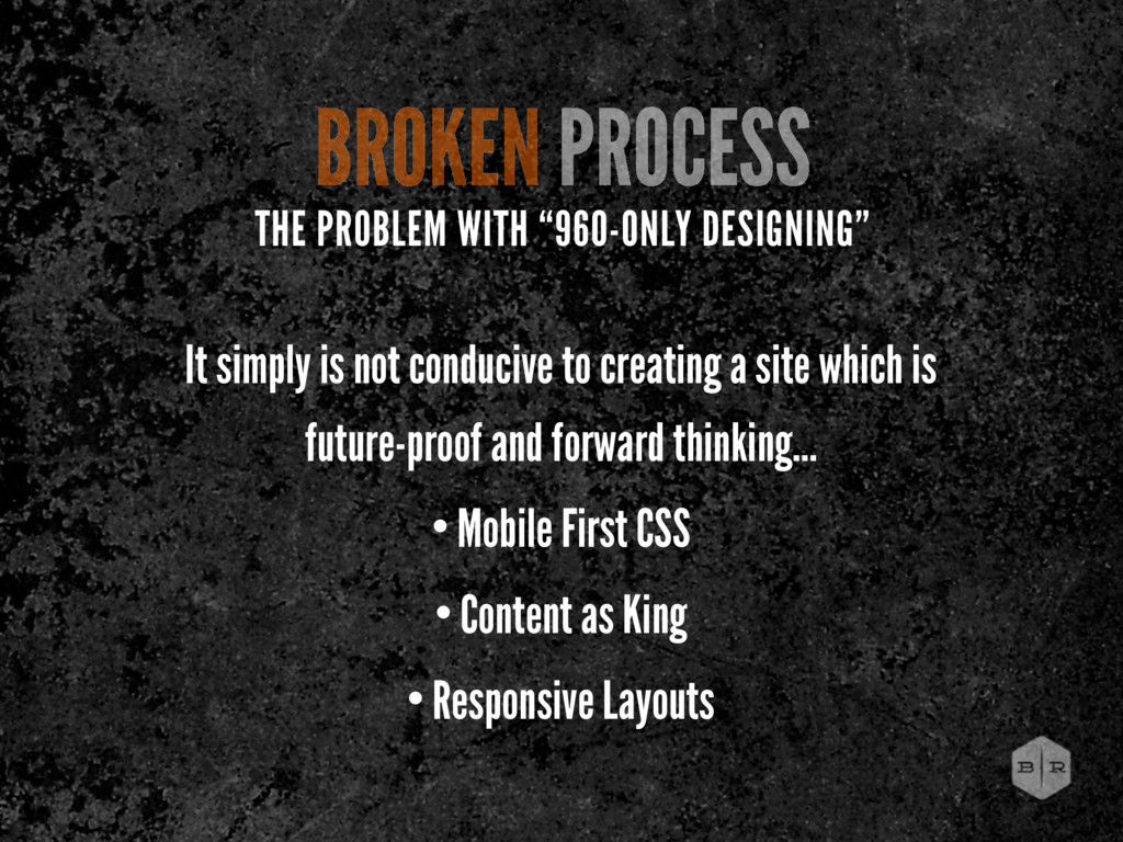
“desktop” as the “real” site with clients. Too much focus on layout misleads clients. Designer may not feel freedom to interpret layout. Leads to “960-Only Design.” BROKEN PROCESS THE PROBLEM WITH COMMON WIREFRAMES
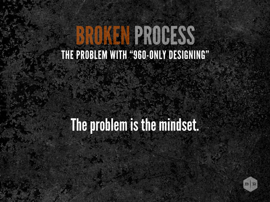
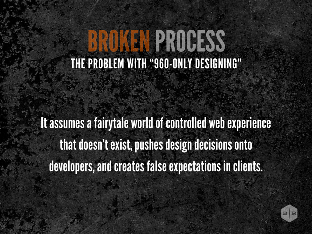
experience that doesn’t exist, pushes design decisions onto developers, and creates false expectations in clients. THE PROBLEM WITH “960-ONLY DESIGNING”
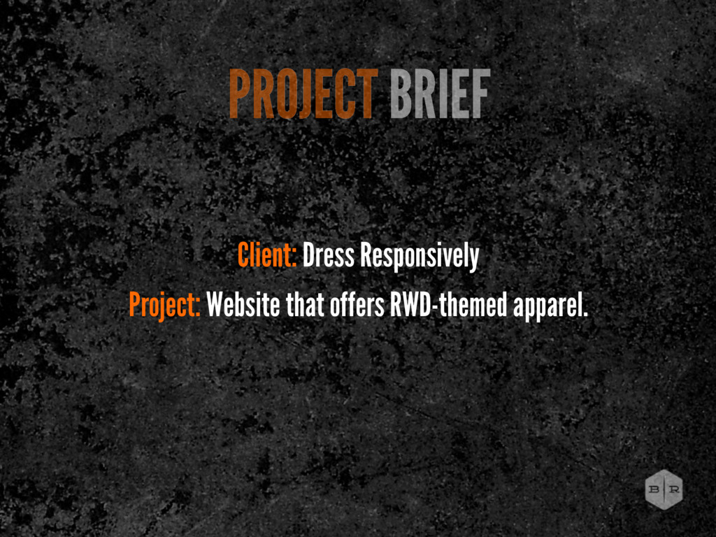
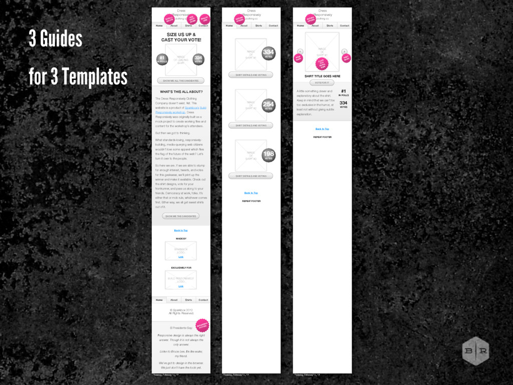
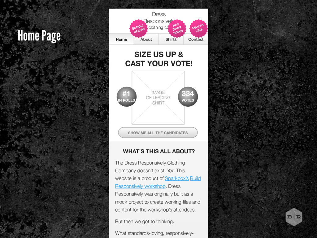
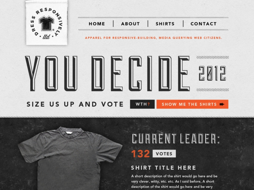
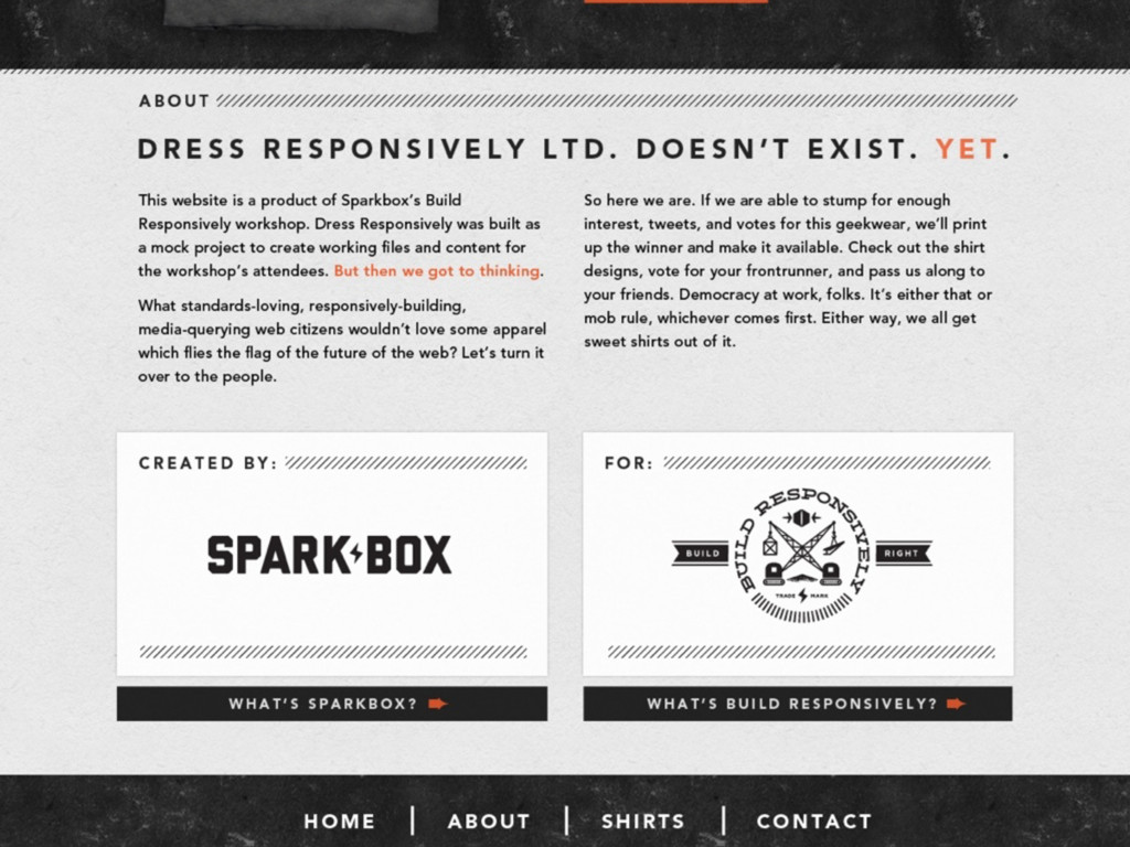
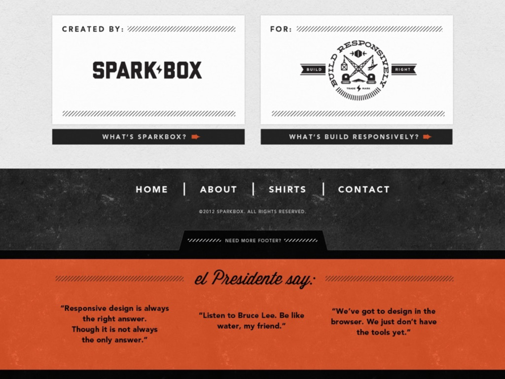
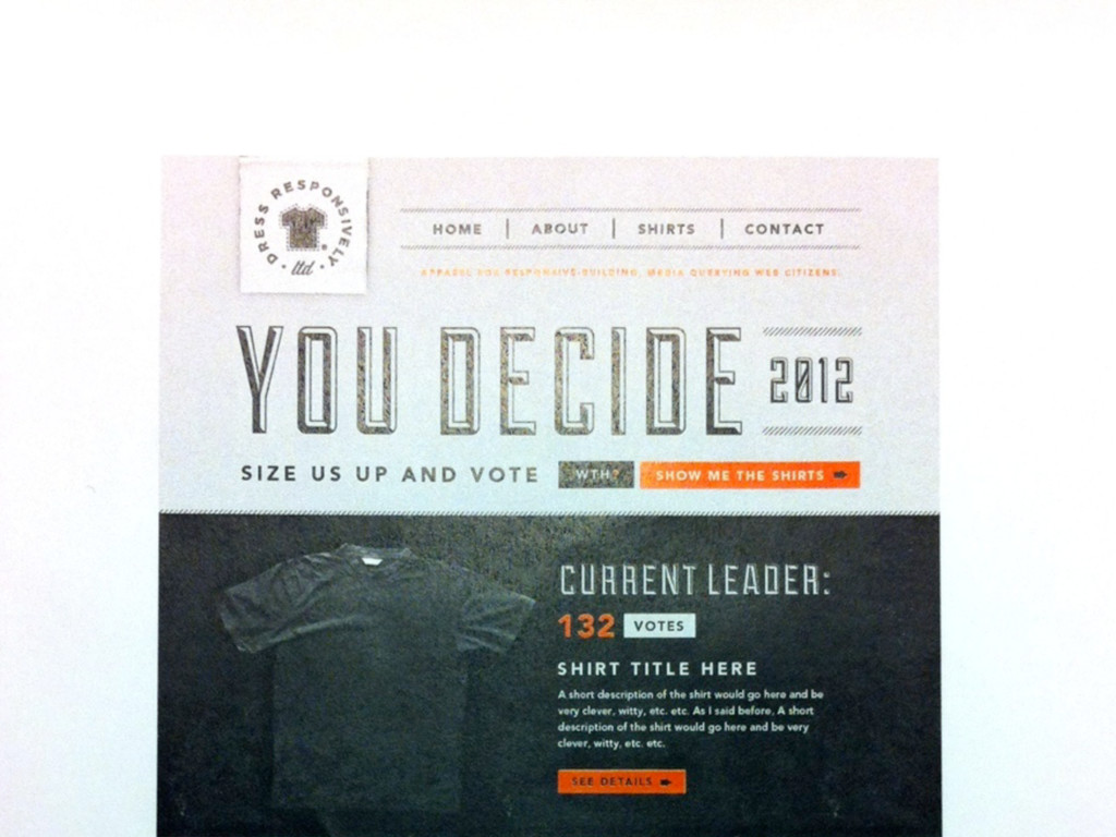
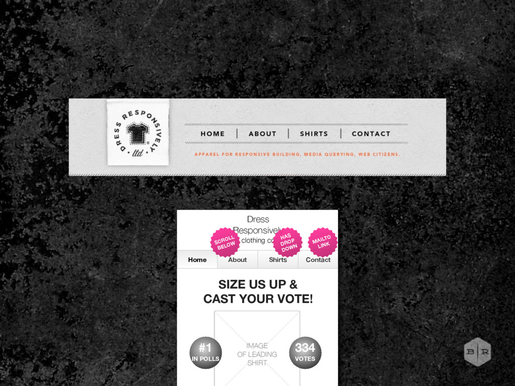
UP & CAST YOUR VOTE! IMAGE OF LEADING SHIRT WHAT’S THIS ALL ABOUT? SHOW ME ALL THE CANDIDATES The Dress Responsively Clothing Company doesn’t exist. Yet. This website is a product of Sparkbox’s Build Responsively workshop. Dress Responsively was originally built as a mock project to create working files and content for the workshop’s attendees. But then we got to thinking. What standards-loving, responsively- HAS DROP DOWN MAILTO LINK SCROLL BELOW 334 VOTES #1 IN POLLS Home Page
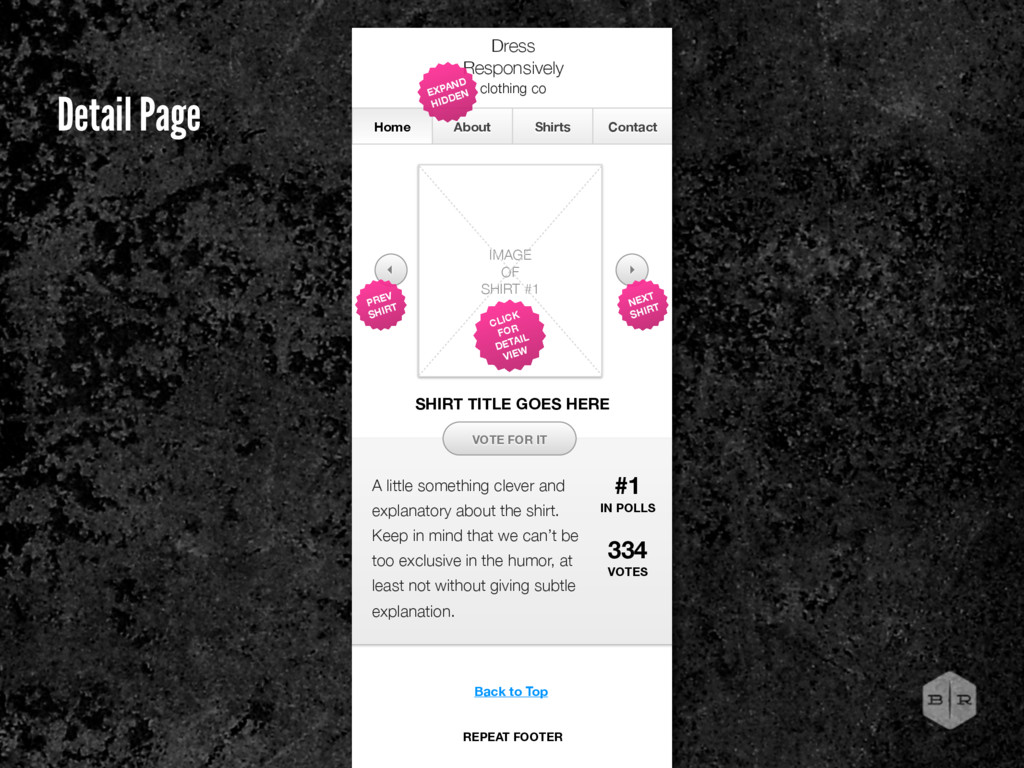
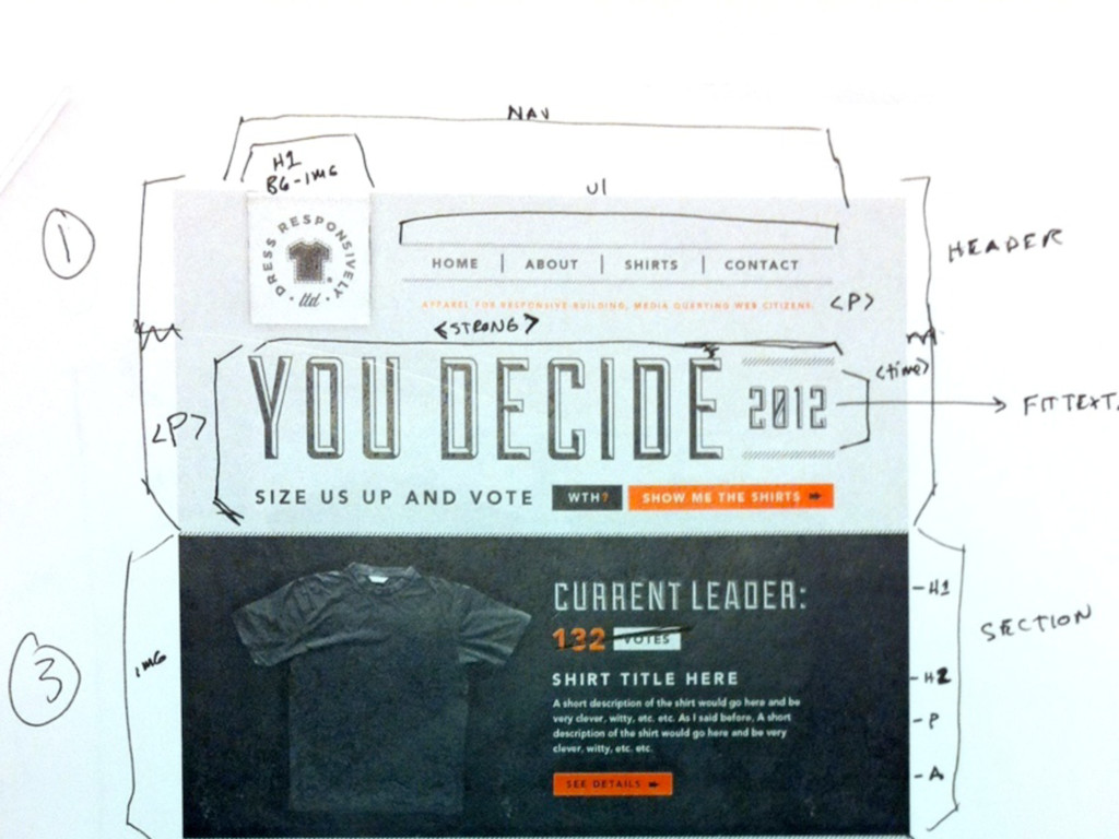
in mind that we can’t be too exclusive in the humor, at least not without giving subtle explanation. Home About Shirts Contact Dress Responsively clothing co IMAGE OF SHIRT #1 VOTE FOR IT EXPAND HIDDEN 334 VOTES CLICK FOR DETAIL VIEW #1 IN POLLS SHIRT TITLE GOES HERE NEXT SHIRT PREV SHIRT Back to Top REPEAT FOOTER Detail Page
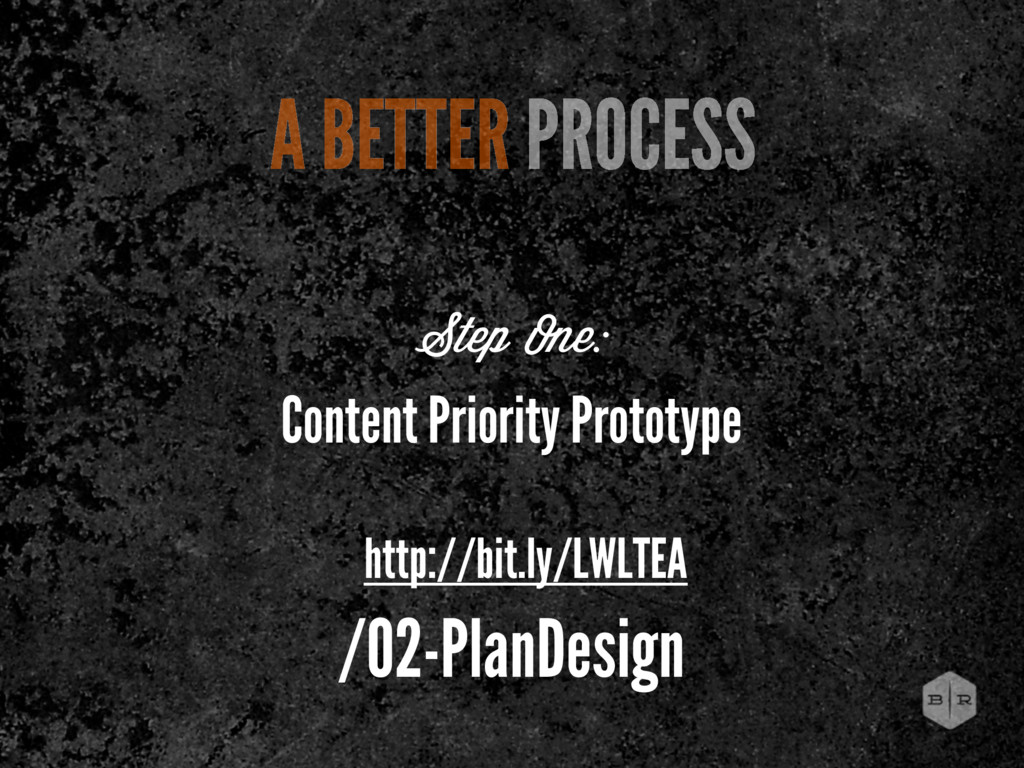
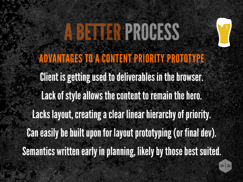
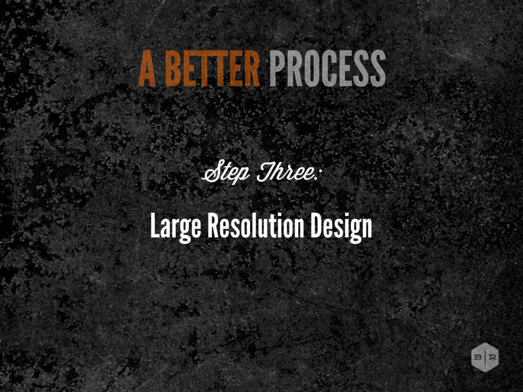
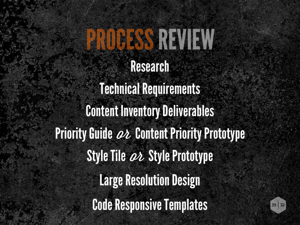
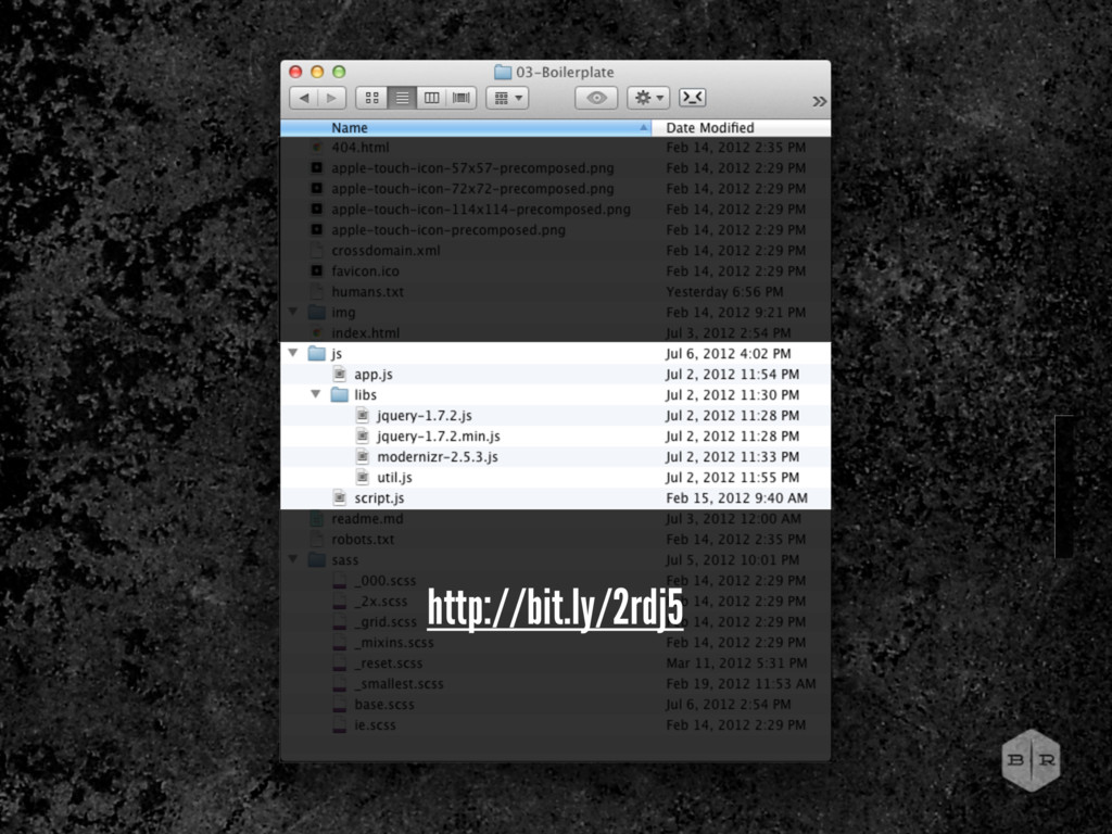
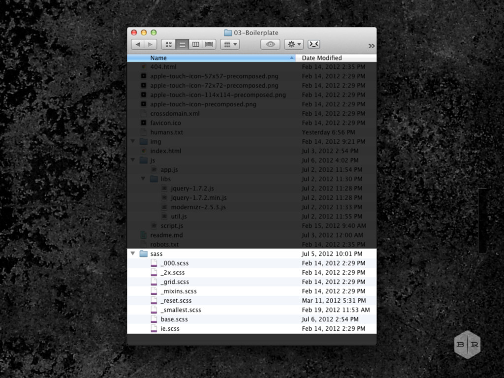
to deliverables in the browser. Lack of style allows the content to remain the hero. Lacks layout, creating a clear linear hierarchy of priority. Can easily be built upon for layout prototyping (or final dev). Semantics written early in planning, likely by those best suited. A BETTER PROCESS
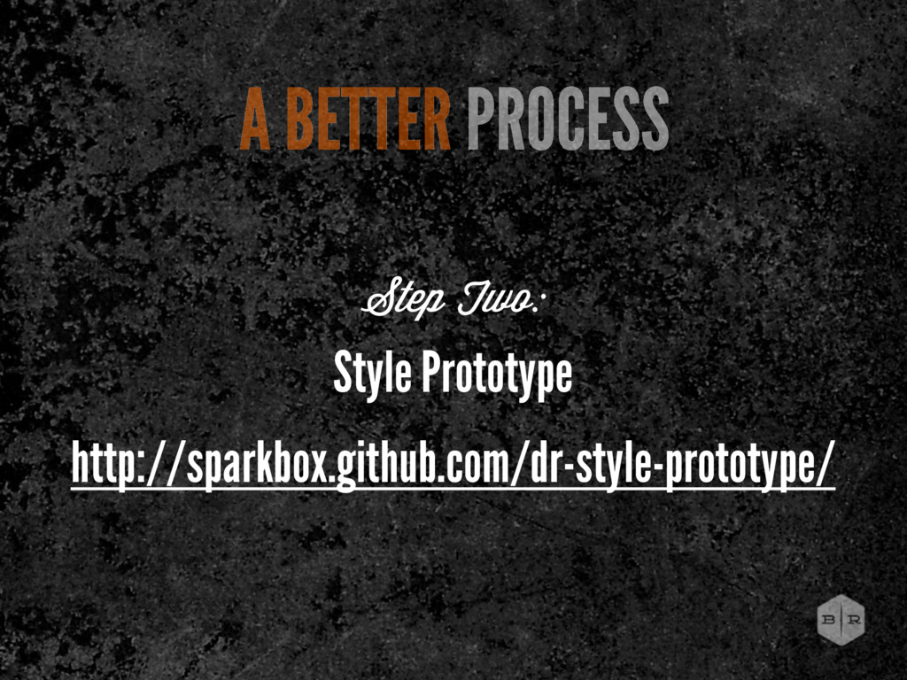
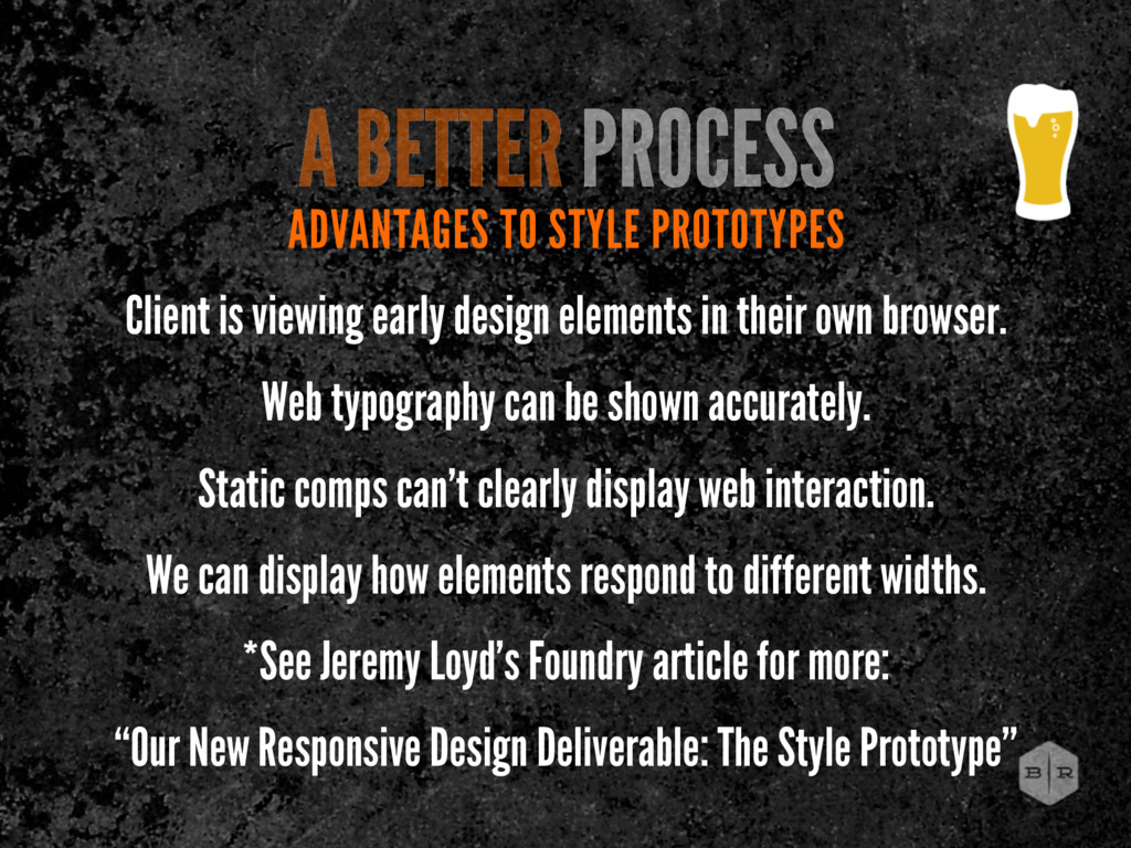
in their own browser. Web typography can be shown accurately. Static comps can’t clearly display web interaction. We can display how elements respond to different widths. *See Jeremy Loyd’s Foundry article for more: “Our New Responsive Design Deliverable: The Style Prototype” A BETTER PROCESS
 brworkshop
 hicard
 uxman
uxman
 seto
seto
 mukai_takeru
 aonomasahiro
 ajstarks
 koyaman
 hjmkth
 vivion
 terencebasart
 nishame
 baasie
 aleyda
 cassininazir
 inesmontani
 tonyrice
 eileencodes
 andyhume
 addyosmani
 speakerdeck
 retrage
 lara
lara
 katarinadahlin
 palkan