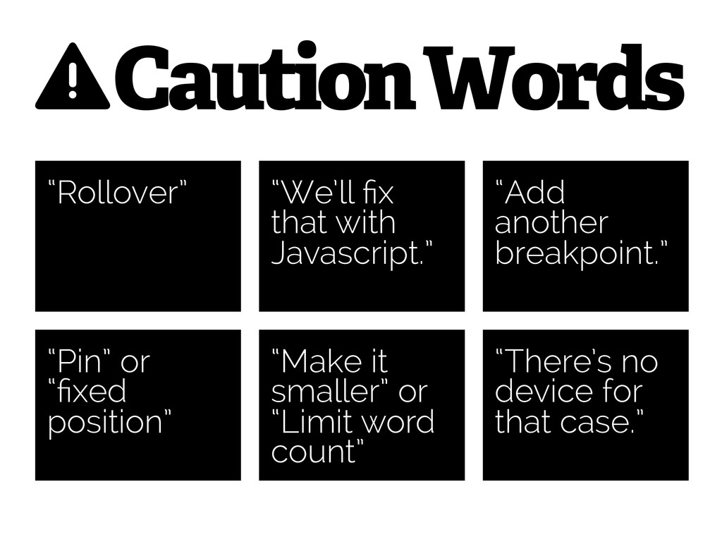
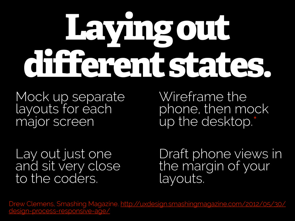
major screen Draft phone views in the margin of your layouts. Lay out just one and sit very close to the coders. Wireframe the phone, then mock up the desktop.* Drew Clemens, Smashing Magazine. http:/ /uxdesign.smashingmagazine.com/2012/05/30/ design-process-responsive-age/
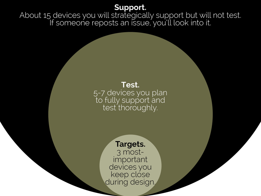
Test. 5-7 devices you plan to fully support and test thoroughly. Support. About 15 devices you will strategically support but will not test. If someone reposts an issue, you’ll look into it.
 lynteo
 chorkaichan
 nttcom
 sevendex
 mhand01
 bebe
bebe
 hicard
 kumanoayumi
 videlvequio
 ajstarks
 toshihidemurata
 nbkouhou
 kastner
 helmedeiros
 marktimemedia
 hannesfritz
 shlominoach
 aemeredith
 orderedlist
 lara
lara
 chrisshort
 pauljervisheath
 sonatard
 chriscoyier