Upgrade to Pro — share decks privately, control downloads, hide ads and more …

Android Themes & Styles demystified (Google IO 16)

Android Themes & Styles demystified (Google IO 16)

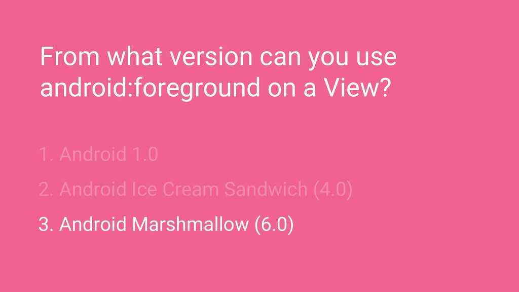
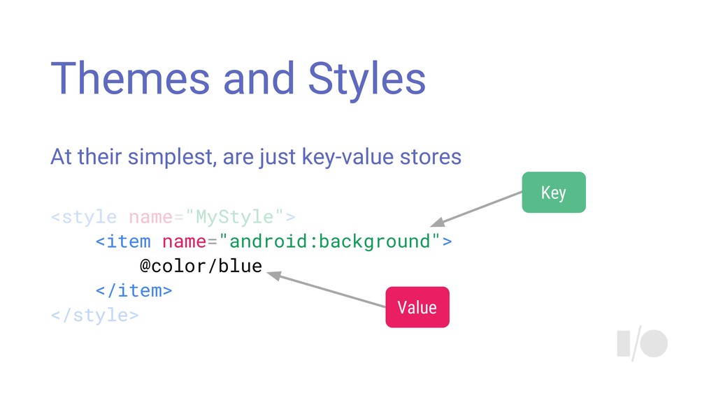
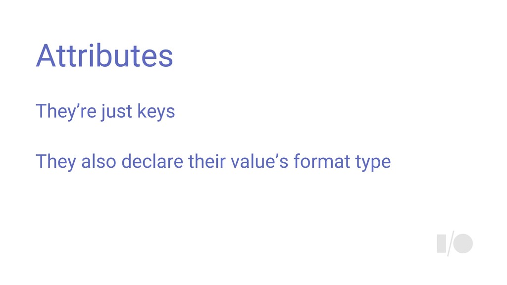
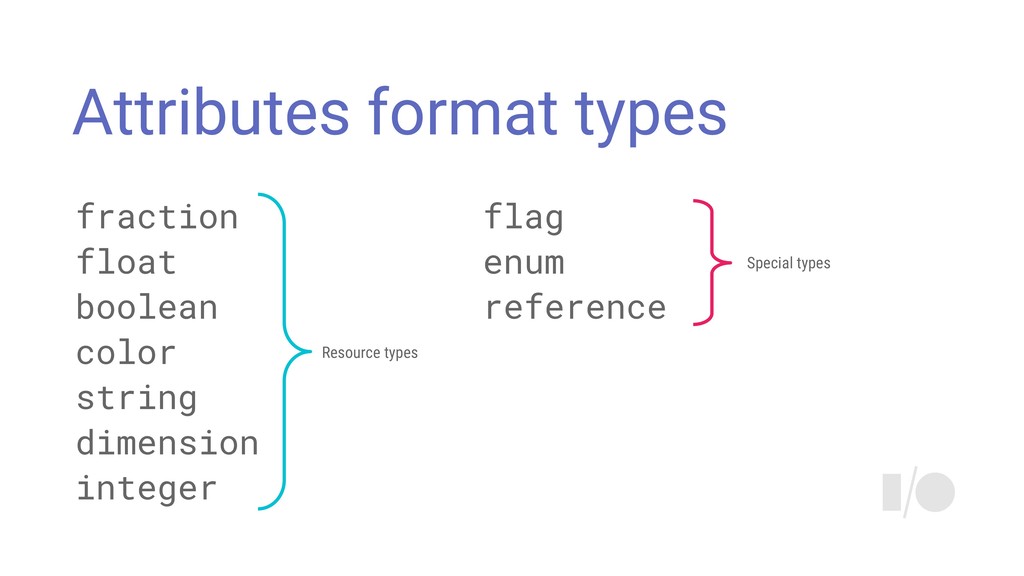
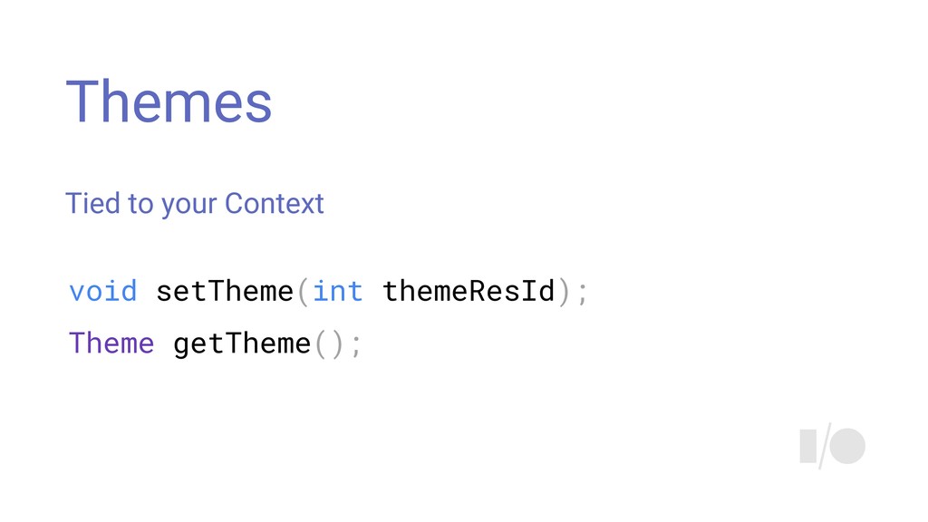
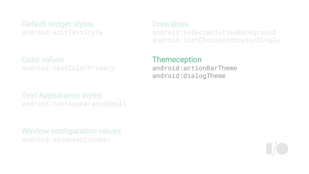
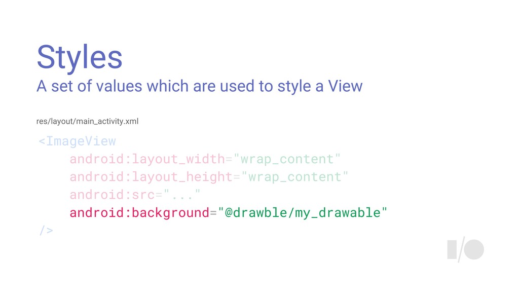
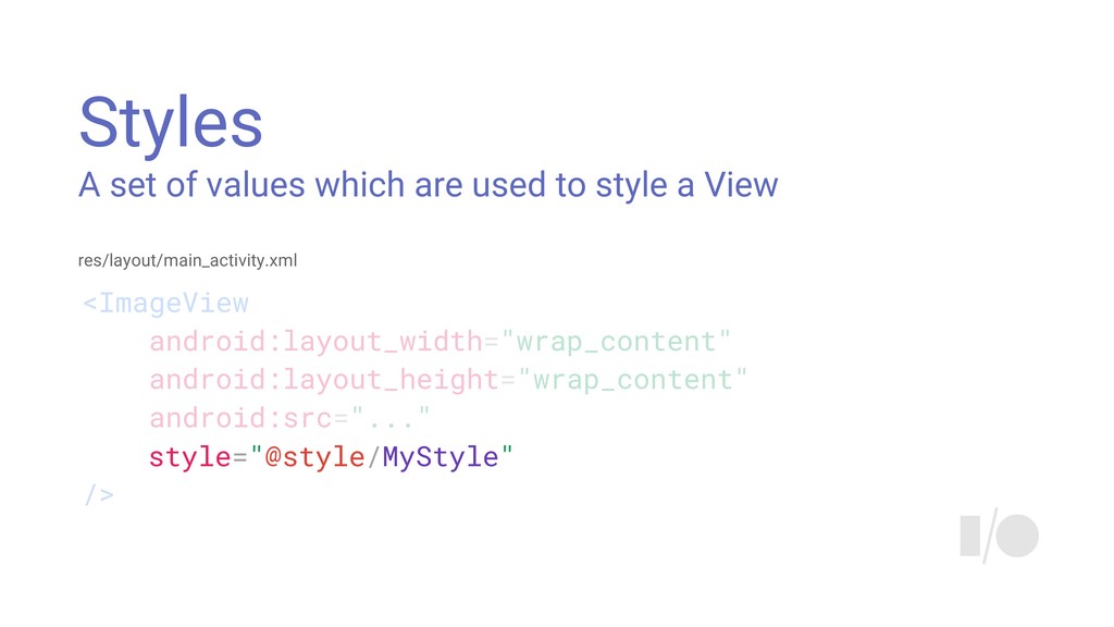
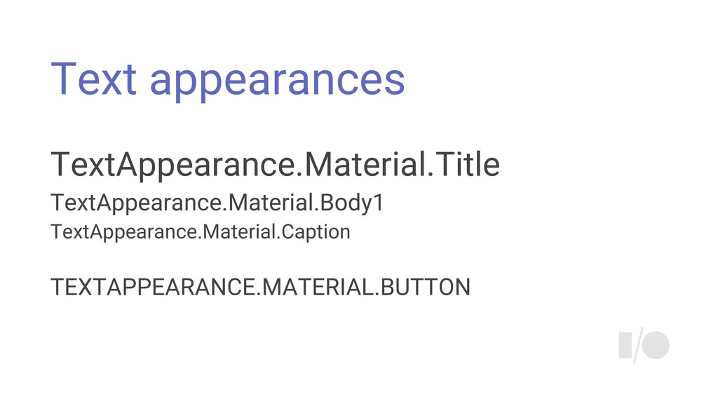
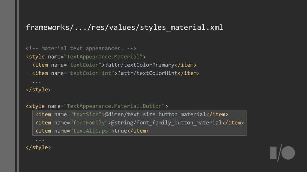
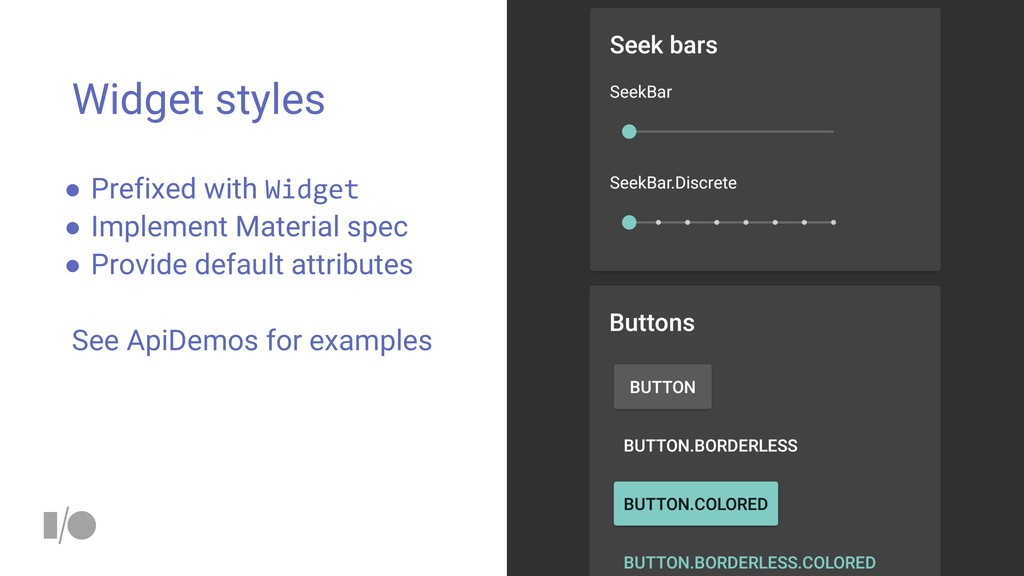
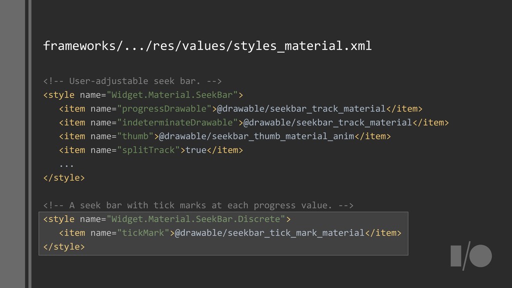
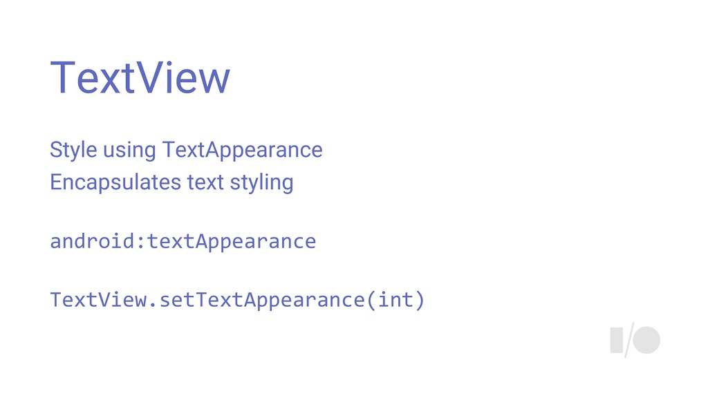
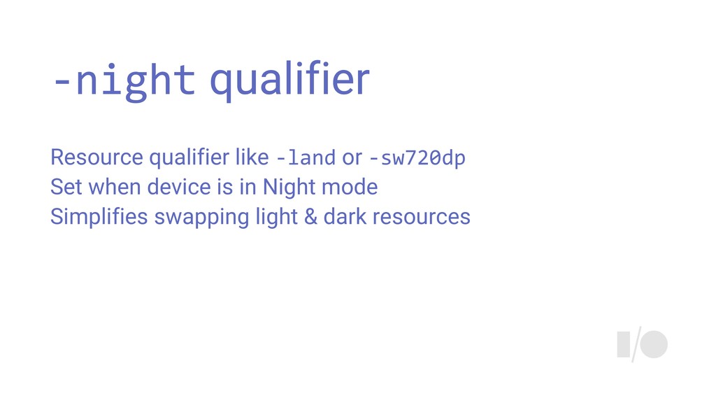
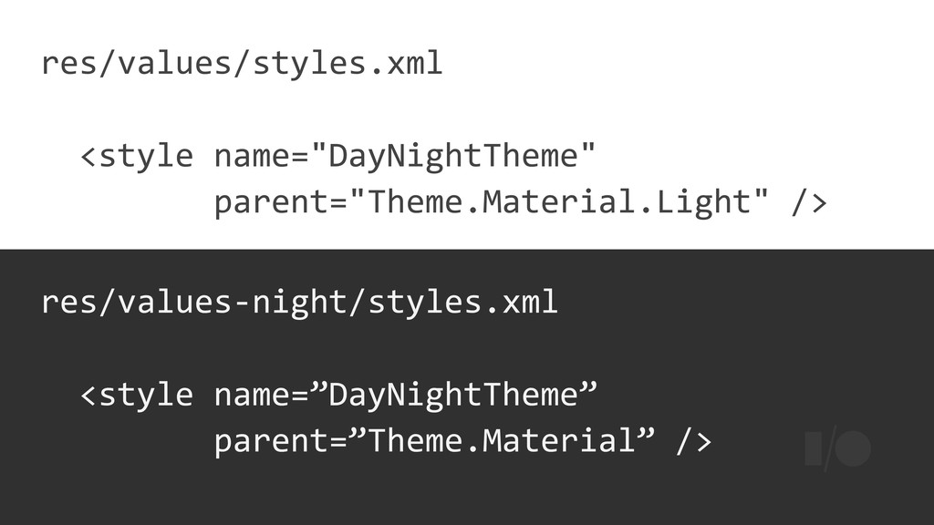
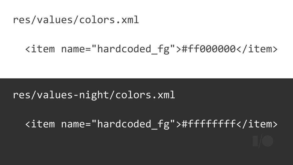
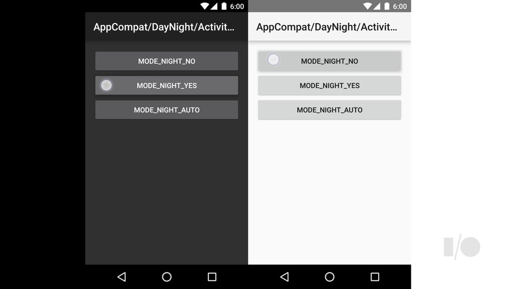
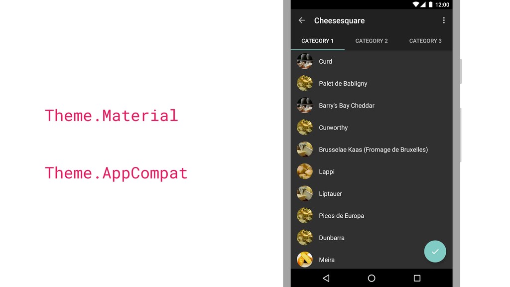
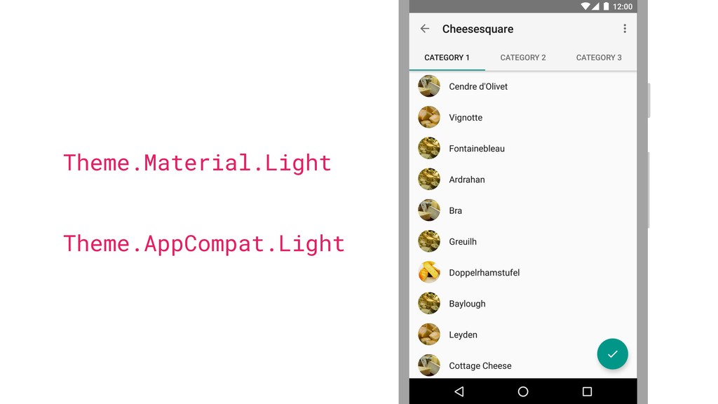
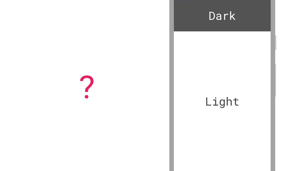
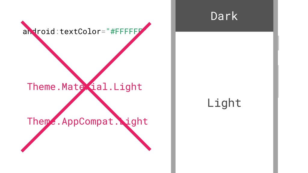
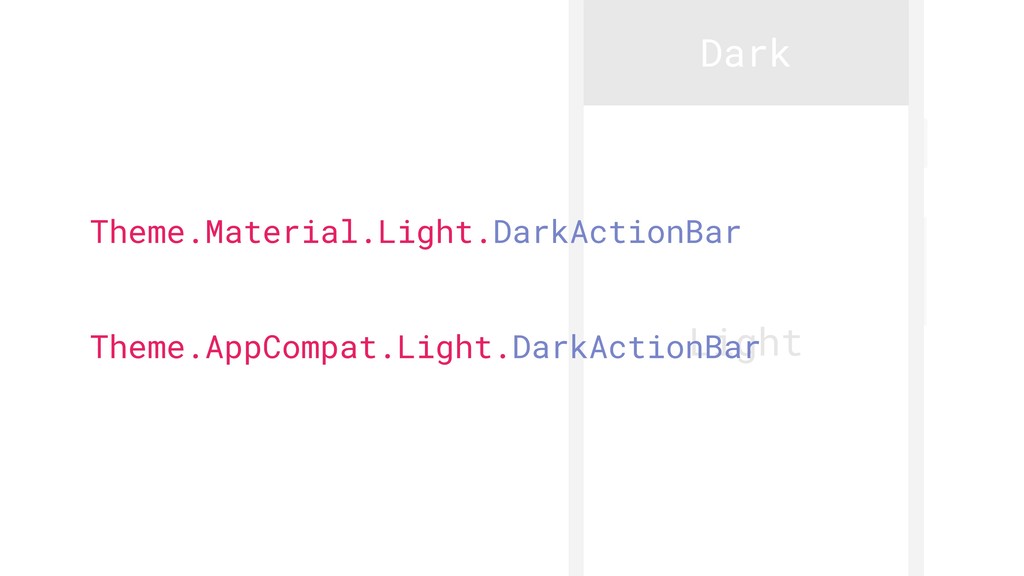
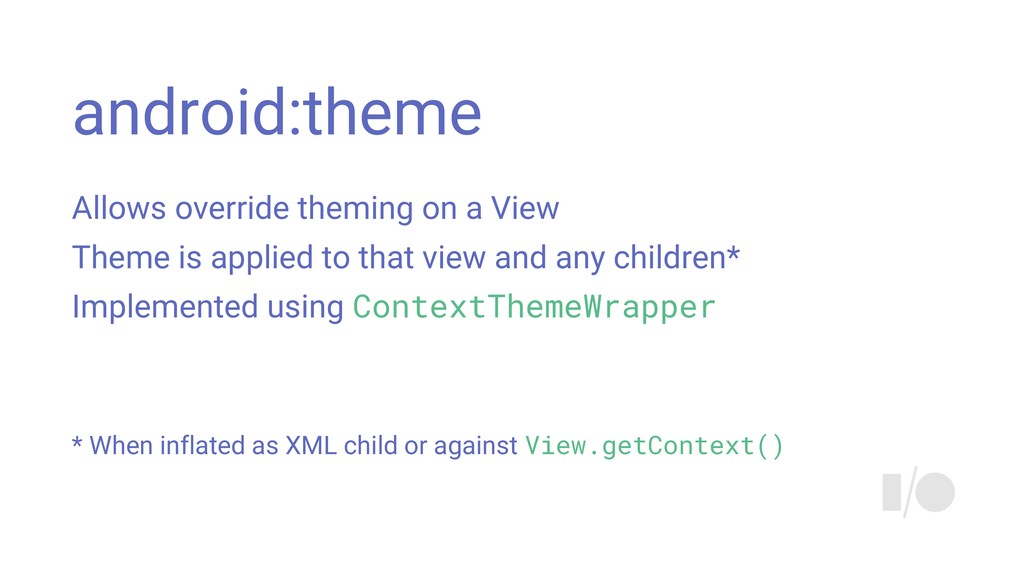
Themes and styles are the bedrock of styling your Android UI, but do you know how they work? This talk will dive deeper into everything you have ever wanted to know about how styles and themes work together, what attributes really are, and how you can use them to make your styles more manageable.

Chris Banes

May 18, 2016
Tweet

More Decks by Chris Banes

Other Decks in Technology

Transcript

  1. Themes & Styles demystified
    +ChrisBanes
    @chrisbanes
    +AlanViverette
    @alanviverette

    View Slide

  2. Quiz time!

    View Slide

  3. In what Android version did
    Theme.Holo appear in?
    1. Android Eclair (2.1)
    2. Android Honeycomb (3.0)
    3. Android Ice Cream Sandwich (4.0)
    #holoyolo

    View Slide

  4. In what Android version did
    Theme.Holo.DarkActionBar appear?
    1. Android Honeycomb (3.0)
    2. Android Honeycomb MR2 (3.2)
    3. Android Ice Cream Sandwich (4.0)

    View Slide

  5. How did selectableItemBackground
    change in KitKat?
    1. Changed to a ripple
    2. Changed to monochrome
    3. Changed shape

    View Slide

  6. From what version can you use
    android:foreground on a View?
    1. Android 1.0
    2. Android Ice Cream Sandwich (4.0)
    3. Android Marshmallow (6.0)

    View Slide

  7. What are Themes and Styles?

    View Slide

  8. Themes and Styles
    They’re technically the same thing
    Both declared using the tag<br/>The only difference between them is how they’re used<br/>Themes == Styles used in a special way<br/>

    View Slide

  9. Themes and Styles
    At their simplest, are just key-value stores
    <br/><item name="android:background"><br/>@color/blue<br/></item><br/>
    Key
    Value

    View Slide

  10. Attributes
    The key to the puzzle

    View Slide

  11. Attributes
    They’re just keys
    They also declare their value’s format type

    View Slide

  12. Attributes format types
    fraction
    float
    boolean
    color
    string
    dimension
    integer
    flag
    enum
    reference
    Resource types
    Special types

    View Slide

  13. Attributes
    Declared in resources:
    format="reference|color" />

    View Slide

  14. Attributes namespaces
    All attributes provided by the framework are in
    the android schema
    xmlns:android="http://schemas.android.com/apk/res/android"
    android:background=”...”>

    View Slide

  15. Custom attributes
    You can also create attributes
    You’re probably using libraries which already do so
    Important to know that non-Android attributes are global
    within your app

    View Slide

  16. Custom attributes
    Global namespace
    All custom attributes are in your app’s schema
    xmlns:app="http://schemas.android.com/apk/res
    app:customAttr=”...”>
    /"
    -auto"

    View Slide

  17. Themes vs Styles
    What’s the difference?

    View Slide

  18. Themes
    Tied to your Context
    void setTheme(int themeResId);
    Theme getTheme();

    View Slide

  19. Themes
    Don’t really do anything themselves
    They’re a big configuration store

    View Slide

  20. Default widget styles
    android:editTextStyle
    Color values
    android:textColorPrimary
    Text Appearance styles
    android:textAppearanceSmall
    Window configuration values
    android:windowActionBar
    Drawables
    android:selectableItemBackground
    android:listChoiceIndicatorSingle
    Themeception
    android:actionBarTheme
    android:dialogTheme

    View Slide

  21. Styles
    A set of values which are used to style a View
    res/layout/main_activity.xml
    android:layout_width="wrap_content"
    android:layout_height="wrap_content"
    android:src="..."
    android:background="@drawble/my_drawable"
    />

    View Slide

  22. Styles
    A set of values which are used to style a View
    res/values/styles.xml
    <br/><item name="android:background"><br/>@drawble/my_drawable<br/></item><br/>

    View Slide

  23. android:layout_width="wrap_content"
    android:layout_height="wrap_content"
    android:src="..."
    />
    android:background="@drawble/my_drawable"
    Styles
    A set of values which are used to style a View
    res/layout/main_activity.xml

    View Slide

  24. android:layout_width="wrap_content"
    android:layout_height="wrap_content"
    android:src="..."
    />
    Styles
    A set of values which are used to style a View
    res/layout/main_activity.xml
    style="@style/MyStyle"

    View Slide

  25. Styles
    Pro-tip
    Android Studio automates
    this
    Long press on a View

    View Slide

  26. Creating themes and styles

    View Slide

  27. Inheritance
    Themes can inherit from each other
    Handy for creating derivative styles
    Styles overlay each other

    View Slide

  28. Inheritance
    Implicit
    Through dot notation
    <br/>Parent<br/>

    View Slide

  29. Inheritance
    Explicit
    Through parent attribute
    parent="Widget.Material.Button.Colored">
    Parent

    View Slide

  30. Inheritance
    Gotcha
    Explicit always wins over implicit
    parent="Widget.Material.Button.Colored">
    Parent

    View Slide

  31. Styles
    Can reference values from the theme
    res/values/styles.xml
    <br/><item name="android:background"><br/></item><br/>
    @drawble/my_drawable

    View Slide

  32. Styles
    Can reference values from the theme
    res/values/styles.xml
    <br/><item name="android:background"><br/></item><br/>
    ?android:attr/selectableItemBackground

    View Slide

  33. ?android:attr/
    Styles
    Can reference values from the theme
    Denotes that we’re doing a theme lookup
    selectableItemBackground

    View Slide

  34. ?android:attr/
    Styles
    Can reference values from the theme
    We’re looking up something within the android namespace
    selectableItemBackground

    View Slide

  35. selectableItemBackground
    ?android:attr/
    Styles
    Can reference values from the theme
    We’re looking up an attribute

    View Slide

  36. selectableItemBackground
    ?android:attr/
    Styles
    Can reference values from the theme
    The name of the attribute we’re looking up

    View Slide

  37. Styles
    Can reference values from the theme
    ?android: selectableItemBackground
    selectableItemBackground
    ?android:attr/

    View Slide

  38. Theme.Material
    Hands-on with themes, styles, and attributes

    View Slide

  39. Themes
    Usually specific to Activity appearance
    Theme.Material
    Theme.Material.Dialog
    Theme.Material.Light.DarkActionBar

    View Slide

  40. frameworks/.../res/values/themes_material.xml

    <br/><item name="colorForeground">@color/foreground_material_dark</item><br/>...<br/><item name="buttonStyle">@style/Widget.Material.Button</item><br/><item name="editTextStyle">@style/Widget.Material.EditText</item><br/><item name="seekBarStyle">@style/Widget.Material.SeekBar</item><br/>...<br/><item name="listPreferredItemHeight">64dp</item><br/><item name="listPreferredItemHeightSmall">48dp</item><br/><item name="listPreferredItemHeightLarge">80dp</item><br/>...<br/>

    View Slide

  41. Overlay themes
    Applied to a section of view hierarchy
    ThemeOverlay.Material.Light
    ThemeOverlay.Material.Dark
    ThemeOverlay.Material.Dialog (API 23+)

    View Slide

  42. frameworks/.../res/values/themes_material.xml

    <br/><item name="colorForeground">@color/foreground_material_light</item><br/><item name="colorForegroundInverse">@color/foreground_material_dark</item><br/>...<br/><item name="textColorPrimary">@color/primary_text_material_light</item><br/><item name="textColorPrimaryInverse">@color/primary_text_material_dark</item><br/>...<br/><item name="colorControlNormal">?attr/textColorSecondary</item><br/><item name="colorControlHighlight">@color/ripple_material_light</item><br/>...<br/>

    View Slide

  43. View Slide

  44. Text appearances
    TextAppearance.Material.Title
    TextAppearance.Material.Body1
    TextAppearance.Material.Caption
    TEXTAPPEARANCE.MATERIAL.BUTTON

    View Slide

  45. frameworks/.../res/values/styles_material.xml

    <br/><item name="textColor">?attr/textColorPrimary</item><br/><item name="textColorHint">?attr/textColorHint</item><br/>...<br/>
    <br/><item name="textSize">@dimen/text_size_button_material</item><br/><item name="fontFamily">@string/font_family_button_material</item><br/><item name="textAllCaps">true</item><br/>...<br/>

    View Slide

  46. Widget styles
    ● Prefixed with Widget
    ● Implement Material spec
    ● Provide default attributes
    See ApiDemos for examples

    View Slide

  47. frameworks/.../res/values/styles_material.xml

    <br/><item name="progressDrawable">@drawable/seekbar_track_material</item><br/><item name="indeterminateDrawable">@drawable/seekbar_track_material</item><br/><item name="thumb">@drawable/seekbar_thumb_material_anim</item><br/><item name="splitTrack">true</item><br/>...<br/>

    <br/><item name="tickMark">@drawable/seekbar_tick_mark_material</item><br/>

    View Slide

  48. frameworks/.../res/values/styles_material.xml
    ...
    parent="Widget.Material.SeekBar" />
    parent="Widget.Material.RatingBar" />
    parent="Widget.Material.RatingBar.Indicator" />
    ...

    View Slide

  49. Theme colors
    ● Defined by the theme
    ● Allow high-level styling
    ● Ensure consistency
    For example,
    ?android:attr/colorAccent

    View Slide

  50. frameworks/.../res/values/styles_material.xml

    <br/><item name="background"><br/>@drawable/btn_colored_material<br/></item><br/>...<br/>

    View Slide

  51. frameworks/.../res/drawable/btn_colored_material.xml


    android:tint="@color/btn_colored_bg_material">

    ...


    View Slide

  52. frameworks/.../res/colors/btn_colored_bg_material.xml


    android:alpha="?android:attr/disabledAlpha"
    android:color="?android:attr/colorButtonNormal" />


    View Slide

  53. Theme colors
    colorForeground
    colorForegroundInverse
    colorBackground
    colorBackgroundFloating

    View Slide

  54. View Slide

  55. frameworks/.../res/colors/switch_track_material.xml


    android:color="?attr/colorForeground"
    android:alpha="?attr/disabledAlpha" />
    android:color="?attr/colorControlActivated" />


    View Slide

  56. Theme colors
    textColorPrimary
    textColorPrimaryInverse
    textColorSecondary
    textColorSecondaryInverse

    View Slide

  57. Theme colors
    colorAccent
    colorPrimary
    colorPrimaryDark
    colorControlNormal (defaults to textColorSecondary)
    colorControlActivated (defaults to colorAccent)

    View Slide

  58. View Slide

  59. Styling resources
    Theming and tinting

    View Slide

  60. Drawables
    Support ColorStateList and theme attributes since API 21
    android:color="?android:attr/colorControlHighlight"/>

    android:color="@color/selectorWithFocusedState"/>

    View Slide

  61. ColorStateLists
    Support theme attributes since API 22

    android:color="?attr/colorControlActivated"
    android:alpha="?android:attr/disabledAlpha"/>


    View Slide

  62. ColorStateLists
    AppCompat also supports this in v24.0
    AppCompatResources.getColorStateList()

    View Slide

  63. View tinting
    Since API 21, most views support tinting
    drawables from layout XML or at run-time

    View Slide

  64. View tinting: Switch
    android:thumbTint
    android:thumbTintMode
    android:trackTint
    android:trackTintMode
    Switch.setThumbTintList(ColorStateList)
    Switch.setThumbTintMode(PorterDuff.Mode)

    View Slide

  65. TextView
    Style using TextAppearance
    Encapsulates text styling
    android:textAppearance
    TextView.setTextAppearance(int)

    View Slide

  66. Day + Night

    View Slide

  67. -night qualifier
    Resource qualifier like -land or -sw720dp
    Set when device is in Night mode
    Simplifies swapping light & dark resources

    View Slide

  68. res/values-night/styles.xml
    parent=”Theme.Material” /><br/>res/values/styles.xml<br/><style name="DayNightTheme"<br/>parent="Theme.Material.Light" /><br/>

    View Slide

  69. res/values-night/colors.xml
    #ffffffff
    res/values/colors.xml
    #ff000000

    View Slide

  70. View Slide

  71. Theme overlays
    (aka Themeception)

    View Slide

  72. Theme.Material
    Theme.AppCompat

    View Slide

  73. Theme.Material.Light
    Theme.AppCompat.Light

    View Slide

  74. ?
    Dark
    Light

    View Slide

  75. android:textColor="#FFFFFF"
    Dark
    Light
    Theme.Material.Light
    Theme.AppCompat.Light

    View Slide

  76. Dark
    Light
    Theme.Material.Light.DarkActionBar
    Theme.AppCompat.Light.DarkActionBar

    View Slide

  77. Overlay themes
    Applied to a section of view hierarchy
    ThemeOverlay.Material.Light
    ThemeOverlay.Material.Dark
    ThemeOverlay.Material.Dialog (API 23+)
    FLASHBACK
    TO EARLIER...

    View Slide

  78. android:theme
    Allows override theming on a View
    Theme is applied to that view and any children*
    Implemented using ContextThemeWrapper
    * When inflated as XML child or against View.getContext()

    View Slide

  79. frameworks/.../android/view/LayoutInflater.java
    // Apply a theme wrapper, if specified.
    TypedArray t = context.obtainStyledAttributes(
    attrs, new int[] { R.attr.theme });
    int themeResId = ta.getResourceId(0, 0);
    if (themeResId != 0) {
    context = new ContextThemeWrapper(
    context, themeResId);
    }
    t.recycle();

    View Slide

  80. (overlay on top of activity theme)
    ThemeOverlay.Material.Dark
    Dark
    Light
    (base activity theme)
    Theme.Material.Light

    View Slide

  81. frameworks/.../res/layout/screen_action_bar.xml

    android:id="@+id/decor_content_parent"
    ...
    android:theme="?attr/actionBarTheme">
    android:id="@+id/action_bar_container"
    android:layout_width="match_parent"
    ...

    View Slide

  82. frameworks/.../res/values/themes_material.xml

    <br/><item name="actionBarTheme"><br/>@style/ThemeOverlay.Material.Dark.ActionBar<br/></item><br/><item name="popupTheme"><br/>@style/ThemeOverlay.Material.Light<br/></item><br/>...<br/>

    View Slide

  83. View Slide

  84. android:theme
    Backwards compatibility
    Provided through AppCompat:
    Works back on API 7+
    Inheritance of parent theme works on API 11+

    View Slide

  85. Common mistakes

    View Slide

  86. Incorrect style parent
    We want to make every
    EditText use the medium
    typeface

    View Slide

  87. Incorrect style parent
    <br/><item name="android:fontFamily"><br/>sans-serif-medium<br/></item><br/>

    View Slide

  88. Incorrect style parent
    parent="@andrid:style/Theme.Material">


    @style/MyEditTextStyle


    View Slide

  89. Incorrect style parent
    Woops, we’ve lost all styling

    View Slide

  90. Incorrect style parent

    sans-serif-medium


    >
    parent="android:Widget.Material.EditText">
    No parent

    View Slide

  91. Incorrect style parent
    Fixed

    View Slide

  92. defStyleAttr vs defStyleRes
    View 4-arg constuctor
    View(Context context, AttributeSet attrs,
    int defStyleAttr, int defStyleRes)
    obtainStyledAttributes()
    obtainStyledAttributes (AttributeSet set, int[] attrs,
    int defStyleAttr, int defStyleRes)

    View Slide

  93. defStyleAttr
    defStyleRes
    The attr in your theme which points
    to the default style
    The resource ID of the default style
    R.attr.editTextStyle
    R.style.Widget_Material_EditText

    View Slide

  94. Search order when evaluating attribute value:
    1. Value in the AttributeSet
    2. Value in the explicit style
    3. Default style specified in defStyleRes
    4. Default style specified in defStyleAttr
    5. Base value in this theme
    Context#obtainStyledAttributes()
    // values set in layout

    View Slide

  95. Search order when evaluating attribute value:
    1. Value in the AttributeSet
    2. Value in the explicit style
    3. Default style specified in defStyleRes
    4. Default style specified in defStyleAttr
    5. Base value in this theme
    Context#obtainStyledAttributes()
    // using style attribute

    View Slide

  96. Search order when evaluating attribute value:
    1. Value in the AttributeSet
    2. Value in the explicit style
    3. Default style specified in defStyleRes
    4. Default style specified in defStyleAttr
    5. Base value in this theme
    Context#obtainStyledAttributes()

    View Slide

  97. Search order when evaluating attribute value:
    1. Value in the AttributeSet
    2. Value in the explicit style
    3. Default style specified in defStyleRes
    4. Default style specified in defStyleAttr
    5. Base value in this theme
    Context#obtainStyledAttributes()

    View Slide

  98. Search order when evaluating attribute value:
    1. Value in the AttributeSet
    2. Value in the explicit style
    3. Default style specified in defStyleRes
    4. Default style specified in defStyleAttr
    5. Base value in this theme
    Context#obtainStyledAttributes()
    // don’t rely on this

    View Slide

  99. View attributes in themes
    <br/><!-- Yadda --><br/><item name="android:background">...</item><br/>

    View Slide

  100. View attributes in themes
    <br/><!-- Yadda --><br/><item name="android:background">...</item><br/>
    #obtainStyledAttributes()
    5. Base value in this theme

    View Slide

  101. View attributes in themes
    Any view which doesn’t have a background
    set, will use the theme’s value

    View Slide

  102. #androidthemesstyles
    +Chris Banes
    @chrisbanes
    +Alan Viverette
    @alanviverette
    Thank You!

    View Slide

  103. View Slide