graphing data with R (mostly) about statistical graphics (entirely) about R’s base graphics (hopefully) helping you to improve your visualization skills
graphing data with R (mostly) about statistical graphics (entirely) about R’s base graphics (hopefully) helping you to improve your visualization skills . . . . (hopefully) fun and entertaining
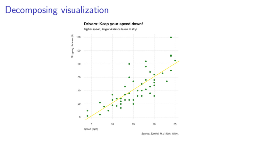
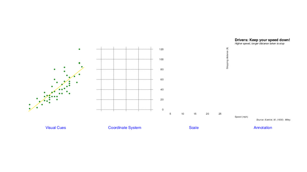
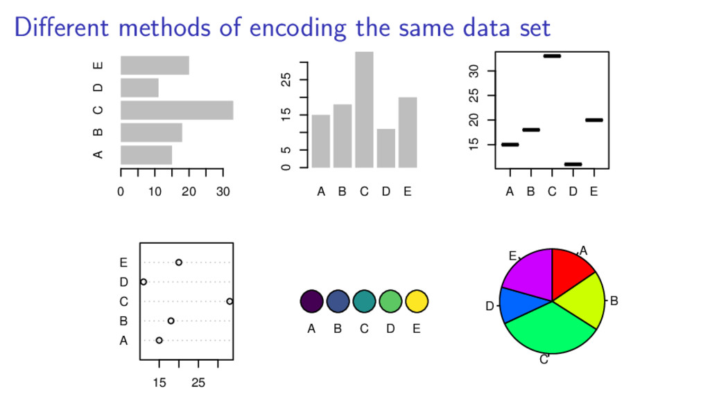
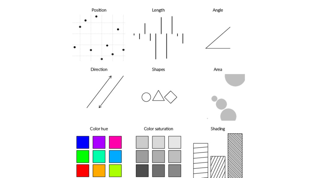
on identical but nonaligned scales 3. Length 4. Angle. Slope 5. Direction 6. Area 7. Volume. Density. Color saturation 8. Color hue (W. Clevelan and R. Mcgrill, 1985)
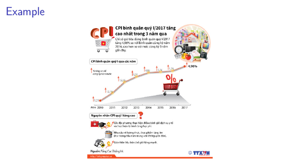
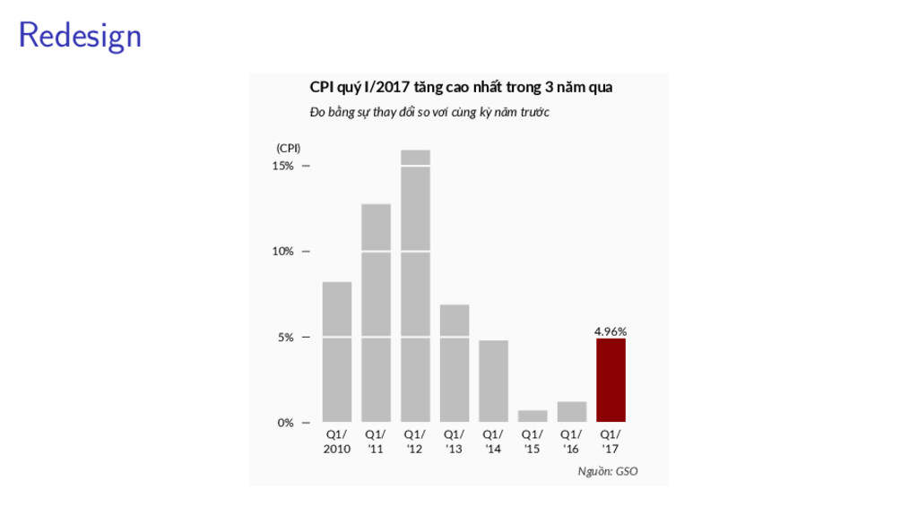
'14 Q1/ '15 Q1/ '16 Q1/ '17 0% 5% 10% 15% 4.96% CPI quý I/2017 tăng cao nhất trong 3 năm qua Đo bằng sự thay đổi so vơí cùng kỳ năm trước (CPI) Nguồn: GSO
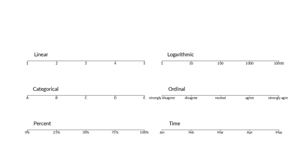
10000 Logarithmic A B C D E Categorical strongly disagree disagree neutral agree strongly agree Ordinal 0% 25% 50% 75% 100% Percent Jan Feb Mar Apr May Time
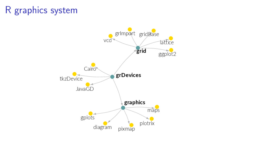
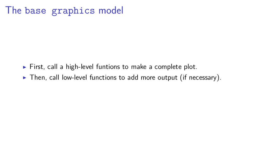
as selecting colors, fonts and output formats. Two (largely incompatible) packages built on top of the graphics engine: graphics: (aka base graphics) S’s legacy. graphics provides both high-level and low-level functions for creating plots. grid: unique to R. grid offers low-level tools used for building ggplot2 and lattice.
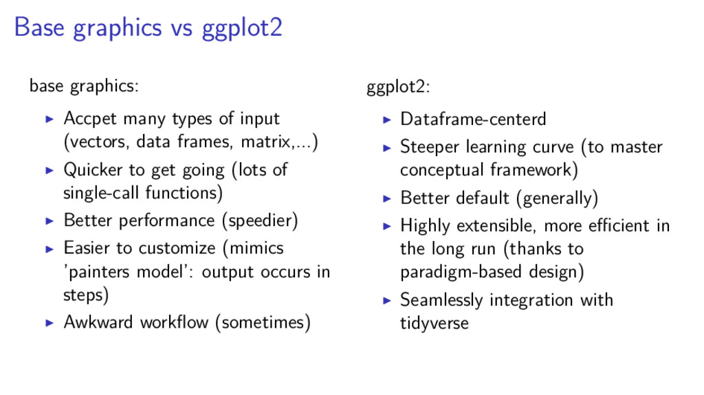
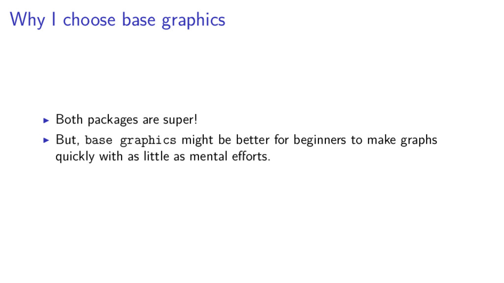
input (vectors, data frames, matrix,...) Quicker to get going (lots of single-call functions) Better performance (speedier) Easier to customize (mimics ’painters model’: output occurs in steps) Awkward workflow (sometimes) ggplot2: Dataframe-centerd Steeper learning curve (to master conceptual framework) Better default (generally) Highly extensible, more efficient in the long run (thanks to paradigm-based design) Seamlessly integration with tidyverse
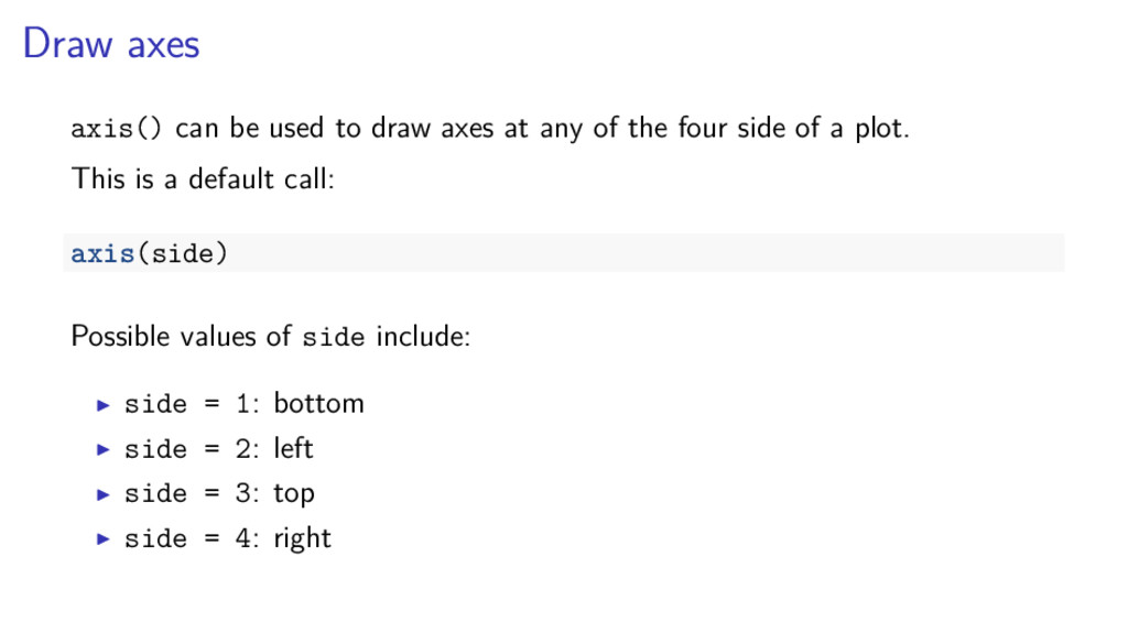
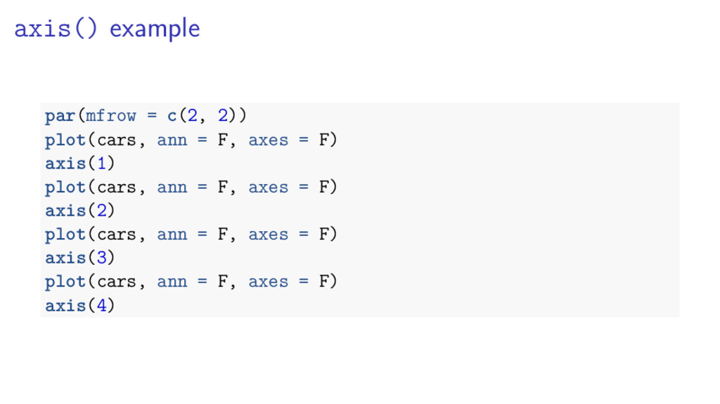
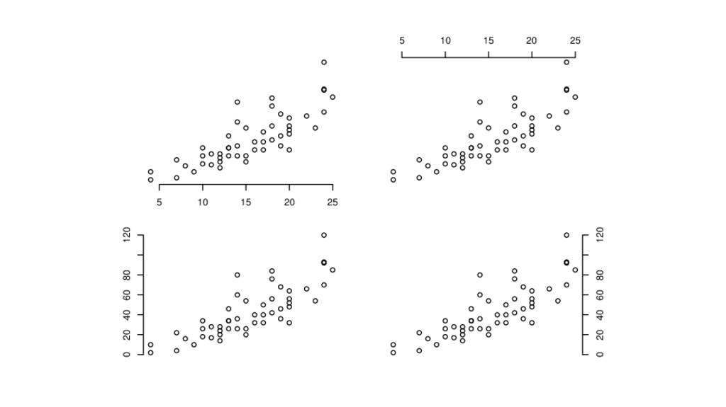
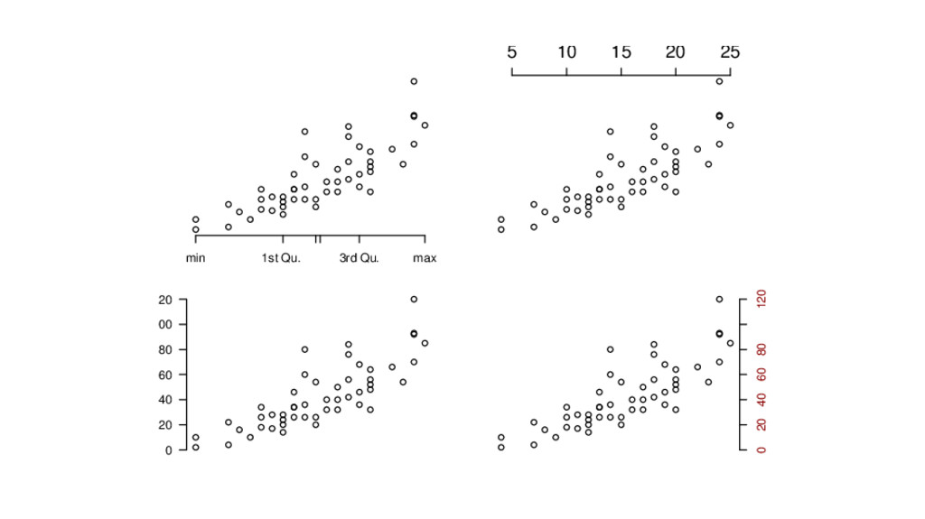
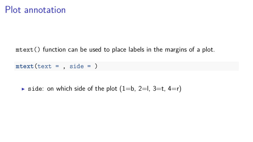
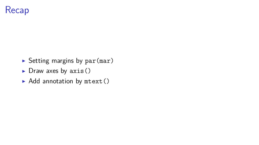
any of the four side of a plot. This is a default call: axis(side) Possible values of side include: side = 1: bottom side = 2: left side = 3: top side = 4: right
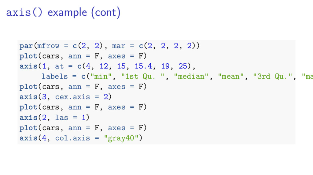
, line = , cex.axis = , col.axis = ) at: tick marks position labels: texts are to be made the tick marks las: labels rotation (0, 1, 2, 3) line: the number of lines into the margin at which the axis line will be drawn cex.axis and col.axis: size and color of axis labels
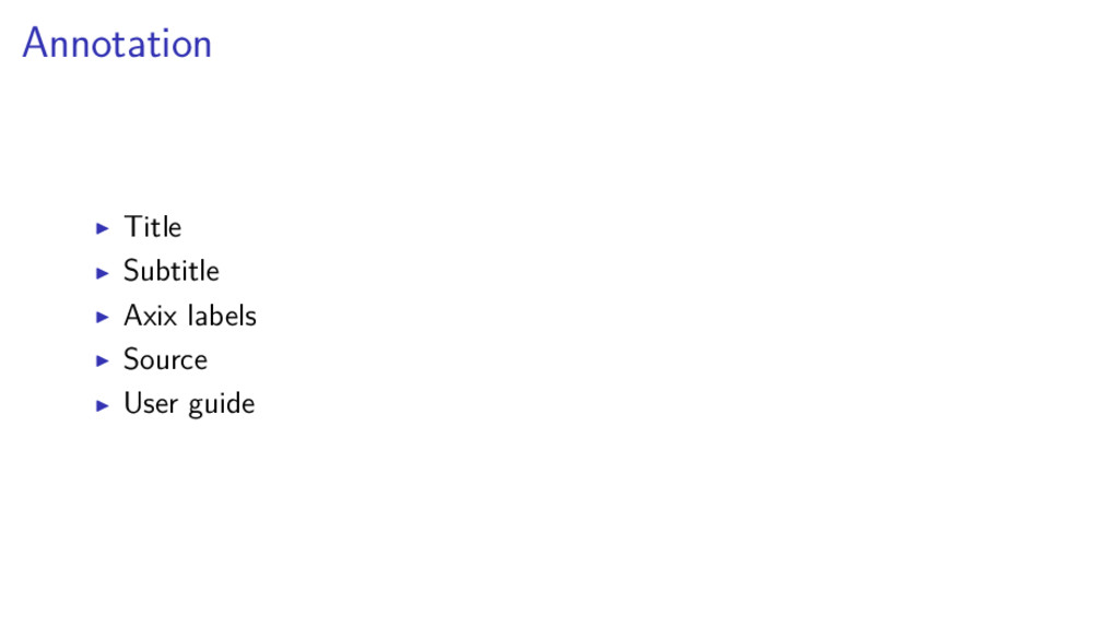
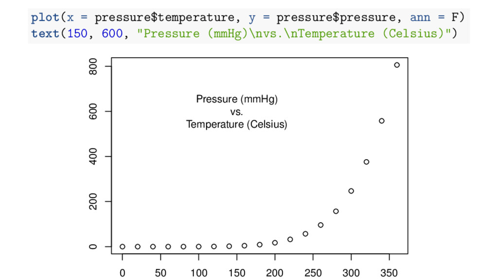
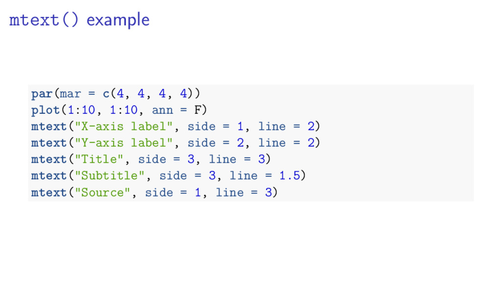
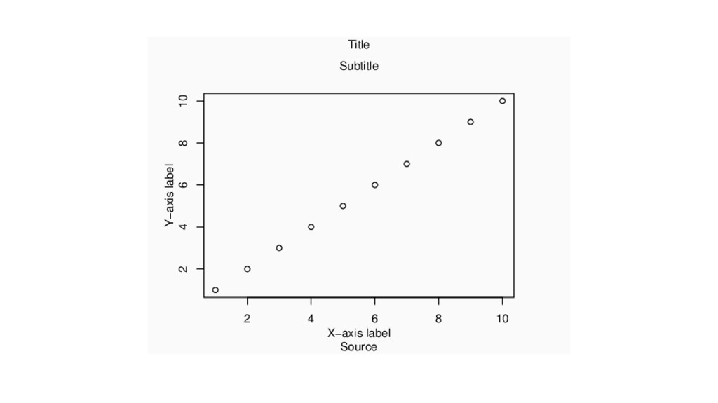
ann = F) mtext("X-axis label", side = 1, line = 2) mtext("Y-axis label", side = 2, line = 2) mtext("Title", side = 3, line = 3) mtext("Subtitle", side = 3, line = 1.5) mtext("Source", side = 1, line = 3)
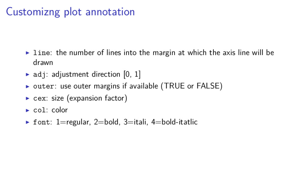
margin at which the axis line will be drawn adj: adjustment direction [0, 1] outer: use outer margins if available (TRUE or FALSE) cex: size (expansion factor) col: color font: 1=regular, 2=bold, 3=itali, 4=bold-itatlic
colors()) 7 default color sets (rainbow(), heat.colors(), terrain.colors(), topo.colors(), cm.colors(), gray.colors()) and a bunch of color packages (viridis, RColorBrewer, colorspace,. . . )
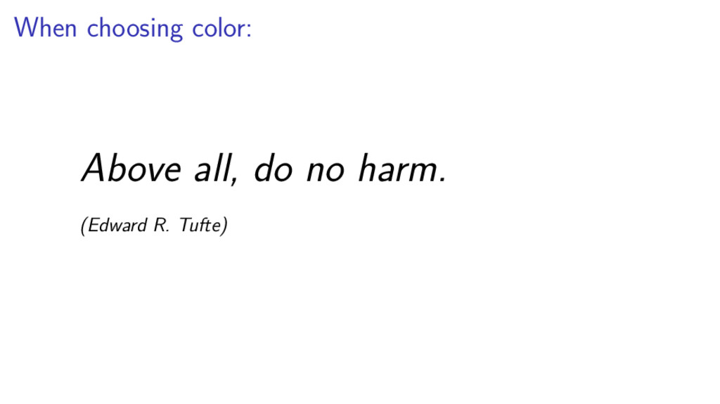
of color in visualization: to label (color as noun) to measure (color as quantity) to represent and imitate reality (color as representation) to decorate (color as beauty) (Edward R. Tufte)
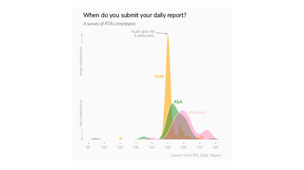
submissions less submissions rtLab R&A rtSolu�on When do you submit your daily report? A survey of RTA's employees Source: Form RTA_Daily_Report rtLab's guys did it pre�y early
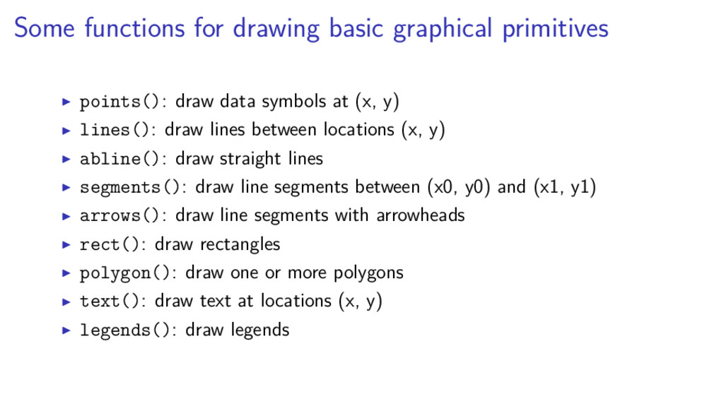
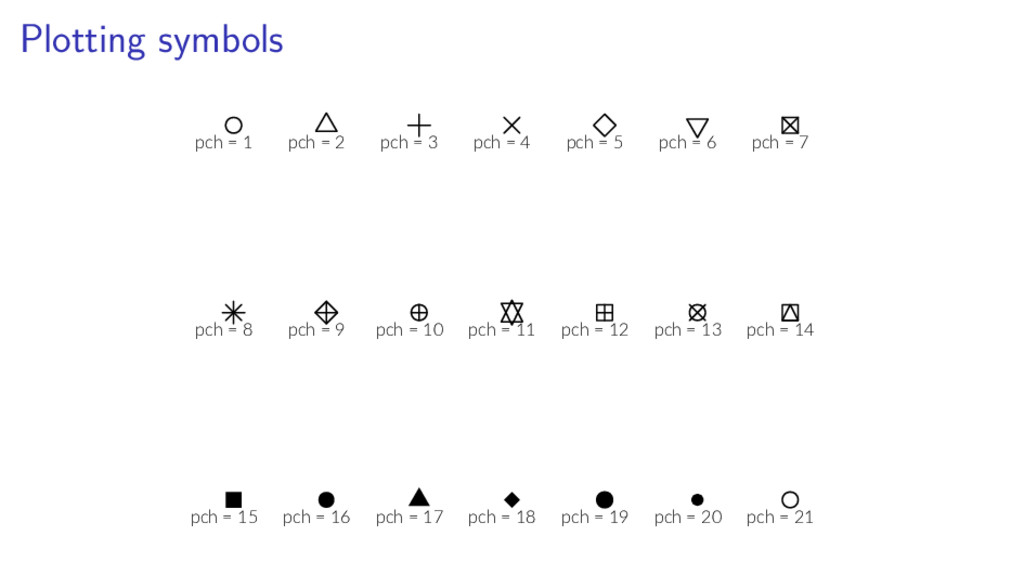
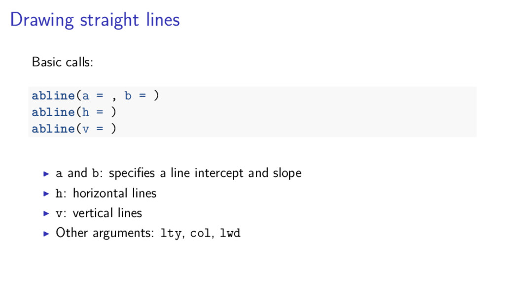
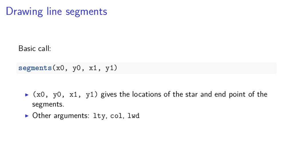
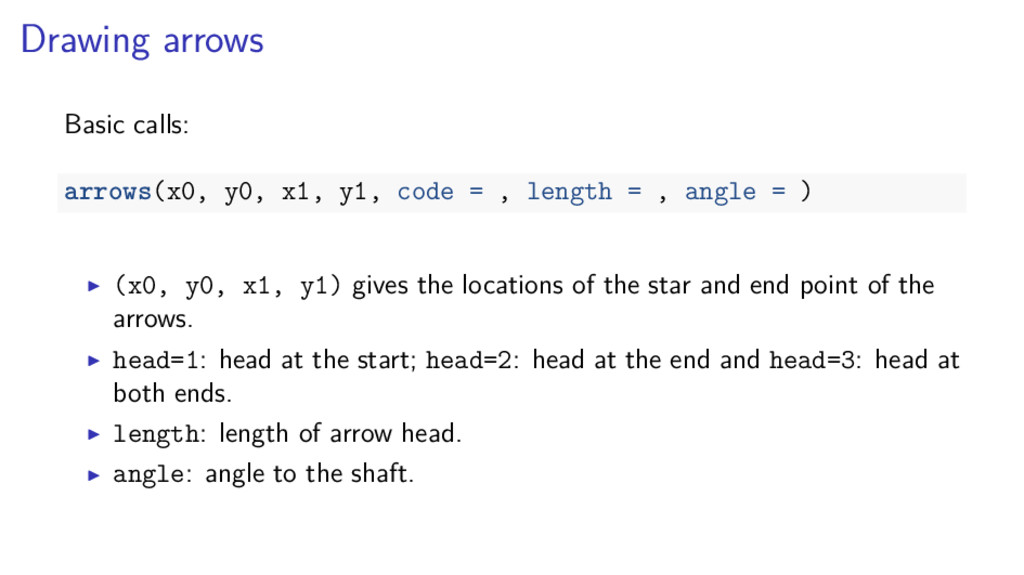
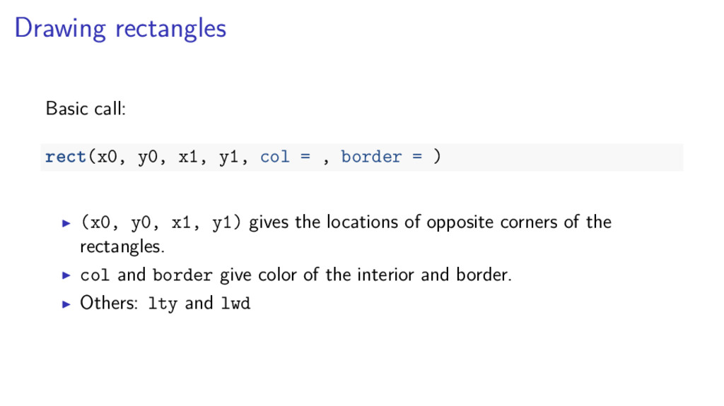
symbols at (x, y) lines(): draw lines between locations (x, y) abline(): draw straight lines segments(): draw line segments between (x0, y0) and (x1, y1) arrows(): draw line segments with arrowheads rect(): draw rectangles polygon(): draw one or more polygons text(): draw text at locations (x, y) legends(): draw legends
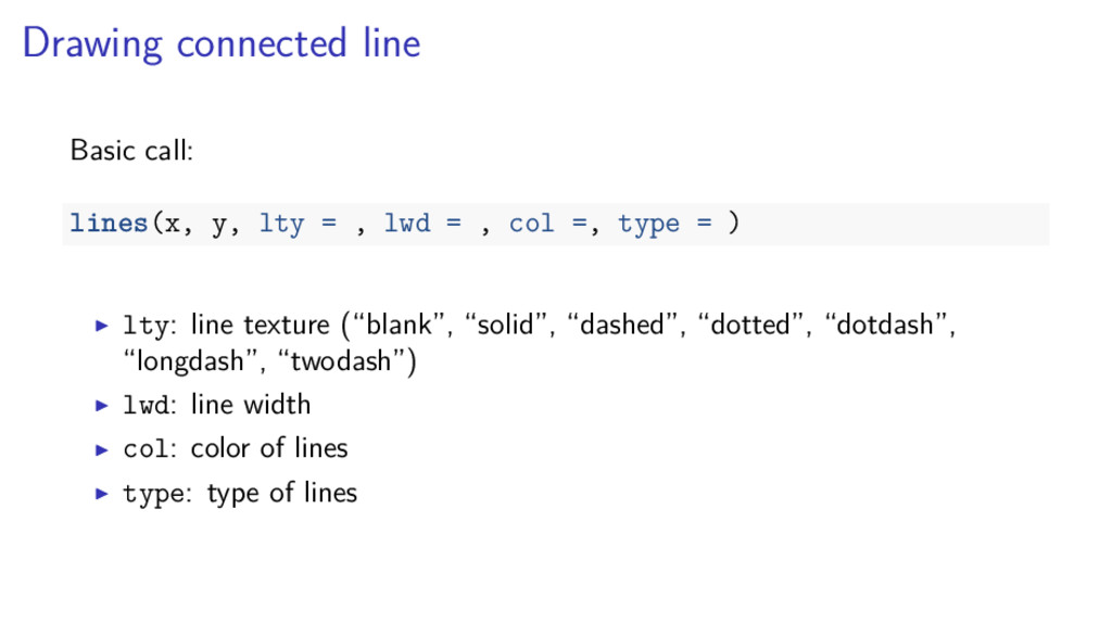
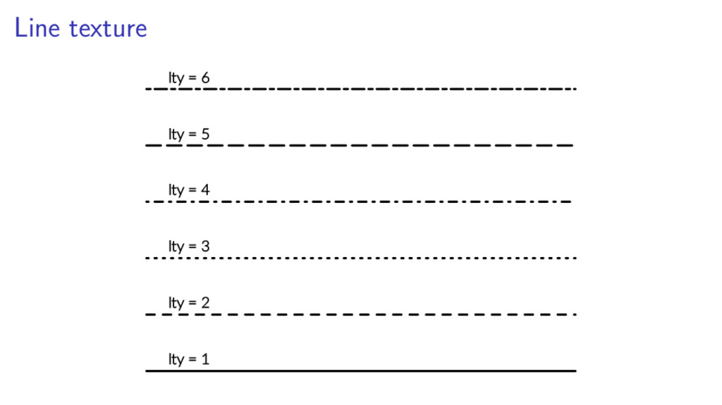
lwd = , col =, type = ) lty: line texture (“blank”, “solid”, “dashed”, “dotted”, “dotdash”, “longdash”, “twodash”) lwd: line width col: color of lines type: type of lines
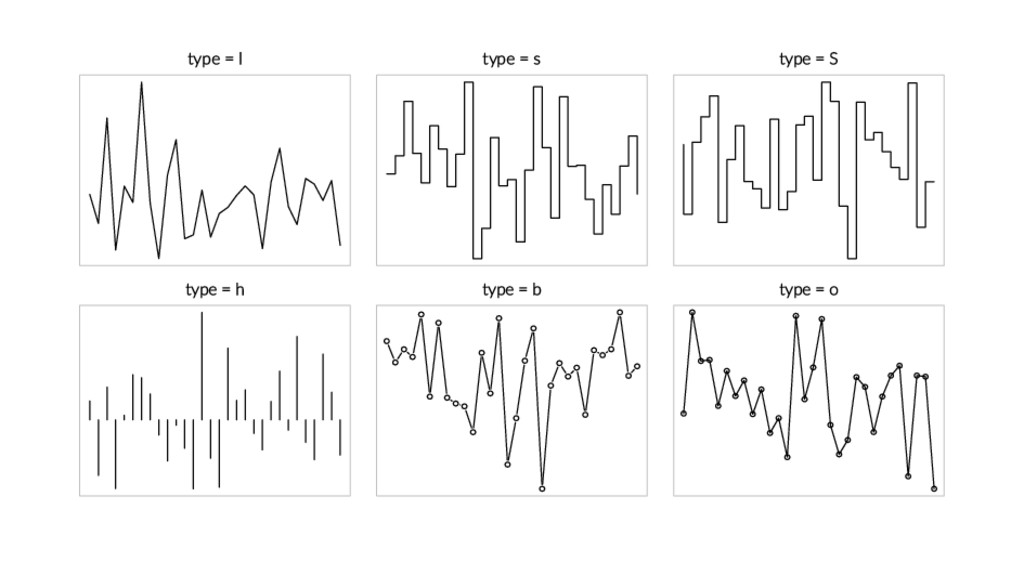
type="l": line graph (default) type="s": step - horizontal first type="S": step - vertical first type="h": high density plot type="b": both points and lines type="o": over-plotting of points and lines
, length = , angle = ) (x0, y0, x1, y1) gives the locations of the star and end point of the arrows. head=1: head at the start; head=2: head at the end and head=3: head at both ends. length: length of arrow head. angle: angle to the shaft.
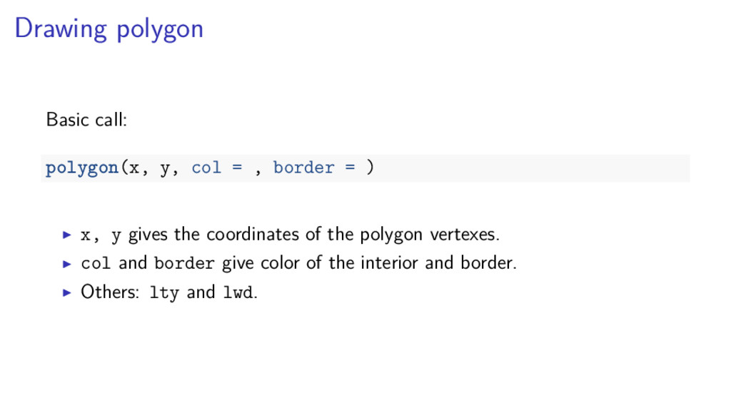
, border = ) (x0, y0, x1, y1) gives the locations of opposite corners of the rectangles. col and border give color of the interior and border. Others: lty and lwd
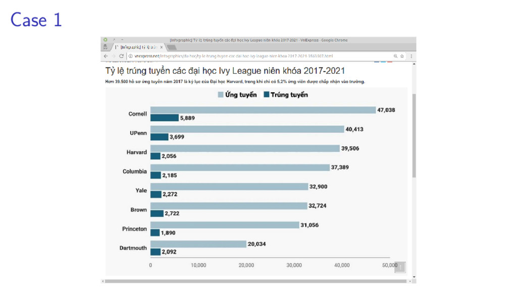
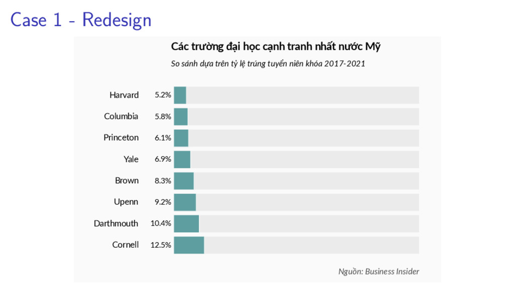
Columbia Harvard 12.5% 10.4% 9.2% 8.3% 6.9% 6.1% 5.8% 5.2% Các trường đại học cạnh tranh nhất nước Mỹ So sánh dựa trên tỷ lệ trúng tuyển niên khóa 2017-2021 Nguồn: Business Insider
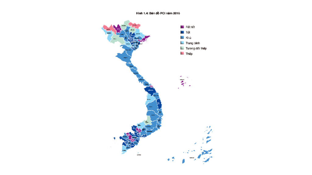
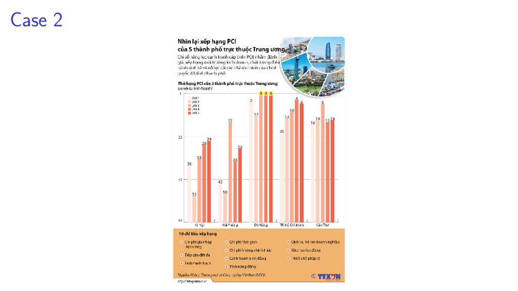
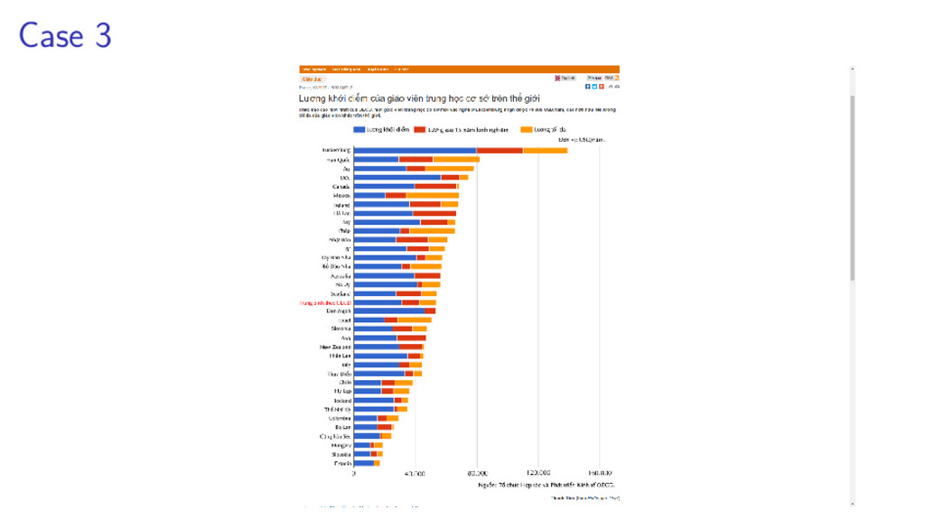
Phòng Hà Nội Cần Thơ Sài Gòn Đà Nẵng 36 24 45 28 5 1 20 6 16 14 Thứ hạng PCI của 5 thành phố trực thuộc TW Chỉ số PCI đo lường chất lượng môi trường kinh doanh, điều hành kinh tế và cải cách hành chính của chính quyền 63 tỉnh/thành phố Nguồn: VCCI
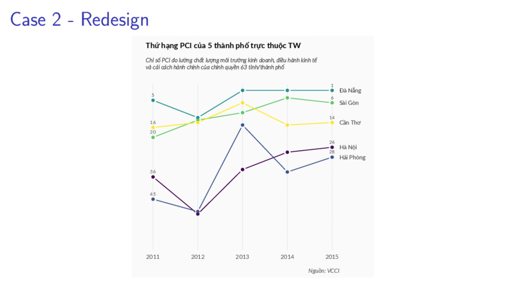
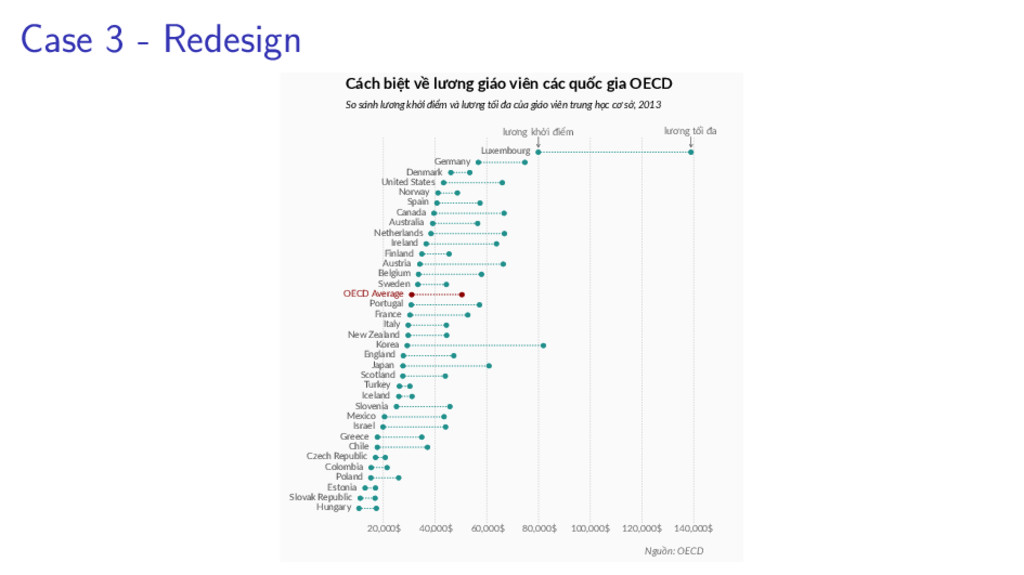
140,000$ Hungary Slovak Republic Estonia Poland Colombia Czech Republic Chile Greece Israel Mexico Slovenia Iceland Turkey Scotland Japan England Korea New Zealand Italy France Portugal OECD Average Sweden Belgium Austria Finland Ireland Netherlands Australia Canada Spain Norway United States Denmark Germany Luxembourg lương khởi điểm lương tối đa Cách biệt về lương giáo viên các quốc gia OECD So sánh lương khởi điểm và lương tối đa của giáo viên trung học cơ sở, 2013 Nguồn: OECD
https://eagereyes.org/, Robert Kosara http://junkcharts.typepad.com/, Kaiser Fung http://www.perceptualedge.com/library.php, Stephen Few http://www.thefunctionalart.com/, Alberto Cairo http://www.visualisingdata.com/, Andy Kirk http://www.randalolson.com/blog/, Randal S. Olson
Edward R.Tufte Visual Explanations, Edward R.Tufte Envisioning Information, Edward R.Tufte Beautiful Evidence, Edward R.Tufte The Elements of Graphing Data, William Cleveland Visualizing Data, William Cleveland Semiology of Graphics, Jacques Bertin Exploratory Data Analysis, John W. Tukey
Cairo The Functional Art, Albert Cairo Visualize This, Nathan Yau Data Points, Nathan Yau Information Dashboard Design, Stephen Few Show Me The Numbers, Stephen Few Now you see it, Stephen Few Signal, Stephen Few Storytelling With Data, Cole Nussbaumer Knaflic Creating More Effective Graphs, Naomi B. Robbins The Wall Street Journal Guide to Information Graphics, Dona M. Wong
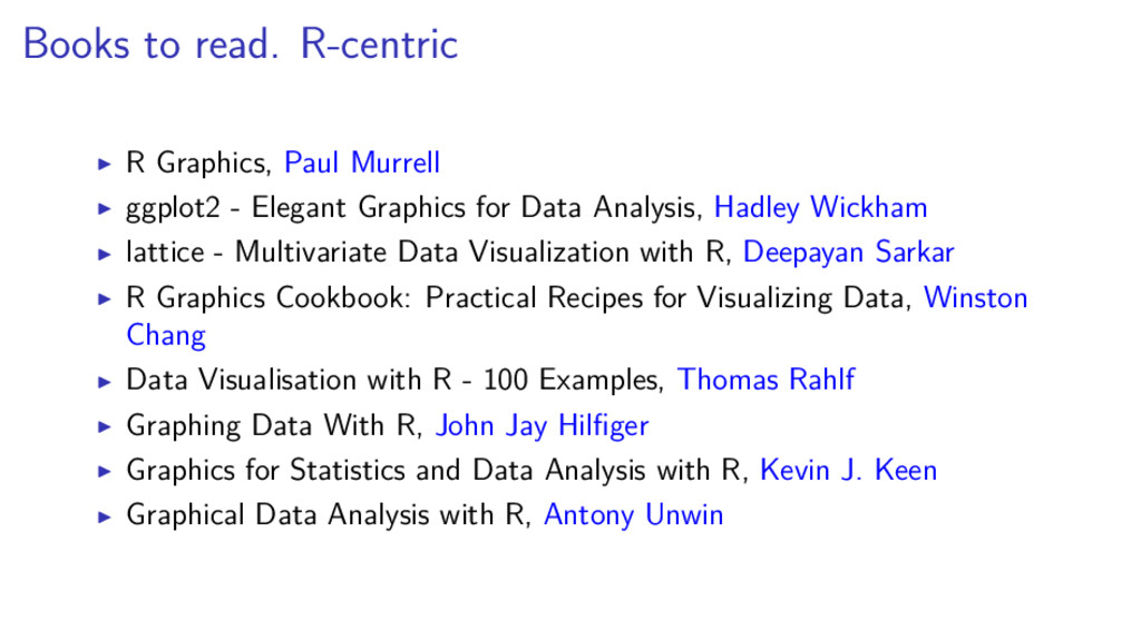
Elegant Graphics for Data Analysis, Hadley Wickham lattice - Multivariate Data Visualization with R, Deepayan Sarkar R Graphics Cookbook: Practical Recipes for Visualizing Data, Winston Chang Data Visualisation with R - 100 Examples, Thomas Rahlf Graphing Data With R, John Jay Hilfiger Graphics for Statistics and Data Analysis with R, Kevin J. Keen Graphical Data Analysis with R, Antony Unwin
Driven Design, Andy Kirk Data Visualization: A Successful Design Process, Andy Kirk Information Visualization: Perception for Design, Colin Ware Visual Thinking for Design, Colin Ware Designing Data Visualizations: Representing Informational Relationships, Noah Iliinsky Visualization Analysis and Design, Tamara Munzner Design for Information, Isabel Meirelles The Non-designer’s Design Book, Robin Williams