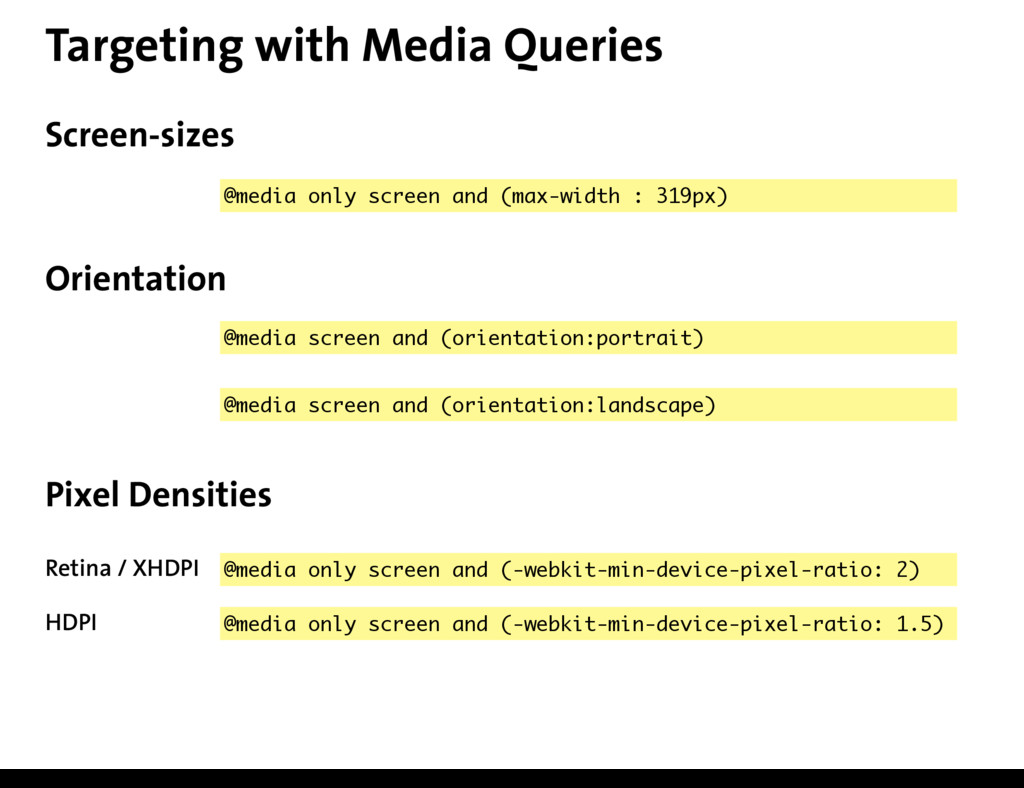
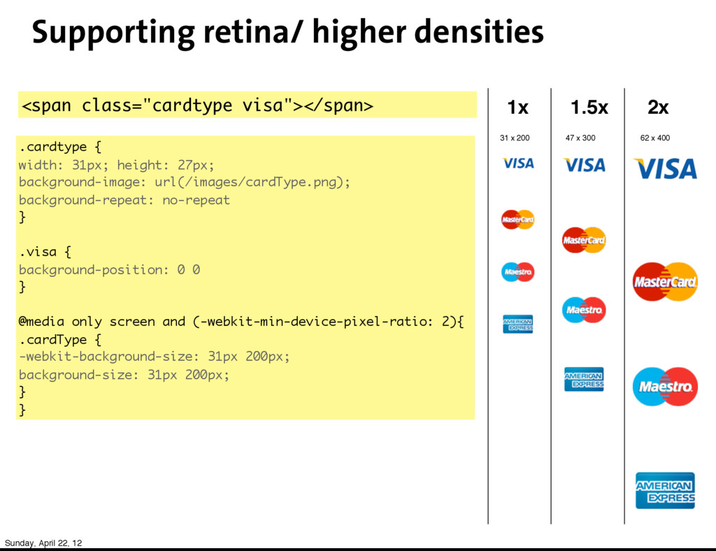
62 x 400 1x 1.5x 2x <span class="cardtype visa"></span> .cardtype { width: 31px; height: 27px; background-image: url(/images/cardType.png); background-repeat: no-repeat } .visa { background-position: 0 0 } @media only screen and (-webkit-min-device-pixel-ratio: 2){ .cardType { -webkit-background-size: 31px 200px; background-size: 31px 200px; } } Sunday, April 22, 12
 cleartrip
 saka2jp
 ajstarks
 kenichiota0711
 bengo4com
 design_dolphins
 kintone
 akatsuki174
 lw
lw
 poteboy
 shinn
shinn
 spring_aki
 daitasu
 62gerente
 charlesmeaden
 cassininazir
 baasie
 greggifford
 mayatellez
 aleyda
 3n
3n
 thekraken
 ianozsvald
 swwweet
 jonyablonski