Share
Slides from my talk on responsive development at the Nashville Google Developer Group & Nashville Mobile Development Group.
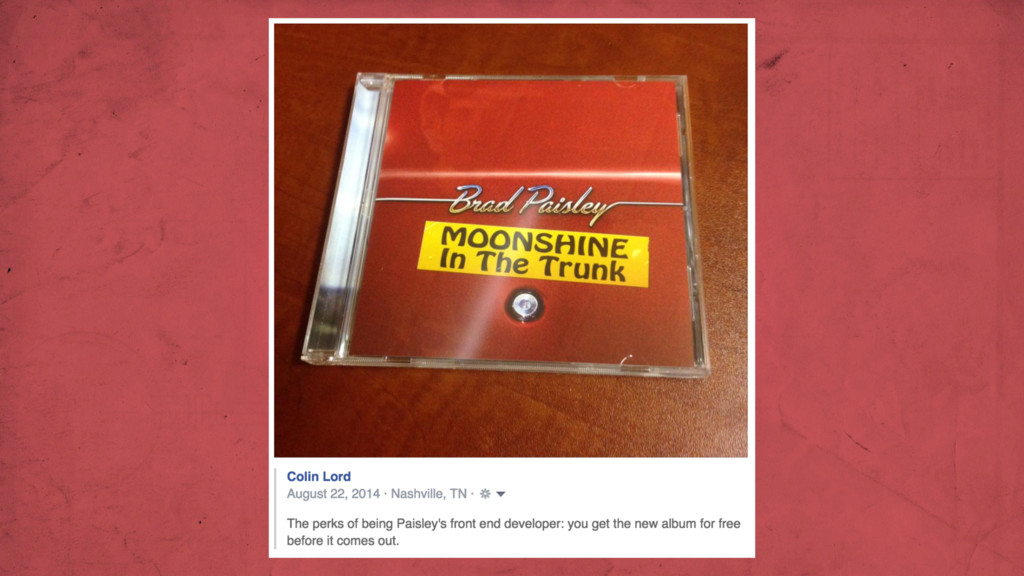
 colinlord
 chmikata
 jukishiya
 kintotechdev
 appleboy
 takafumisu2uk1
 y150saya
 uhyo
uhyo
 askul
askul
 moznion
 vtryo
vtryo
 murabayashi
 oomatomo
 reverentgeek
 maltzj
 lynnandtonic
 afnizarnur
 elsirapls
 greggifford
 axbom
axbom
 katarinadahlin
 aleyda
 baasie
 cassininazir
 inesmontani
![LET’S CHAT [email protected] @colinlord](https://files.speakerdeck.com/presentations/55519b60b4500131d8f07625813d8974/slide_19.jpg)