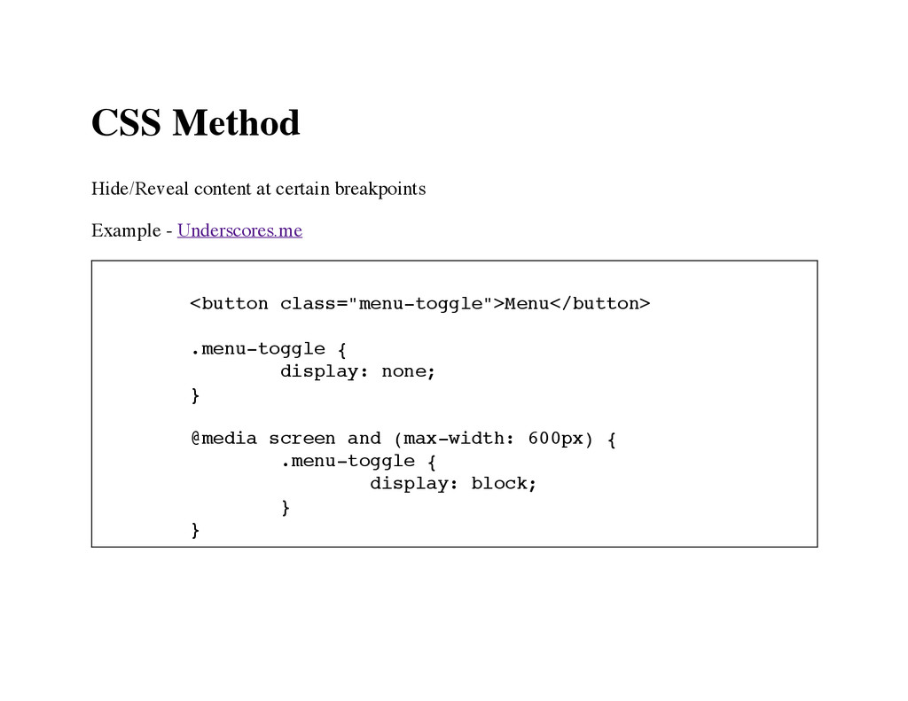
< b u t t o n c l a s s = " m e n u - t o g g l e " > M e n u < / b u t t o n > . m e n u - t o g g l e { d i s p l a y : n o n e ; } @ m e d i a s c r e e n a n d ( m a x - w i d t h : 6 0 0 p x ) { . m e n u - t o g g l e { d i s p l a y : b l o c k ; } }
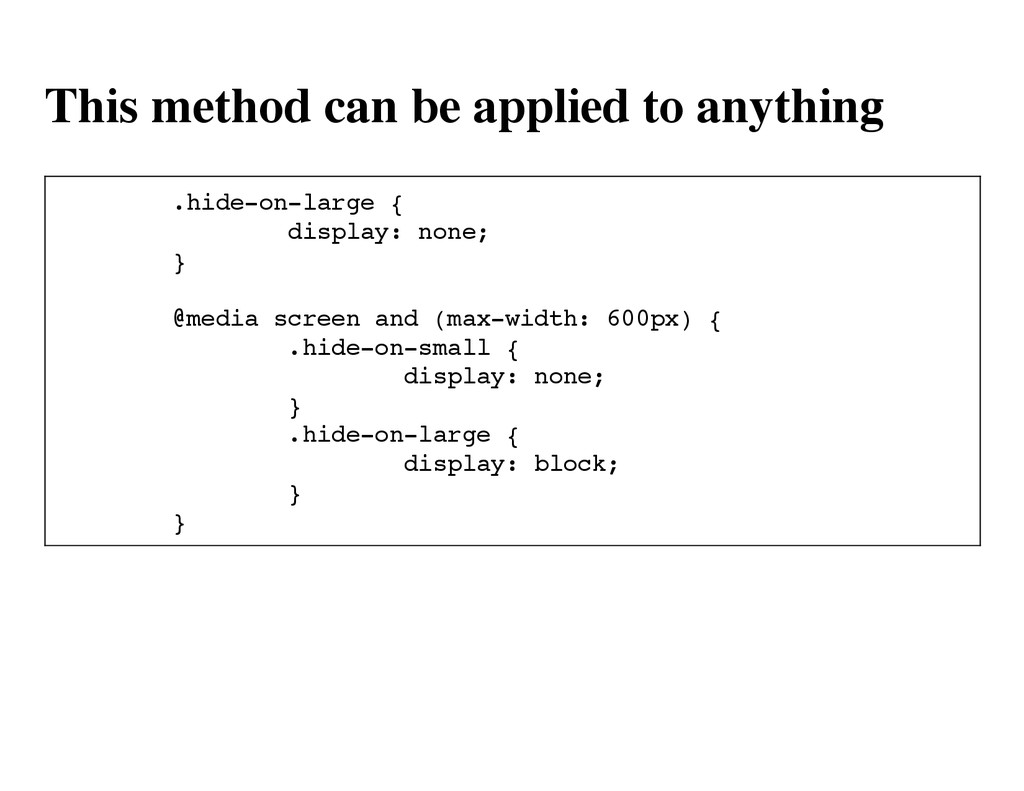
d e - o n - l a r g e { d i s p l a y : n o n e ; } @ m e d i a s c r e e n a n d ( m a x - w i d t h : 6 0 0 p x ) { . h i d e - o n - s m a l l { d i s p l a y : n o n e ; } . h i d e - o n - l a r g e { d i s p l a y : b l o c k ; } }
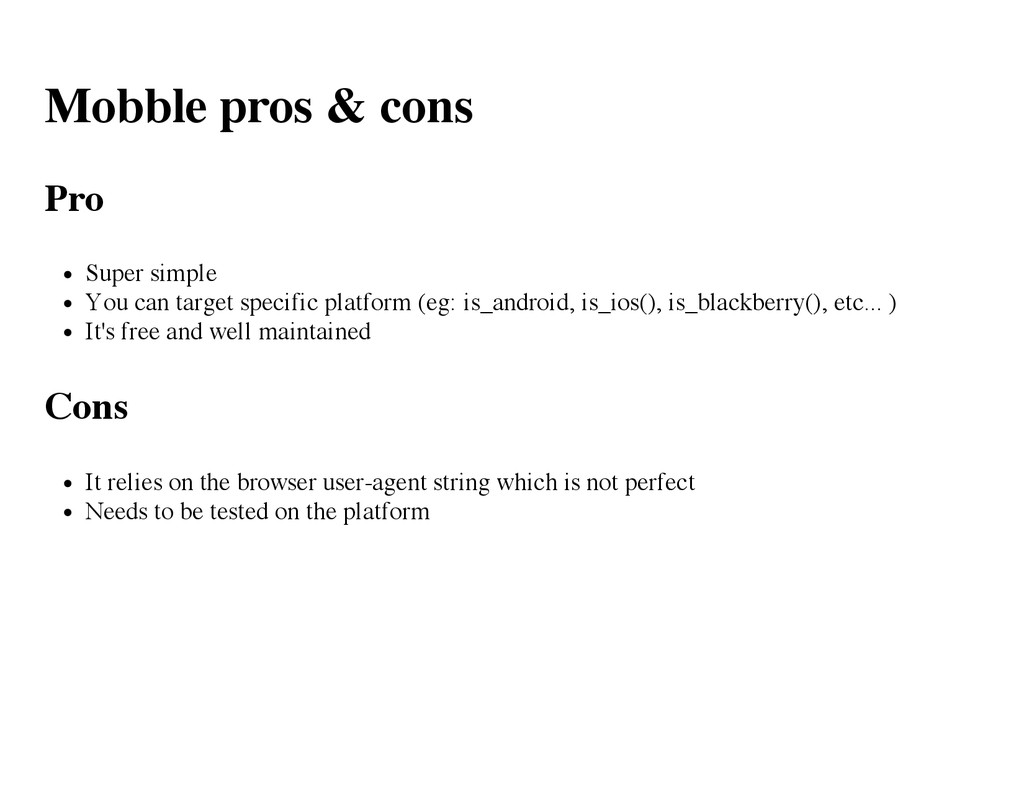
of mobile devices and tablets. It is developed using Mobile_Detect which is also used by numerous others plaftorms. Mobile_Detect is a lightweight PHP class for detecting mobile devices (including tablets). It uses the User-Agent string combined with specific HTTP headers to detect the mobile environment.
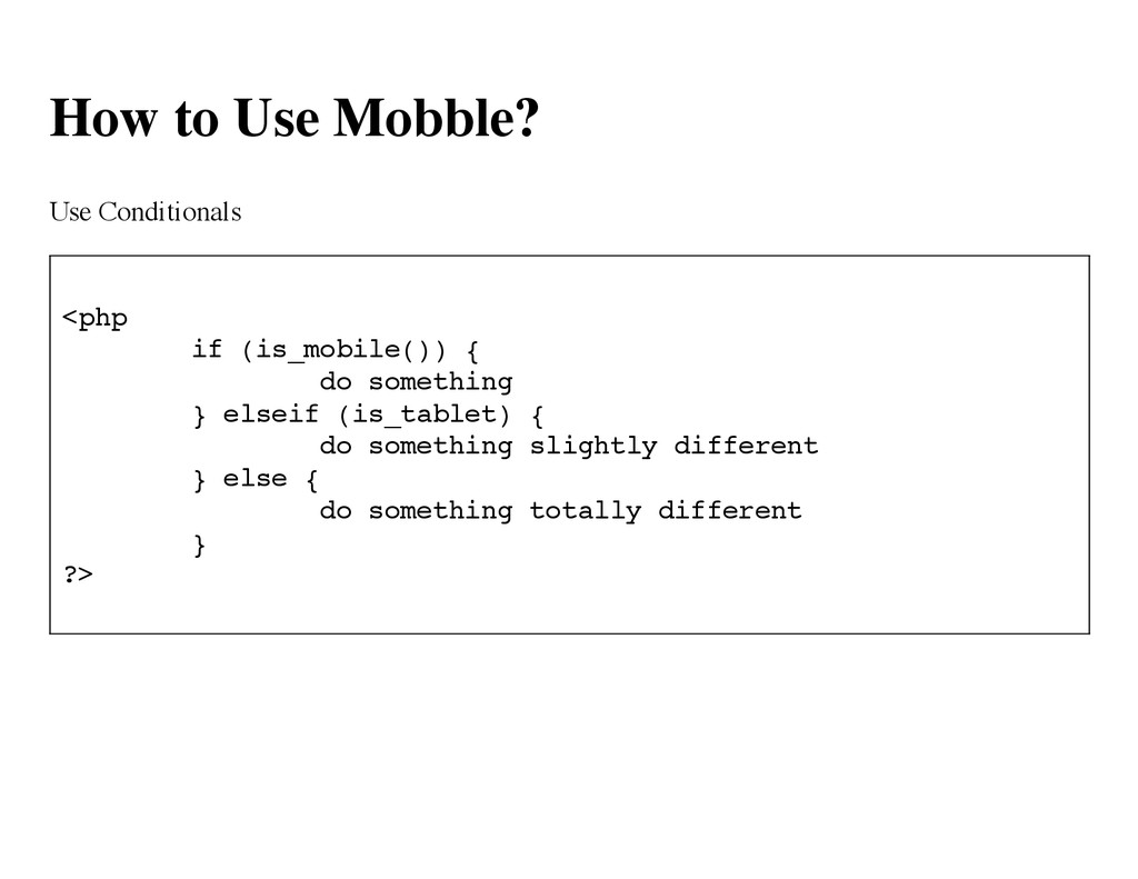
i f ( i s _ m o b i l e ( ) ) { d o s o m e t h i n g } e l s e i f ( i s _ t a b l e t ) { d o s o m e t h i n g s l i g h t l y d i f f e r e n t } e l s e { d o s o m e t h i n g t o t a l l y d i f f e r e n t } ? >
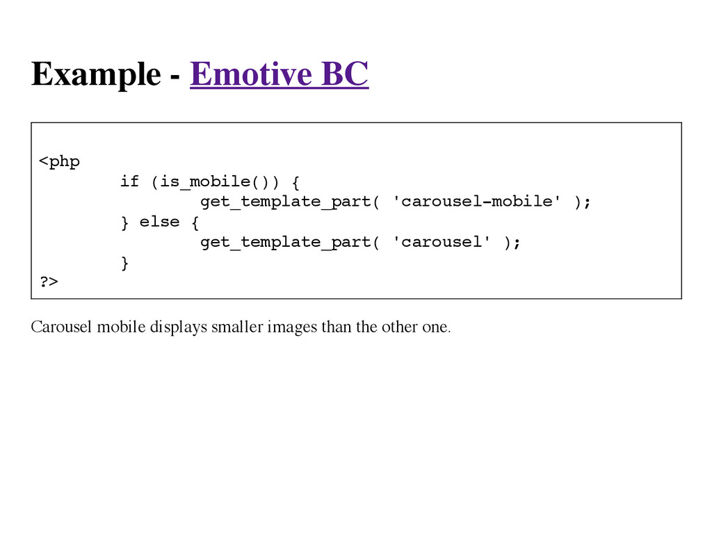
( i s _ m o b i l e ( ) ) { g e t _ t e m p l a t e _ p a r t ( ' c a r o u s e l - m o b i l e ' ) ; } e l s e { g e t _ t e m p l a t e _ p a r t ( ' c a r o u s e l ' ) ; } ? > Carousel mobile displays smaller images than the other one.
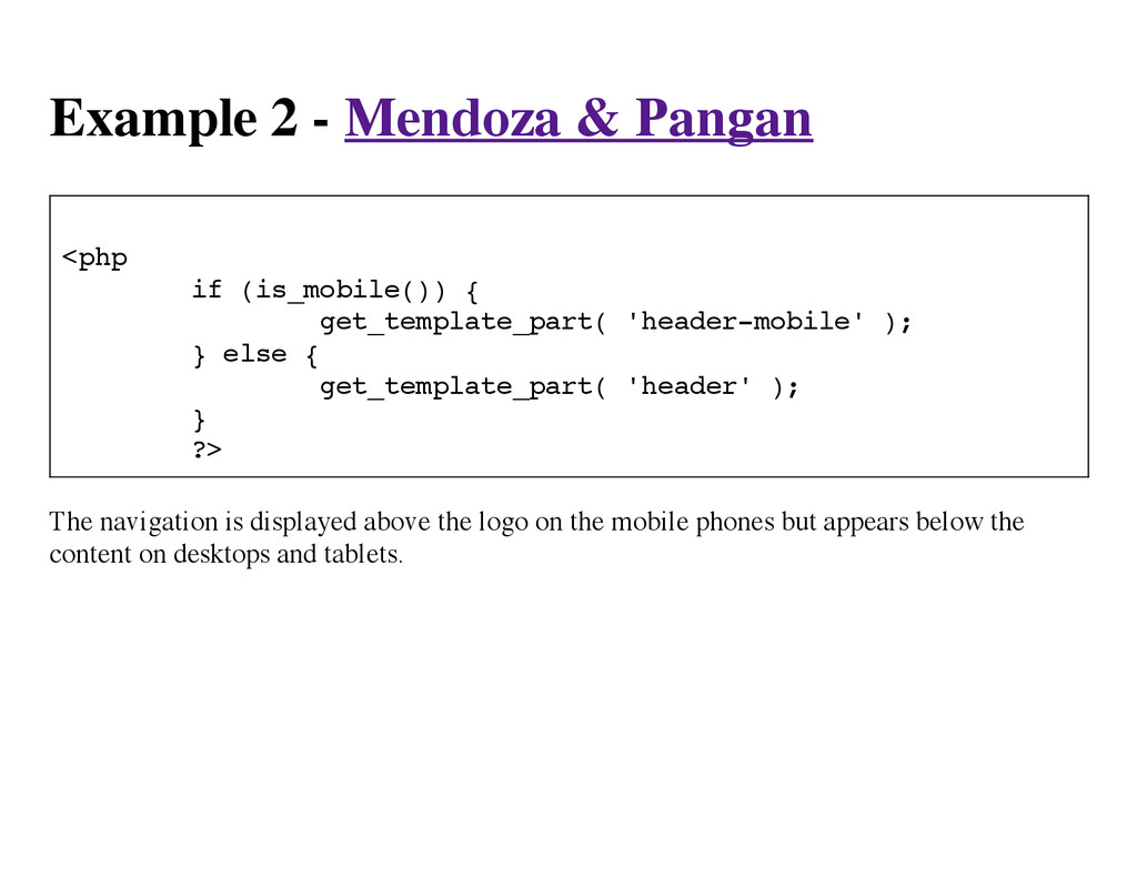
i f ( i s _ m o b i l e ( ) ) { g e t _ t e m p l a t e _ p a r t ( ' h e a d e r - m o b i l e ' ) ; } e l s e { g e t _ t e m p l a t e _ p a r t ( ' h e a d e r ' ) ; } ? > The navigation is displayed above the logo on the mobile phones but appears below the content on desktops and tablets.
specific platform (eg: is_android, is_ios(), is_blackberry(), etc... ) It's free and well maintained Cons It relies on the browser user-agent string which is not perfect Needs to be tested on the platform
 crondeau
 georgesinnott
 mfcabrera
 cbtlibrary
 matsu0228
 juanmartin2026
 denkiwakame
 stardy
 signer
 sciencetokyo
 akiraasano
 sapi_kawahara
 palkan
 jonoalderson
 bethany
 codingconduct
 honzajavorek
 addyosmani
 aleyda
 lara
lara
 rabernat
 techseoconnect
 jacobtomlinson
 katiecoart