Upgrade to Pro
— share decks privately, control downloads, hide ads and more …
Speaker Deck
Features
Speaker Deck
PRO
Sign in
Sign up for free
Search
Search
Bootstrap-让Web开发更迅速、简单
Search
Sponsored
·
Ship Features Fearlessly
Turn features on and off without deploys. Used by thousands of Ruby developers.
→
cssrain
July 14, 2014
Technology
190
1
Share
Embed
Copy iframe code
Copy JS code
Copy link
Start on current slide
Bootstrap-让Web开发更迅速、简单
cssrain
July 14, 2014
More Decks by cssrain
See All by cssrain
UED工作流程分享和交流
cssrain
1
480
解读HTML
cssrain
0
150
解读HTML5
cssrain
2
180
基础CSS(1)
cssrain
0
160
基础CSS(2)
cssrain
0
120
高效的CSS
cssrain
0
160
高级CSS—继承
cssrain
0
140
PhoneGap分享和交流
cssrain
0
110
PhoneGap实践
cssrain
0
87
Other Decks in Technology
See All in Technology
地元にいないローカルオーガナイザーの立ち回り
uvb_76
1
540
先取りMaven4 ~16年ぶりのメジャーアップデート、その進化とは?~
ogiwarat
0
140
はじめてのDatadog
kairim0
0
280
MIERUNE JCT 発表資料「宇宙から伊能忠敬ごっこ」
syuchimu
0
190
noUncheckedIndexedAccess、3時間、1万円。 / noUncheckedIndexedAccess, 3 Hours, 10,000 JPY.
kaonavi
1
310
個人最適 から 全体最適 へ AI情報共有会・AIギルド・AI-DLC で進める カンリーの組織展開
rfdnxbro
0
1.6k
データ基盤をDataformで整えた話 〜 開発環境を添えて 〜
takapy
0
110
BigQuery の Cross-cloud Lakehouse への歩み
phaya72
2
570
Oracle Cloud Infrastructure IaaS 新機能アップデート 2026/3 - 2026/5
oracle4engineer
PRO
1
200
React、まだ楽しくて草
uhyo
7
4.1k
AI Testing Talks: Challenges of Applying AI in Software Testing: From Hype to Practical Use
exactpro
PRO
1
130
タクシーアプリ『GO』の実践的データ活用
mot_techtalk
3
160
Featured
See All Featured
[Rails World 2023 - Day 1 Closing Keynote] - The Magic of Rails
eileencodes
38
2.9k
The State of eCommerce SEO: How to Win in Today's Products SERPs - #SEOweek
aleyda
2
11k
How to Grow Your eCommerce with AI & Automation
katarinadahlin
PRO
1
200
Chasing Engaging Ingredients in Design
codingconduct
0
210
What Being in a Rock Band Can Teach Us About Real World SEO
427marketing
0
250
Learning to Love Humans: Emotional Interface Design
aarron
275
41k
Save Time (by Creating Custom Rails Generators)
garrettdimon
PRO
32
3.3k
Creating an realtime collaboration tool: Agile Flush - .NET Oxford
marcduiker
35
2.5k
Beyond borders and beyond the search box: How to win the global "messy middle" with AI-driven SEO
davidcarrasco
3
150
More Than Pixels: Becoming A User Experience Designer
marktimemedia
3
430
Taking LLMs out of the black box: A practical guide to human-in-the-loop distillation
inesmontani
PRO
3
2.3k
個人開発の失敗を避けるイケてる考え方 / tips for indie hackers
panda_program
122
22k
Transcript
Bootstrap3 简洁、直观、强悍、移动设备优先的前端开发框架, 让web开发更迅速、简单。 UED分享 · 交流 http://cssrain.github.io
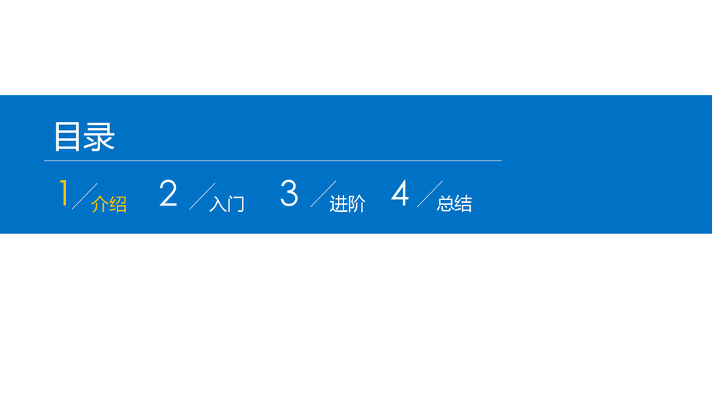
目录 1 介绍 2 入门 3 进阶 4 总结
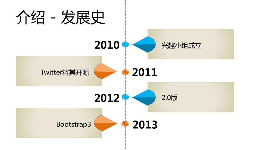
介绍 - 发展史 2013 2012 2011 2010 兴趣小组成立 Twitter将其开源 Bootstrap3
2.0版
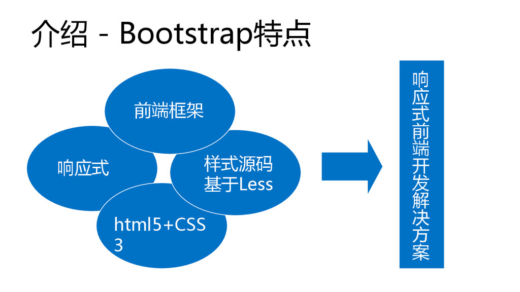
介绍 - Bootstrap特点 响应式 CSS3 响 应 式 前 端
开 发 解 决 方 案 html5+CSS 3 样式源码 基于Less 前端框架
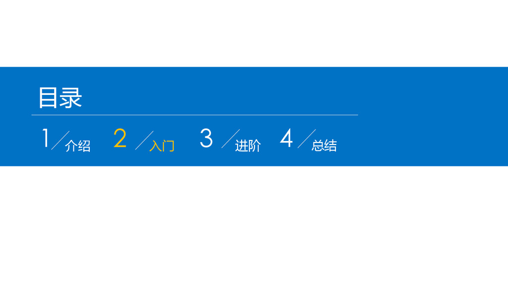
目录 1 介绍 2 入门 3 进阶 4 总结
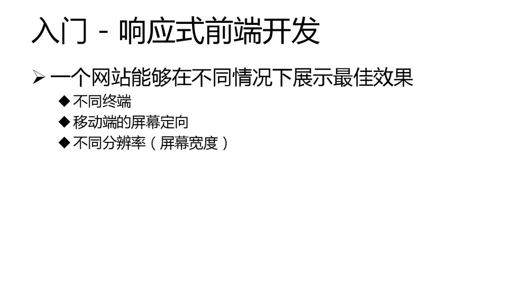
入门 - 响应式前端开发 一个网站能够在不同情况下展示最佳效果 不同终端 移动端的屏幕定向 不同分辨率(屏幕宽度)
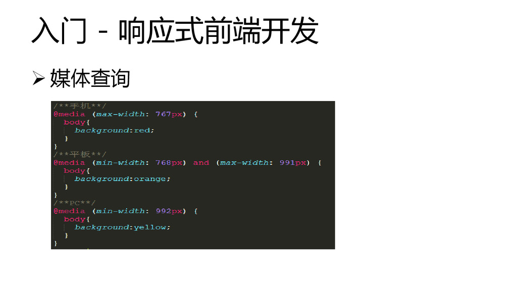
入门 - 响应式前端开发 媒体查询
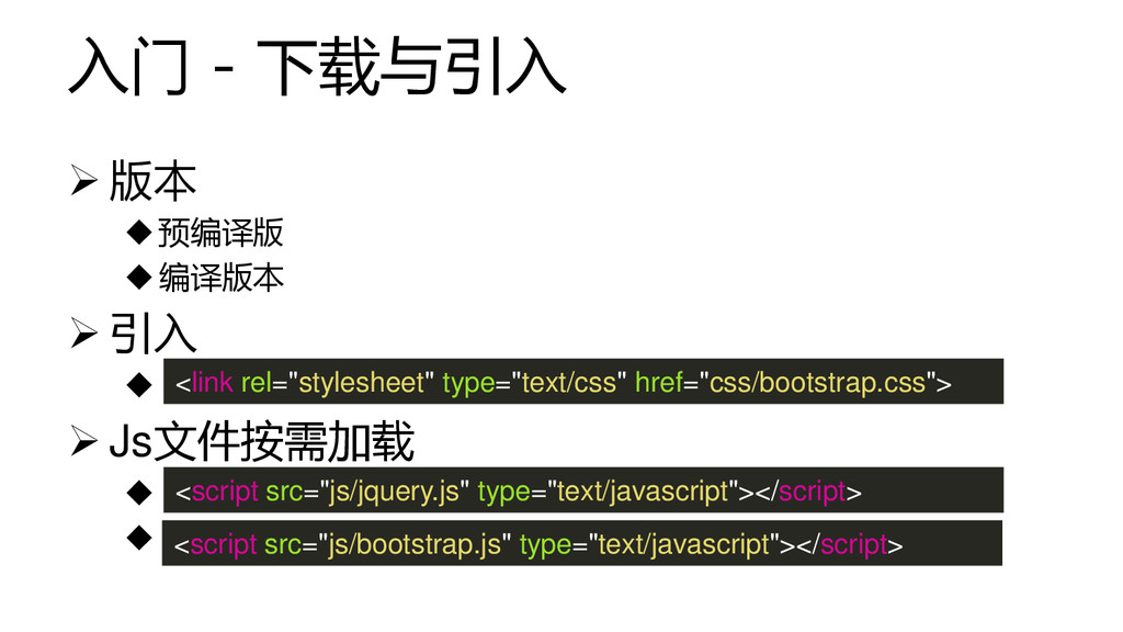
入门 - 下载与引入 版本 预编译版 编译版本 引入
Js文件按需加载 <link rel="stylesheet" type="text/css" href="css/bootstrap.css"> <script src="js/jquery.js" type="text/javascript"></script> <script src="js/bootstrap.js" type="text/javascript"></script>
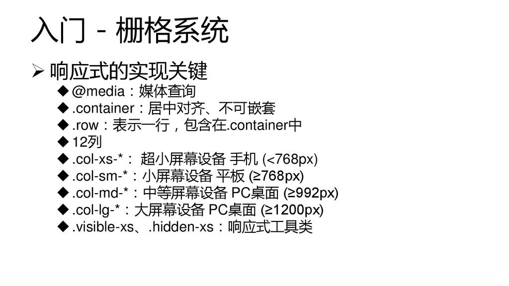
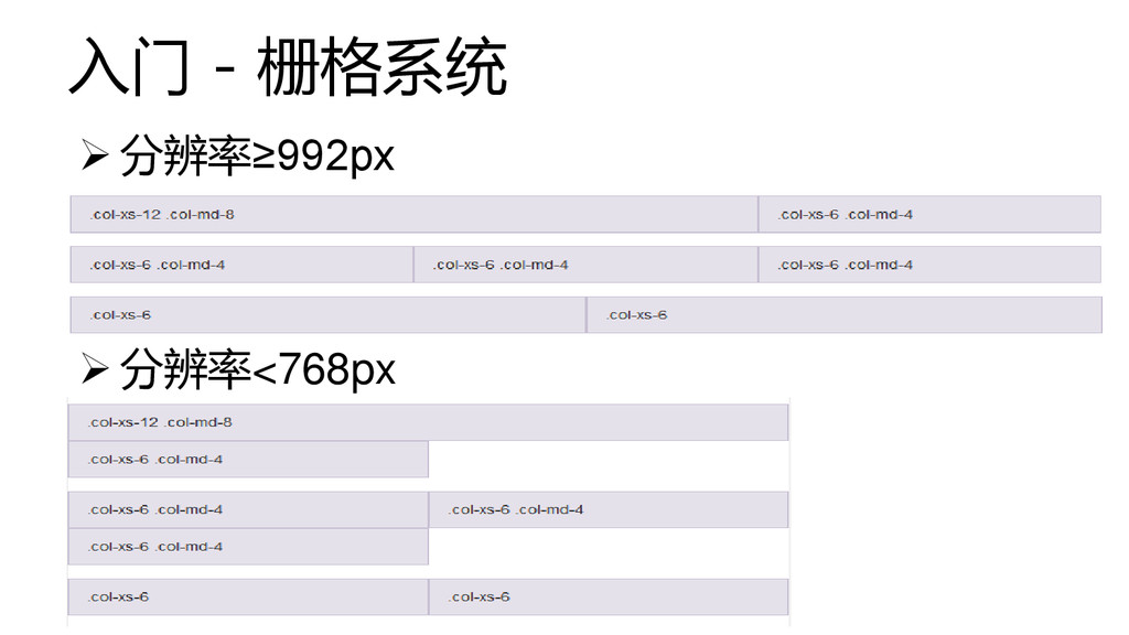
入门 - 栅格系统 响应式的实现关键 @media:媒体查询 .container:居中对齐、不可嵌套 .row:表示一行,包含在.container中 12列 .col-xs-*:
超小屏幕设备 手机 (<768px) .col-sm-*:小屏幕设备 平板 (≥768px) .col-md-*:中等屏幕设备 PC桌面 (≥992px) .col-lg-*:大屏幕设备 PC桌面 (≥1200px) .visible-xs、.hidden-xs:响应式工具类
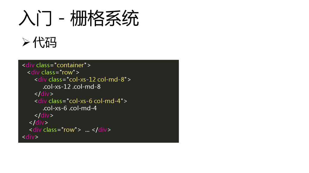
入门 - 栅格系统 <div class="container"> <div class="row"> <div class="col-xs-12 col-md-8">
.col-xs-12 .col-md-8 </div> <div class="col-xs-6 col-md-4"> .col-xs-6 .col-md-4 </div> </div> <div class="row"> ... </div> <div> 代码
入门 - 栅格系统 分辨率≥992px 分辨率<768px
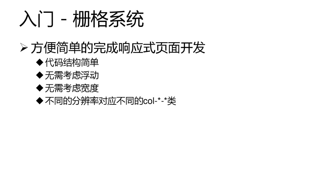
入门 - 栅格系统 方便简单的完成响应式页面开发 代码结构简单 无需考虑浮动 无需考虑宽度 不同的分辨率对应不同的col-*-*类
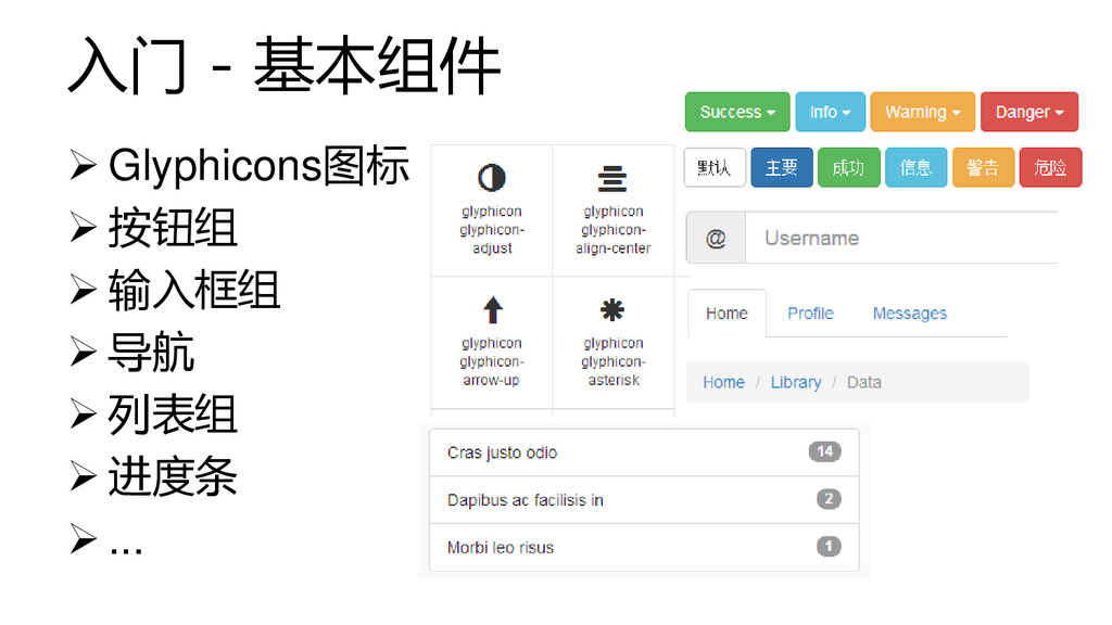
入门 - 基本组件 Glyphicons图标 按钮组 输入框组
导航 列表组 进度条 ...
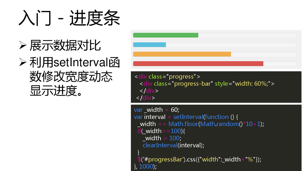
入门 - 进度条 展示数据对比 利用setInterval函 数修改宽度动态 显示进度。 <div
class="progress"> <div class="progress-bar" style="width: 60%;"> </div> </div> var _width = 60; var interval = setInterval(function () { _width += Math.floor(Math.random()*10+1); if(_width>=100){ _width = 100; clearInterval(interval); } $('#progressBar').css({"width":_width+"%"}); }, 1000);
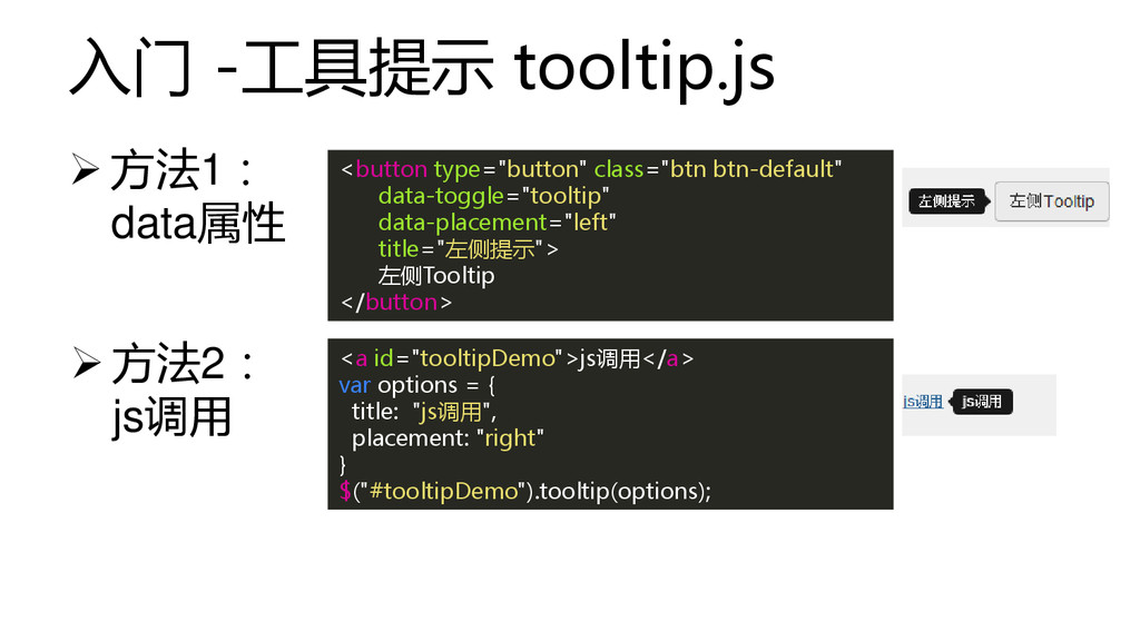
入门 -工具提示 tooltip.js 方法1: data属性 <button type="button" class="btn btn-default"
data-toggle="tooltip" data-placement="left" title="左侧提示"> 左侧Tooltip </button> <a id="tooltipDemo">js调用</a> var options = { title: "js调用", placement: "right" } $("#tooltipDemo").tooltip(options); 方法2: js调用
目录 1 介绍 2 入门 3 进阶 4 总结
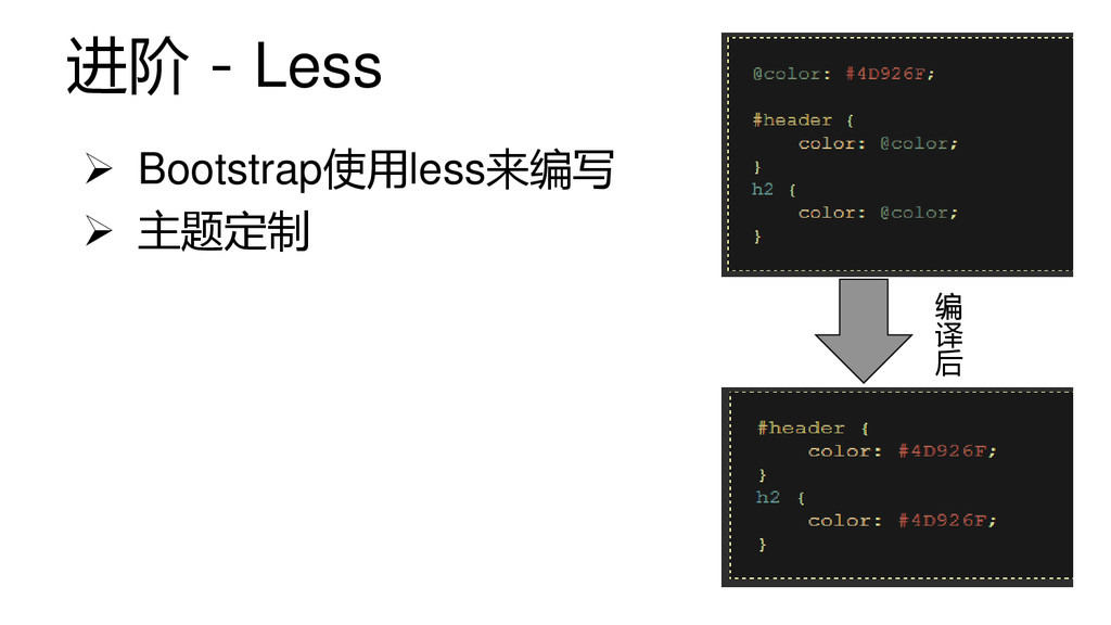
进阶 - Less Bootstrap使用less来编写 主题定制 编 译 后
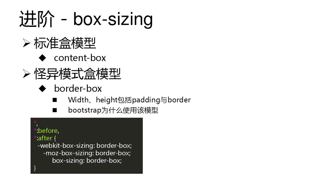
进阶 - box-sizing *, *:before, *:after { -webkit-box-sizing: border-box; -moz-box-sizing:
border-box; box-sizing: border-box; } 标准盒模型 content-box 怪异模式盒模型 border-box Width、height包括padding与border bootstrap为什么使用该模型
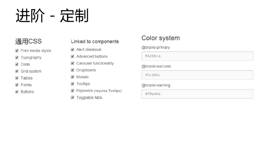
进阶 - 定制
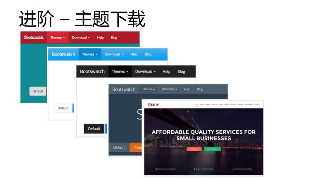
进阶 – 主题下载
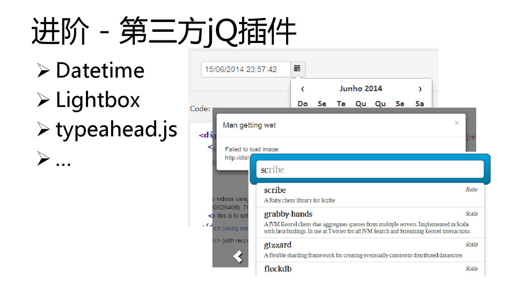
进阶 - 第三方jQ插件 Datetime Lightbox typeahead.js
…
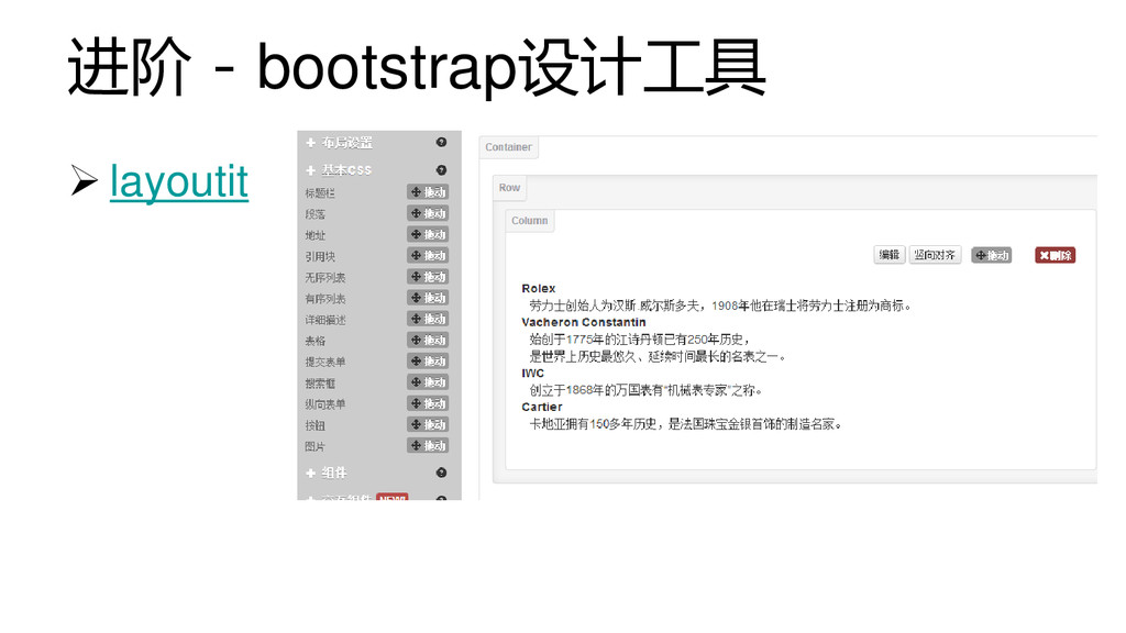
进阶 - bootstrap设计工具 layoutit
目录 1 介绍 2 入门 3 进阶 4 总结
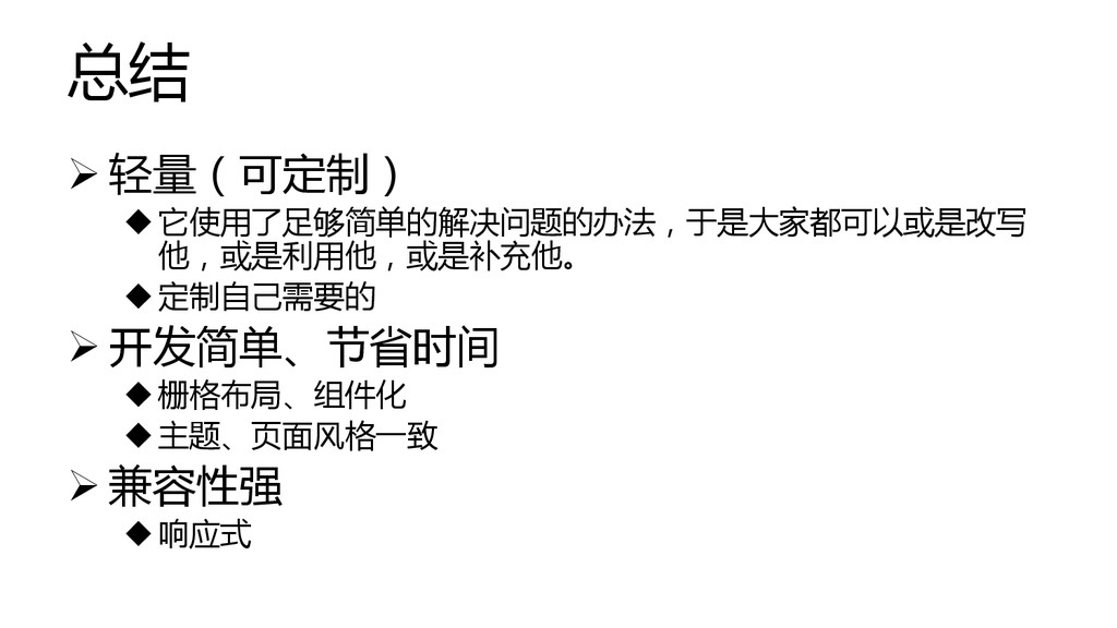
总结 轻量(可定制) 它使用了足够简单的解决问题的办法,于是大家都可以或是改写 他,或是利用他,或是补充他。 定制自己需要的 开发简单、节省时间 栅格布局、组件化 主题、页面风格一致
兼容性强 响应式
UED分享 · 交流 http://cssrain.github.io
 cssrain
 uvb_76
 ogiwarat
 kairim0
 syuchimu
 kaonavi
 rfdnxbro
 takapy
 phaya72
 oracle4engineer
 uhyo
uhyo
 exactpro
 mot_techtalk
 eileencodes
 aleyda
 katarinadahlin
 codingconduct
 427marketing
 aarron
 garrettdimon
 marcduiker
 davidcarrasco
 marktimemedia
 inesmontani
 panda_program