Upgrade to Pro — share decks privately, control downloads, hide ads and more …

Skalabilna web tipografija uz pomoć Sass-a

DaFED
December 03, 2014

Skalabilna web tipografija uz pomoć Sass-a

DaFED#28
Speaker: Andrej Mlinarević, Mono Software

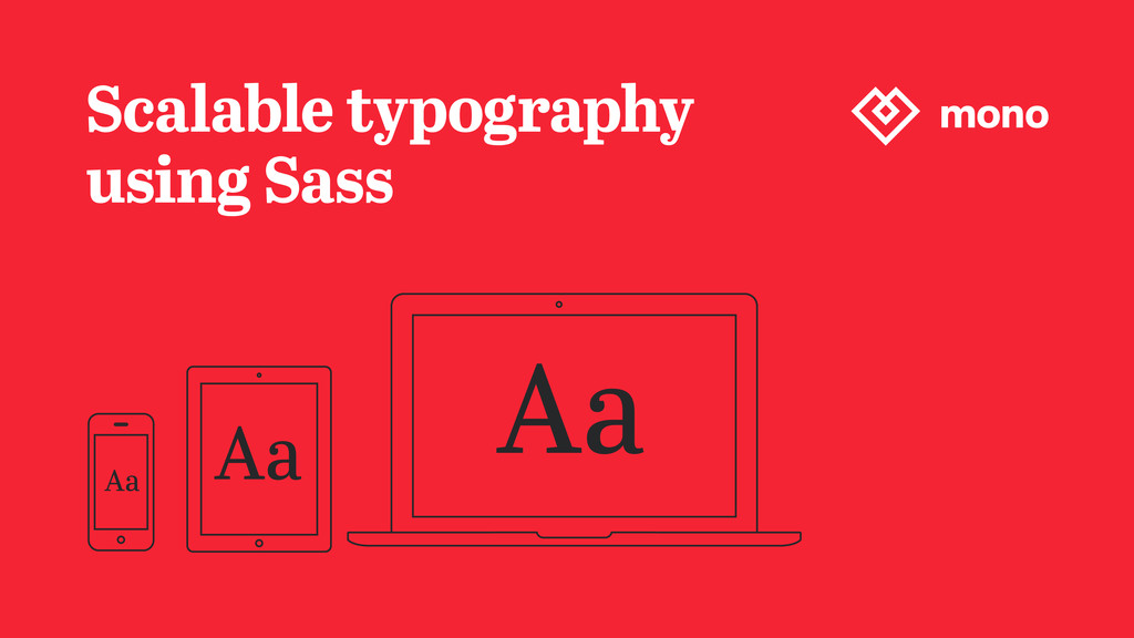
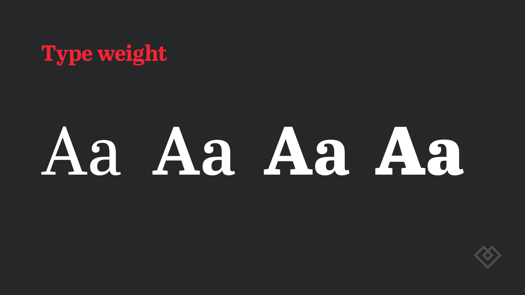
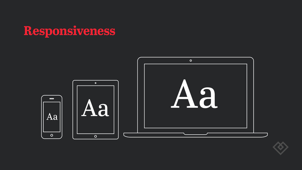
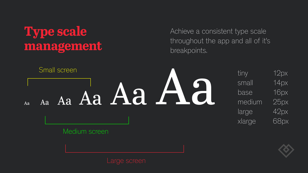
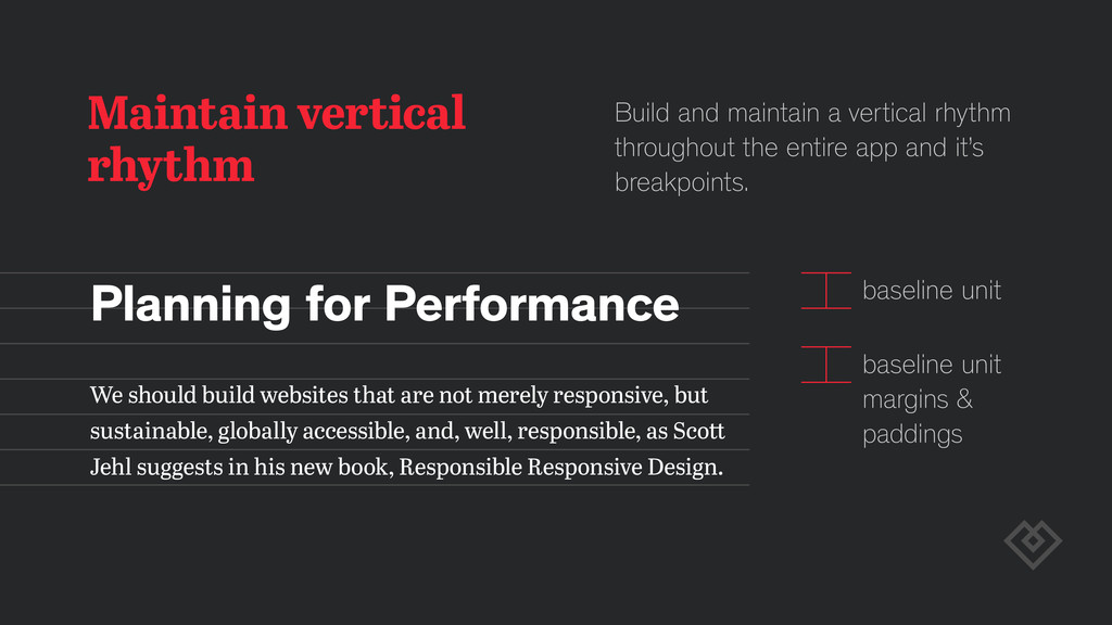
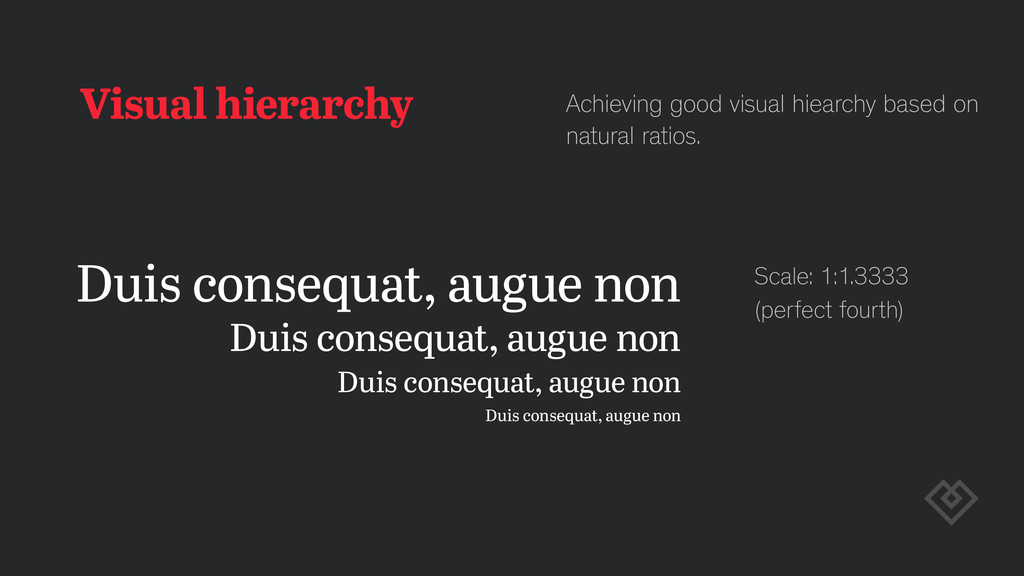
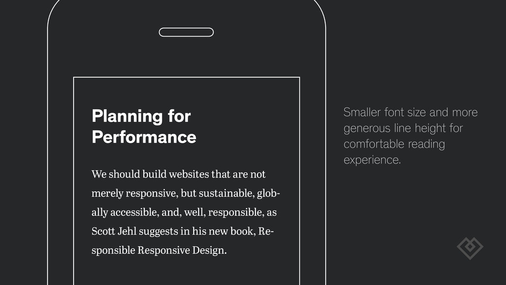
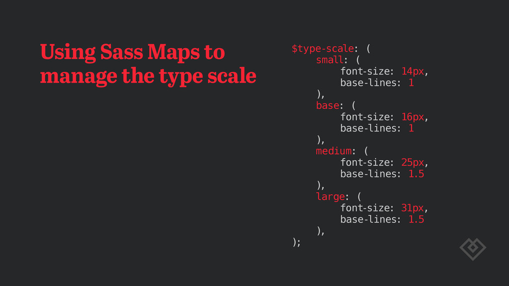
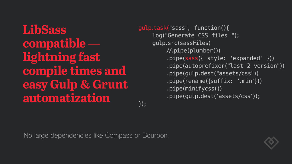
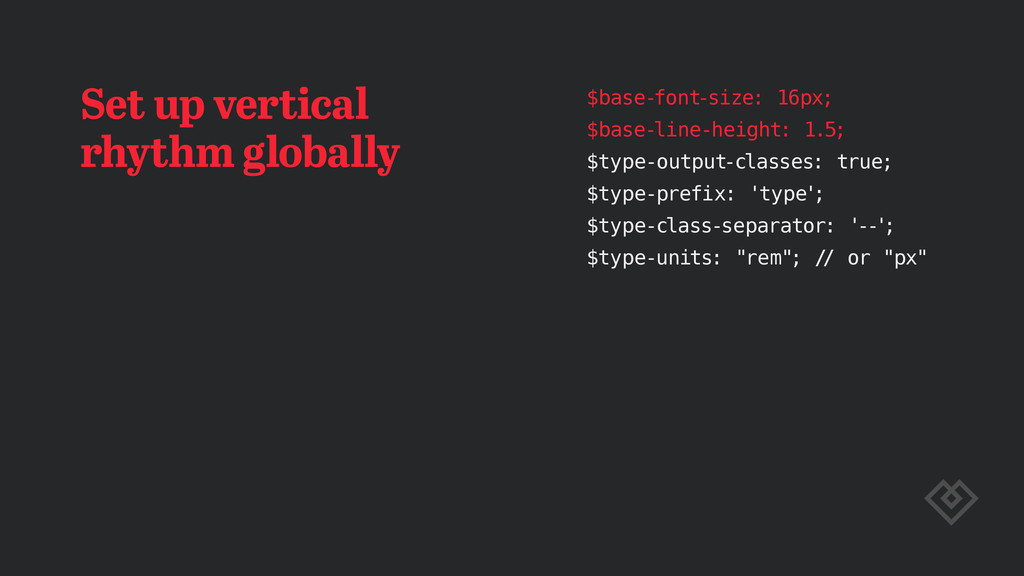
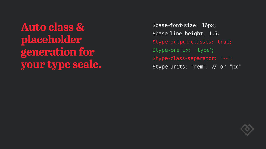
Izgradnja skalabilnog sastava za upravljanje tipografijom na veb projektu uz pomoć Sass-a. Načini efikasnog upravljanja tipografijom na projektima različite kompleksnosti uz pomoć Sass preprocesora.

DaFED

December 03, 2014
Tweet

More Decks by DaFED

Other Decks in Programming

Transcript

  1. Best regional small enterprise in 2011. Croatian Chamber of Economy

    National Champion in The European Business Awards 2014/15 sponsored by RSM International Fast 50 Program in Central Europe Deloi e Technology
  2. Justification, hypenation, drop caps, kerning, character alignment, OpenType features, Web

    font formats, text rendering, performance… BR AM STEIN And a bunch of other stuff still to come.
  3. Type scale management Achieve a consistent type scale throughout the

    app and all of it’s breakpoints. Small screen tiny 12px small 14px base 16px medium 25px large 42px xlarge 68px Medium screen Large screen
  4. Maintain vertical rhythm baseline unit baseline unit margins & paddings

    Build and maintain a vertical rhythm throughout the entire app and it’s breakpoints. Planning for Performance We should build websites that are not merely responsive, but sustainable, globally accessible, and, well, responsible, as Sco Jehl su gests in his new book, Responsible Responsive Design.
  5. Visual hierarchy Achieving good visual hiearchy based on natural ratios.

    Duis consequat, augue non Duis consequat, augue non Duis consequat, augue non Duis consequat, augue non Scale: 1:1.3333 (perfect fourth)
  6. Planning for Performance We should build websites that are not

    merely responsive, but sustainable, glob- ally accessible, and, well, responsible, as Sco Jehl su gests in his new book, Re- sponsible Responsive Design. Smaller font size and more generous line height for comfortable reading experience.
  7. Planning for Performance We should build websites that are not

    merely responsive, but sustainable, globally accessi- ble, and, well, responsible, as Sco Jehl sug- gests in his new book, Responsible Responsive Design. Larger, more impactfull headers and a desktop reading optimized line height.
  8. Boost your CSS performance using @extend and %placeholder Use the

    @extend directive with %placeholders to to achieve achieve a lighter, smaller code.
  9. Keep it all organized and in one place to easily

    scale up or down. Place all type scale sizes in a single Sass Map and use functions like map-get to get the values.
  10. Typomatic 2 Toolkit for managing and scaling typography on the

    web using LibSass. Clone & go (MIT licence). typomatic2
  11. Toolkit made with Sass — a small set of configurable

    Sass mixins — made for LibSass — dependency free — lightweight — open source (MIT)
  12. Typomatic 2 features — simple to use & modify —

    framework independant (LibSass only) — PX and REM support (EM support on the way) — uses @extend to DRY out your code — achieve vertical rhythm easily — customizable namespacing (BEM, OOCSS…)
  13. Using Sass Maps to manage the type scale $type-scale: (

    small: ( font-size: 14px, base-lines: 1 ), base: ( font-size: 16px, base-lines: 1 ), medium: ( font-size: 25px, base-lines: 1.5 ), large: ( font-size: 31px, base-lines: 1.5 ), );
  14. LibSass compatible — lightning fast compile times and easy Gulp

    & Grunt automatization gulp.task("sass", function(){ log("Generate CSS files "); gulp.src(sassFiles) // .pipe(plumber()) .pipe(sass({ style: 'expanded' })) .pipe(autoprefixer("last 2 version")) .pipe(gulp.dest("assets/css")) .pipe(rename({suffix: ' .min'})) .pipe(minifycss()) .pipe(gulp.dest('assets/css')); }); No large dependencies like Compass or Bourbon.
  15. Set up vertical rhythm globally $base-font-size: 16px; $base-line-height: 1.5; $type-output-classes:

    true; $type-prefix: 'type' ; $type-class-separator: '--' ; $type-units: "rem"; // or "px"
  16. Auto class & placeholder generation for your type scale. $base-font-size:

    16px; $base-line-height: 1.5; $type-output-classes: true; $type-prefix: 'type' ; $type-class-separator: '--' ; $type-units: "rem"; // or "px"
  17. .type--small { font-size: 13px; line-height: 21px; } .t-sml { font-size:

    13px; line-height: 21px; } %type--small { font-size: 13px; line-height: 21px; } %t-sml { font-size: 13px; line-height: 21px; }
  18. PX or REM support (EM on the way) $base-font-size: 16px;

    $base-line-height: 1.5; $type-output-classes: true; $type-prefix: 'type' ; $type-class-separator: '--' ; $type-units: "rem"; // or "px" .type--small { font-size: 0.75rem; line-height: 1rem; } .type--small { font-size: 12px; line-height: 16px; }
  19. Use in @media queries .my-custom-large-heading { @include breakpoint(100em) { @include

    type-scale(large, false); } } @media all and (min-width: 100em) { .my-custom-large-heading { font-size: 4rem; line-height: 6rem; } }
  20. Typomatic 2 — roadmap typomatic2 — add EM support —

    add PX fallback support — enhance code — add multiple baseline and map support — add warning and other code UX goodies — add advance typographic features support