web to help connect your users to your brand. By structuring the content and design around a concept, we can create a solid construct that ties the site together in a really cohesive way. Here are a few concepts that drive successful sites. 3
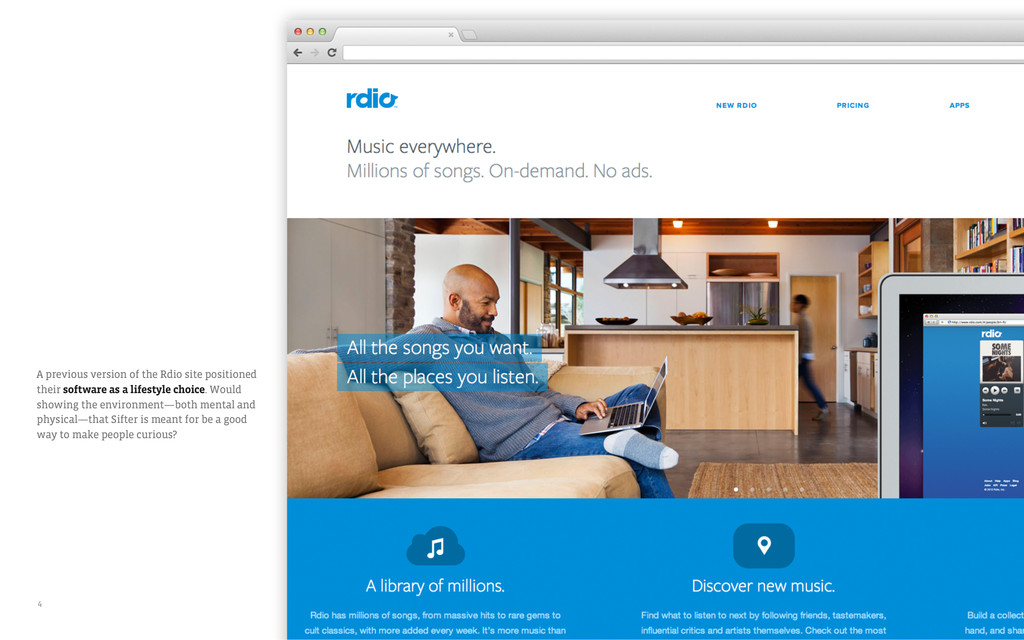
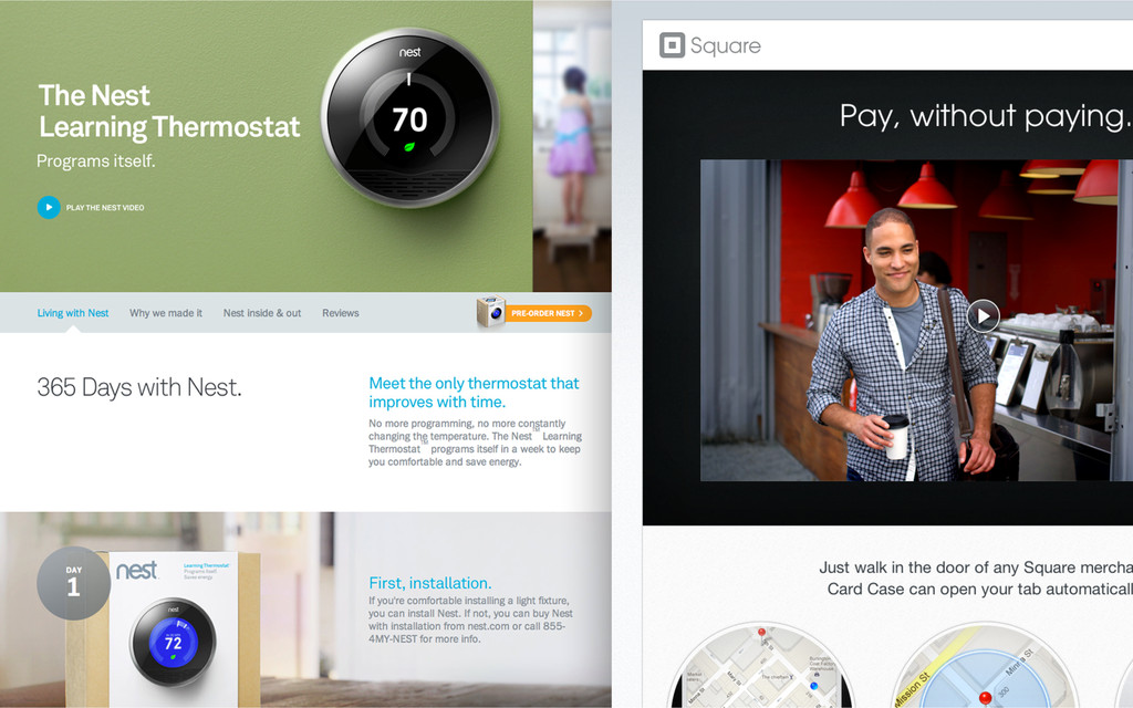
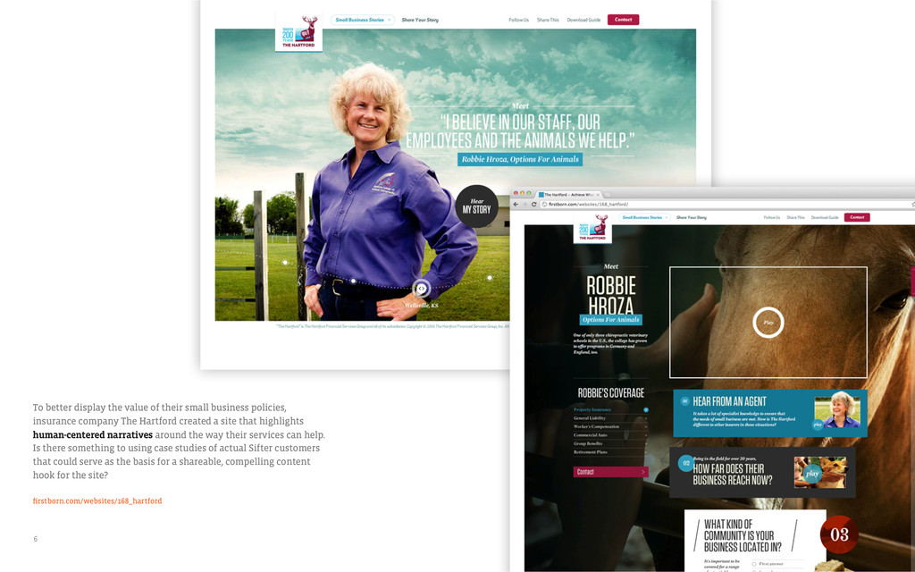
insurance company The Hartford created a site that highlights human-centered narratives around the way their services can help. Is there something to using case studies of actual Sifter customers that could serve as the basis for a shareable, compelling content hook for the site? firstborn.com/websites/168_hartford 6
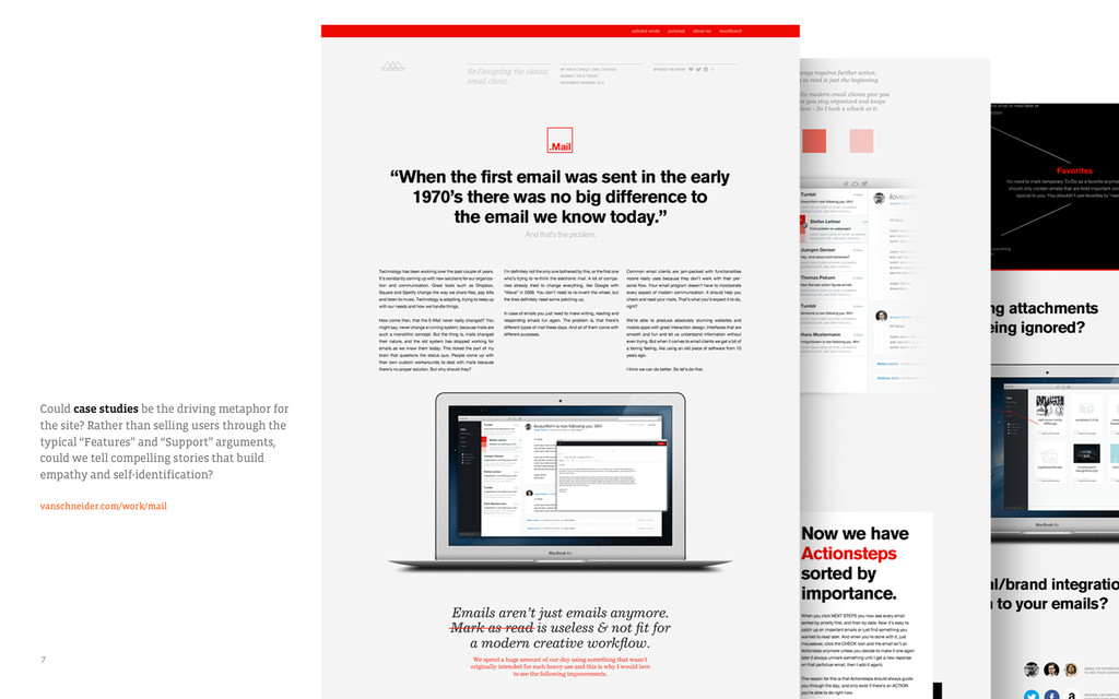
Rather than selling users through the typical “Features” and “Support” arguments, could we tell compelling stories that build empathy and self-identification? vanschneider.com/work/mail 7
has shown that users can even form impressions about a website in as quickly as 50 milliseconds.† The right color scheme can help to influence this perception. Here are some color schemes that may add just the right tone to the new Sifter website. † http://news.bbc.co.uk/2/hi/technology/4616700.stm 10
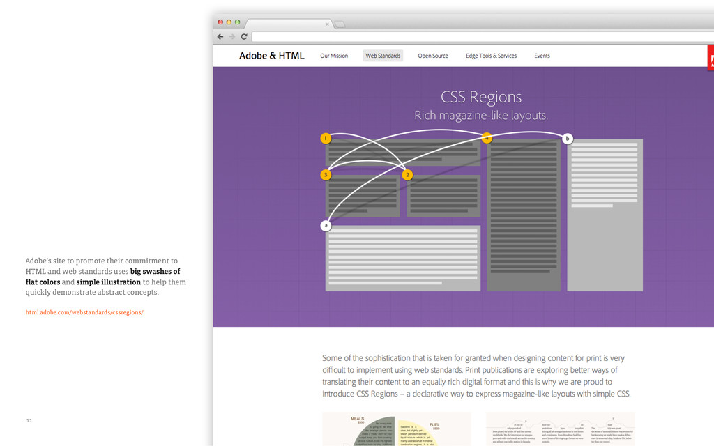
standards uses big swashes of flat colors and simple illustration to help them quickly demonstrate abstract concepts. html.adobe.com/webstandards/cssregions/ 11
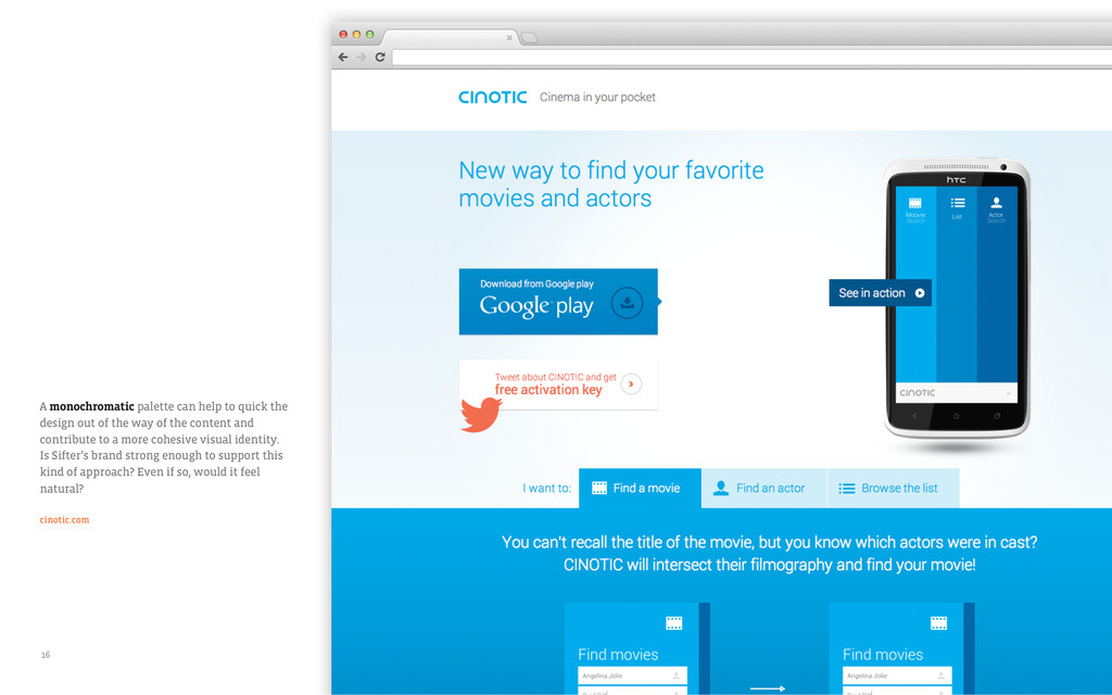
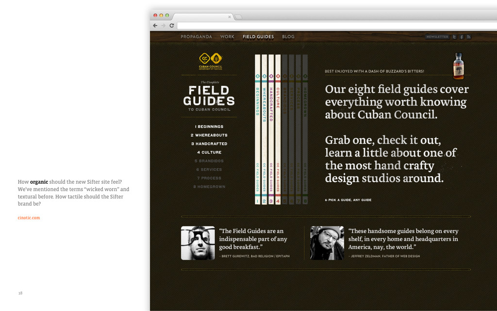
of the way of the content and contribute to a more cohesive visual identity. Is Sifter’s brand strong enough to support this kind of approach? Even if so, would it feel natural? cinotic.com 16
are with what we could do for the new website. What things resonated well with you? As a recap, here are all of the things we covered in this document: Concept Software as a lifestyle choice, human-centered narratives, case studies, front and center interface Color Big swashes of flat color, simple illustration, largely type-driven and color-constrained, monochromatic, organic Tone Playful and whimsical, professional and approachable 23
with you. A follow-up phone call to talk through these seems most appropriate. We’re eager to hear your thoughts, and come to some agreements for things that we can carry into the next phase of visual design. Thanks! 24