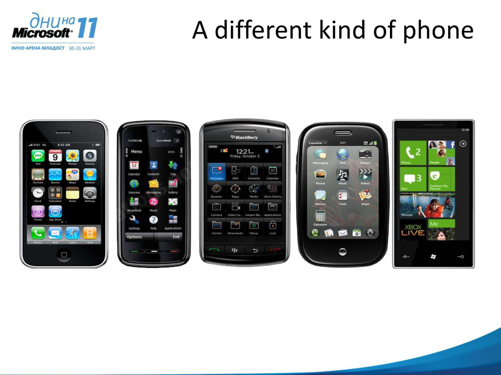
mom “My life is a balancing act between work, family, friends, and my own personal needs.” Miles Growing his own architectural biz “I love running my life real-time so I can take advantage of whatever is inspiring me…whether it’s a new project, a pick up game or a stolen moment with Anna.”
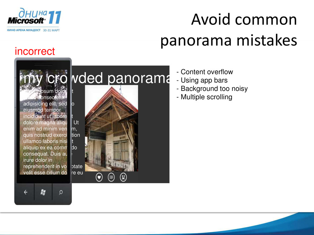
sit amet, consectetur adipisicing elit, sed do eiusmod tempor incididunt ut labore et dolore magna aliqua. Ut enim ad minim veniam, quis nostrud exercitation ullamco laboris nisi ut aliquip ex ea commodo consequat. Duis aute irure dolor in reprehenderit in voluptate velit esse cillum dolore eu fugiat nulla pariatur. Excepteur sint occaecat cupidatat non proident, sunt in culpa qui officia deserunt mollit anim id est laborumea commodo consequat. Duis aute irure dolor - Content overflow - Using app bars - Background too noisy - Multiple scrolling incorrect
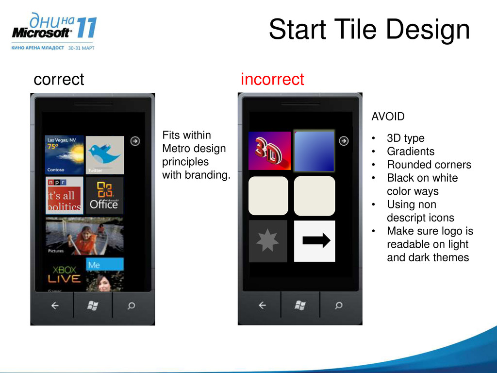
Gradients • Rounded corners • Black on white color ways • Using non descript icons • Make sure logo is readable on light and dark themes Your ignored app Fits within Metro design principles with branding.
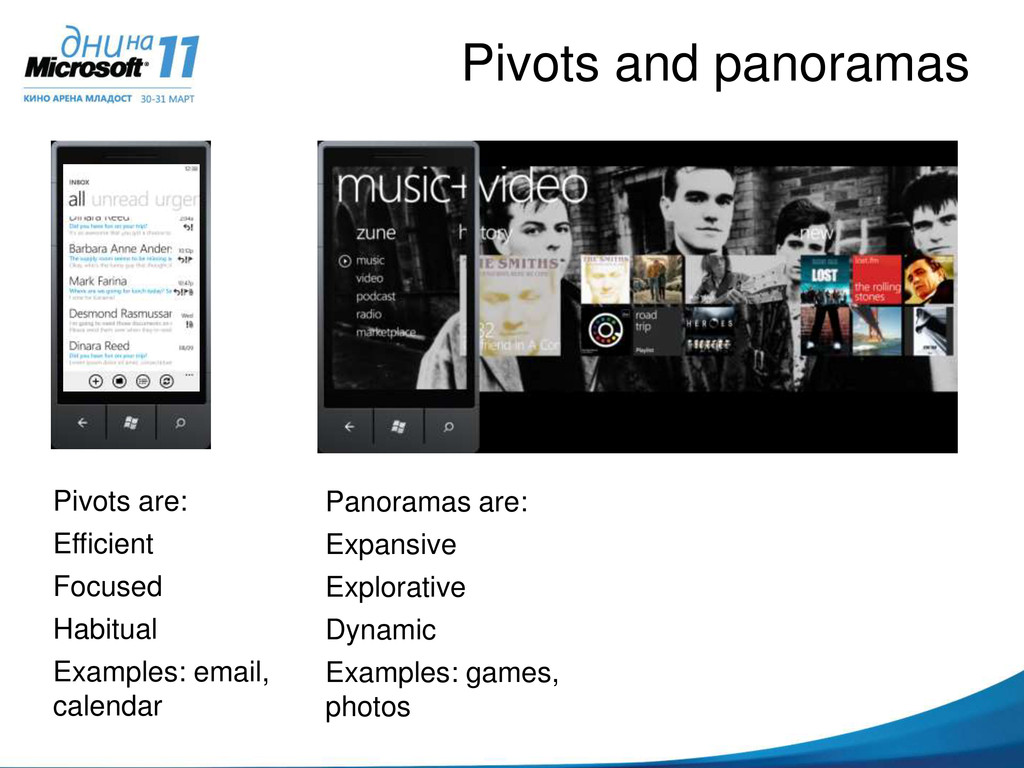
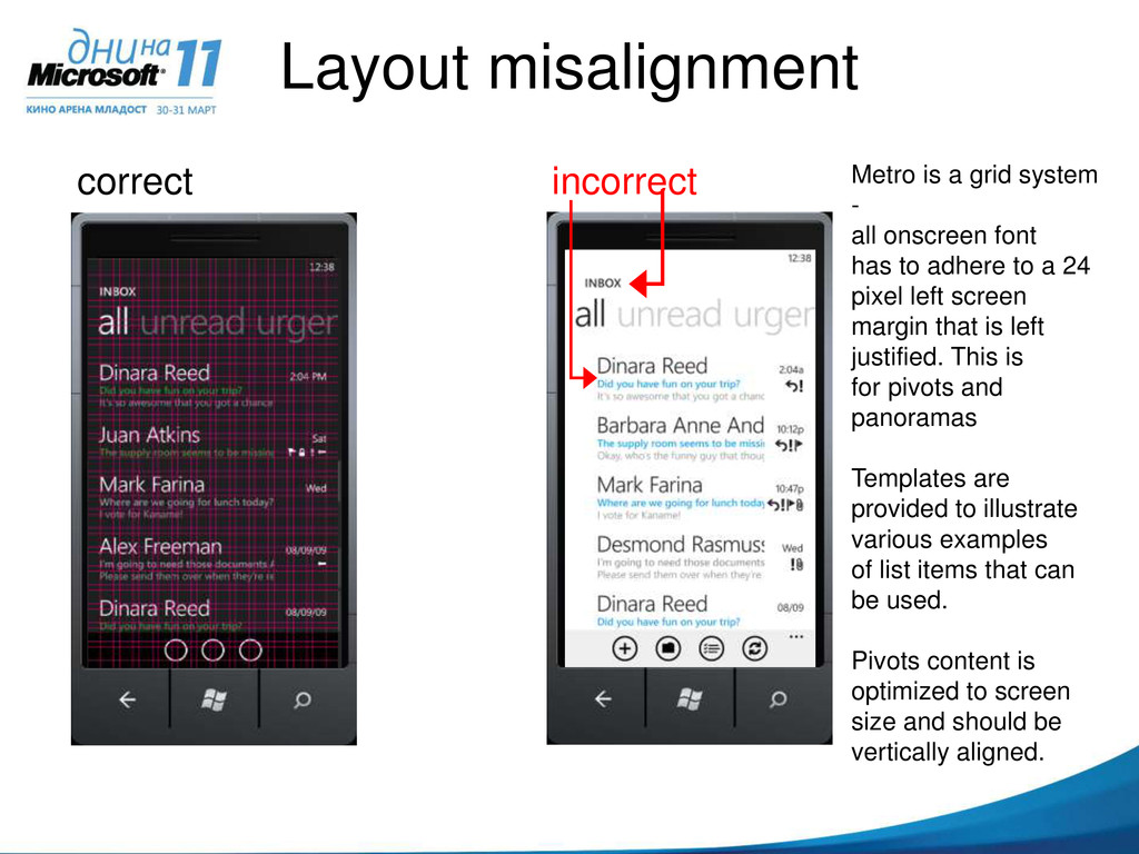
system - all onscreen font has to adhere to a 24 pixel left screen margin that is left justified. This is for pivots and panoramas Templates are provided to illustrate various examples of list items that can be used. Pivots content is optimized to screen size and should be vertically aligned.
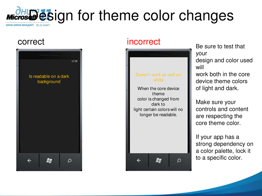
sure to test that your design and color used will work both in the core device theme colors of light and dark. Make sure your controls and content are respecting the core theme color. If your app has a strong dependency on a color palette, lock it to a specific color. white When the core device theme color is changed from dark to light certain colors will no longer be readable. Is readable on a dark background
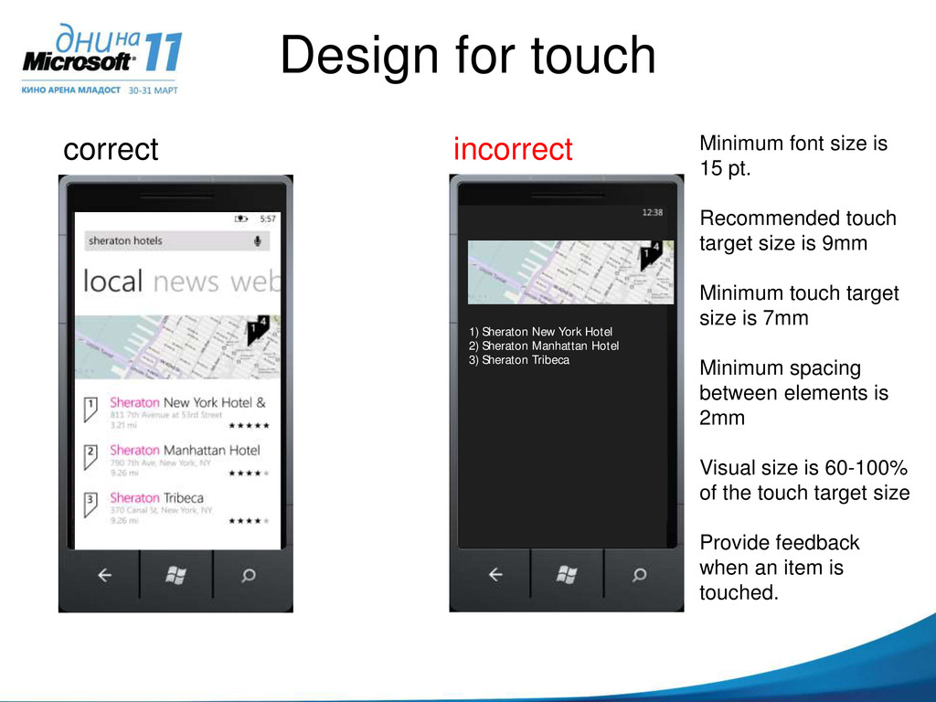
is 15 pt. Recommended touch target size is 9mm Minimum touch target size is 7mm Minimum spacing between elements is 2mm Visual size is 60-100% of the touch target size Provide feedback when an item is touched. hte When the core device thme color is changed from dak to light certain colors will no longer be readable. Is readable on a dark background 1) Sheraton New York Hotel 2) Sheraton Manhattan Hotel 3) Sheraton Tribeca
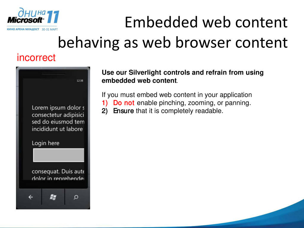
our Silverlight controls and refrain from using embedded web content. If you must embed web content in your application: 1) Do not enable pinching, zooming, or panning. 2) Ensure that it is completely readable.
 daronyondem
 yanzm
yanzm
 mocobeta
 stefafafan
 seike460
 chanyou0311
 ebiken
 hssh2_bin
 ming_ayami
 kozy4324
 gotok365
 masahirokawahara
 edeandrea
 aarron
 mclloyd
 productmarketing
 michielstock
 lauravandoore
 cassininazir
 schlessera
 twada
twada
 skipperchong
 codingconduct
 jdejongh
![THANKS! Daron Yöndem http://daron.yondem.com [email protected]](https://files.speakerdeck.com/presentations/13ef24301ea301307bca1231381a70f4/slide_41.jpg)