$30 off During Our Annual Pro Sale. View Details »

Intro to Data Visualisation - Digital Humanities Research Group

Dave Kelly
January 31, 2023

Intro to Data Visualisation - Digital Humanities Research Group

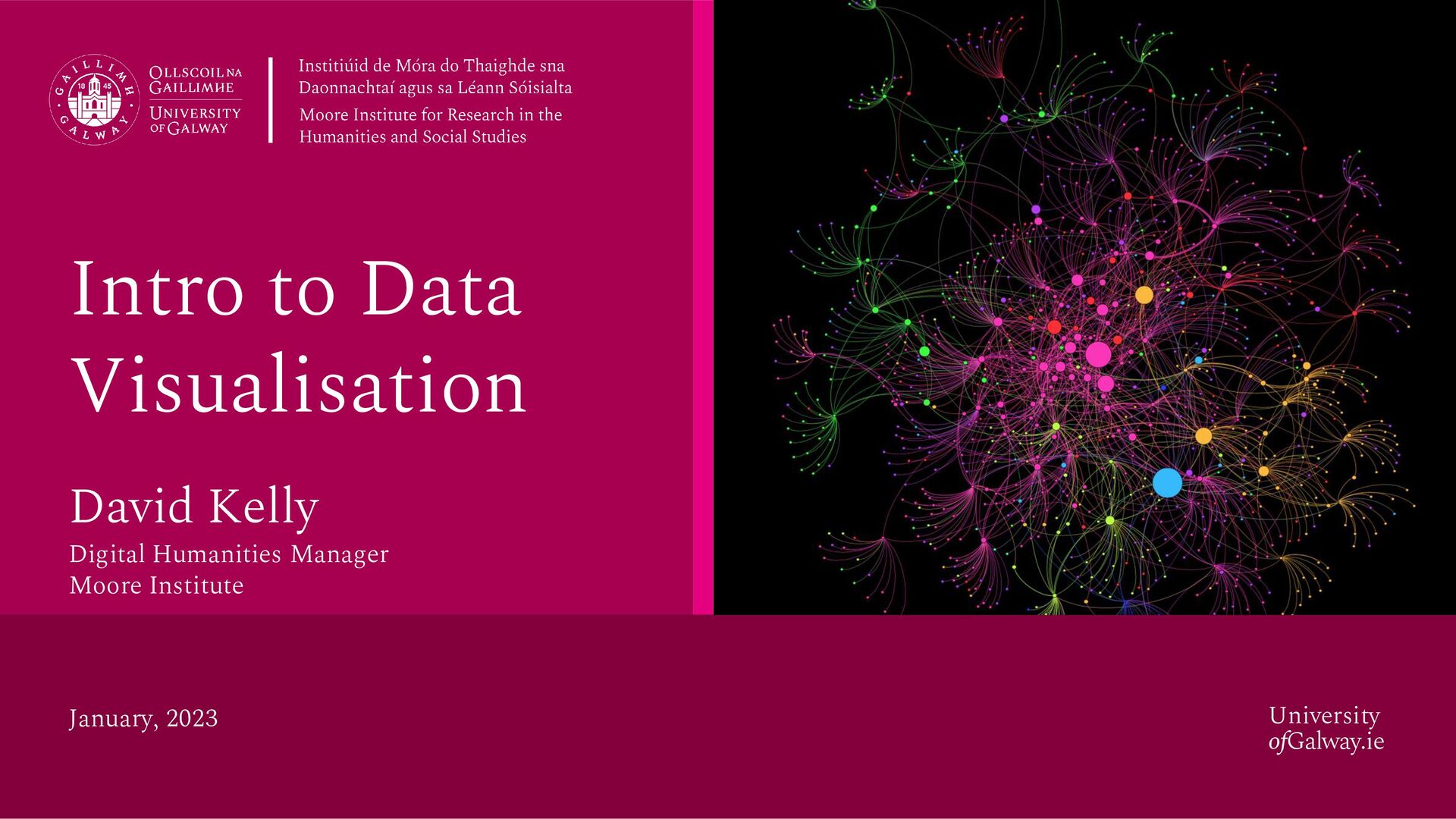
Introduction to data visualisation by David Kelly, Digital Humanities Manager at the Moore Institute

The first in a series of talks surveying digital approaches to Humanities research.

Co-ordinated by the Moore Institute’s Digital Humanities Research Group (DHRG), with the support of the Moore Institute’s Digital Lab and the Library’s Digital Scholarship and Archives units.

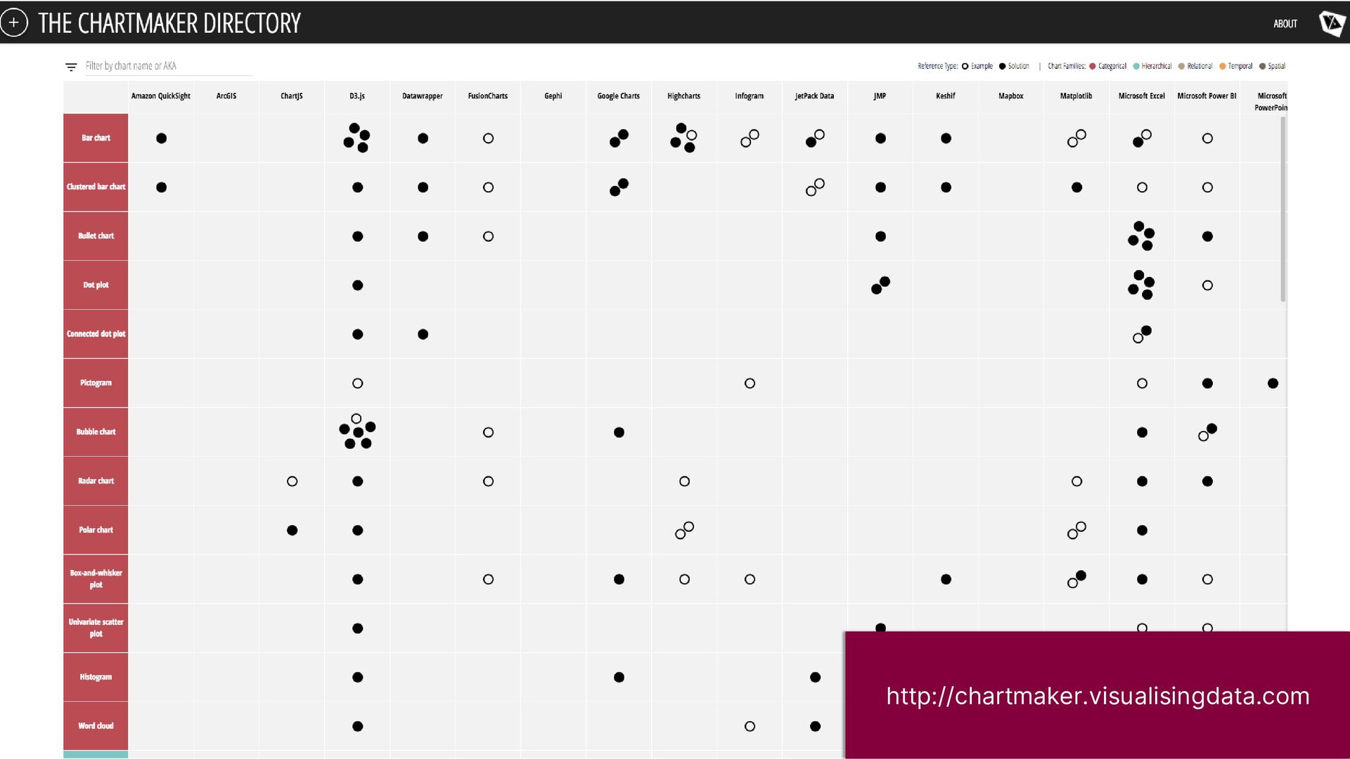
https://mooreinstitute.ie/research-group/digital-humanities/

Dave Kelly

January 31, 2023
Tweet

More Decks by Dave Kelly

Other Decks in Education

Transcript

  1. University
    ofGalway.ie
    Intro to Data
    Visualisation
    David Kelly
    January, 2023
    Digital Humanities Manager
    Moore Institute

    View Slide

  2. University
    ofGalway.ie
    What are we
    talking about?

    View Slide

  3. …the graphical
    representation of
    information and data.
    Tableau (https://www.tableau.com/learn/articles/data-visualization)
    Kirk (2016)

    View Slide

  4. University
    ofGalway.ie
    Data Representation
    Colour
    Composition
    Interaction
    Motion
    Annotation
    Kirk (2016)
    Data Vis
    Components

    View Slide

  5. Data
    Visualisation
    Data
    Art

    View Slide

  6. http://giorgialupi.com/bruises-the-data-we-dont-see/
    “Clinical records alone hardly capture the impact the illness of
    a child has on a family. This is how we used music and art to
    understand and communicate the information that was
    missing.”
    Bruises — The Data We Don’t See Giorgia Lupi & Kaki King

    View Slide

  7. View Slide

  8. Data
    Visualisation
    Data
    Art

    View Slide

  9. https://elmss.nuigalway.ie/corpus/11
    Earlier Latin Manuscripts
    Tools for studying the scripts of the oldest
    Latin manuscripts

    View Slide

  10. Data
    Visualisation
    Data
    Art

    View Slide

  11. “As you probably can see, this isn’t by any
    means a scientific representation of data.
    Still, we believe it paints an accurate
    sensorial picture of this personal journey.”

    View Slide

  12. University
    ofGalway.ie
    Explorable
    Explanations

    View Slide

  13. University
    ofGalway.ie
    Bret Victor (2011)
    http://worrydream.com/ExplorableExplanations/
    An active reader asks questions, considers
    alternatives, questions assumptions, and even
    questions the trustworthiness of the author. An
    active reader tries to generalize specific
    examples, and devise specific examples for
    generalities. An active reader doesn't passively
    sponge up information, but uses the author's
    argument as a springboard for critical thought and
    deep understanding.
    Explorable Explanations

    View Slide

  14. University
    ofGalway.ie
    Why visualise
    data?

    View Slide

  15. University
    ofGalway.ie
    University
    ofGalway.ie
    New
    Perspectives

    View Slide

  16. Cultural Networks
    Data from interviews with cultural
    practitioners:
    • Demographic
    • Funding
    • Relationship types
    • Geographic data
    Dr. Patrick Collins – Geography @ University of Galway

    View Slide

  17. View Slide

  18. https://industrialmemories.ucd.ie/

    View Slide

  19. https://industrialmemories.ucd.ie/project/the-transfer-graph

    View Slide

  20. University
    ofGalway.ie
    University
    ofGalway.ie
    Data
    Exploration

    View Slide

  21. Prof Marie-Louise Coolahan – English @ University of Galway

    View Slide

  22. Dr. Mark Stansbury – Classics @ University
    of Galway

    View Slide

  23. https://impactlab.org

    View Slide

  24. University
    ofGalway.ie
    University
    ofGalway.ie
    Impact &
    Engagement

    View Slide

  25. “Unimaginable Death: Visualizations of COVID-19
    Pandemic Milestones”, Supplement to Issue 2 of Nightingale
    Journal of the Data Visualisation Society, 2022

    View Slide

  26. “Unimaginable Death: Visualizations of COVID-19
    Pandemic Milestones”, Supplement to Issue 2 of Nightingale
    Journal of the Data Visualisation Society, 2022

    View Slide

  27. https://www.nytimes.com/interactive/2016/01/07/us/drug-overdose-deaths-in-the-us.html

    View Slide

  28. https://guns.periscopic.com

    View Slide

  29. University
    ofGalway.ie
    University
    ofGalway.ie
    Complexity &
    non-expert users

    View Slide

  30. The Guardian, Feb 2015

    View Slide

  31. https://impactlab.org

    View Slide

  32. http://projects.propublica.org/louisiana/
    Data Is Plural Submissions: London Stage Database
    https://nightingaledvs.com/data-is-plural-submissions-london-stage-database/

    View Slide

  33. University
    ofGalway.ie
    Useful Tools
    Mostly web-based, free
    option, little/no programming

    View Slide

  34. http://ft.com/vocabulary

    View Slide

  35. http://ft.com/vocabulary

    View Slide

  36. http://chartmaker.visualisingdata.com

    View Slide

  37. ParseHub.com
    Code-based:
    Data Gathering,
    Cleaning & Preparation
    Mapping
    Charting
    Data Management
    Design
    Visualisation

    View Slide

  38. Code-based:
    A free, open source, powerful tool for working
    with messy data
    openrefine.org
    Data Gathering,
    Cleaning & Preparation
    Mapping
    Charting
    Data Management
    Design
    Visualisation

    View Slide

  39. • Limited free / education
    plans available
    Code-based:
    • Map design
    • Data storage
    • Embed maps
    carto.com
    mapbox.com
    Data Gathering,
    Cleaning & Preparation
    Mapping
    Charting
    Data Management
    Design
    Visualisation

    View Slide

  40. Omeka Plugin
    storymap.knightlab.com
    Data Gathering,
    Cleaning & Preparation
    Mapping
    Charting
    Data Management
    Design
    Visualisation

    View Slide

  41. Code-based:
    http://datamatic.io
    www.datawrapper.de
    Data Gathering,
    Cleaning & Preparation
    Mapping
    Charting
    Data Management
    Design
    Visualisation

    View Slide

  42. Code-based:
    https://flourish.studio
    Data Gathering,
    Cleaning & Preparation
    Mapping
    Charting
    Data Management
    Design
    Visualisation

    View Slide

  43. https://timeline.knightlab.com
    Uses a Google Spreadsheet as a data source
    https://juxtapose.knightlab.com/
    Data Gathering,
    Cleaning & Preparation
    Mapping
    Charting
    Data Management
    Design
    Visualisation

    View Slide

  44. https://juxtapose.knightlab.com
    Data Gathering,
    Cleaning & Preparation
    Mapping
    Charting
    Data Management
    Design
    Visualisation

    View Slide

  45. Code-based:
    http://hdlab.stanford.edu/palladio/
    gephi.org
    Data Gathering,
    Cleaning & Preparation
    Mapping
    Charting
    Data Management
    Design
    Visualisation

    View Slide

  46. public.tableau.com/app/discover
    Also offer free academic licenses for Tableau
    Desktop for students & teachers
    Data Gathering,
    Cleaning & Preparation
    Mapping
    Charting
    Data Management
    Design
    Visualisation

    View Slide

  47. • Colour Choices
    Maps: - http://colorbrewer2.org
    Palette Selection: https://blog.datawrapper.de/colors-for-data-vis-style-guides/
    • ProPublica's Nerd Guides - https://github.com/propublica/guides
    • Data Viz Style Guide Collection: http://policyviz.com/style-guides/
    Data Gathering,
    Cleaning & Preparation
    Mapping
    Charting
    Data Management
    Design
    Visualisation

    View Slide

  48. “Easily manage all your research outputs and make them
    available in a citable, shareable and discoverable manner”
    http://www.nature.com/sdata/policies/repositories
    Data Gathering,
    Cleaning & Preparation
    Mapping
    Charting
    Data Management
    Design
    Visualisation
    https://libguides.library.nuigalway.ie/researchdatamanagement

    View Slide

  49. http://www.clean-sheet.org/
    See https://medium.com/@giorgialupi/data-humanism-the-revolution-will-be-
    visualized-31486a30dbfb
    and
    https://www.ted.com/talks/giorgia_lupi_how_we_can_find_ourselves_in_data

    View Slide

  50. • Nightingale – Journal of the Data Visualisation Society:
    https://nightingaledvs.com/tag/historic-dataviz/
    • The Data Visualisation Catalogue: https://datavizcatalogue.com/
    • FT Visual Vocabulary - http://ft.com/vocabulary
    • Seeing Data: http://seeingdata.org
    • “How we can find ourselves in data”, Giorgia Lupi (2017)
    https://www.ted.com/talks/giorgia_lupi_how_we_can_find_ourselves_in_data
    Useful Resources

    View Slide

  51. University
    ofGalway.ie
    Thank you
    [email protected]
    mooreinstitute.ie/digital-lab

    View Slide