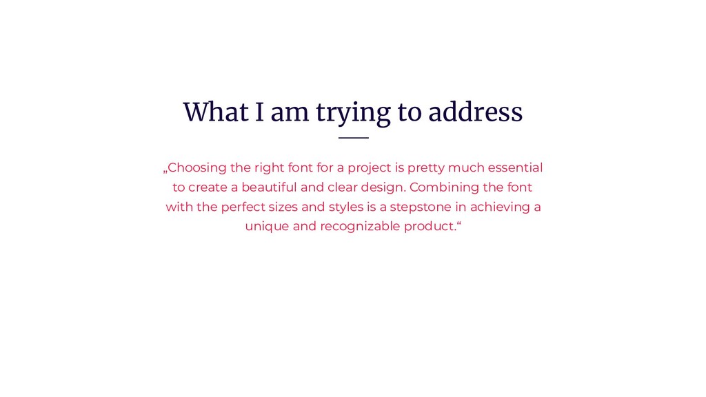
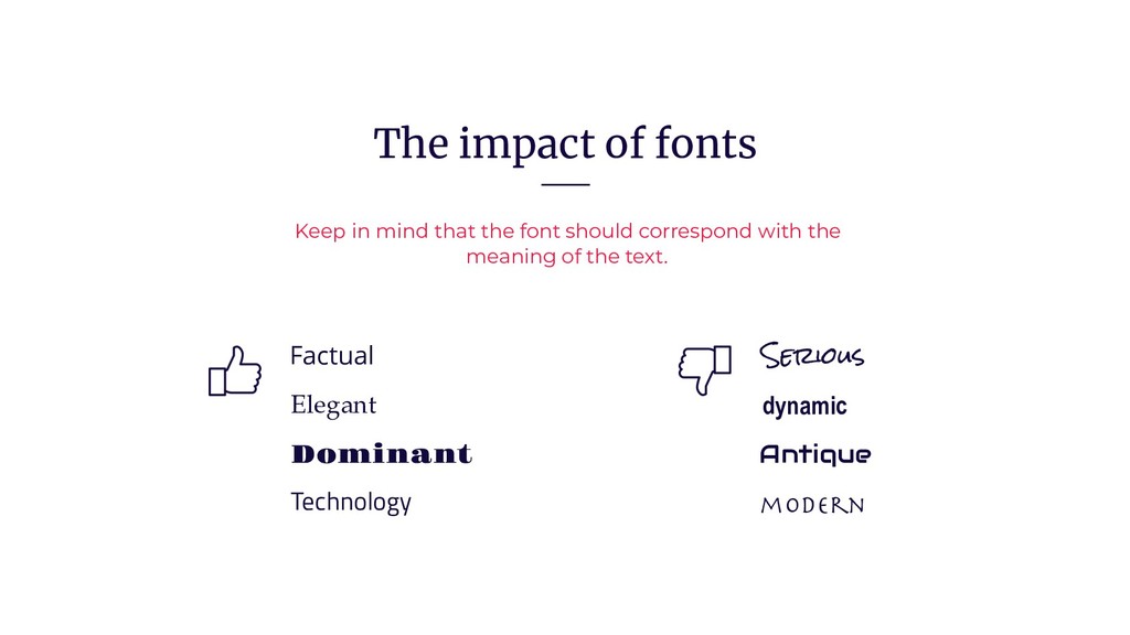
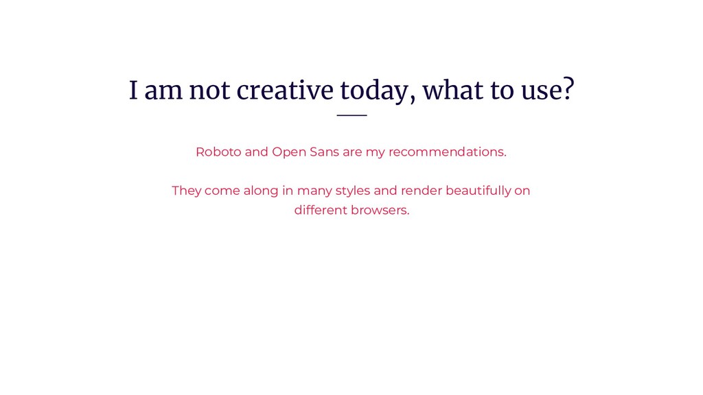
Choosing the right font for a project is pretty much essential to create a beautiful and clear design. Combining the font with the perfect sizes and styles is a stepstone in achieving a unique and recognizable product.
Let me give you an introduction on how to best use Typography in your project.