Upgrade to Pro — share decks privately, control downloads, hide ads and more …

Front-End Style Guides

Front-End Style Guides

From the Tech For Good & Front-End Innovators meet-up at DoSomething.org on June 23rd 2014.

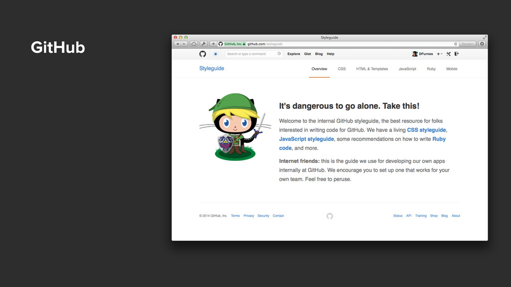
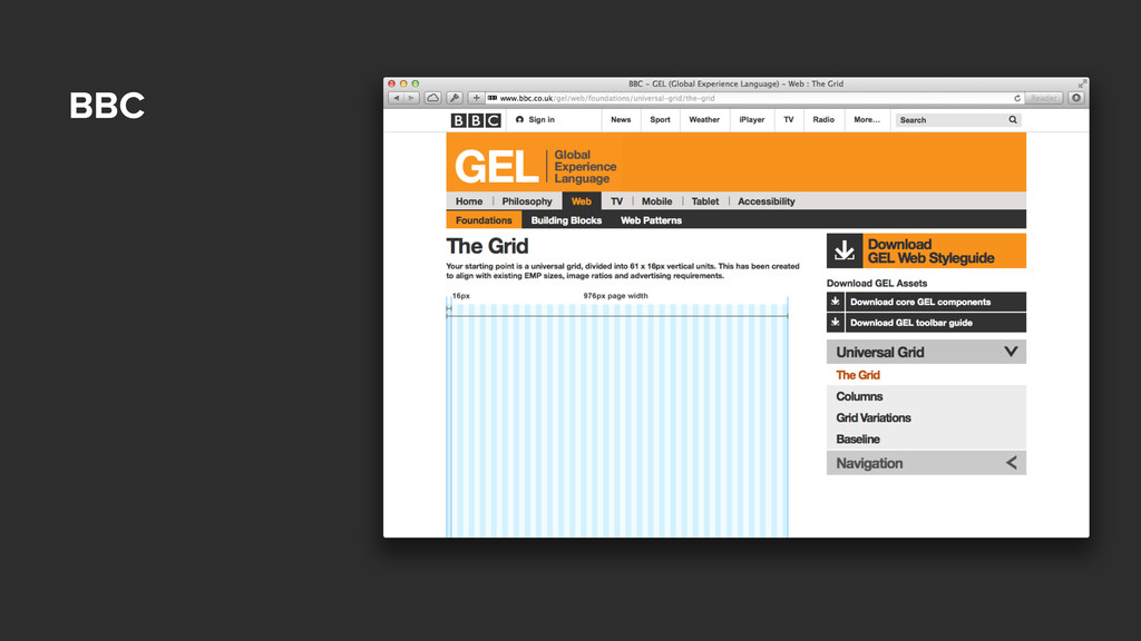
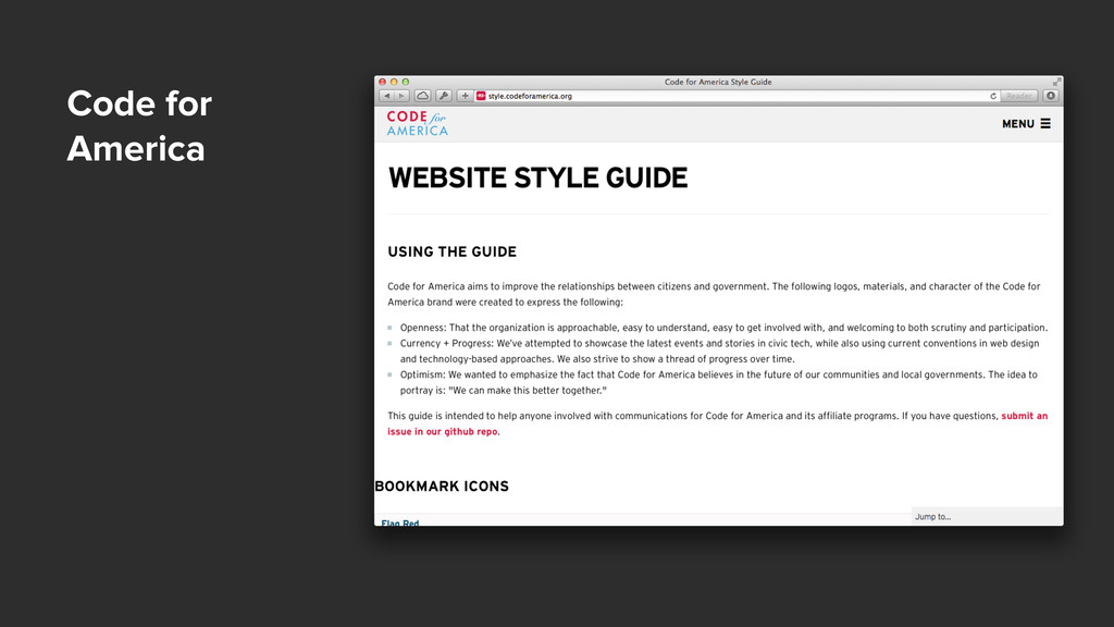
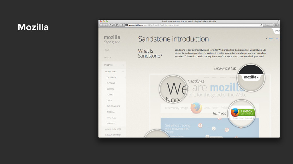
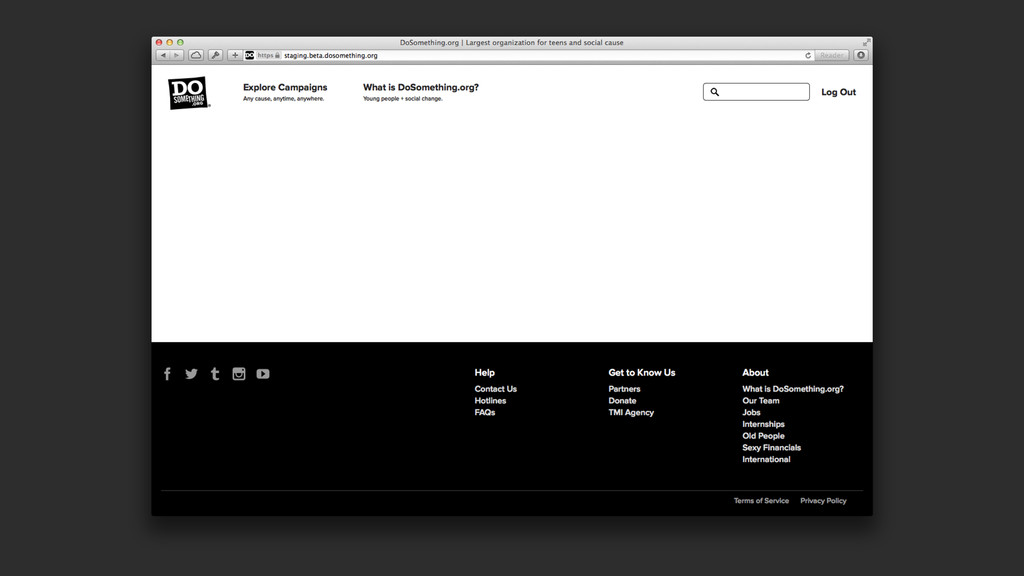
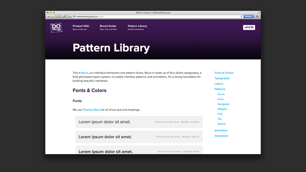
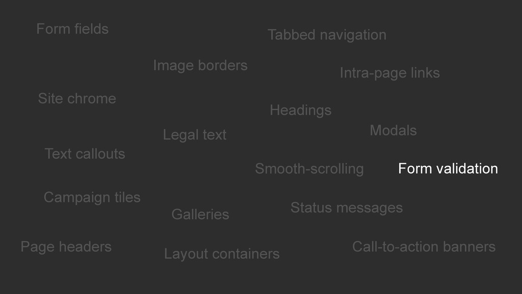
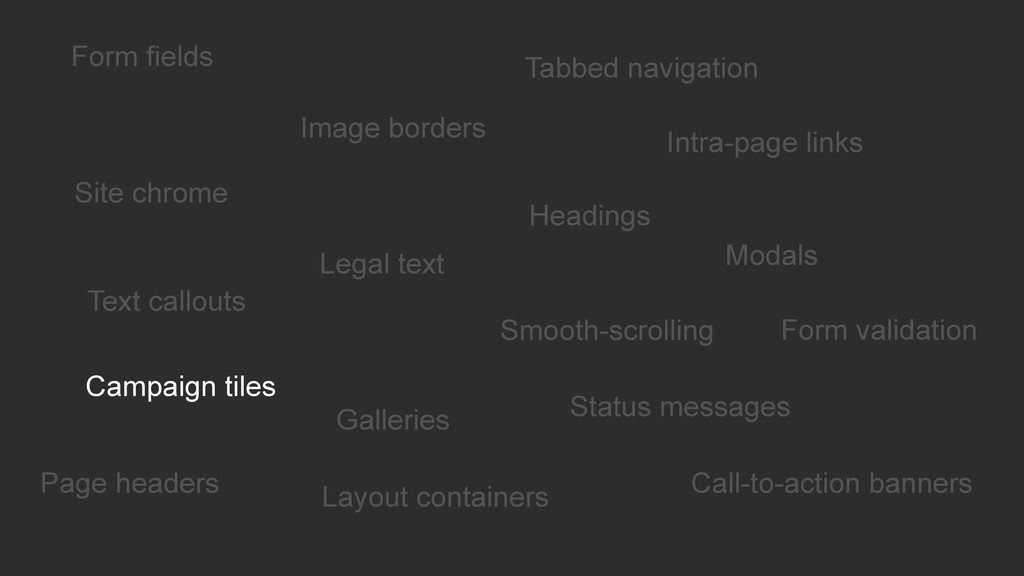
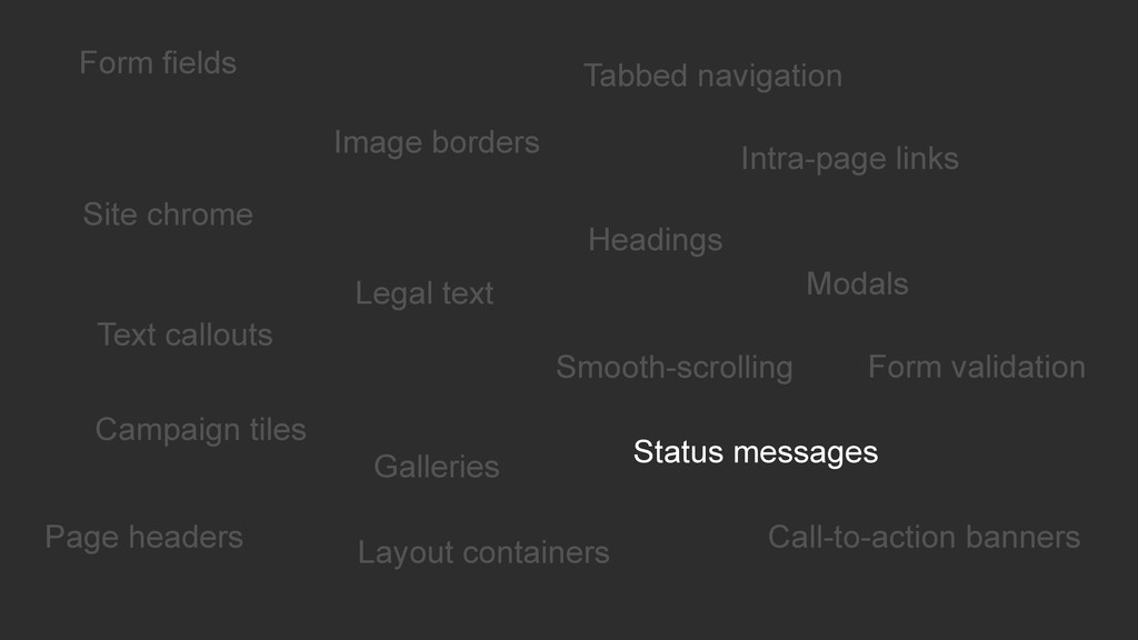
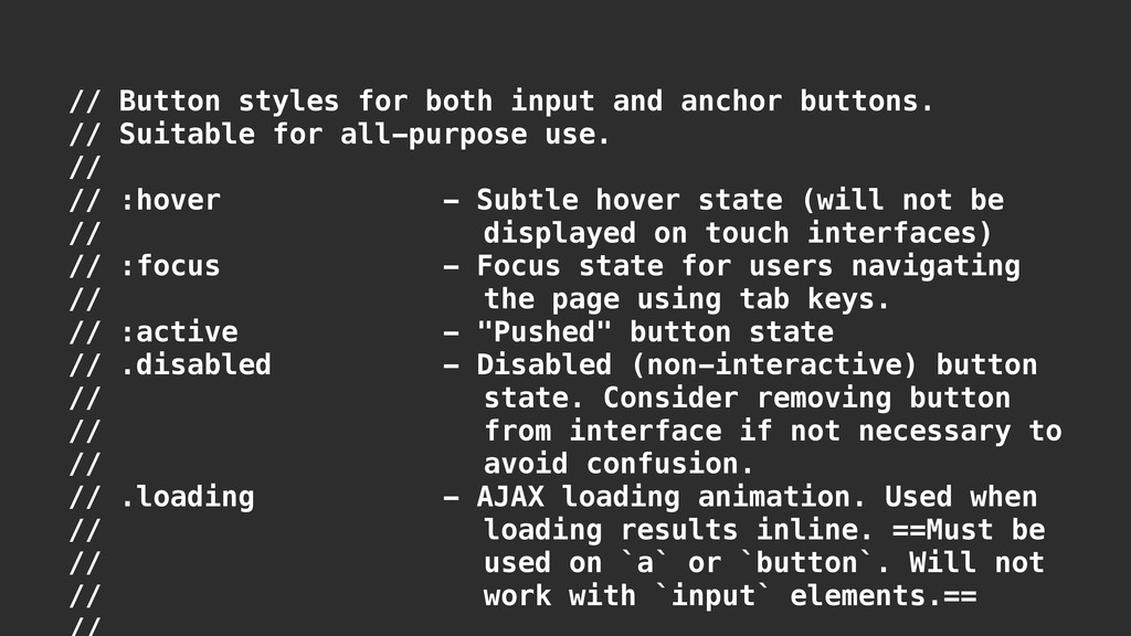
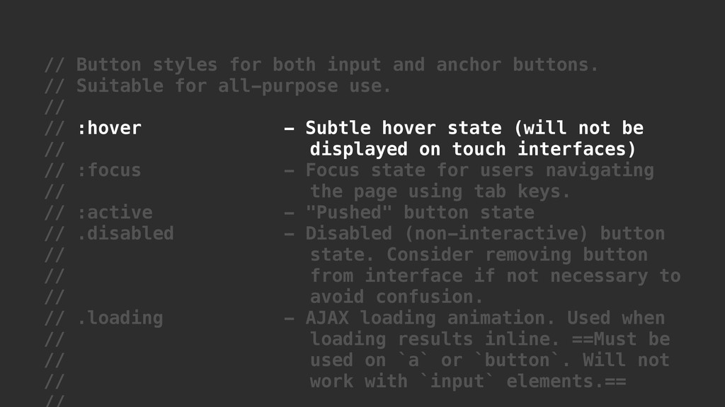
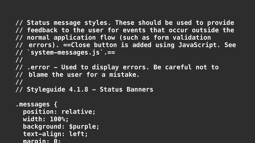
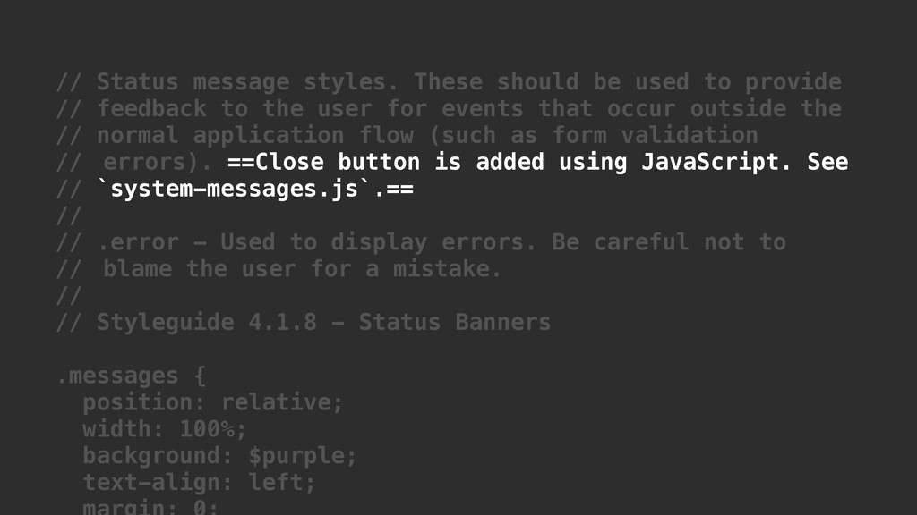
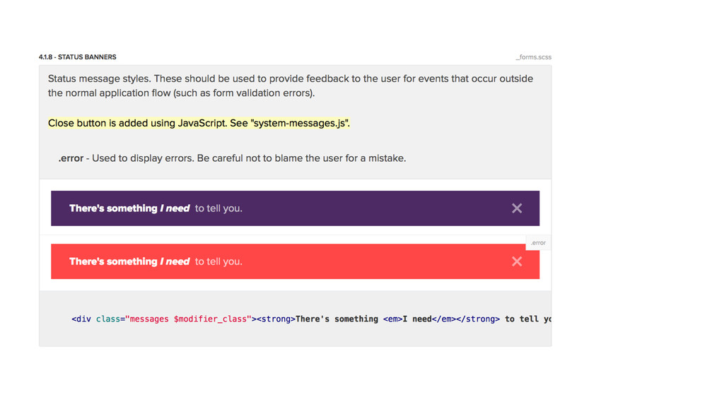
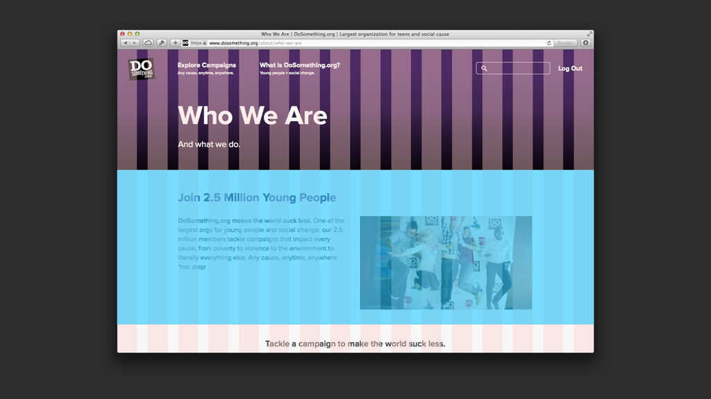
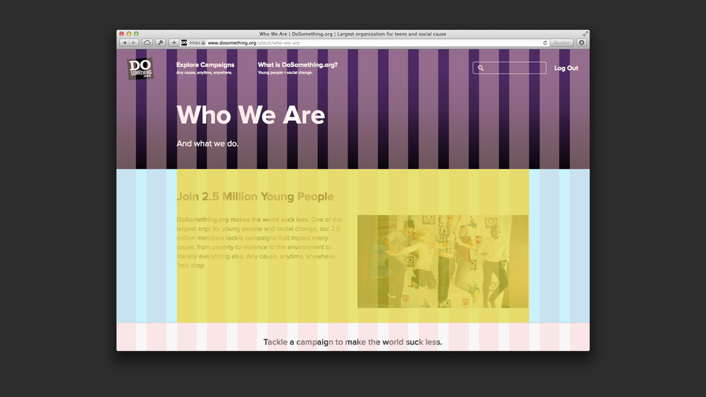
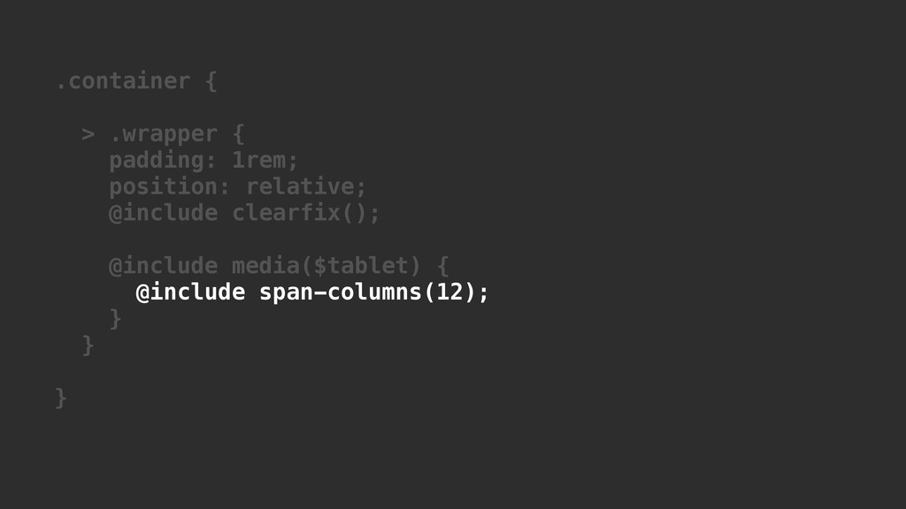
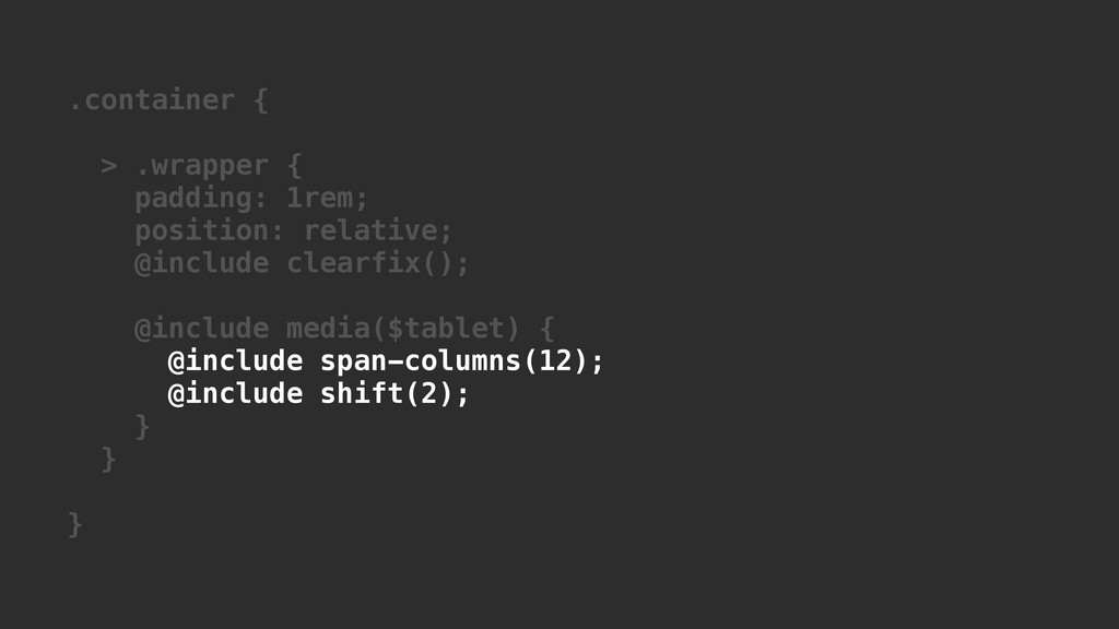
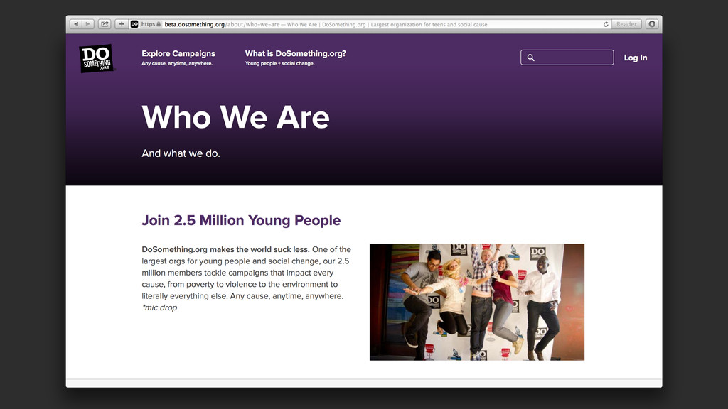
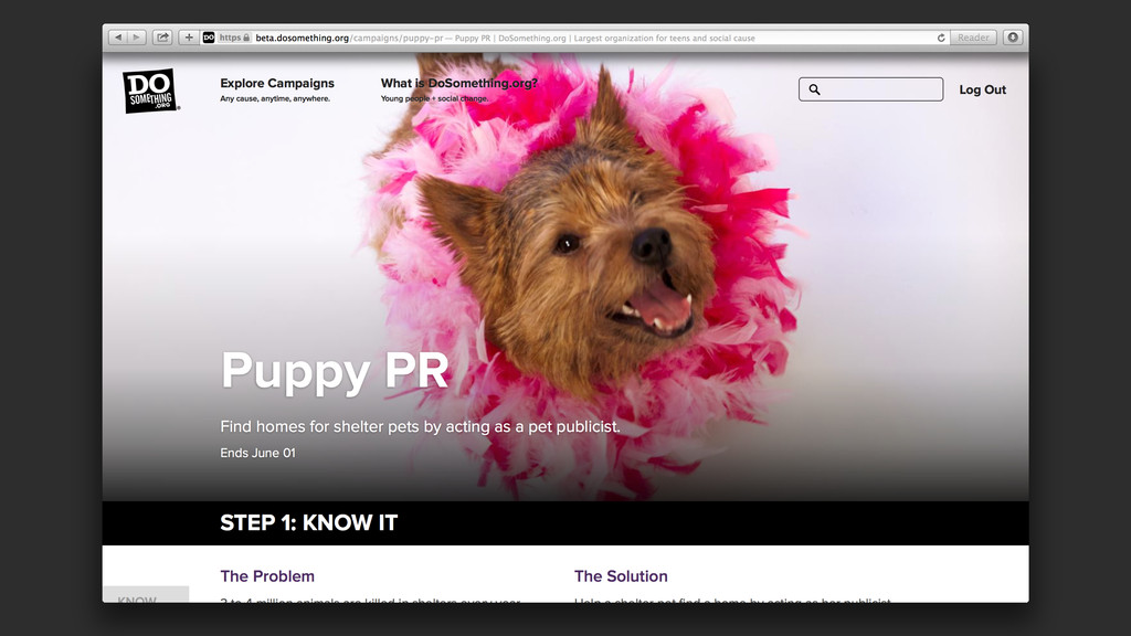
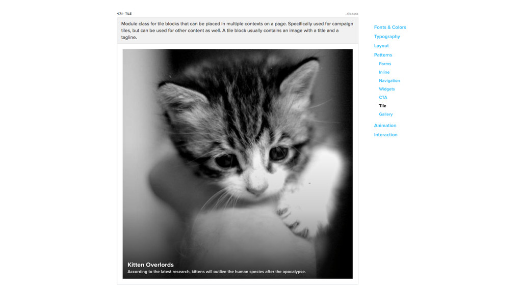
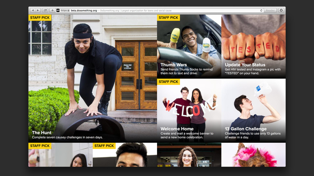
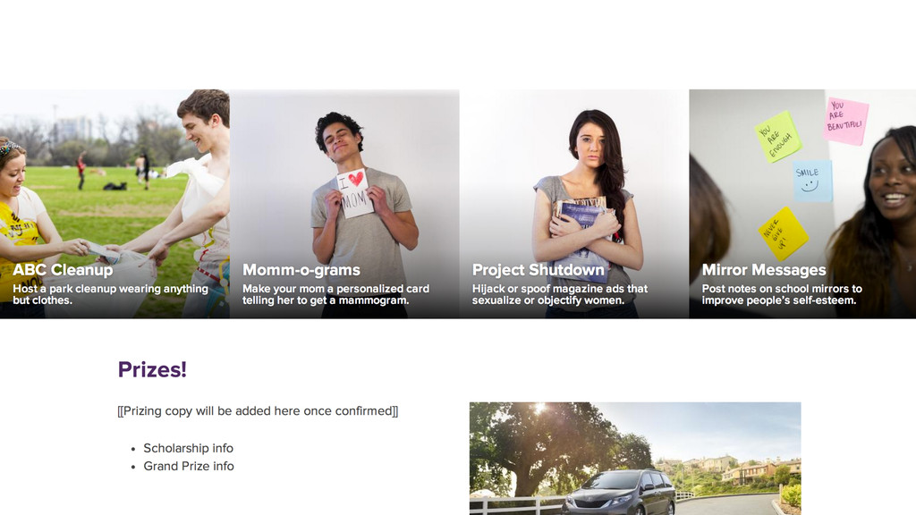
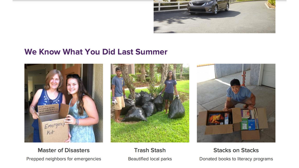
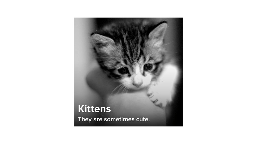
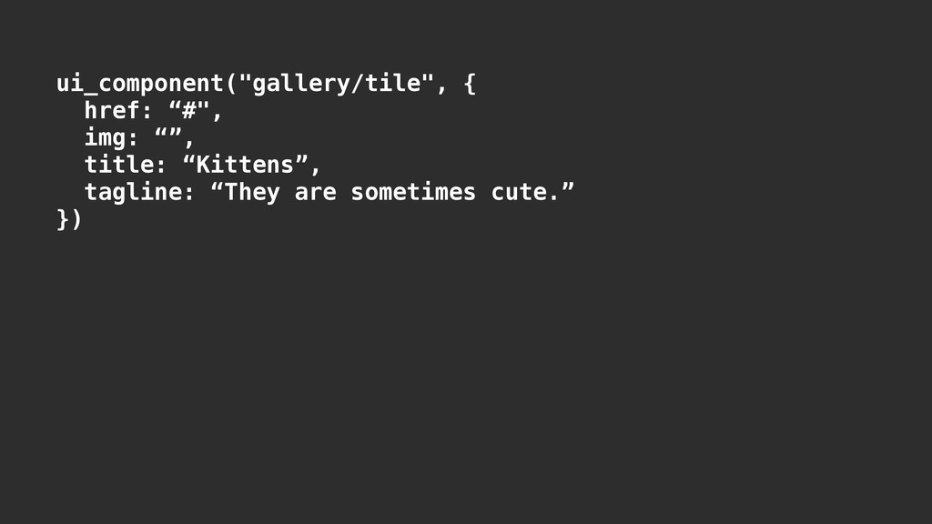
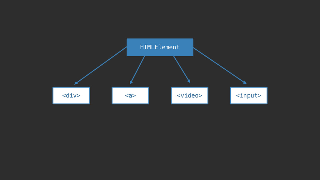
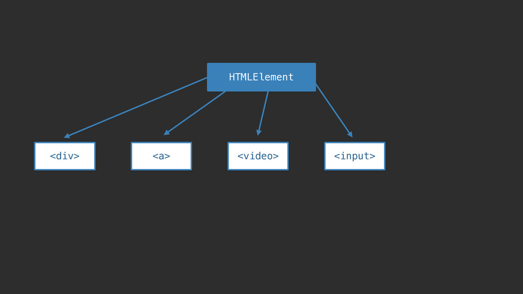
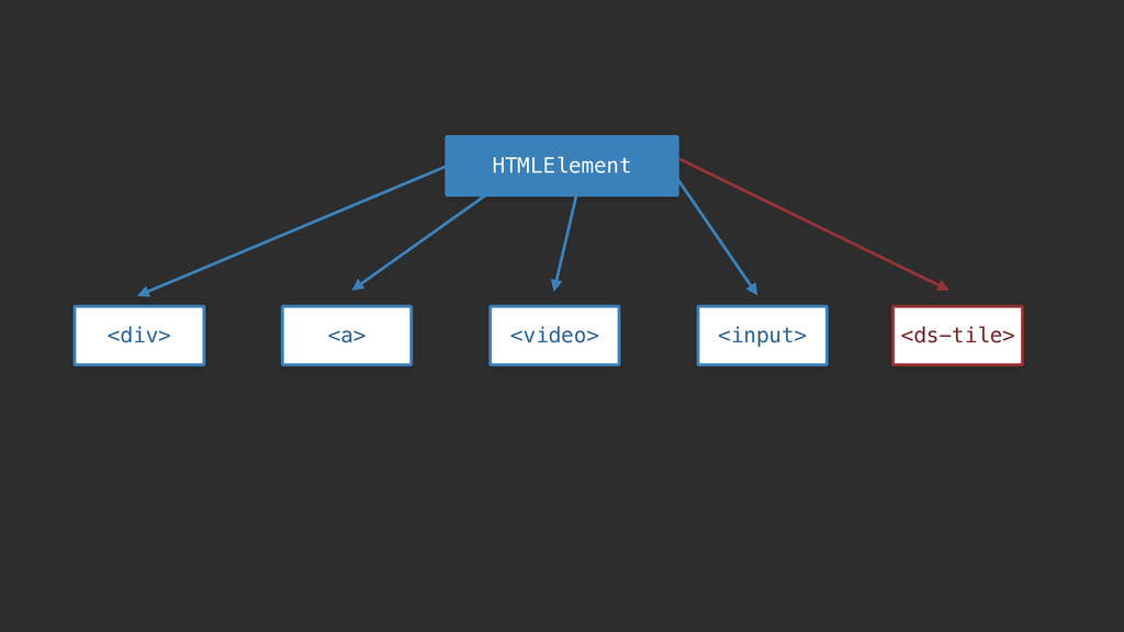
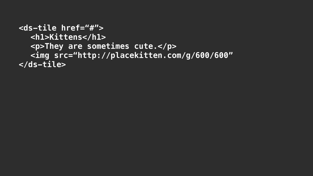
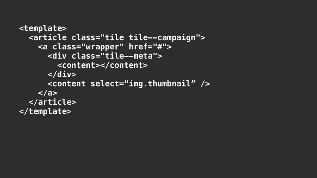
A number of websites such as GitHub, BBC and CodeForAmerica utilize live style guides to enforce visual consistency throughout their site and facilitate rapid building of user interfaces. You can think of a style guide as a living document of your front-end code and design decisions, outlining the elements and patterns used throughout your website.

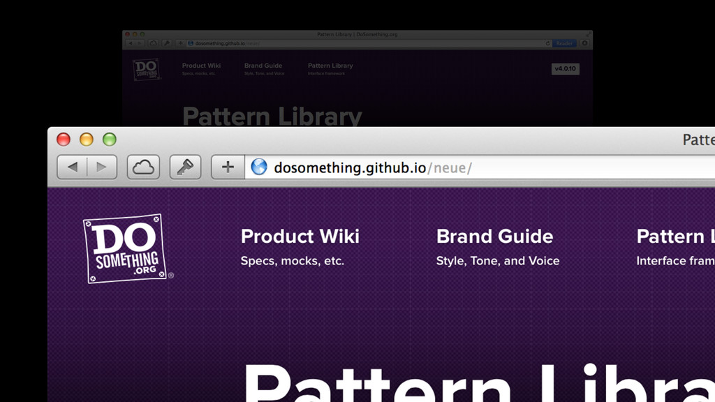
Front-End focused Software Engineers David Furnes and Diego Lorenzo will talk through how we created our Style Guide and Pattern Library - http://neue.dosomething.org - and how we use it on a daily basis at DoSomething.org.

You can watch a video of this talk on YouTube at: https://www.youtube.com/watch?v=4hrQ7XVjsSQ

David Furnes

June 23, 2014
Tweet

More Decks by David Furnes

Other Decks in Programming

Transcript

  1. @
    LET’S DO SOMETHING ABOUT
    Front-End Style Guides

    View Slide

  2. Who needs a style guide?

    View Slide

  3. GitHub

    View Slide

  4. BBC

    View Slide

  5. Code for
    America

    View Slide

  6. Yelp

    View Slide

  7. Starbucks

    View Slide

  8. Mozilla

    View Slide

  9. You need a style guide too.

    View Slide

  10. PART ONE
    Why a style guide?
    PART TWO
    Introducing Neue
    PART THREE
    How it’s made
    PART FOUR
    The Future

    View Slide

  11. PART ONE
    Why a style guide?

    View Slide

  12. Make development easier.

    View Slide

  13. Make design easier.

    View Slide

  14. Make talking about
    design easier.

    View Slide

  15. Make your site faster.

    View Slide

  16. Stop re-inventing the wheel.

    View Slide

  17. Mocks suck.

    View Slide

  18. PART TWO
    Introducing Neue

    View Slide

  19. View Slide

  20. View Slide

  21. View Slide

  22. Fonts & Colors

    View Slide

  23. Typography

    View Slide

  24. Fluid Grid Layout

    View Slide

  25. View Slide

  26. View Slide

  27. Re-usable Patterns

    View Slide

  28. Form fields
    Intra-page links
    Headings
    Modals
    Form validation
    Status messages
    Call-to-action banners
    Layout containers
    Galleries
    Campaign tiles
    Page headers
    Text callouts
    Legal text
    Smooth-scrolling
    Image borders
    Tabbed navigation
    Site chrome

    View Slide

  29. View Slide

  30. View Slide

  31. View Slide

  32. Form fields
    Image borders
    Tabbed navigation
    Intra-page links
    Headings
    Modals
    Form validation
    Status messages
    Call-to-action banners
    Layout containers
    Galleries
    Campaign tiles
    Page headers
    Site chrome
    Text callouts
    Legal text
    Smooth-scrolling

    View Slide

  33. View Slide

  34. Form fields
    Intra-page links
    Headings
    Modals
    Form validation
    Status messages
    Call-to-action banners
    Layout containers
    Galleries
    Campaign tiles
    Page headers
    Text callouts
    Legal text
    Smooth-scrolling
    Image borders
    Tabbed navigation
    Site chrome

    View Slide

  35. Form fields
    Intra-page links
    Headings
    Modals
    Form validation
    Status messages
    Call-to-action banners
    Layout containers
    Galleries
    Campaign tiles
    Page headers
    Text callouts
    Legal text
    Smooth-scrolling
    Image borders
    Tabbed navigation
    Site chrome

    View Slide

  36. View Slide

  37. Form fields
    Intra-page links
    Headings
    Modals
    Form validation
    Status messages
    Call-to-action banners
    Layout containers
    Galleries
    Campaign tiles
    Page headers
    Text callouts
    Legal text
    Smooth-scrolling
    Image borders
    Tabbed navigation
    Site chrome

    View Slide

  38. View Slide

  39. Animations

    View Slide

  40. Measurements

    View Slide

  41. PART THREE
    How it’s made

    View Slide

  42. SCSS

    View Slide

  43. KSS

    View Slide

  44. // Button styles for both input and anchor buttons.
    // Suitable for all-purpose use.
    //
    // :hover - Subtle hover state (will not be
    // displayed on touch interfaces)
    // :focus - Focus state for users navigating
    // the page using tab keys.
    // :active - "Pushed" button state
    // .disabled - Disabled (non-interactive) button
    // state. Consider removing button
    // from interface if not necessary to
    // avoid confusion.
    // .loading - AJAX loading animation. Used when
    // loading results inline. ==Must be
    // used on `a` or `button`. Will not
    // work with `input` elements.==

    View Slide

  45. // Button styles for both input and anchor buttons.
    // Suitable for all-purpose use.
    //
    // :hover - Subtle hover state (will not be
    // displayed on touch interfaces)
    // :focus - Focus state for users navigating
    // the page using tab keys.
    // :active - "Pushed" button state
    // .disabled - Disabled (non-interactive) button
    // state. Consider removing button
    // from interface if not necessary to
    // avoid confusion.
    // .loading - AJAX loading animation. Used when
    // loading results inline. ==Must be
    // used on `a` or `button`. Will not
    // work with `input` elements.==

    View Slide

  46. // Status message styles. These should be used to provide
    // feedback to the user for events that occur outside the
    // normal application flow (such as form validation
    // errors). ==Close button is added using JavaScript. See
    // `system-messages.js`.==
    //
    // .error - Used to display errors. Be careful not to
    // blame the user for a mistake.
    //
    // Styleguide 4.1.8 - Status Banners
    !
    .messages {
    position: relative;
    width: 100%;
    background: $purple;
    text-align: left;

    View Slide

  47. // Status message styles. These should be used to provide
    // feedback to the user for events that occur outside the
    // normal application flow (such as form validation
    // errors). ==Close button is added using JavaScript. See
    // `system-messages.js`.==
    //
    // .error - Used to display errors. Be careful not to
    // blame the user for a mistake.
    //
    // Styleguide 4.1.8 - Status Banners
    !
    .messages {
    position: relative;
    width: 100%;
    background: $purple;
    text-align: left;

    View Slide

  48. // Status message styles. These should be used to provide
    // feedback to the user for events that occur outside the
    // normal application flow (such as form validation
    // errors). ==Close button is added using JavaScript. See
    // `system-messages.js`.==
    //
    // .error - Used to display errors. Be careful not to
    // blame the user for a mistake.
    //
    // Styleguide 4.1.8 - Status Banners
    !
    .messages {
    position: relative;
    width: 100%;
    background: $purple;
    text-align: left;

    View Slide

  49. View Slide

  50. Fluid, Semantic Grid Layout

    View Slide

  51. Fluid, Semantic Grid Layout

    View Slide

  52. Fluid, Semantic Grid Layout

    View Slide

  53. Fluid, Semantic Grid Layout

    View Slide

  54. http://neat.bourbon.io

    View Slide

  55. View Slide

  56. View Slide

  57. .container {
    !
    > .wrapper {
    padding: 1rem;
    position: relative;
    @include clearfix();
    !
    @include media($tablet) {
    !
    }
    }
    !
    }

    View Slide

  58. .container {
    !
    > .wrapper {
    padding: 1rem;
    position: relative;
    @include clearfix();
    !
    @include media($tablet) {
    @include span-columns(12);
    }
    }
    !
    }

    View Slide

  59. .container {
    !
    > .wrapper {
    padding: 1rem;
    position: relative;
    @include clearfix();
    !
    @include media($tablet) {
    @include span-columns(12);
    @include shift(2);
    }
    }
    !
    }

    View Slide

  60. View Slide

  61. Pattern-ity test

    View Slide

  62. View Slide

  63. View Slide

  64. View Slide

  65. View Slide

  66. View Slide

  67. View Slide

  68. View Slide

  69. View Slide

  70. Anatomy of a Pattern

    View Slide

  71. A pattern is a set of rules.

    View Slide

  72. Defines consistent markup.

    View Slide

  73. Break components into
    reusable blocks.

    View Slide

  74. Break components into
    reusable blocks.

    View Slide

  75. Structuring your CSS

    View Slide

  76. OOCS

    View Slide

  77. OOCS, ACSS

    View Slide

  78. OOCS, ACSS, SMACSS

    View Slide

  79. OOCS, ACSS, SMACSS, BEM

    View Slide

  80. .block { }
    .block__element { }
    .block--modifier { }
    // but shit gets cray:
    .block__element--modifier { }
    .block__element--modifier__element { }

    View Slide


  81. Kittens
    They are sometimes cute.


    View Slide

  82. View Slide

  83. Sharing the style guide

    View Slide

  84. View Slide

  85. Using the style guide

    View Slide

  86. View Slide

  87. Semantic Versioning

    View Slide

  88. dosomething/bower.json
    !
    {
    “name: “dosomething”,
    “dependencies”: {
    “neue”: “DoSomething/neue#~4.0.0”,
    “jquery”: “1.8.3”,
    “html5shiv”: “~3.7.0”,
    “lodash”: “~2.4.1”,
    /* ... */
    },
    /* ... */
    }

    View Slide

  89. neue/bower.json
    !
    {
    “name: “neue”,
    “version”: “4.0.10”,
    “main”: [
    “dist/neue.css”,
    “dist/neue.min.js”
    ],
    "dependencies": {
    "jquery": ">=1.7.2"
    },
    /* ... */
    }

    View Slide

  90. neue/bower.json
    !
    {
    “name: “neue”,
    “version”: “4.0.10”,
    “main”: [
    “dist/neue.css”,
    “dist/neue.min.js”
    ],
    "dependencies": {
    "jquery": ">=1.7.2"
    },
    /* ... */
    }

    View Slide

  91. PART FOUR
    The Future

    View Slide

  92. Keeping things in sync.

    View Slide

  93. View Slide

  94. View Slide


  95. Kittens
    They are sometimes cute.


    View Slide

  96. ui_component("gallery/tile", {
    href: “#",
    img: “”,
    title: “Kittens”,
    tagline: “They are sometimes cute.”
    })

    View Slide

  97. Web Components

    View Slide

  98. HTMLElement

    View Slide

  99. HTMLElement

    View Slide


  100. HTMLElement

    View Slide


  101. Kittens
    They are sometimes cute.


    View Slide


  102. Kittens
    They are sometimes cute.

    !

    View Slide


  103. View Slide

  104. View Slide

  105. View Slide

  106. View Slide

  107. KEEP THAT SHIT
    NICE AND DRY.

    View Slide

  108. DON’T BUILD MORE
    THAN YOU HAVE TO.

    View Slide

  109. BUILD THINGS TO HELP
    YOU BUILD THINGS.

    View Slide

  110. QUESTIONS?
    David Furnes
    @dfurnes
    !
    Diego Lorenzo
    @weerd

    View Slide