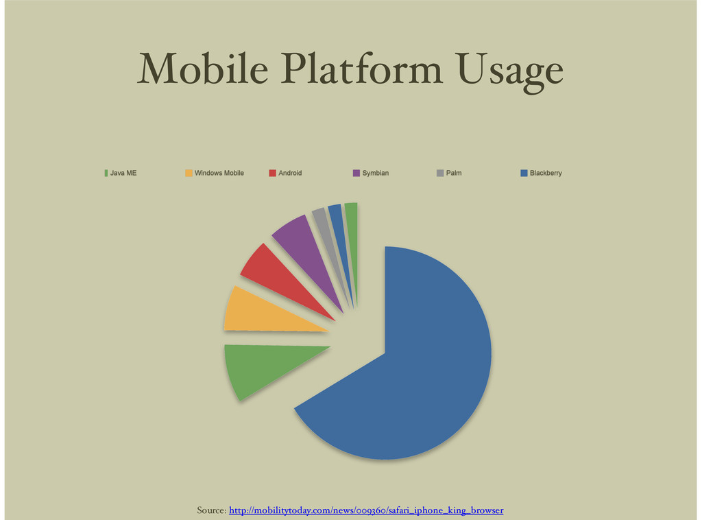
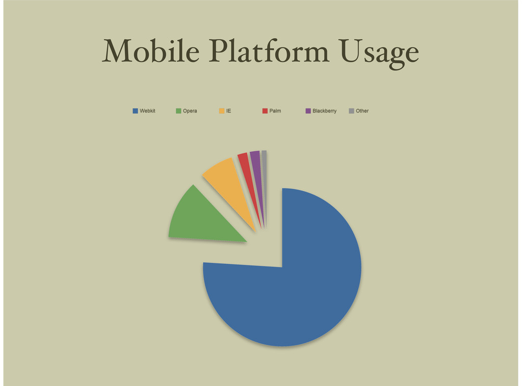
Symbian Palm Blackberry BREW Mobile Safari Java ME Windows Mobile Android Symbian Palm Blackberry BREW Source: http://mobilitytoday.com/news/009360/safari_iphone_king_browser
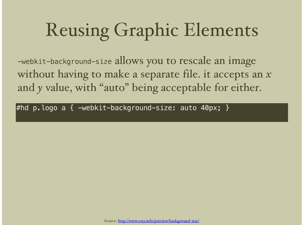
} -webkit-background-size allows you to rescale an image without having to make a separate file. it accepts an x and y value, with “auto” being acceptable for either. Source: http://www.css3.info/preview/background-size/
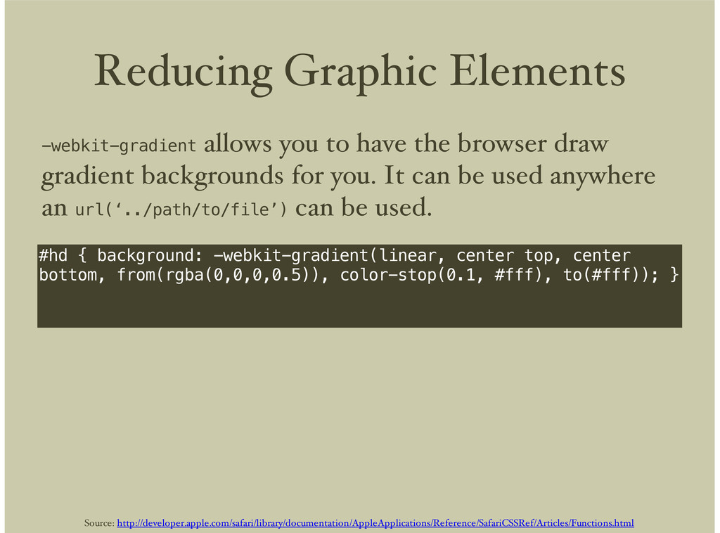
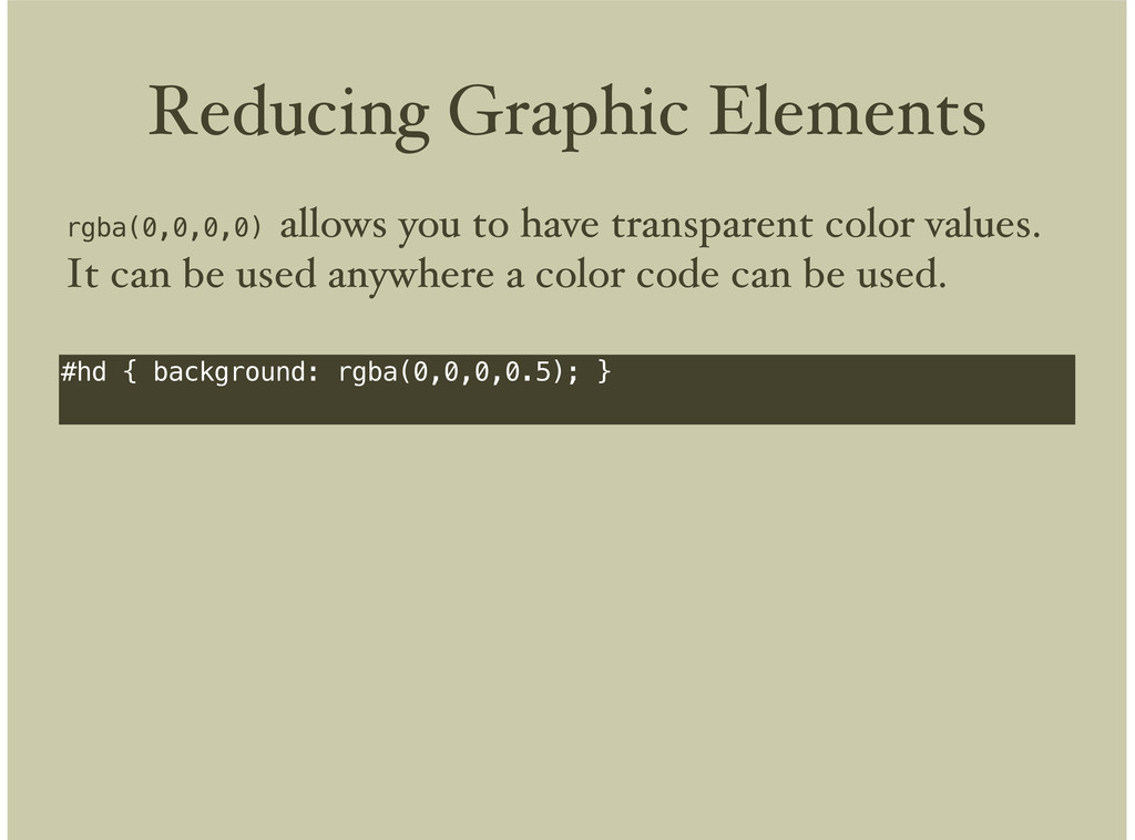
bottom, from(rgba(0,0,0,0.5)), color-stop(0.1, #fff), to(#fff)); } -webkit-gradient allows you to have the browser draw gradient backgrounds for you. It can be used anywhere an url(‘../path/to/file’) can be used. Source: http://developer.apple.com/safari/library/documentation/AppleApplications/Reference/SafariCSSRef/Articles/Functions.html
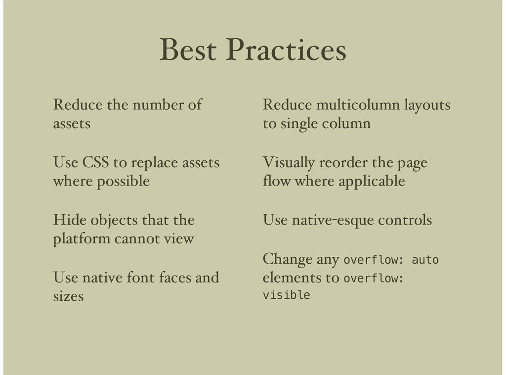
replace assets where possible Hide objects that the platform cannot view Use native font faces and sizes Reduce multicolumn layouts to single column Visually reorder the page flow where applicable Use native-esque controls Change any overflow: auto elements to overflow: visible
 dryan
dryan
 muziyoshiz
 ymty
ymty
 miyukichi_ospf
 ken6377
 kakehashi
 dmmsre
 ysknsid25
 shift_evolve
 chacco38
 doradora09
 chmikata
 nwiizo
 inesmontani
 uxyall
 jct
jct
 eileencodes
 addyosmani
 ivargrimstad
 keavy
keavy
 rkendrick25
 morganepeng
 aleyda
 keithpitt