am emulating on this slide is not a miracle of good design. In fact, it’s horrible design, except that it fulfills one useful purpose—letting instructors leave scribbled feedback—very well. If term-paper design is all you know about design, that’s not your fault—but you will do yourself a huge favor if you expand your design horizons.
design removes it. • Do you really want people thinking “oh, high school term paper” when they read your magnum opus? (Hint: no, you don’t.) • Good design assists reading and comprehension. Bad design impedes them. • Good design is accessible. Bad design frequently isn’t. • Good design persuades. Bad design frustrates.
the MA/LIS. Anything that makes the committees look kindly upon us helps! • In our 2014 round, the visiting committee speci fi cally mentioned how pleasant and legible the design of our Program Presentation (self-study) document was. • This made me very happy, as it was my work!
in which case, why are you looking at this? You’re fi ne. Go do something else. • I know. Neither am I. Color theory bewilders me. • Though I know a bit about print typography because I did a little book typesetting back in the day. • What I have is a relatively small selection of useful design tricks that I use over and over again, and known-bad things I avoid. • You can build your own selection. I’ll walk you through what might be in it.
can implement in almost all word-processing software… • … even Google Docs, which is incredibly resistant to good design. • I’ll tell you about “styles” and “templates” at the end, because they make good design faster to apply to documents and easier to share with others.
and contextual. • You MUST know about the cultural characteristics and design conventions of the people you’re designing for. • This is especially important for COLOR, which has widely varying meanings in different cultures. • What I’m telling you should work okay for most North American and Western European professional contexts, because that’s what I know. Anywhere/anyone else? STUDY UP, please. • If/when you travel, paying attention to local design conventions is a super-useful thing to bring home with you.
over several centuries of print design, and perhaps a decade and a half of web design) • Visual acuity, or lack thereof • “Saccades” (reading in short bursts of text) • One thing this means is that if a line of text is too long or has too many words in it, we can lose our place in it. • Same when text is too vertically dense (that is, not enough space between lines) or not dense enough (too much line space). • Inferring text structure from typography, layout, color • Literate humans are amazing at this! We don’t even usually think about it, or how amazing it is that we can do it so well! (Computers are total crap at it.) • But it does mean that designers need to work with it! Lean in on differentiating structurally-distinct pieces of text using typography, layout, and color!
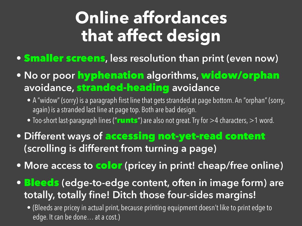
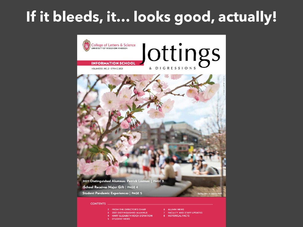
than print (even now) • No or poor hyphenation algorithms, widow/orphan avoidance, stranded-heading avoidance • A “widow” (sorry) is a paragraph fi rst line that gets stranded at page bottom. An “orphan” (sorry, again) is a stranded last line at page top. Both are bad design. • Too-short last-paragraph lines (“runts”) are also not great. Try for >4 characters, >1 word. • Different ways of accessing not-yet-read content (scrolling is different from turning a page) • More access to color (pricey in print! cheap/free online) • Bleeds (edge-to-edge content, often in image form) are totally, totally fi ne! Ditch those four-sides margins! • (Bleeds are pricey in actual print, because printing equipment doesn’t like to print edge to edge. It can be done… at a cost.)
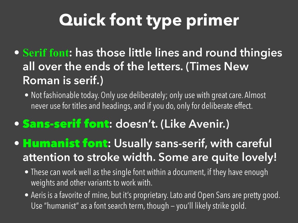
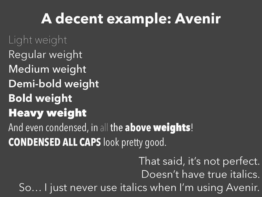
lines and round thingies all over the ends of the letters. (Times New Roman is serif.) • Not fashionable today. Only use deliberately; only use with great care. Almost never use for titles and headings, and if you do, only for deliberate effect. • Sans-serif font: doesn’t. (Like Avenir.) • Humanist font: Usually sans-serif, with careful attention to stroke width. Some are quite lovely! • These can work well as the single font within a document, if they have enough weights and other variants to work with. • Aeris is a favorite of mine, but it’s proprietary. Lato and Open Sans are pretty good. Use “humanist” as a font search term, though — you’ll likely strike gold.
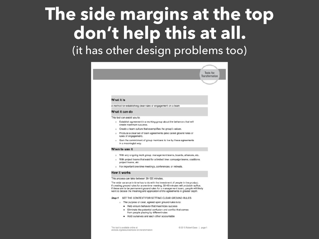
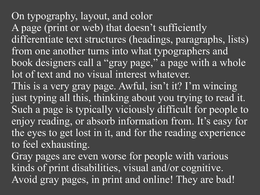
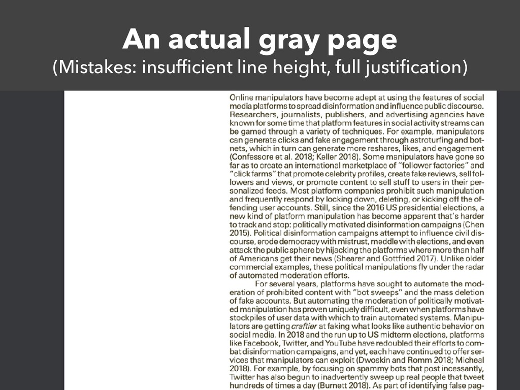
that doesn’t sufficiently differentiate text structures (headings, paragraphs, lists) from one another turns into what typographers and book designers call a “gray page,” a page with a whole lot of text and no visual interest whatever. This is a very gray page. Awful, isn’t it? I’m wincing just typing all this, thinking about you trying to read it. Such a page is typically viciously difficult for people to enjoy reading, or absorb information from. It’s easy for the eyes to get lost in it, and for the reading experience to feel exhausting. Gray pages are even worse for people with various kinds of print disabilities, visual and/or cognitive. Avoid gray pages, in print and online! They are bad!
“RIVERS” of space. DO NOT. EVER. Not for online. Left-align everything (also called “ragged right”). A page (print or web) that doesn’t sufficiently differentiate text structures from one another turns into what typographers and book designers call a “gray page,” a page with a whole lot of text and no visual interest whatever. This is a very gray page. Awful, isn’t it? I’m wincing just typing all this, thinking about you trying to read it. Such a page is typically viciously difficult for people to enjoy reading, or absorb information from. It’s easy for the eyes to get lost in it, and for the reading experience to feel exhausting. Gray pages are even worse for people with various
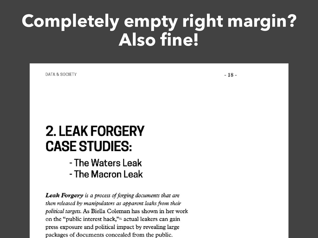
ows are absolutely obnoxious online because of scrolling and mobile. Please don’t use them. • Yeah, yeah, a lot of publications do, still. You’re better than that. You don’t. • I truly, madly, deeply wish computer-science conferences would learn this! All their paper layouts are two-column, argh! • But you can’t put a single column of small-font body copy across a whole page either. Lines become too long to read easily! • I’ll show you some ways to cope with this.
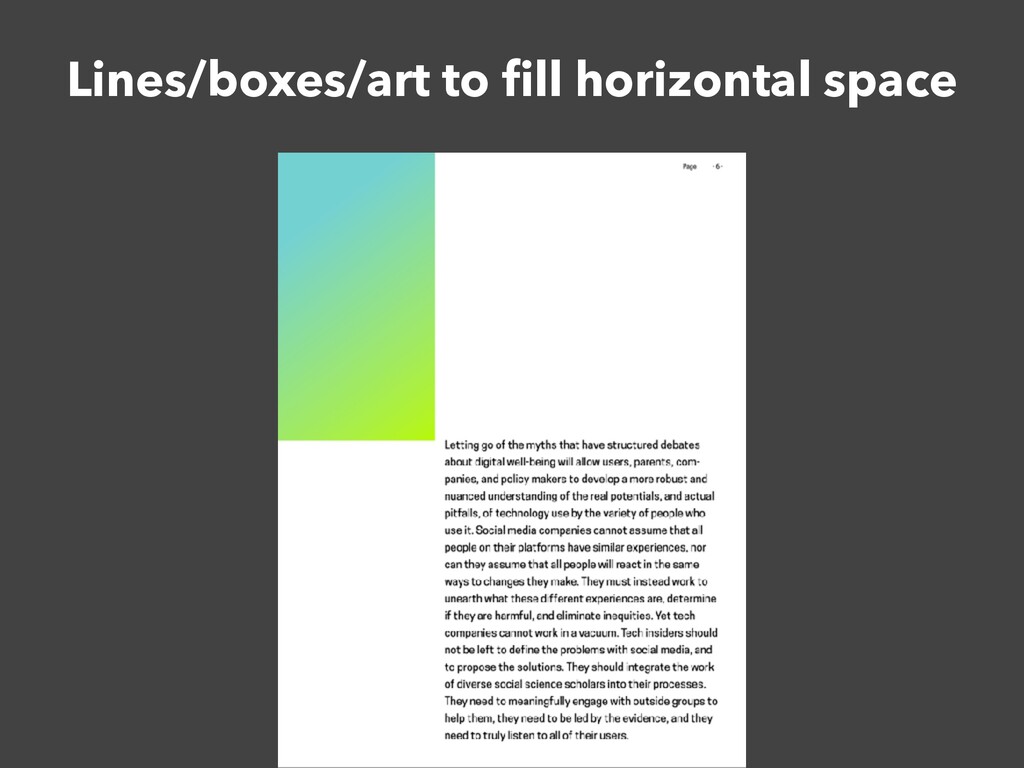
(including citations), pull quotes, bullet lists (“key points”), graphs/charts if they work at a small size • Okay to have big stretches of empty right margin!
term-papery hell. Just don’t! The fi rst line of the fi rst paragraph after a heading should never be indented. • Look at well-designed non fi ction books, please! • Paragraph indentation is unfashionable today anyway; web defaults created a long-term trend for vertical whitespace between paragraphs instead. • Personally, old-school book typesetter that I am, I don’t love this… but I’m fi ne with y’all doing it because it’s so common.
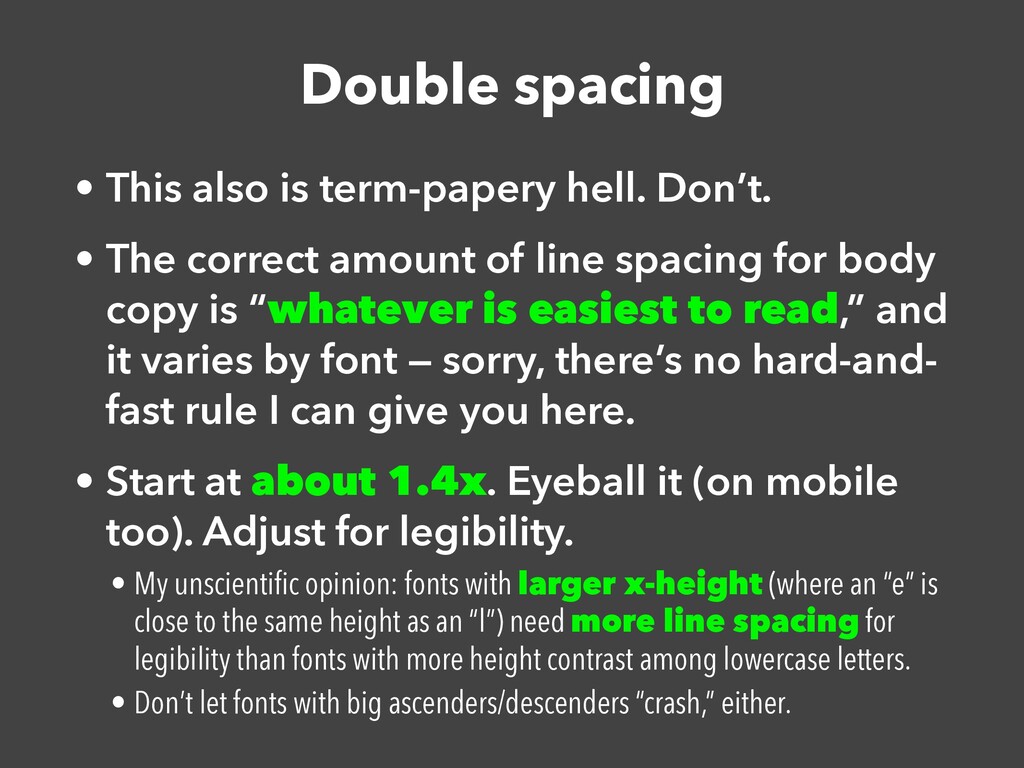
The correct amount of line spacing for body copy is “whatever is easiest to read,” and it varies by font — sorry, there’s no hard-and- fast rule I can give you here. • Start at about 1.4x. Eyeball it (on mobile too). Adjust for legibility. • My unscienti fi c opinion: fonts with larger x-height (where an “e” is close to the same height as an “l”) need more line spacing for legibility than fonts with more height contrast among lowercase letters. • Don’t let fonts with big ascenders/descenders “crash,” either.
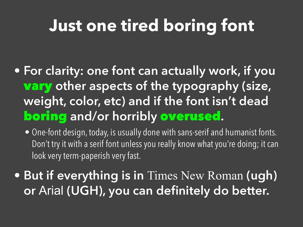
can actually work, if you vary other aspects of the typography (size, weight, color, etc) and if the font isn’t dead boring and/or horribly overused. • One-font design, today, is usually done with sans-serif and humanist fonts. Don’t try it with a serif font unless you really know what you’re doing; it can look very term-paperish very fast. • But if everything is in Times New Roman (ugh) or Arial (UGH), you can de fi nitely do better.
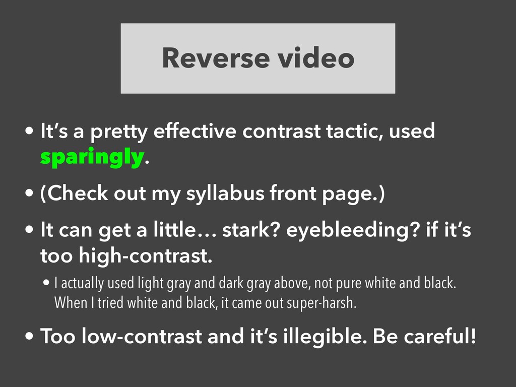
light background color for part of a page can add a lot of pop to that page! • So can reverse video with an interesting color. • (… probably not this particular green — it’s too bright and too saturated — but just to give you the idea…) • Great for pull quotes (or entire pull sections, which some documents have), block quotations, lists, headings, page-number headers/footers…
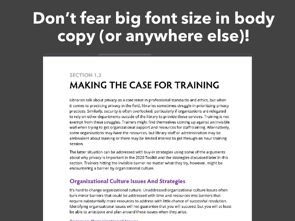
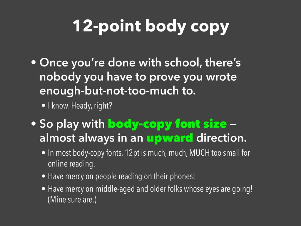
nobody you have to prove you wrote enough-but-not-too-much to. • I know. Heady, right? • So play with body-copy font size — almost always in an upward direction. • In most body-copy fonts, 12pt is much, much, MUCH too small for online reading. • Have mercy on people reading on their phones! • Have mercy on middle-aged and older folks whose eyes are going! (Mine sure are.)
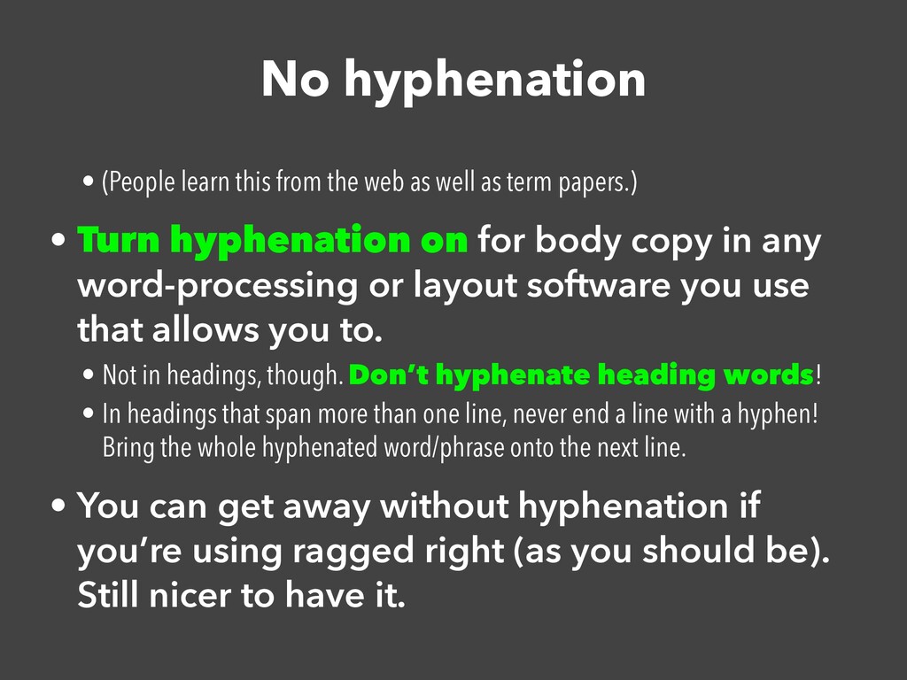
well as term papers.) • Turn hyphenation on for body copy in any word-processing or layout software you use that allows you to. • Not in headings, though. Don’t hyphenate heading words! • In headings that span more than one line, never end a line with a hyphen! Bring the whole hyphenated word/phrase onto the next line. • You can get away without hyphenation if you’re using ragged right (as you should be). Still nicer to have it.
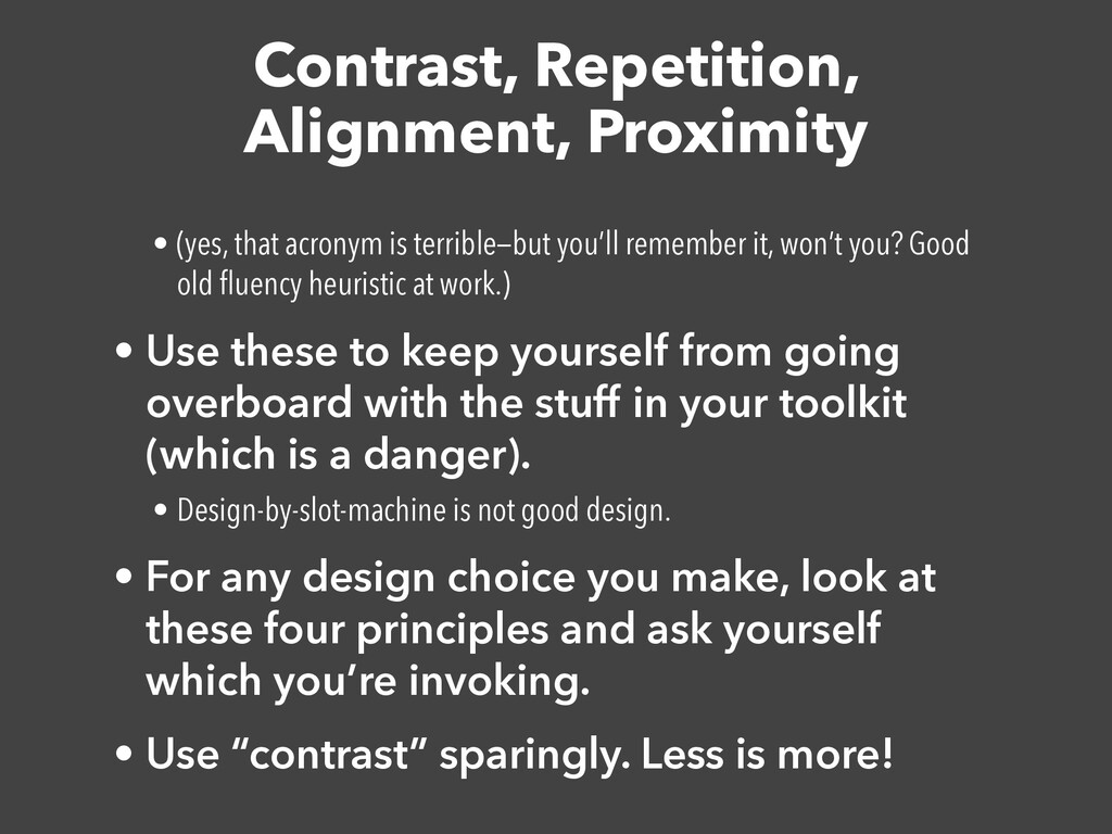
you’ll remember it, won’t you? Good old fl uency heuristic at work.) • Use these to keep yourself from going overboard with the stuff in your toolkit (which is a danger). • Design-by-slot-machine is not good design. • For any design choice you make, look at these four principles and ask yourself which you’re invoking. • Use “contrast” sparingly. Less is more!
(let’s not have the “font vs. typeface” argument here, okay?) • Color • Layout (where things are on the page) • Whitespace, other dividers • (borders/lines, rules, ornaments, shaped/colored backgrounds, etc) • If you don’t know what you’re doing, prefer adding whitespace to anything else. Good use of whitespace is tremendously elegant! • Art (including photos)
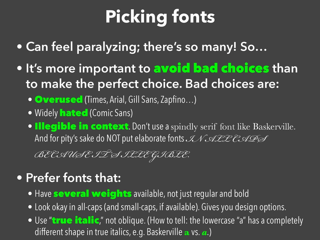
• It’s more important to avoid bad choices than to make the perfect choice. Bad choices are: • Overused (Times, Arial, Gill Sans, Zap fi no…) • Widely hated (Comic Sans) • Illegible in context. Don’t use a spindly serif font like Baskerville. And for pity’s sake do NOT put elaborate fonts IN ALL CAPS BECAUSE IT’S ILLEGIBLE. • Prefer fonts that: • Have several weights available, not just regular and bold • Look okay in all-caps (and small-caps, if available). Gives you design options. • Use “true italic,” not oblique. (How to tell: the lowercase “a” has a completely different shape in true italics, e.g. Baskerville a vs. a.)
Demi-bold weight Bold weight Heavy weight And even condensed, in all the above weights! CONDENSED ALL CAPS look pretty good. That said, it’s not perfect. Doesn’t have true italics. So… I just never use italics when I’m using Avenir.
(though sadly, Avenir just has oblique) • ALL CAPS, SMALL CAPS • Size • Condensed/expanded lettering (horizontally) • Increas ed/decreased letter-spacing • Decrease with care! Too little space harms legibility. • Increased is often used for running heads, occasionally for headings; often combined with small- or all-caps. • Use a few of these (but don’t go overboard!) to help create a hierarchy of visual importance. • Non-body-copy must contrast with body copy! • Don’t mess around with body copy. Legibility is paramount!!!
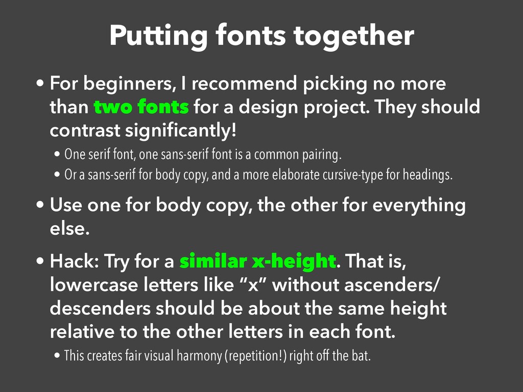
more than two fonts for a design project. They should contrast signi fi cantly! • One serif font, one sans-serif font is a common pairing. • Or a sans-serif for body copy, and a more elaborate cursive-type for headings. • Use one for body copy, the other for everything else. • Hack: Try for a similar x-height. That is, lowercase letters like “x” without ascenders/ descenders should be about the same height relative to the other letters in each font. • This creates fair visual harmony (repetition!) right off the bat.
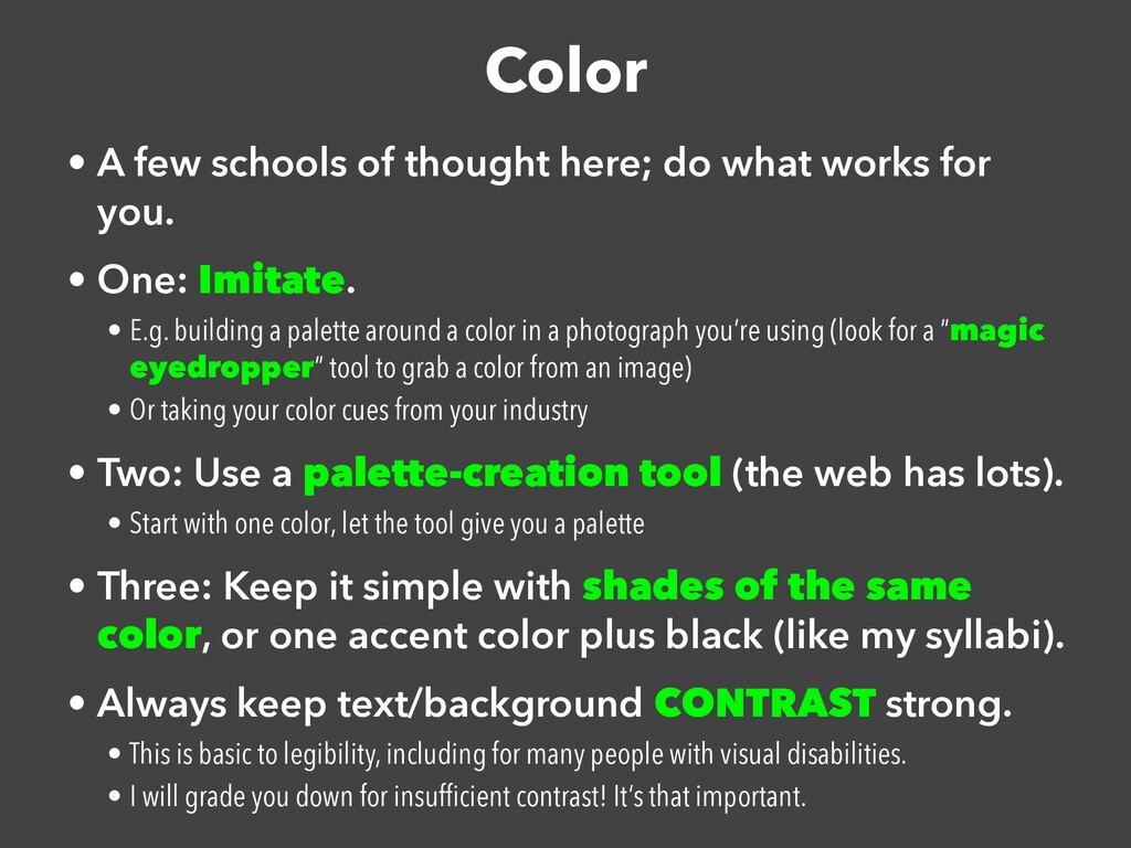
works for you. • One: Imitate. • E.g. building a palette around a color in a photograph you’re using (look for a “magic eyedropper” tool to grab a color from an image) • Or taking your color cues from your industry • Two: Use a palette-creation tool (the web has lots). • Start with one color, let the tool give you a palette • Three: Keep it simple with shades of the same color, or one accent color plus black (like my syllabi). • Always keep text/background CONTRAST strong. • This is basic to legibility, including for many people with visual disabilities. • I will grade you down for insuf fi cient contrast! It’s that important.
on black. Like this. It’s illegible. Don’t. • I see posters do this, and I’m just all “what were they thinking?” • Gray on black. Gray on white (WEB DESIGNERS STOP). • Have mercy on everyone’s eyesight! Contrast, please! • Text on a too-busy photograph • One way around this: put a translucent-colored shape behind the text to give it greater contrast with the photo. (An opaque shape works too, but is a bit less elegant.) • Another way: put the photo on a black background, then reduce the photo’s opacity to darken it. (I do this in slidedecks a lot.) Or blur the photo until the text is clear. • Third way: put the text on a relatively one-color, contrasting part of the photo. • Other options here! Just please, watch that contrast!
sparingly. • (Check out my syllabus front page.) • It can get a little… stark? eyebleeding? if it’s too high-contrast. • I actually used light gray and dark gray above, not pure white and black. When I tried white and black, it came out super-harsh. • Too low-contrast and it’s illegible. Be careful!
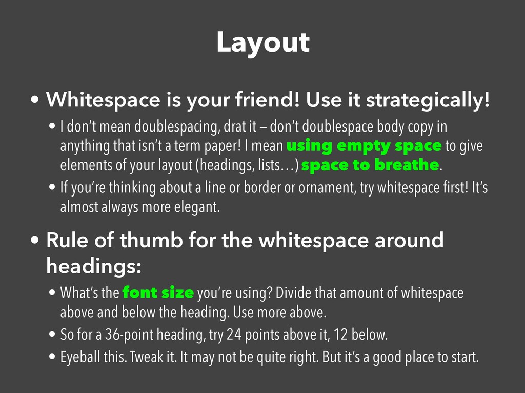
I don’t mean doublespacing, drat it — don’t doublespace body copy in anything that isn’t a term paper! I mean using empty space to give elements of your layout (headings, lists…) space to breathe. • If you’re thinking about a line or border or ornament, try whitespace fi rst! It’s almost always more elegant. • Rule of thumb for the whitespace around headings: • What’s the font size you’re using? Divide that amount of whitespace above and below the heading. Use more above. • So for a 36-point heading, try 24 points above it, 12 below. • Eyeball this. Tweak it. It may not be quite right. But it’s a good place to start.
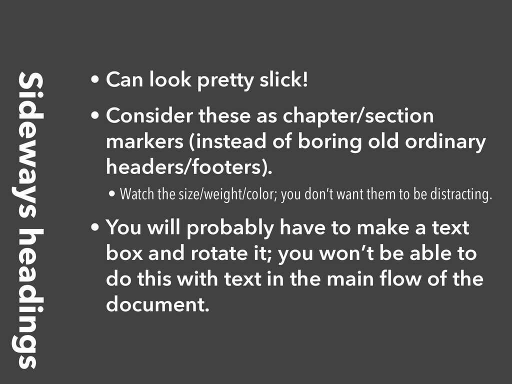
as chapter/section markers (instead of boring old ordinary headers/footers). • Watch the size/weight/color; you don’t want them to be distracting. • You will probably have to make a text box and rotate it; you won’t be able to do this with text in the main fl ow of the document.
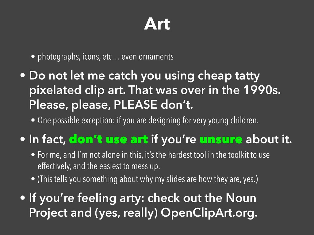
let me catch you using cheap tatty pixelated clip art. That was over in the 1990s. Please, please, PLEASE don’t. • One possible exception: if you are designing for very young children. • In fact, don’t use art if you’re unsure about it. • For me, and I’m not alone in this, it’s the hardest tool in the toolkit to use effectively, and the easiest to mess up. • (This tells you something about why my slides are how they are, yes.) • If you’re feeling arty: check out the Noun Project and (yes, really) OpenClipArt.org.
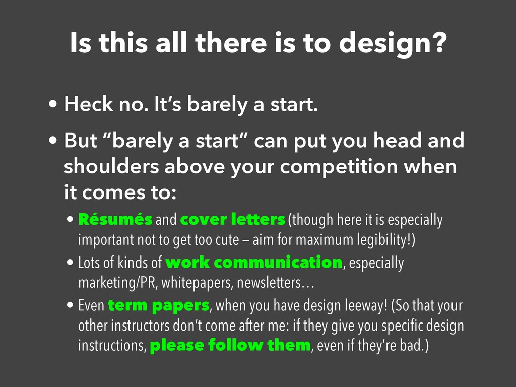
It’s barely a start. • But “barely a start” can put you head and shoulders above your competition when it comes to: • Résumés and cover letters (though here it is especially important not to get too cute — aim for maximum legibility!) • Lots of kinds of work communication, especially marketing/PR, whitepapers, newsletters… • Even term papers, when you have design leeway! (So that your other instructors don’t come after me: if they give you speci fi c design instructions, please follow them, even if they’re bad.)
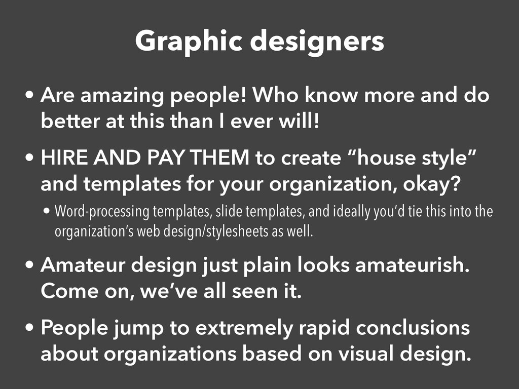
do better at this than I ever will! • HIRE AND PAY THEM to create “house style” and templates for your organization, okay? • Word-processing templates, slide templates, and ideally you’d tie this into the organization’s web design/stylesheets as well. • Amateur design just plain looks amateurish. Come on, we’ve all seen it. • People jump to extremely rapid conclusions about organizations based on visual design.
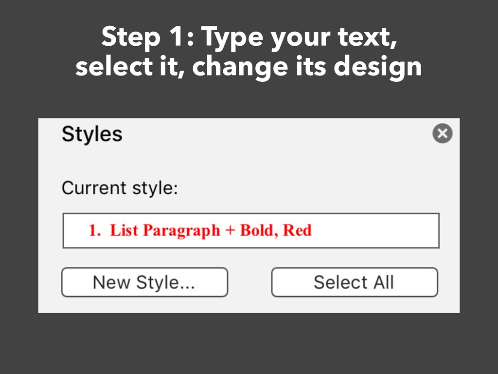
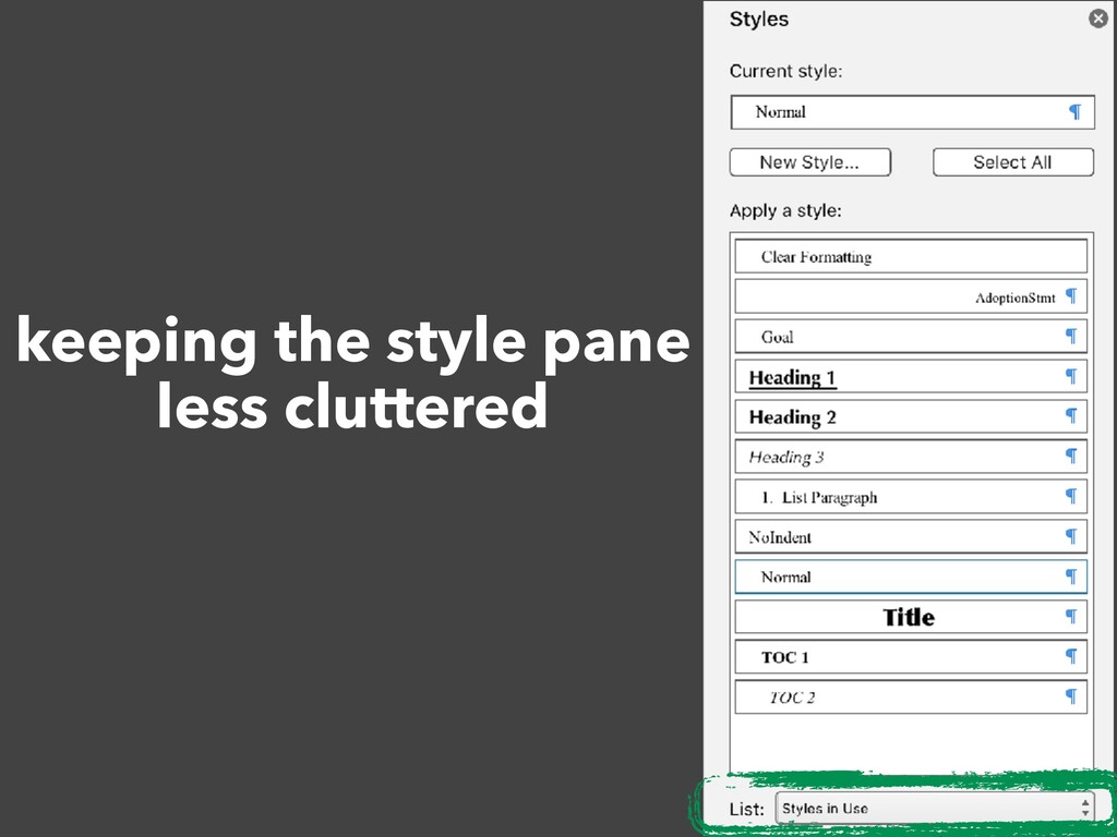
size, whitespace above/below, and/or color every time you type a heading is a giant timesink. • Fortunately, you don’t have to do this. • STYLES. Learn to use them! They will keep you from hating design forever!
changes. • Give the bundle a name. • That’s a style. You can apply it wherever you need it. • And if you change your mind about the design, you change the style de fi nition, and everything marked with that style changes to match! • In most software, two kinds of styles: • “Paragraph” styles: for blocky things like headings, paragraphs, pull quotes • “Character” styles: for a span of text within a block, such as a sudden pop of color and weight for emphasis • (If there’s a third kind, it’s probably for lists, which have their own design considerations.)
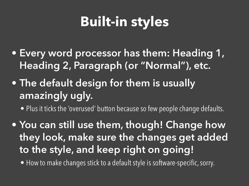
Heading 2, Paragraph (or “Normal”), etc. • The default design for them is usually amazingly ugly. • Plus it ticks the ‘overused’ button because so few people change defaults. • You can still use them, though! Change how they look, make sure the changes get added to the style, and keep right on going! • How to make changes stick to a default style is software-speci fi c, sorry.
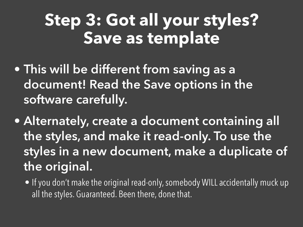
Dedicated word-processing software has these. Google Docs… sort of does but not really. • You can also fi nd templates online for popular word processors. • Some are good (Apple’s are usually good). Some aren’t. Some are too much hassle. • But you can make and save your own!
This will be different from saving as a document! Read the Save options in the software carefully. • Alternately, create a document containing all the styles, and make it read-only. To use the styles in a new document, make a duplicate of the original. • If you don’t make the original read-only, somebody WILL accidentally muck up all the styles. Guaranteed. Been there, done that.