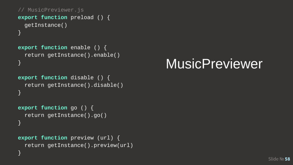
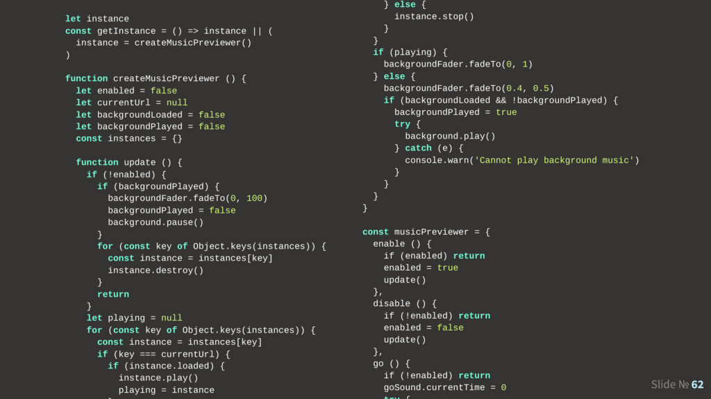
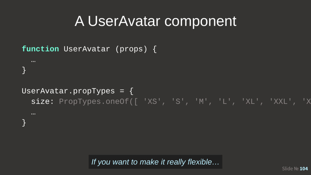
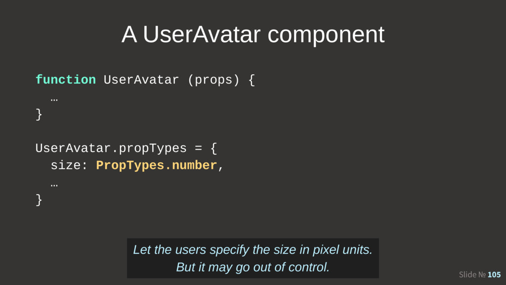
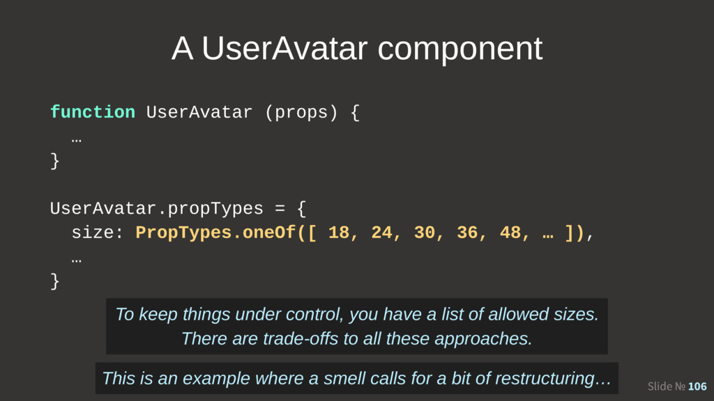
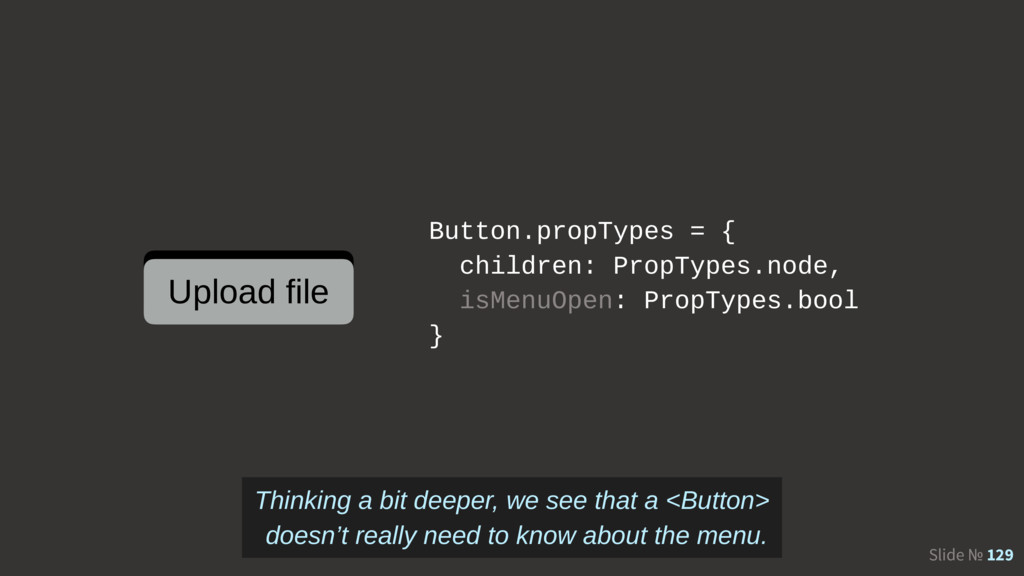
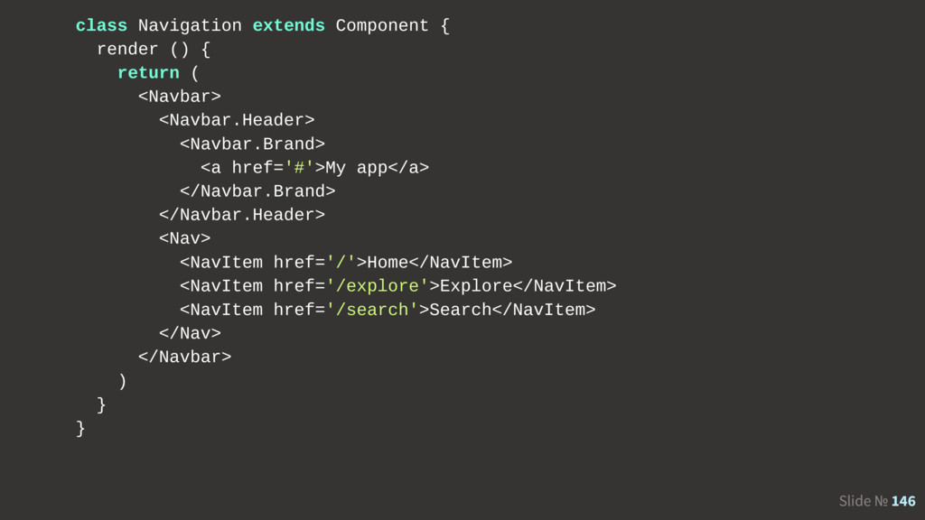
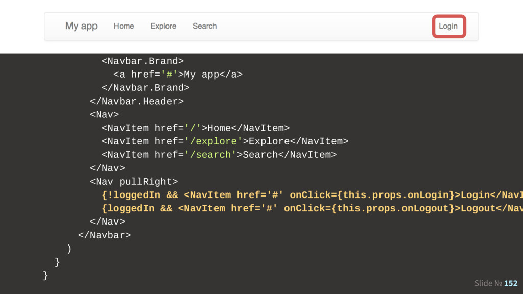
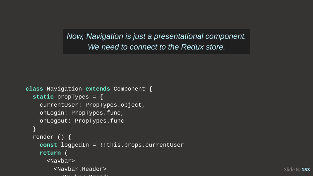
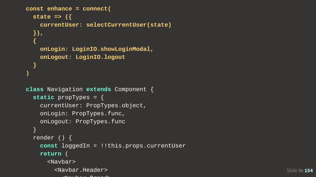
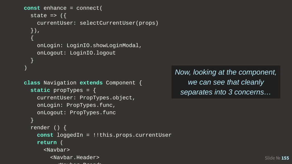
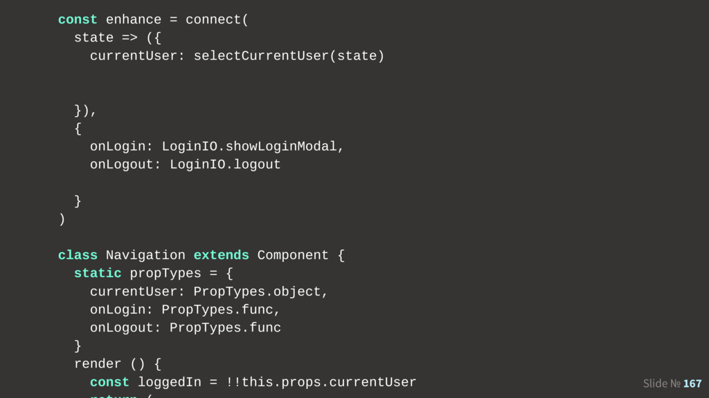
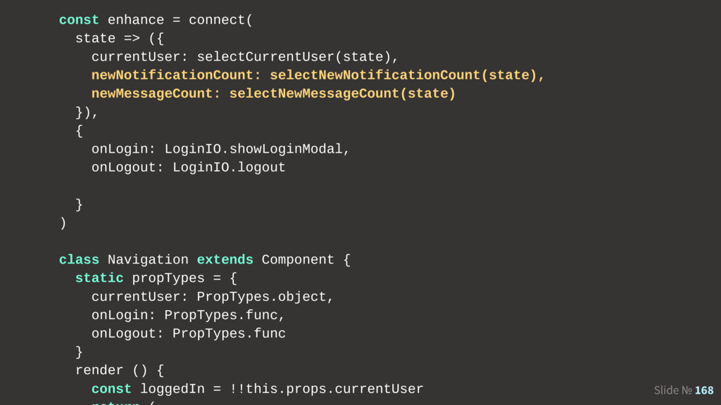
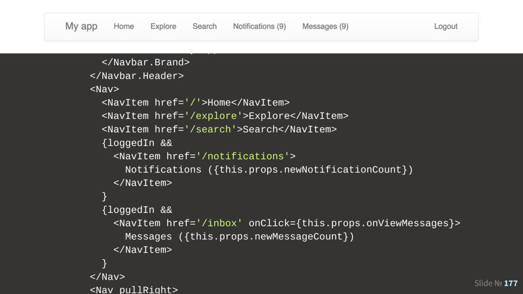
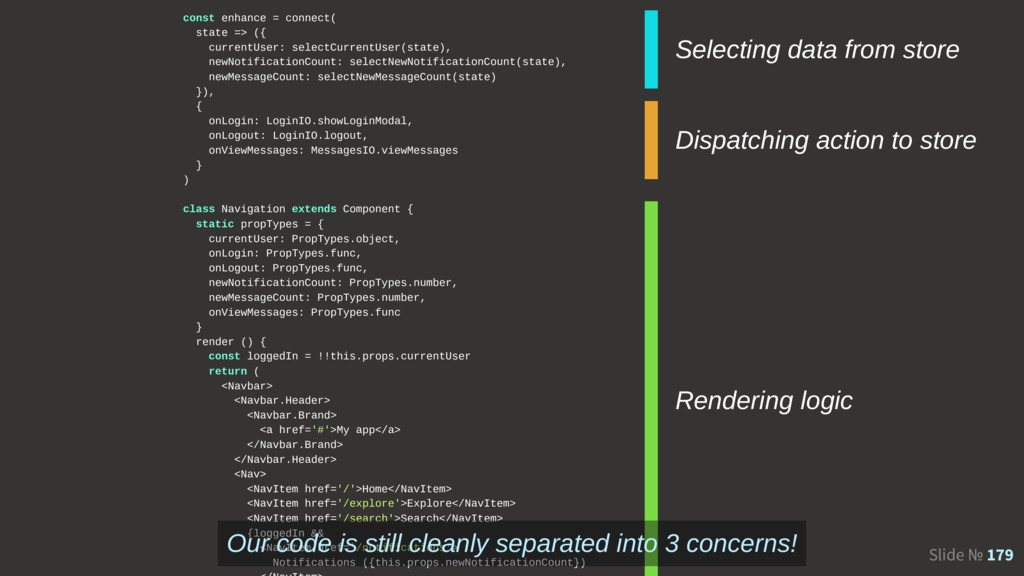
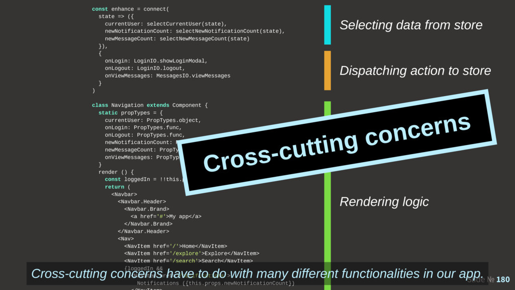
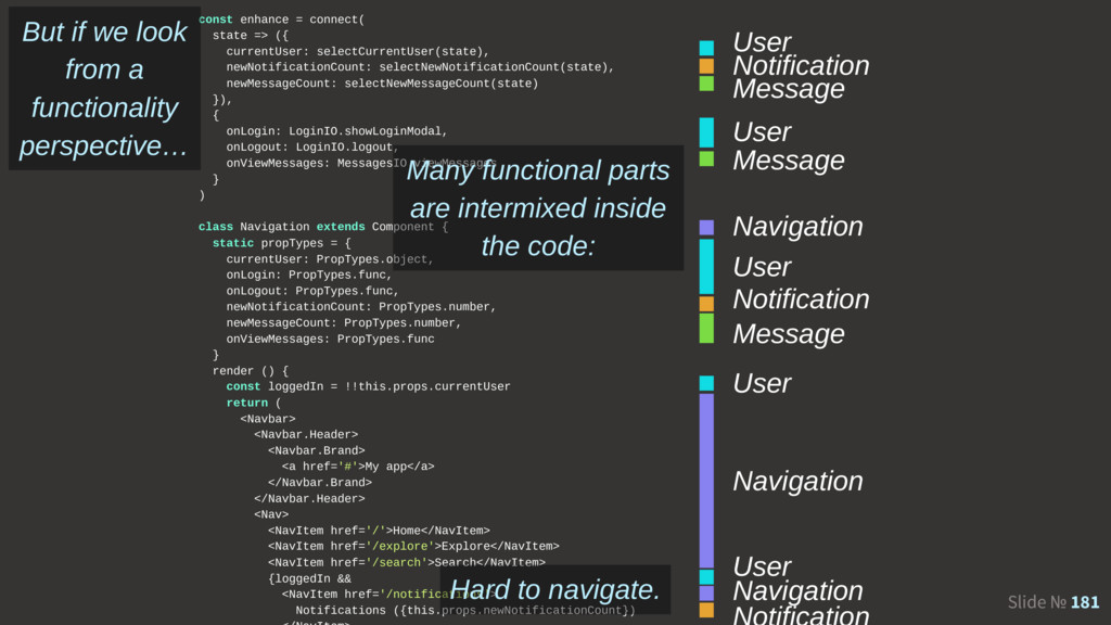
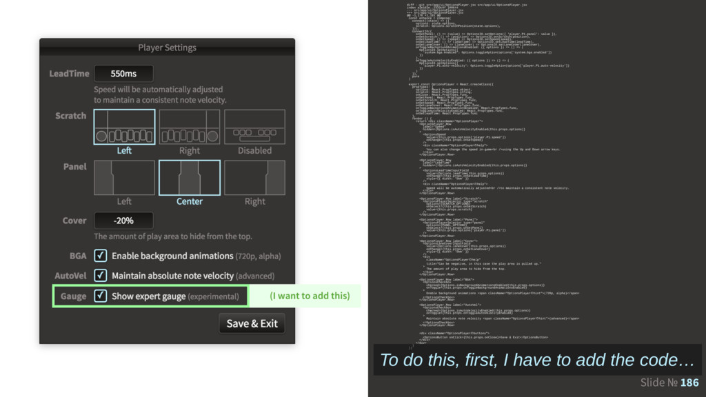
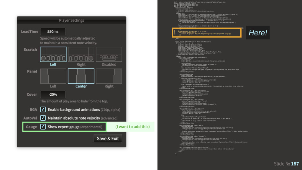
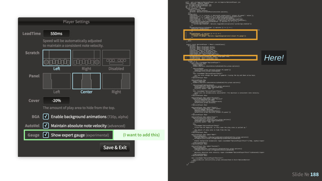
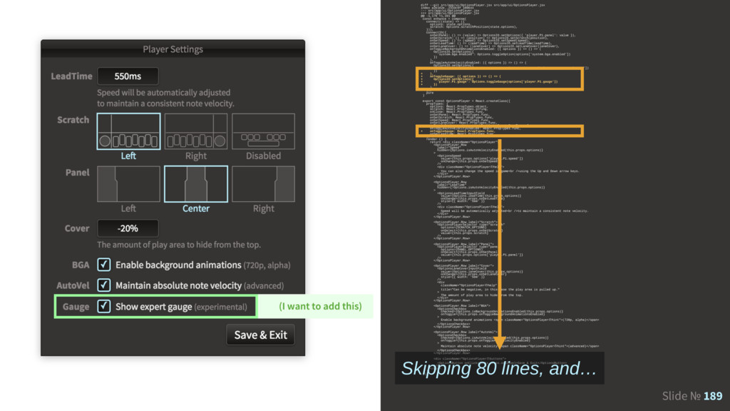
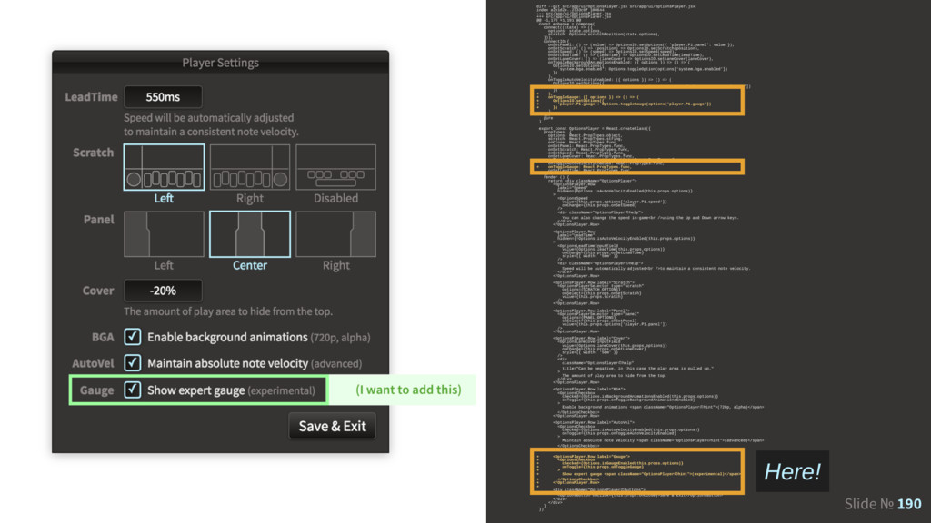
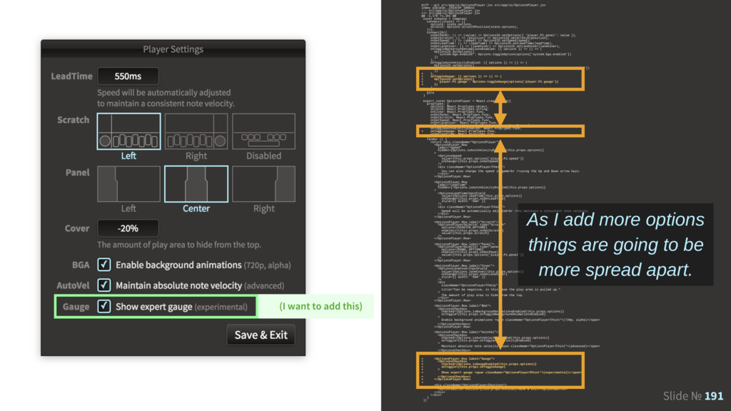
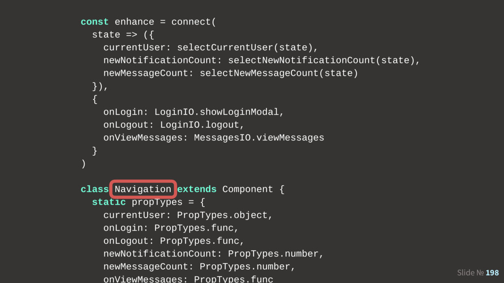
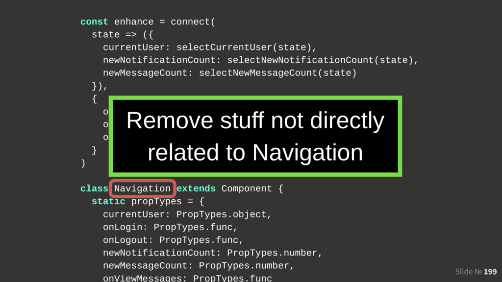
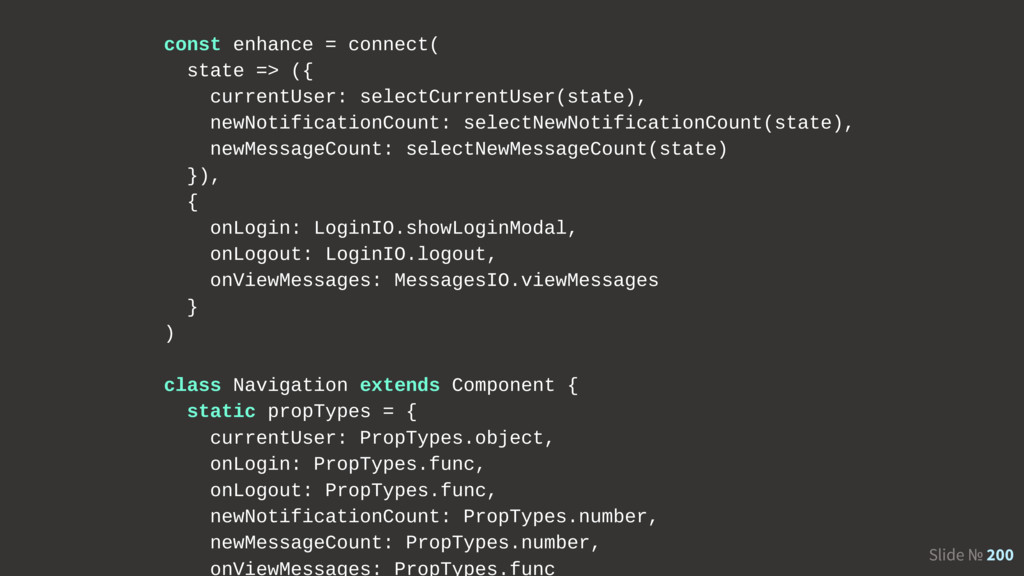
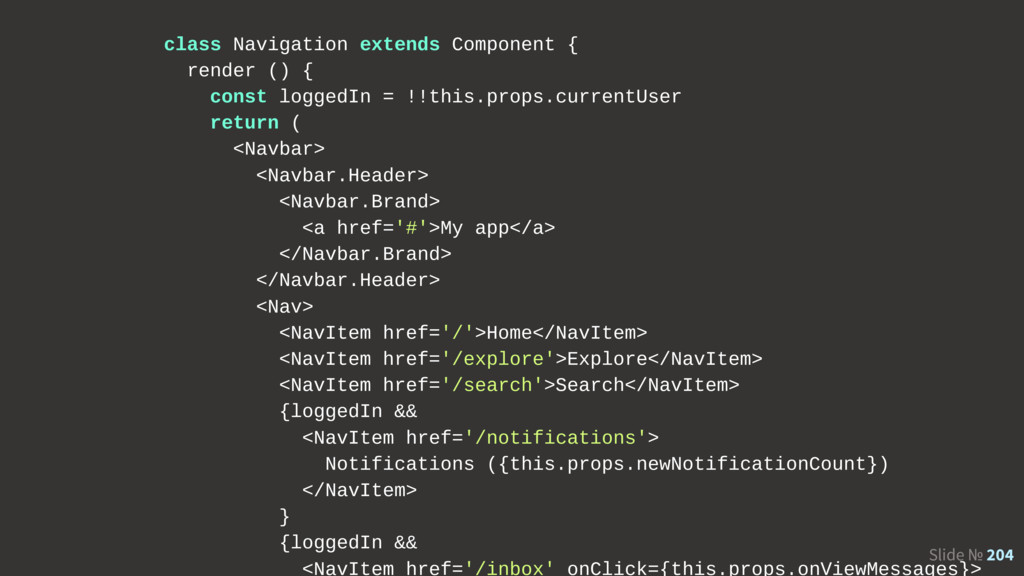
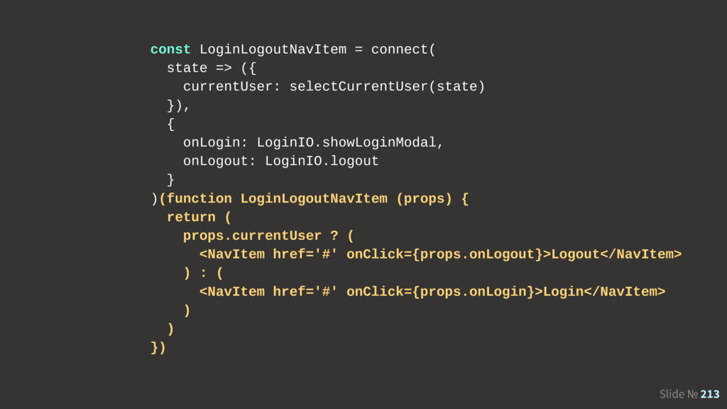
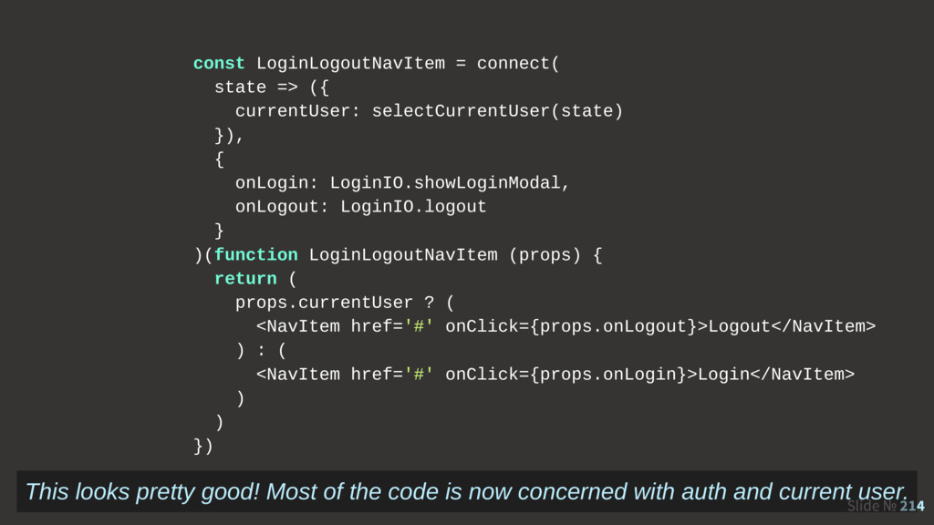
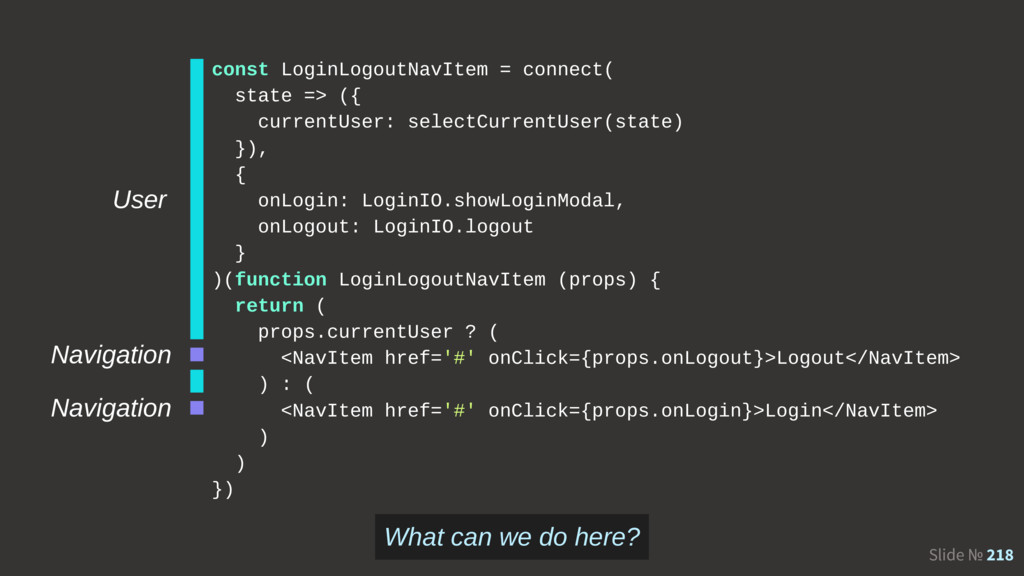
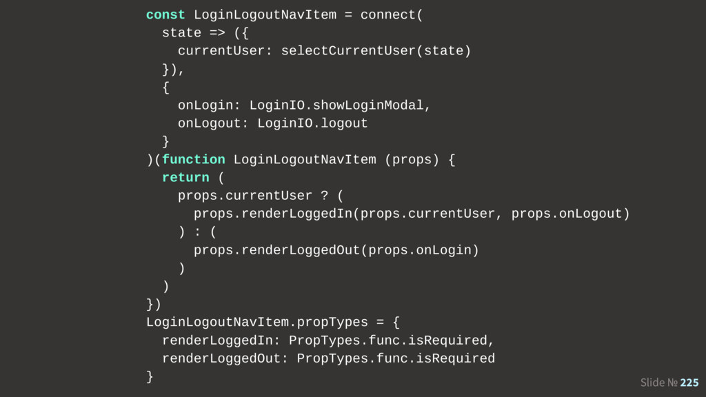
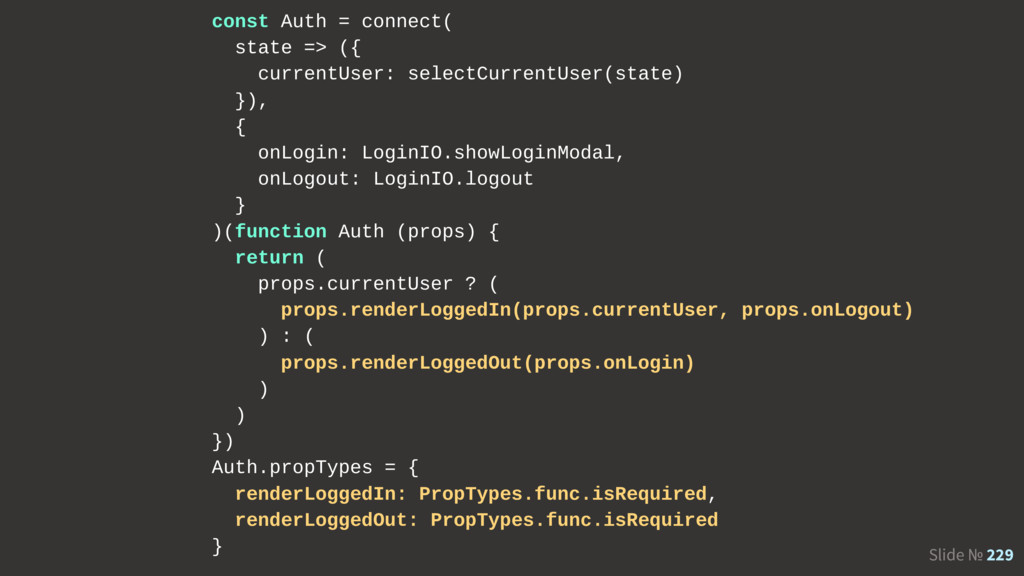
--- src/app/ui/OptionsPlayer.jsx +++ src/app/ui/OptionsPlayer.jsx @@ -1,176 +1,191 @@ const enhance = compose( connect((state) => ({ options: state.options, scratch: Options.scratchPosition(state.options), })), connectIO({ onSetPanel: () => (value) => OptionsIO.setOptions({ 'player.P1.panel': value }), onSetScratch: () => (position) => OptionsIO.setScratch(position), onSetSpeed: () => (speed) => OptionsIO.setSpeed(speed), onSetLeadTime: () => (leadTime) => OptionsIO.setLeadTime(leadTime), onSetLaneCover: () => (laneCover) => OptionsIO.setLaneCover(laneCover), onToggleBackgroundAnimationsEnabled: ({ options }) => () => ( OptionsIO.setOptions({ 'system.bga.enabled': Options.toggleOption(options['system.bga.enabled']) }) ), onToggleAutoVelocityEnabled: ({ options }) => () => ( OptionsIO.setOptions({ 'player.P1.auto-velocity': Options.toggleOption(options['player.P1.auto-velocity']) }) + ), + onToggleGauge: ({ options }) => () => ( + OptionsIO.setOptions({ + 'player.P1.gauge': Options.toggleGauge(options['player.P1.gauge']) + }) ) }), pure ) export const OptionsPlayer = React.createClass({ propTypes: { options: React.PropTypes.object, scratch: React.PropTypes.string, onClose: React.PropTypes.func, onSetPanel: React.PropTypes.func, onSetScratch: React.PropTypes.func, onSetSpeed: React.PropTypes.func, onSetLaneCover: React.PropTypes.func, onToggleBackgroundAnimationsEnabled: React.PropTypes.func, onToggleAutoVelocityEnabled: React.PropTypes.func, + onToggleGauge: React.PropTypes.func, onSetLeadTime: React.PropTypes.func }, render () { return <div className="OptionsPlayer"> <OptionsPlayer.Row label="Speed" hidden={Options.isAutoVelocityEnabled(this.props.options)} > <OptionsSpeed value={this.props.options['player.P1.speed']} onChange={this.props.onSetSpeed} /> <div className="OptionsPlayerͷhelp"> You can also change the speed in-game<br />using the Up and Down arrow keys. </div> </OptionsPlayer.Row> <OptionsPlayer.Row label="LeadTime" hidden={!Options.isAutoVelocityEnabled(this.props.options)} > <OptionsLeadTimeInputField value={Options.leadTime(this.props.options)} onChange={this.props.onSetLeadTime} style={{ width: '5em' }} /> <div className="OptionsPlayerͷhelp"> Speed will be automatically adjusted<br />to maintain a consistent note velocity. </div> </OptionsPlayer.Row> <OptionsPlayer.Row label="Scratch"> <OptionsPlayerSelector type="scratch" options={SCRATCH_OPTIONS} onSelect={this.props.onSetScratch} value={this.props.scratch} /> </OptionsPlayer.Row> <OptionsPlayer.Row label="Panel"> <OptionsPlayerSelector type="panel" options={PANEL_OPTIONS} onSelect={this.props.onSetPanel} value={this.props.options['player.P1.panel']} /> </OptionsPlayer.Row> <OptionsPlayer.Row label="Cover"> <OptionsLaneCoverInputField value={Options.laneCover(this.props.options)} onChange={this.props.onSetLaneCover} style={{ width: '5em' }} /> <div className="OptionsPlayerͷhelp" title="Can be negative, in this case the play area is pulled up." > The amount of play area to hide from the top. </div> </OptionsPlayer.Row> <OptionsPlayer.Row label="BGA"> <OptionsCheckbox checked={Options.isBackgroundAnimationsEnabled(this.props.options)} onToggle={this.props.onToggleBackgroundAnimationsEnabled} > Enable background animations <span className="OptionsPlayerͷhint">(720p, alpha)</span> </OptionsCheckbox> </OptionsPlayer.Row> <OptionsPlayer.Row label="AutoVel"> <OptionsCheckbox checked={Options.isAutoVelocityEnabled(this.props.options)} onToggle={this.props.onToggleAutoVelocityEnabled} > Maintain absolute note velocity <span className="OptionsPlayerͷhint">(advanced)</span> </OptionsCheckbox> </OptionsPlayer.Row> <div className="OptionsPlayerͷbuttons"> <OptionsButton onClick={this.props.onClose}>Save & Exit</OptionsButton> </div> </div> } }) Skipping 80 lines, and…
 dtinth
 nrslib
 wemra
wemra
 danielsogl
 akihisaikeda
 andpad
 sumedhbala
 wakana0222
 terryu16
 minodriven
 naokihaba
 yukukotani
 yusukebe
 mkilby
 rmw
rmw
 ivargrimstad
 jct
jct
 takai
takai
 davetheseo
 orderedlist
 lynnandtonic
 joshbly
 tessaabrams
 panda_program
 aleyda