Upgrade to Pro — share decks privately, control downloads, hide ads and more …

Living Globe: Tridimensional interactive visualization of world demographic data

Living Globe: Tridimensional interactive visualization of world demographic data

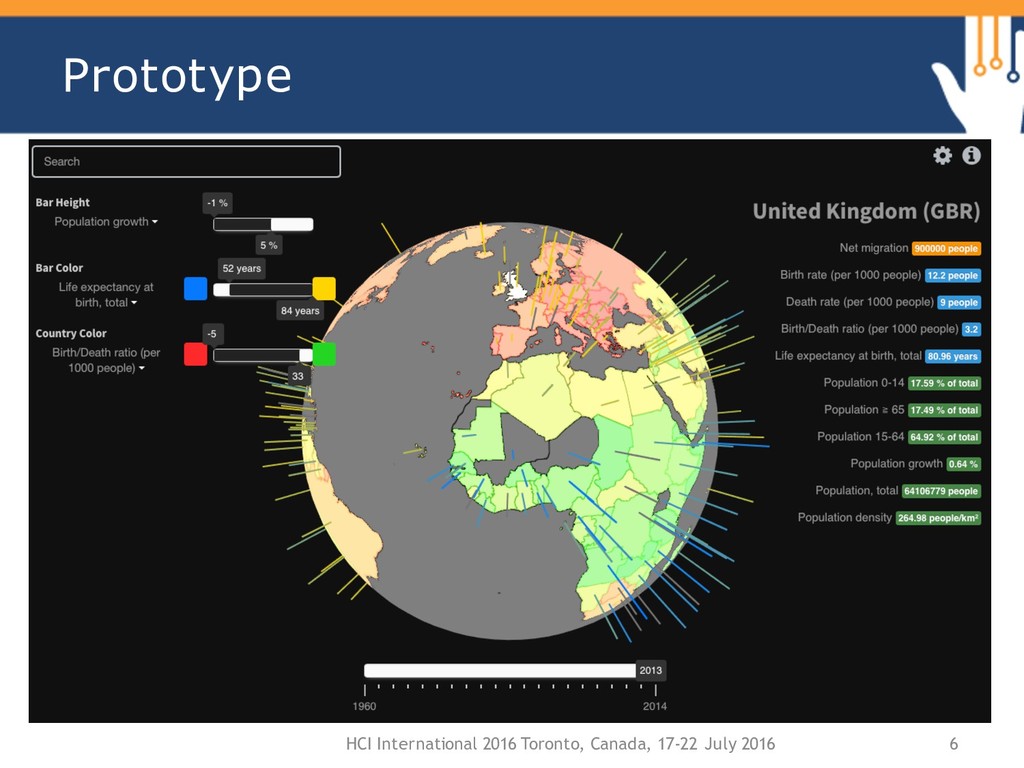
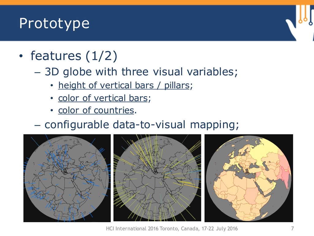
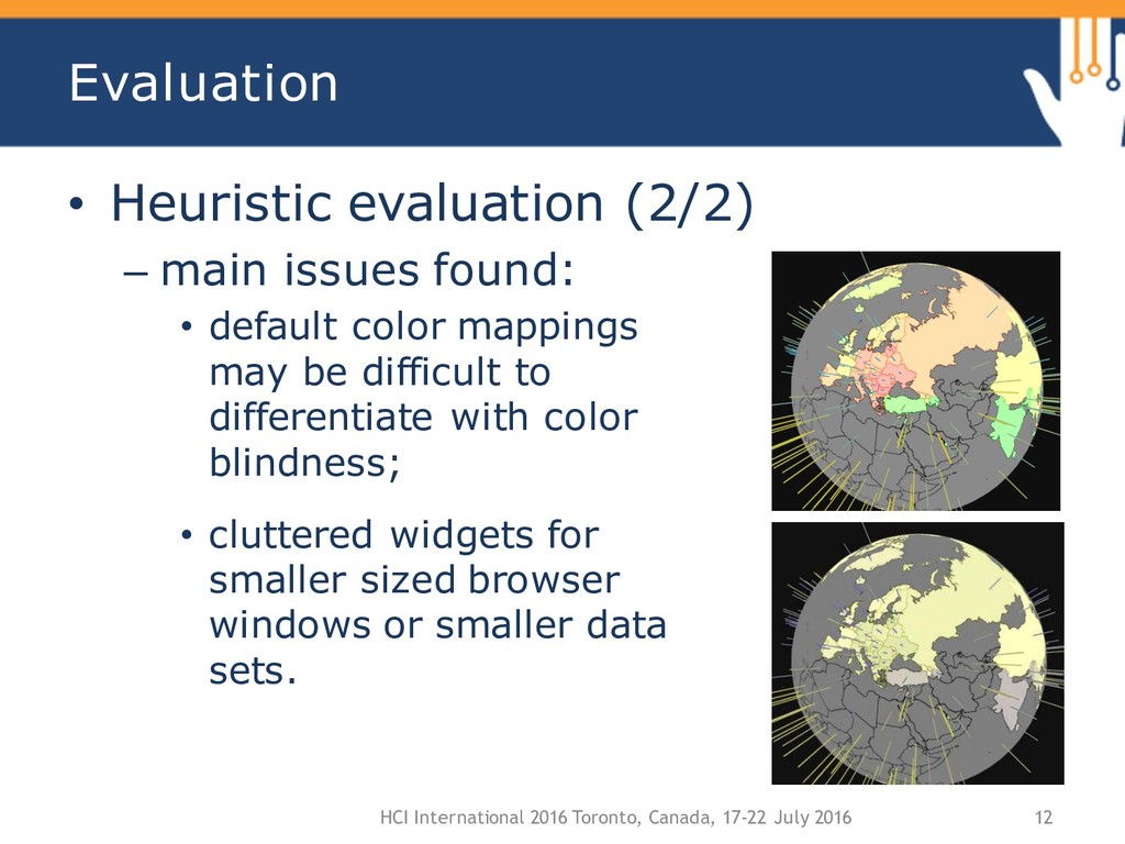
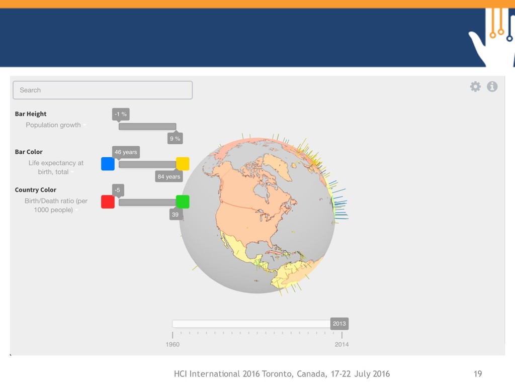
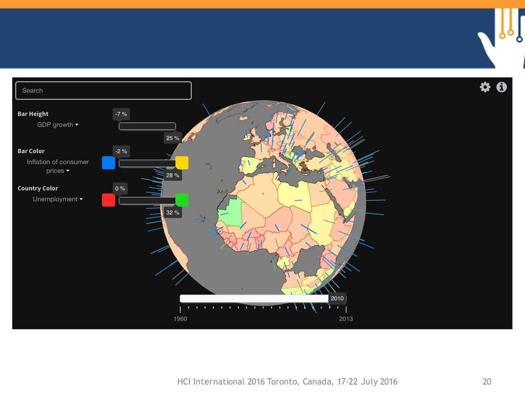
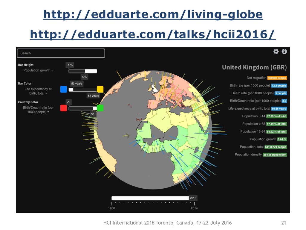
This presentation showcases Living Globe, a WebGL application for tri-dimensional worldwide data visualization. It allows the simultaneous representation of multiple indicators as spatial structures (bars and other objects located in a specific latitude-longitude on the globe). The mapping of data to the provided visual structures is configurable by the user, introducing an aspect of customization which encourages a more immediate, visual-only interpretation of the data. Additionally, the represented data is normalized within an adjustable scale. This can be used to filter out extremely high or extremely low samples, uniforming the remaining data and improving its visibility.

Ed Duarte

June 21, 2016
Tweet

More Decks by Ed Duarte

Other Decks in Technology

Transcript

  1. Living Globe: Tridimensional interactive visualization of world demographic data Eduardo

    Duarte Pedro Bordonhos Paulo Dias Beatriz Sousa Santos University of Aveiro, Portugal
  2. Introduction • tri-dimensional worldwide demography – display spatial data on

    a 3D globe; – conventionally: • the globe can be dragged to adjust the observed location; • vertical bars / pillars are displayed on top of every country or city; • values are represented by the height of these bars. HCI International 2016 Toronto, Canada, 17-22 July 2016 2
  3. State of the Art • WebGL Globe – World Population

    • WebGL Globe – China and US Population • World Population Density - 2010 HCI International 2016 Toronto, Canada, 17-22 July 2016 3
  4. State of the Art • The state of the art

    works: – display only one data type; – extremely high/low values affect readability of the remaining data; – lack user customization; • default preferences differ from the user’s; – lack usability features; • no data-zoom / selection of subsets. HCI International 2016 Toronto, Canada, 17-22 July 2016 4
  5. Proposal • allow visual exploration of multiple demographic indicators simultaneously

    along a set period of time; – pattern detection through visual stimuli only • introduce conventional usability features; • targeted at: – unexperienced users; – users with some computer and statistics literacy; HCI International 2016 Toronto, Canada, 17-22 July 2016 5
  6. Prototype • features (1/2) – 3D globe with three visual

    variables; • height of vertical bars / pillars; • color of vertical bars; • color of countries. – configurable data-to-visual mapping; HCI International 2016 Toronto, Canada, 17-22 July 2016 7
  7. Prototype • features (2/2) – selection of countries; – adjustable

    year; – country name-search (with dynamic suggestion) – configurable minimum and maximum values; HCI International 2016 Toronto, Canada, 17-22 July 2016 8
  8. Prototype • technologies used: – HTML, CSS and Javascript +

    libraries (three.js, chroma.js, jQuery); • successfully tested in Firefox 44, Chrome 48 and Safari 9.1; • data collected: – 8 indicators; – 1960 to 2014. HCI International 2016 Toronto, Canada, 17-22 July 2016 10
  9. Evaluation • Heuristic evaluation (1/2) – 3 evaluators with some

    experience in IV; – heuristics used: • Nielsen’s heuristics; • two visualization-specific sets of heuristics (Zuk and Carpendale; Forsell and Johanson); HCI International 2016 Toronto, Canada, 17-22 July 2016 11
  10. Evaluation • Heuristic evaluation (2/2) – main issues found: •

    default color mappings may be difficult to differentiate with color blindness; • cluttered widgets for smaller sized browser windows or smaller data sets. HCI International 2016 Toronto, Canada, 17-22 July 2016 12
  11. Evaluation • Usability testing (1/3) – 3 phases (brief introduction,

    task solving and questionnaire; – 4 users with various degrees of computer literacy; HCI International 2016 Toronto, Canada, 17-22 July 2016 13
  12. Evaluation • Usability testing (2/3) – the first 3 tasks:

    • put the user at ease; • encourage usage of usability features, i.e. search and selection; – the 4th task: • encourage usage of filtering; – the 5th task: • find out if inherent symbolism of default colors might lead user to the wrong conclusion. HCI International 2016 Toronto, Canada, 17-22 July 2016 14
  13. Evaluation • Usability testing (3/3) – findings: • all users

    preferred using country colors; • additional optional widgets were not considered to be useful; • application was easy to learn and use; • default color scales in country colors can be misinterpreted. HCI International 2016 Toronto, Canada, 17-22 July 2016 15
  14. Conclusions and Future Work • the proposed model iterates on

    the state- of-the-art by: – improving the visual exploration of multiple data indicators simultaneously; – eases the interaction with the tool; • filtering allows a clearer observation of smaller samples; • most negative points have been corrected in the latest releases; HCI International 2016 Toronto, Canada, 17-22 July 2016 17
  15. Conclusions and Future Work • model to detect patterns and

    data correlations over time; • there is potential to extend it outside the demographical data spectrum; • https://github.com/edduarte/living-globe HCI International 2016 Toronto, Canada, 17-22 July 2016 18