Upgrade to Pro — share decks privately, control downloads, hide ads and more …

include-media: yet another library for writing media queries in Sass

include-media: yet another library for writing media queries in Sass

Eduardo Bouças

April 15, 2015
Tweet

More Decks by Eduardo Bouças

Other Decks in Programming

Transcript

  1. A common case phone tablet desktop __ ____ _ ___

    __ ____ _ ___ __ ____ _ ___ __ ____ _ ___ __ ____ _ ___ __ ____ _ ___ __ ____ _ ___ __ ____ _ ___ __ ____ _ ___ __ ____ _ ___ __ ____ _ ___ __ ____ _ ___ __ ____ _ ___ __ ____ _ ___ __ ____ _ ___ __ ____ _ ___ __ ____ _ ___ __ ____ _ ___ __ ____ _ ___ __ ____ _ ___ __ ____ _ ___
  2. A common solution .featured-article { width: 100%; // Rows with

    2 articles on tablet @media (min-width: 768px) { width: 50%; } // Rows with 4 articles on desktop @media (min-width: 1024px) { width: 25%; } } CSS
  3. .featured-article { width: 100%; @media (min-width: 768px) { width: 50%;

    } @media (min-width: 1024px) { width: 25%; } } .header { @media (min-width: 768px) { font-size: 2rem; } @media (min-width: 1024px) { font-size: 4rem; } } DRY $bp-tablet: 768px; $bp-desktop: 1024px; .featured-article { width: 100%; @media (min-width: $bp-tablet) { width: 50%; } @media (min-width: $bp-desktop) { width: 25%; } } .header { @media (min-width: $bp-tablet) { font-size: 2rem; } @media (min-width: $bp-desktop) { font-size: 4rem; } } CSS SCSS
  4. .header__subtitle { // Hide subtitle on tablet view @media (min-width:

    768px) and (max-width: 1023px) { display: none; } } A shorter syntax .header__subtitle { // Hide subtitle on tablet view @include tablet { display: none; } } // Mixin declaration @mixin tablet { @media (min-width: 768px) and (max-width: 1023px) { @content; } } CSS SCSS
  5. Dmitry Sheiko's technique $mediaMaxWidth: 1260px; $mediaBp1Width: 960px; $mediaMinWidth: 480px; @function

    translate-media-condition($c) { $condMap: ( "screen": "only screen", "print": "only print", "retina": "(-webkit-min-device-pixel-ratio: 1.5), (min--moz-device-pixel-ratio: 1.5), (-o- ">maxWidth": "(min-width: #{$mediaMaxWidth + 1})", "<maxWidth": "(max-width: #{$mediaMaxWidth})", ">bp1Width": "(min-width: #{$mediaBp1Width + 1})", "<bp1Width": "(max-width: #{$mediaBp1Width})", ">minWidth": "(min-width: #{$mediaMinWidth + 1})", "<minWidth": "(max-width: #{$mediaMinWidth})" ); @return map-get( $condMap, $c ); } // (...) @include media("screen", ">minWidth", "<bp1Width") { // My rules here } Syntax Media types Retina expression
  6. Where I started // _ _ _ _ _ //

    (_) | | | | | (_) // _ _ __ ___| |_ _ __| | ___ _ __ ___ ___ __| |_ __ _ // | | '_ \ / __| | | | |/ _` |/ _ \ | '_ ` _ \ / _ \/ _` | |/ _` | // | | | | | (__| | |_| | (_| | __/ | | | | | | __/ (_| | | (_| | // |_|_| |_|\___|_|\__,_|\__,_|\___| |_| |_| |_|\___|\__,_|_|\__,_| // $breakpoints: ( 'phone': 320px, 'tablet': 768px, 'desktop': 1024px ) !default; // (...) @include media('>phone') { // My rules here } @include media('>tablet', '<desktop') { // Other rules here }
  7. Media expressions $breakpoints: ( 'phone': 320px, 'tablet': 768px, 'desktop': 1024px

    ) !default; $media-expressions: ( 'screen': 'screen', 'print': 'print', 'handheld': 'handheld', 'landscape': '(orientation: landscape)', 'portrait': '(orientation: portrait)' ) !default; // (...) @include media('>tablet', 'landscape') { // Rules for tablet in landscape mode } @include media('<phone', 'portrait') { // Rules for phone in portrait mode }
  8. Add a new breakpoint? $breakpoints: ( 'phone': 320px, 'big-enough-for-logo': 549px,

    // A new breakpoint 'tablet': 768px, 'desktop': 1024px ) !default; // (...) .header__logo { @include media('>big-enough-for-logo') { display: block; } } // _ // ( ) // ___ ___ __ | |__ // /' _ ` _ `\ /'__`\| _ `\ // | ( ) ( ) |( ___/| | | | _ _ _ // (_) (_) (_)`\____)(_) (_)(_)(_)(_) //
  9. Support for custom values // Our breakpoints map remains the

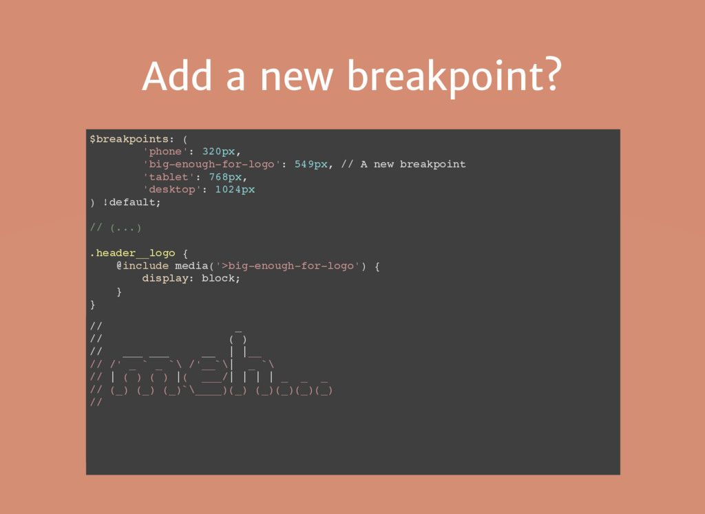
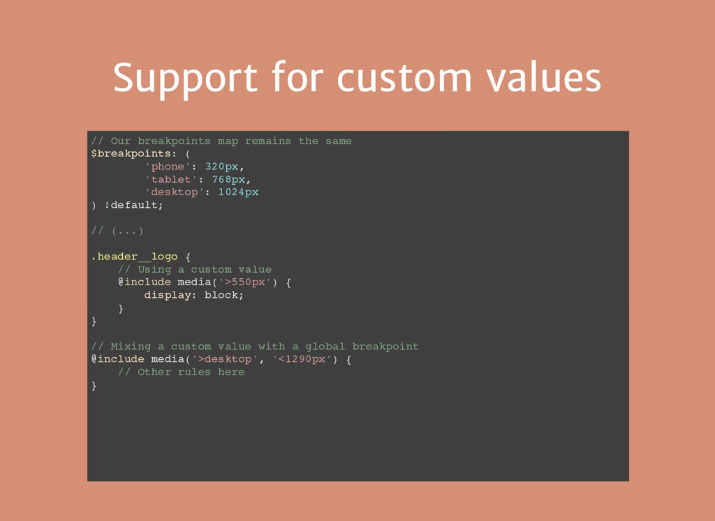
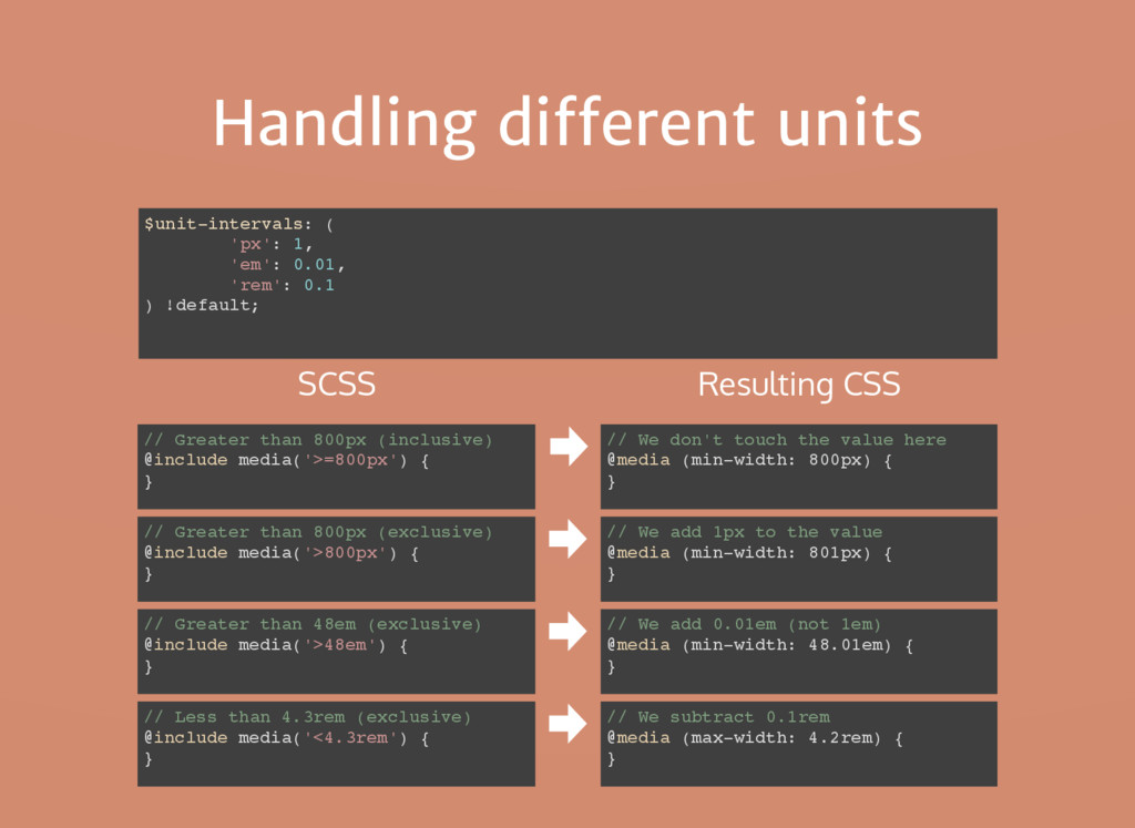
    same $breakpoints: ( 'phone': 320px, 'tablet': 768px, 'desktop': 1024px ) !default; // (...) .header__logo { // Using a custom value @include media('>550px') { display: block; } } // Mixing a custom value with a global breakpoint @include media('>desktop', '<1290px') { // Other rules here }
  10. A problem with intervals 768px 500px 320px 960px 1024px @include

    media('<tablet') @include media('>tablet') Conditions are collectively exhaustive, but NOT mutually exclusive ... ... @media (min-width: 768px) {} @media (max-width: 768px) {}
  11. '>=' and '<=' operators $breakpoints: ( 'phone': 320px, 'tablet': 768px,

    'desktop': 1024px ) !default; @include media('>=800px') { } @media (min-width: 800px) { } SCSS Resulting CSS @include media('>800px') { } // We add 1px to the value @media (min-width: 801px) { } @include media('<1000px') { } // We subtract 1px from the value @media (max-width: 999px) { }
  12. Problem solved 768px 500px 320px 960px 1024px @include media('<=tablet') @include

    media('>tablet') Conditions are collectively exhaustive AND mutually exclusive ... ... @media (min-width: 769px) {} @media (max-width: 768px) {}
  13. Handling different units $unit-intervals: ( 'px': 1, 'em': 0.01, 'rem':

    0.1 ) !default; // Greater than 800px (inclusive) @include media('>=800px') { } // We don't touch the value here @media (min-width: 800px) { } SCSS Resulting CSS // Greater than 800px (exclusive) @include media('>800px') { } // We add 1px to the value @media (min-width: 801px) { } // Greater than 48em (exclusive) @include media('>48em') { } // We add 0.01em (not 1em) @media (min-width: 48.01em) { } // Less than 4.3rem (exclusive) @include media('<4.3rem') { } // We subtract 0.1rem @media (max-width: 4.2rem) { }
  14. Parsing expression members Is media expression Has operator? Yes No

    Global breakpoint? Yes No Is global breakpoint Is custom value '>=tablet' '>=tablet' '>40em' '>40em' 'landscape' Expression 'landscape'
  15. The "OR" operator in CSS A media query that fires

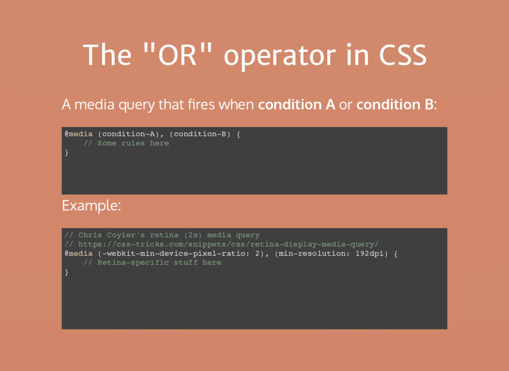
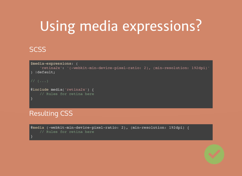
    when condition A or condition B: // Chris Coyier's retina (2x) media query // https://css-tricks.com/snippets/css/retina-display-media-query/ @media (-webkit-min-device-pixel-ratio: 2), (min-resolution: 192dpi) { // Retina-specific stuff here } @media (condition-A), (condition-B) { // Some rules here } Example:
  16. Using media expressions? $media-expressions: ( 'retina2x': '(-webkit-min-device-pixel-ratio: 2), (min-resolution: 192dpi)'

    ) !default; // (...) @include media('retina2x') { // Rules for retina here } @media (-webkit-min-device-pixel-ratio: 2), (min-resolution: 192dpi) { // Rules for retina here } SCSS Resulting CSS
  17. A problem with logic $media-expressions: ( 'retina2x': '(-webkit-min-device-pixel-ratio: 2), (min-resolution:

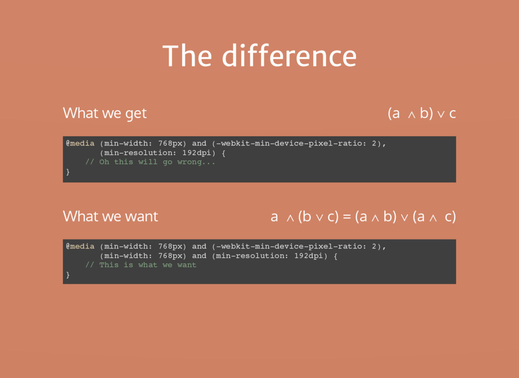
    192dpi)' ) !default; // (...) @include media('>tablet', 'retina2x') { // Rules for retina device greater than tablet } @media (min-width: 768px) and (-webkit-min-device-pixel-ratio: 2), (min-resolution: 192dpi) { // This is NOT what we wanted! } SCSS Resulting CSS a ∧ (b ∨ c) != (a ∧ b) ∨ c
  18. The difference @media (min-width: 768px) and (-webkit-min-device-pixel-ratio: 2), (min-width: 768px)

    and (min-resolution: 192dpi) { // This is what we want } @media (min-width: 768px) and (-webkit-min-device-pixel-ratio: 2), (min-resolution: 192dpi) { // Oh this will go wrong... } What we want What we get a ∧ (b ∨ c) = (a ∧ b) ∨ (a ∧ c) (a ∧ b) ∨ c
  19. Branching disjunctions $media-expressions: ( 'retina2x': '(-webkit-min-device-pixel-ratio: 2)', '(min-resolution: 192dpi)' )

    !default; a ∧ (b ∨ c) ∧ d ∧ e ∧ (f ∨ g) a b d e f, a c d e f, a b d e g, a c d e g Expand groups of expressions to generate all possible combinations
  20. I could use your help Build a comprehensive list of

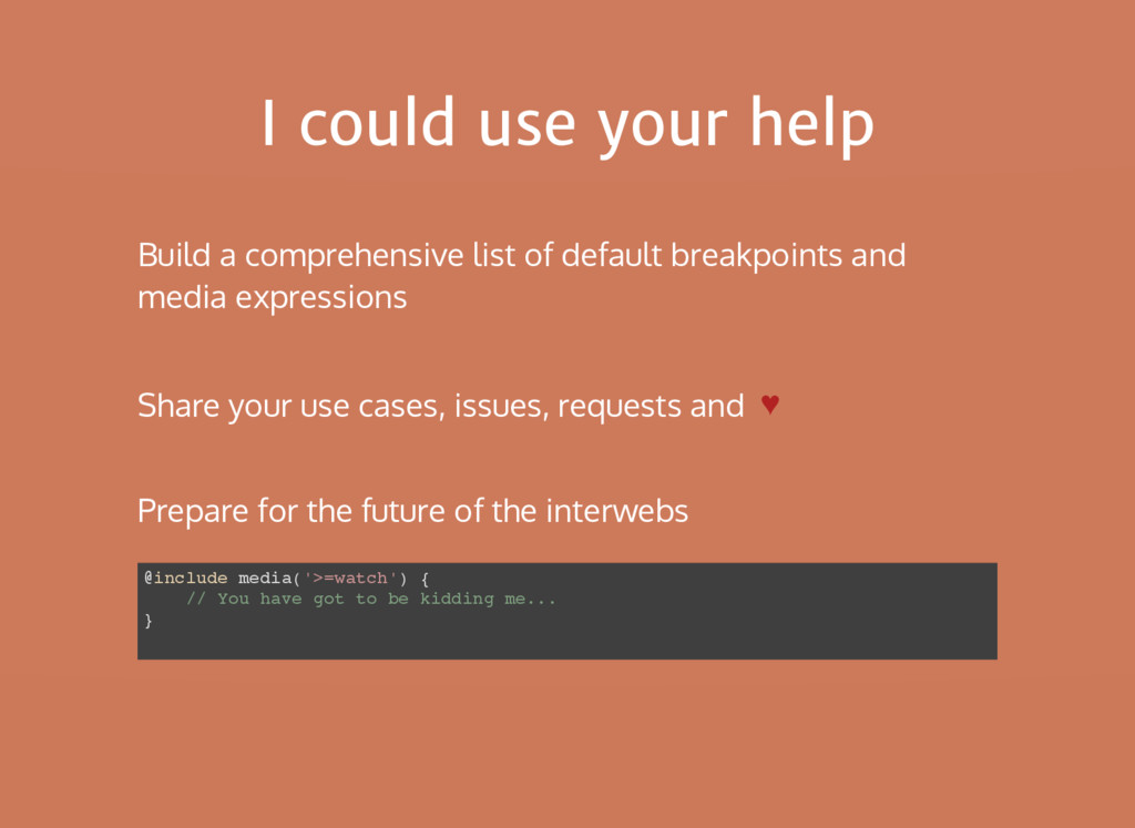
    default breakpoints and media expressions Prepare for the future of the interwebs @include media('>=watch') { // You have got to be kidding me... } Share your use cases, issues, requests and 쁥