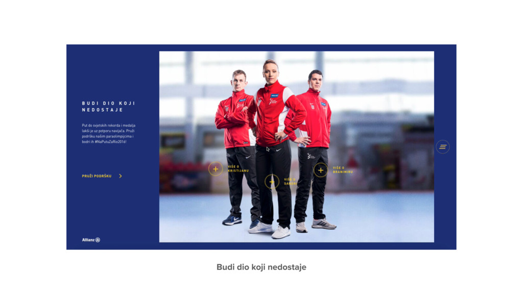
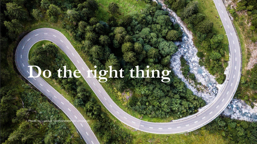
What are the most frequent mistakes both clients and designers make in their quest to design visually appealing websites? And, where is the barrier between visual and functional? How to focus on users instead of building a good–looking website/or/application that users will hate to use? And how to say no to clients "overthinking" the user interface?
The design shouldn't be just a "nice looking interface" – it is so much more. The design has to solve problems and not create new ones. Let's explore together what are the best practices and how to escape from the usual client wishes.