Upgrade to Pro — share decks privately, control downloads, hide ads and more …

P.S. I Love You – A Story About Web Accessibility

Emanuel Blagonic
September 24, 2016

P.S. I Love You – A Story About Web Accessibility

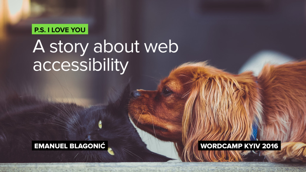
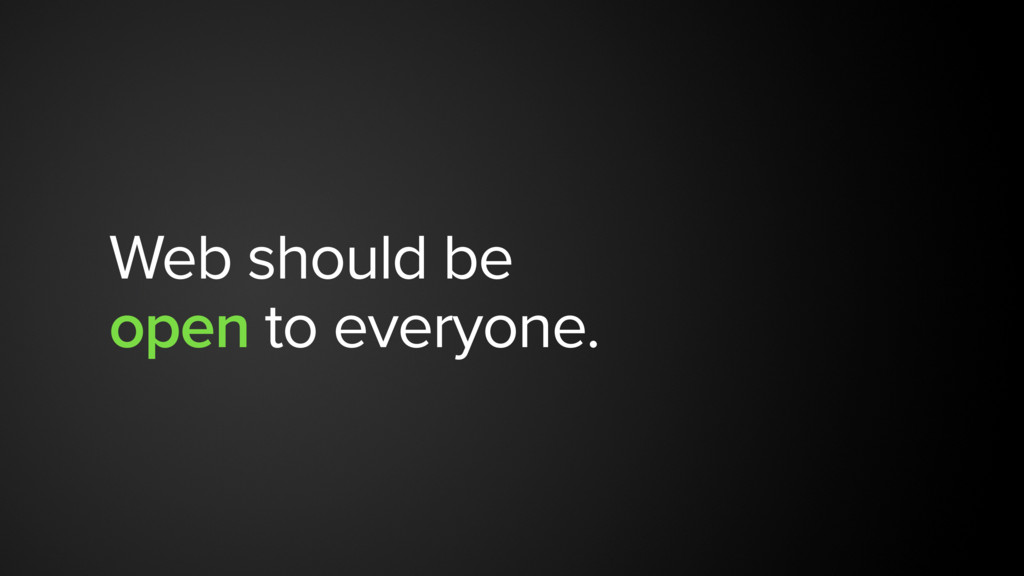
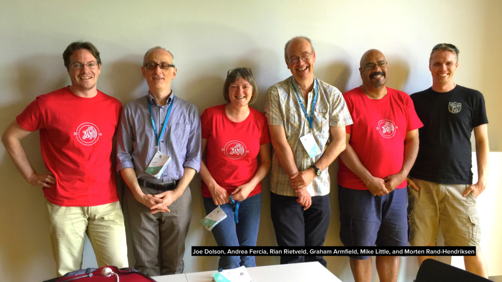
Yes. We say I love you all too often, and yes – web *IS* the most transparent platform in the world. But, do we really think of all the users in the world that will access our website? We are not all the same. Every one of us uses the web differently. Some use it on their mobile phones, some on their tablets, some on their desktops and some on their televisions.

When building websites we don't think about *all* the users out there, aren't we? And the reason is often – money. We don't get enough of a budget to think of them. But let's be honest – we should do more. Is there something we should and can do? Is there a way to create a better website for *all the people out there* and not only the lucky ones?

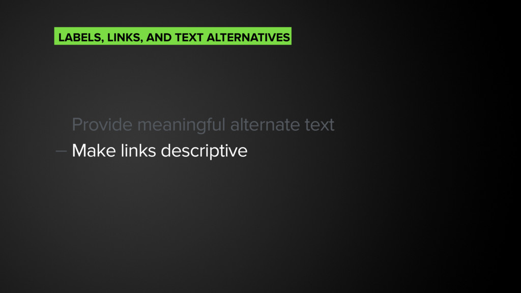
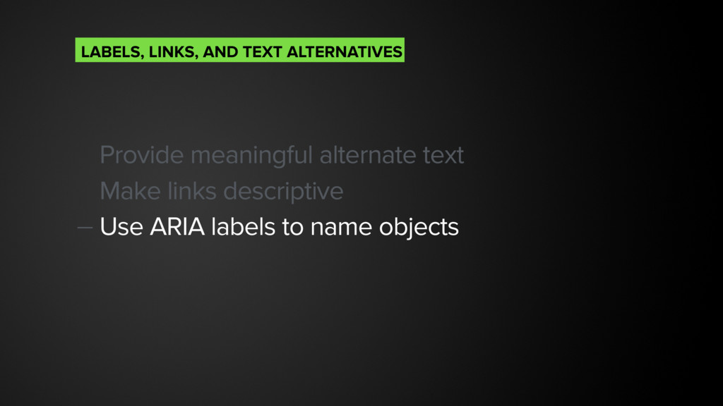
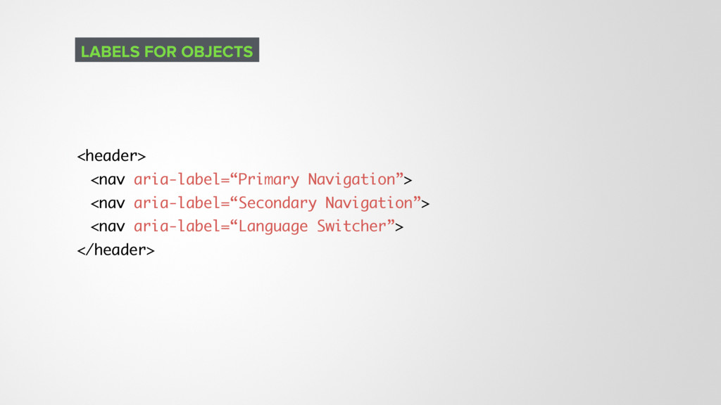
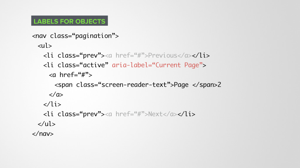
In this talk I will explore how people with disabilities use the web and will give you some guidelines that will help you create better user experiences for everyone.

Emanuel Blagonic

September 24, 2016
Tweet

More Decks by Emanuel Blagonic

Other Decks in Design

Transcript

  1. “ Web users ultimately want to get 
 at data

    quickly and easily. They 
 don't care as much about 
 attractive sites and pretty design. Sir Tim Berners–Lee, inventor of World Wide Web
  2. “ Technology is best when it 
 brings people together.

    Matt Mullenweg, co-founder of WordPress
  3. Make text readable and let it behave in predictable ways.

    Avoid using dark UX patterns. UNDERSTANDABLE
  4. “ Support for accessibility leads to 
 well-crafted HTML. Lyza

    Gardner, co-author of Head First Mobile Web
  5. <!-- Add aria-label if there is more than one navigation

    --> <nav id=“header-nav” aria-label=“Primary navigation”>…</nav> <nav id=“footer-nav” aria-label=“Secondary navigation”>…</nav> <!-- No need to use role=“main” if you use <main> and are not supporting older browsers like IE7 --> <main>…</main> THINGS TO NOTE, THOUGH
  6. <div role=“search”> <form> <!-- copy & paste your form here

    :) --> </form> </div> CREATING A SEARCH FORM
  7. “ ARIA isn't for making HTML 
 accessible. It's for

    making 
 inaccessible HTML accessible. Heydon Pickering, freelance web accessibility consultant, interface designer and writer
  8. — role="banner" for header — role="main" for main content —

    role="complementary" for sidebars — role="contentinfo" for footer — role="search" for search form — role="navigation" for navigation menus ARIA ROLES TO USE
  9. <h1>WordPress.org</h1> <h4>WordPres Swag</h4> <h4>News From Our Blog</h4> <h5>WordPress 4.6.1 Security

    and Maintenance Release</h5> <h4>It’s Easy As…</h4> <h4>WordPress Users</h4> <h6>Code is Poetry</h6> A UNICORN DIED ON WORDPRESS.ORG
  10. <!-- Use H1 for showing Site Title on homepage only

    --> <div class=“site-branding”> <h1>Site Title</h1> <p>Site tagline</h1> </div> HOW TO USE H1
  11. <!-- On subpages you should use H1 for a Page

    Title --> <div class=“site-branding”> <p>Site Title</p> <p>Site tagline</h1> </div> SITE BRANDING ON SUBPAGES
  12. Don’t use H1’s only Use proper heading structure (H1 >

    H2 > H3…) — Make headings descriptive
 HEADINGS
  13. <h1>How to get to Kyiv?</h1> <h2>Arriving by airplane</h2> <h2>Arriving by

    car</h2> <h2>Arriving by train</h2> DESCRIPTIVE HEADINGS https://yoast.com/headings-use/
  14. <!-- Bad -->
 <a href=“#”>Click here</a> to learn more about

    our company <!-- Good -->
 Learn more about our company on our <a href=“#”>About us</a> page DESCRIPTIVE LINKS
  15. Provide meaningful alternate text Make links descriptive — Use ARIA

    labels to name objects
 LABELS, LINKS, AND TEXT ALTERNATIVES
  16. <nav class=“pagination”> <ul> <li class=“prev”><a href=“#”>Previous</a></li> <li class=“active” aria-label=“Current Page”>

    <a href=“#”> <span class=“screen-reader-text”>Page </span>2 </a> </li> <li class=“prev”><a href=“#”>Next</a></li> </ul> </nav> LABELS FOR OBJECTS
  17. Provide meaningful alternate text Make links descriptive Use ARIA labels

    to name objects — Provide text alternative for non-text content LABELS, LINKS, AND TEXT ALTERNATIVES
  18. <div role="img" aria-labelledby="star_id"> <img src="fullstar.png" alt=""/> <img src="fullstar.png" alt=""/> <img

    src="fullstar.png" alt=""/> <img src="fullstar.png" alt=""/> <img src="emptystar.png" alt=""/> </div> <div id="star_id">4 of 5</div> TEXT ALTERNATIVE FOR NON-TEXT CONTENT
  19. Use buttons instead of a <div> to create switchers —

    Use “aria-expanded” property to show if menu is open or closed MENU SWITCHERS
  20. <!-- When menu is not visible -->
 <button aria-expanded=“false” aria-controls=“menu”>Menu</button>

    <nav id=“menu” aria-expanded=“false”>…</nav> <!-- When menu is visible -->
 <button aria-expanded=“true” aria-controls=“menu”>Menu</button> <nav id=“menu” aria-expanded=“true”>…</nav> DESCRIPTIVE LINKS
  21. .screen-reader-text { position: absolute; width: 1px; height: 1px; padding: 0;

    margin: -1px; overflow: hidden; clip: rect(0,0,0,0); border: 0; } SCREEN READER ONLY CSS
  22. <a href=“#content” class=“skip-link screen-reader-only”> Skip to content </a> <a href=“#footer”

    class=“skip-link screen-reader-only”> Skip to footer </a> SKIP LINKS
  23. Make “skip links” first focusable element on your page —

    Don’t remove :focus styles, rather improve them
 :FOCUS
  24. Make “skip links” first focusable element on your page Don’t

    remove :focus styles, rather improve them — Add an indication that something is focused (subtle background color, border or text decoration) :FOCUS
  25. <form> <ol> <li> <label for=“firstname” class=“screen-reader-only”>
 First Name</label> <input type=“text”

    name=“firstname” id=“firstname” placeholder=“First Name”> </li> </ol> </form> HIDING LABELS IN FORMS
  26. Make text readable Allow users to change text size —

    Use fonts of appropriate weights
 TEXT SIZES AND CONTRAST
  27. Make text readable Allow users to change text size Use

    fonts of appropriate weights — Contrast ratio should be 4,5:1 for AA 
 and 7:1 for AAA TEXT SIZES AND CONTRAST
  28. Foreground: #333 Background: #fff Ratio 12,63:1 / AAA Foreground: #666

    Background: #fff Ratio 5,74:1 / AA Foreground: #999 Background: #fff Ratio 2,85:1 / Fail Foreground: #fff Background: #000 Ratio 21:1 / AAA
  29. Practical ARIA examples
 http://heydonworks.com/practical_aria_examples/ Color Contrast Checker
 http://webaim.org/resources/contrastchecker/ WordPress Theme

    Review Accessibility guidelines
 https://make.wordpress.org/themes/handbook/review/accessibility/required/