Upgrade to Pro — share decks privately, control downloads, hide ads and more …

Rebuilding a university homepage to be "responsive". Twice. In less than a year.

Rebuilding a university homepage to be "responsive". Twice. In less than a year.

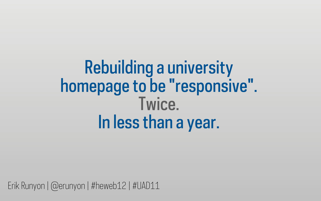
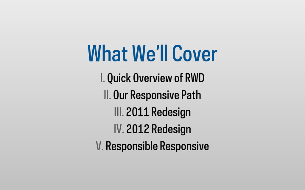
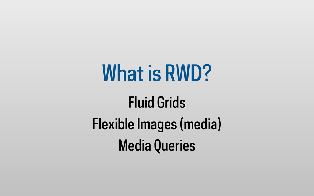
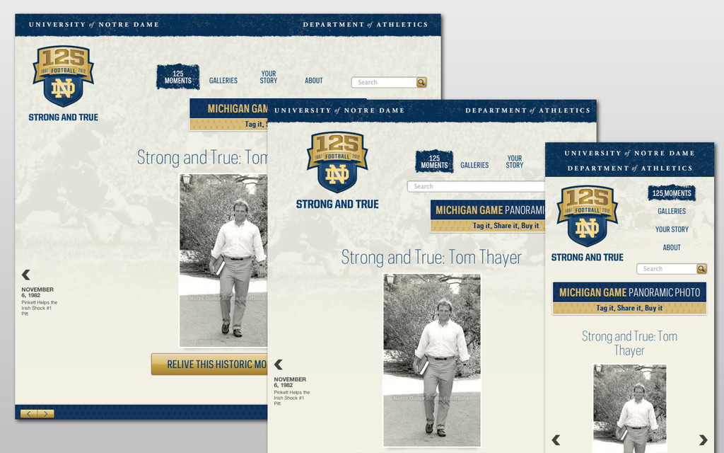
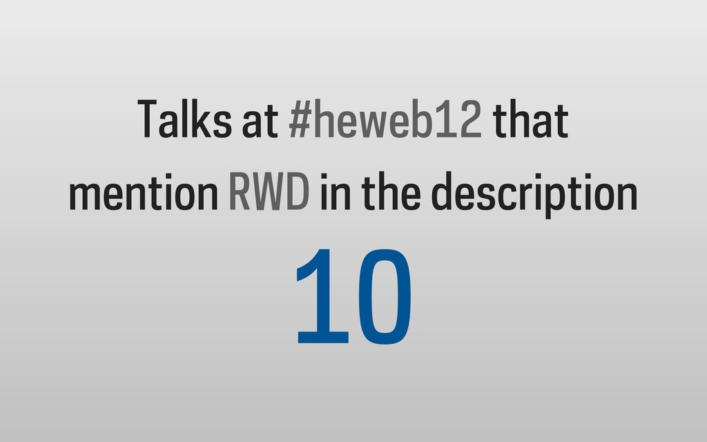
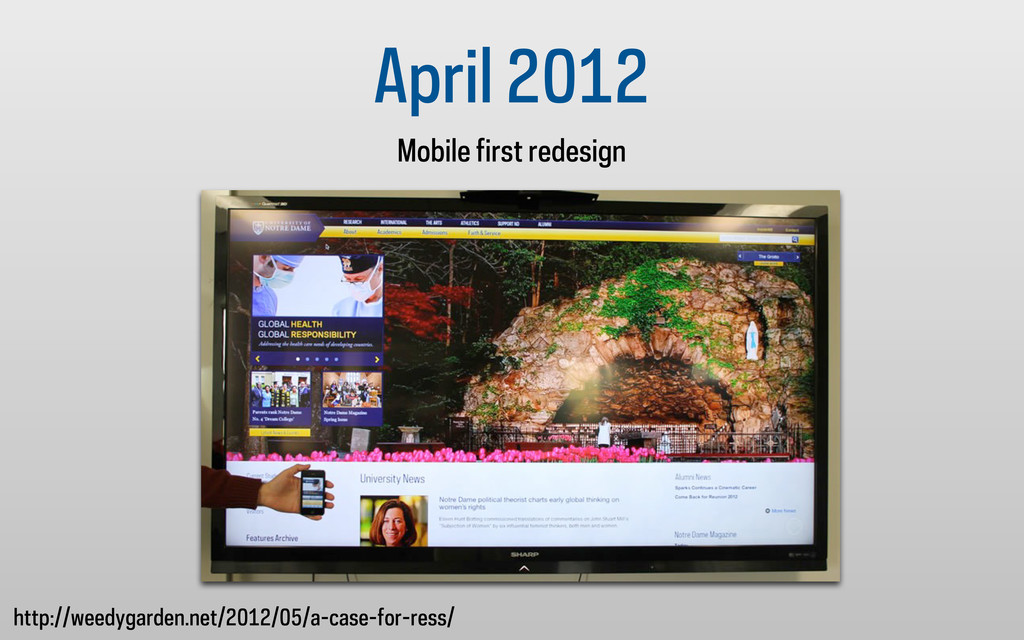
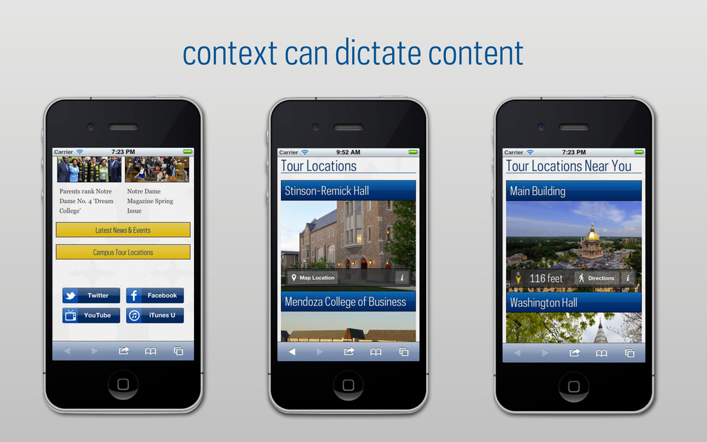
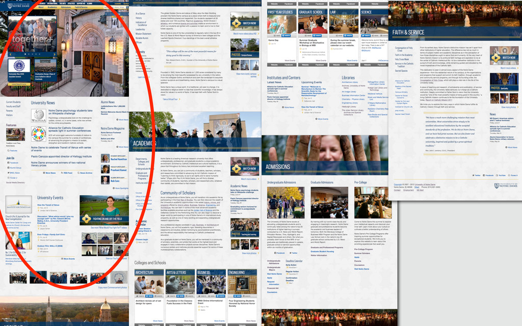
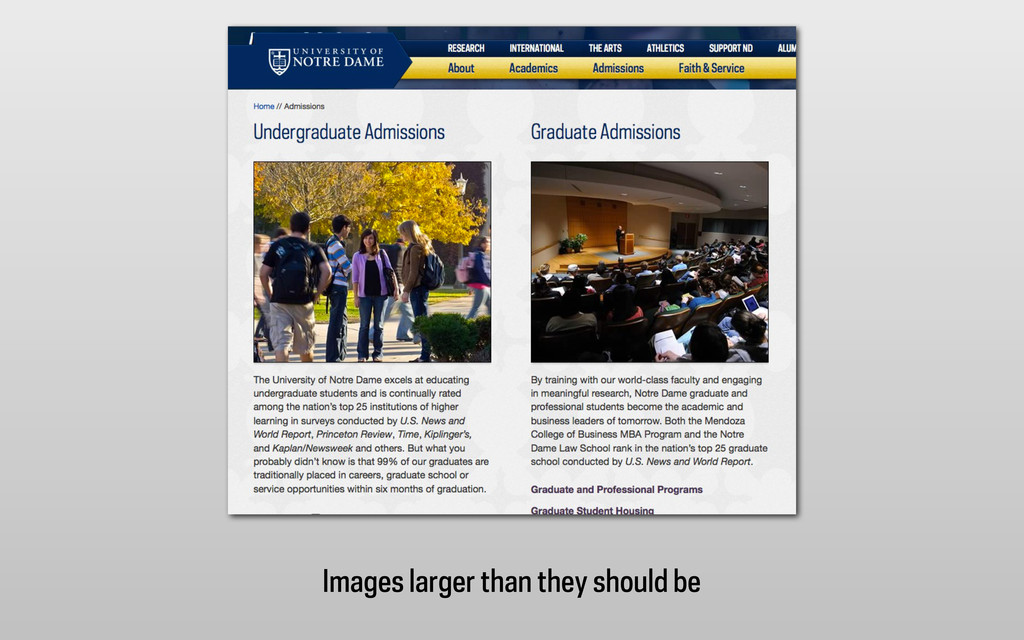
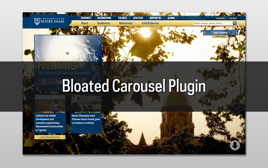
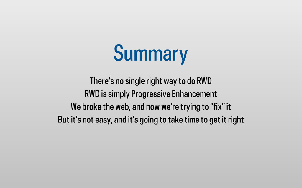
The history of Notre Dames two responsive (RWD) homepages, how we got to where we are, and some yelling about building responsive sites responsibly.

For more info about the conference, context to the slides and to watch a recording, visit http://bit.ly/heweb12-wg

Erik Runyon

October 09, 2012
Tweet

More Decks by Erik Runyon

Other Decks in Technology

Transcript

  1. Rebuilding a university homepage to be "responsive". Twice. In less

    than a year. Erik Runyon | @erunyon | #heweb12 | #UAD11
  2. who am i? Erik Runyon Manager of Interactive Development University

    Communications: Web University of Notre Dame
  3. What We’ll Cover I. Quick Overview of RWD II. Our

    Responsive Path III. 2011 Redesign IV. 2012 Redesign V. Responsible Responsive
  4. 2010 ND.edu 2.6% Admissions 3.6% Game Day 7.18% 2011 ND.edu

    4.37% Admissions 8.76% Game Day 26.09% 2012 ND.edu 13.3% Admissions 17.7% Game Day 41.88%
  5. // IN THE HEAD OF THE DOCUMENT <link href="webkit.css" media="only

    screen and (max-width: 480px)" rel="stylesheet" type="text/css" /> <link href="mobile.css" media="handheld" rel="stylesheet" type="text/css" /> // IN THE JS (IMMEDIATELY FOLLOWING CSS) if( (navigator.userAgent.match(/iPhone/i)) || (navigator.userAgent.match(/iPod/i)) || (navigator.userAgent.match(/Android/i)) || (navigator.userAgent.match(/webOS/i))) { // REMOVES ALL STYLESHEETS ... for (var k=0;k < document.styleSheets.length; k++) { if (document.styleSheets[k].href != null && document.styleSheets[k].href.lastIndexOf("webkit") == -1) { document.styleSheets[k].disabled = true; } } window.scrollTo(0,1); }
  6. <meta name="viewport" content="width=device-width; initial-scale=1.0;"> /************************************************************************** @media queries **************************************************************************/ /* iPad

    landscape ----------- */ @media only screen and (min-width:801px) and (max-width:1100px) {} /* iPad portrait ----------- */ @media only screen and (max-width:768px) {} /* Mid-Size Tablets (Galaxy Tab) (portrait) ----------- */ @media only screen and (max-width:591px) and (orientation:portrait) {} /* Smartphones (portrait and landscape) ----------- */ @media only screen and (min-width: 320px) and (max-width: 480px) {} /* Smartphones (portrait) ----------- */ @media only screen and (min-width:320px) and (max-width:380px) {}
  7. June 2011 Redesign Goals •Unify the interface •Replace Flash carousel

    with feature story image •Mobile friendly (Adaptive design)
  8. /************************************************************************** @media queries **************************************************************************/ /* Tablets landscape */ @media only

    screen and (max-width:1100px) {} /* Tablets portrait */ @media only screen and (max-width:800px) {} /* Mid-Size Tablets */ @media only screen and (max-width:600px) {} /* Smartphones (landscape) */ @media only screen and (max-width:480px) {} /* Smartphones (portrait) */ @media only screen and (max-width:320px) {}
  9. Design • How will elements be presented on small screens?

    • How will elements be presented on giant screens? • How will design decisions impact performance? Development • Build mobile first • Keep mobile experience fast • Maintain content parity
  10. “The absence of support for @media queries is in fact

    the first @media query” @bryanrieger slideshare.net/bryanrieger/rethinking-the-mobile-web-by-yiibu
  11. mobile first @mq 1. Global 2. Screen 3. @media queries

    as needed 4. Hi-res/retina specific 5. Print (yes, print)
  12. <?php require("UAParser.php"); $result = UA::parse(); /* * Some other generic

    boolean options */ print $result->isMobile; // return true if the browser met criteria of a mobile browser based on the user agent information print $result->isMobileDevice; // return true if the device met criteria of a mobile device based on the user agent information print $result->isTablet; // return true if the device was a tablet according to the user agent information print $result->isSpider; // return true if the device was a spider according to the user agent information print $result->isComputer; // return true if the device was a computer according to the user agent information print $result->isUIWebview; // return true if the user agent was from a uiwebview in iOS ?> UA-Parser
  13. http://www.websiteoptimization.com/speed/tweak/average-web-page/ http://www.webperformancetoday.com/2012/05/24/average-web-page-size-1-mb/ “Within the last eight years, the size of

    the average web page has more than septupled, and the number of external objects has more than tripled. While broadband users have experienced somewhat faster response times, dial-up users have been left behind.” - websiteoptimization.com (May 31, 2011) In the past 18 months, the average web page has grown by 50% — from 702 KB in November 2010 to 1042 KB on May 1, 2012. At this rate, the average page will hit 2 MB by 2015. - webperformancetoday.com (May 24, 2012)
  14. “Out of the 106 sites I reviewed, 64 of them

    had mobile sites that were less than ten percent smaller than the desktop version. Twenty-six of the sites had mobile web sites that were larger than the desktop equivalent.” @grigs http://www.uie.com/articles/mobile_first_rwd/
  15. averages for #highered RWD sites 34 sites sampled with iPhone

    UA and narrow screen (to simulate mobile) requests: 55 size: 1.4MB Sites used to generate these stats: http://bit.ly/highered-rwd
  16. averages for #highered RWD sites 34 sites sampled with iPhone

    UA and narrow screen (to simulate mobile) > 1MB = 15 > 2MB = 4 Sites used to generate these stats: http://bit.ly/highered-rwd
  17. stand-outs * University of California, San Diego ucsd.edu West Virginia

    University wvu.edu 31 requests | 439kb 26 requests | 361kb http://notredame.photoshelter.com/gallery-image/2012-Graduate-School-Ceremony/G0000QHnZV6vbKHg/I0000S5ossz793xo * Not including ND.edu in a veiled attempt at being humble
  18. http://www.alistapart.com/articles/dao/ “...make pages which are adaptable. Make pages which are

    accessible, regardless of the browser, platform or screen that your reader chooses or must use to access your pages.” John Allsopp @johnallsopp
  19. http://www.alistapart.com/articles/dao/ “The web’s greatest strength, I believe, is often seen

    as a limitation, as a defect. It is the nature of the web to be flexible, and it should be our role as designers and developers to embrace this flexibility, and produce pages which, by being flexible, are accessible to all.” John Allsopp @johnallsopp
  20. Summary There’s no single right way to do RWD RWD

    is simply Progressive Enhancement We broke the web, and now we’re trying to “fix” it But it’s not easy, and it’s going to take time to get it right