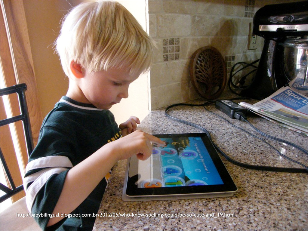
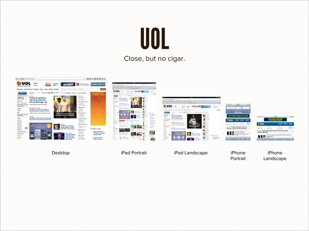
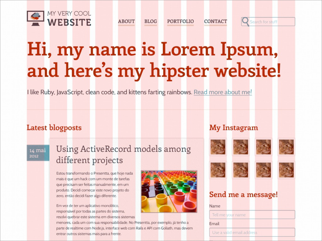
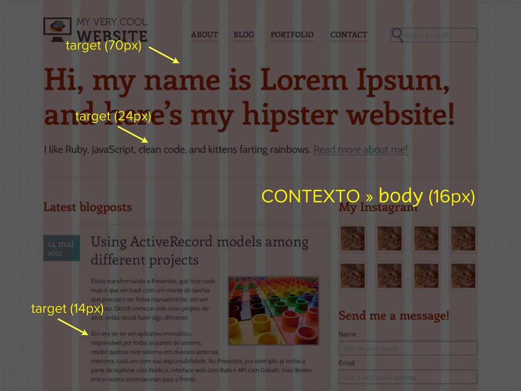
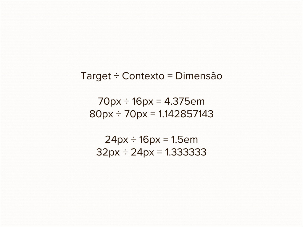
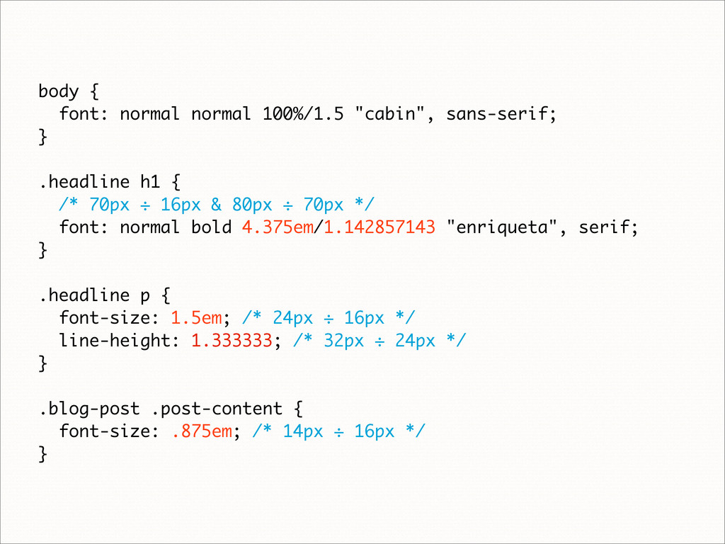
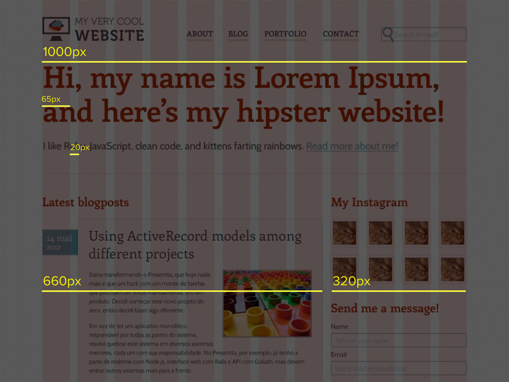
Não é nenhum segredo que o mundo está cada vez mais móvel. As vendas de PCs caíram em 20% desde 2008, e em 2015 é esperado que o acesso à Internet por dispositivos portáteis supere o acesso por desktops. A Web pode ser acessada de qualquer lugar, a qualquer hora. Mas com tantos modelos de dispositivos—tablets, notebooks, netbooks e smartphones—como fazer com que seu produto funcione em todos?
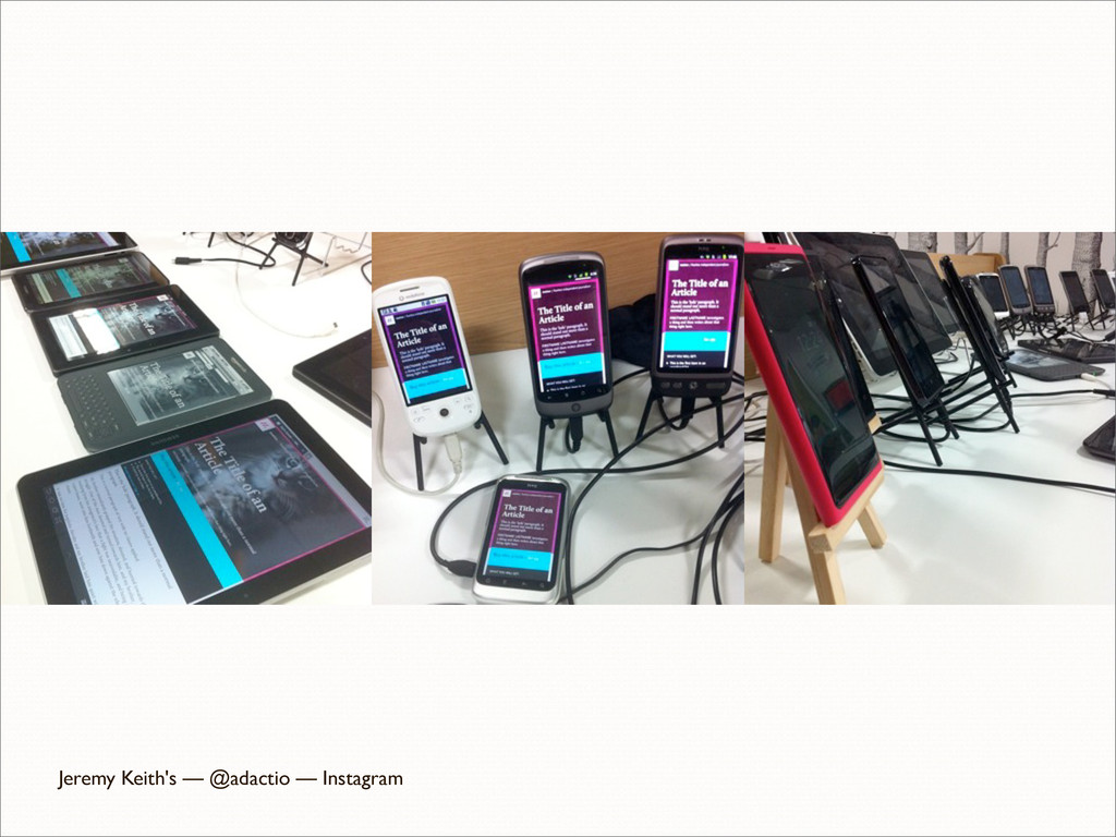
O Responsive Web Design—um conjunto de técnicas e ideologias—promete solucionar este problema, oferecendo o mesmo conteúdo em todas as plataformas, da melhor maneira. Nesta palestra, serão ensinadas técnicas de design, front e back-end para que seu site seja usável e acessível por todos, sem limitar-se a modelos, tamanhos de tela ou versões específicas.
 eshiota
 handlename
 yusukebe
 wakana0222
 niftycorp
 kishida
 pkshadeck
 77web
77web
 vinceamstoutz
 suguruooki
 findyinc
 pizzacat83
 techseoconnect
 addyosmani
.png) helenjbeal
helenjbeal
 wayneb77
 vanstee
 matthewcrist
 rocio
rocio
 michielstock
 aleyda
 shlominoach
 katiecoart
 michaelherold
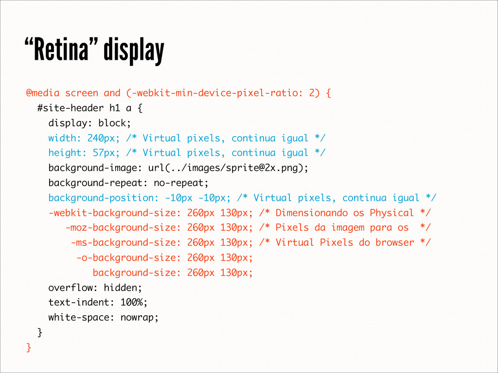
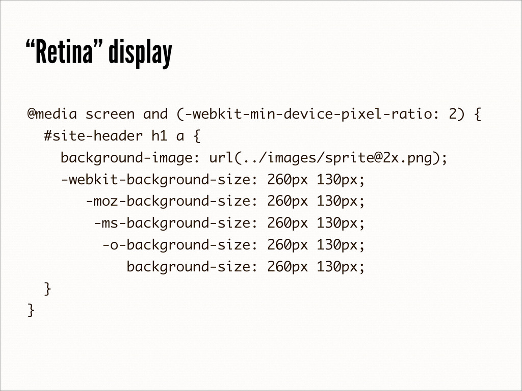
![“Retina” display [email protected] 260px 520px](https://files.speakerdeck.com/presentations/503812d71d81480002028eb8/slide_66.jpg)