Upgrade to Pro — share decks privately, control downloads, hide ads and more …

Building Shapeshifting Interfaces

Frank Leue
December 10, 2013

Building Shapeshifting Interfaces

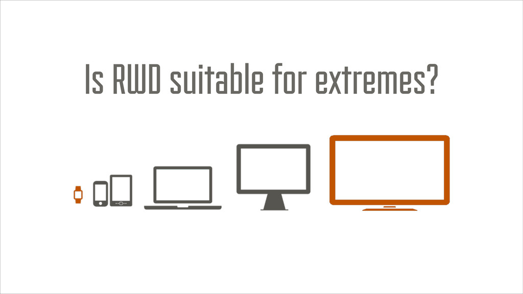
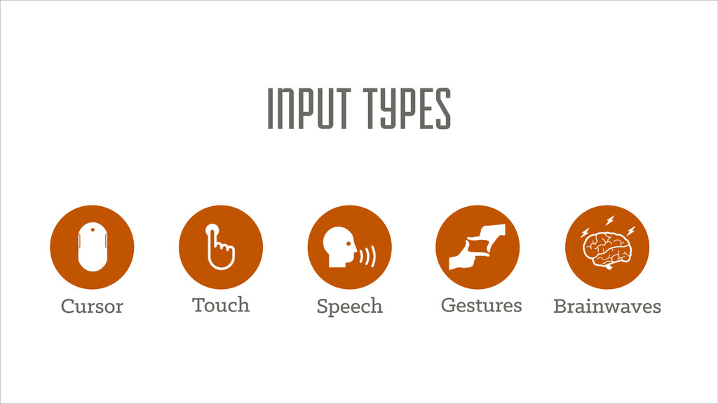
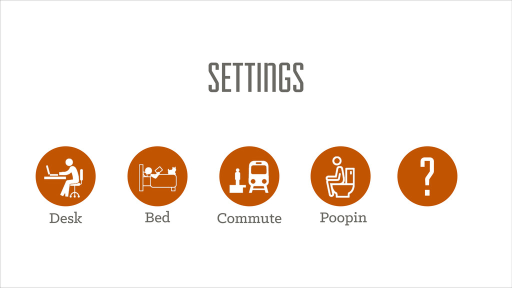
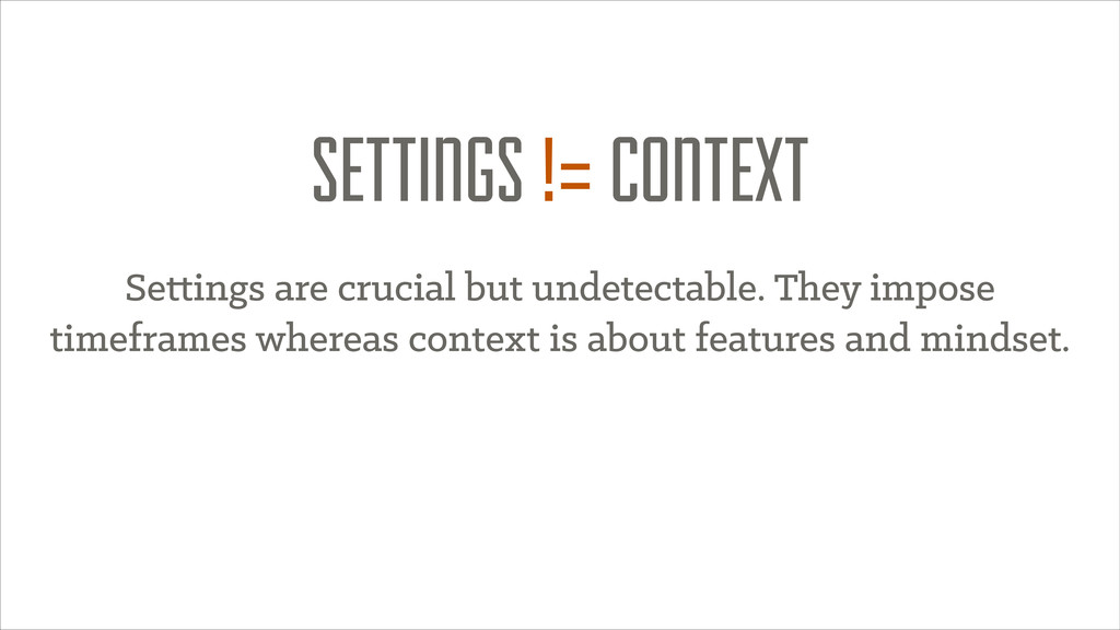
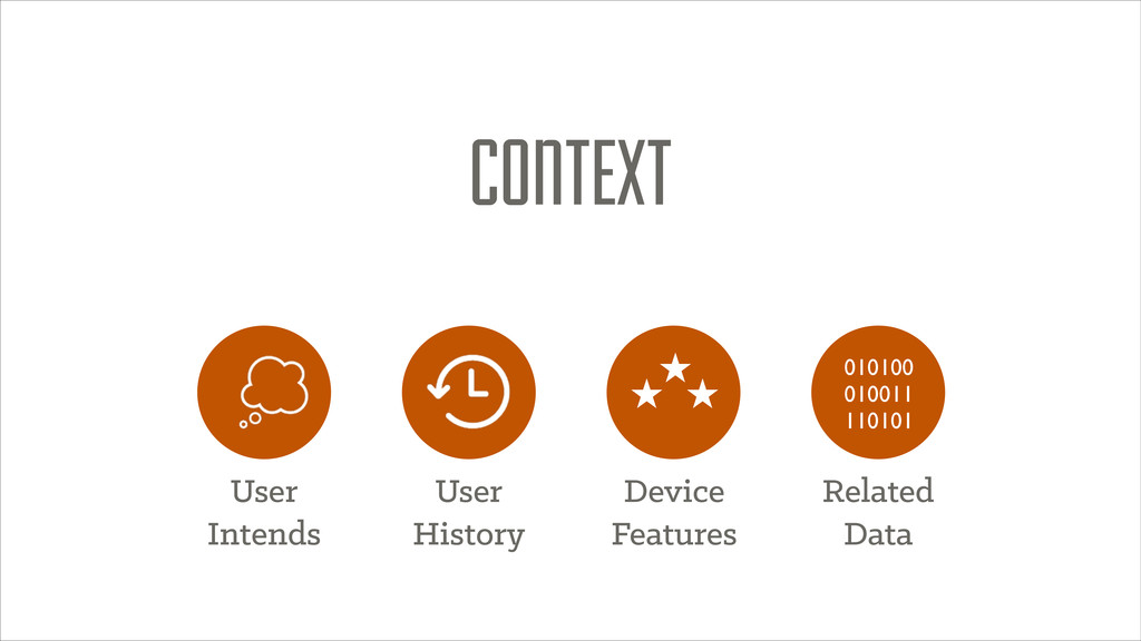
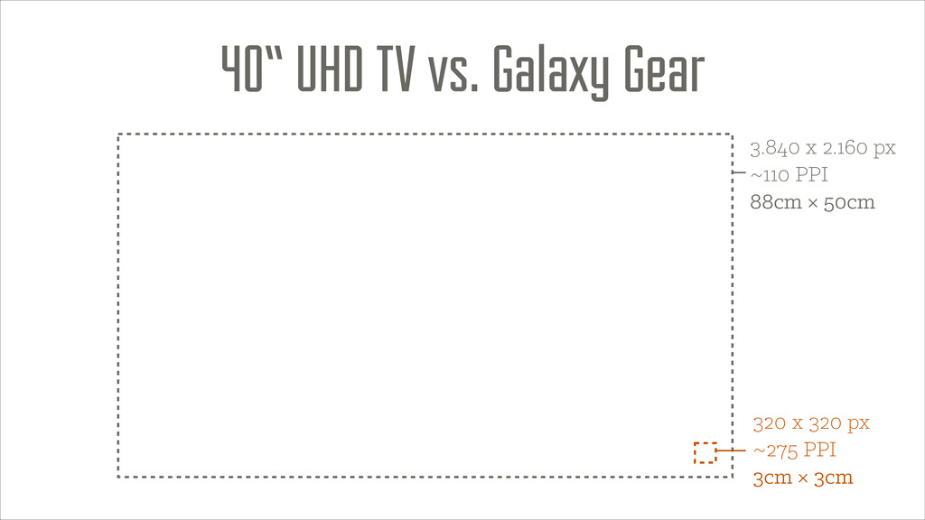
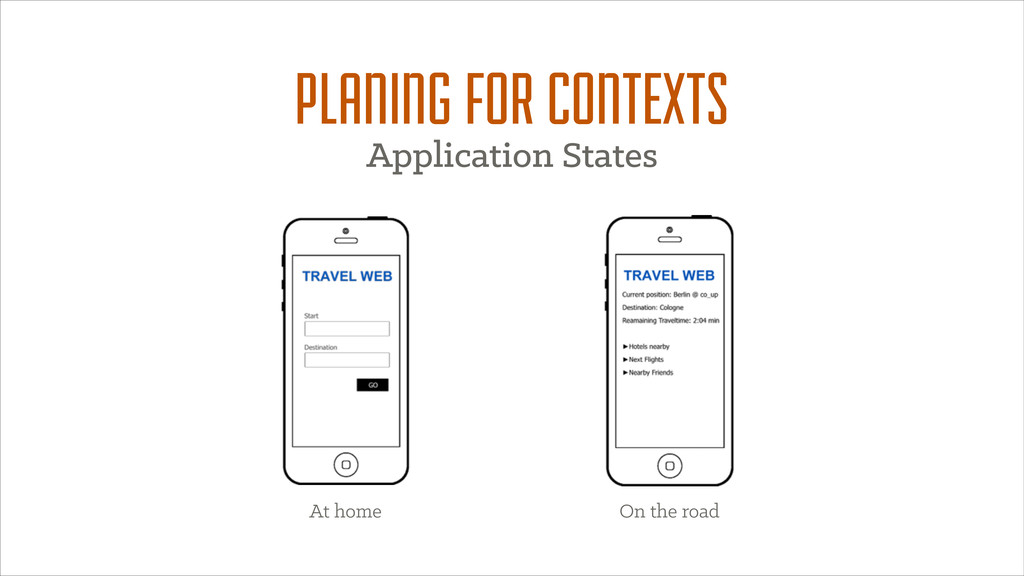
Building things on the web is great. Especially just now as responsive design solved lots of our problems. But taking a glimpse at the near future you’ll see not only desktops, tablets and phones. There will be watches and super large TV sets. Interaction with those devices will not necessarily include your fingertips anymore but very likely gestures and voice control. While the emerging internet of things is going to surround us with connected devices constantly providing or collecting data, we need to think about how to build consistent experiences throughout the day. This talk is about how to build frontends that adopt to contexts and provide consistent information and a continuity of your brand across devices.

Frank Leue

December 10, 2013
Tweet

More Decks by Frank Leue

Other Decks in Programming

Transcript

  1. SETTINGS != CONTEXT Settings are crucial but undetectable. They impose

    timeframes whereas context is about features and mindset.
  2. 3.840 x 2.160 px ~110 PPI 88cm × 50cm 40“

    UHD TV vs. Galaxy Gear 320 x 320 px ~275 PPI 3cm × 3cm
  3. @media screen and (min-width: X) {! body {! font-size: (

    ( 1em / X ) * 100 )vw;! }! } he screen size being used to access it. http:/ /codepen.io/aarongustafson/full/stnpj COUCH MODE
  4. „ SMACCS is an attempt to document a consistent approach

    to site development when using CSS.“ @snookca http:/ /smacss.com/
  5. „RequireJS is a JavaScript file and module loader[…] Using a

    modular script loader like RequireJS will improve the speed and quality of your code.“ http:/ /requirejs.org/
  6. CLIENT SIDE APPROACH 1. Load document 2. Load referenced resources

    3. Render document 4. Detect features 5. React to detected features
  7. Mozilla/5.0 (iPhone; CPU iPhone OS 7_0_4 like Mac OS X)

    AppleWebKit/537.51.1 (KHTML, like Gecko) CriOS/31.0.1650.18 Mobile/11B554a Safari/8536.25
  8. {! "type": "mobile",! "markup": "iphone",! "screenWidth": 320,! "screenHeight": 568,! "imageFormats":

    [! "png",! "jpg",! "gif"! ],! "jsSupport": "1",! "pixelRatio": 2! } http:/ /wurfl.sourceforge.net/wurfl_download.php
  9. Detection methods are not reliable and possibly never will be.

    Combining approaches narrows detection results.
  10. ASKING THE CLIENT FOR CONTEXT var battery = navigator.battery ||

    navigator.mozBattery || navigator.webkitBattery;! ! function updateBatteryStatus() {! console.log("Battery status: " + battery.level * 100 + " %");! ! if (battery.charging) {! console.log("Battery is charging"); ! }! }! ! battery.addEventListener("chargingchange", updateBatteryStatus);! battery.addEventListener("levelchange", updateBatteryStatus);! updateBatteryStatus(); Battery level
  11. ASKING THE CLIENT FOR CONTEXT window.addEventListener('devicelight', function(event) {! var html

    = document.getElementsByTagName('html')[0];! ! if (event.value < 50) {! html.classList.add('darklight');! html.classList.remove('brightlight');! } else {! html.classList.add('brightlight');! html.classList.remove('darklight');! }! }); Ambient light EXPERIMENTAL
  12. ASKING THE CLIENT FOR CONTEXT window.addEventListener('userproximity', function(event) {! if (event.near)

    {! // let's power off the screen! navigator.mozPower.screenEnabled = false;! } else {! // Otherwise, let's power on the screen! navigator.mozPower.screenEnabled = true;! }! });! User proximity EXPERIMENTAL
  13. ASKING THE CLIENT FOR CONTEXT var connection = navigator.connection ||

    navigator.mozConnection || navigator.webkitConnection;! ! function updateConnectionStatus() {! alert("Connection bandwidth: " + connection.bandwidth + " MB/s");! if (connection.metered) {! alert("The connection is metered!");! }! }! ! connection.addEventListener("change", updateConnectionStatus);! updateConnectionStatus();! Network Information EXPERIMENTAL
  14. Fabulous Icons From The Noun Project: Computer designed by Alyssa

    Mahlberg Iphone designed by Marwa Boukarim Television designed by Anton Outkine Laptop + Speech designed by Edward Boatman Tablet designed by Megan Hillman Mouse designed by Monika Ciapala Keyboard designed by Roger Dean Oldén Monitor designed by Karthick Nagarajan Brainstorm + Fingerframe designed by Bernice Beltran Touch designed by Cengiz SARI Toilet designed by Jaclyne Ooi Train Station designed by Pierre-Luc Auclair Reading in Bed designed by Ainsley Wagoner Desk designed by Juan Pablo Bravo History designed by Ema Dimitrova Thought Bubble designed by irene hoffman Code designed by Luboš Volkov Location designed by John Caserta Clock designed by Nicholas Burroughs CREDITS Gorgeous Fonts from FAIRVIEW BY RILEY CRAN KLINIC SLAB BY JOE PRINCE