Upgrade to Pro
— share decks privately, control downloads, hide ads and more …
Speaker Deck
Features
Speaker Deck
PRO
Sign in
Sign up for free
Search
Search
Jetpack Compose + design systems
Search
François Blavoet
May 03, 2022
Programming
440
1
Share
Embed
Copy iframe code
Copy JS code
Copy link
Start on current slide
Jetpack Compose + design systems
François Blavoet
May 03, 2022
More Decks by François Blavoet
See All by François Blavoet
Accessibility made Easy
francois_blavoet
0
130
Vectorial Victories - Android Makers 2018 - Paris
francois_blavoet
0
830
New York Accessibility Hackathon - Accessibility on Android
francois_blavoet
1
120
SVG
francois_blavoet
0
120
And then my phone became smarter - A journey into the Awareness API - MobileEra 2016
francois_blavoet
0
730
And then my phone became smarter - A journey into the Awareness API
francois_blavoet
2
1.5k
Let's Sprinkle some #PerfMatters on your ViewGroups - Droidcon Turin 2016
francois_blavoet
10
1.6k
Let's Sprinkle some #PerfMatters on your ViewGroups - Droidcon Paris 2015
francois_blavoet
13
1.7k
Other Decks in Programming
See All in Programming
AI時代の仕事技芸論〜ソフトウェア開発で「遊ぶように働く」職人的熟達のすすめ(スクフェス仙台 2026バージョン)
kuranuki
0
710
2年かけて Deno に DOMMatrix を実装した話 / How I implemented DOMMatrix in Deno over two years
petamoriken
0
110
人間の目はかわらない、だからJPEGは30年もつ
yuzneri
1
550
Lean は証明の正しさを確認するためだけのツールって思ってませんか?
inoueasei
1
110
ITヒヤリハットを整理してみた ~ライフサイクルと原因から考える再発防止策~
koukimiura
1
110
AIエージェントで 変わるAndroid開発環境
takahirom
2
710
Generative UI & AI-Assistants for Your Angular Solutions
manfredsteyer
PRO
0
120
Laravelで学ぶ Webアプリケーションチューニング入門/web_application_tuning_101
hanhan1978
4
1.3k
変わらないものが、変わるものを決める — 意図駆動開発 × イベントソーシング × イミュータブル | What Doesn't Change Decides What Can — IDD × Event Sourcing × Immutability
tomohisa
0
200
全PRの83%がAIレビューだけでマージできるようになった開発組織はその後どうなったか
athug
0
300
Prismを使った型安全な暗号化_関数型まつり2026
_fhhmm
0
150
PHP に部分適用が来るぞ!……ところで何それ?おいしいの? #phpcon / phpcon-2026
shogogg
0
340
Featured
See All Featured
The Invisible Side of Design
smashingmag
301
52k
Why Your Marketing Sucks and What You Can Do About It - Sophie Logan
marketingsoph
0
310
Testing 201, or: Great Expectations
jmmastey
46
8.2k
End of SEO as We Know It (SMX Advanced Version)
ipullrank
3
4.3k
Google's AI Overviews - The New Search
badams
0
1.1k
HU Berlin: Industrial-Strength Natural Language Processing with spaCy and Prodigy
inesmontani
PRO
0
550
Navigating the Design Leadership Dip - Product Design Week Design Leaders+ Conference 2024
apolaine
1
370
Documentation Writing (for coders)
carmenintech
77
5.4k
Reflections from 52 weeks, 52 projects
jeffersonlam
356
21k
Thoughts on Productivity
jonyablonski
76
5.3k
Writing Fast Ruby
sferik
630
63k
The browser strikes back
jonoalderson
0
1.4k
Transcript
Jetpack Compose + Design Systems François Blavoet
Jetpack Compose • Compose is the future of Android UI
development • When is the best time to start adopting it ?
Design systems What is a Design system ? -> it
is a complete set of standards intended to manage design at scale using reusable components and patterns.
Design systems @GET("/addresses") fun getAddresses(): Single<GetAddressesResponse> @PUT("/addresses/{address_id}") fun updateAddress(@Path("address_id") id:
String, @Body body: Map<String, Any>): Single<AddressResponse>
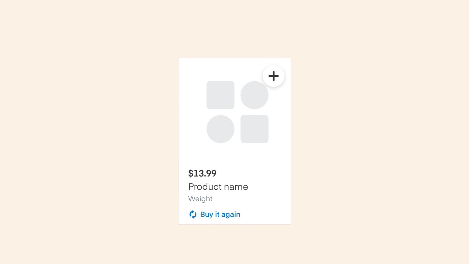
Let’s have a look at one component
Let’s have a look at one component
Let’s have a look at one component
Let’s have a look at one component
Let’s have a look at one component Row.Content { leading(
label = "Order Changes Preferences", label2 = "Suggest replacements ...", ) trailing( label = "Edit", option = Row.TrailingOption.Clickable(onPreferenceClick) ) }
Let’s have a look at one component Row.Content { leading(
label = "Tue Jun 2, 4–5pm", option = LeadingOption.Icon(Icon.Time), ) }
One design system
Material Design
Material Design Button( onClick: () -> Unit, modifier: Modifier =
Modifier, enabled: Boolean = true, interactionSource: MutableInteractionSource = remember {..}, elevation: ButtonElevation? = ButtonDefaults.elevation(), shape: Shape = MaterialTheme.shapes.small, border: BorderStroke? = null, colors: ButtonColors = ButtonDefaults.buttonColors(), contentPadding: PaddingValues = ButtonDefaults.ContentPadding, content: @Composable RowScope.() -> Unit, )
Material Design?
Material Design? ?
None
Let’s implement our own system
Atoms
Atoms Requirements: • Day/night • Customizable for white label apps
• As easy to use as possible • Have an abstract representation outside of the composition
Atoms interface ColorSpec { @Composable fun value(): Color }
Atoms interface ColorSpec { @Composable fun value(): Color companion object
{ val SystemGrayscale70: ColorSpec = … val SystemGrayscale50: ColorSpec = … … } }
Atoms interface ColorSpec { @Composable fun value(): Color companion object
{ val SystemGrayscale70: ColorSpec = … val SystemGrayscale50: ColorSpec = … … fun fromColor(color: Color): ColorSpec { return StaticColor(color) } } }
Atoms @Composable fun DesignTheme( configuration: ThemeConfig? = null, content: @Composable
() -> Unit, ) { … } object DesignTheme { val colors: Colors @Composable @ReadOnlyComposable get() = LocalColors.current }
Atoms
Atoms interface IconSlot { @Composable fun Content(contentColor: Color) }
Atoms interface IconSlot { @Composable fun Content(contentColor: Color) companion object
{ fun fromResource( @DrawableRes res: Int, contentDescription: TextSpec?, ): IconSlot { return ResIcon(res, contentDescription) } } }
Atoms enum class Icons(@DrawableRes internal val resId: Int) : IconSlot
{ Accessibility(R.drawable.cp_accessibility), Account(R.drawable.cp_account), Add(R.drawable.cp_add), … }
Molecules
Molecules data class PillSpec( val label: TextSpec, val onClick: (()
-> Unit)?, val selected: Boolean = false, ) @Composable fun Pill( spec: PillSpec, modifier: Modifier = Modifier, )
Molecules data class PillSpec( val label: TextSpec, val onClick: (()
-> Unit)?, val selected: Boolean = false, ) @Composable fun Pill( spec: PillSpec, modifier: Modifier = Modifier, ) @Composable fun BasePill( selected: Boolean, onClick: (() -> Unit)?, modifier: Modifier = Modifier, … content: @Composable BoxScope.(contentColor: Color) -> Unit, )
Going Further import androidx.compose.material.Text @Composable fun Text( text: AnnotatedString, modifier:
Modifier = Modifier, style: TextStyle = LocalTextStyle.current, … ) {
Going Further import com.instacart.compote.foundation.Text @Composable fun Text( text: RichTextSpec, modifier:
Modifier = Modifier, style: TextStyle = TextStyleSpec.Default, … )
33
Thank you! François Blavoet
 francois_blavoet
 kuranuki
 petamoriken
 yuzneri
 inoueasei
 koukimiura
.png) takahirom
takahirom
 manfredsteyer
 hanhan1978
 tomohisa
 athug
athug
 _fhhmm
 shogogg
 smashingmag
 marketingsoph
 jmmastey
 ipullrank
 badams
 inesmontani
 apolaine
 carmenintech
 jeffersonlam
 jonyablonski
 sferik
 jonoalderson