Upgrade to Pro — share decks privately, control downloads, hide ads and more …

CSS in a component filled landscape

Frontend NE
October 05, 2017

CSS in a component filled landscape

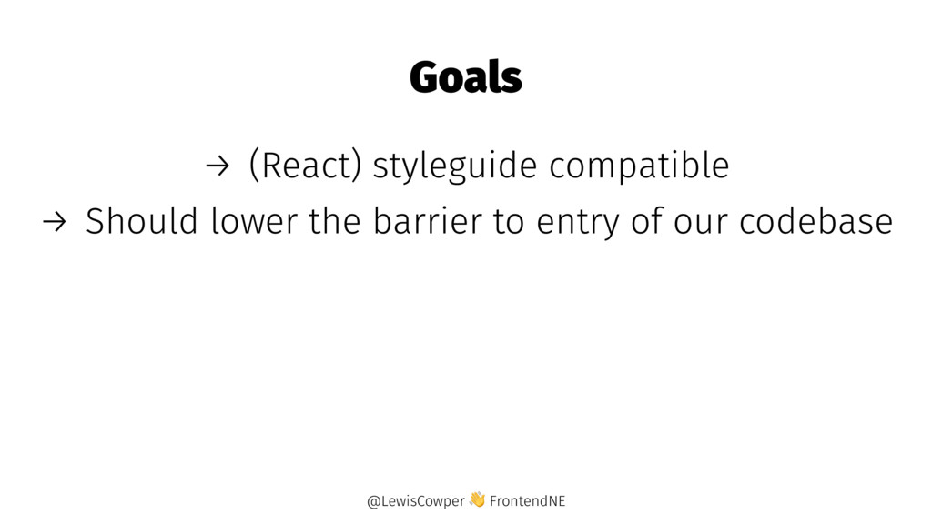
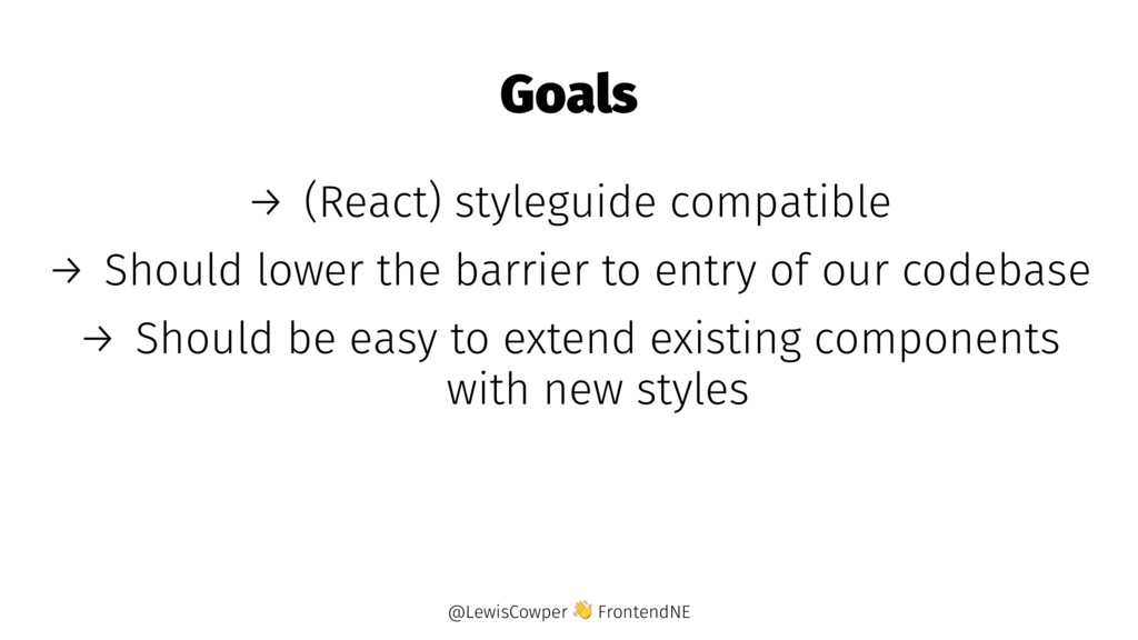
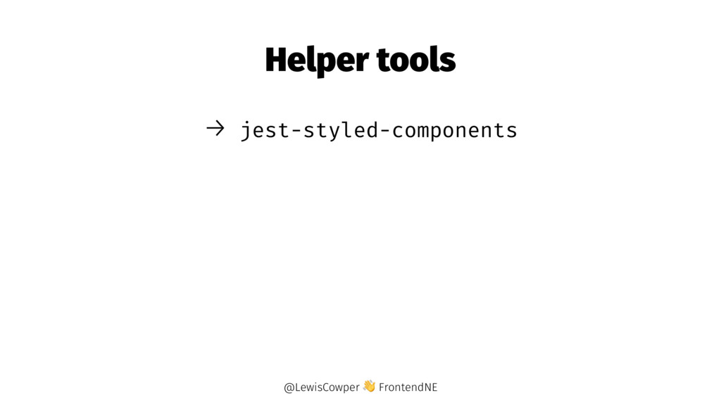
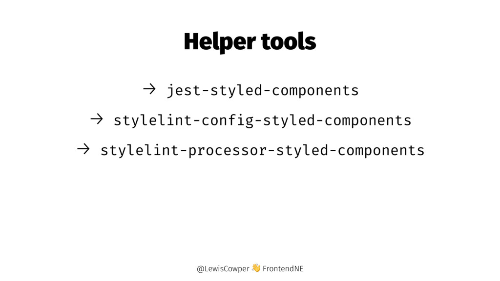
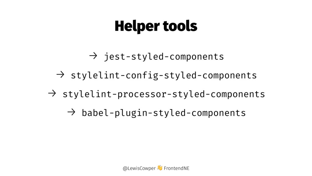
Lewis will help you make some sense of the variety of tools available to you to "component-ise" your CSS, from CSS modules, CSS in JS solutions, and styled-components.

Frontend NE

October 05, 2017
Tweet

More Decks by Frontend NE

Other Decks in Technology

Transcript

  1. Goals → (React) styleguide compatible → Should lower the barrier

    to entry of our codebase @LewisCowper FrontendNE
  2. Goals → (React) styleguide compatible → Should lower the barrier

    to entry of our codebase → Should be easy to extend existing components with new styles @LewisCowper FrontendNE
  3. /* styles.css */ .className { color: tomato; } // index.js

    import 'styles.css' render(<h1 className='className'>Hello</h1>) @LewisCowper FrontendNE
  4. CSS Modules /* styles.css */ .className { color: tomato; }

    // index.js import { className } from 'styles.css' // import styles from 'styles.css' render(<h1 className={className}>Hello</h1>) // render(<h1 className={styles.className}>Hello</h1>) @LewisCowper FrontendNE
  5. CSS Modules - Composition /* styles.css */ .className { color:

    tomato; background-color: papayawhip; } .anotherClassName { composes: className; color: dodgerblue; } // index.js import { anotherClassName } from 'styles.css' render(<h1 className={anotherClassName}>Hello</h1>) @LewisCowper FrontendNE
  6. CSS Modules - Composition /* styles.css */ .className { color:

    tomato; background-color: papayawhip; } .anotherClassName { composes: className; color: dodgerblue; } // index.js import { anotherClassName } from 'styles.css' render(<h1 className={anotherClassName}>Hello</h1>) @LewisCowper FrontendNE
  7. Styled-Components import styled from 'styled-components' const Title = styled.h1` color:

    tomato; ` render(<Title>Hello</Title>) @LewisCowper FrontendNE
  8. Styled-Components import styled from 'styled-components' const Title = styled.h1` color:

    ${props => ( props.primary ? 'tomato' : 'dodgerblue' )}; ` render(<Title>Hello</Title>) @LewisCowper FrontendNE
  9. Conclusions → You might not need it → Try out

    CSS Modules @LewisCowper FrontendNE
  10. Conclusions → You might not need it → Try out

    CSS Modules → Once you realise your styles could use some JavaScript, check out styled-components @LewisCowper FrontendNE
  11. Conclusions → You might not need it → Try out

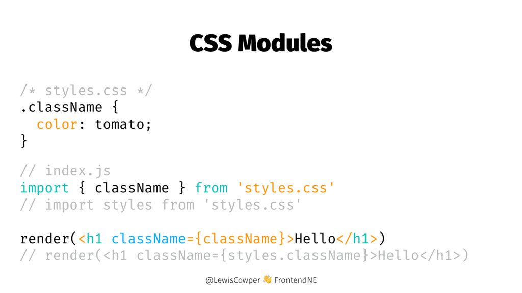
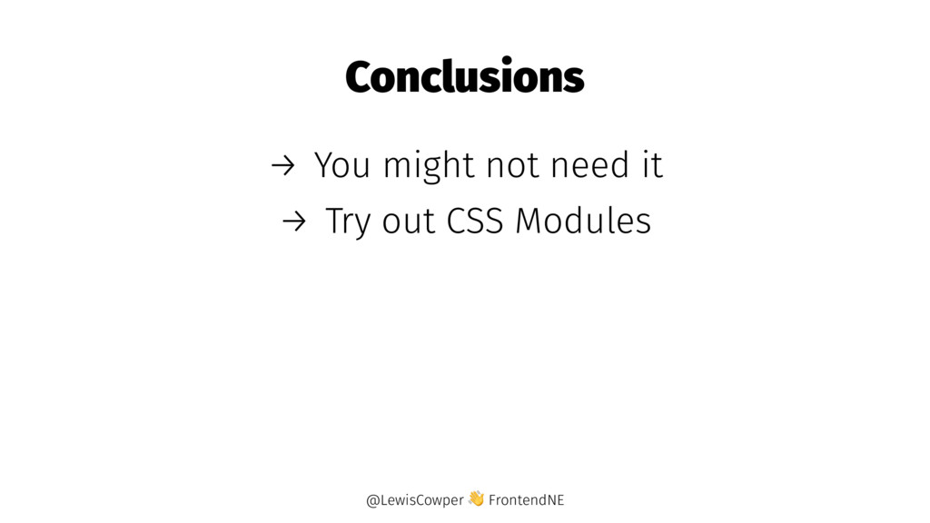
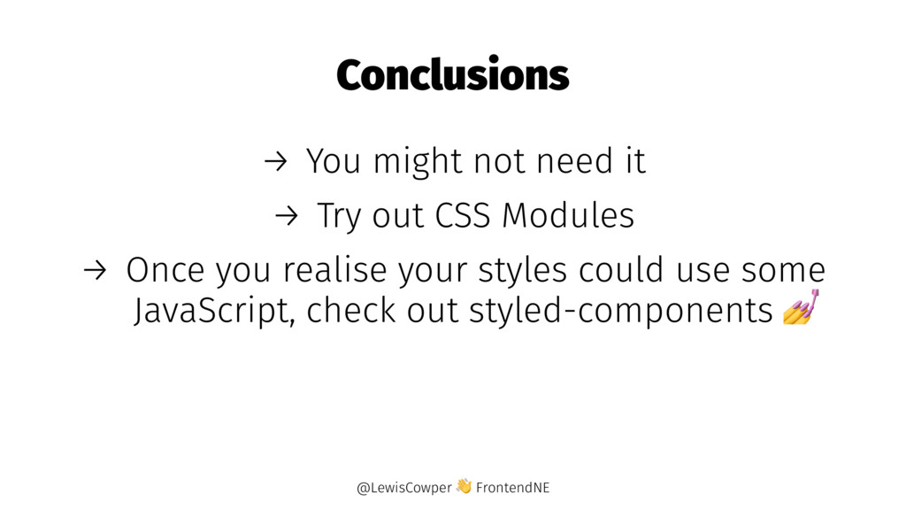
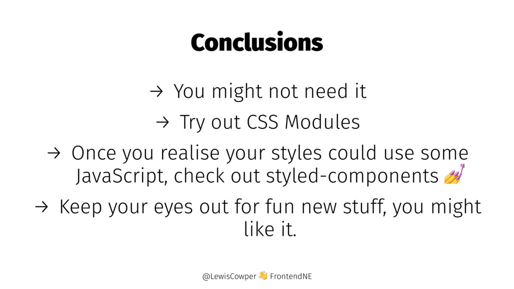
    CSS Modules → Once you realise your styles could use some JavaScript, check out styled-components → Keep your eyes out for fun new stuff, you might like it. @LewisCowper FrontendNE
  12. → References to other components? → What about external components?

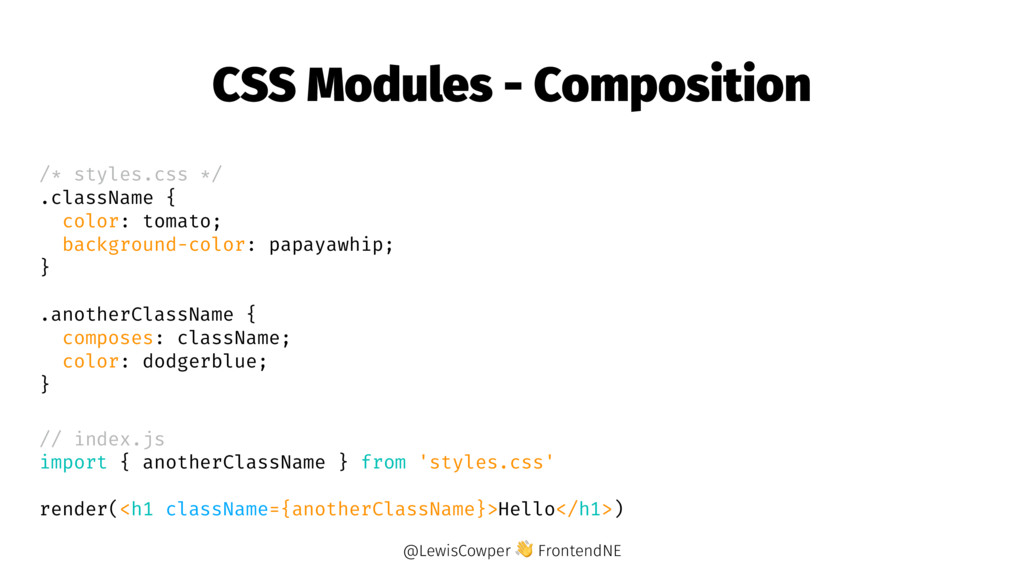
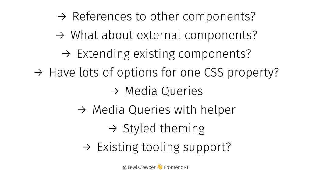
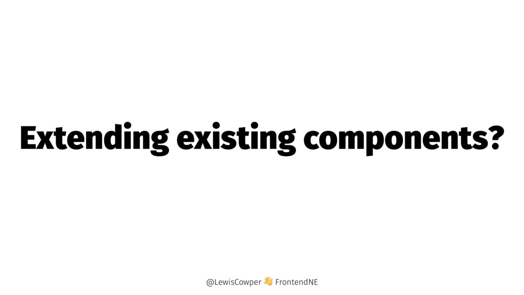
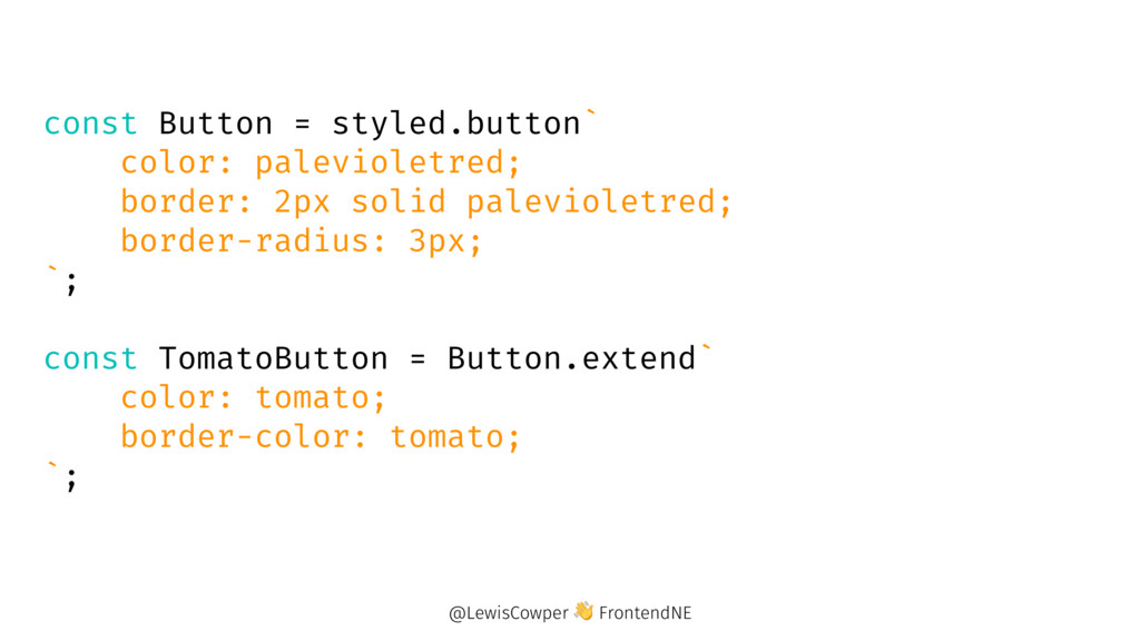
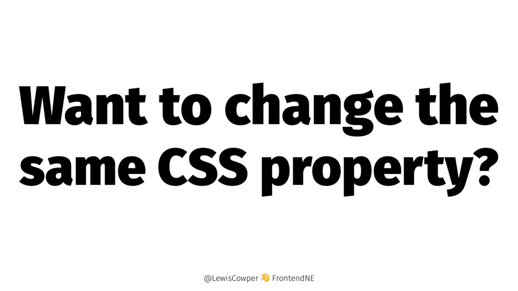
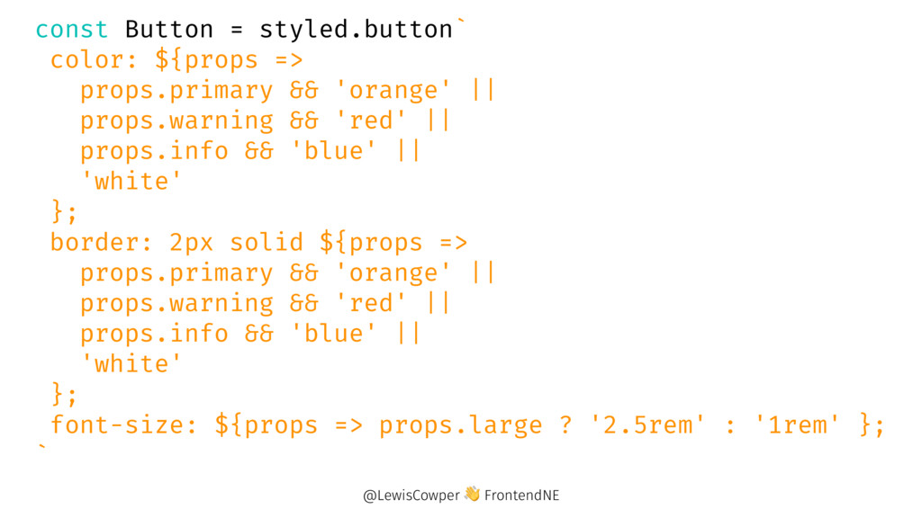
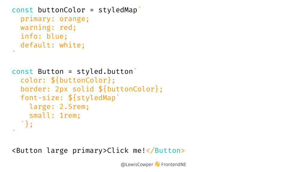
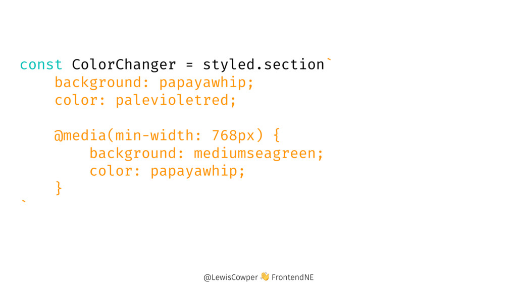
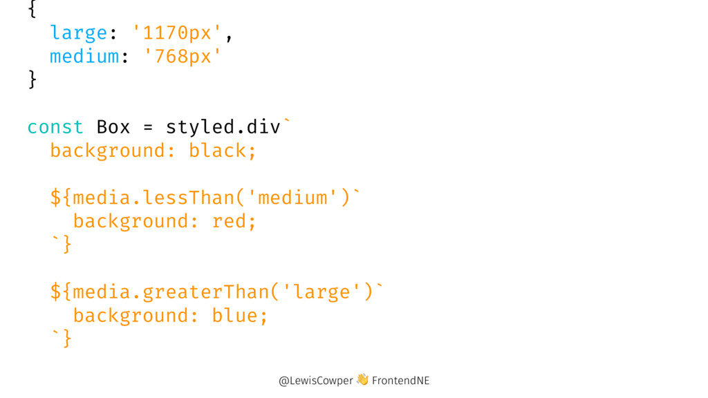
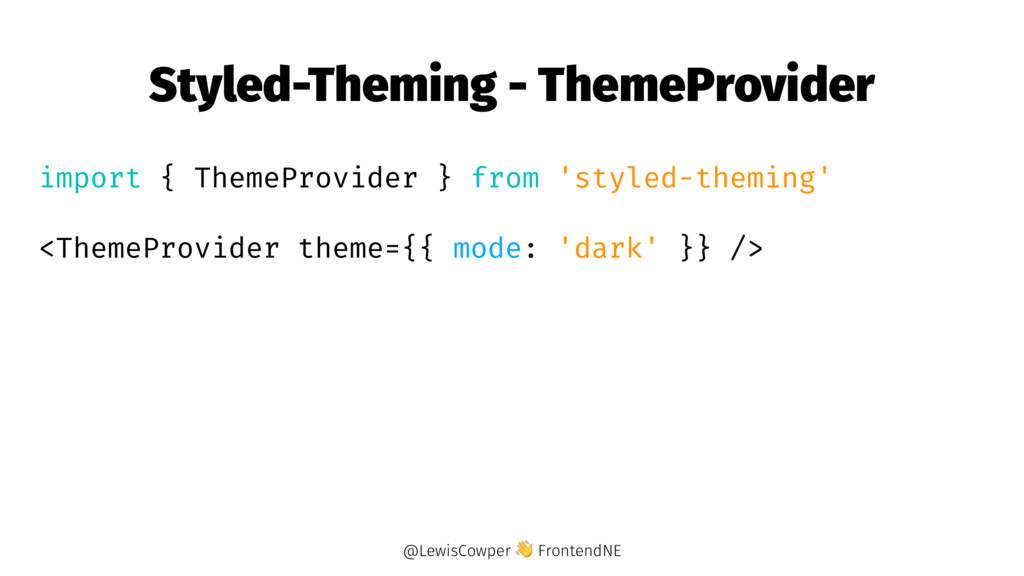
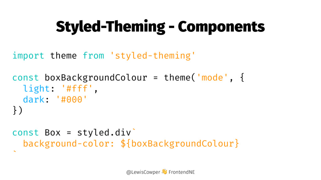
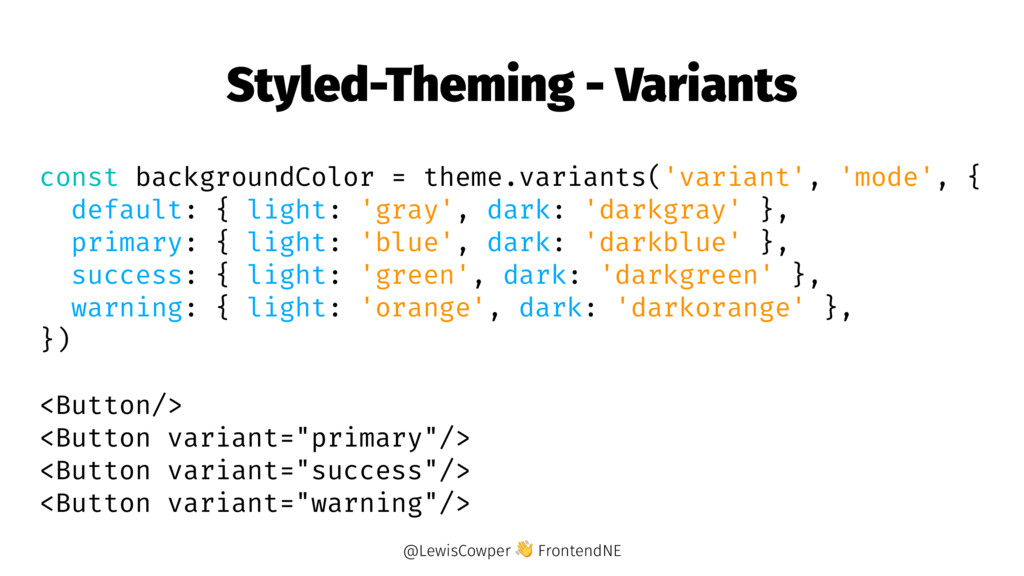
    → Extending existing components? → Have lots of options for one CSS property? → Media Queries → Media Queries with helper → Styled theming → Existing tooling support? @LewisCowper FrontendNE
  13. const Link = styled.a` background: papayawhip; color: palevioletred; ` const

    Icon = styled.svg` transition: fill 0.25s; ${Link}:hover & { fill: rebeccapurple; } ` @LewisCowper FrontendNE
  14. import { Link } from 'react-router-dom' const StyledLink = styled(Link)`

    color: palevioletred; font-weight: bold; ` @LewisCowper FrontendNE
  15. const Button = styled.button` color: palevioletred; border: 2px solid palevioletred;

    border-radius: 3px; `; const TomatoButton = Button.extend` color: tomato; border-color: tomato; `; @LewisCowper FrontendNE
  16. const Button = styled.button` color: ${props => props.primary && 'orange'

    || props.warning && 'red' || props.info && 'blue' || 'white' }; border: 2px solid ${props => props.primary && 'orange' || props.warning && 'red' || props.info && 'blue' || 'white' }; font-size: ${props => props.large ? '2.5rem' : '1rem' }; ` @LewisCowper FrontendNE
  17. const buttonColor = styledMap` primary: orange; warning: red; info: blue;

    default: white; ` const Button = styled.button` color: ${buttonColor}; border: 2px solid ${buttonColor}; font-size: ${styledMap` large: 2.5rem; small: 1rem; `}; ` <Button large primary>Click me!</Button> @LewisCowper FrontendNE
  18. const ColorChanger = styled.section` background: papayawhip; color: palevioletred; @media(min-width: 768px)

    { background: mediumseagreen; color: papayawhip; } ` @LewisCowper FrontendNE
  19. { large: '1170px', medium: '768px' } const Box = styled.div`

    background: black; ${media.lessThan('medium')` background: red; `} ${media.greaterThan('large')` background: blue; `} @LewisCowper FrontendNE
  20. Styled-Theming - Components import theme from 'styled-theming' const boxBackgroundColour =

    theme('mode', { light: '#fff', dark: '#000' }) const Box = styled.div` background-color: ${boxBackgroundColour} ` @LewisCowper FrontendNE
  21. Styled-Theming - Variants const backgroundColor = theme.variants('variant', 'mode', { default:

    { light: 'gray', dark: 'darkgray' }, primary: { light: 'blue', dark: 'darkblue' }, success: { light: 'green', dark: 'darkgreen' }, warning: { light: 'orange', dark: 'darkorange' }, }) <Button/> <Button variant="primary"/> <Button variant="success"/> <Button variant="warning"/> @LewisCowper FrontendNE
  22. Conclusions → The community is small, growing, and adding new

    platforms quickly. @LewisCowper FrontendNE
  23. Conclusions → The community is small, growing, and adding new

    platforms quickly. → If you don't use React, the ideas and concepts should still be applicable. @LewisCowper FrontendNE
  24. Conclusions → The community is small, growing, and adding new

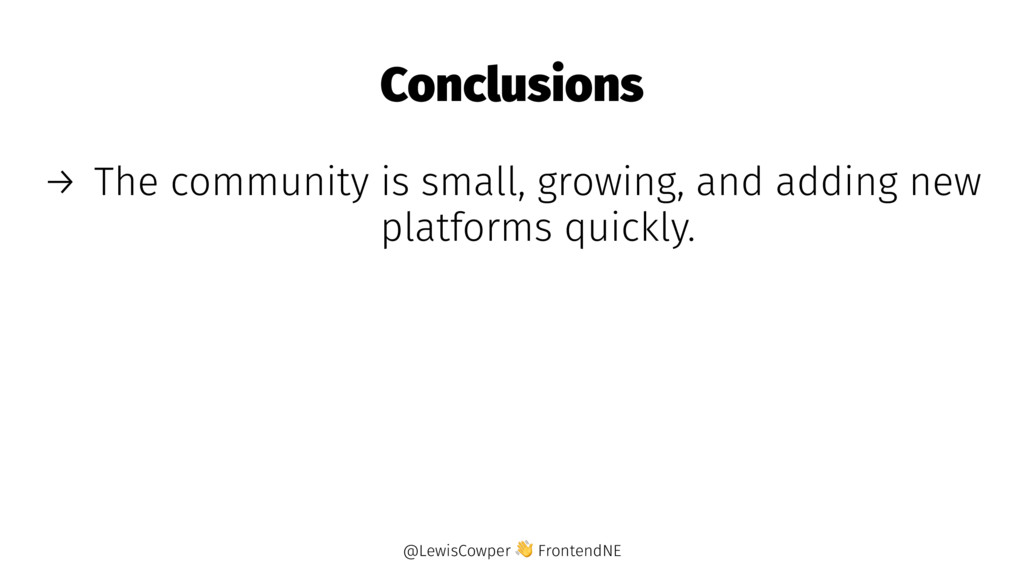
    platforms quickly. → If you don't use React, the ideas and concepts should still be applicable. → Definitely try out new things, it's super fun, and can definitely help you. @LewisCowper FrontendNE