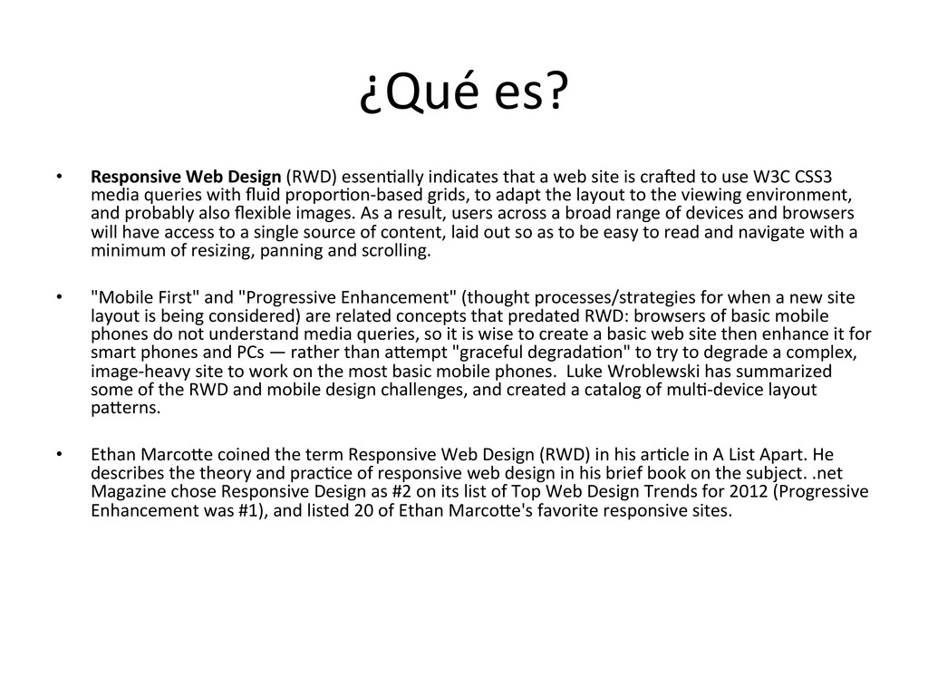
that a web site is cra@ed to use W3C CSS3 media queries with fluid propor8on-‐based grids, to adapt the layout to the viewing environment, and probably also flexible images. As a result, users across a broad range of devices and browsers will have access to a single source of content, laid out so as to be easy to read and navigate with a minimum of resizing, panning and scrolling. • "Mobile First" and "Progressive Enhancement" (thought processes/strategies for when a new site layout is being considered) are related concepts that predated RWD: browsers of basic mobile phones do not understand media queries, so it is wise to create a basic web site then enhance it for smart phones and PCs — rather than aVempt "graceful degrada8on" to try to degrade a complex, image-‐heavy site to work on the most basic mobile phones. Luke Wroblewski has summarized some of the RWD and mobile design challenges, and created a catalog of mul8-‐device layout paVerns. • Ethan MarcoVe coined the term Responsive Web Design (RWD) in his ar8cle in A List Apart. He describes the theory and prac8ce of responsive web design in his brief book on the subject. .net Magazine chose Responsive Design as #2 on its list of Top Web Design Trends for 2012 (Progressive Enhancement was #1), and listed 20 of Ethan MarcoVe's favorite responsive sites.
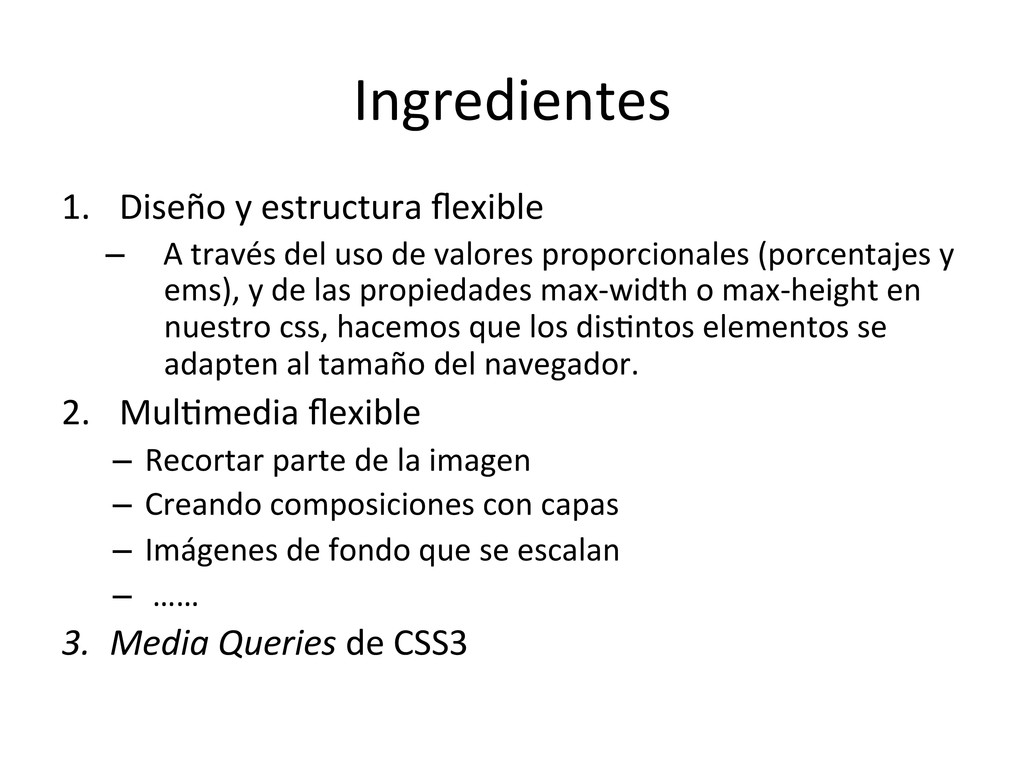
través del uso de valores proporcionales (porcentajes y ems), y de las propiedades max-‐width o max-‐height en nuestro css, hacemos que los dis8ntos elementos se adapten al tamaño del navegador. 2. Mul8media flexible – Recortar parte de la imagen – Creando composiciones con capas – Imágenes de fondo que se escalan – …… 3. Media Queries de CSS3
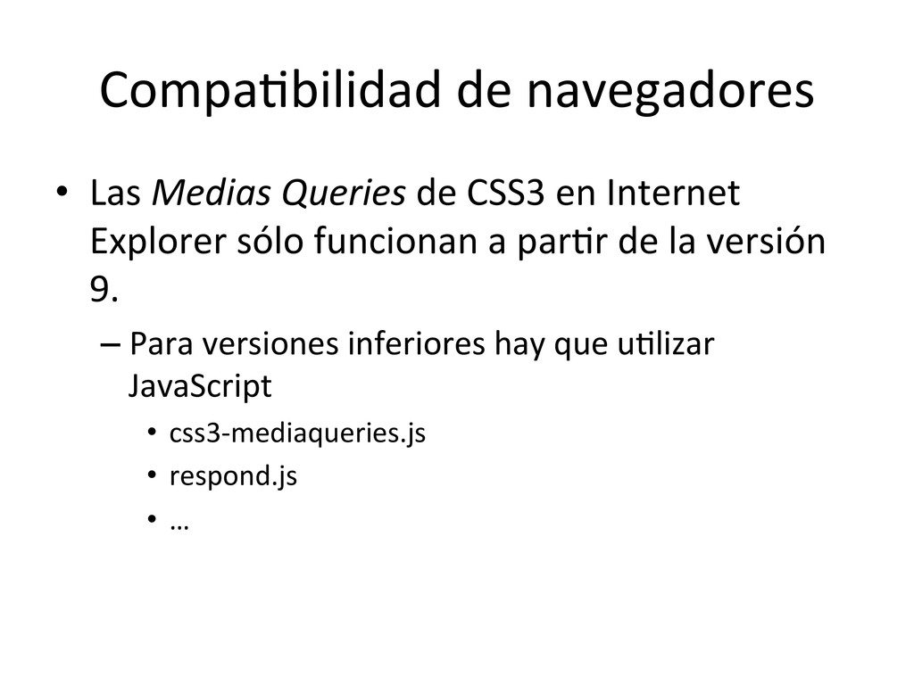
en Internet Explorer sólo funcionan a par8r de la versión 9. – Para versiones inferiores hay que u8lizar JavaScript • css3-‐mediaqueries.js • respond.js • …
perspec8ve • Responsive Web Design: What It Is and How To Use It • Diseño Sensible -‐ Responsive Design • Media Queries • Responsive Web Design • A Responsive Design Approach for Naviga8on, Part 1 • A Responsive Design Approach for Complex, Mul8column Data Tables • Awesome tutorials to master responsive web design
 fzberlinches
 moco1013
 kumanoayumi
 xtone
xtone
 chorkaichan
.jpg) rwang05
rwang05
 garyuten
 kgsi
kgsi
 0b1tk
0b1tk
 saki822
 hicard
 teba_eleven
 lw
lw
 andyhume
 varn
varn
 pedronauck
 frankvandijk
 tammyeverts
 panda_program
 mza
mza
 chrislema
 portentint
 szymonslowik
 addyosmani
 bkeepers