Web en Adesis. Coorganizador del grupo meetup Madrid Accesibilidad TICs. Organizador del grupo meetup WordPress Madrid. Organizador del grupo meetup Madrid Sass & Compass Meetup. Aerotranstornado: piloto online P1 y aspirante a controlador S1 en la red VATSIM
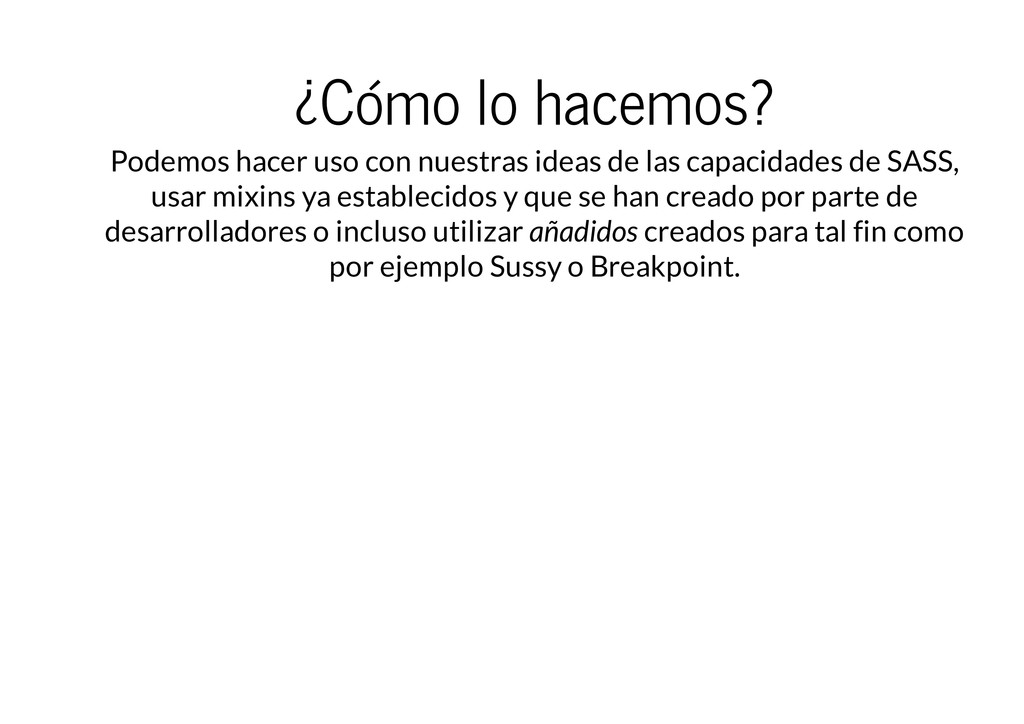
las capacidades de SASS, usar mixins ya establecidos y que se han creado por parte de desarrolladores o incluso utilizar añadidos creados para tal fin como por ejemplo Sussy o Breakpoint.
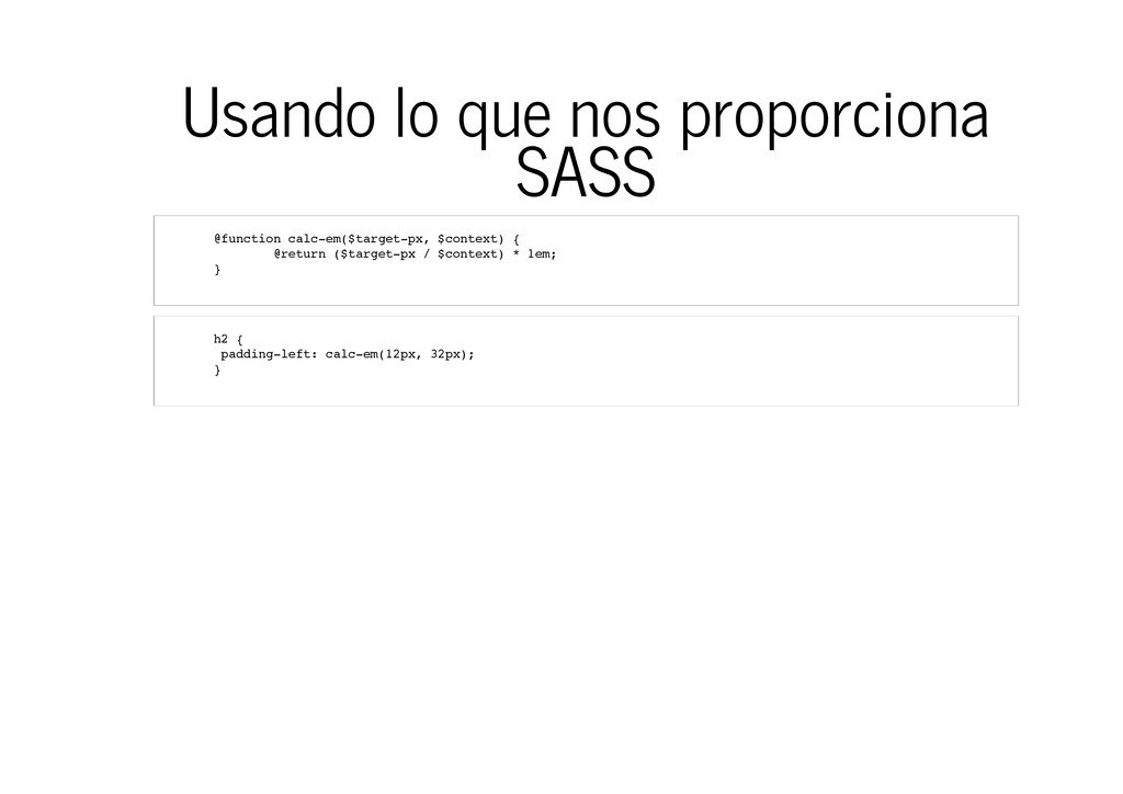
c t i o n c a l c - e m ( $ t a r g e t - p x , $ c o n t e x t ) { @ r e t u r n ( $ t a r g e t - p x / $ c o n t e x t ) * 1 e m ; } h 2 { p a d d i n g - l e f t : c a l c - e m ( 1 2 p x , 3 2 p x ) ; }
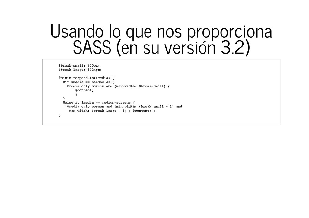
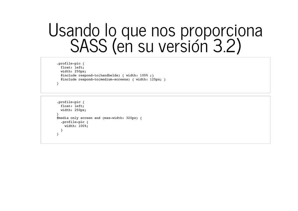
$ b r e a k - s m a l l : 3 2 0 p x ; $ b r e a k - l a r g e : 1 0 2 4 p x ; @ m i x i n r e s p o n d - t o ( $ m e d i a ) { @ i f $ m e d i a = = h a n d h e l d s { @ m e d i a o n l y s c r e e n a n d ( m a x - w i d t h : $ b r e a k - s m a l l ) { @ c o n t e n t ; } } @ e l s e i f $ m e d i a = = m e d i u m - s c r e e n s { @ m e d i a o n l y s c r e e n a n d ( m i n - w i d t h : $ b r e a k - s m a l l + 1 ) a n d ( m a x - w i d t h : $ b r e a k - l a r g e - 1 ) { @ c o n t e n t ; } }
. p r o f i l e - p i c { f l o a t : l e f t ; w i d t h : 2 5 0 p x ; @ i n c l u d e r e s p o n d - t o ( h a n d h e l d s ) { w i d t h : 1 0 0 % ; } @ i n c l u d e r e s p o n d - t o ( m e d i u m - s c r e e n s ) { w i d t h : 1 2 5 p x ; } } . p r o f i l e - p i c { f l o a t : l e f t ; w i d t h : 2 5 0 p x ; } @ m e d i a o n l y s c r e e n a n d ( m a x - w i d t h : 3 2 0 p x ) { . p r o f i l e - p i c { w i d t h : 1 0 0 % ; } }
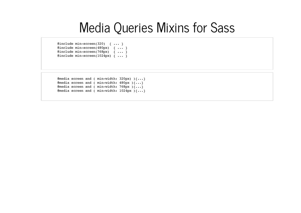
u d e m i n - s c r e e n ( 3 2 0 ) { . . . } @ i n c l u d e m i n - s c r e e n ( 4 8 0 p x ) { . . . } @ i n c l u d e m i n - s c r e e n ( 7 6 8 p x ) { . . . } @ i n c l u d e m i n - s c r e e n ( 1 0 2 4 p x ) { . . . } @ m e d i a s c r e e n a n d ( m i n - w i d t h : 3 2 0 p x ) ) { . . . } @ m e d i a s c r e e n a n d ( m i n - w i d t h : 4 8 0 p x ) { . . . } @ m e d i a s c r e e n a n d ( m i n - w i d t h : 7 6 8 p x ) { . . . } @ m e d i a s c r e e n a n d ( m i n - w i d t h : 1 0 2 4 p x ) { . . . }
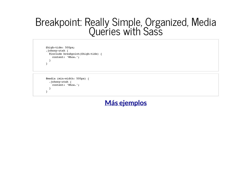
$ h i g h - t i d e : 5 0 0 p x ; . j o h n n y - u t a h { @ i n c l u d e b r e a k p o i n t ( $ h i g h - t i d e ) { c o n t e n t : ' W h o a . ' ; } } @ m e d i a ( m i n - w i d t h : 5 0 0 p x ) { . j o h n n y - u t a h { c o n t e n t : ' W h o a . ' ; } }
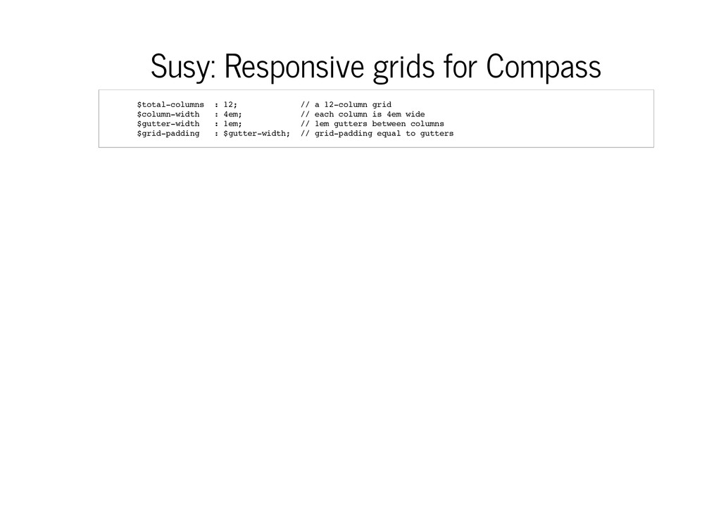
l - c o l u m n s : 1 2 ; / / a 1 2 - c o l u m n g r i d $ c o l u m n - w i d t h : 4 e m ; / / e a c h c o l u m n i s 4 e m w i d e $ g u t t e r - w i d t h : 1 e m ; / / 1 e m g u t t e r s b e t w e e n c o l u m n s $ g r i d - p a d d i n g : $ g u t t e r - w i d t h ; / / g r i d - p a d d i n g e q u a l t o g u t t e r s
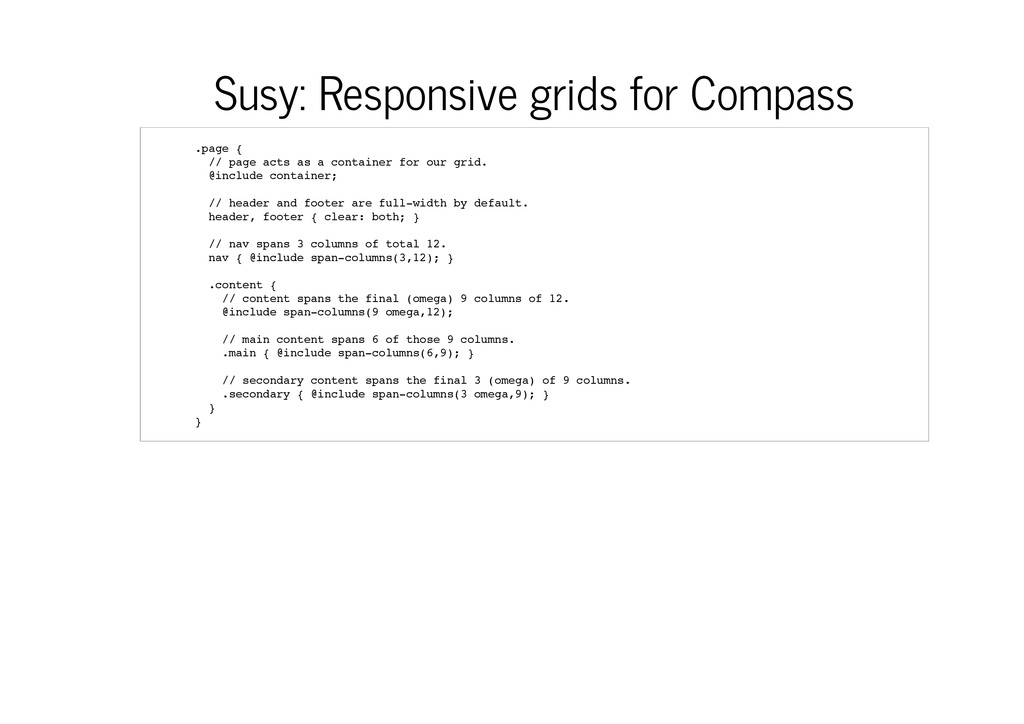
{ / / p a g e a c t s a s a c o n t a i n e r f o r o u r g r i d . @ i n c l u d e c o n t a i n e r ; / / h e a d e r a n d f o o t e r a r e f u l l - w i d t h b y d e f a u l t . h e a d e r , f o o t e r { c l e a r : b o t h ; } / / n a v s p a n s 3 c o l u m n s o f t o t a l 1 2 . n a v { @ i n c l u d e s p a n - c o l u m n s ( 3 , 1 2 ) ; } . c o n t e n t { / / c o n t e n t s p a n s t h e f i n a l ( o m e g a ) 9 c o l u m n s o f 1 2 . @ i n c l u d e s p a n - c o l u m n s ( 9 o m e g a , 1 2 ) ; / / m a i n c o n t e n t s p a n s 6 o f t h o s e 9 c o l u m n s . . m a i n { @ i n c l u d e s p a n - c o l u m n s ( 6 , 9 ) ; } / / s e c o n d a r y c o n t e n t s p a n s t h e f i n a l 3 ( o m e g a ) o f 9 c o l u m n s . . s e c o n d a r y { @ i n c l u d e s p a n - c o l u m n s ( 3 o m e g a , 9 ) ; } } }
Fluid Layouts and Fluid Images Responsive Web Design in Sass Part 2: Media Queries in Sass Responsive Web Design in Sass: Using Media Queries in Sass 3.2 Responsive Web Design (RWD) with Sass+Compass Susy: Responsive grids for Compass
 fzberlinches
 gre212
 negima
 raspython3
 tabatad
 syobochim
 you
you
 cm_yasuhara
 littlehands
 databricksjapan
 yama3133
 ido_kara_deru
 uvb_76
 tammyeverts
 tmiket
 schroneko
 greggifford
 rabernat
 axbom
axbom
 jnunemaker
 skipperchong
 palkan
 addyosmani
 zakiyama