Upgrade to Pro
— share decks privately, control downloads, hide ads and more …
Speaker Deck
Features
Speaker Deck
PRO
Sign in
Sign up for free
Search
Search
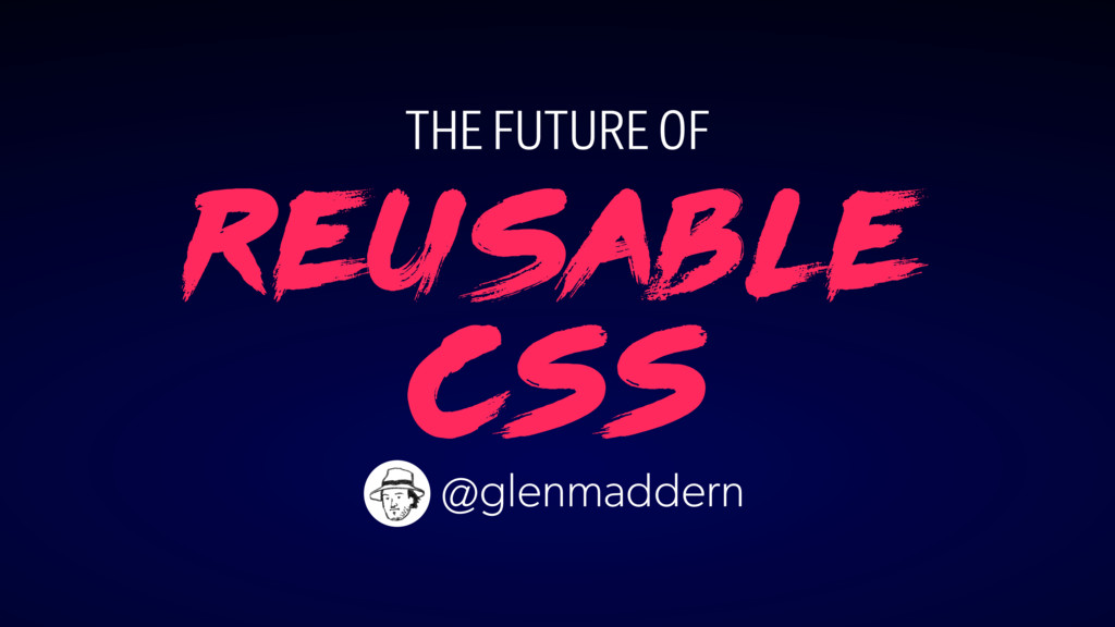
The Future of Reusable CSS
Search
Glen Maddern
September 01, 2016
Technology
230
2
Share
Embed
Copy iframe code
Copy JS code
Copy link
Start on current slide
The Future of Reusable CSS
Presented at Coldfront Conf 2016 <3
Glen Maddern
September 01, 2016
More Decks by Glen Maddern
See All by Glen Maddern
The Road to Styled Components & the Road Ahead
geelen
2
250
The Road to Styled Components
geelen
2
1.5k
Styled Components and the Road to Unification
geelen
2
300
CSS Modules, CSS Variables and the Future of Reusable CSS
geelen
9
1.3k
Other Decks in Technology
See All in Technology
Devsumi 2026 Summer 人もAIも使える共通基盤を事業の加速装置にする~デザインシステム運用に学ぶ組織レバレッジ~ 渡辺 凌央
legalontechnologies
PRO
1
280
「守りたい体験」を渡すだけで E2E を生成させられるようになった話
hinac0
2
1k
kaonavi Tech Night#1
kaonavi
0
160
OPENLOGI Company Profile for engineer
hr01
1
74k
壊して学ぶAWS CDK: そのcdk deployで消えるもの、残るもの
k_adachi_01
1
480
Oracle Base Database Service 技術詳細
oracle4engineer
PRO
15
110k
AI、CDK と協働する Full TypeScript アプリケーション開発 / Full TypeScript Application with AI and CDK
geekplus_tech
2
480
AI工学特論: MLOps・継続的評価
asei
5
1.1k
設計レビューとAIハーネスで向き合う AIが生み出した新しいボトルネックの対処法 / Design Reviews and AI Harnesses Against New Bottlenecks Created by AI
nstock
4
430
Oracle Exadata Database Service on Cloud@Customer X11M (ExaDB-C@C) サービス概要
oracle4engineer
PRO
2
8.5k
41歳でAWSが好きすぎてITエンジニアになったおっさんの話
yama3133
1
740
ダッシュボード"開発"について 〜使われるダッシュボードのつくりかた〜
kimichan
0
200
Featured
See All Featured
Navigating the moral maze — ethical principles for Al-driven product design
skipperchong
2
420
Marketing Yourself as an Engineer | Alaka | Gurzu
gurzu
0
260
Google's AI Overviews - The New Search
badams
0
1.1k
Making Projects Easy
brettharned
120
6.7k
How STYLIGHT went responsive
nonsquared
100
6.2k
Docker and Python
trallard
47
4k
End of SEO as We Know It (SMX Advanced Version)
ipullrank
3
4.3k
Building Flexible Design Systems
yeseniaperezcruz
330
40k
Lightning Talk: Beautiful Slides for Beginners
inesmontani
PRO
2
610
Automating Front-end Workflow
addyosmani
1370
210k
How to Grow Your eCommerce with AI & Automation
katarinadahlin
PRO
1
230
16th Malabo Montpellier Forum Presentation
akademiya2063
PRO
0
280
Transcript
Reusable CSS THE FUTURE OF @glenmaddern
HELLO copeNhagen! ♥
@glenmaddern
@glenmaddern "
@glenmaddern
@glenmaddern front end C E N T E R https://frontend.center
@glenmaddern
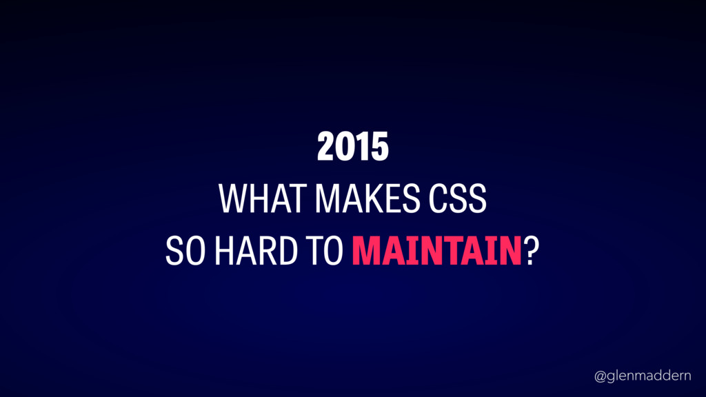
@glenmaddern 2015 WHAT MAKES CSS SO HARD TO MAINTAIN?
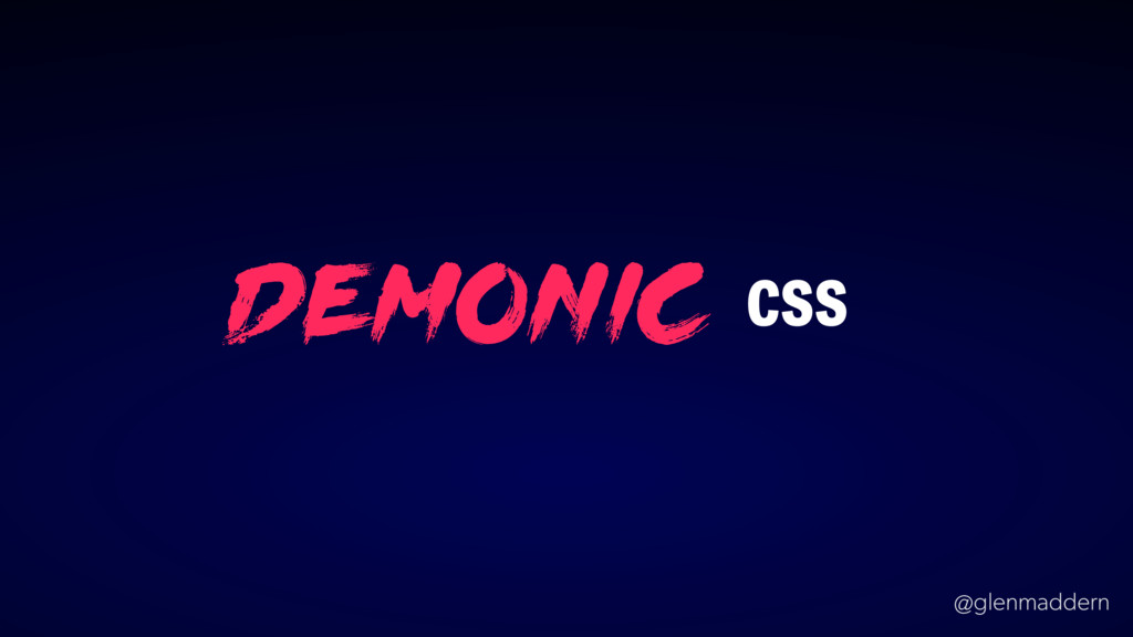
@glenmaddern demonic CSS
None
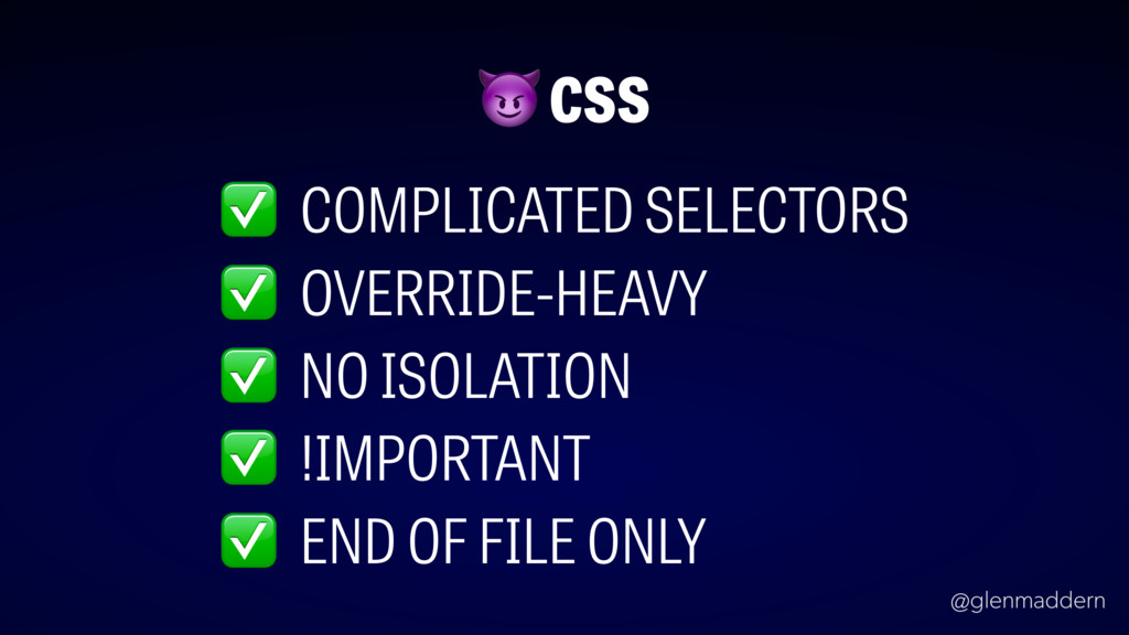
@glenmaddern ✅ COMPLICATED SELECTORS CSS ✅ OVERRIDE-HEAVY ✅ NO ISOLATION
✅ !IMPORTANT ✅ END OF FILE ONLY
@glenmaddern
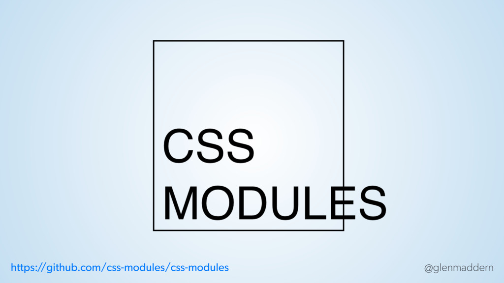
@glenmaddern https:/ /github.com/css-modules/css-modules
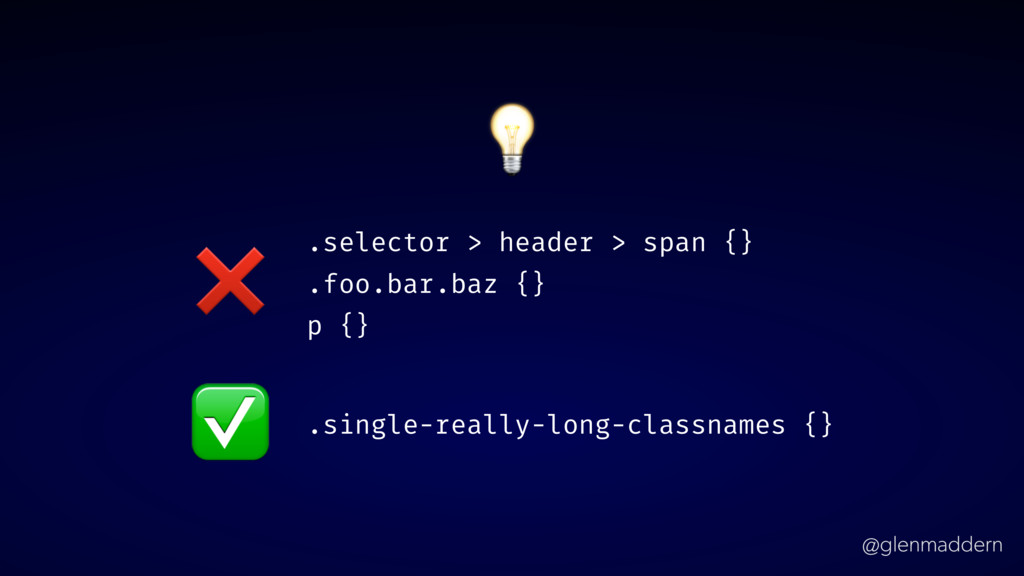
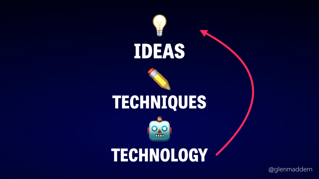
@glenmaddern IDEAS TECHNIQUES ✏ TECHNOLOGY
@glenmaddern .selector > header > span {} .foo.bar.baz {} p
{} ❌ .single-really-long-classnames {} ✅
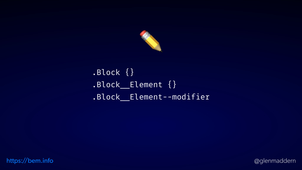
@glenmaddern ✏ .Block {} .Block__Element {} .Block__Element--modifier https:/ /bem.info
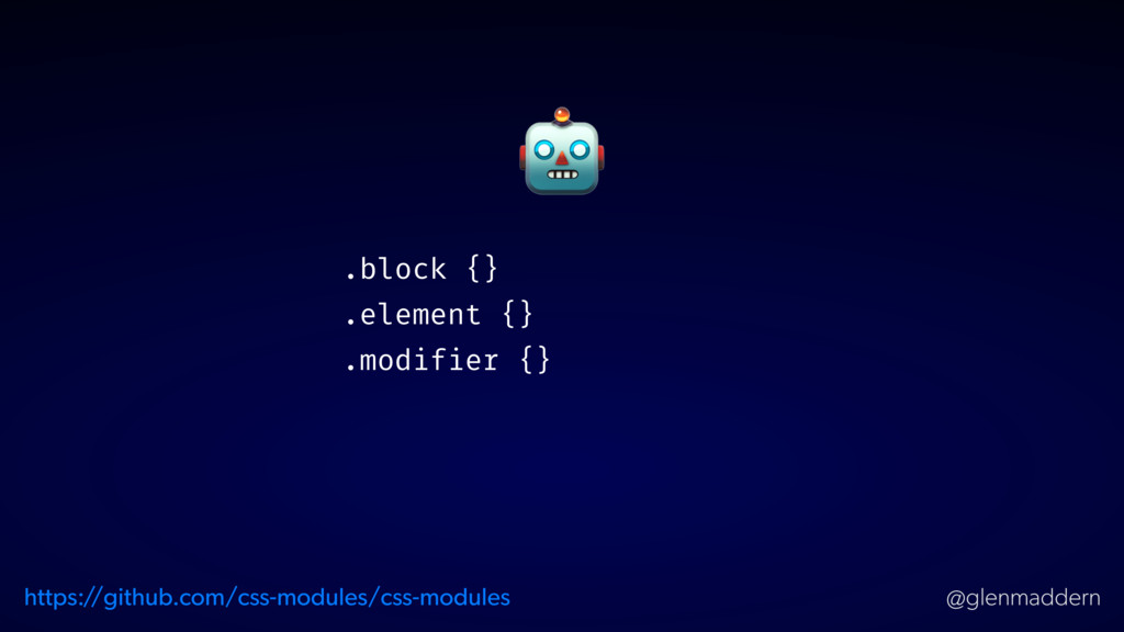
@glenmaddern .block {} .element {} .modifier {} https:/ /github.com/css-modules/css-modules
@glenmaddern
@glenmaddern
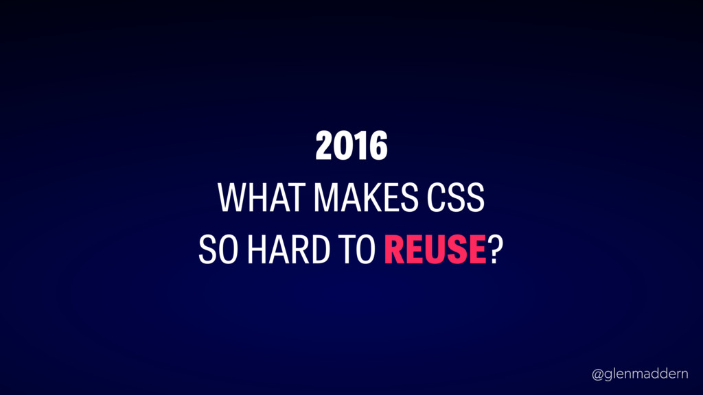
@glenmaddern 2016 WHAT MAKES CSS SO HARD TO REUSE?
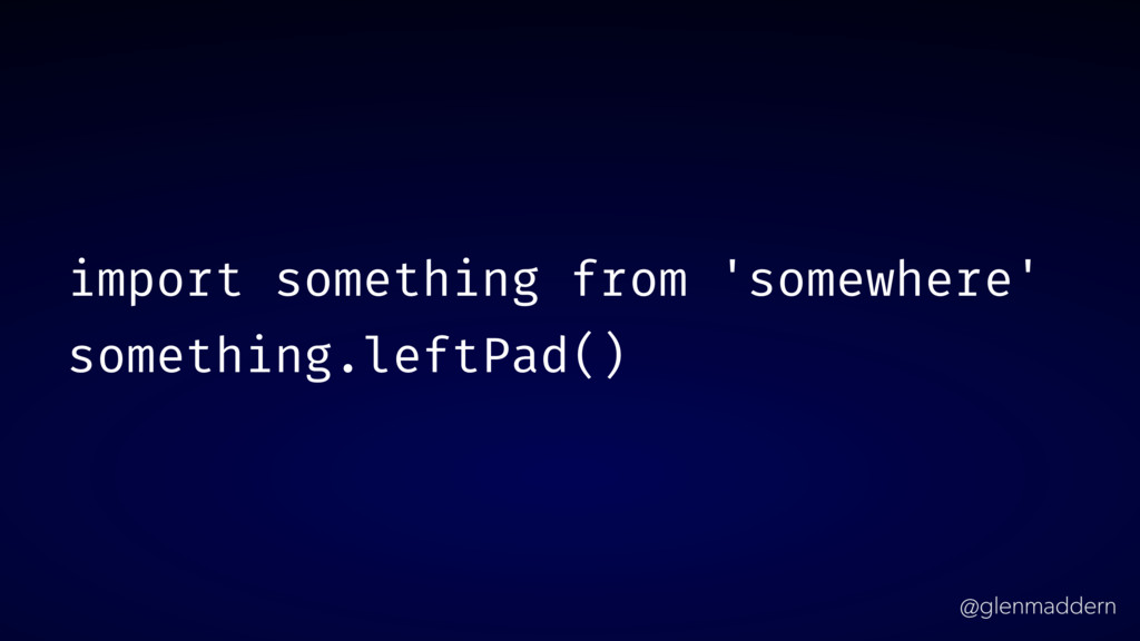
@glenmaddern import something from 'somewhere' something.leftPad()
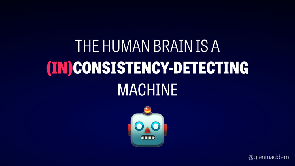
@glenmaddern THE HUMAN BRAIN IS A (IN)CONSISTENCY-DETECTING MACHINE
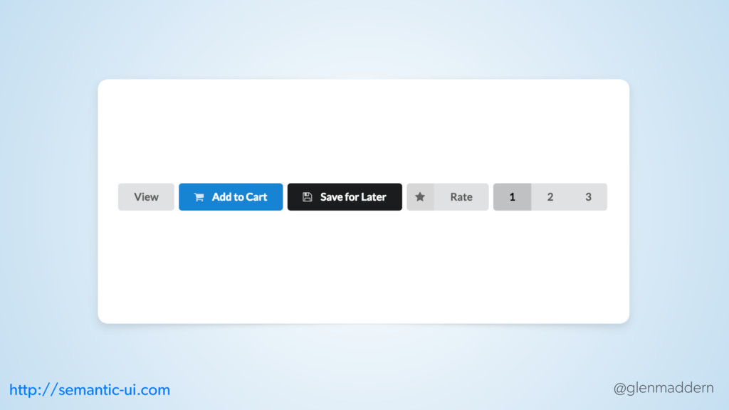
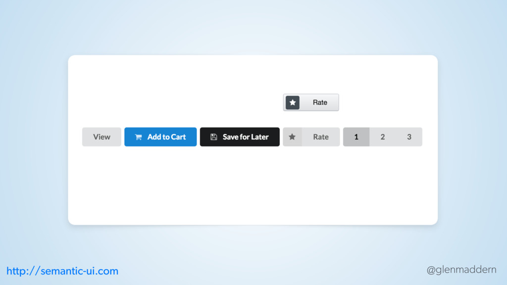
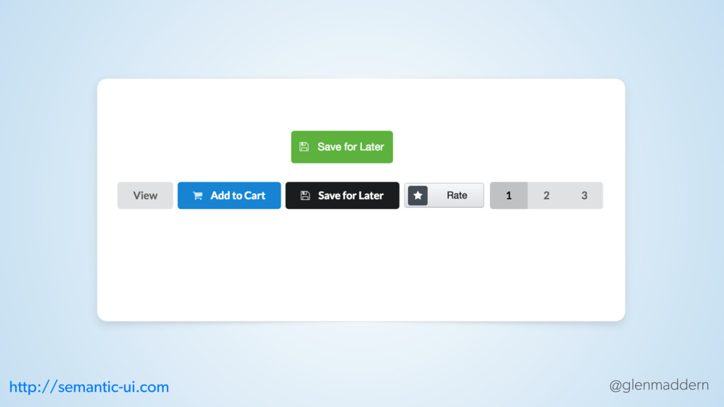
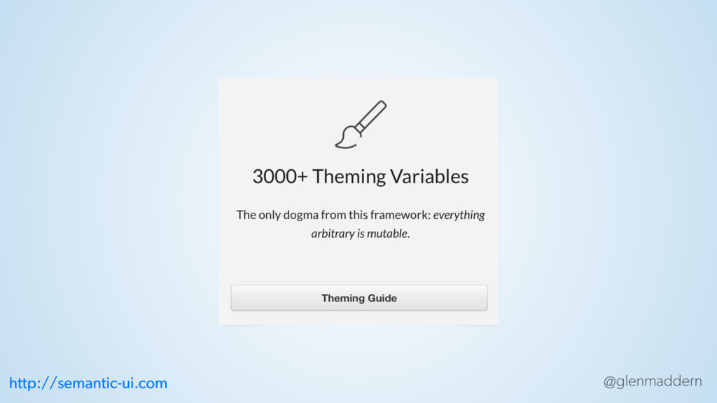
@glenmaddern http://semantic-ui.com
@glenmaddern http://semantic-ui.com
@glenmaddern http://semantic-ui.com
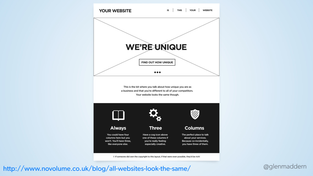
@glenmaddern http://www.novolume.co.uk/blog/all-websites-look-the-same/
@glenmaddern SETTINGS.SCSS
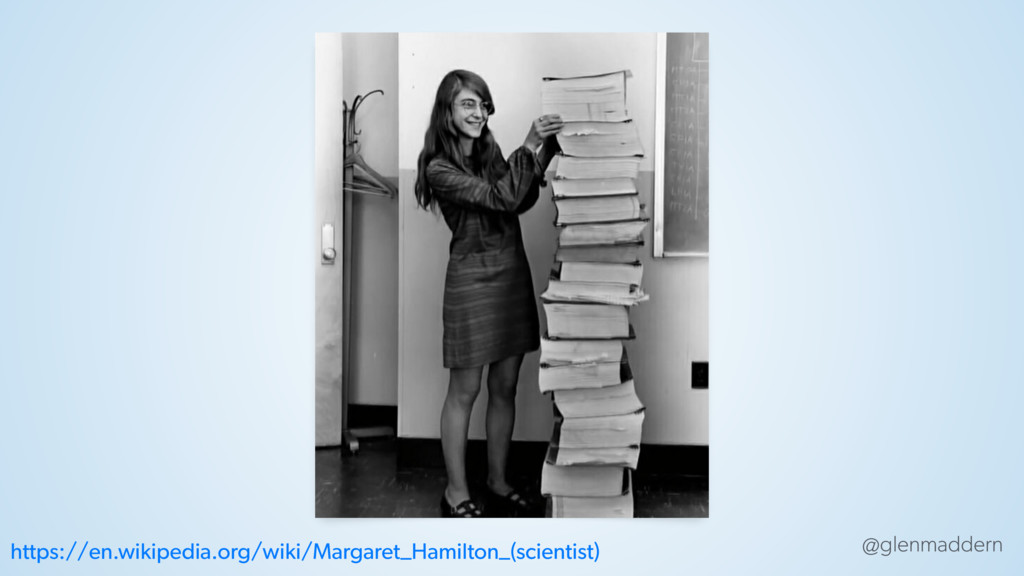
@glenmaddern https://en.wikipedia.org/wiki/Margaret_Hamilton_(scientist)
@glenmaddern http://semantic-ui.com
@glenmaddern IDEAS TECHNIQUES ✏ TECHNOLOGY
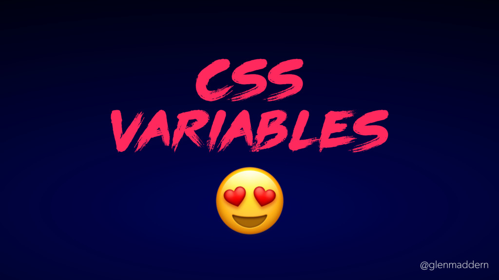
@glenmaddern css v ari able s
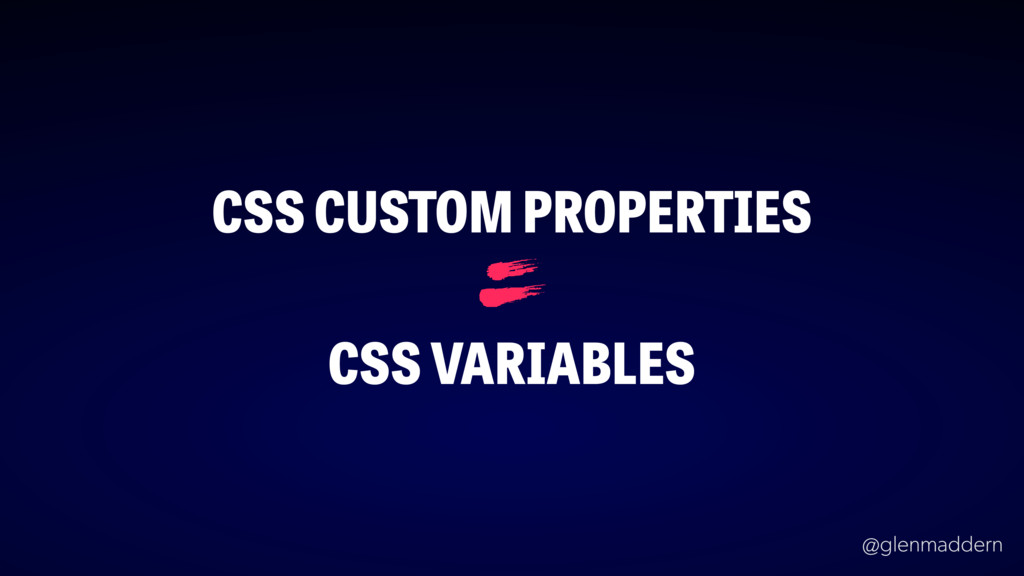
@glenmaddern CSS CUSTOM PROPERTIES CSS VARIABLES =
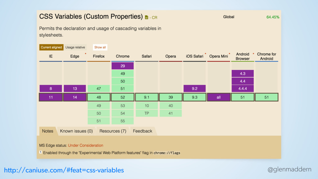
@glenmaddern http://caniuse.com/#feat=css-variables
@glenmaddern
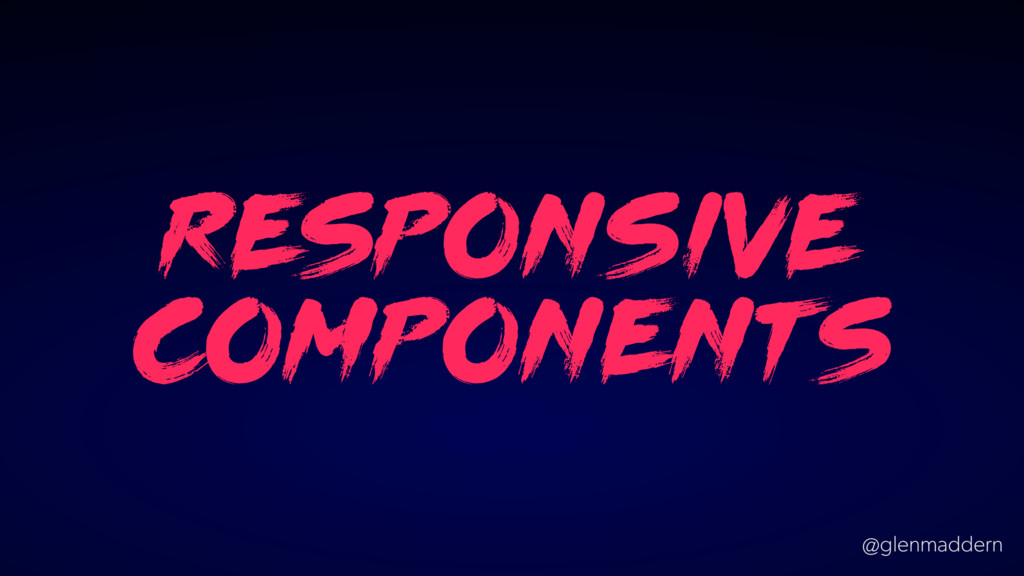
@glenmaddern re sponsive component s
@glenmaddern DEATH TO PIXEL PERFECTION
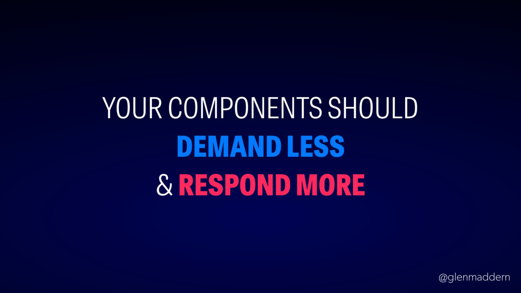
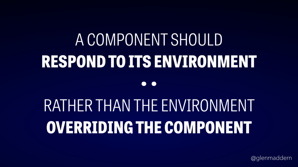
@glenmaddern YOUR COMPONENTS SHOULD DEMAND LESS & RESPOND MORE
@glenmaddern A COMPONENT SHOULD RESPOND TO ITS ENVIRONMENT • •
RATHER THAN THE ENVIRONMENT OVERRIDING THE COMPONENT
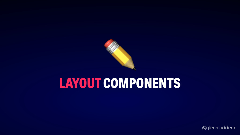
@glenmaddern LAYOUT COMPONENTS ✏
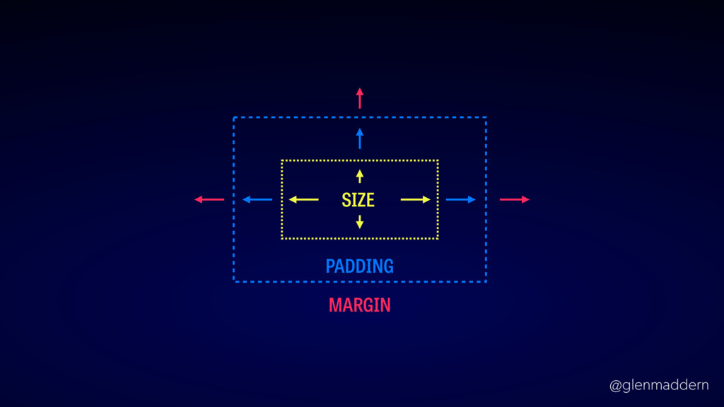
@glenmaddern PADDING MARGIN SIZE
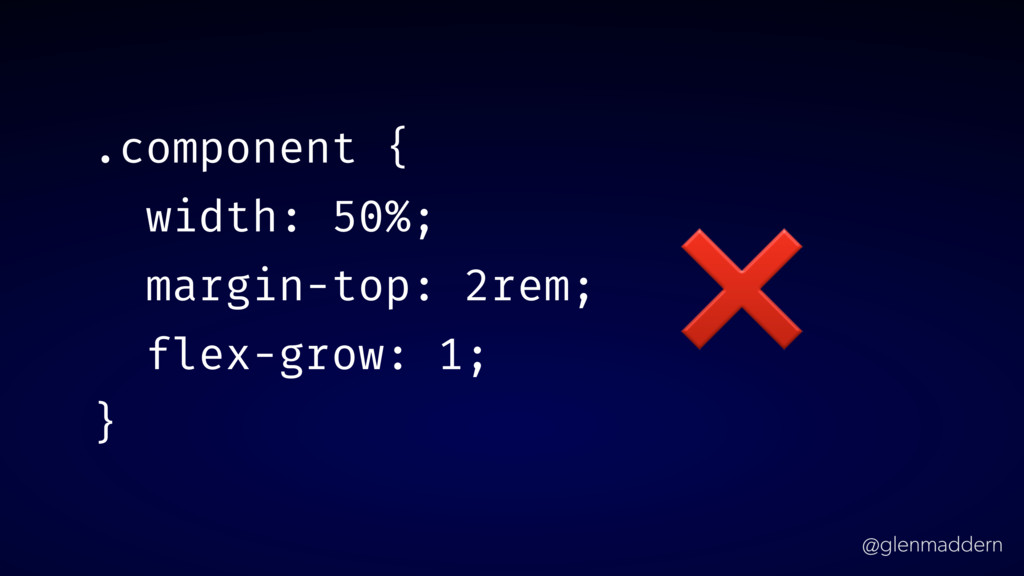
@glenmaddern .component { width: 50%; margin-top: 2rem; flex-grow: 1; }
❌
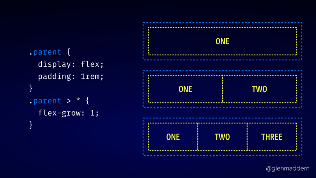
@glenmaddern .parent { display: flex; padding: 1rem; } .parent >
* { flex-grow: 1; } ONE ONE TWO ONE TWO THREE
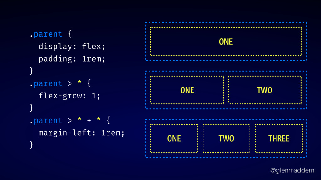
@glenmaddern .parent { display: flex; padding: 1rem; } .parent >
* { flex-grow: 1; } .parent > * + * { margin-left: 1rem; } ONE ONE TWO ONE TWO THREE
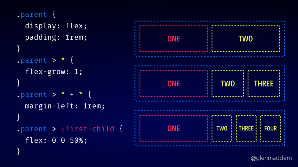
@glenmaddern .parent { display: flex; padding: 1rem; } .parent >
* { flex-grow: 1; } .parent > * + * { margin-left: 1rem; } .parent > :first-child { flex: 0 0 50%; } ONE TWO ONE TWO THREE ONE TWO THREE FOUR
@glenmaddern CONTEXTUAL COMPONENTS ✏
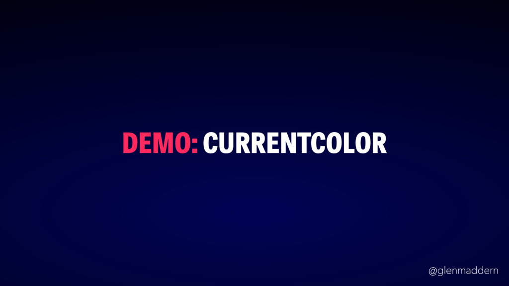
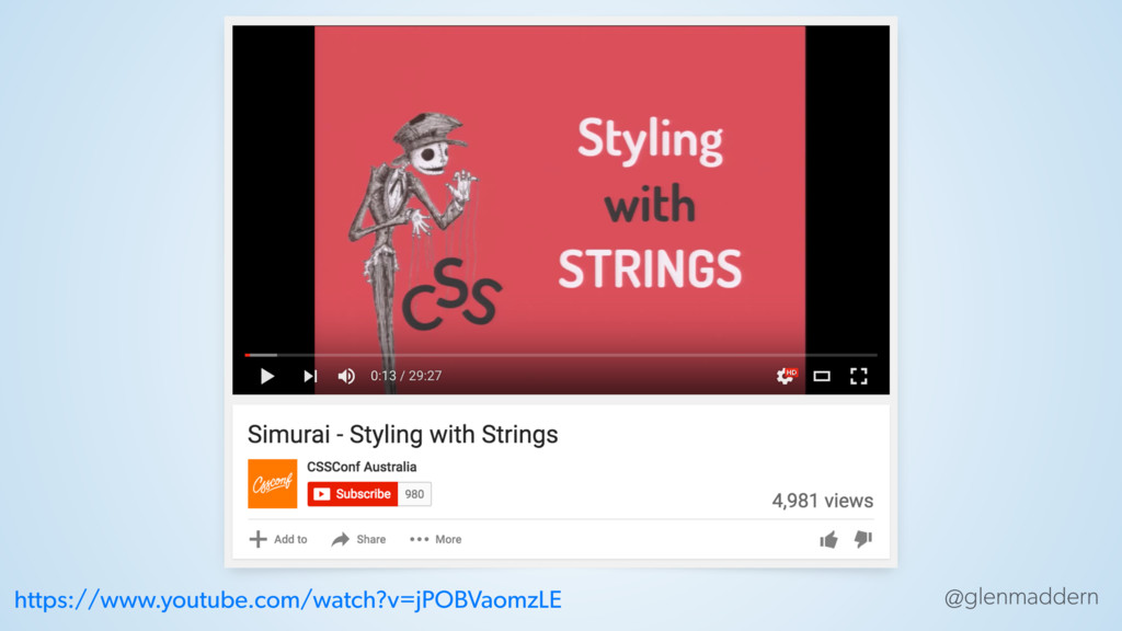
@glenmaddern DEMO: CURRENTCOLOR
@glenmaddern https://www.youtube.com/watch?v=jPOBVaomzLE
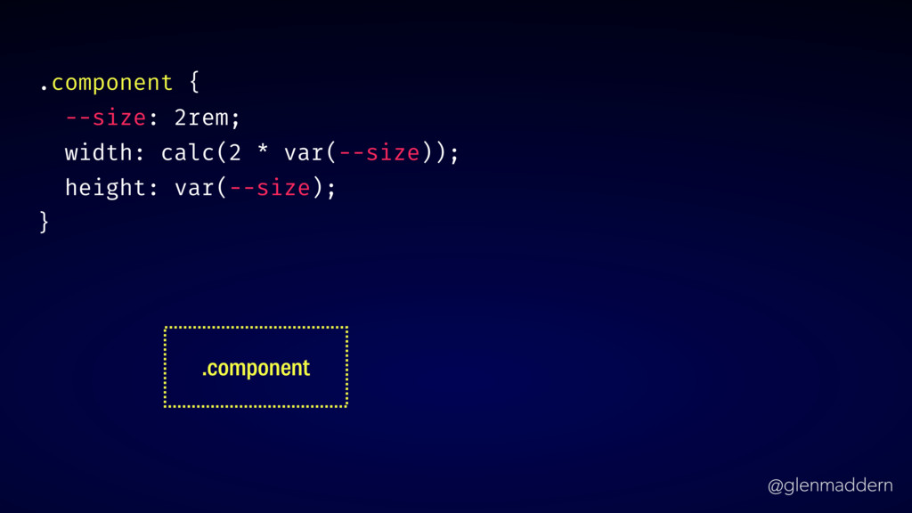
@glenmaddern .component { --size: 2rem; width: calc(2 * var(--size)); height:
var(--size); } .component
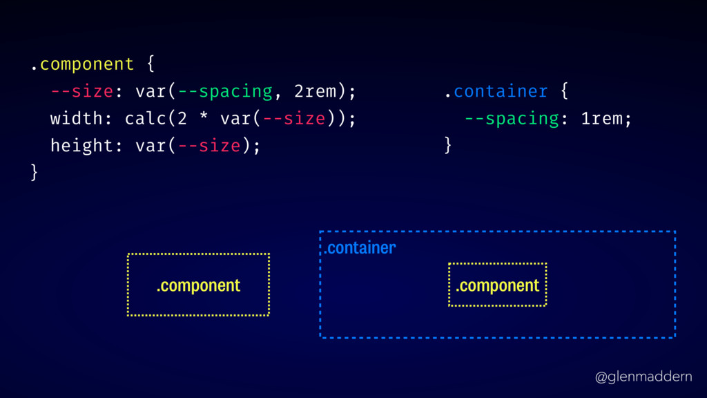
@glenmaddern .component { --size: var(--spacing, 2rem); width: calc(2 * var(--size));
height: var(--size); } .component .container .component .container { --spacing: 1rem; }
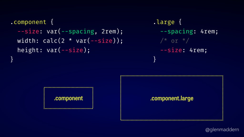
@glenmaddern .component { --size: var(--spacing, 2rem); width: calc(2 * var(--size));
height: var(--size); } .component .component.large .large { --spacing: 4rem; /* or */ --size: 4rem; }
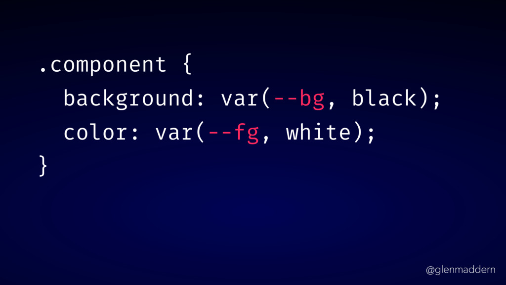
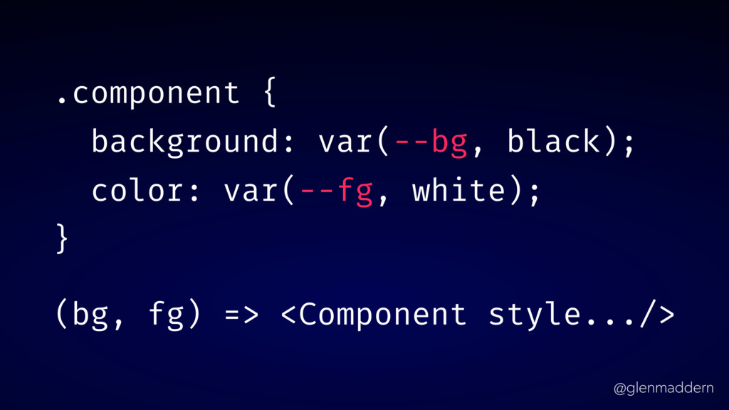
@glenmaddern .component { background: var(--bg, black); color: var(--fg, white); }
@glenmaddern .component { background: var(--bg, black); color: var(--fg, white); }
(bg, fg) => <Component style.../>
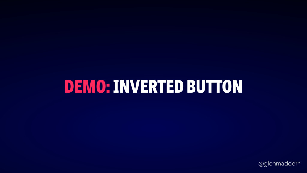
@glenmaddern DEMO: INVERTED BUTTON
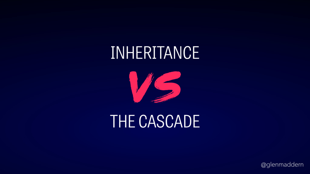
@glenmaddern INHERITANCE THE CASCADE vs
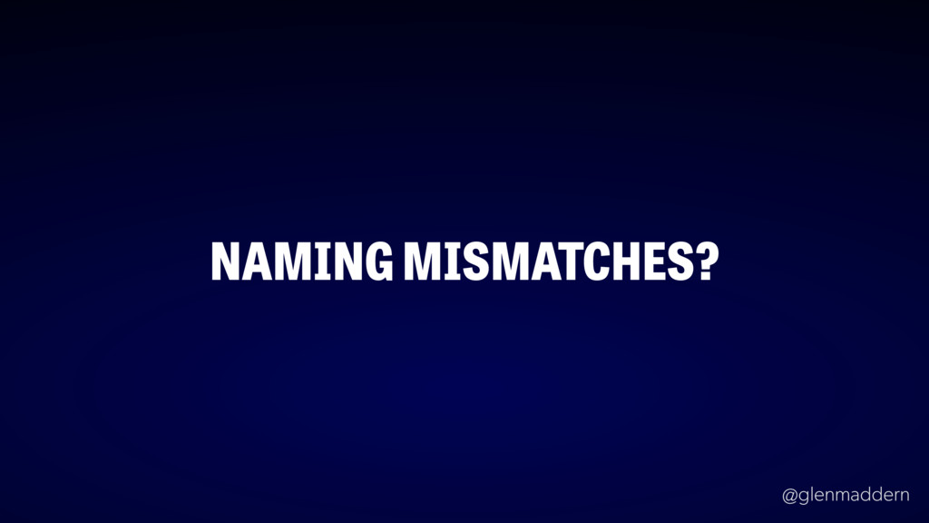
@glenmaddern NAMING MISMATCHES?
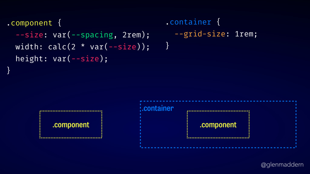
@glenmaddern .container .container { --grid-size: 1rem; } .component .component .component
{ --size: var(--spacing, 2rem); width: calc(2 * var(--size)); height: var(--size); }
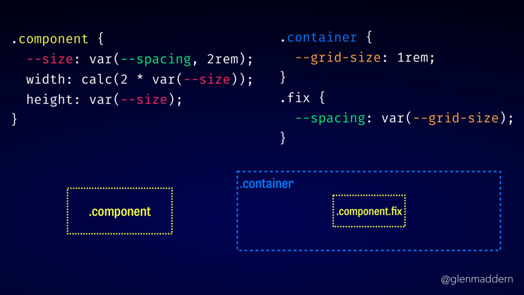
@glenmaddern .component .container .component.fix .container { --grid-size: 1rem; } .fix
{ --spacing: var(--grid-size); } .component { --size: var(--spacing, 2rem); width: calc(2 * var(--size)); height: var(--size); }
@glenmaddern EXPLICIT COMPONENTS ✏
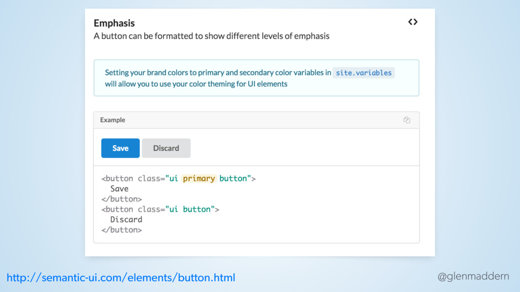
@glenmaddern http://semantic-ui.com/elements/button.html
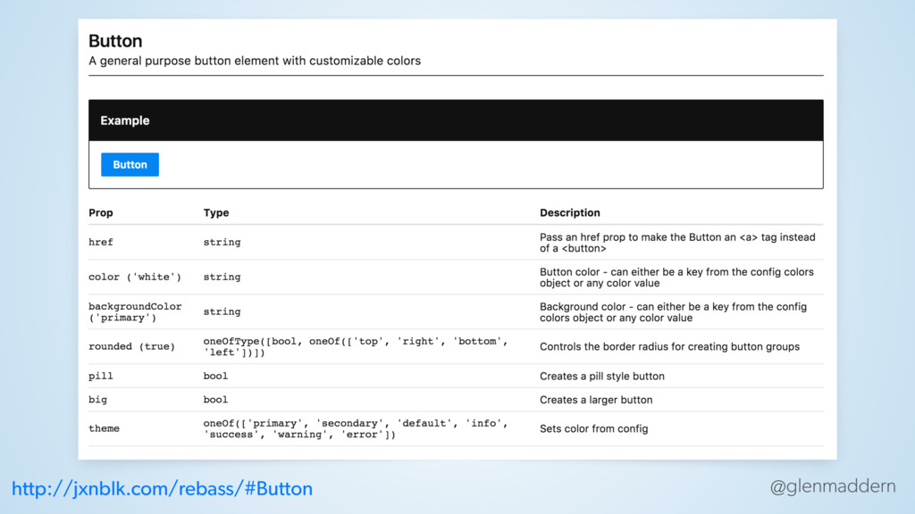
@glenmaddern http://jxnblk.com/rebass/#Button
@glenmaddern DEMO: DOCUMENTATION
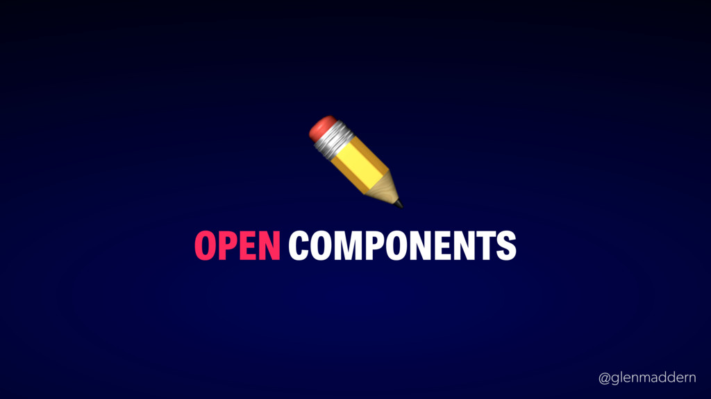
@glenmaddern OPEN COMPONENTS ✏
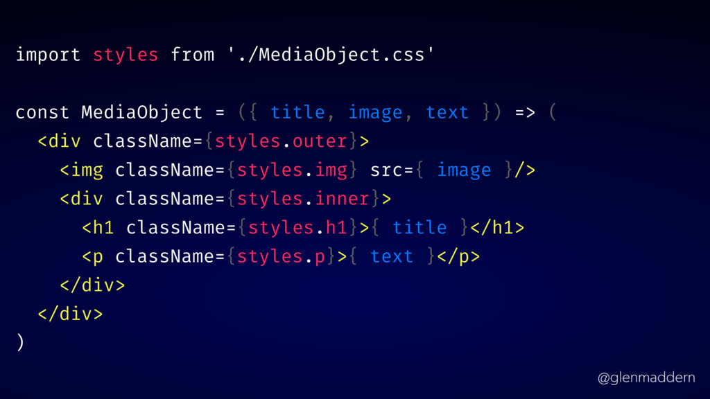
@glenmaddern import styles from './MediaObject.css' const MediaObject = ({ title,
image, text }) => ( <div className={styles.outer}> <img className={styles.img} src={ image }/> <div className={styles.inner}> <h1 className={styles.h1}>{ title }</h1> <p className={styles.p}>{ text }</p> </div> </div> )
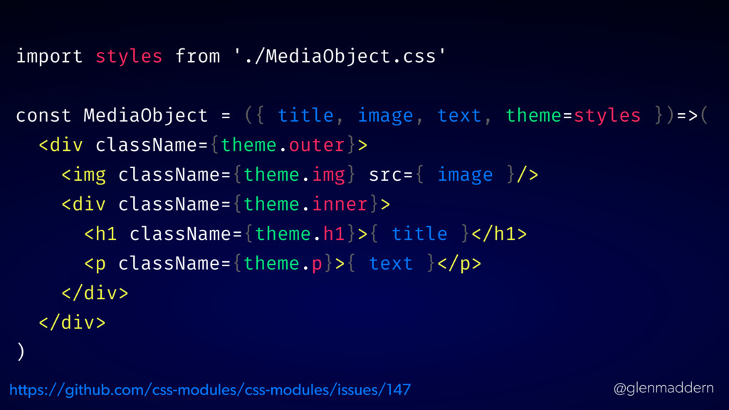
@glenmaddern import styles from './MediaObject.css' const MediaObject = ({ title,
image, text, theme=styles })=>( <div className={theme.outer}> <img className={theme.img} src={ image }/> <div className={theme.inner}> <h1 className={theme.h1}>{ title }</h1> <p className={theme.p}>{ text }</p> </div> </div> ) https://github.com/css-modules/css-modules/issues/147
@glenmaddern DEMO: INTERNAL STRUCTURE DOCS
@glenmaddern re sponsive component s
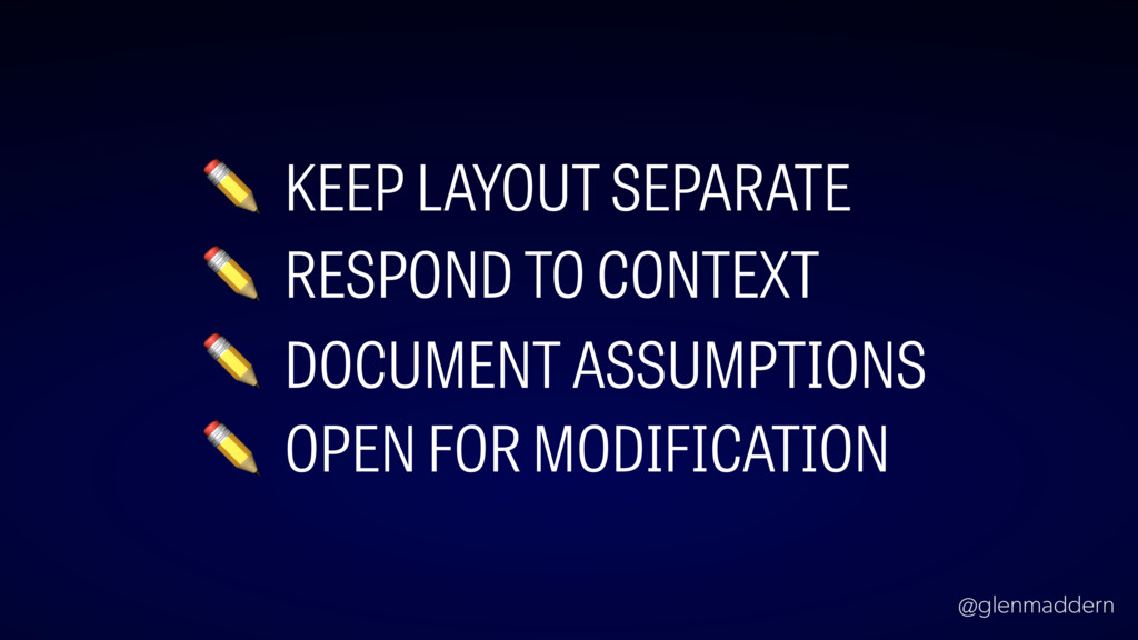
@glenmaddern ✏ KEEP LAYOUT SEPARATE ✏ RESPOND TO CONTEXT ✏
DOCUMENT ASSUMPTIONS ✏ OPEN FOR MODIFICATION
@glenmaddern t hank you! @glenmaddern
 geelen
 legalontechnologies
 hinac0
 kaonavi
 hr01
hr01
 k_adachi_01
 oracle4engineer
 geekplus_tech
 asei
asei
 nstock
 yama3133
 kimichan
 skipperchong
 gurzu
gurzu
 badams
 brettharned
 nonsquared
 trallard
 ipullrank
 yeseniaperezcruz
 inesmontani
 addyosmani
 katarinadahlin
 akademiya2063