Upgrade to Pro
— share decks privately, control downloads, hide ads and more …
Speaker Deck
Features
Speaker Deck
PRO
Sign in
Sign up for free
Search
Search
CSS Modules, CSS Variables and the Future of Re...
Search
Glen Maddern
May 11, 2016
Technology
1.3k
9
Share
Embed
Copy iframe code
Copy JS code
Copy link
Start on current slide
CSS Modules, CSS Variables and the Future of Reusable CSS
Presented at CSSConf Budapest, 2016 <3
Glen Maddern
May 11, 2016
More Decks by Glen Maddern
See All by Glen Maddern
The Road to Styled Components & the Road Ahead
geelen
2
250
The Road to Styled Components
geelen
2
1.5k
Styled Components and the Road to Unification
geelen
2
300
The Future of Reusable CSS
geelen
2
230
Other Decks in Technology
See All in Technology
発表と総括 / Presentations and Summary
ks91
PRO
0
190
SRENEXT_2026_Chairs__Talks_in_Tamachi.sre.pdf
srenext
1
150
JAWS_ICEBERG_BASECAMP
iqbocchi
2
110
「休む」重要さ
smt7174
6
1.6k
AI、CDK と協働する Full TypeScript アプリケーション開発 / Full TypeScript Application with AI and CDK
geekplus_tech
2
480
壊して学ぶAWS CDK: そのcdk deployで消えるもの、残るもの
k_adachi_01
1
480
AIコード生成×サプライチェーン攻撃 — PHPが直面する“二重の信頼問題
shinyasaita
0
450
ここは地獄!つらい朝会を体験することで、チームとしてのより良い振る舞いに気づくワークショップ / The stand-up meeting from hell in the game industry
scrummasudar
0
220
伝票作成AIエージェントを支える、LLMOpsとインフラの選択肢 / AICon2026_takeda
rakus_dev
0
260
変更し続けられるシステムをどう保つか — AI時代のSSoTという設計原則
kawauso
1
1.1k
設計レビューとAIハーネスで向き合う AIが生み出した新しいボトルネックの対処法 / Design Reviews and AI Harnesses Against New Bottlenecks Created by AI
nstock
4
430
AIエージェントがあれば技術書なんてすぐ書けるでしょ→無理でした
watany
2
260
Featured
See All Featured
The Mindset for Success: Future Career Progression
greggifford
PRO
0
430
Designing for Timeless Needs
cassininazir
1
400
How to optimise 3,500 product descriptions for ecommerce in one day using ChatGPT
katarinadahlin
PRO
1
3.7k
How to Think Like a Performance Engineer
csswizardry
28
2.7k
Scaling GitHub
holman
464
140k
How to build a perfect <img>
jonoalderson
1
5.8k
Done Done
chrislema
186
16k
The Cult of Friendly URLs
andyhume
79
7k
Google's AI Overviews - The New Search
badams
0
1.1k
We Are The Robots
honzajavorek
0
280
For a Future-Friendly Web
brad_frost
183
10k
Abbi's Birthday
coloredviolet
3
8.8k
Transcript
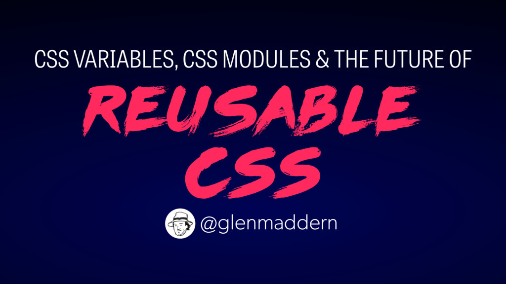
Reusable CSS CSS VARIABLES, CSS MODULES & THE FUTURE OF
@glenmaddern
HELLO BUDAPEST! ♥
Reusable CSS CSS VARIABLES, CSS MODULES & THE FUTURE OF
@glenmaddern
None
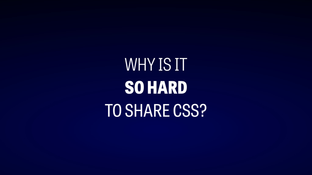
WHY IS IT SO HARD TO SHARE CSS?
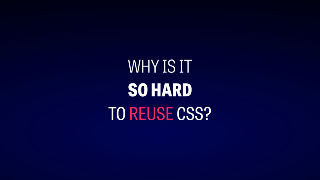
WHY IS IT SO HARD TO REUSE CSS?
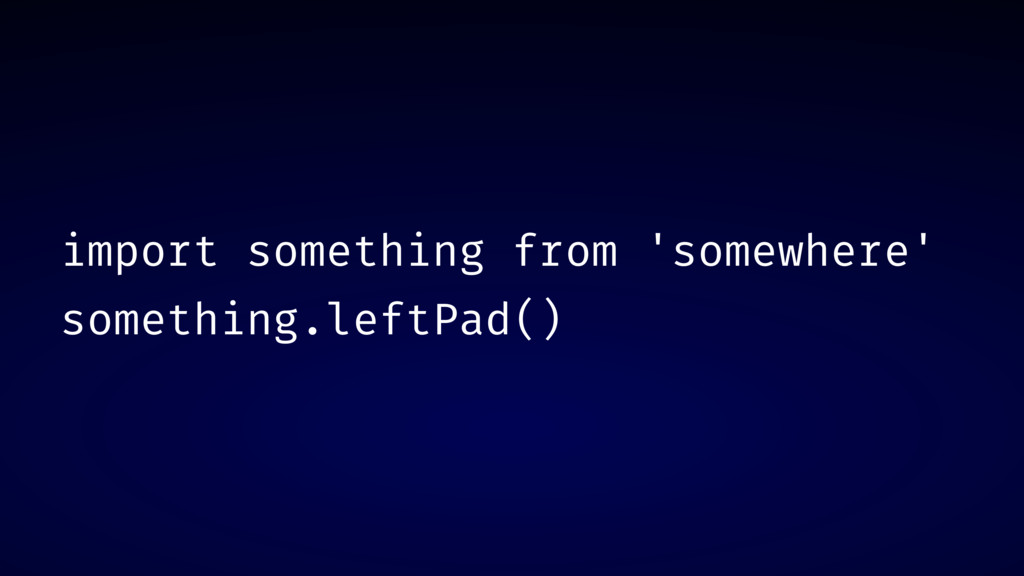
import something from 'somewhere' something.leftPad()
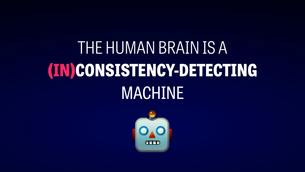
THE HUMAN BRAIN IS A (IN)CONSISTENCY-DETECTING MACHINE
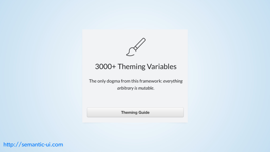
http://semantic-ui.com
http://semantic-ui.com
http://semantic-ui.com
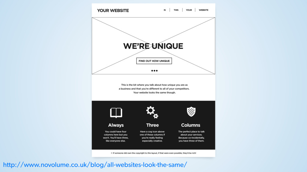
http://www.novolume.co.uk/blog/all-websites-look-the-same/
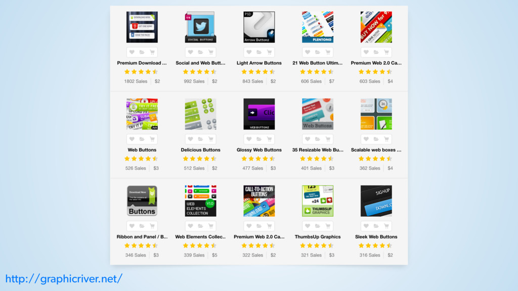
http://graphicriver.net/
None
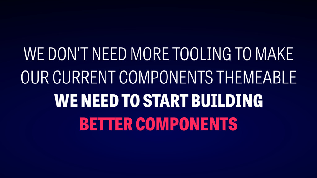
WE DON'T NEED MORE TOOLING TO MAKE OUR CURRENT COMPONENTS
THEMEABLE WE NEED TO START BUILDING BETTER COMPONENTS
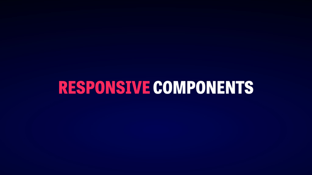
st ep #1
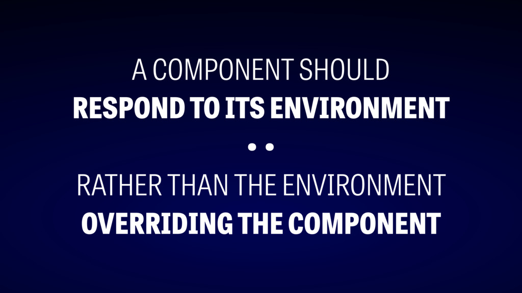
RESPONSIVE COMPONENTS
A COMPONENT SHOULD RESPOND TO ITS ENVIRONMENT • • RATHER
THAN THE ENVIRONMENT OVERRIDING THE COMPONENT
OUTSIDE-IN OVERRIDES
https://en.wikipedia.org/wiki/Margaret_Hamilton_(scientist)
http://semantic-ui.com
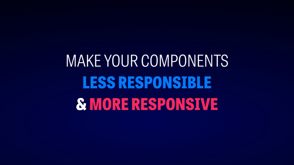
MAKE YOUR COMPONENTS LESS RESPONSIBLE & MORE RESPONSIVE
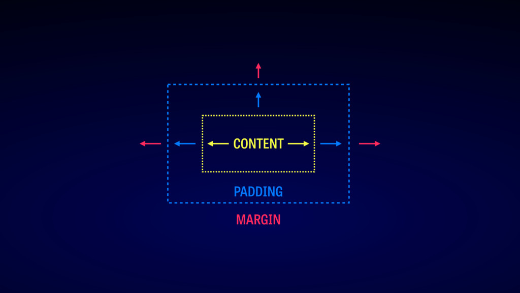
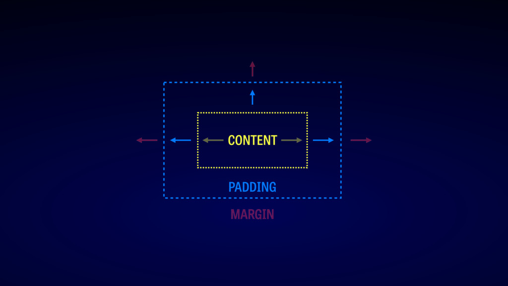
layout
PADDING CONTENT MARGIN
PADDING CONTENT MARGIN
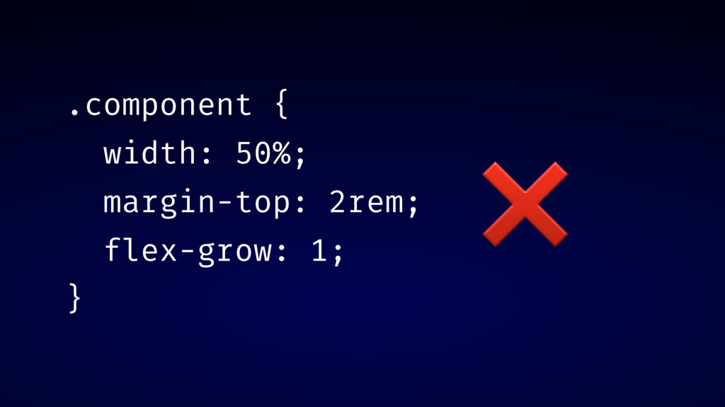
.component { width: 50%; margin-top: 2rem; flex-grow: 1; } ❌
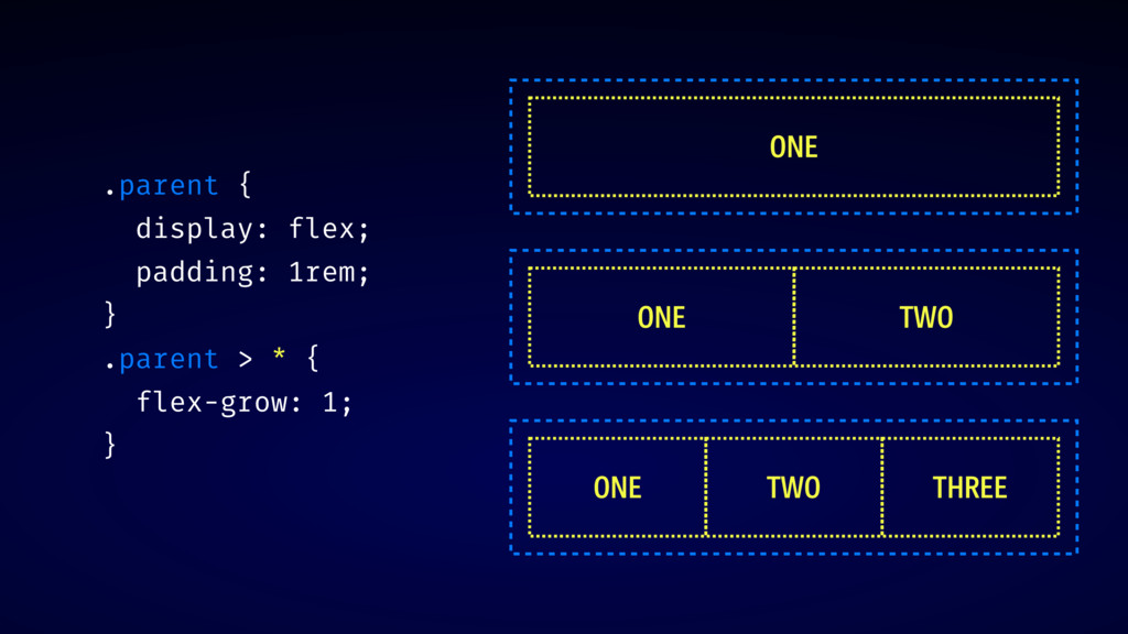
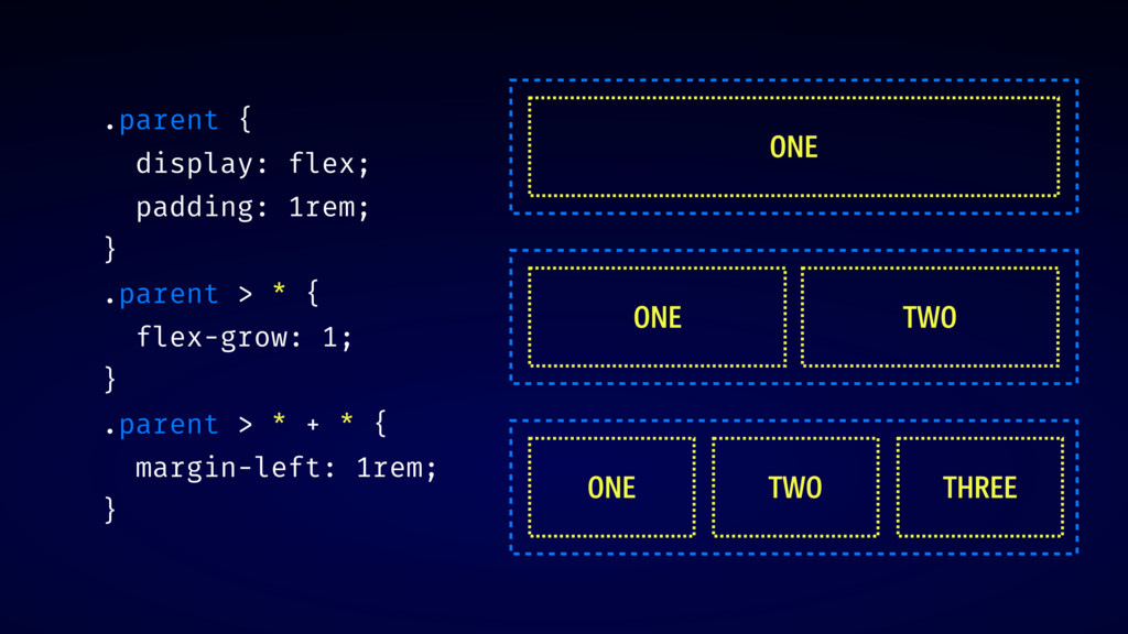
.parent { display: flex; padding: 1rem; } .parent > *
{ flex-grow: 1; } ONE ONE TWO ONE TWO THREE
.parent { display: flex; padding: 1rem; } .parent > *
{ flex-grow: 1; } .parent > * + * { margin-left: 1rem; } ONE ONE TWO ONE TWO THREE
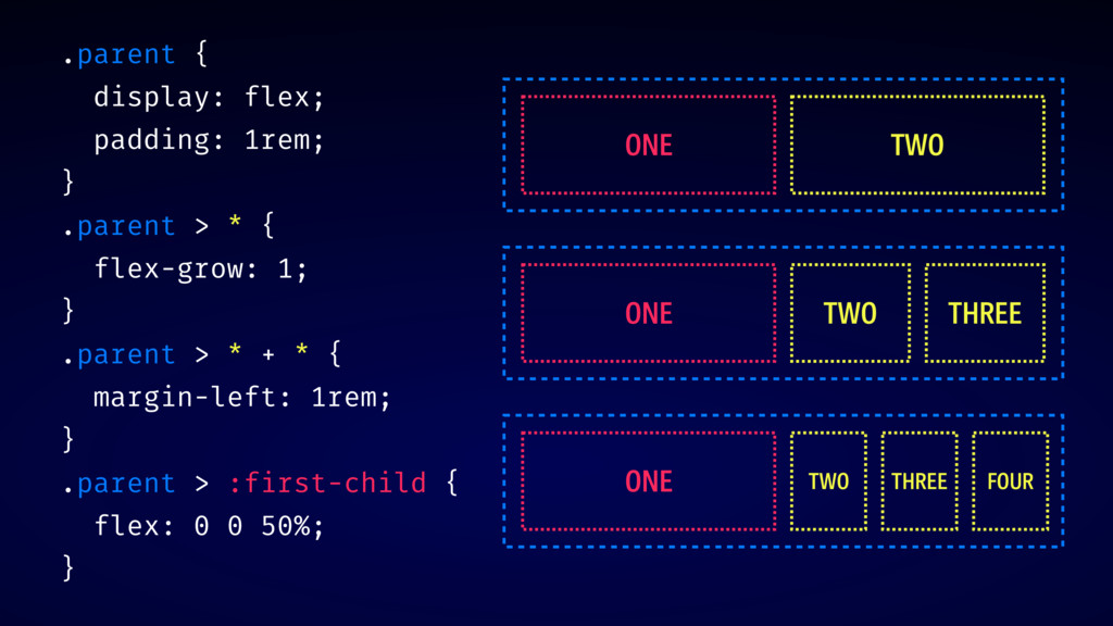
.parent { display: flex; padding: 1rem; } .parent > *
{ flex-grow: 1; } .parent > * + * { margin-left: 1rem; } .parent > :first-child { flex: 0 0 50%; } ONE TWO ONE TWO THREE ONE TWO THREE FOUR
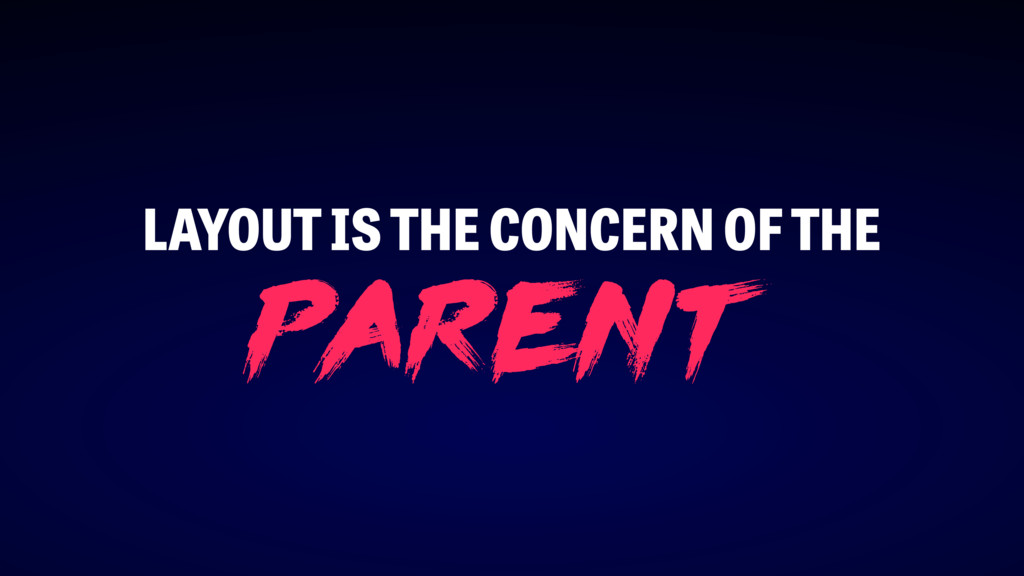
LAYOUT IS THE CONCERN OF THE p arent
DEMO: CURRENTCOLOR
https://www.youtube.com/watch?v=jPOBVaomzLE
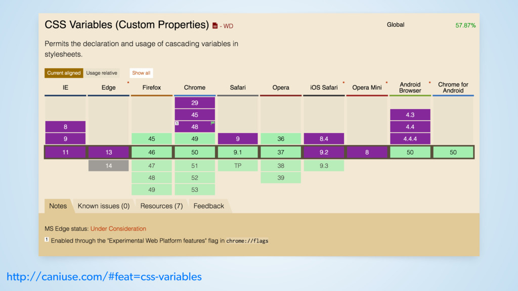
css v ari able s
http://caniuse.com/#feat=css-variables
CSS CUSTOM PROPERTIES CSS VARIABLES =
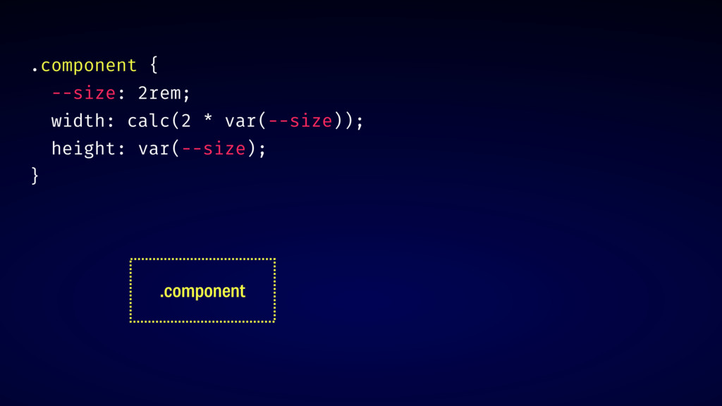
.component { --size: 2rem; width: calc(2 * var(--size)); height: var(--size);
} .component
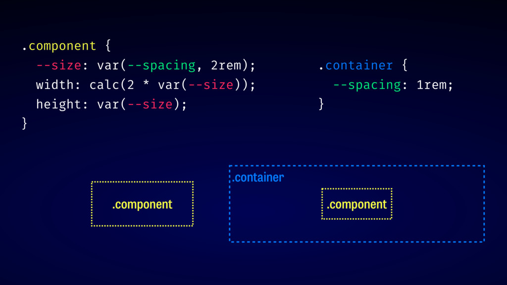
.component { --size: var(--spacing, 2rem); width: calc(2 * var(--size)); height:
var(--size); } .component .container .component .container { --spacing: 1rem; }
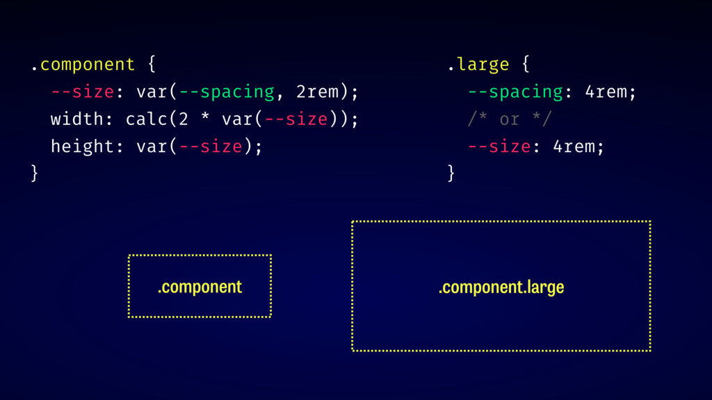
.component { --size: var(--spacing, 2rem); width: calc(2 * var(--size)); height:
var(--size); } .component .component.large .large { --spacing: 4rem; /* or */ --size: 4rem; }
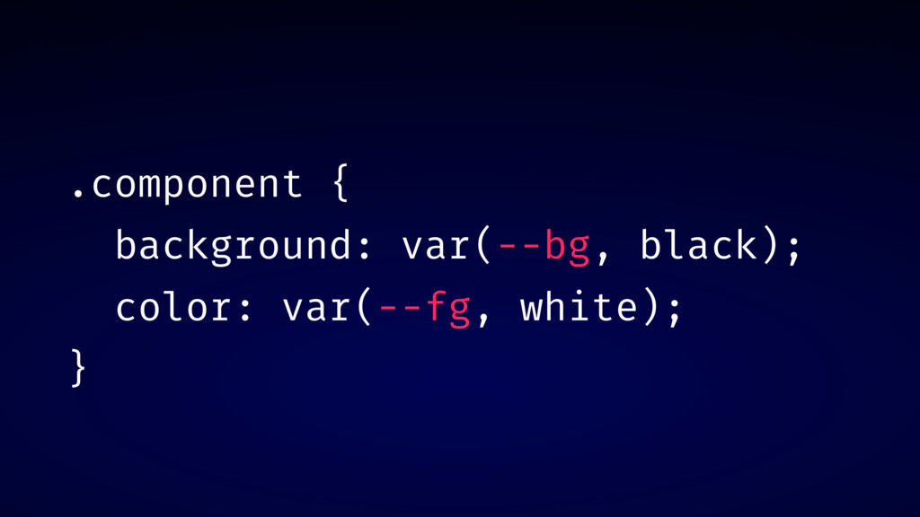
.component { background: var(--bg, black); color: var(--fg, white); }
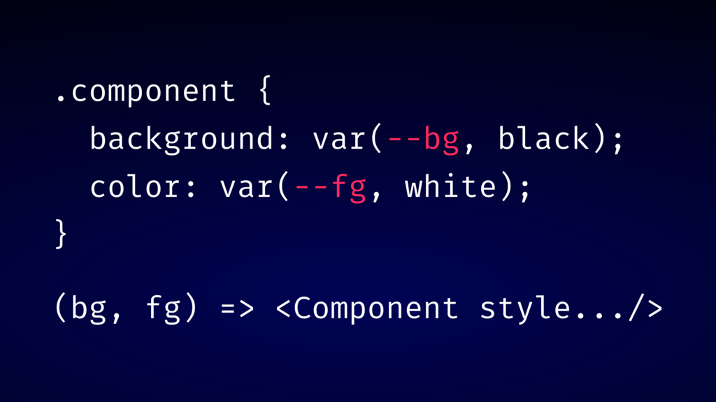
.component { background: var(--bg, black); color: var(--fg, white); } (bg,
fg) => <Component style.../>
DEMO: INVERTED BUTTON
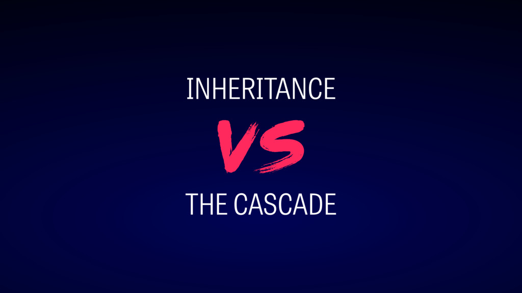
INHERITANCE THE CASCADE vs
st ep #2
EXPLICIT COMPONENTS
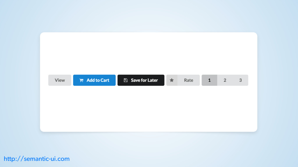
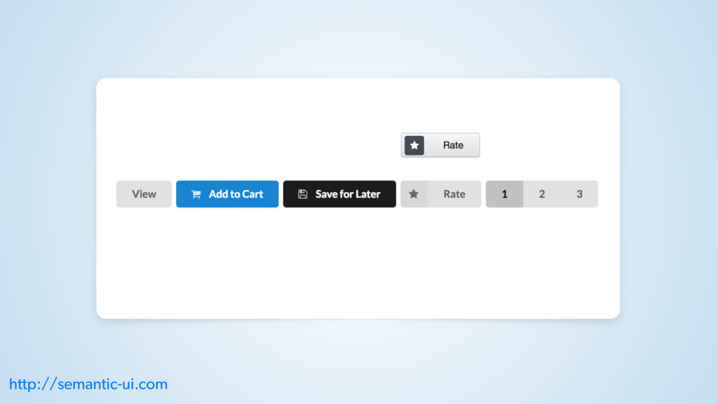
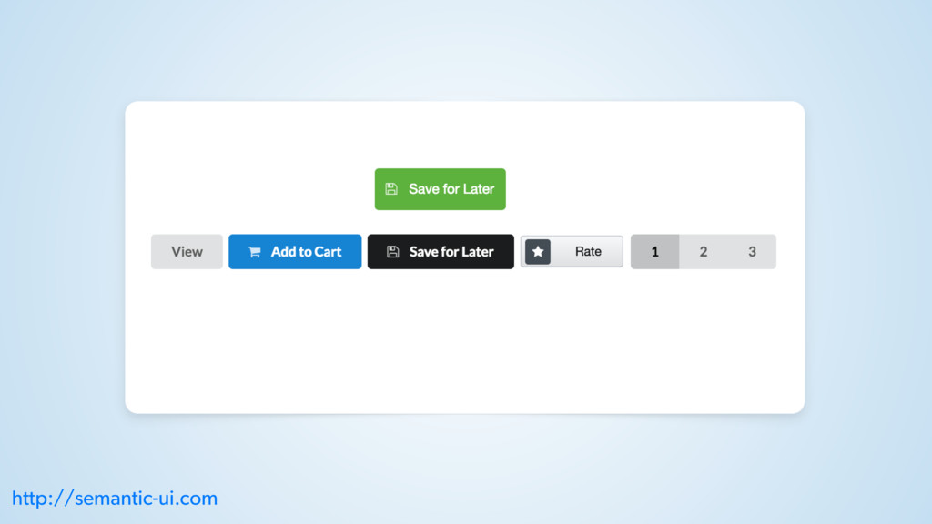
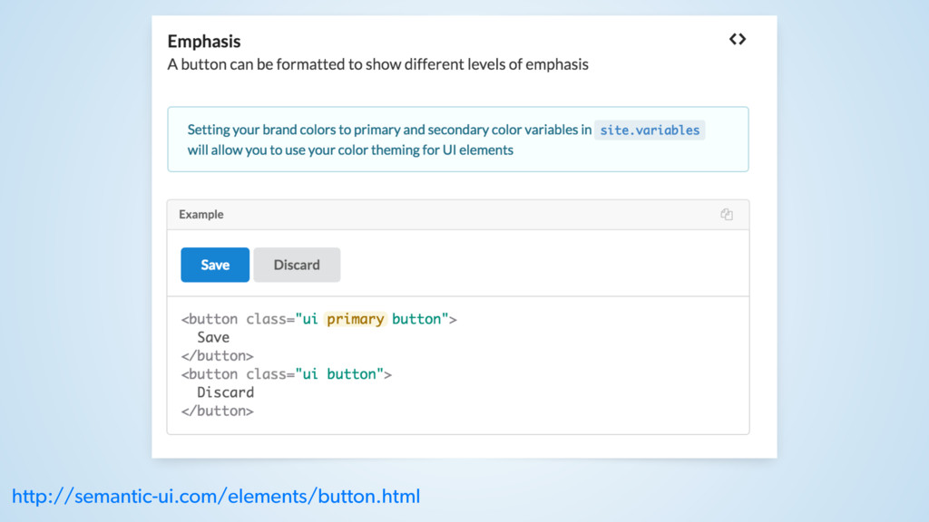
http://semantic-ui.com/elements/button.html
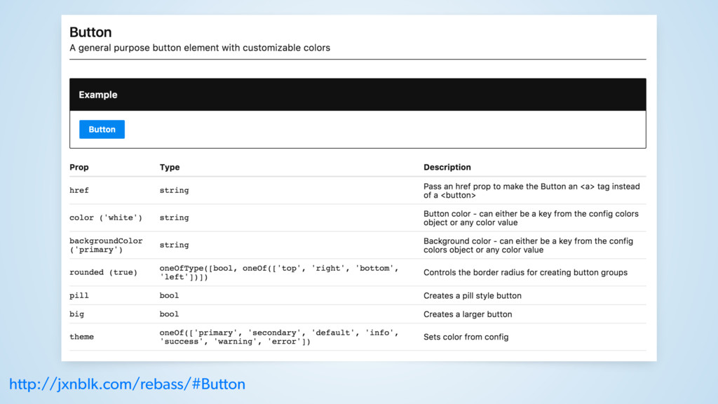
http://jxnblk.com/rebass/#Button
DEMO: DOCUMENTATION
NAMING MISMATCHES?
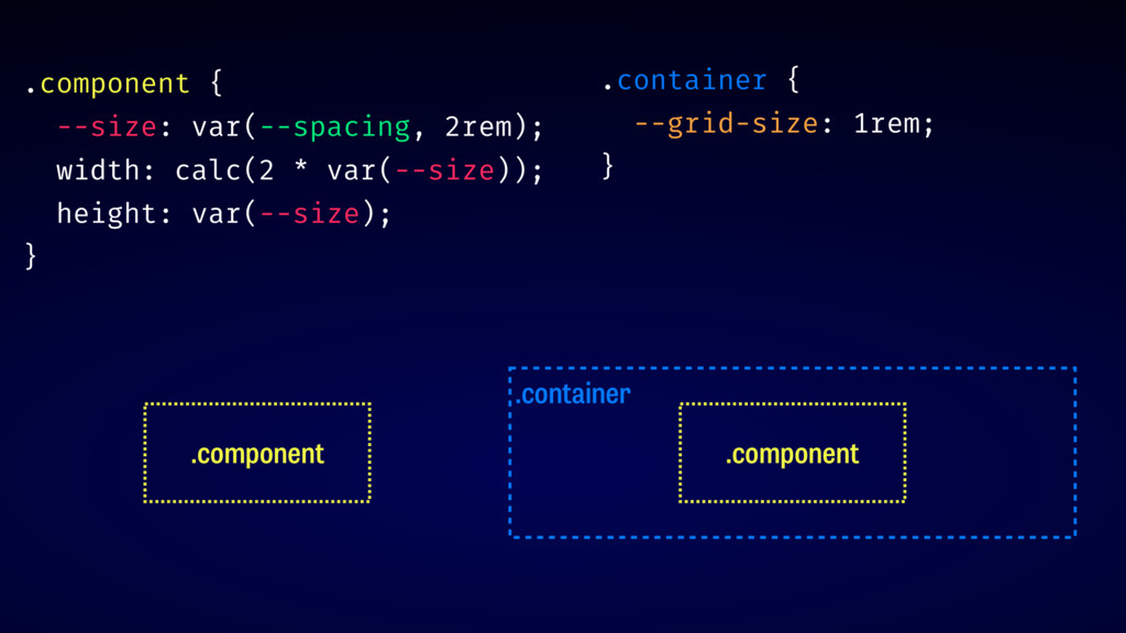
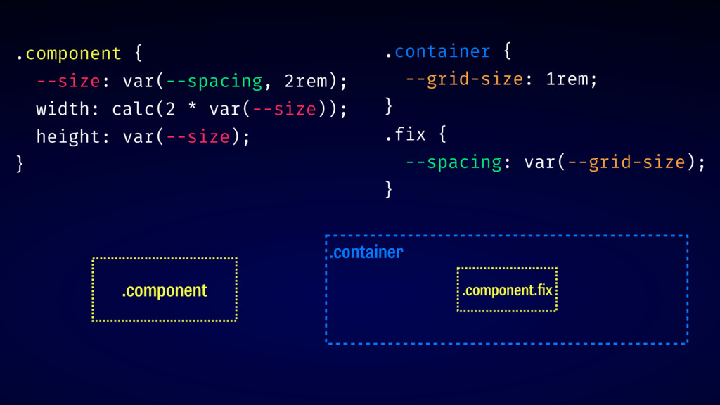
.container .container { --grid-size: 1rem; } .component .component .component {
--size: var(--spacing, 2rem); width: calc(2 * var(--size)); height: var(--size); }
.component .container .component.fix .container { --grid-size: 1rem; } .fix {
--spacing: var(--grid-size); } .component { --size: var(--spacing, 2rem); width: calc(2 * var(--size)); height: var(--size); }
st ep #3
RESILIENT COMPONENTS
w arning: re act
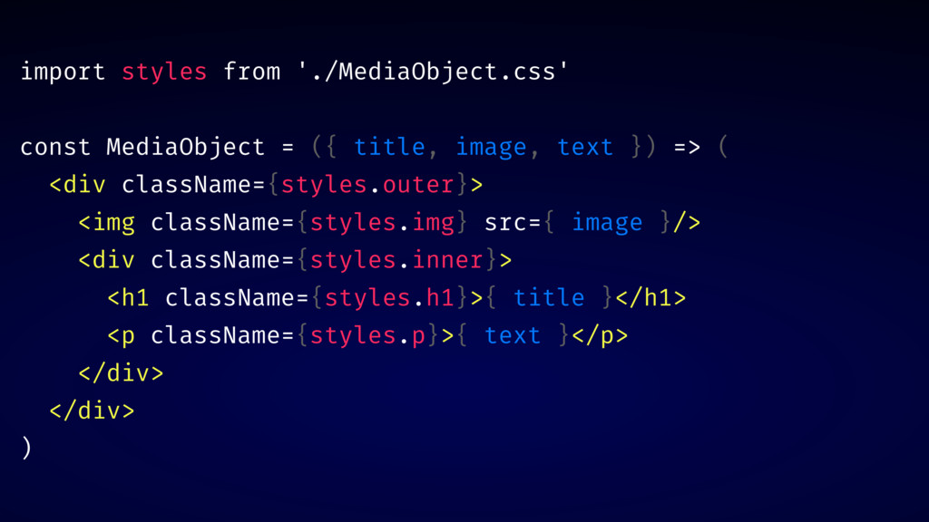
import styles from './MediaObject.css' const MediaObject = ({ title, image,
text }) => ( <div className={styles.outer}> <img className={styles.img} src={ image }/> <div className={styles.inner}> <h1 className={styles.h1}>{ title }</h1> <p className={styles.p}>{ text }</p> </div> </div> )
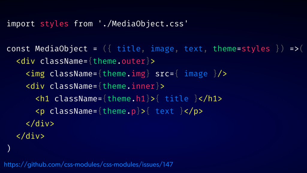
import styles from './MediaObject.css' const MediaObject = ({ title, image,
text, theme=styles }) =>( <div className={theme.outer}> <img className={theme.img} src={ image }/> <div className={theme.inner}> <h1 className={theme.h1}>{ title }</h1> <p className={theme.p}>{ text }</p> </div> </div> ) https://github.com/css-modules/css-modules/issues/147
DEMO: INTERNAL STRUCTURE DOCS
✅ RESPOND TO ENVIRONMENT ✅ USE INTERNAL VARIABLES ✅ EXPOSE
INTERNAL STRUCTURE
t hank you! @glenmaddern
 geelen
 ks91
ks91
 srenext
 iqbocchi
 smt7174
 geekplus_tech
 k_adachi_01
 shinyasaita
 scrummasudar
 rakus_dev
 kawauso
 nstock
 watany
 greggifford
 cassininazir
 katarinadahlin
 csswizardry
 holman
 jonoalderson
 chrislema
 andyhume
 badams
 honzajavorek
 brad_frost
 coloredviolet