Upgrade to Pro — share decks privately, control downloads, hide ads and more …

Styled Components and the Road to Unification

Styled Components and the Road to Unification

Presented at Localhost AU Deployment on June 6-9th, 2017

Glen Maddern

June 09, 2017
Tweet

More Decks by Glen Maddern

Other Decks in Technology

Transcript

  1. • Scoped styles • Critical CSS • Smarter optimisations •

    Package management • Non-browser styling BENEFITS OF CSS-IN-JS https://medium.com/seek-blog/a-unified-styling-language-d0c208de2660 @markdalgleish
  2. https://speakerdeck.com/didoo/let-there-be-peace-on-css @areaweb Separation of Concerns Separation of Concerns (only, from

    a different point of view) JS CSS HTML BUTTON DATE PICKER MODAL LIST LIST-ITEM MEDIA
  3. @glenmaddern /* styles.css */ .Headline { padding: 4em; background: papayawhip;

    } .Headline_Text { font-size: 1.5em; text-align: center; color: palevioletred; } <!-- my_page.html --> <!-- ... --> <header class="Headline"> <h1 class="Headline_Text"> My Page Title </h1> </header> <!-- ... -->
  4. @glenmaddern /* styles.css */ .Headline { padding: 4em; background: papayawhip;

    } .Headline_Text { font-size: 1.5em; text-align: center; color: palevioletred; } <!-- my_page.html --> <!-- ... --> <header class="Headline"> <h1 class="Headline_Text"> My Page Title </h1> </header> <!-- ... --> /* src/components/Headline.css */ .Headline { padding: 4em; background: papayawhip; } .Headline_Text { font-size: 1.5em; text-align: center; color: palevioletred; } /* src/components/Headline.js */ import './Headline.css' export default ({ text }) => ( <header className="Headline"> <h1 className="Headline_Text"> { text } </h1> </header> )
  5. @glenmaddern /* src/components/Headline.css */ .Headline { padding: 4em; background: papayawhip;

    } .Headline_Text { font-size: 1.5em; text-align: center; color: palevioletred; } /* src/components/Headline.js */ import './Headline.css' export default ({ text }) => ( <header className="Headline"> <h1 className="Headline_Text"> { text } </h1> </header> ) /* src/components/Headline.js */ import styles from './Headline.css' export default ({ text }) => ( <header className={ styles.wrapper }> <h1 className={ styles.text }> { text } </h1> </header> ) /* src/components/Headline.module.css */ .wrapper { padding: 4em; background: papayawhip; } .text { font-size: 1.5em; text-align: center; color: palevioletred; }
  6. @glenmaddern /* src/components/Headline.js */ import styled from 'styled-components' const Wrapper

    = styled.header` padding: 4em; background: papayawhip; `; const Text = styled.h1` font-size: 1.5em; text-align: center; color: palevioletred; `; export default ({ text }) => ( <Wrapper> <Text>{ text }</Text> </Wrapper> ) /* src/components/Headline.js */ import styles from './Headline.css' export default ({ text }) => ( <header className={ styles.wrapper }> <h1 className={ styles.text }> { text } </h1> </header> ) /* src/components/Headline.module.css */ .wrapper { padding: 4em; background: papayawhip; } .text { font-size: 1.5em; text-align: center; color: palevioletred; }
  7. @glenmaddern /* EqualDivider.scss */ .EqualDivider { display: flex; margin: 0.5rem;

    padding: 1rem; background: papayawhip; > * { flex: 1; &:not(:first-child) { margin-left: 1rem; } } } .Box { padding: 0.25rem 0.5rem; background: palevioletred; }
  8. @glenmaddern /* EqualDivider.sass */ .EqualDivider display: flex margin: 0.5rem padding:

    1rem background: papayawhip > * flex: 1 &:not(:first-child) margin-left: 1rem .Box padding: 0.25rem 0.5rem background: palevioletred
  9. @glenmaddern /* EqualDivider.scss */ .EqualDivider { display: flex; margin: 0.5rem;

    padding: 1rem; background: papayawhip; > * { flex: 1; &:not(:first-child) { margin-left: 1rem; } } } .Box { padding: 0.25rem 0.5rem; background: palevioletred; }
  10. @glenmaddern /* EqualDivider.css.js */ const equalDivider = { display: 'flex',

    margin: '0.5rem', padding: '1rem', background: 'papayawhip', '> *': { flex: 1, '&:not(:first-child)': { marginLeft: '1rem' } } } const box = { padding: '0.25rem 0.5rem', background: 'palevioletred' }
  11. @glenmaddern /* EqualDivider.js */ const EqualDivider = styled.div` display: flex;

    margin: 0.5rem; padding: 1rem; background: papayawhip; > * { flex: 1; &:not(:first-child) { margin-left: 1rem; } } ` const Box = styled.div` padding: 0.25rem 0.5rem; background: palevioletred; `
  12. @glenmaddern const Button = styled.button` font-size: 1em; margin: 1em; padding:

    0.25em 1em; border: 2px solid palevioletred; border-radius: 3px; background: palevioletred; color: white; ${props => props.primary && css` background: white; color: palevioletred; `} ` <Button>Option A</Button> <Button primary>Option B</Button>
  13. @glenmaddern const vars = { primary: 'palevioletred', secondary: 'white' }

    const Button = styled.button` font-size: 1em; margin: 1em; padding: 0.25em 1em; border: 2px solid palevioletred; border-radius: 3px; background: ${ vars.primary }; color: ${ vars.secondary }; ${props => props.primary && css` background: ${ vars.secondary }; color: ${ vars.primary }; `} `
  14. @glenmaddern import styled from 'styled-components/native'; const Wrapper = styled.View` background-color:

    papayawhip; flex: 1; justify-content: center; align-items: center; `; const Title = styled.Text` font-size: 20px; text-align: center; margin: 10px; color: palevioletred; font-weight: bold; `;
  15. @glenmaddern class StyledComponentsNative extends React.Component { render() { return (

    <Wrapper> <Title> Hello World, this is my first native styled component! </Title> </Wrapper> ) } }
  16. @glenmaddern LANDING PAGE WEB APP • Static HTML & CSS

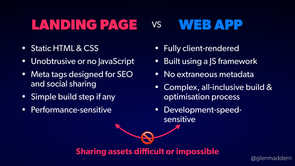
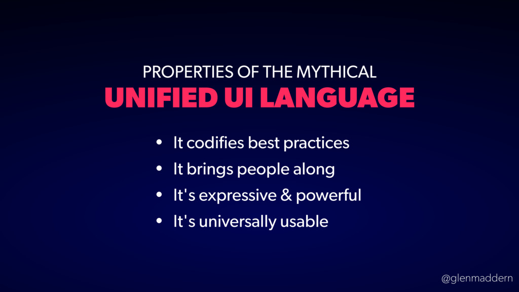
    • Unobtrusive or no JavaScript • Meta tags designed for SEO and social sharing • Simple build step if any • Performance-sensitive • Fully client-rendered • Built using a JS framework • No extraneous metadata • Complex, all-inclusive build & optimisation process • Development-speed- sensitive VS Sharing assets difficult or impossible
  17. @glenmaddern PROPERTIES OF THE MYTHICAL UNIFIED UI LANGUAGE • It

    codifies best practices • It brings people along • It's expressive & powerful • It's universally usable