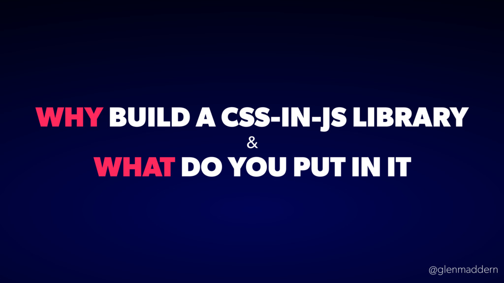
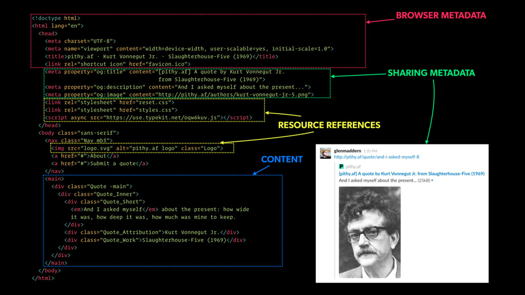
user-scalable=yes, initial-scale=1.0"> <title>pithy.af · Kurt Vonnegut Jr. · Slaughterhouse-Five (1969)</title> <link rel="shortcut icon" href="favicon.ico"> <meta property="og:title" content="[pithy.af] A quote by Kurt Vonnegut Jr. from Slaughterhouse-Five (1969)"> <meta property="og:description" content="And I asked myself about the present..."> <meta property="og:image" content="http://pithy.af/authors/kurt-vonnegut-jr-5.png"> <link rel="stylesheet" href="reset.css"> <link rel="stylesheet" href="styles.css"> <script async src="https://use.typekit.net/oqw6kuv.js"></script> </head> <body class="sans-serif"> <nav class="Nav mb3"> <img src="logo.svg" alt="pithy.af logo" class="Logo"> <a href="#">About</a> <a href="#">Submit a quote</a> </nav> <main> <div class="Quote -main"> <div class="Quote_Inner"> <div class="Quote_Short"> <em>And I asked myself</em> about the present: how wide it was, how deep it was, how much was mine to keep. </div> <div class="Quote_Attribution">Kurt Vonnegut Jr.</div> <div class="Quote_Work">Slaughterhouse-Five (1969)</div> </div> </div> </main> </body> </html> CONTENT BROWSER METADATA RESOURCE REFERENCES SHARING METADATA
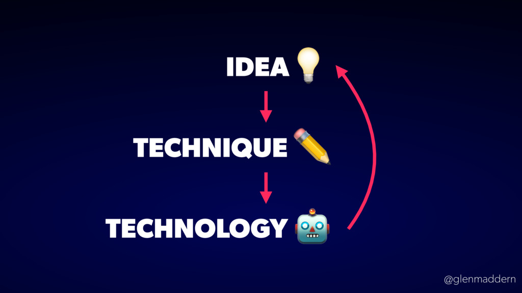
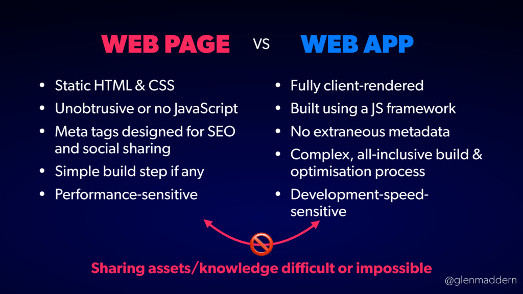
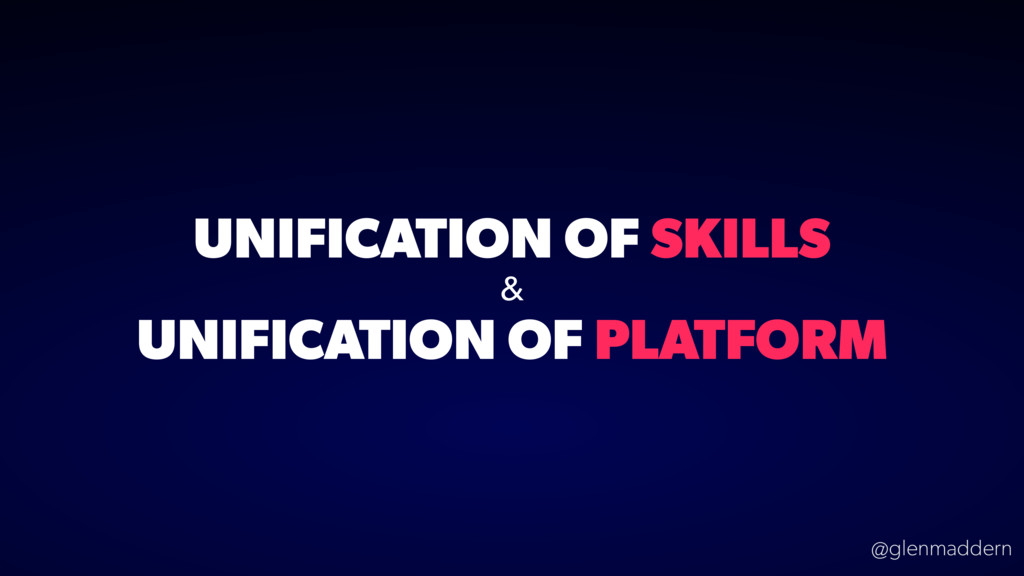
• Unobtrusive or no JavaScript • Meta tags designed for SEO and social sharing • Simple build step if any • Performance-sensitive • Fully client-rendered • Built using a JS framework • No extraneous metadata • Complex, all-inclusive build & optimisation process • Development-speed- sensitive VS Sharing assets/knowledge difficult or impossible
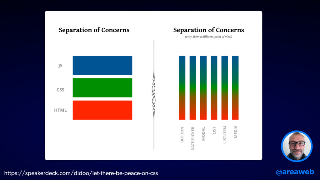
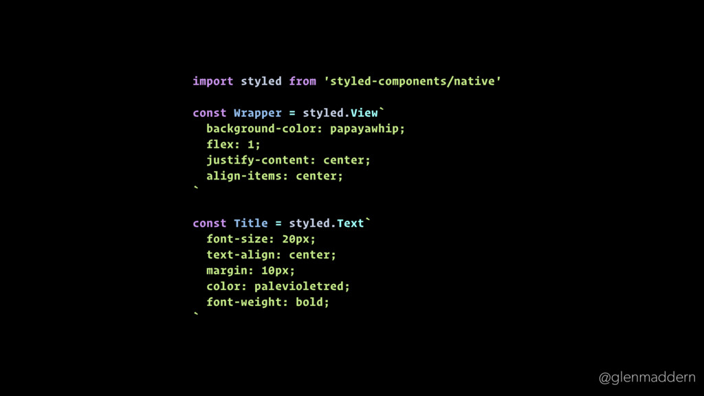
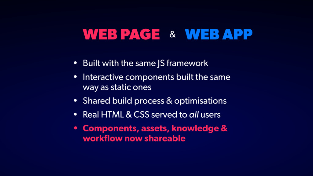
framework • Interactive components built the same way as static ones • Shared build process & optimisations • Real HTML & CSS served to all users • Components, assets, knowledge & workflow now shareable &
 SiteGround - Reliable hosting with speed, security, and support you can count on.
 geelen
 shinyasaita
 cyberagentdevelopers
 kaonavi
 fujiwara3
 yakumo
 legalontechnologies
 matsuritechnologies
 smt7174
 miyukki
 muehara
 yoshiyama_hana
 fossamagna
 palkan
 jeffersonlam
 katarinadahlin
 jonoalderson
 skoyamalab
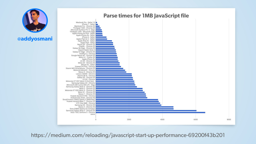
 addyosmani
 cassininazir
 wjessup
 techseoconnect
 charlesmeaden
 tammyeverts