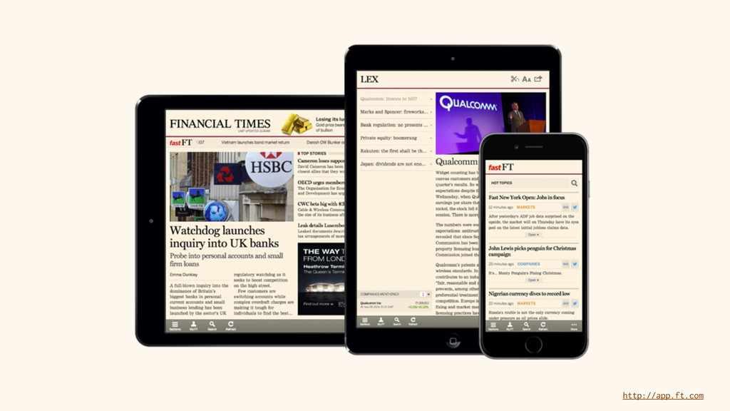
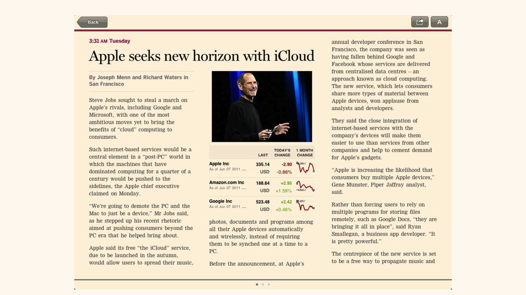
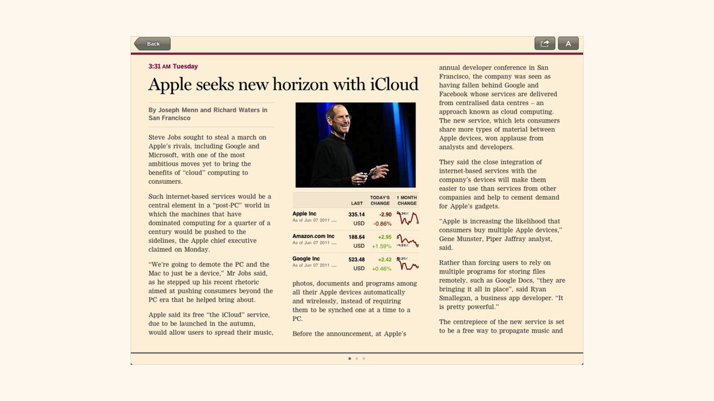
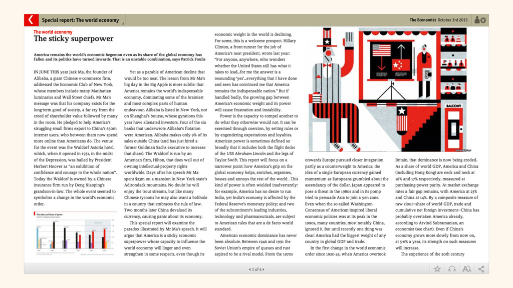
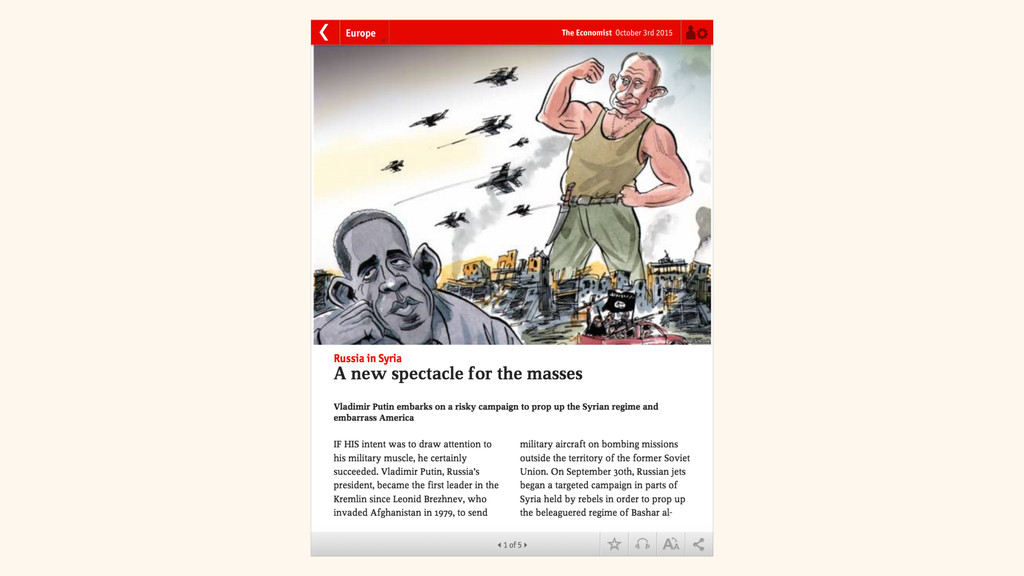
Since its initial brief, the challenge for The Economist’s web app (https://app.economist.com) was to present the same slick interface as the newspaper’s existing iOS and Android apps, using just web technologies. As the project matured and we began to support a wider variety of device sizes and capabilities, we realised we were making significant compromises to the quality of the presentation, and indeed the legibility of the text. For a news publication with a loyal user-base and strong visual identity, this was not great.
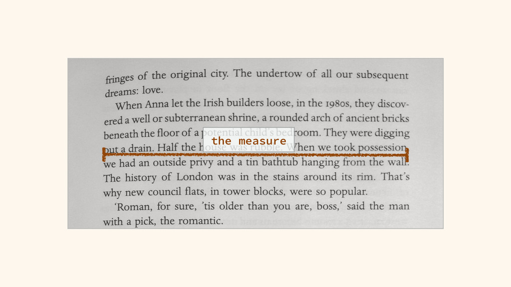
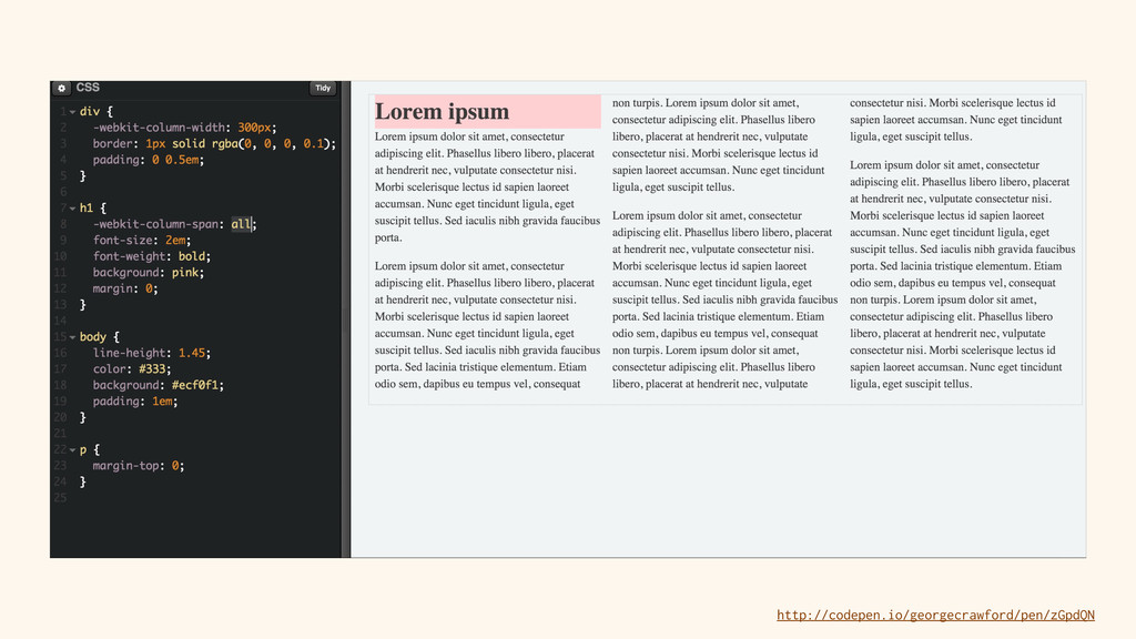
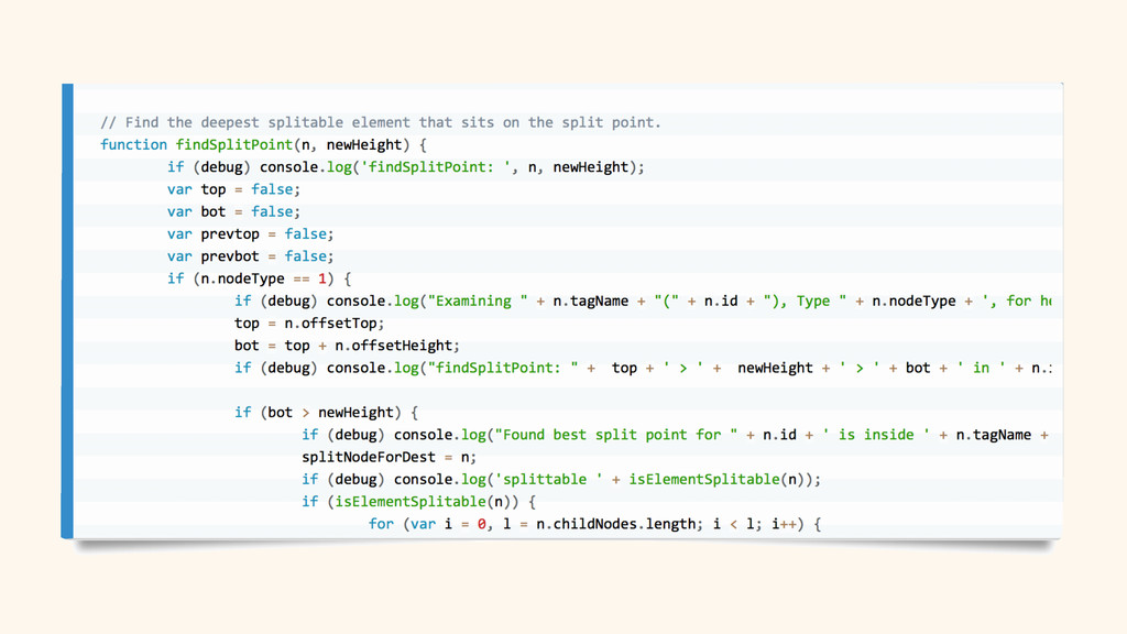
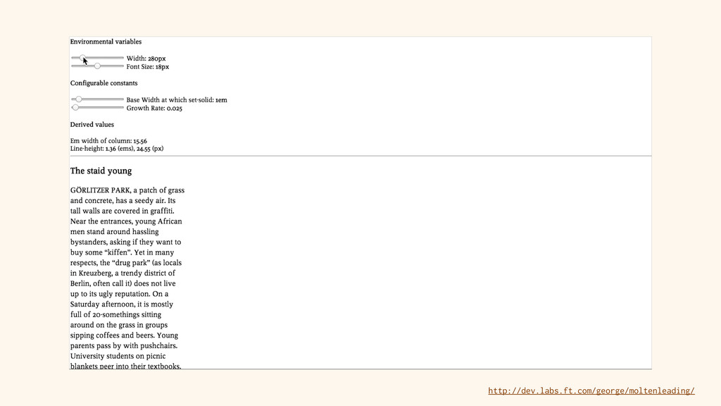
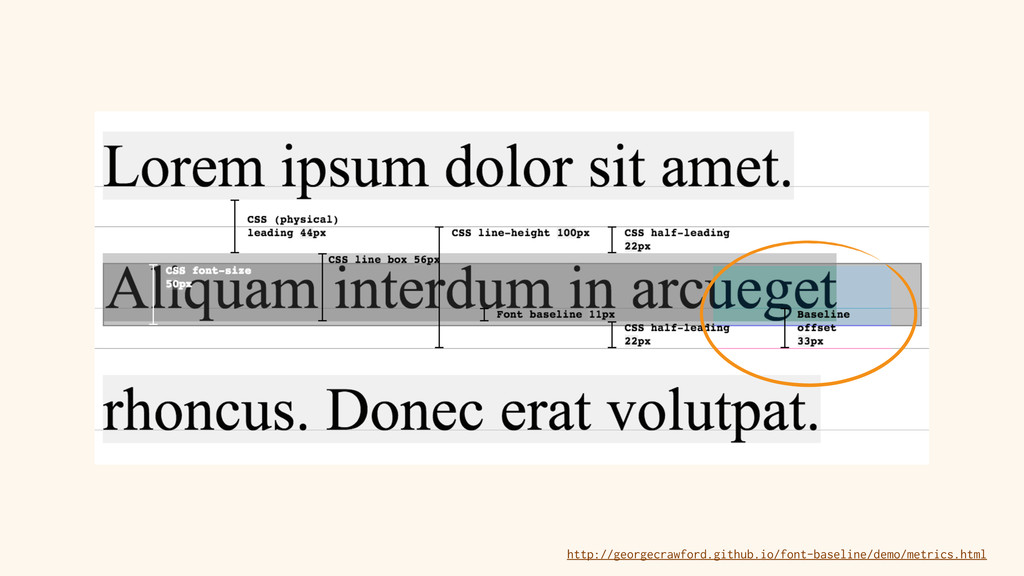
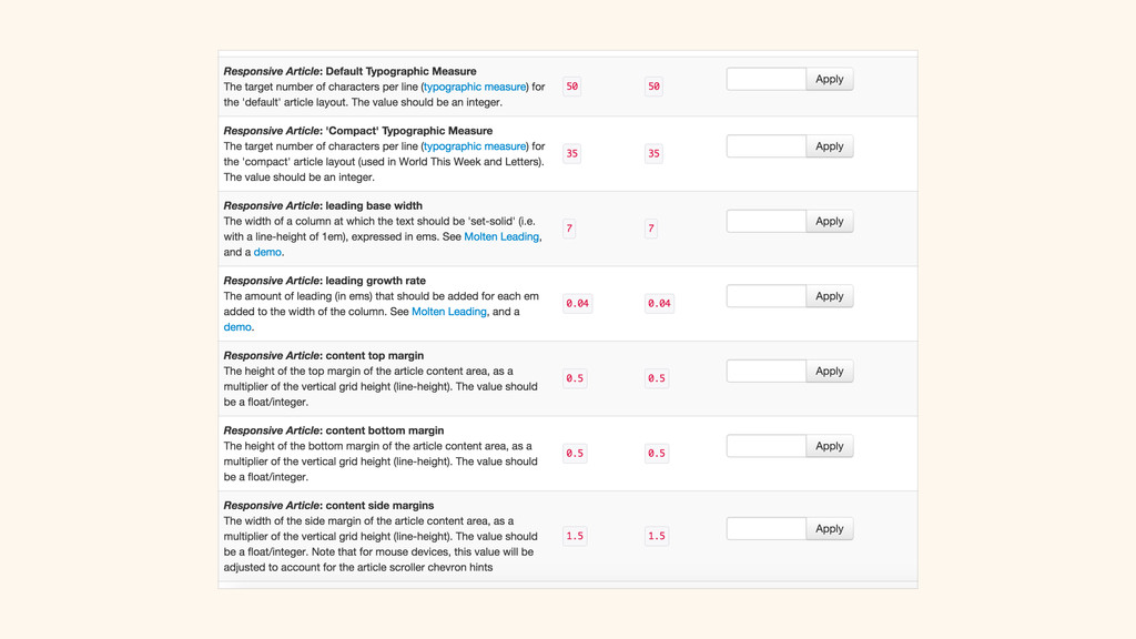
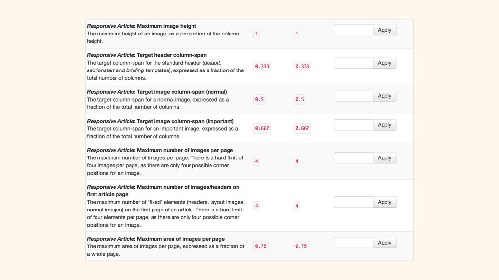
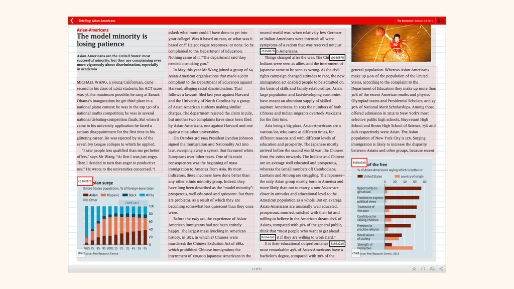
With the application of a series of clever algorithms, a move to a constraint-based layout system, and a more mature relationship between the design, editorial and development teams, we were able to make drastic improvements to the layout and typography of the article view, and thus the immersive, tailor-made experience for the user.
Slide notes:
1. I’m a front-end engineer at the Financial Times. Going to be talking about a scheme of work I did earlier in the year which greatly improved the reading experience for one of our products
2. Spend most of my time working on the FT web app
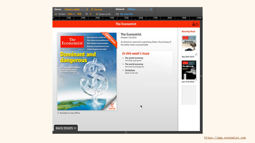
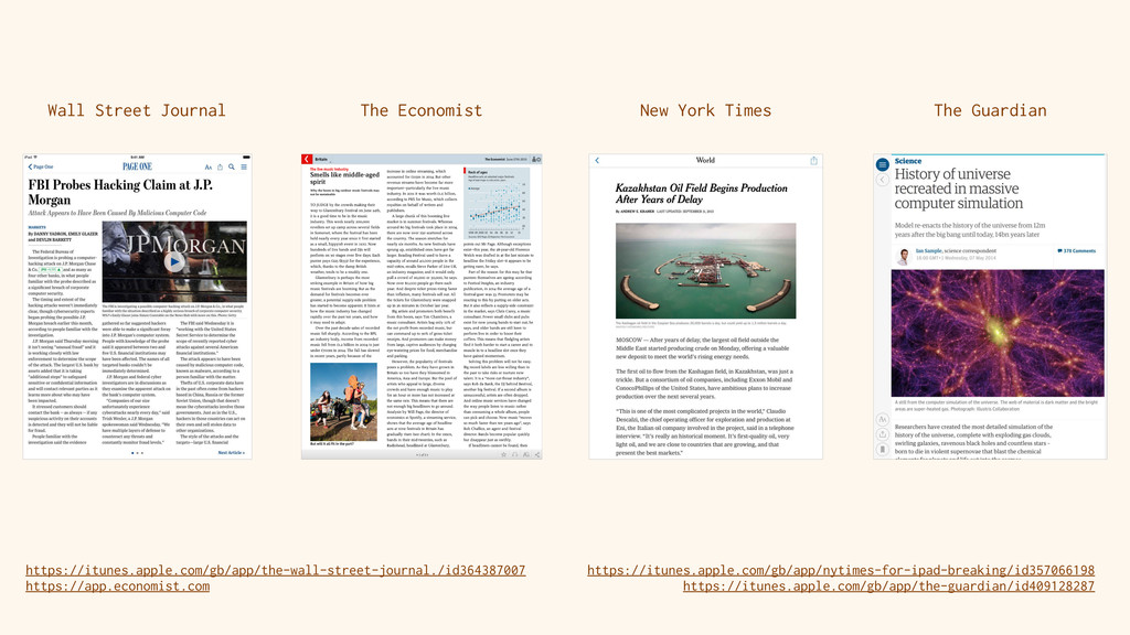
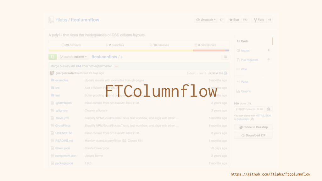
3. Until recently, also the lead developer of the Economist’s web app
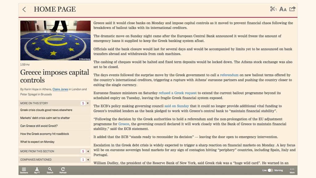
which launched four years ago.
4. https://www.dropbox.com/s/deiv9xv33melntf/Economist%20app%20demo.mov?dl=0. Working on the two projects side-by side allowed cross-pollination of ideas and technologies
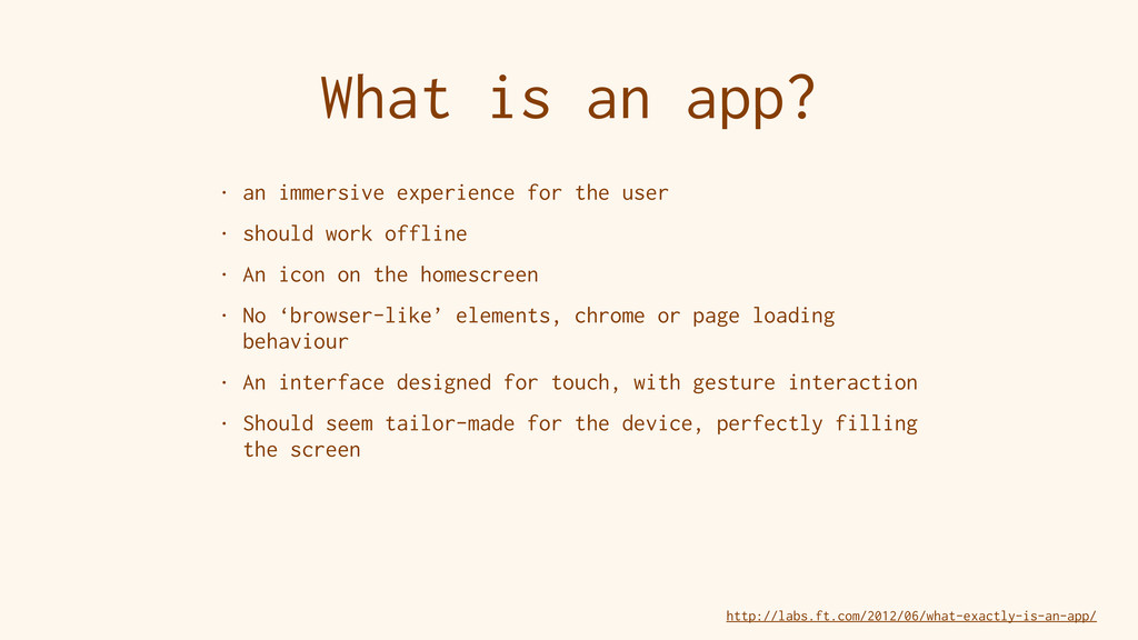
5. At the FT, we've thought hard about what exactly an app is, and how that applies to the web.
6. As a print publication moving into the digital world, we have to answer a few important questions: How to best present our articles to be read on digital devices? Historically, studies have shown that there's an ideal length for a line of text: the ‘measure’. A good measure helps the eye easily track from the end of a line to the beginning of the next one. Too long, and the flow is interrupted as the eye searches for the beginning of the next line. Too short, and the text appears to be clunky and chopped-up. Around 66 characters per line is deemed ‘perfect, as seen in the typical paperback book
7. But newspapers have been printing articles on large pages, arranged in narrow columns of text since the 19th century. Why? A few reasons, often due to the way mechanical type was set historically. If a breaking story needed to be inserted, whole typeset columns could be shuffled around to make room. Multiple, narrow columns allow more stories to appear 'above the fold’. A more flexible grid to lay out advertising. A primary source of income for most print journalism. Stories are written in an ‘inverted pyramid’. A high-level summary paragraph is followed by paragraphs of increasing detail. Stories can be 'cut from the bottom’ to make room for adverts.
8. Setting body text in columns on the web and on digital devices is a subject of debate. Today’s news apps fall into two groups: paginated, multi-column layouts: still heavily influenced by print, and single scrolling columns: giving the digital product a unique feel.
9. The FT web app initially used a 3-column view.
10. After a few years, we launched a redesign with a single, scrolling column. Designers didn’t feel the need to continue to follow the print paradigm.
11. Suffers from very long lines on large screensThe Economist have kept extremely faithful to their print design.
12. The Economist hasn’t changed very much since the newspaper launched in 1846. The newspaper is intended to be read from cover to cover. Starts with the contents page, and the punchy World This Week, followed by looser, longer-form articles. The digital products retain that aesthetic with a paginated, column layout. With columns and pagination adapting to the viewport, we can greatly contribute to the immersive, tailor-made experience we’re looking for.
13. Columns on the web are easy, right? Just use CSS Multi-Column layout? Buggy in 2011, and still now. Flowing anything but basic paragraphs can break the layout. Elements like lists and tables need special treatment.
14. integer column-spans were not part of the spec - only 'all' or ‘none’, so the pink header can either span a single column, or all of them.
15. So neither of the original layouts for the FT…
16. …and the Economist were possible.
17. Initial solution was to do to string manipulation in JS to flow the text across columns. Iterate through the paragraphs, find the one which overflows the column, cut the text at the overflowing word, move it to the next column, ensure that all tags are correctly closed and re-opened. Special treatment for lists, tables and images.
18. Worked fine, but extremely slow on the early tablets and smartphones around in 2011. This bug report describes how it took 20 seconds to render a long article on an iPad 1.
19. We developed FTColumnFlow, which greatly improved the speed at which we could flow text across columns. Adds a further number of useful features.
20. Simple principle: First, create a single column, and put everything in it, measure the heights of all the block elements, which are now the correct width, move blocks to the render area, adding to the first column until it is overflowed, duplicate the overflowing block element at the top of the next column with a negative top margin, set overflow to be hidden on the columns. https://www.dropbox.com/s/esarog8lfjffvrx/Columnflow%20overflow%20exposed.mov?dl=0
21. I can reveal what’s going on behind the scenes. Rather than manipulating the contents of DOM nodes with string operations, we make a trade-off with a slightly heavier DOM. Much, much faster.
22. Declarative markup. Configure: column width, gutter width, page margins and page dimensions. Pages can be aligned horizontally or vertically. Fixed-position elements get span attribute and position attributes.
23. So we were able to achieve the column layout as designed, for both the FT and Economist apps.
24. But the Economist was hampered by a design compromise, which got more noticeable as we launched on more and more types of device. It has a design very like the print publication. Our initial brief was to make it work on the iPad as a reference device. We then launched on other mobile phones and tablets. The markup we consumed from their CMS gave instructions about the size and placement of each image…
25. …but working entirely to the assumption that the viewport was the same size and shape as an iPad.
26. When your layout dictates the number of columns per page, and the CMS dictates the aspect ratio and positioning of each image, you have problems. For a widescreen device, images spanning two of the three columns could overflow the bottom of the viewport. We looked into using responsive images with art-direction, embedding crop metadata, but it was too much complexity for their CMS & editorial team. Solution: always present the app in an iPad-shaped viewport. Add margins for other shapes; at the sides for widescreen, top and bottom for squarer screens. Means that the CMS can lay out articles for a single target canvas, and can carefully specify the size, position and page of each image. But over time, the assumption that every device was the same size and shape as an iPad became increasingly unrealistic.
27. This compromise degrades the app’s typography in many different scenarios: particularly square or wide screens, particularly large or small tablets, users who prefer larger or smaller fonts. Reading experience is fine for an iPad-sized screen, but on other devices the typographic measure can get uncomfortably short or long. Kindle Fire, for example: smallest ‘tablet’ we support, an article is sometimes rendered on a viewport of only 640x400 pixels. When the user prefers a larger font size the result is comically bad.
28. The markup we get from the CMS for positioning images (e.g. top-right of page 6) can often introduce other undesired results. Very small screen like Kindle Fire, with large font: an article might be 30 pages long. Nothing we can do if that’s what the user wants. If there are photos on pages 2, 4 and 6, we then have no choice but to show 24 pages with no photos. Large desktop screen, small font size: not as many pages as the editor expected, whole article might fit on a single page. Photos on pages 2, 4 and 6, orphaned images at end of article. Possible to see consecutive empty pages at the end of an article before the last image.
29. Earlier this year, we released a significant enhancement to the appearance and reading experience for articles in the Economist app. We focussed on two key areas: typography & image layout. Our app should follow accepted and fundamental typographic principles. Step one was to remove the white margins, and get back to that immersive experience for all devices.
30. We wanted to let the Economist’s editors have control over the ‘ideal’ measure
They can also change it for different types of article: the standard article has a comfortable measure, The World This Week and Letters are allowed a tighter measure to match the print house-style. We then dynamically calculate the number of columns, based on the viewport dimensions, the average width of the characters in the font at the preferred size and the ideal measure for the article.
31. So, the horizontal layout is improved. The vertical grid is also extremely important to good typesetting. One of the problems with CSS Columns is that elements with a different line-height can break out of the vertical grid. Watch the first paragraph slip off the grid as I change the line-height of the header: http://codepen.io/georgecrawford/pen/KpZvjw.
32. FTColumnflow has a ‘standardise line height’ setting: adds padding to the bottom of block elements to align the next element to the grid - see the green block. As long as the line-height of the text within the paragraphs is consistent, text will line up across columns despite having images and headlines which don’t conform.
33. What about the distance between the lines? In typography, the gap between the lines of text is called Leading. Literally named after the strips of lead which were used to separate rows of type. Good leading can make a huge difference to the legibility of text.
34. ‘Molten Leading’: the principle of calculating the perfect leading for a given typeface for a particular measure. https://www.dropbox.com/s/kbsso5jzq6ch0li/molten%20leading.mov?dl=0. The longer the measure, the larger the leading should be. Helps the eye to find the next line. Watch as I change the width of this column of text. We now have an ideal measure, but obviously we never precisely hit that, as we have to have a whole number of columns. So the actual measure will vary a bit, and the principle of molten leading says that we also need to vary the leading. The leading determines the height of our vertical grid.
35. Ideally, you want to align both text and the images to the same vertical grid. Determining the baseline position of a block of text on the web is much harder than it should be. It is not yet a property that CSS exposes. We discovered a hack which makes use of a quirk in the inline-box spec. We can get the baseline offset in px for a particular typeface and font size. Added as a feature to ColumnFlow. Now we can line up text and images by shifting the text to compensate for the baseline offset.
36. We set about making a list of variables, and deciding where each should be defined: a user preference exposed in the UI (e.g. font size), an editorially configurable setting (ideal measure), a constant value set in code (average width of a character, baseline offset), an environmental observation (viewport size), an algorithmically-derived variable (actual measure, line-height). For the configurable settings, we gave editors the ability to tweak settings in the live app using our QA tool.
37. This matrix of variables and algorithms leads to a greatly enhanced reading experience. Compare these before/after animations: looping through the available font sizes a user can choose from. Previously (https://www.dropbox.com/s/6r8w6emgx0aj2t7/iPad%20changing%20font%20size%2C%20before.mov?dl=0): A fixed, 3-column layout, the measure became uncomfortably short at larger font sizes, the line-height was fixed. Now (https://www.dropbox.com/s/b766w56ty8lx62u/iPad%20changing%20font%20size%2C%20after.mov?dl=0): columns fill the page. The number of columns is adjusted to keep to the ‘ideal measure’. For a longer measure, the line-height and page margins are slightly increased.
38. Compare the Kindle Fire at a large font-size before the improvements, and after. Significant improvements to the typography.
39. But: couldn't release the work as we still had the image aspect-ratio problem from before. Needed to develop our own image layout algorithms rather than follow the assumptions made by the CMS. Images are a vital part of the Economist product:
they add huge value to the reading experience in terms of illustration: photos and drawings…
40. …and information: maps, tables and charts.
41. Decided to move away from the declarative markup from the CMS. Too many false assumptions. Move towards a constraints-based approach, following rules. Every combination of device and user preferences receives a slightly different rendering. Achieves our goal of a tailor-made layout for the user.
42-25. Algorithmic decisions
46. Again, we give editorial control over many variables, exposed in our QA tool.
47. Also added a layout debug overlay. Exposes at a glance: baseline grid, column and page borders, highlights the different types of image, and their corresponding inline placeholders. Has proved extremely useful for editorial and QA to verify images are near their placeholders…
48. …and when aligning images and text baselines.
49. Two little demos, both simply changing the font size:
- https://www.dropbox.com/s/p2m1xgzf0zw1qx2/demo%20-%20font%20size.mov?dl=0
- https://www.dropbox.com/s/3uy9l6nvppv30uh/demo%20-%20font%20size%20-%20portrait.mov?dl=0
You can see that in both landscape and portrait orientation, the number of columns adjusts to match the ideal measure. The master image and headline span an appropriate number of columns, the leading changes to suit the measure. Images are shuffled around and resized to best fit the page. We decided to be brave, to break away from the specifications, mockups and markup we originally got from the client. Moved towards a constraint-based solution, drawing on our knowledge of the existing app’s design, the concerns and aims of the designers, and the house-style of the newspaper as a whole. The editorial and design teams still control many of the inputs to the algorithms. It’s true that no single article rendering will conform to any one of the client’s design mockups, but every rendering follows the rules they lay down, across a wide range of screen shapes and sizes, and will be both legible and immersive. We see this as a success story for responsive design: developers are involved in the design process, and the design team are encouraged to think about constraints rather than absolute layouts. We were able to adopt such a complex solution because of the existing nature of the app: JS-heavy, client-side rendered solution. Had already moved past inadequate CSS solutions in favour of JS layout routines. Next steps: client-side art direction of images, so we can crop an image rather than introduce white space to perfectly span a whole number of columns. Face recognition, embedded crop metadata, etc. Only applicable to illustrative images - doesn’t work for charts and tables. Ideally, we could do this using web standards. Responsive images and the picture element help of course. Proposed and emerging specs, with interesting work from Adobe in particular.
50. CSS Regions. Like Adobe InDesign, flow text over a linked chain of block containers which can be anywhere. https://www.dropbox.com/s/5cfm3mgef2kw4k3/CSS%20regions.mov?dl=0
51. Construct columns on the fly, allow text to flow between them, and listen to CSS events to determine when regions over- or under-flow. But Regions have been dropped by Chrome and Firefox.
52. CSS Figures. Greatly improves the power of what we can do with CSS floats. Float bottom, float to nearest edge, float with regard to pages and columns. Finally, we get an integer column-span attribute.
53. CSS Line Grid: automatic alignment following a header with an incompatible height, align sidebar blocks with different font sizes, only snap to the grid the elements you want.
54. Project Houdini: opens the possibility of a CSS polyfill. We could explore the pros and cons of a spec to solve our use-cases.
55. We might use the proposed Font Metrics API to get baseline offset, for example, or register new kinds of Custom Layouts and custom @rule’s. Use the Parser API so that rules can be specified in a normal stylesheet.
56. Also check out Grid Style Sheets from thegrid.io: implements a totally constraints-based approach to layout.
57. We’ve all struggled with the move from a fixed Photoshop mockup from a designer who doesn’t ‘get’ responsive design. Just because you now get three mockups for different breakpoints or device classes, doesn’t mean you still have to stay rigid to a design. Try to work to rules and constraints, rather than pixel-perfect designs. Give the designers and editors control, whether by getting them to commit Sass variable changes into Git, or with a hidden tool with which they can tweak settings in the live app. Think about typography and the reading experience as a vital part of the User Experience; a core part of the ‘design’, and more important than lots of the purely aesthetic design considerations. Hopefully some food for thought.