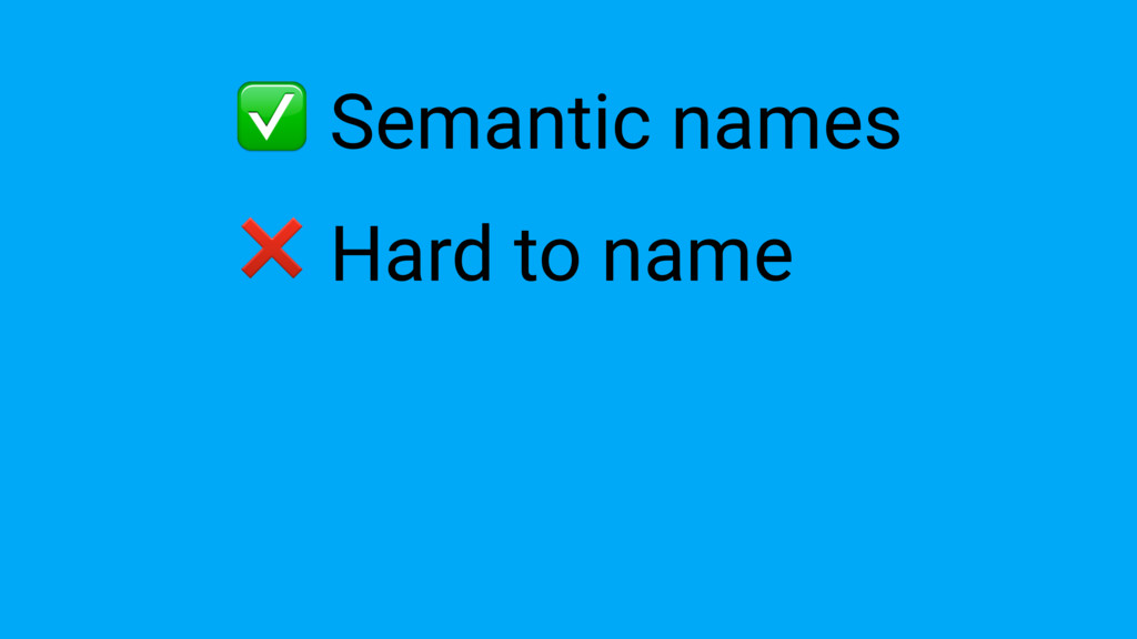
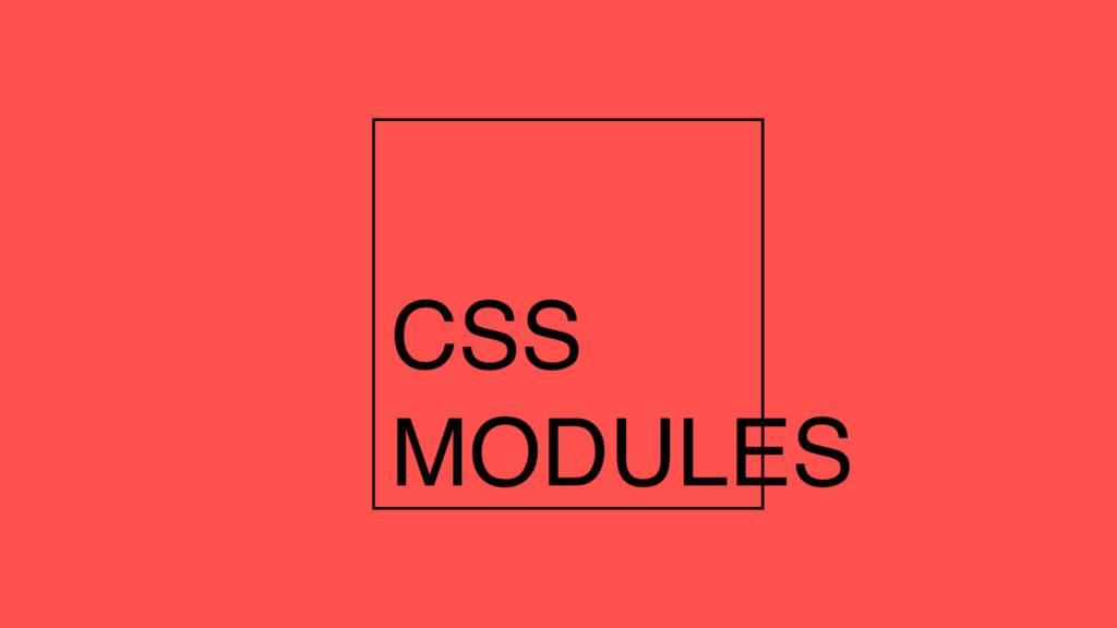
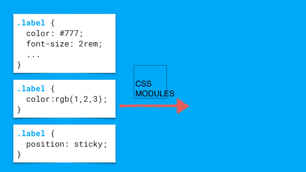
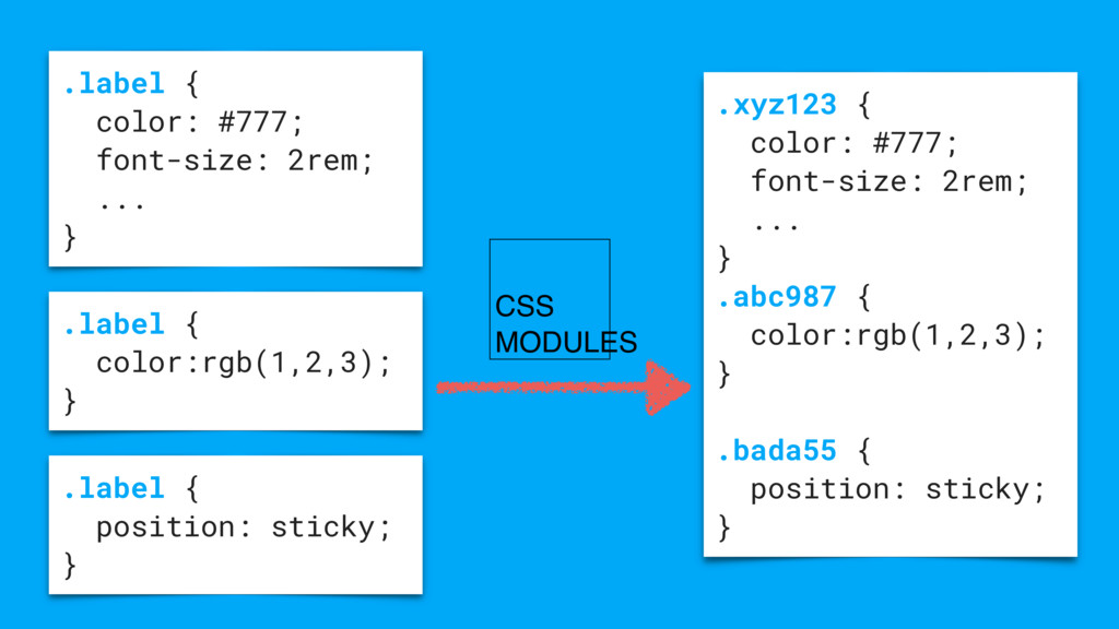
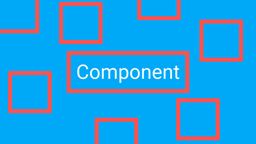
CSS improved a lot in the last years but for many, it's still one of the hardest parts to handle while developing big web applications. Pre-processed languages like Sass and Less added many new features, but we still have to rely on methodologies such as BEM and OOCSS to avoid name collisions. Component-based libraries like React and Polymer are giving us a new tool to manage large front-end applications. In this talk, Giorgio will explain how to use these approaches so you can benefit from them in your next project.
 gpx
gpx
 lycorptech_jp
 sansantech
 uhyo
uhyo
 appleboy
 joooee0000
 oprstchn
 yanzm
yanzm
 naitosatoshi
 nomizone
 smasato
 ks91
ks91
 sbspsy
 leimatthew05
 tammyeverts
 akademiya2063
 bluesmoon
 codingconduct
 jdejongh
 samtorres
 reverentgeek
 kimpetersen
 mojombo
 cassininazir
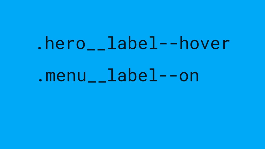
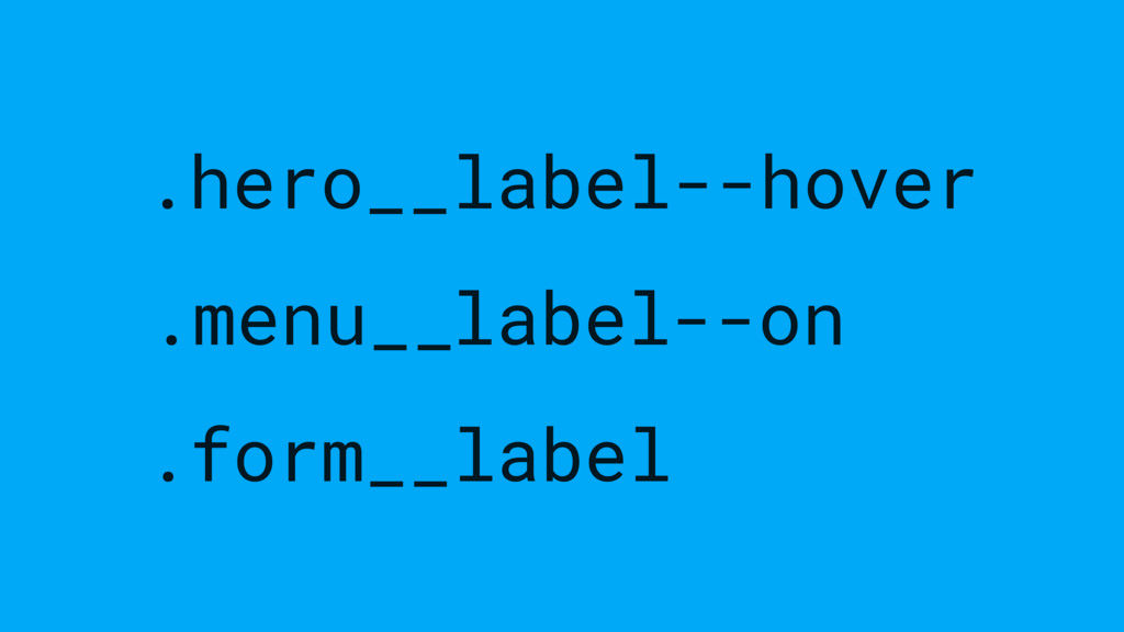
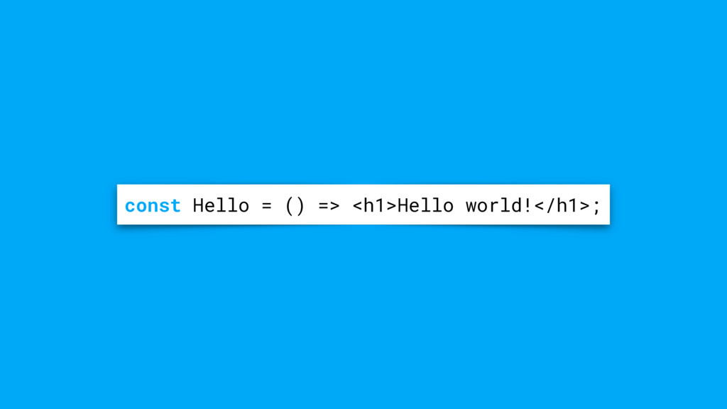
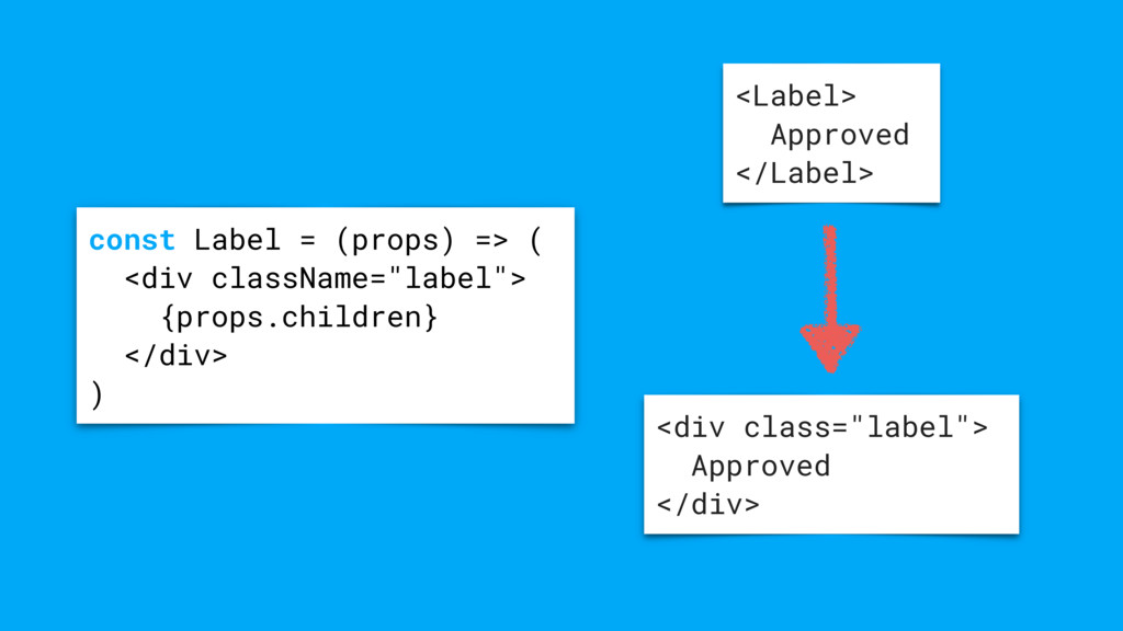
![[email protected] email](https://files.speakerdeck.com/presentations/edaea5754b0e403fa7d5a4dabe406a4b/slide_14.jpg)
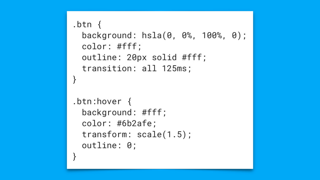
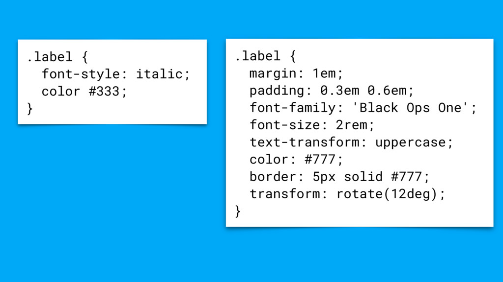
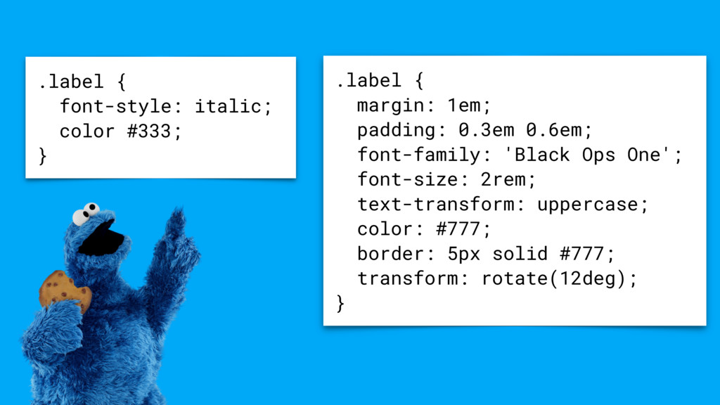
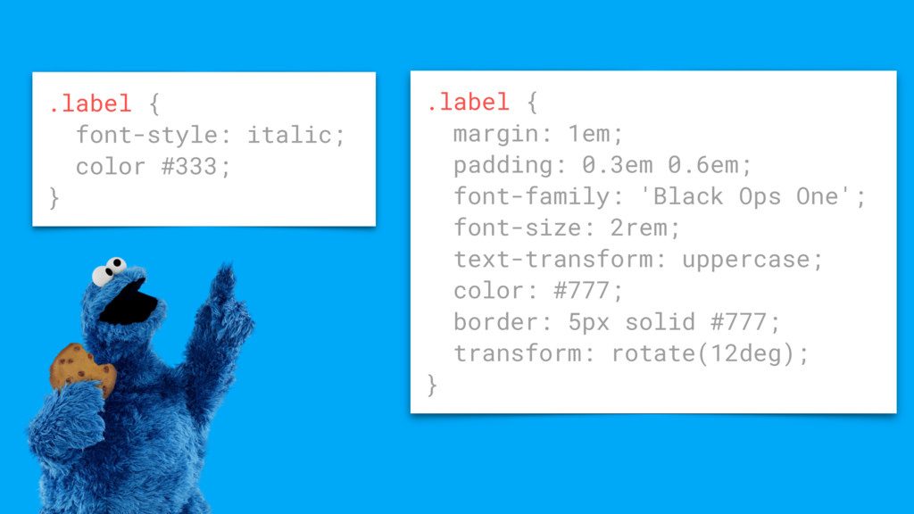
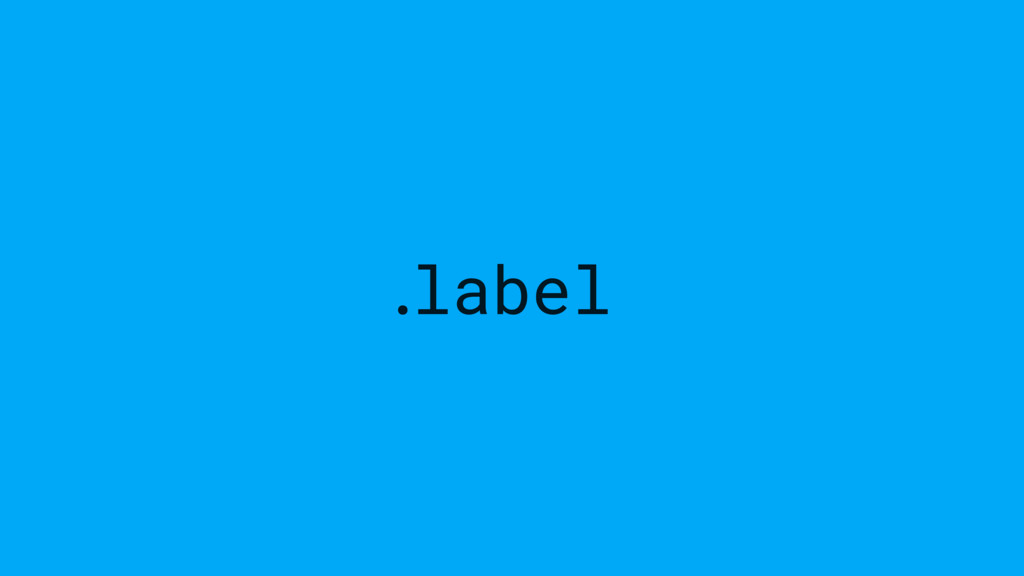
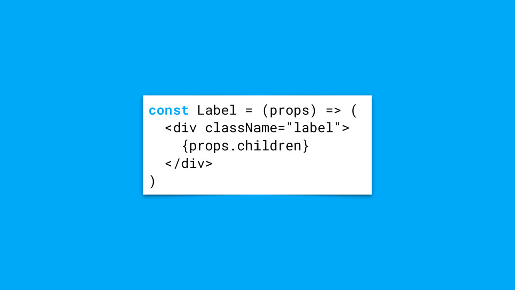
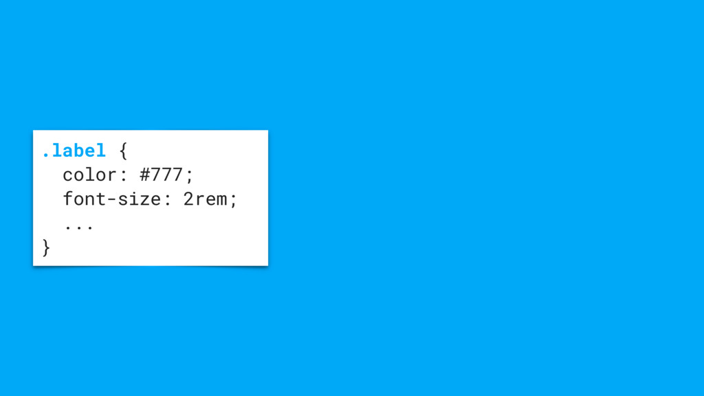
![[email protected] email .label { font-style: italic; color #333; }](https://files.speakerdeck.com/presentations/edaea5754b0e403fa7d5a4dabe406a4b/slide_15.jpg)