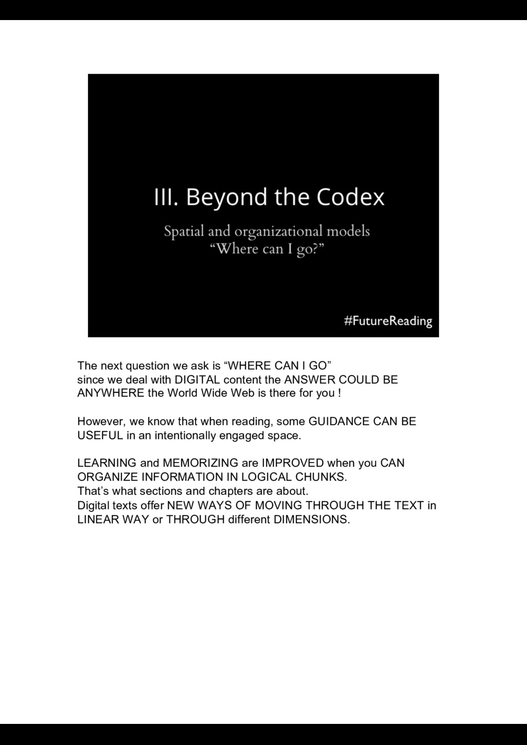
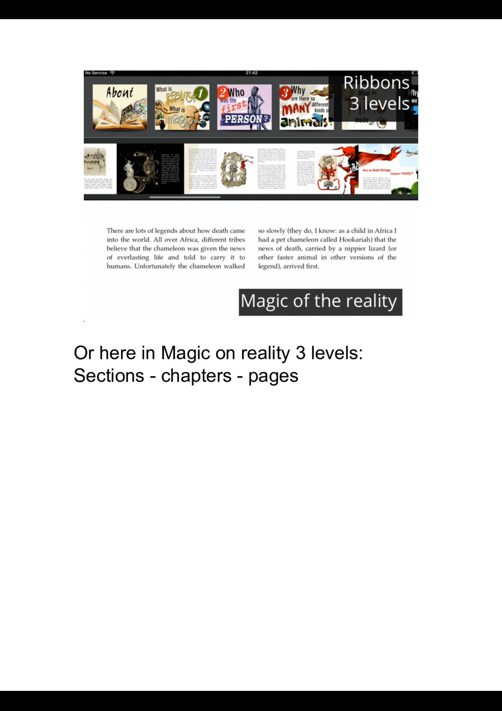
since we deal with DIGITAL content the ANSWER COULD BE ANYWHERE the World Wide Web is there for you ! However, we know that when reading, some GUIDANCE CAN BE USEFUL in an intentionally engaged space. LEARNING and MEMORIZING are IMPROVED when you CAN ORGANIZE INFORMATION IN LOGICAL CHUNKS. That’s what sections and chapters are about. Digital texts offer NEW WAYS OF MOVING THROUGH THE TEXT in LINEAR WAY or THROUGH different DIMENSIONS.
CHANGING and what HAS BEEN changing in the SPACES where we read, particularly in TOUCH BASED applications for reading and enriched e-books. Along the way we'll have some RECOMMENDATIONS on what we think is useful, and what we consider could use IMPROVEMENT.
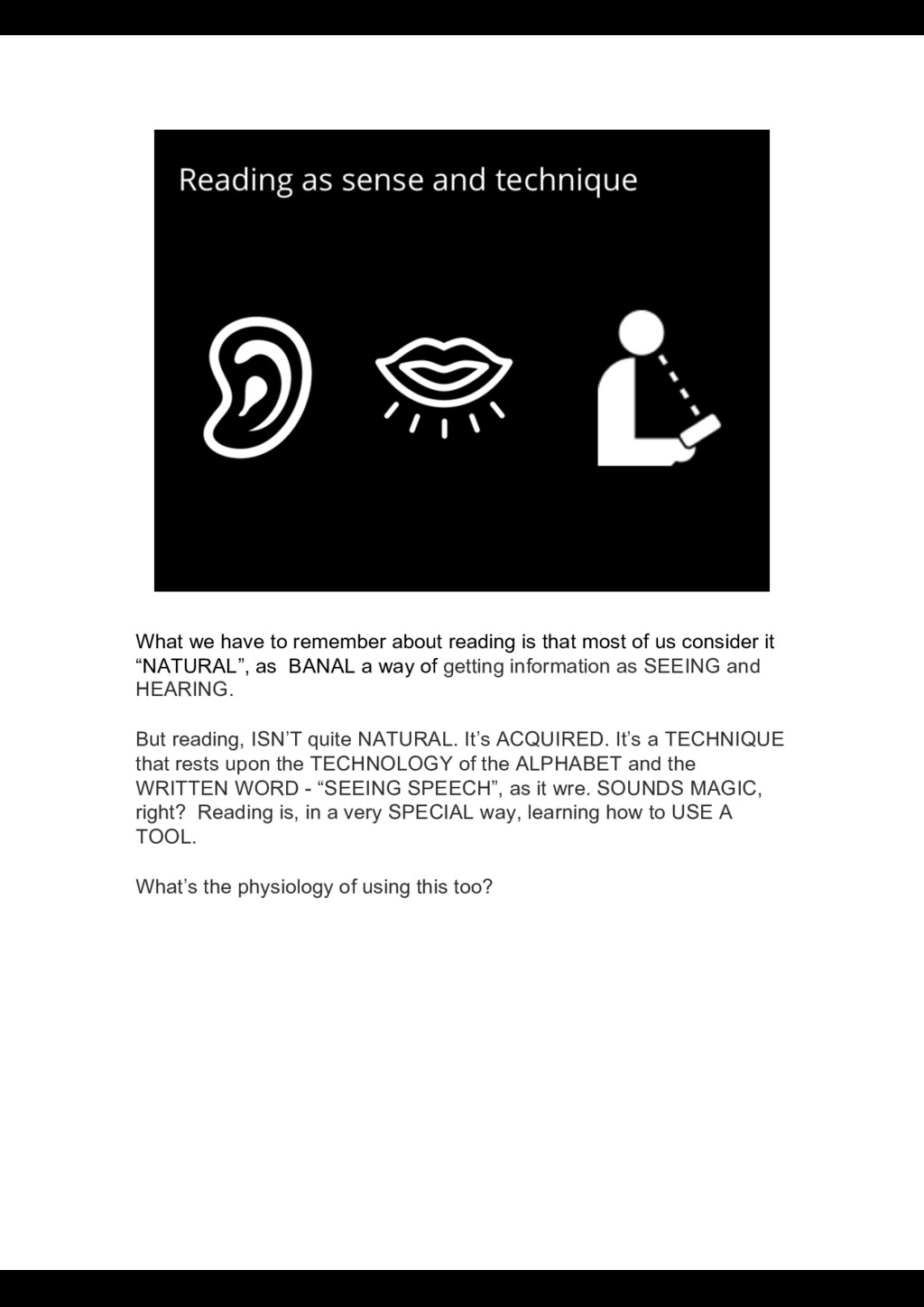
of us consider it “NATURAL”, as BANAL a way of getting information as SEEING and HEARING. But reading, ISN’T quite NATURAL. It’s ACQUIRED. It’s a TECHNIQUE that rests upon the TECHNOLOGY of the ALPHABET and the WRITTEN WORD - “SEEING SPEECH”, as it wre. SOUNDS MAGIC, right? Reading is, in a very SPECIAL way, learning how to USE A TOOL. What’s the physiology of using this too?
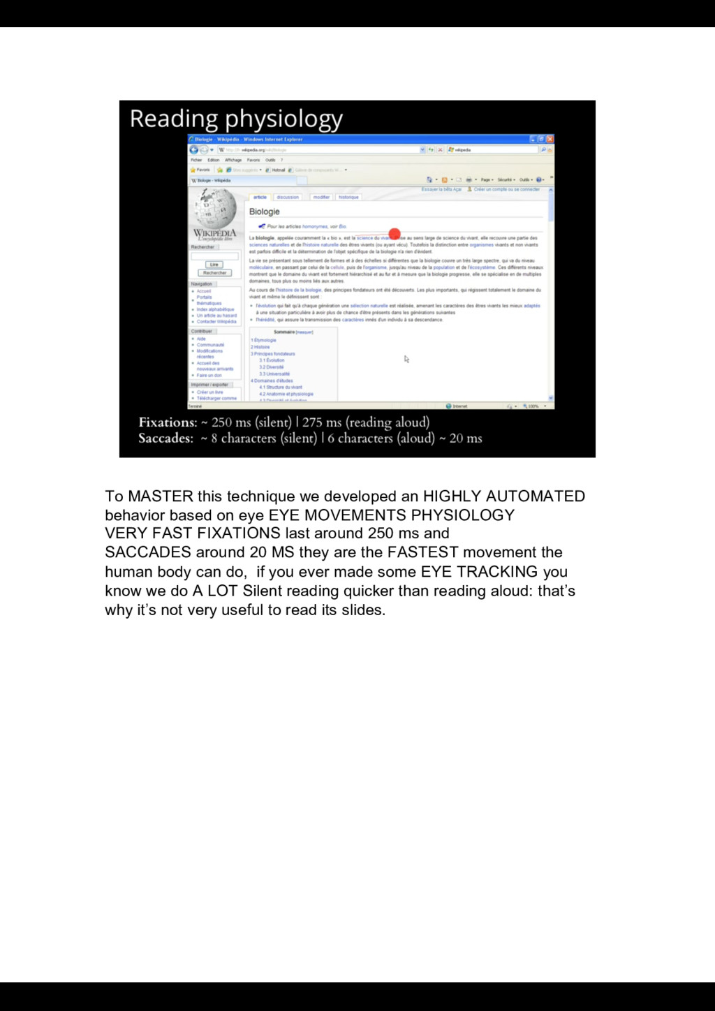
based on eye EYE MOVEMENTS PHYSIOLOGY VERY FAST FIXATIONS last around 250 ms and SACCADES around 20 MS they are the FASTEST movement the human body can do, if you ever made some EYE TRACKING you know we do A LOT Silent reading quicker than reading aloud: that’s why it’s not very useful to read its slides.
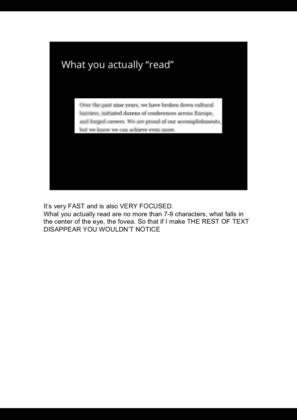
actually read are no more than 7-9 characters, what falls in the center of the eye, the fovea. So that if I make THE REST OF TEXT DISAPPEAR YOU WOULDN’T NOTICE
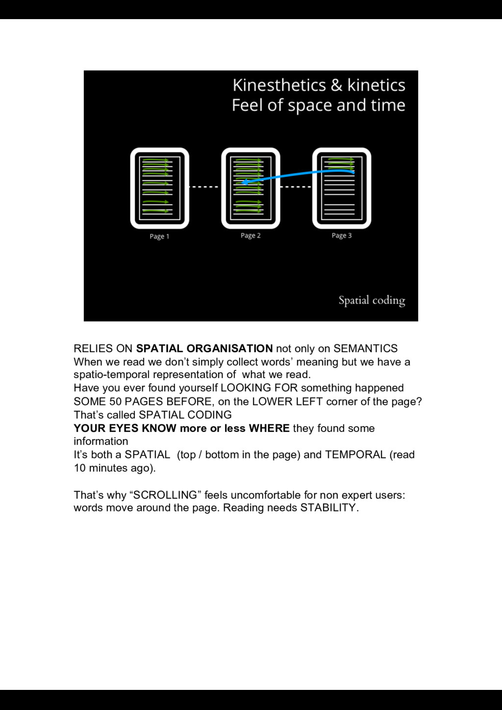
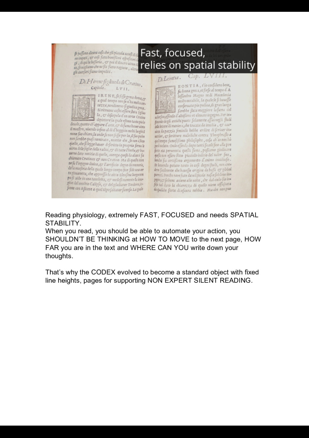
read we don’t simply collect words’ meaning but we have a spatio-temporal representation of what we read. Have you ever found yourself LOOKING FOR something happened SOME 50 PAGES BEFORE, on the LOWER LEFT corner of the page? That’s called SPATIAL CODING YOUR EYES KNOW more or less WHERE they found some information It’s both a SPATIAL (top / bottom in the page) and TEMPORAL (read 10 minutes ago). That’s why “SCROLLING” feels uncomfortable for non expert users: words move around the page. Reading needs STABILITY.
you read, you should be able to automate your action, you SHOULDN’T BE THINKING at HOW TO MOVE to the next page, HOW FAR you are in the text and WHERE CAN YOU write down your thoughts. That’s why the CODEX evolved to become a standard object with fixed line heights, pages for supporting NON EXPERT SILENT READING.
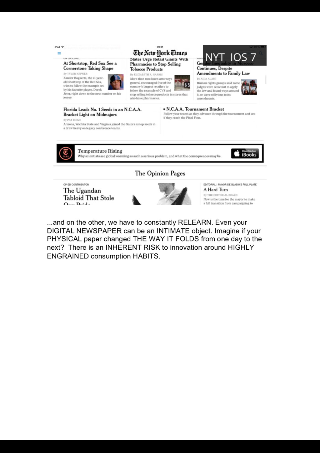
your DIGITAL NEWSPAPER can be an INTIMATE object. Imagine if your PHYSICAL paper changed THE WAY IT FOLDS from one day to the next? There is an INHERENT RISK to innovation around HIGHLY ENGRAINED consumption HABITS.
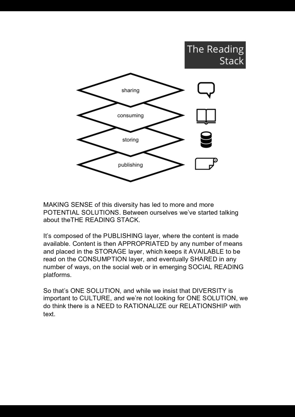
more POTENTIAL SOLUTIONS. Between ourselves we’ve started talking about theTHE READING STACK. It’s composed of the PUBLISHING layer, where the content is made available. Content is then APPROPRIATED by any number of means and placed in the STORAGE layer, which keeps it AVAILABLE to be read on the CONSUMPTION layer, and eventually SHARED in any number of ways, on the social web or in emerging SOCIAL READING platforms. So that’s ONE SOLUTION, and while we insist that DIVERSITY is important to CULTURE, and we’re not looking for ONE SOLUTION, we do think there is a NEED to RATIONALIZE our RELATIONSHIP with text.
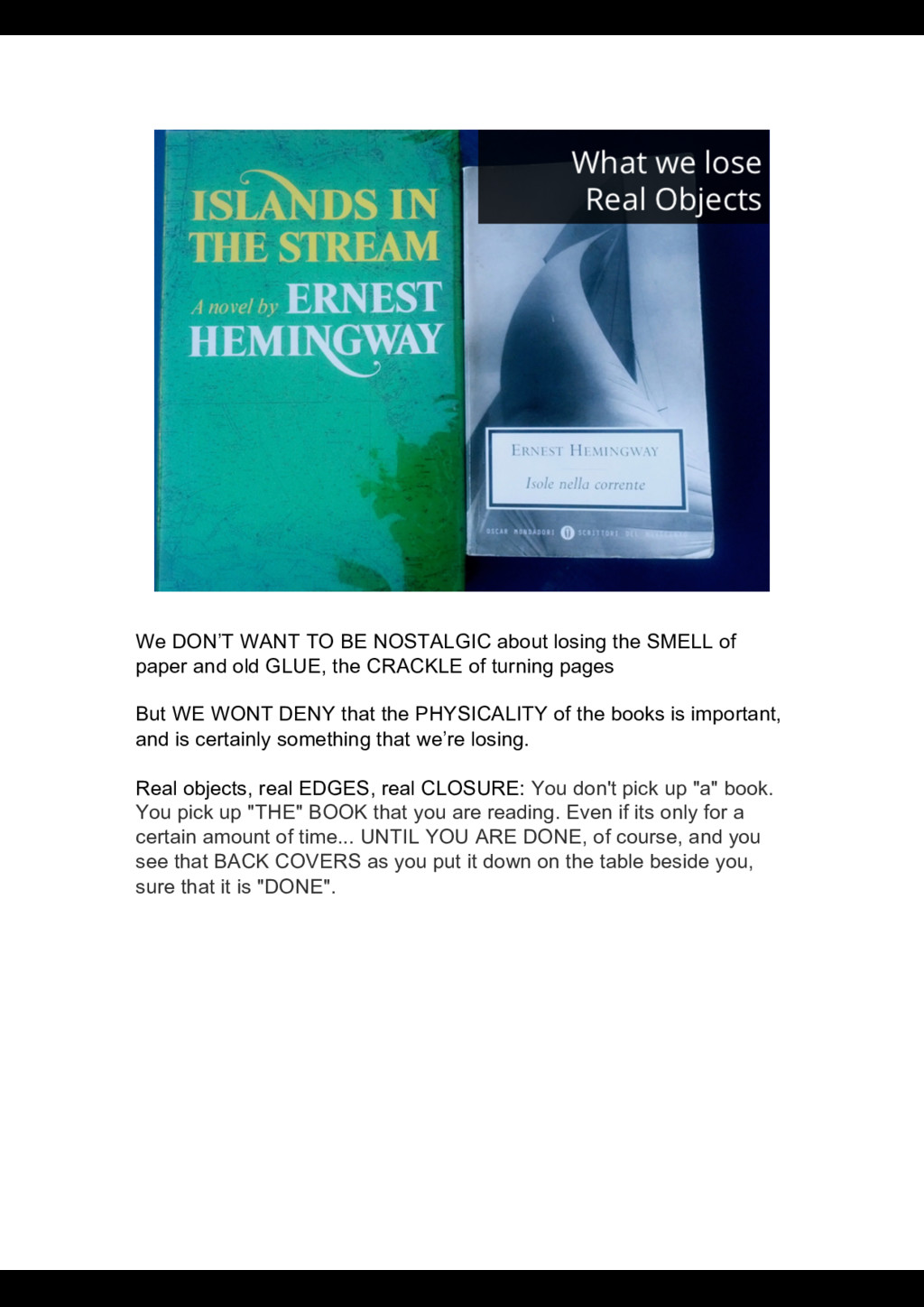
of paper and old GLUE, the CRACKLE of turning pages But WE WONT DENY that the PHYSICALITY of the books is important, and is certainly something that we’re losing. Real objects, real EDGES, real CLOSURE: You don't pick up "a" book. You pick up "THE" BOOK that you are reading. Even if its only for a certain amount of time... UNTIL YOU ARE DONE, of course, and you see that BACK COVERS as you put it down on the table beside you, sure that it is "DONE".
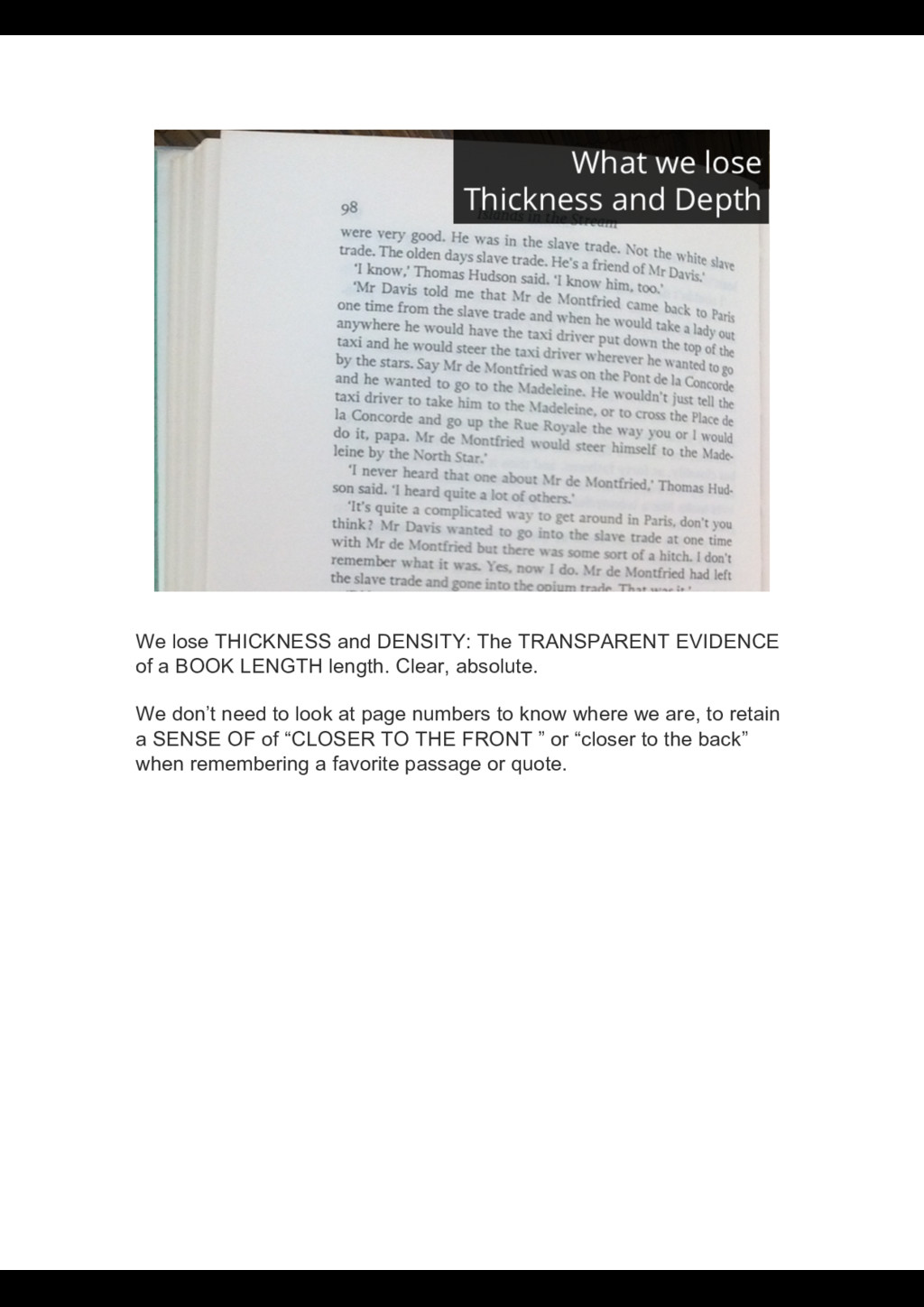
BOOK LENGTH length. Clear, absolute. We don’t need to look at page numbers to know where we are, to retain a SENSE OF of “CLOSER TO THE FRONT ” or “closer to the back” when remembering a favorite passage or quote.
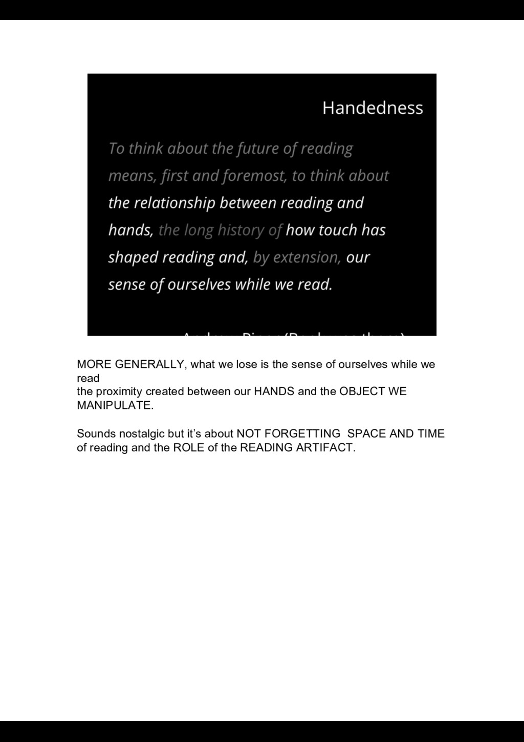
while we read the proximity created between our HANDS and the OBJECT WE MANIPULATE. Sounds nostalgic but it’s about NOT FORGETTING SPACE AND TIME of reading and the ROLE of the READING ARTIFACT.
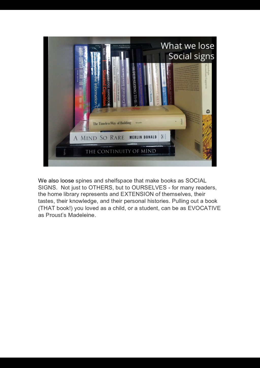
SOCIAL SIGNS. Not just to OTHERS, but to OURSELVES - for many readers, the home library represents and EXTENSION of themselves, their tastes, their knowledge, and their personal histories. Pulling out a book (THAT book!) you loved as a child, or a student, can be as EVOCATIVE as Proust’s Madeleine.
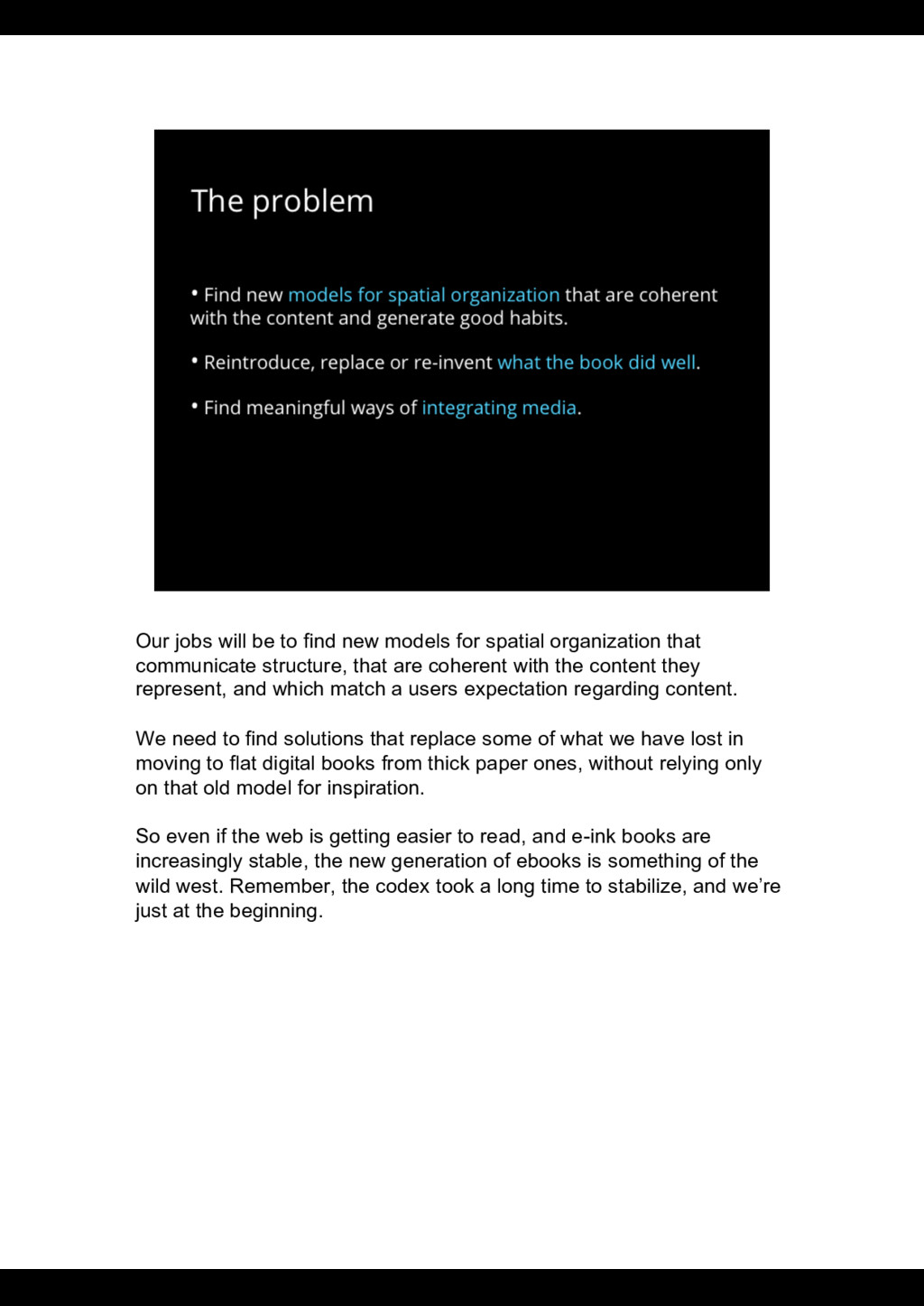
organization that communicate structure, that are coherent with the content they represent, and which match a users expectation regarding content. We need to find solutions that replace some of what we have lost in moving to flat digital books from thick paper ones, without relying only on that old model for inspiration. So even if the web is getting easier to read, and e-ink books are increasingly stable, the new generation of ebooks is something of the wild west. Remember, the codex took a long time to stabilize, and we’re just at the beginning.
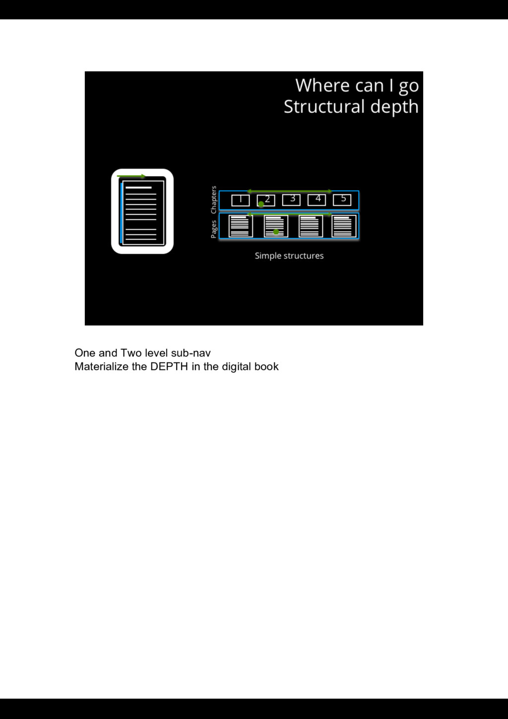
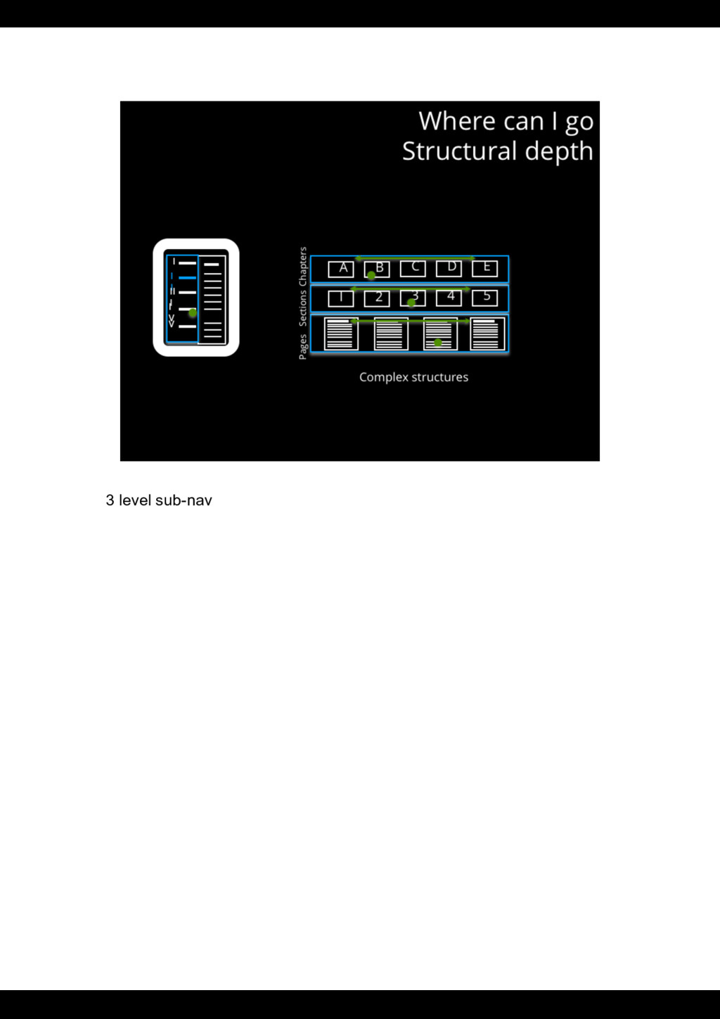
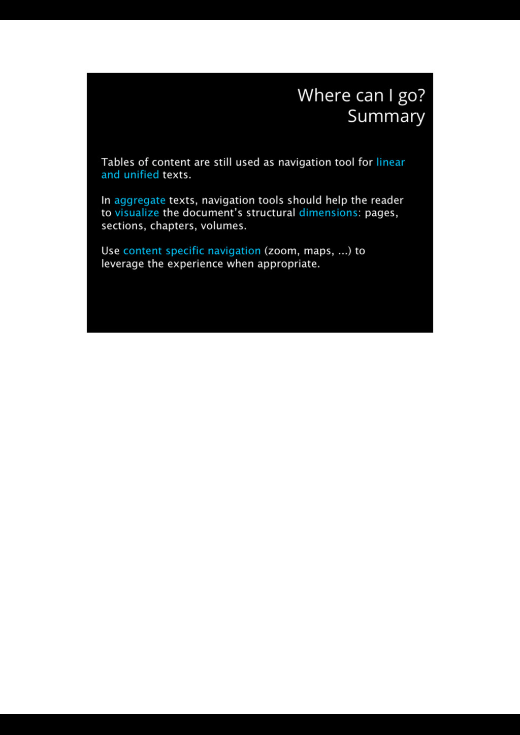
Even if its death as such is not a problem, WE STILL NEED solutions for ESTABLISHING a rhythm and ORGANIZING CONTENT. WHAT is the unit, HOW do you move from UNIT to UNIT, across chapters or through the text ? HOW DO YOU VISUALIZE POSITION when the book thickness is no more an option ? The BOOK HAD SOLUTIONS for most of this questions as it evolved over centuries to fit our way of reading. HOW TO communicate the DIMENSIONS of a FLAT OBJECT ?
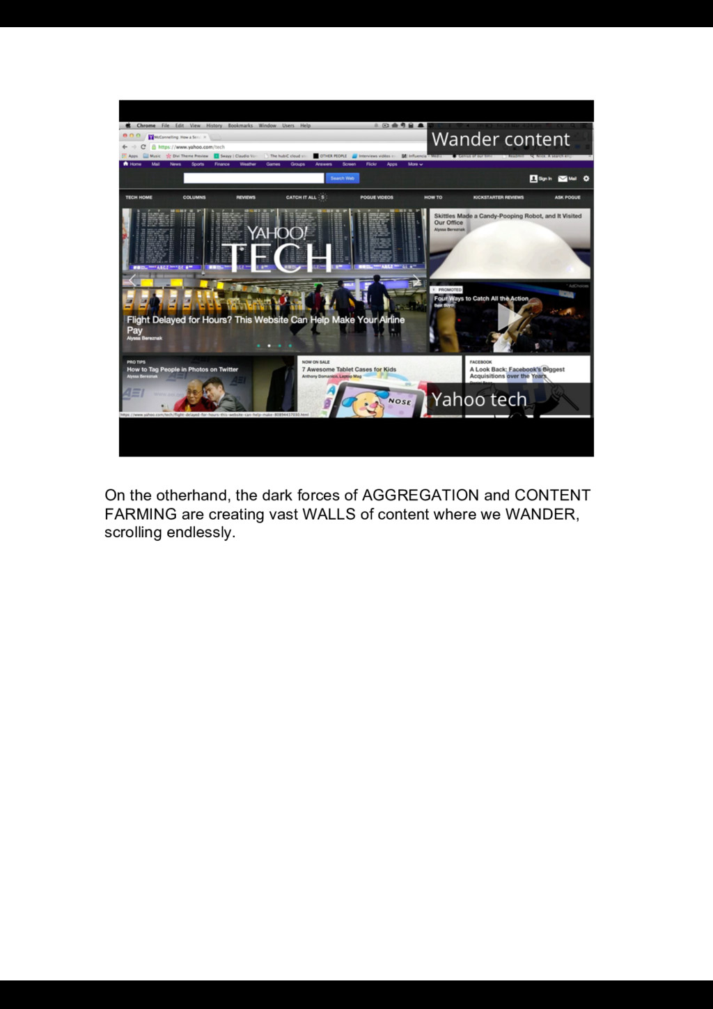
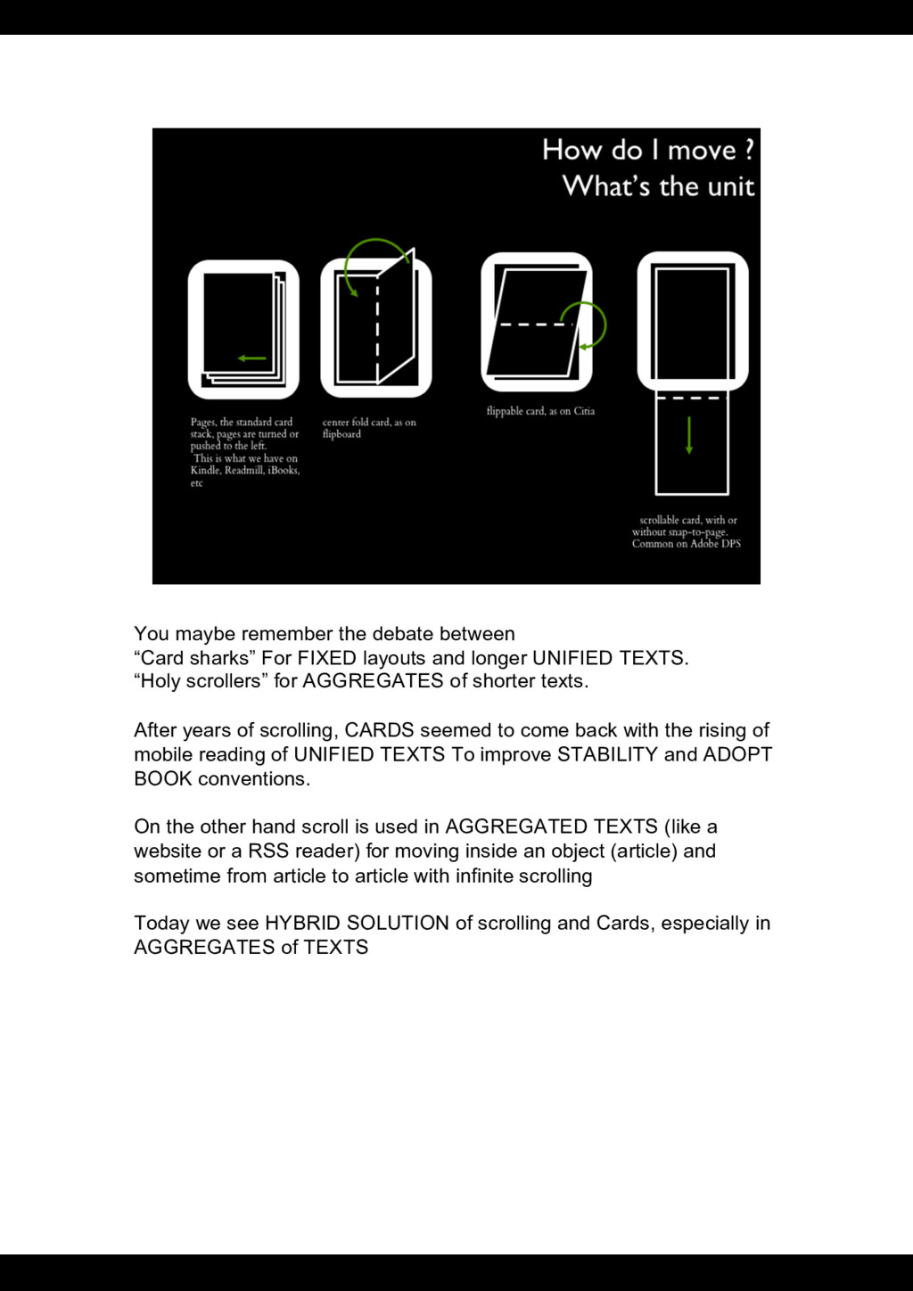
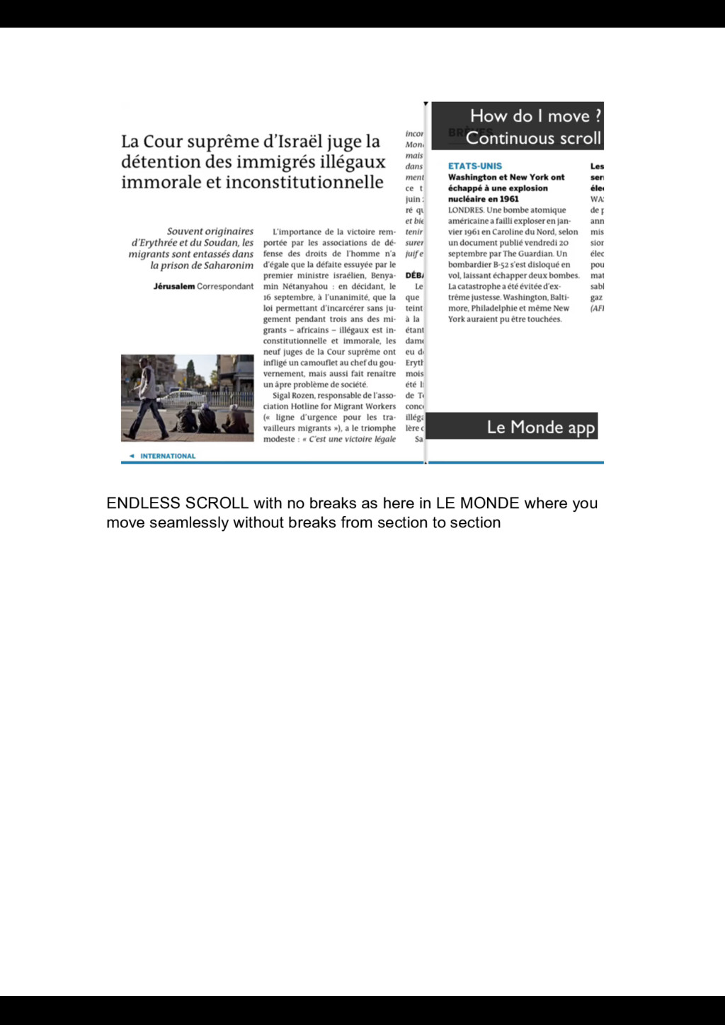
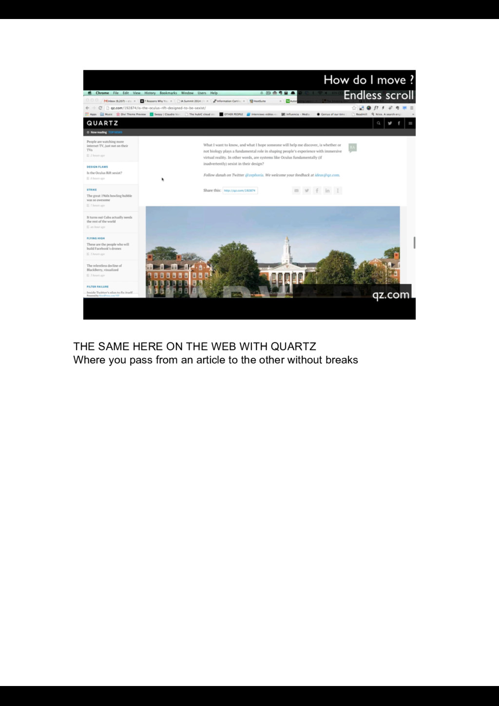
layouts and longer UNIFIED TEXTS. “Holy scrollers” for AGGREGATES of shorter texts. After years of scrolling, CARDS seemed to come back with the rising of mobile reading of UNIFIED TEXTS To improve STABILITY and ADOPT BOOK conventions. On the other hand scroll is used in AGGREGATED TEXTS (like a website or a RSS reader) for moving inside an object (article) and sometime from article to article with infinite scrolling Today we see HYBRID SOLUTION of scrolling and Cards, especially in AGGREGATES of TEXTS
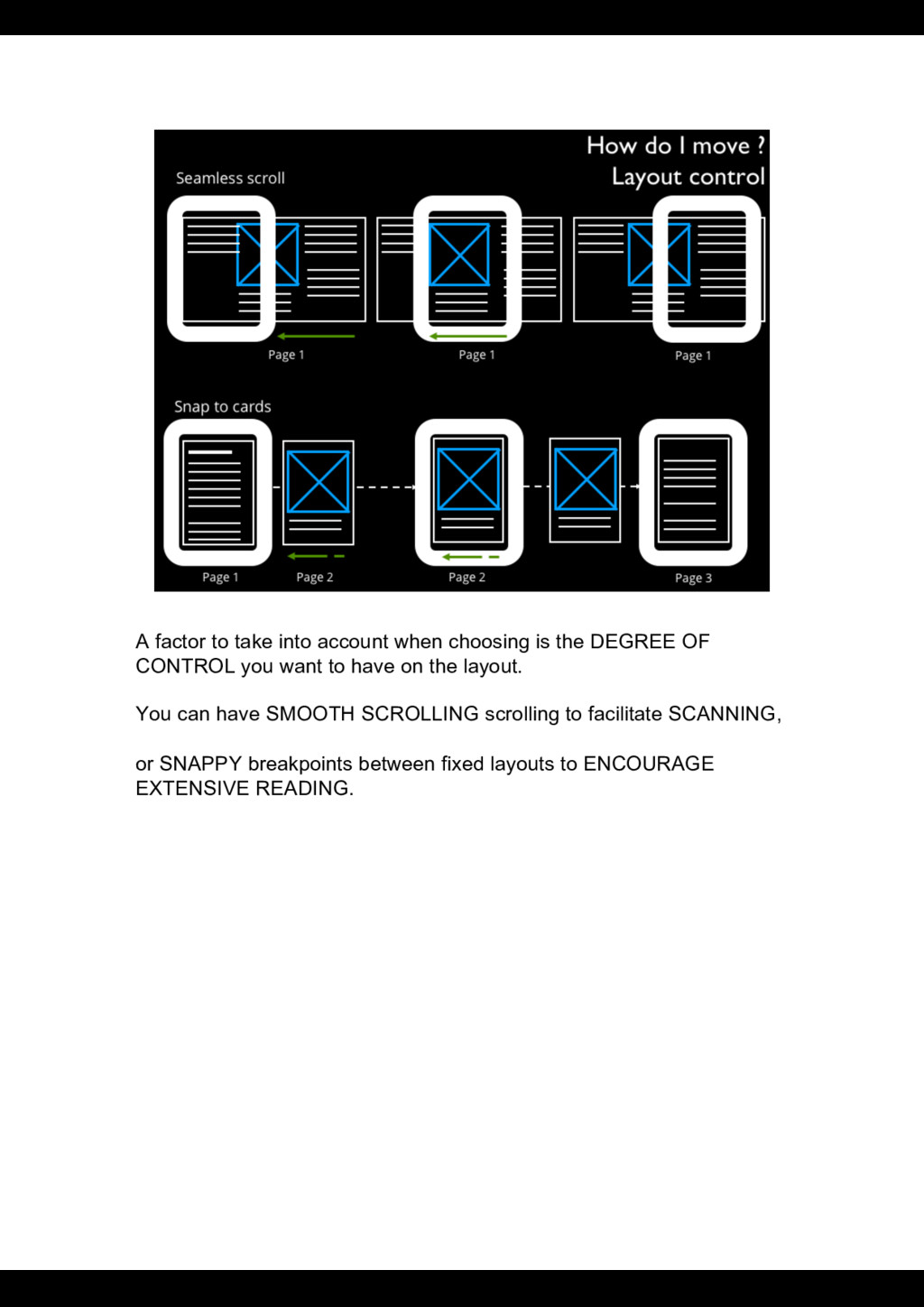
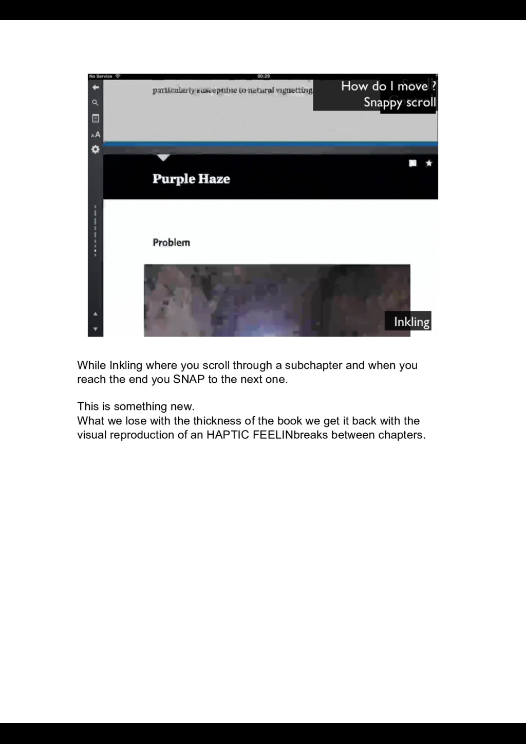
DEGREE OF CONTROL you want to have on the layout. You can have SMOOTH SCROLLING scrolling to facilitate SCANNING, or SNAPPY breakpoints between fixed layouts to ENCOURAGE EXTENSIVE READING.
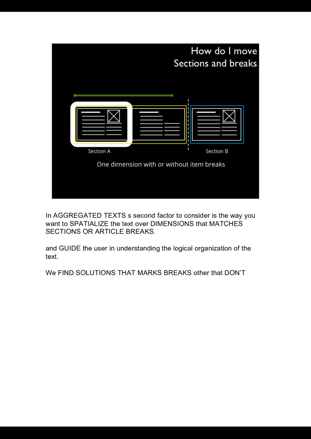
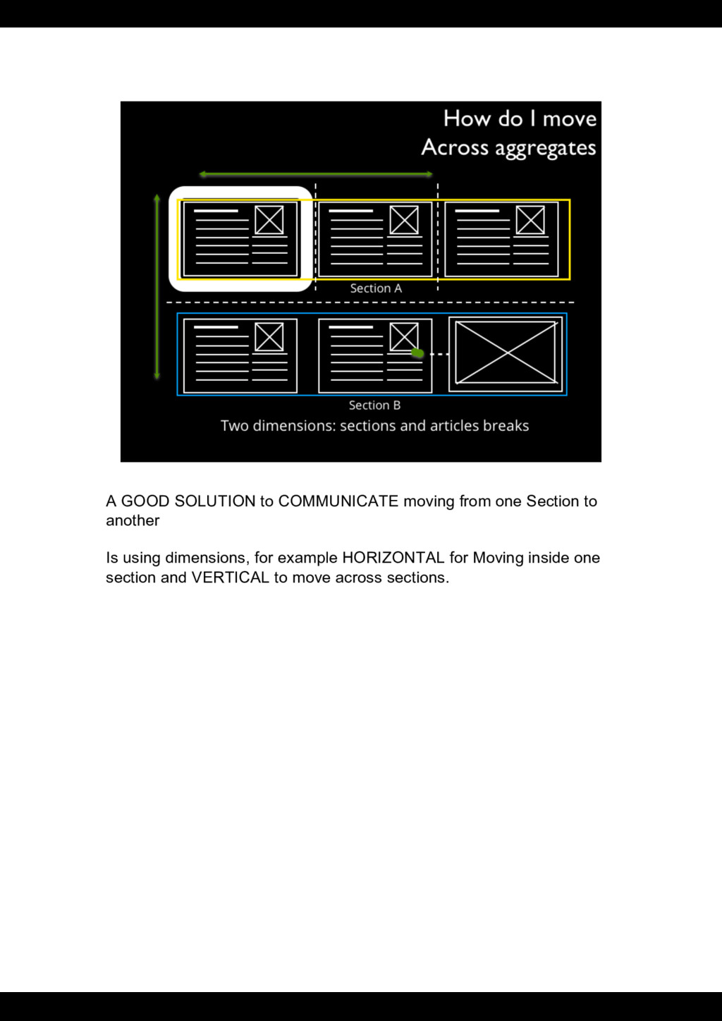
way you want to SPATIALIZE the text over DIMENSIONS that MATCHES SECTIONS OR ARTICLE BREAKS. and GUIDE the user in understanding the logical organization of the text. We FIND SOLUTIONS THAT MARKS BREAKS other that DON’T
you reach the end you SNAP to the next one. This is something new. What we lose with the thickness of the book we get it back with the visual reproduction of an HAPTIC FEELINbreaks between chapters.
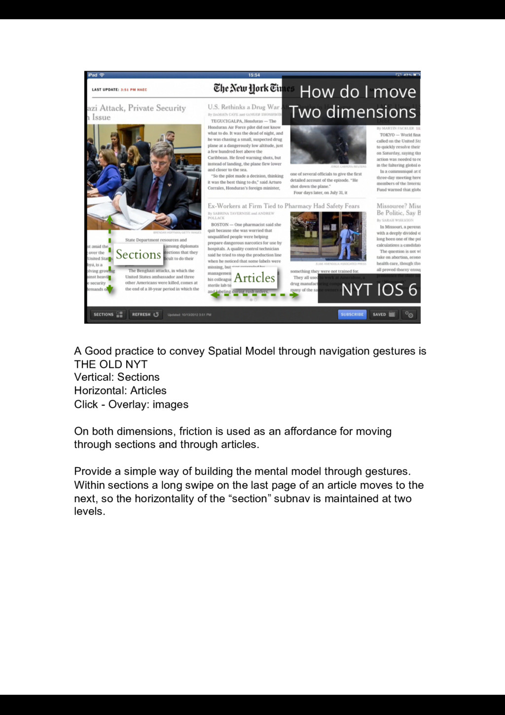
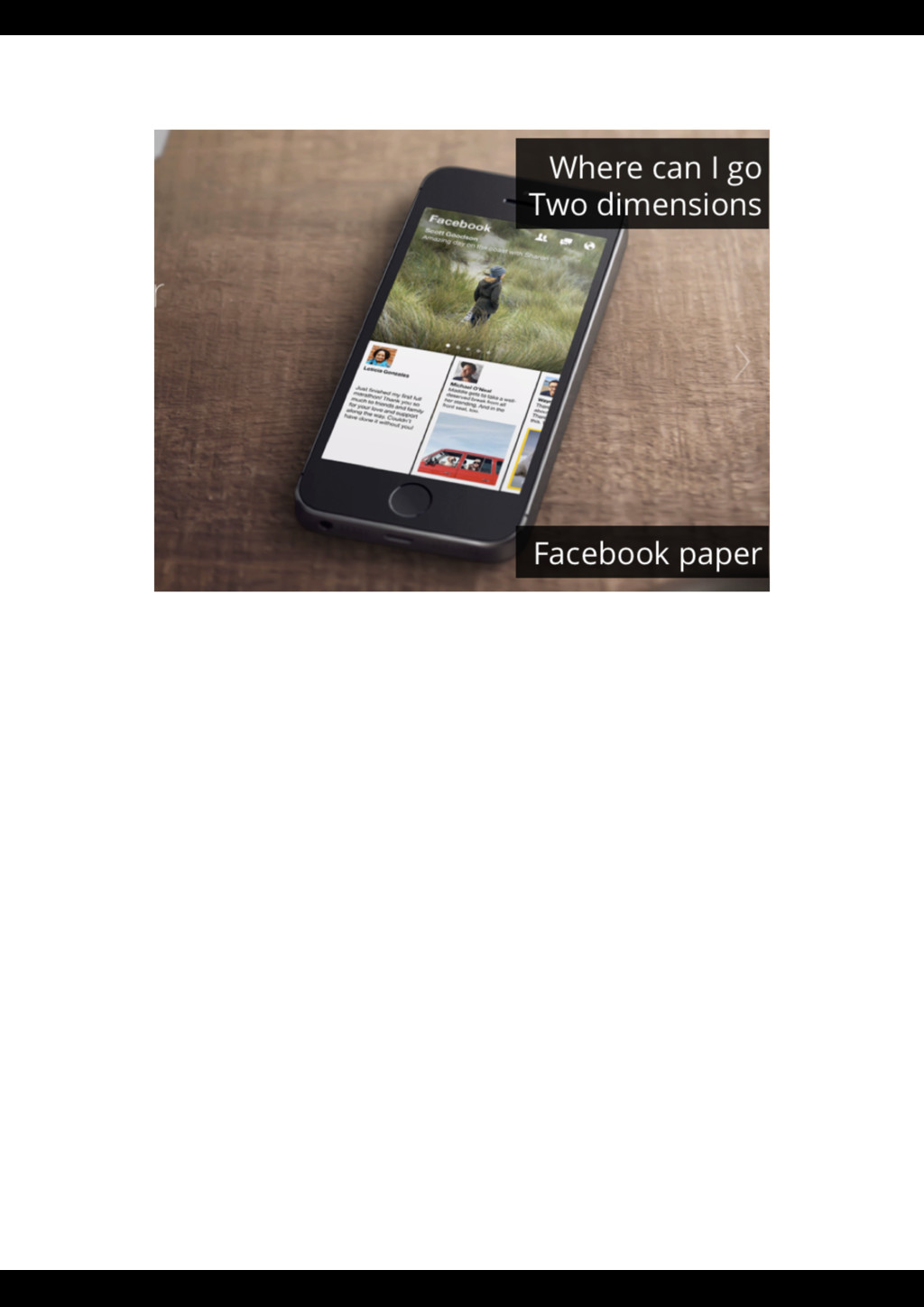
is THE OLD NYT Vertical: Sections Horizontal: Articles Click - Overlay: images On both dimensions, friction is used as an affordance for moving through sections and through articles. Provide a simple way of building the mental model through gestures. Within sections a long swipe on the last page of an article moves to the next, so the horizontality of the “section” subnav is maintained at two levels.
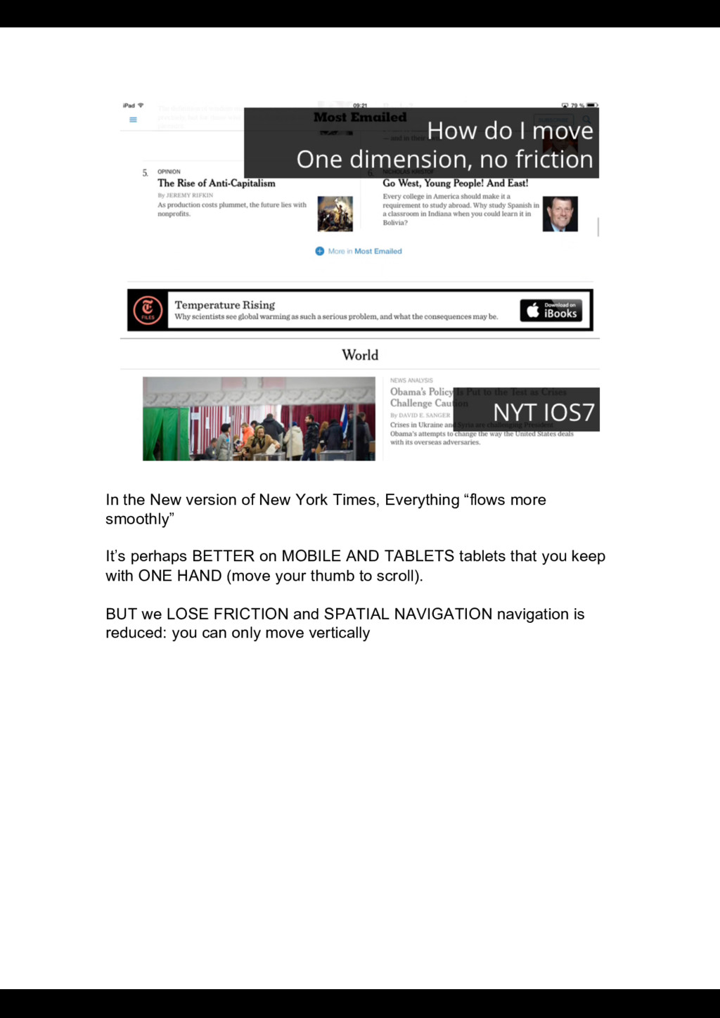
more smoothly” It’s perhaps BETTER on MOBILE AND TABLETS tablets that you keep with ONE HAND (move your thumb to scroll). BUT we LOSE FRICTION and SPATIAL NAVIGATION navigation is reduced: you can only move vertically
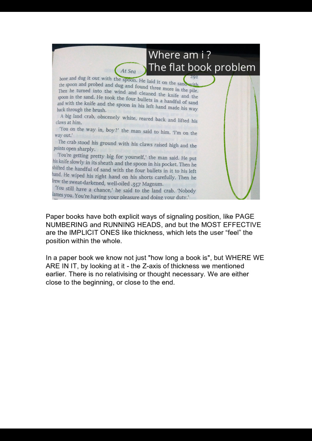
PAGE NUMBERING and RUNNING HEADS, and but the MOST EFFECTIVE are the IMPLICIT ONES like thickness, which lets the user “feel” the position within the whole. In a paper book we know not just "how long a book is", but WHERE WE ARE IN IT, by looking at it - the Z-axis of thickness we mentioned earlier. There is no relativising or thought necessary. We are either close to the beginning, or close to the end.
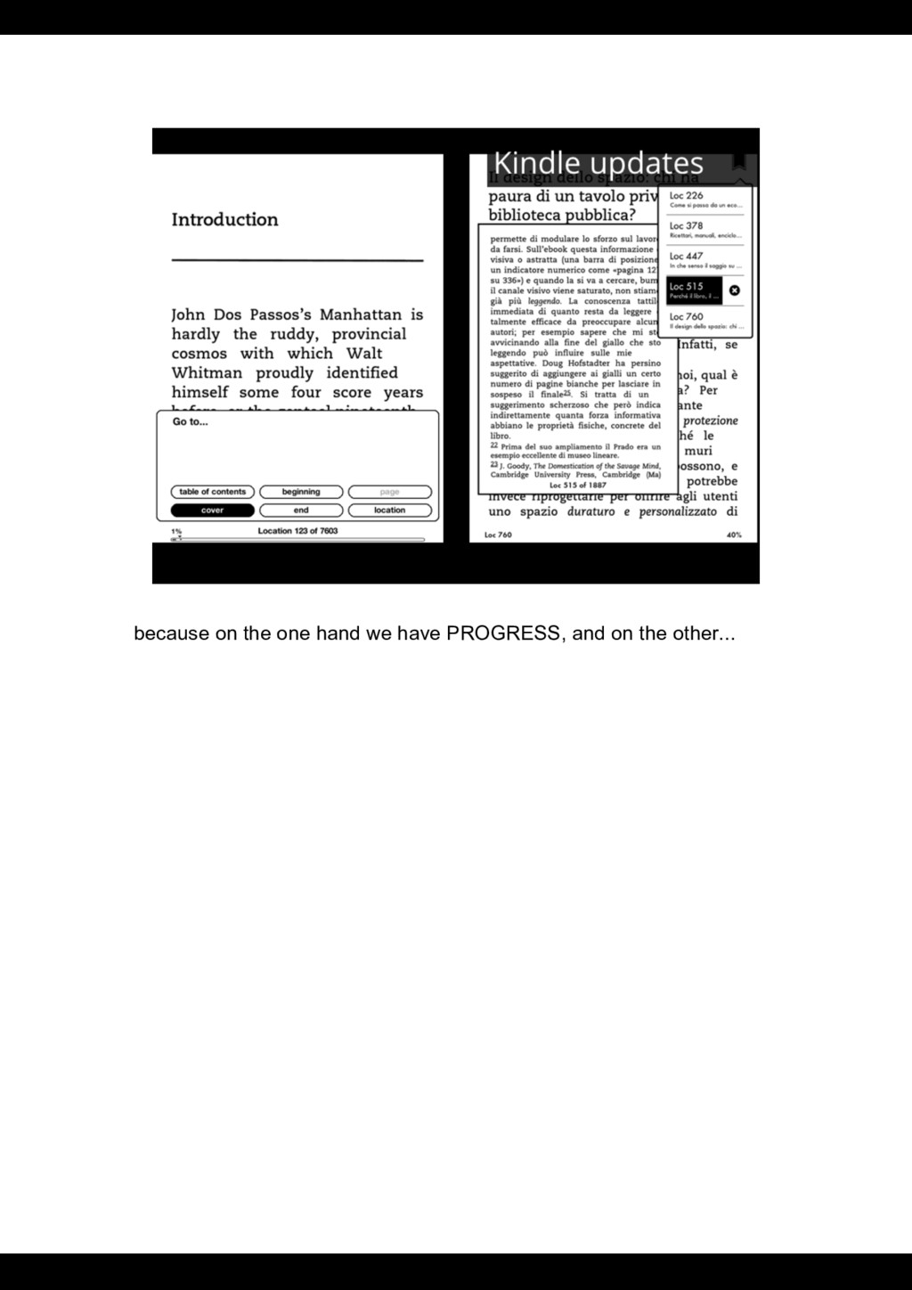
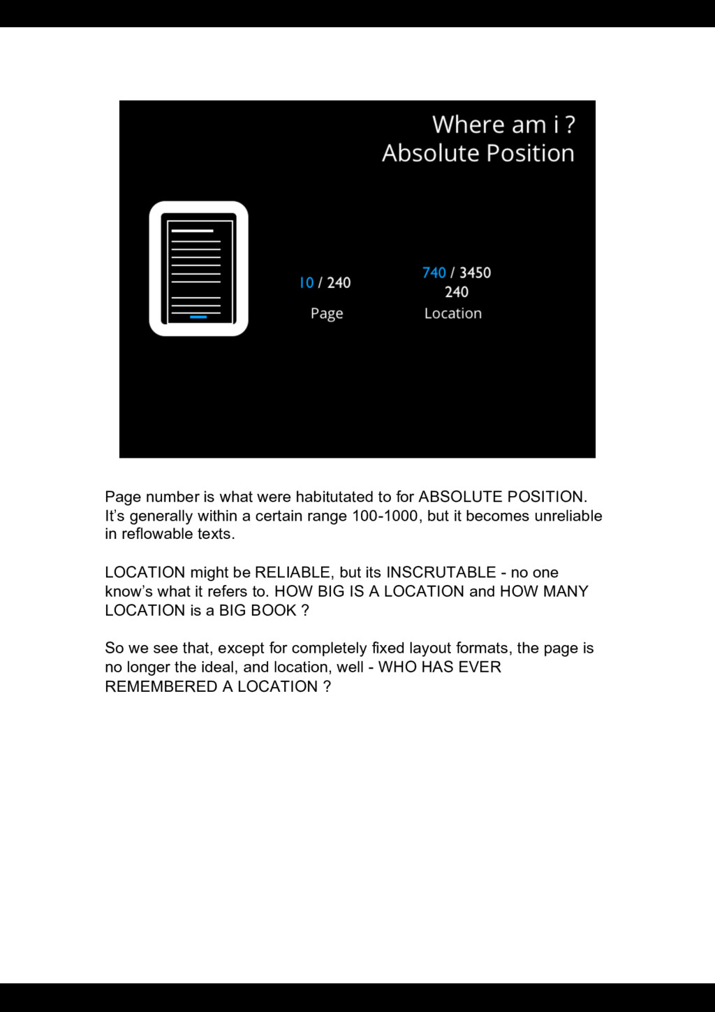
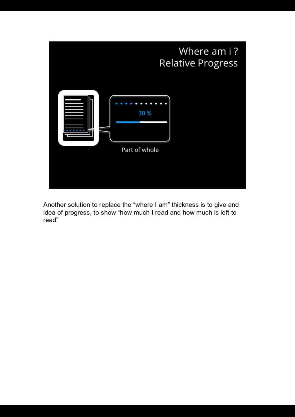
It’s generally within a certain range 100-1000, but it becomes unreliable in reflowable texts. LOCATION might be RELIABLE, but its INSCRUTABLE - no one know’s what it refers to. HOW BIG IS A LOCATION and HOW MANY LOCATION is a BIG BOOK ? So we see that, except for completely fixed layout formats, the page is no longer the ideal, and location, well - WHO HAS EVER REMEMBERED A LOCATION ?
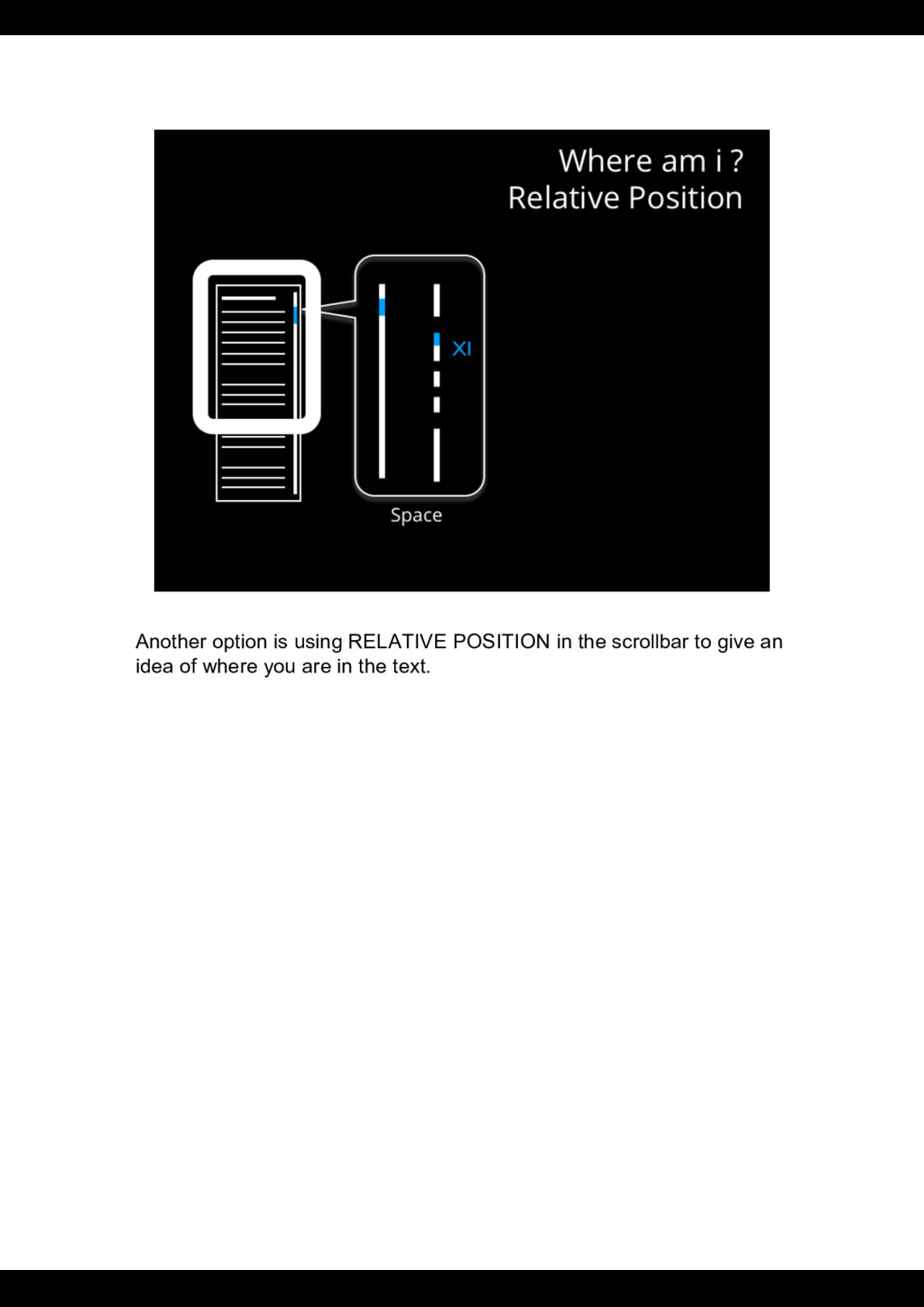
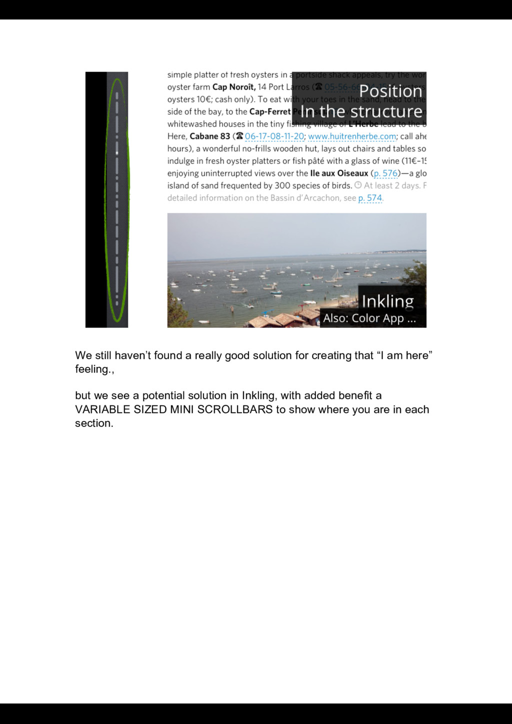
that “I am here” feeling., but we see a potential solution in Inkling, with added benefit a VARIABLE SIZED MINI SCROLLBARS to show where you are in each section.
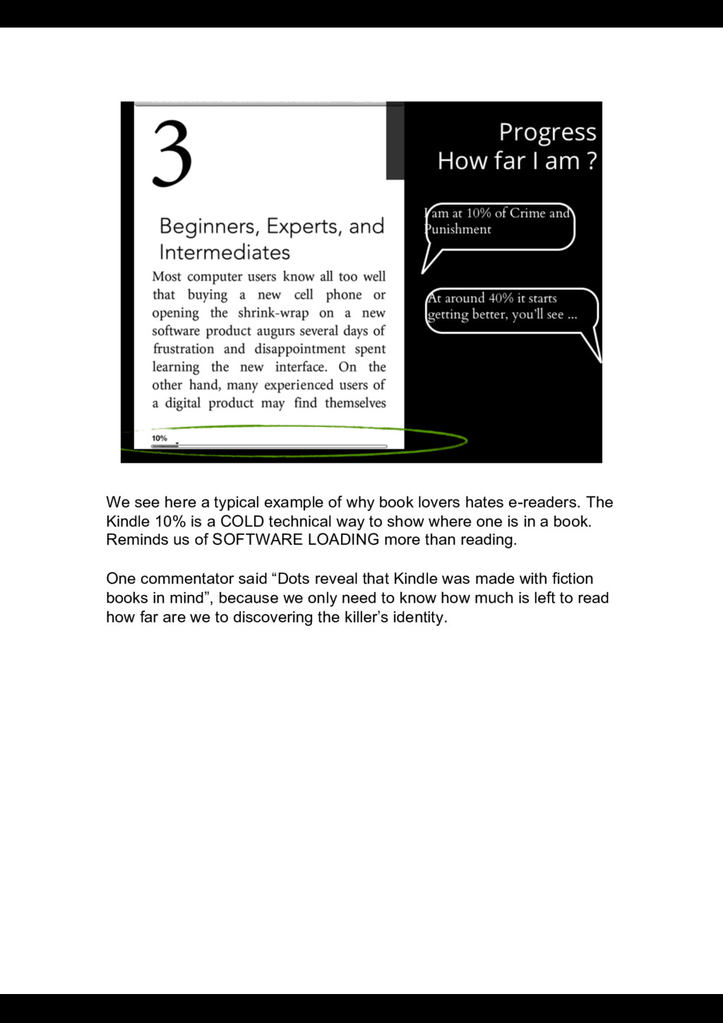
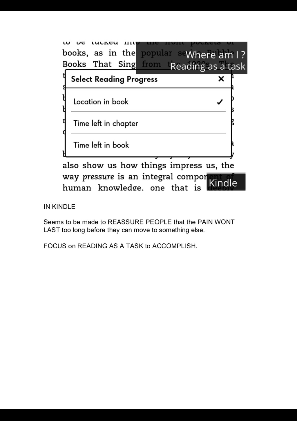
hates e-readers. The Kindle 10% is a COLD technical way to show where one is in a book. Reminds us of SOFTWARE LOADING more than reading. One commentator said “Dots reveal that Kindle was made with fiction books in mind”, because we only need to know how much is left to read how far are we to discovering the killer’s identity.
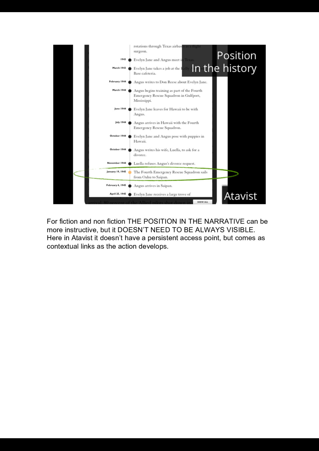
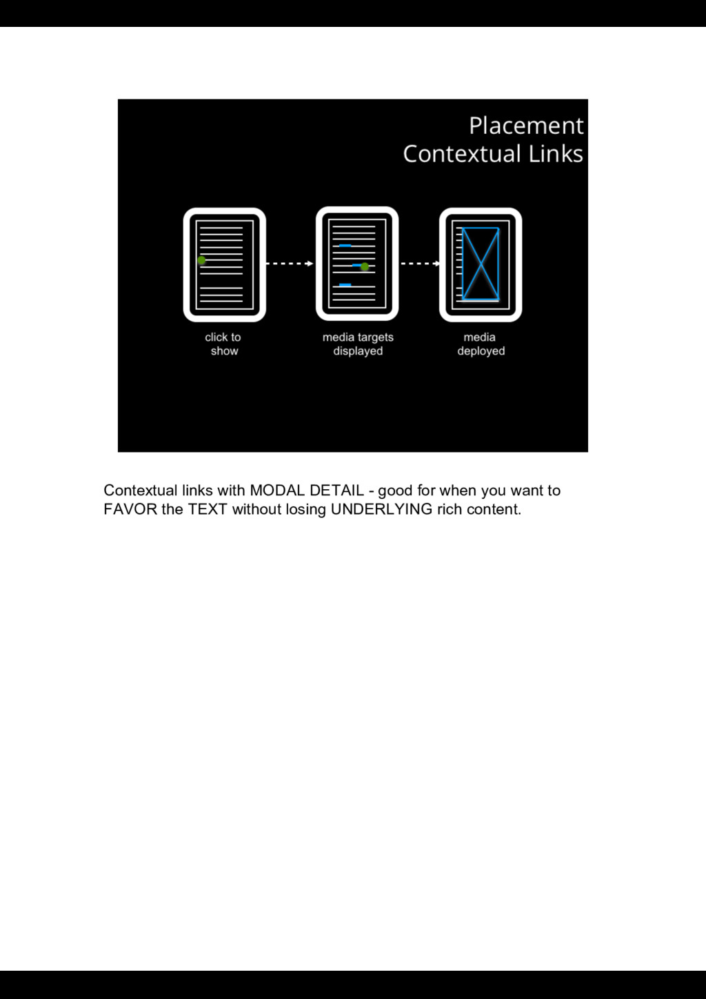
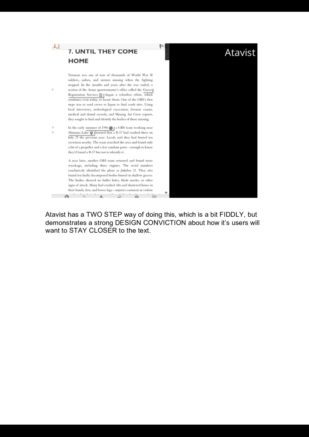
can be more instructive, but it DOESN’T NEED TO BE ALWAYS VISIBLE. Here in Atavist it doesn’t have a persistent access point, but comes as contextual links as the action develops.
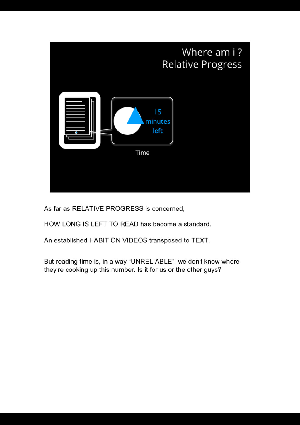
LEFT TO READ has become a standard. An established HABIT ON VIDEOS transposed to TEXT. But reading time is, in a way “UNRELIABLE”: we don't know where they're cooking up this number. Is it for us or the other guys?
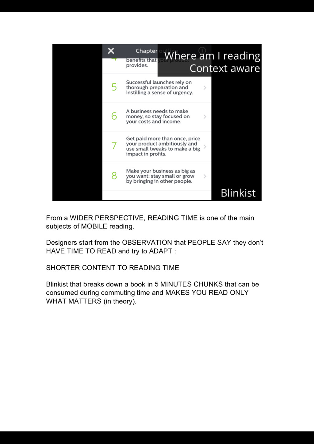
main subjects of MOBILE reading. Designers start from the OBSERVATION that PEOPLE SAY they don’t HAVE TIME TO READ and try to ADAPT : SHORTER CONTENT TO READING TIME Blinkist that breaks down a book in 5 MINUTES CHUNKS that can be consumed during commuting time and MAKES YOU READ ONLY WHAT MATTERS (in theory).
since we deal with DIGITAL content the ANSWER COULD BE ANYWHERE the World Wide Web is there for you ! However, we know that when reading, some GUIDANCE CAN BE USEFUL in an intentionally engaged space. LEARNING and MEMORIZING are IMPROVED when you CAN ORGANIZE INFORMATION IN LOGICAL CHUNKS. That’s what sections and chapters are about. Digital texts offer NEW WAYS OF MOVING THROUGH THE TEXT in LINEAR WAY or THROUGH different DIMENSIONS.
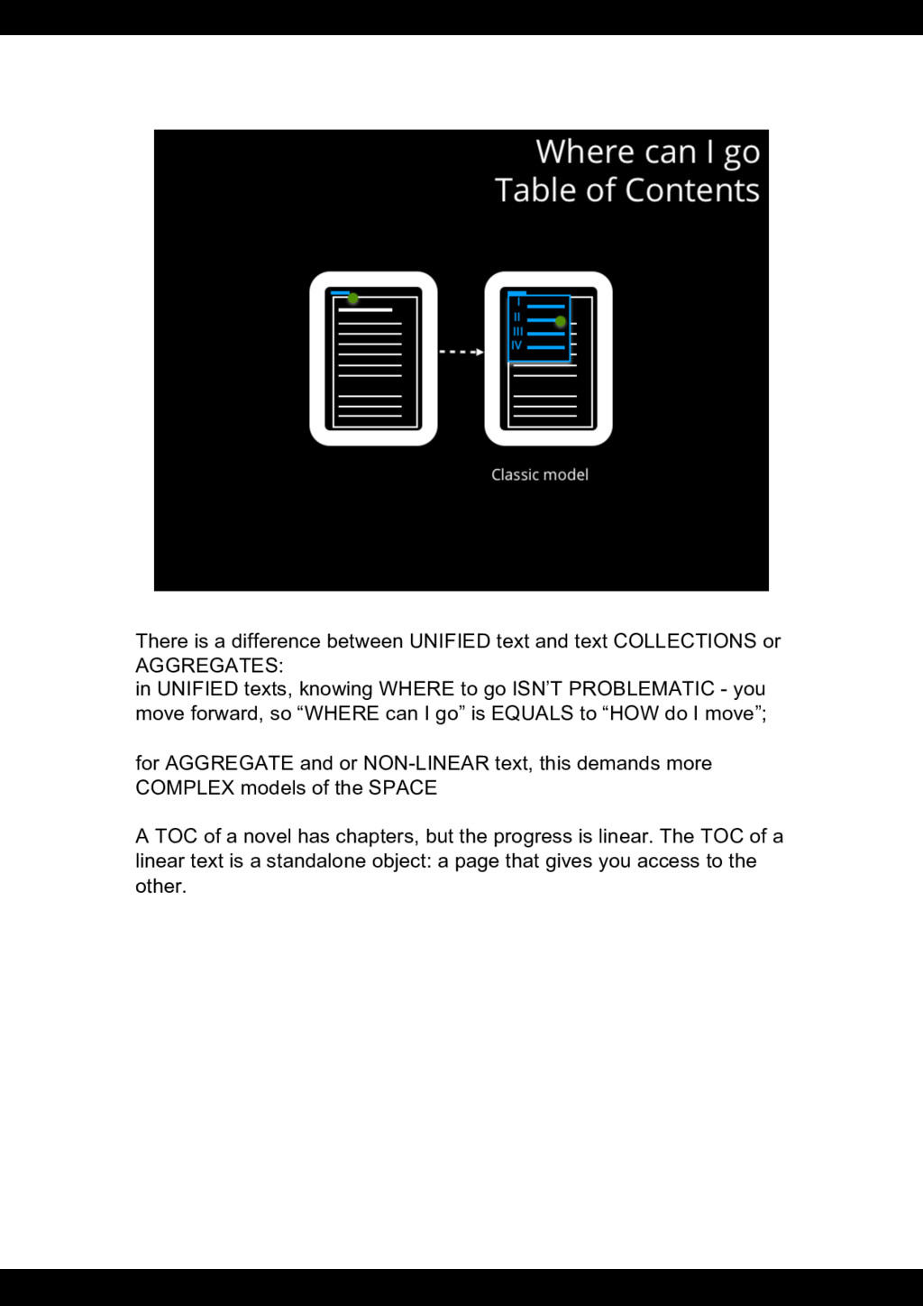
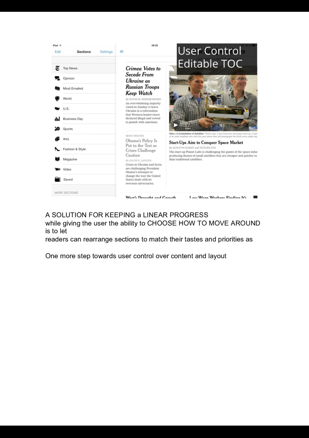
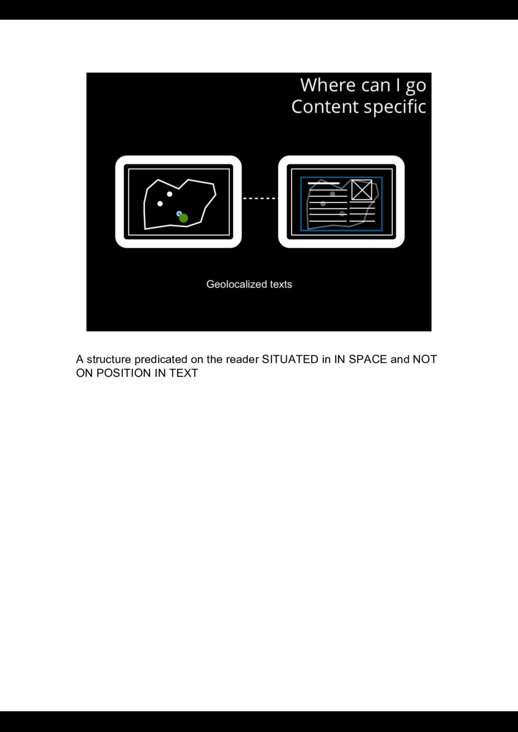
or AGGREGATES: in UNIFIED texts, knowing WHERE to go ISN’T PROBLEMATIC - you move forward, so “WHERE can I go” is EQUALS to “HOW do I move”; for AGGREGATE and or NON-LINEAR text, this demands more COMPLEX models of the SPACE A TOC of a novel has chapters, but the progress is linear. The TOC of a linear text is a standalone object: a page that gives you access to the other.
user the ability to CHOOSE HOW TO MOVE AROUND is to let readers can rearrange sections to match their tastes and priorities as One more step towards user control over content and layout
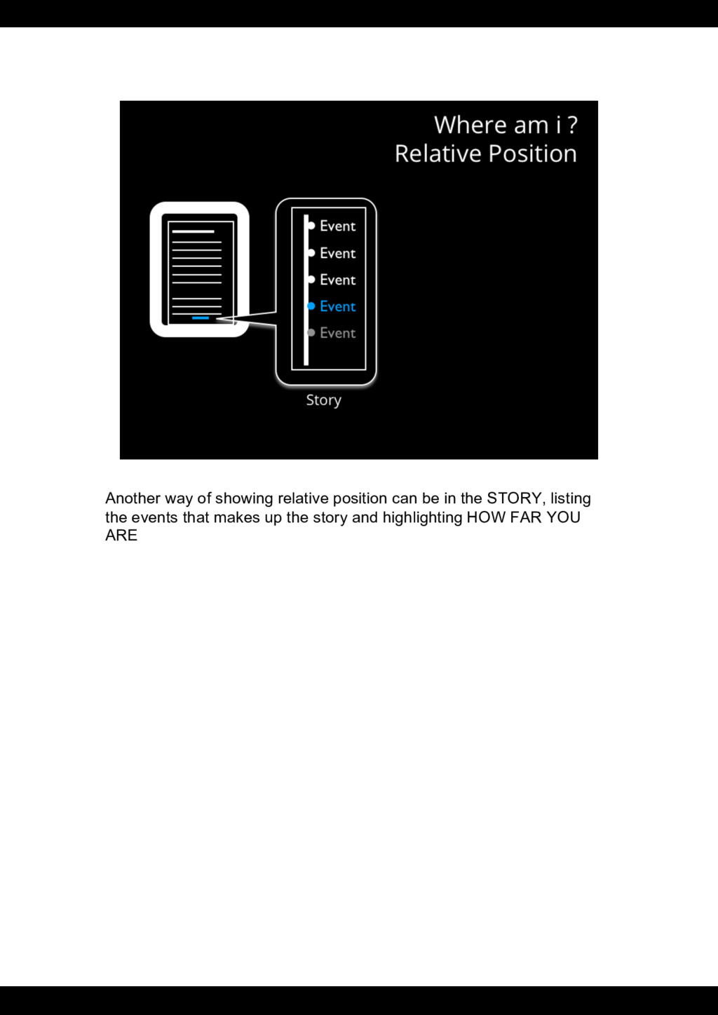
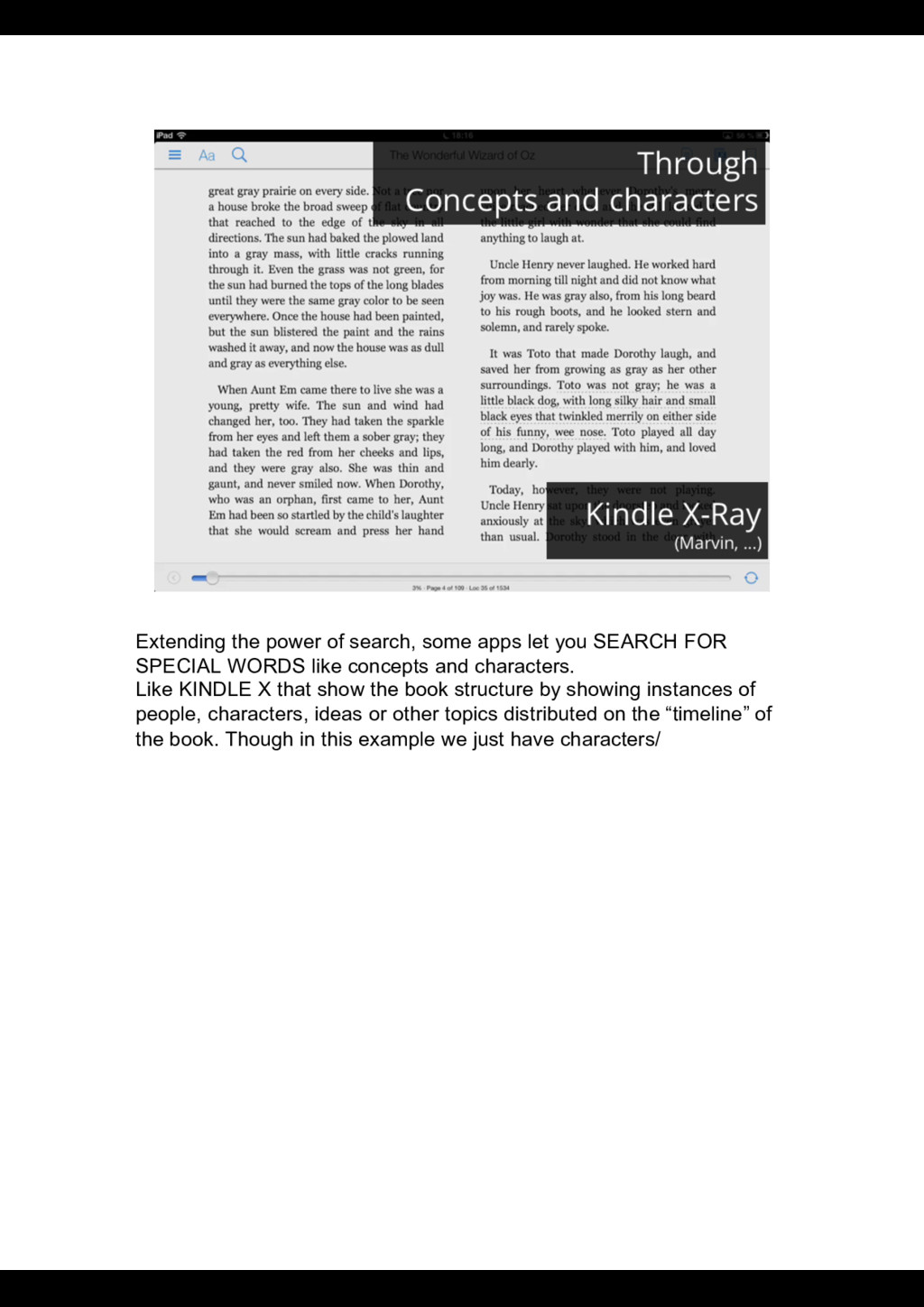
FOR SPECIAL WORDS like concepts and characters. Like KINDLE X that show the book structure by showing instances of people, characters, ideas or other topics distributed on the “timeline” of the book. Though in this example we just have characters/
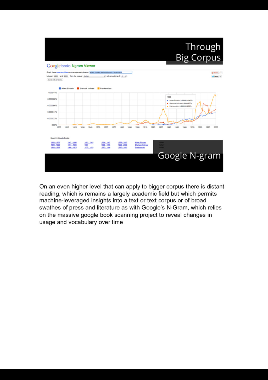
corpus there is distant reading, which is remains a largely academic field but which permits machine-leveraged insights into a text or text corpus or of broad swathes of press and literature as with Google’s N-Gram, which relies on the massive google book scanning project to reveal changes in usage and vocabulary over time
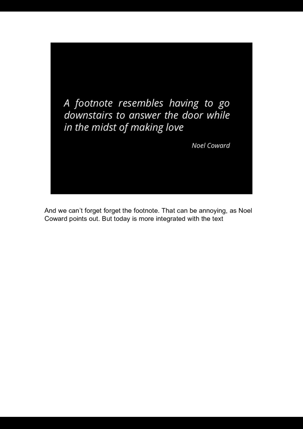
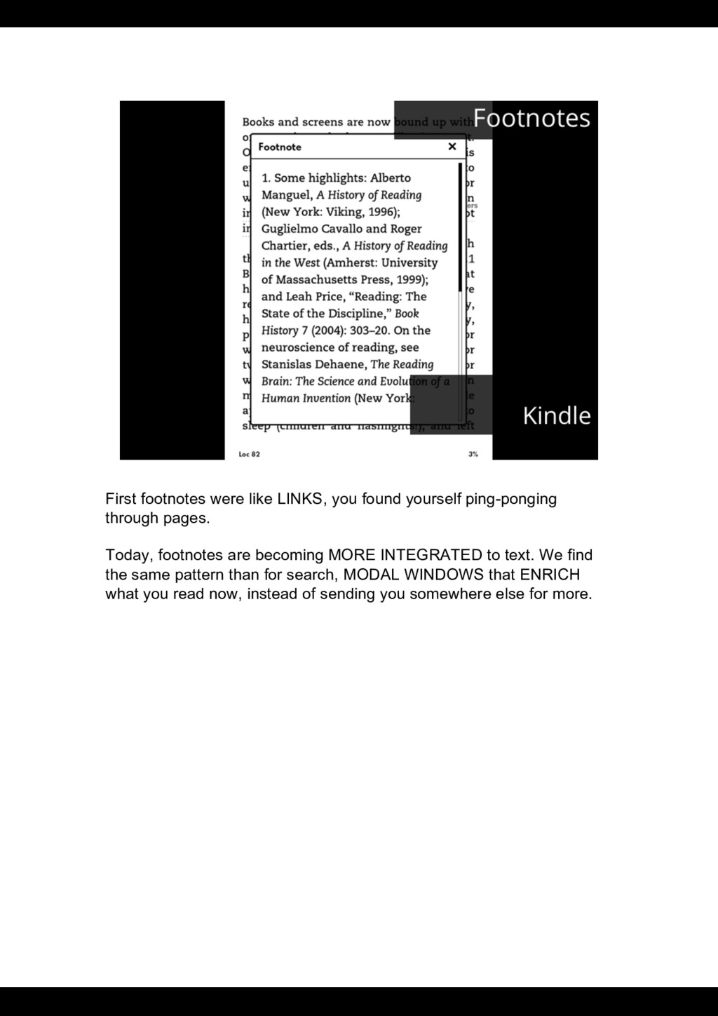
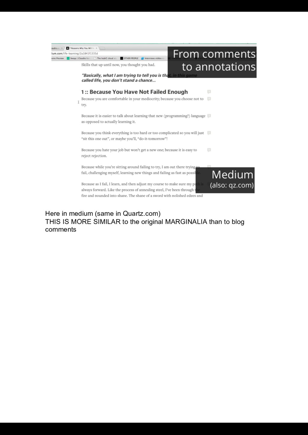
pages. Today, footnotes are becoming MORE INTEGRATED to text. We find the same pattern than for search, MODAL WINDOWS that ENRICH what you read now, instead of sending you somewhere else for more.
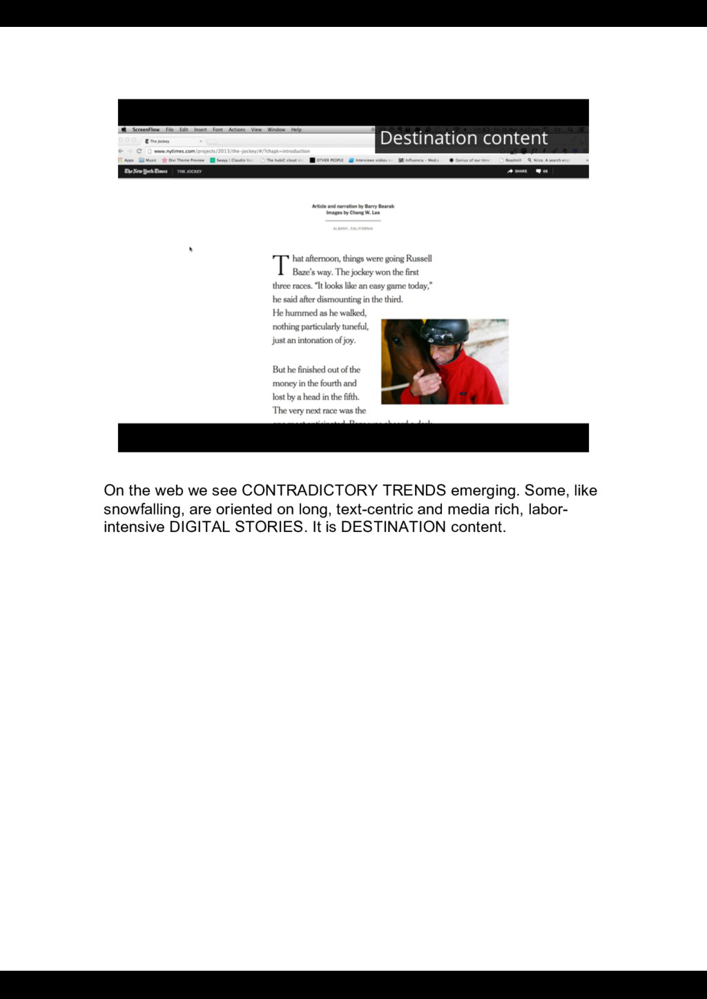
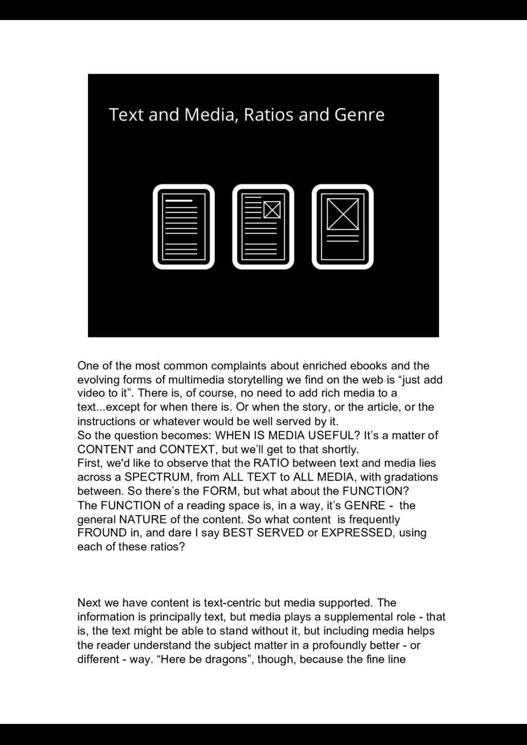
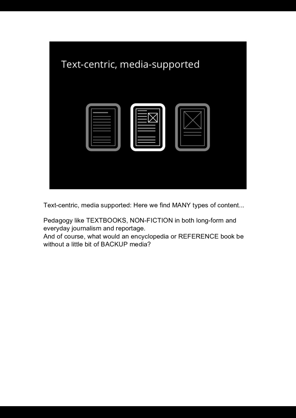
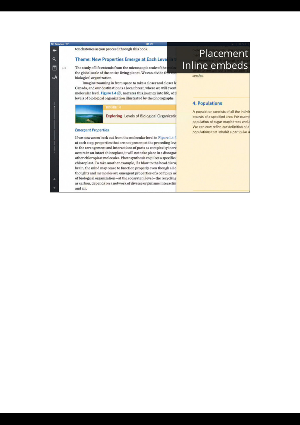
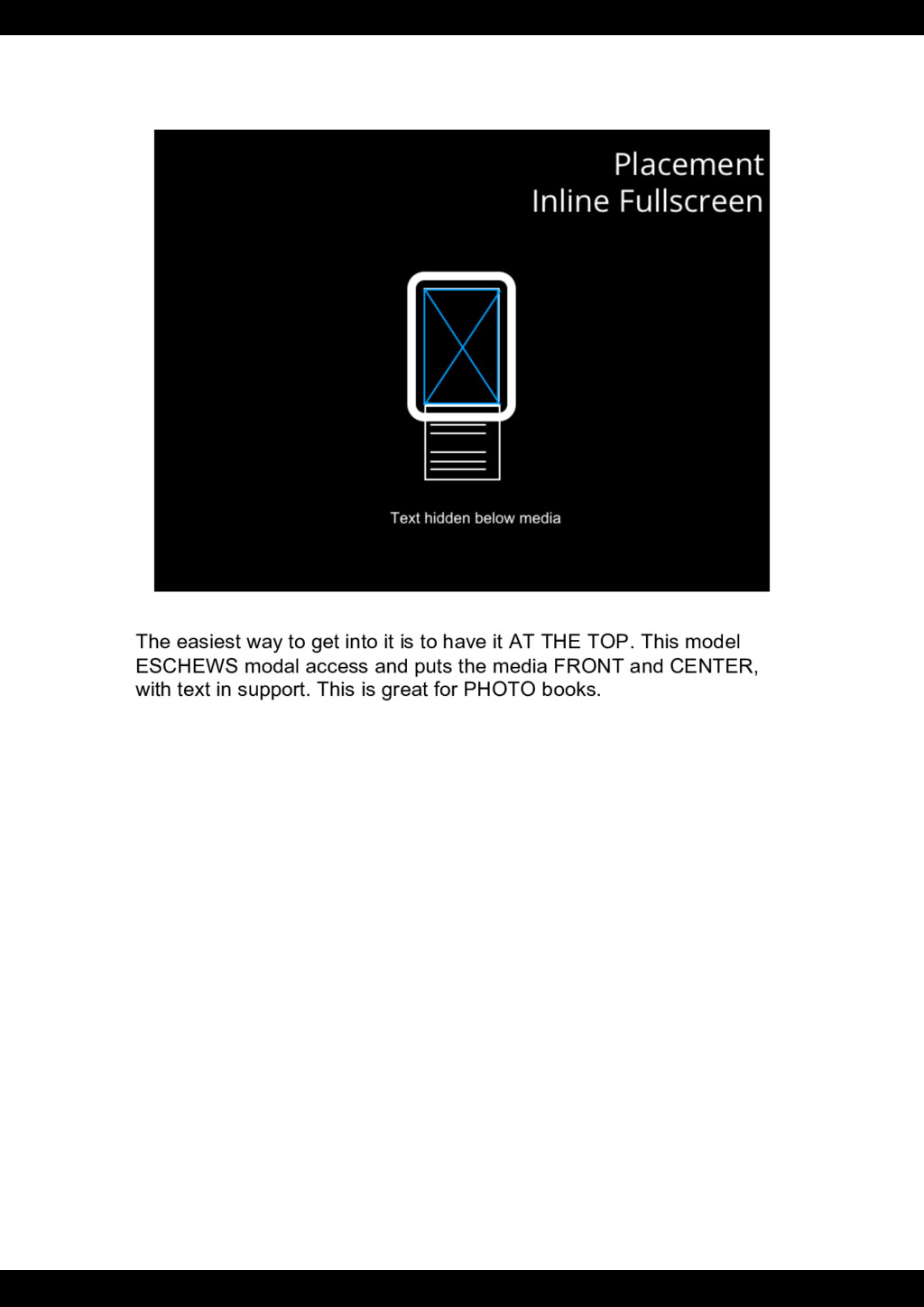
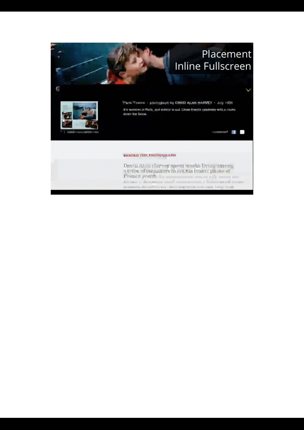
the evolving forms of multimedia storytelling we find on the web is “just add video to it”. There is, of course, no need to add rich media to a text...except for when there is. Or when the story, or the article, or the instructions or whatever would be well served by it. So the question becomes: WHEN IS MEDIA USEFUL? It’s a matter of CONTENT and CONTEXT, but we’ll get to that shortly. First, we'd like to observe that the RATIO between text and media lies across a SPECTRUM, from ALL TEXT to ALL MEDIA, with gradations between. So there’s the FORM, but what about the FUNCTION? The FUNCTION of a reading space is, in a way, it’s GENRE - the general NATURE of the content. So what content is frequently FROUND in, and dare I say BEST SERVED or EXPRESSED, using each of these ratios? Next we have content is text-centric but media supported. The information is principally text, but media plays a supplemental role - that is, the text might be able to stand without it, but including media helps the reader understand the subject matter in a profoundly better - or different - way. “Here be dragons”, though, because the fine line
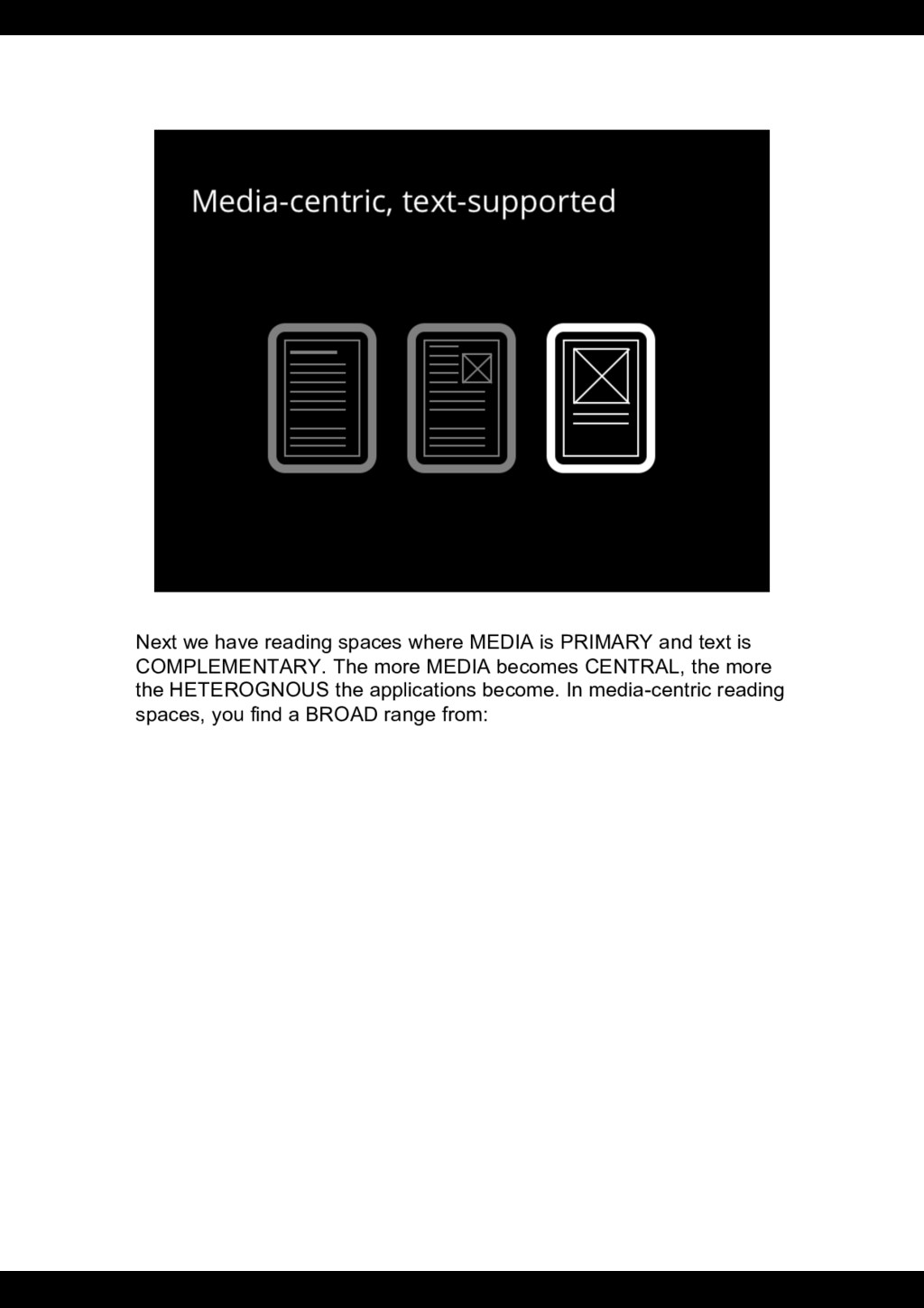
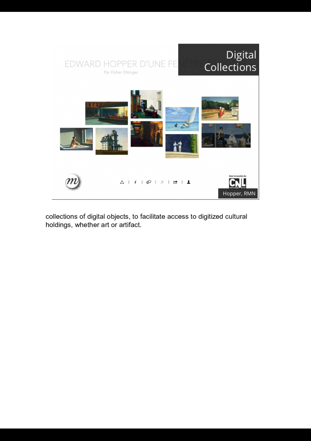
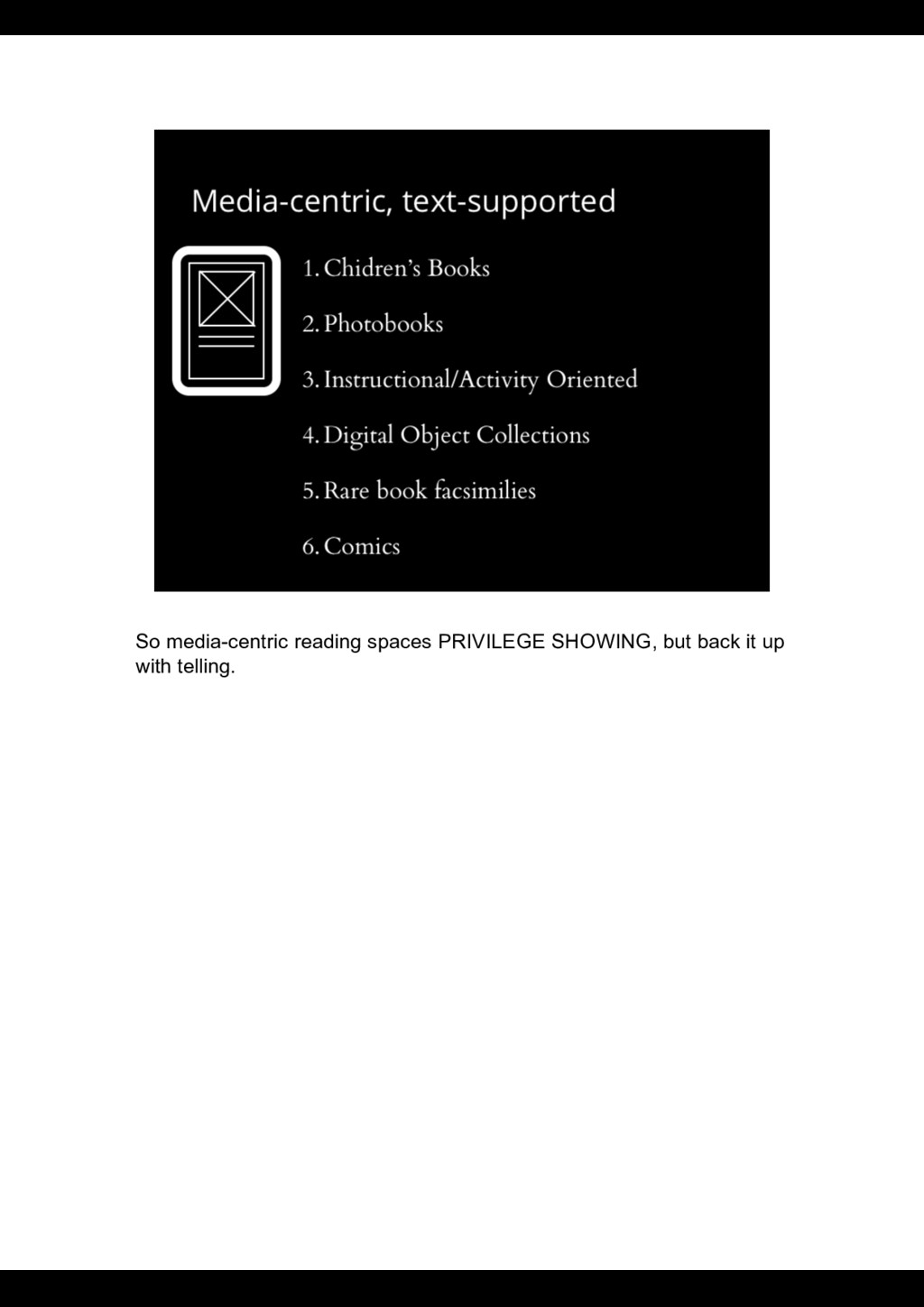
we have media-centric but text supported, where the media is the primary content, and text is provided as a complement that explains, clarifies or possibly narrates it. Here we principally mean visual media but it could also be audiovisual or simply just audio. Finally we get to pure media that speaks for itself (or, as it may be, preserves its mystery) without the written word. So to recap: full text, primary text with supplemental media, primary media with complentary text, and full media. With this little framework in mind. Let’s have a look at what content it applies to. We could potentially add a fifth class, where text and media are equally important and you could have one without the other but you would lose more than you gain (e.g. textbooks). Opinion?
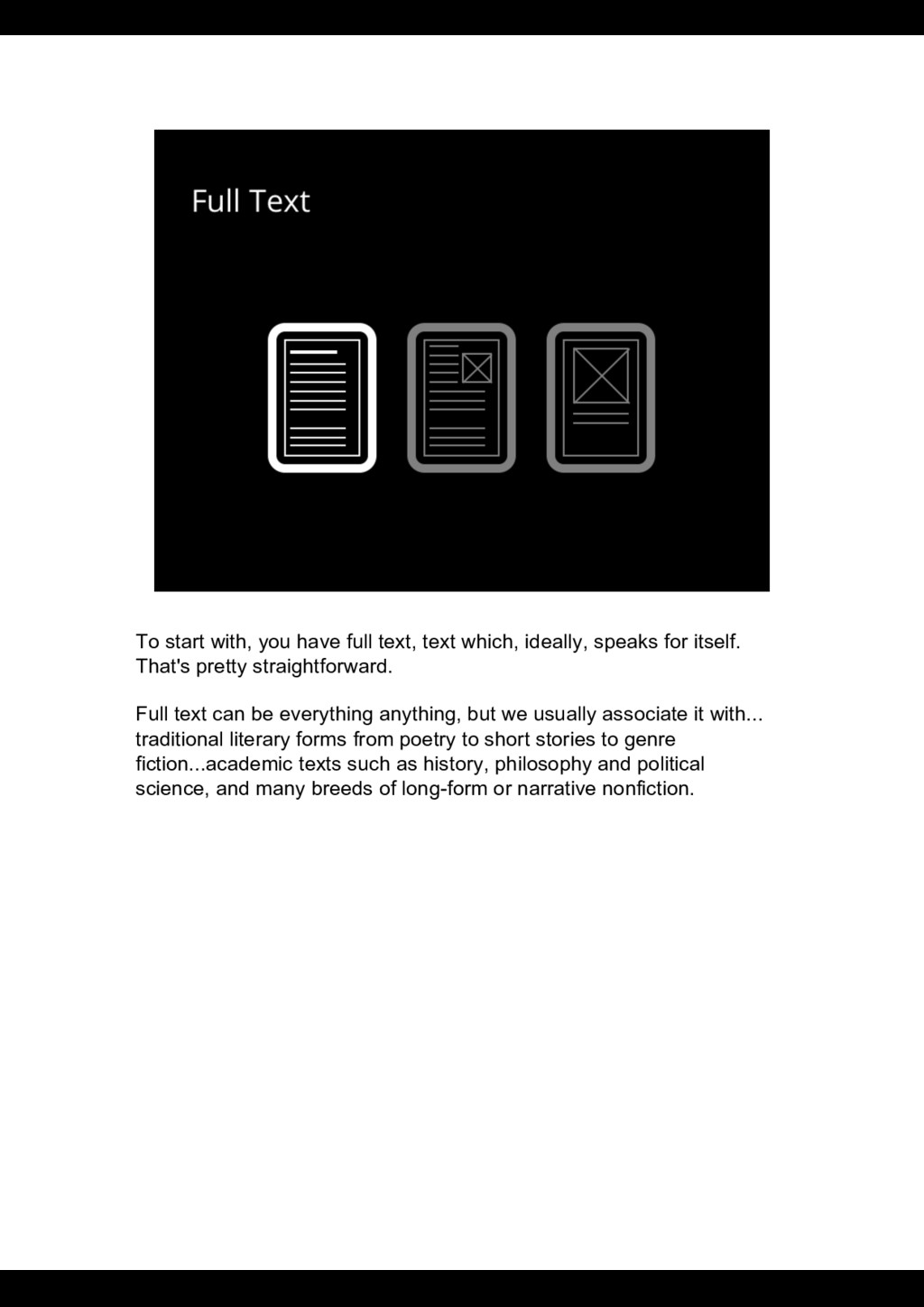
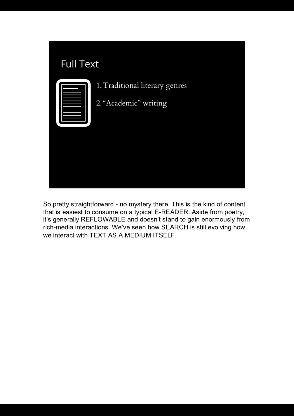
speaks for itself. That's pretty straightforward. Full text can be everything anything, but we usually associate it with... traditional literary forms from poetry to short stories to genre fiction...academic texts such as history, philosophy and political science, and many breeds of long-form or narrative nonfiction.
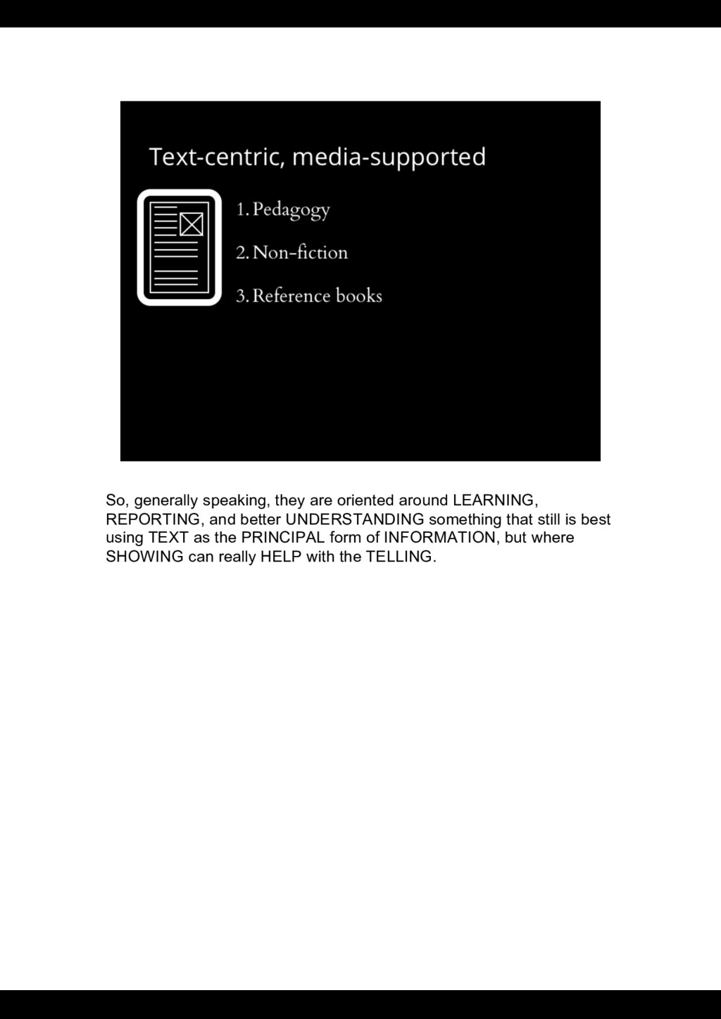
kind of content that is easiest to consume on a typical E-READER. Aside from poetry, it’s generally REFLOWABLE and doesn’t stand to gain enormously from rich-media interactions. We’ve seen how SEARCH is still evolving how we interact with TEXT AS A MEDIUM ITSELF.
Pedagogy like TEXTBOOKS, NON-FICTION in both long-form and everyday journalism and reportage. And of course, what would an encyclopedia or REFERENCE book be without a little bit of BACKUP media?
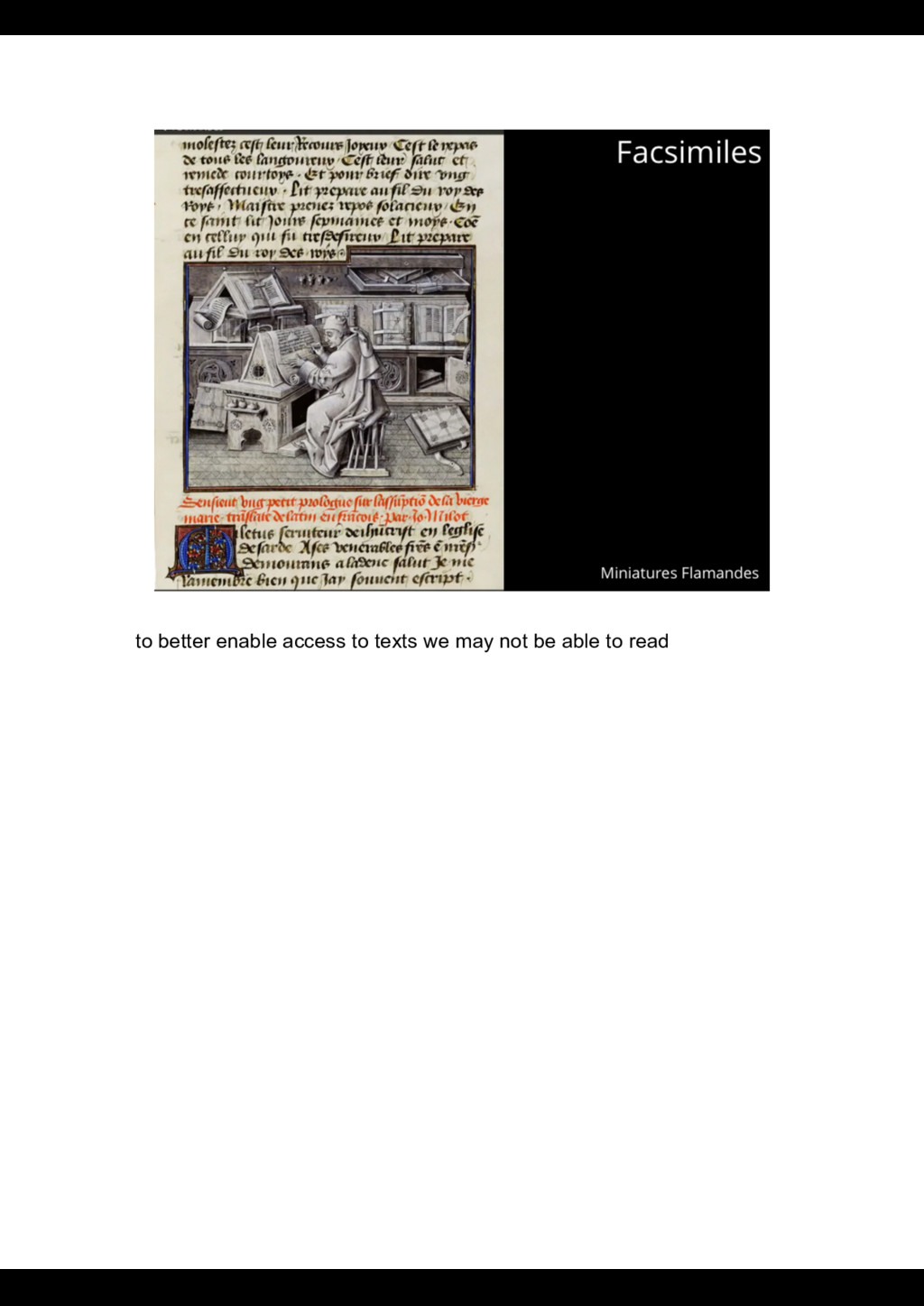
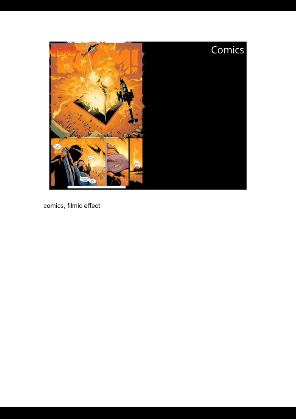
text is COMPLEMENTARY. The more MEDIA becomes CENTRAL, the more the HETEROGNOUS the applications become. In media-centric reading spaces, you find a BROAD range from:
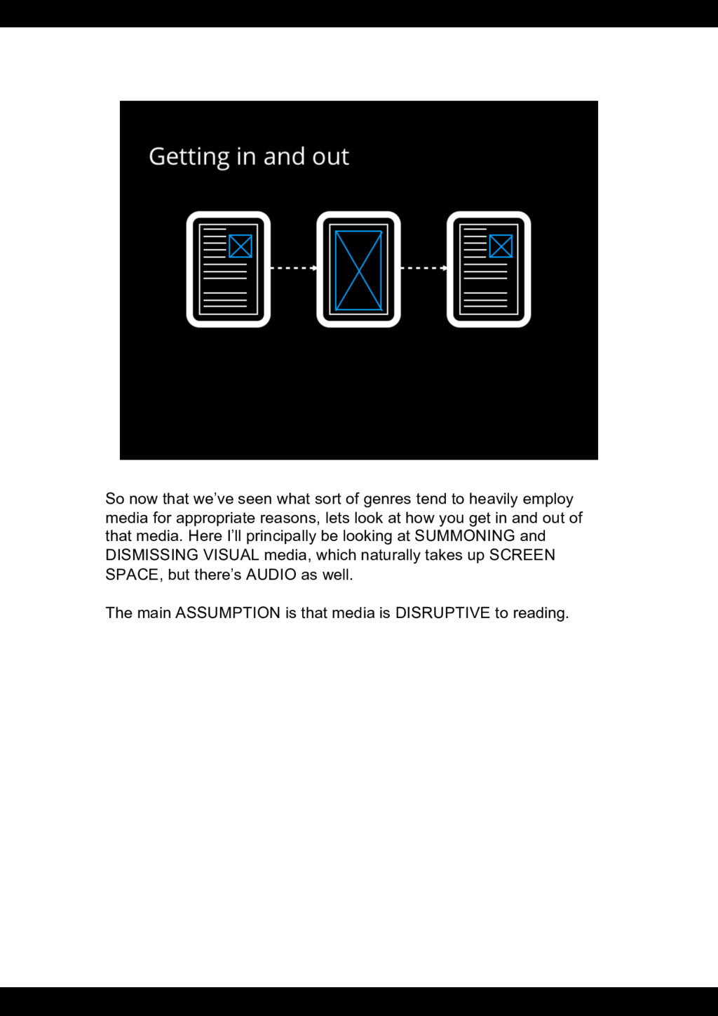
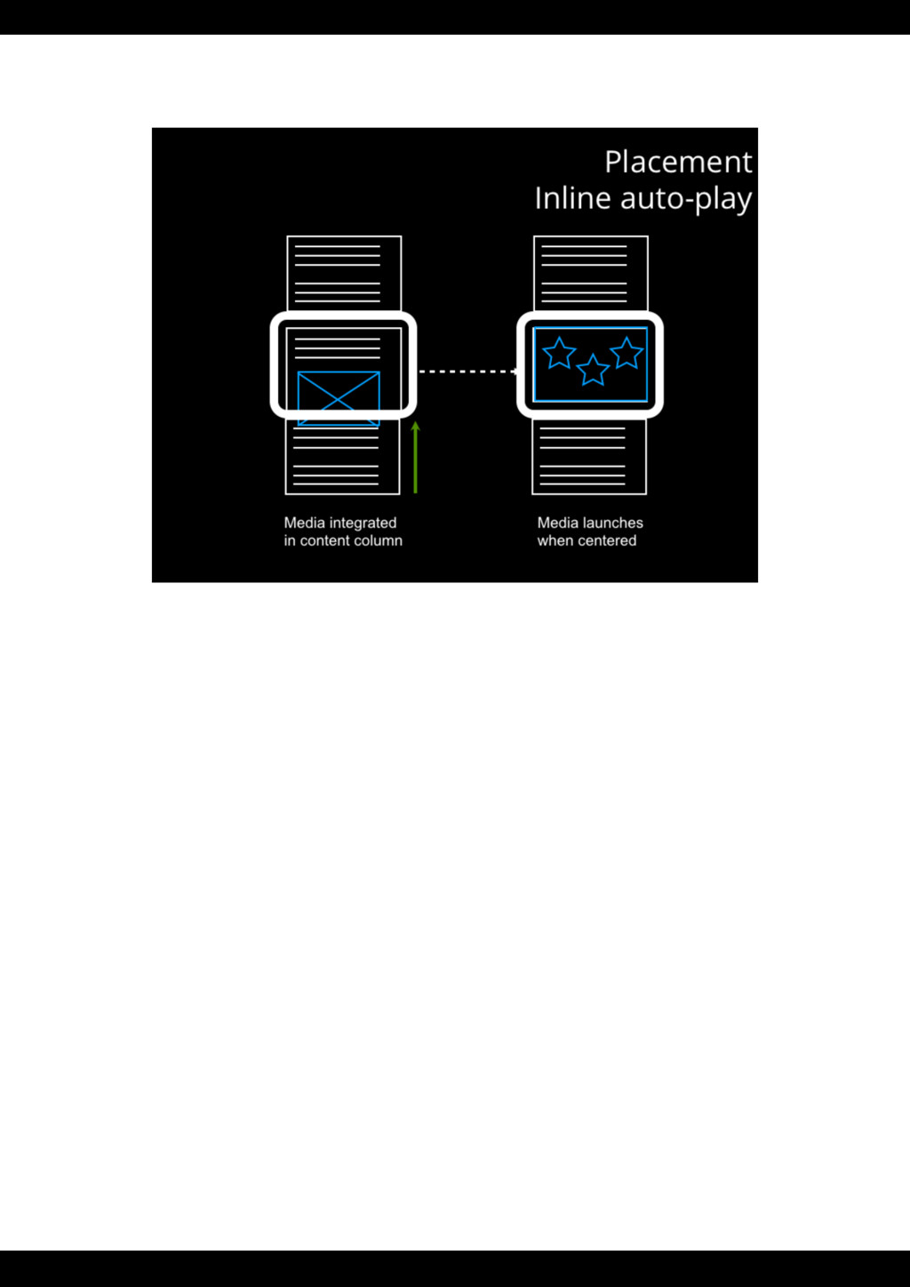
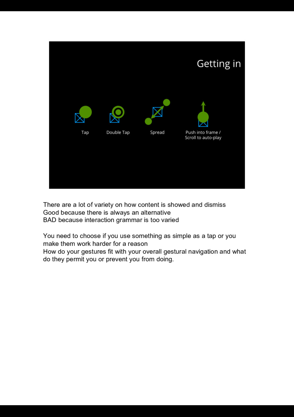
to heavily employ media for appropriate reasons, lets look at how you get in and out of that media. Here I’ll principally be looking at SUMMONING and DISMISSING VISUAL media, which naturally takes up SCREEN SPACE, but there’s AUDIO as well. The main ASSUMPTION is that media is DISRUPTIVE to reading.
showed and dismiss Good because there is always an alternative BAD because interaction grammar is too varied You need to choose if you use something as simple as a tap or you make them work harder for a reason How do your gestures fit with your overall gestural navigation and what do they permit you or prevent you from doing.
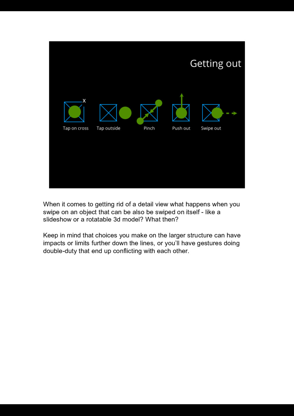
what happens when you swipe on an object that can be also be swiped on itself - like a slideshow or a rotatable 3d model? What then? Keep in mind that choices you make on the larger structure can have impacts or limits further down the lines, or you’ll have gestures doing double-duty that end up conflicting with each other.
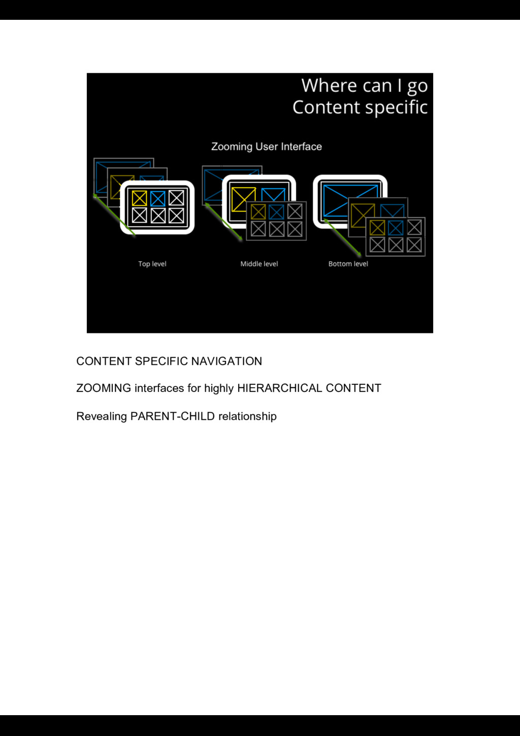
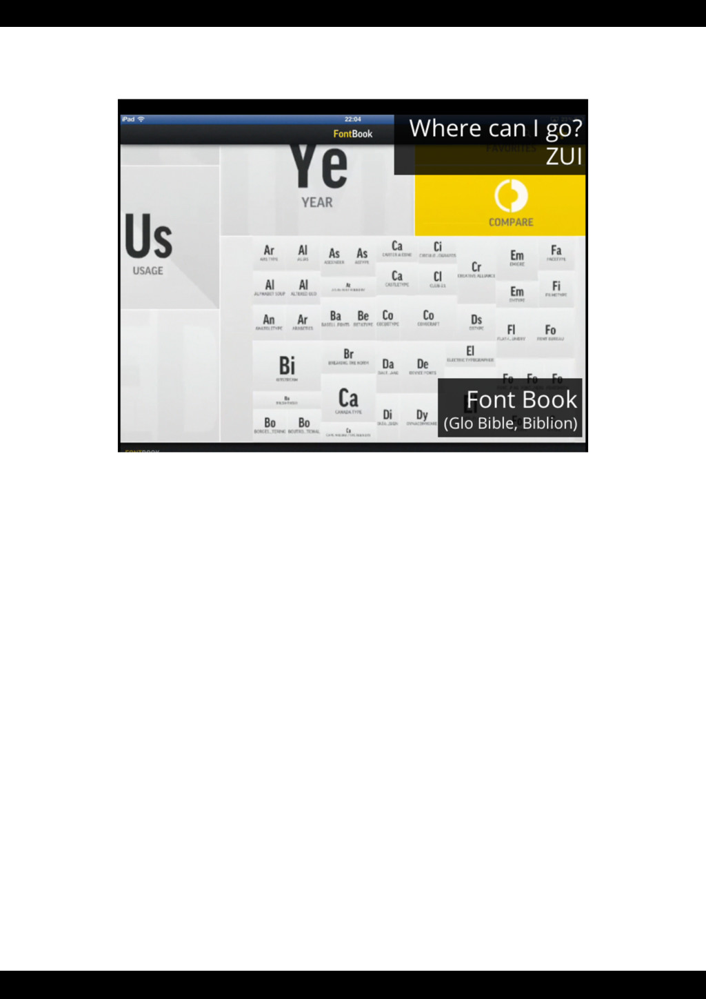
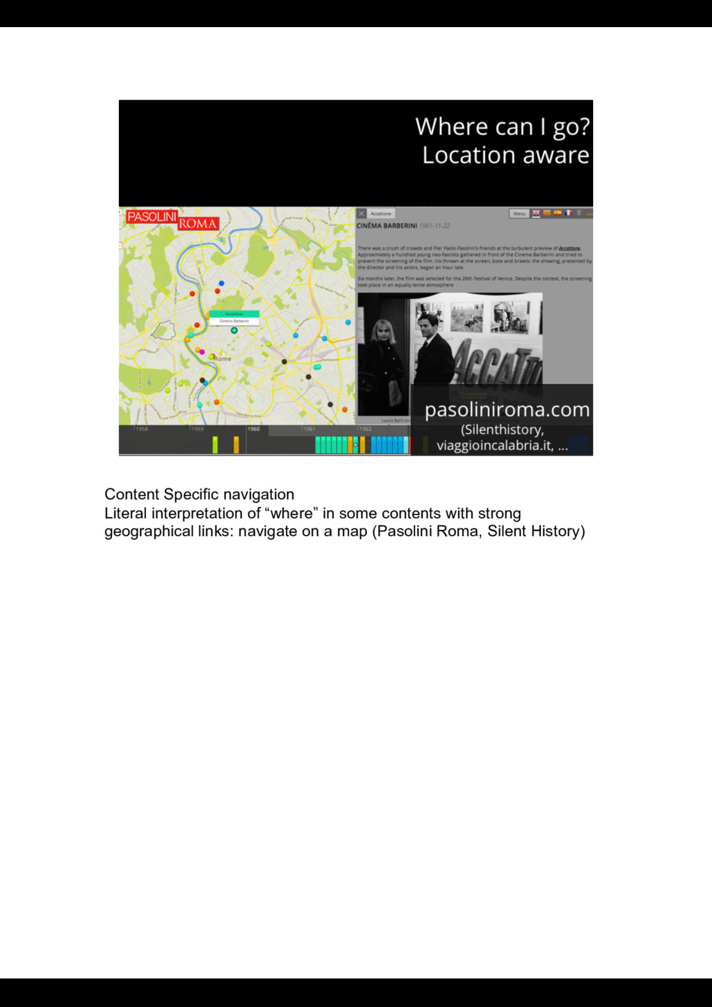
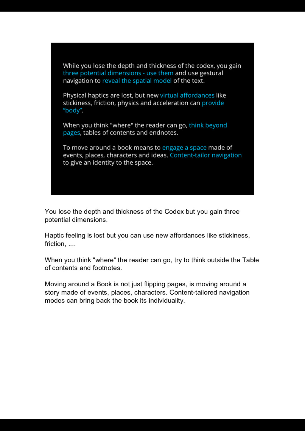
you gain three potential dimensions. Haptic feeling is lost but you can use new affordances like stickiness, friction, .... When you think "where" the reader can go, try to think outside the Table of contents and footnotes. Moving around a Book is not just flipping pages, is moving around a story made of events, places, characters. Content-tailored navigation modes can bring back the book its individuality.
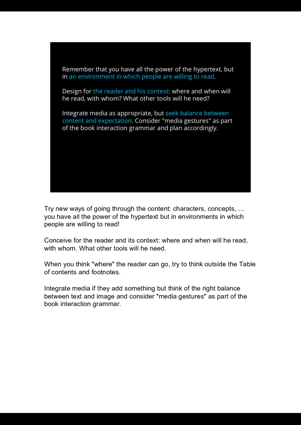
… you have all the power of the hypertext but in environments in which people are willing to read! Conceive for the reader and its context: where and when will he read, with whom. What other tools will he need. When you think "where" the reader can go, try to think outside the Table of contents and footnotes. Integrate media if they add something but think of the right balance between text and image and consider "media gestures" as part of the book interaction grammar.