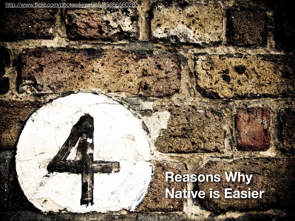
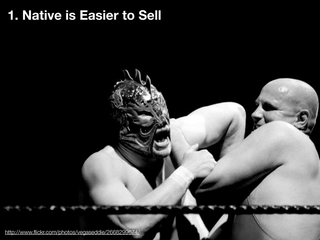
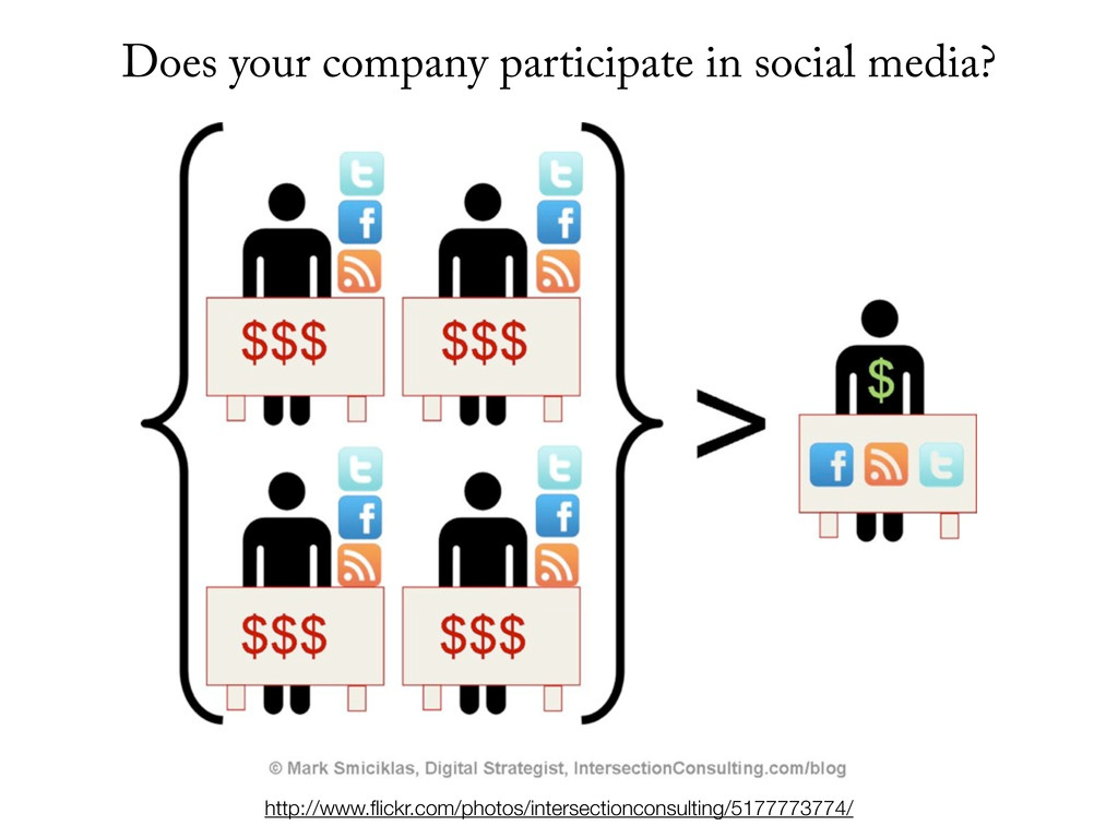
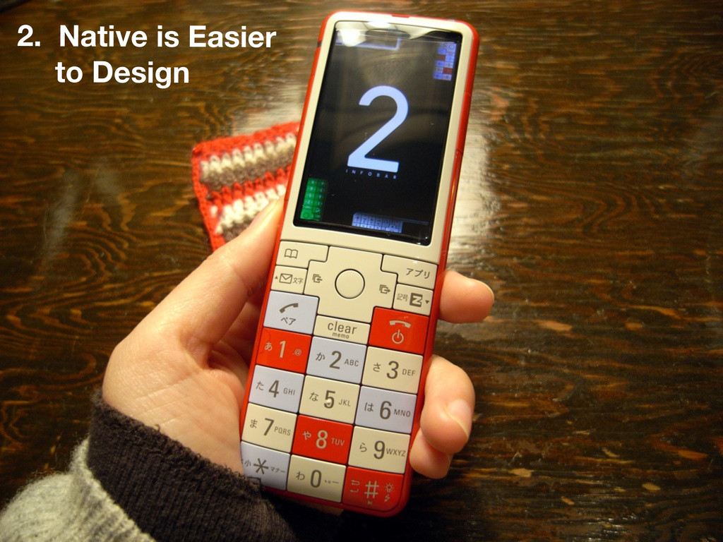
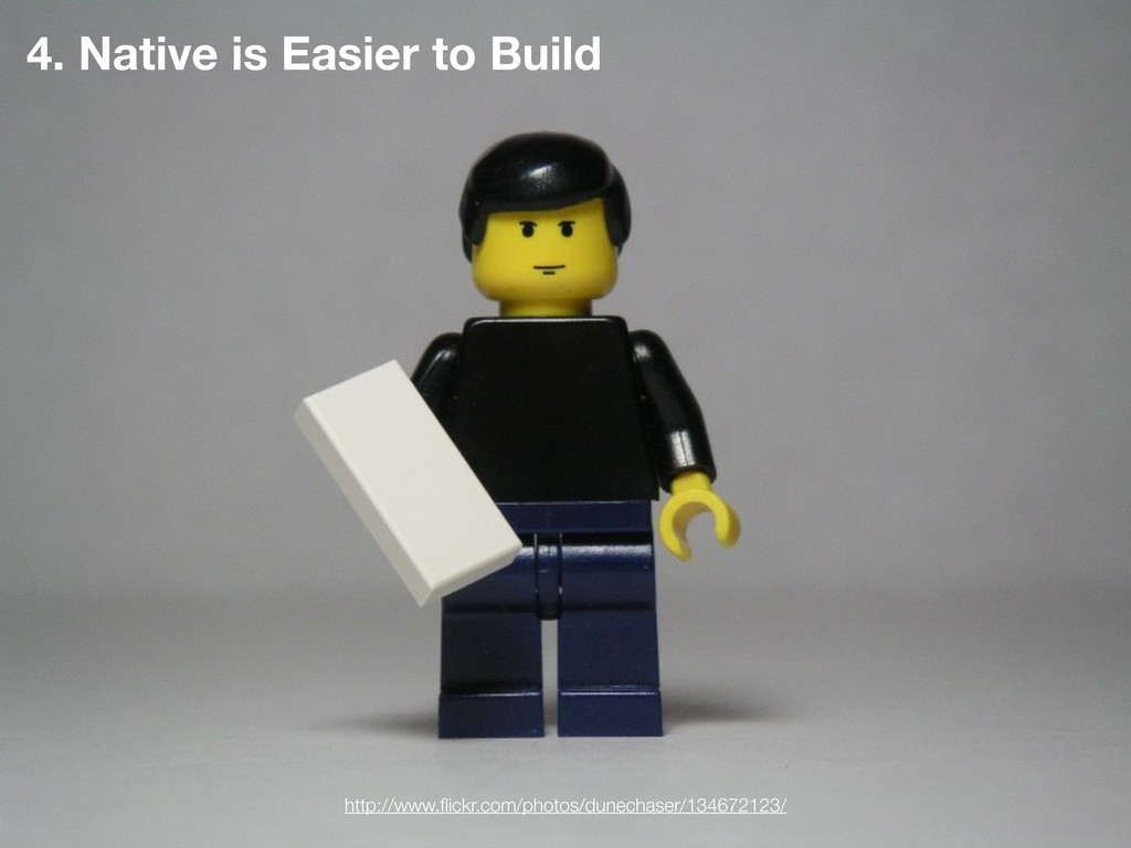
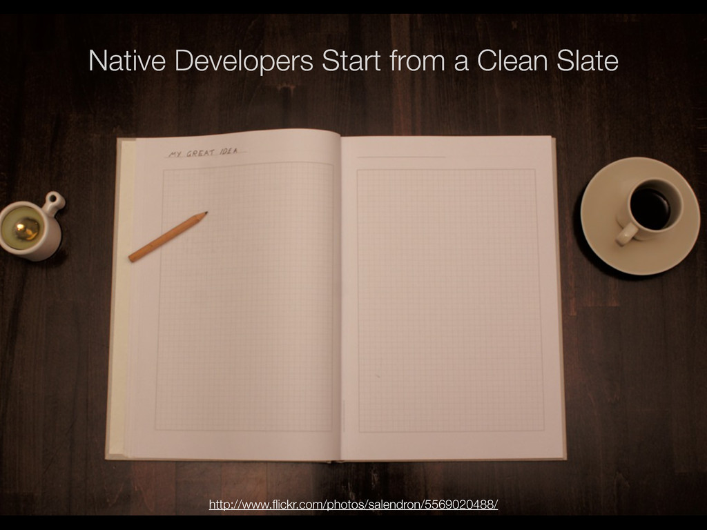
No one who advocates for the mobile web wants to admit it, but it is true. Native is easier.
It’s easier to sell to stakeholders. Easier to monetize. And most importantly, easier to implement.
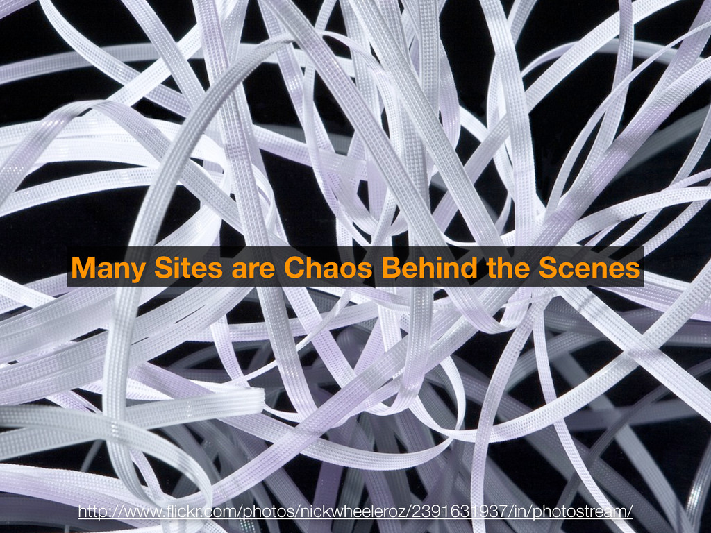
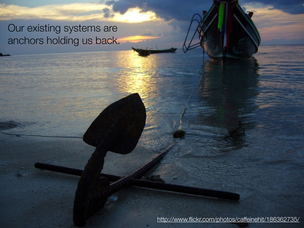
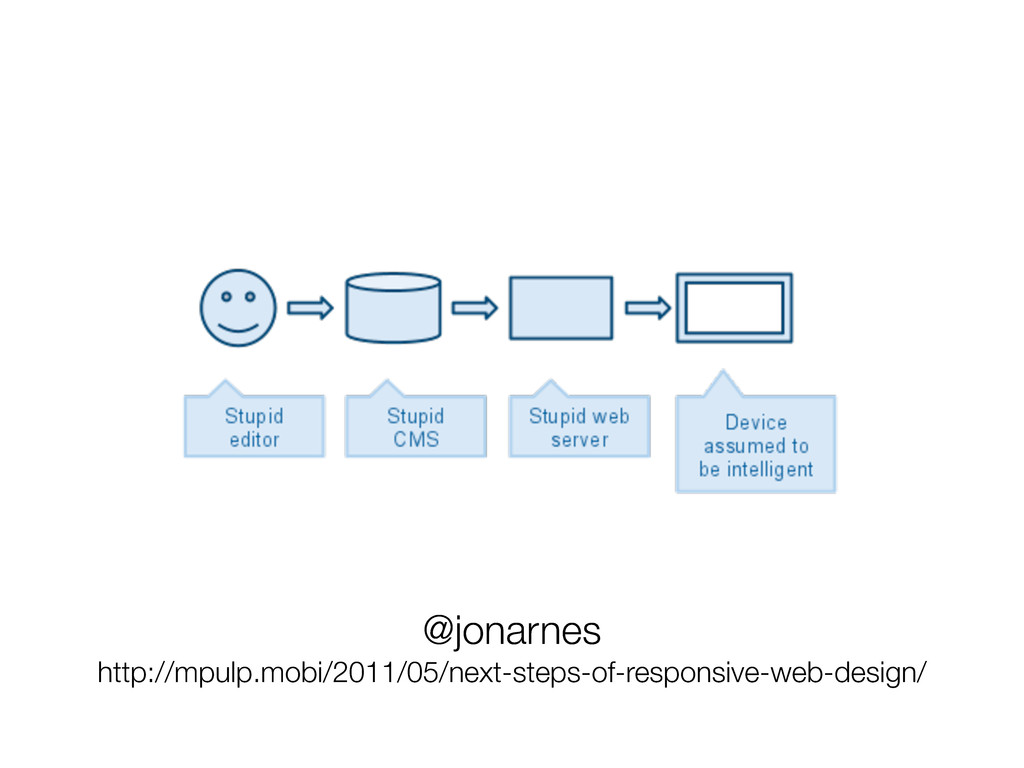
Argue about programming languages, memory management and reach all you want. There is one undeniable disadvantage that the mobile web faces that native apps don’t–over a decade of legacy code, cruft and entrenched organizational politics.
But the web is essential. Even companies whose businesses are centered on native apps need web pages to sell those apps. We can demonstrate time and again that a web-based approach is a smart investment.
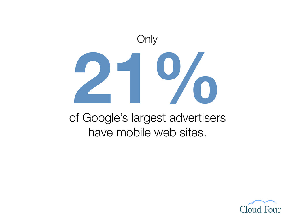
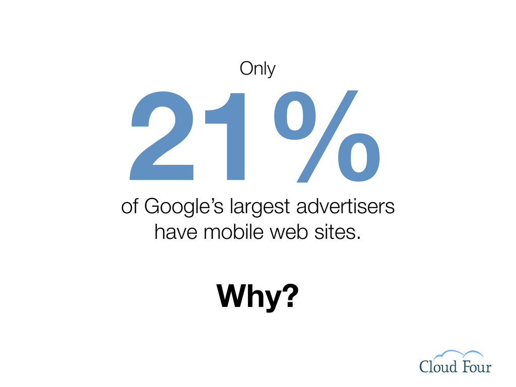
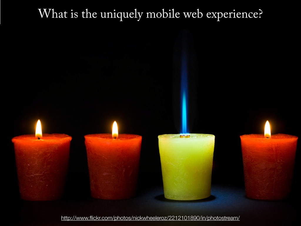
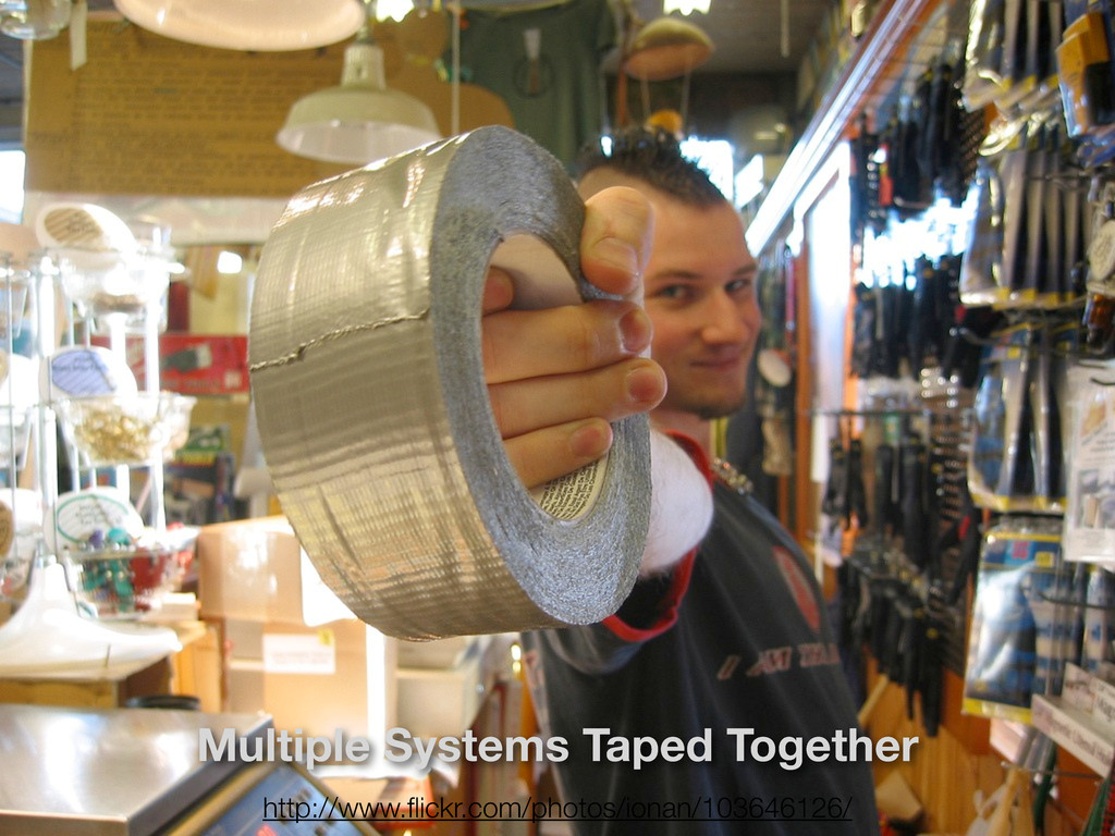
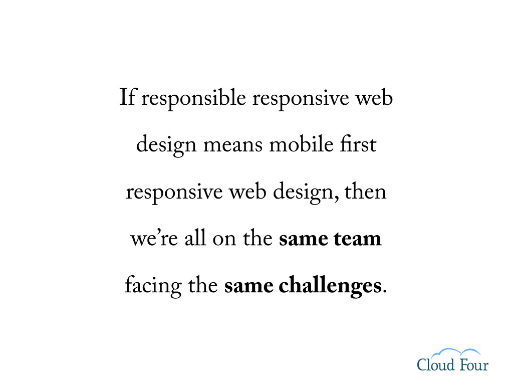
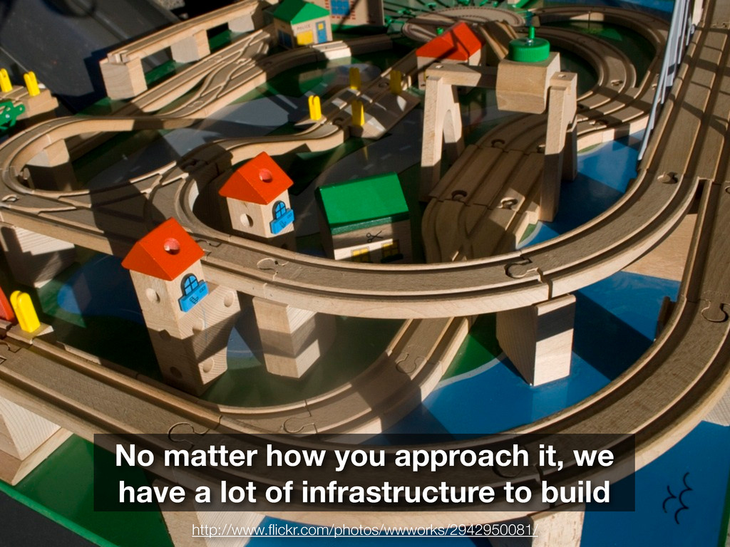
So how do we sell mobile web projects? How do we work with the systems we currently have to build compelling mobile web experiences?
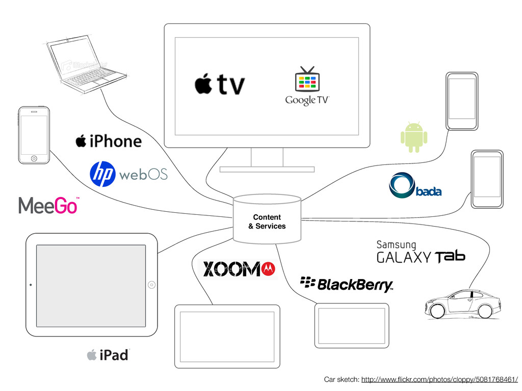
And most importantly, how should we be changing our web infrastructure, tools and workflow for the coming zombie apocalypse of devices.
 grigs
grigs
 yukiogawa
 rakus_dev
 cyberagentdevelopers
 oracle4engineer
 shinkufencer
 segavvy
 fossamagna
 flatt_security
 kitano_yuichi
 i35_267
 twada
twada
 kamoshika
 cassininazir
 rocio
rocio
 eileencodes
 chriscoyier
 ivargrimstad
 ammeep
 garrettdimon
 malarkey
 elsirapls
 portentint
 jeffersonlam
![http://mobiforge.com/designing/story/effective-design-multiple-screen-sizes Mobile Progressive Enhancement [content] Thanks Bryan and Stephanie](https://files.speakerdeck.com/presentations/4e274eb1575308159f000002/slide_39.jpg)
![http://mobiforge.com/designing/story/effective-design-multiple-screen-sizes Mobile Progressive Enhancement [content] Device Detection Thanks Bryan and](https://files.speakerdeck.com/presentations/4e274eb1575308159f000002/slide_40.jpg)
![http://mobiforge.com/designing/story/effective-design-multiple-screen-sizes Mobile Progressive Enhancement [content] Device Detection Thanks Bryan and](https://files.speakerdeck.com/presentations/4e274eb1575308159f000002/slide_41.jpg)
![http://mobiforge.com/designing/story/effective-design-multiple-screen-sizes Mobile Progressive Enhancement [content] Device Detection Phone Gap Add](https://files.speakerdeck.com/presentations/4e274eb1575308159f000002/slide_42.jpg)
![http://mobiforge.com/designing/story/effective-design-multiple-screen-sizes Mobile Progressive Enhancement [content] Device Detection Phone Gap Add](https://files.speakerdeck.com/presentations/4e274eb1575308159f000002/slide_43.jpg)
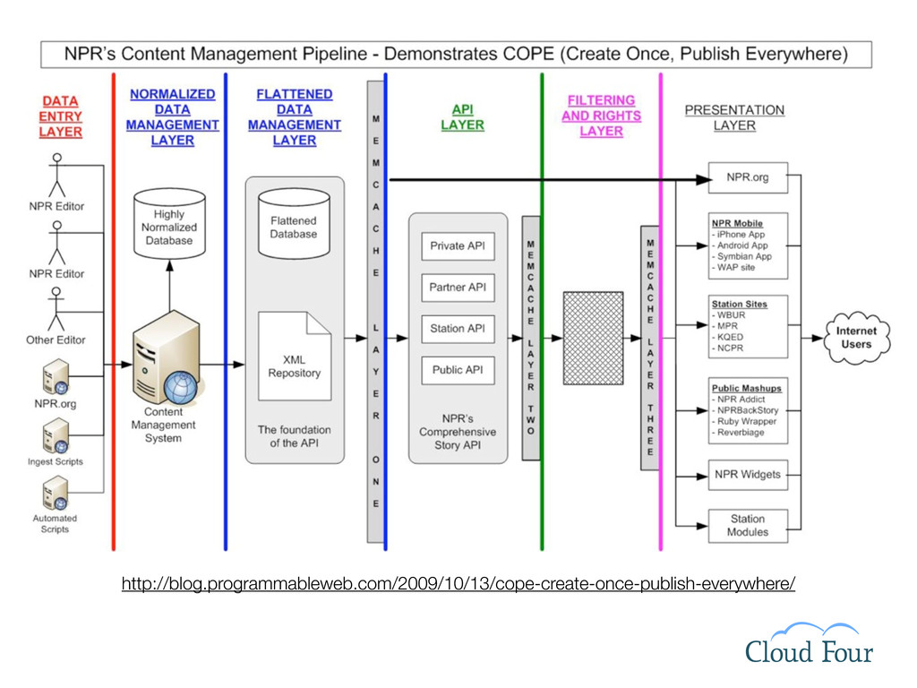
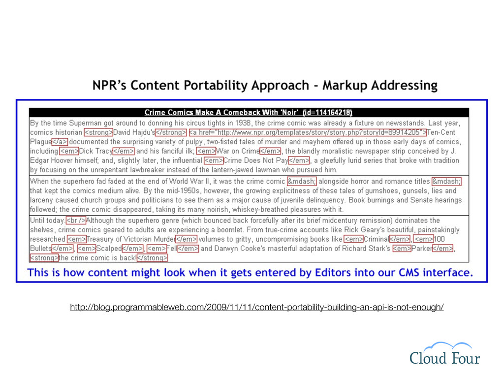
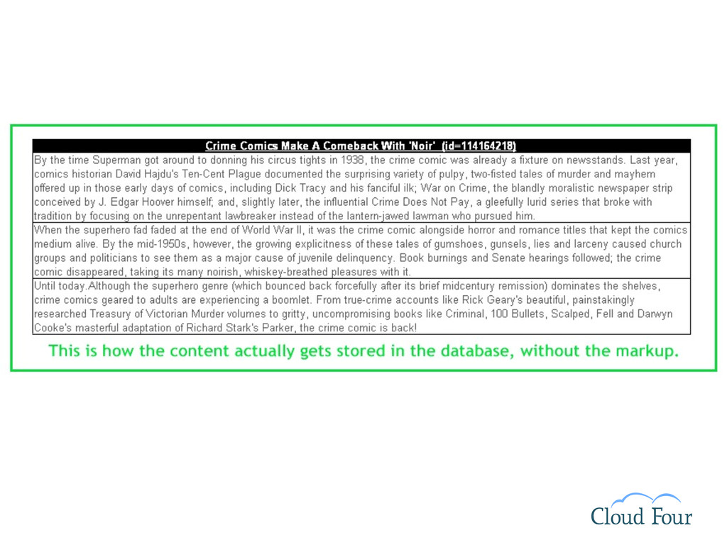
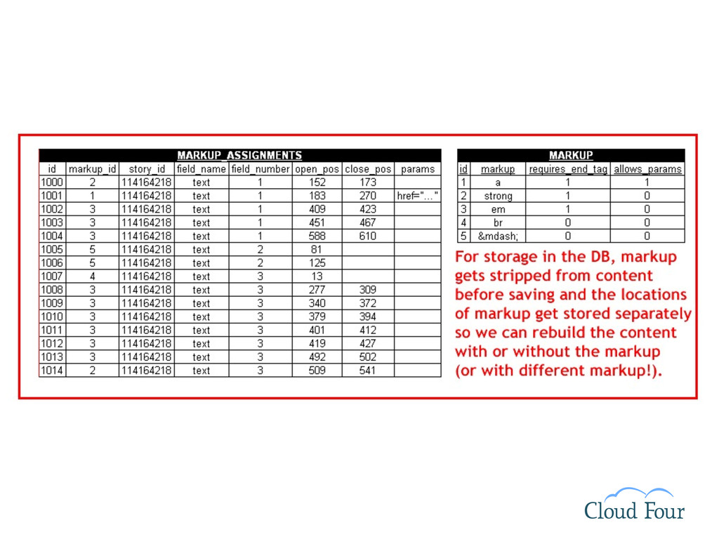
![Desktop Web Server Internet example.com/products/[productID] One Possible Bridging Solution](https://files.speakerdeck.com/presentations/4e274eb1575308159f000002/slide_104.jpg)
![Desktop Web Server Internet example.com/products/[productID] Desktop or Mobile One Possible](https://files.speakerdeck.com/presentations/4e274eb1575308159f000002/slide_105.jpg)
![Desktop Web Server Internet example.com/products/[productID] Desktop or Mobile Desktop Web](https://files.speakerdeck.com/presentations/4e274eb1575308159f000002/slide_106.jpg)
![Desktop Web Server Internet example.com/products/[productID] Desktop or Mobile Desktop Web](https://files.speakerdeck.com/presentations/4e274eb1575308159f000002/slide_107.jpg)
![Desktop Web Server Internet example.com/products/[productID] Desktop or Mobile Desktop Web](https://files.speakerdeck.com/presentations/4e274eb1575308159f000002/slide_108.jpg)
![Desktop Web Server Internet example.com/products/[productID] Desktop or Mobile Desktop Web](https://files.speakerdeck.com/presentations/4e274eb1575308159f000002/slide_109.jpg)
![Desktop Web Server Internet example.com/products/[productID] Desktop or Mobile Desktop Web](https://files.speakerdeck.com/presentations/4e274eb1575308159f000002/slide_110.jpg)
![[email protected] | cloudfour.com/blog | @grigs | slides: bit.ly/grigs_wdx2011 http://www.flickr.com/photos/polvero/4232984120/in/faves-grigs/](https://files.speakerdeck.com/presentations/4e274eb1575308159f000002/slide_122.jpg)