Upgrade to Pro — share decks privately, control downloads, hide ads and more …

Writing Modular CSS with Sass

Writing Modular CSS with Sass

Slides for my CSS Summit 2015 talk.

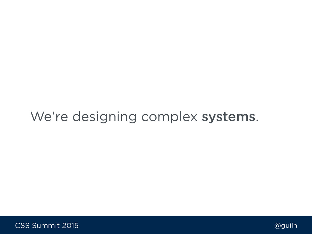
CSS needs to be reusable, scalable and adaptable to different use cases.
When writing modular CSS, our goal should be to get to a point where modifying or re-arranging anything about the structure will not break the front-end.

In this session, Guil will go over how to use many of the best practices and principles of modular CSS architecture with Sass. You’ll learn how a modular approach with Sass can boost your front-end workflow and cut down on maintenance, including:

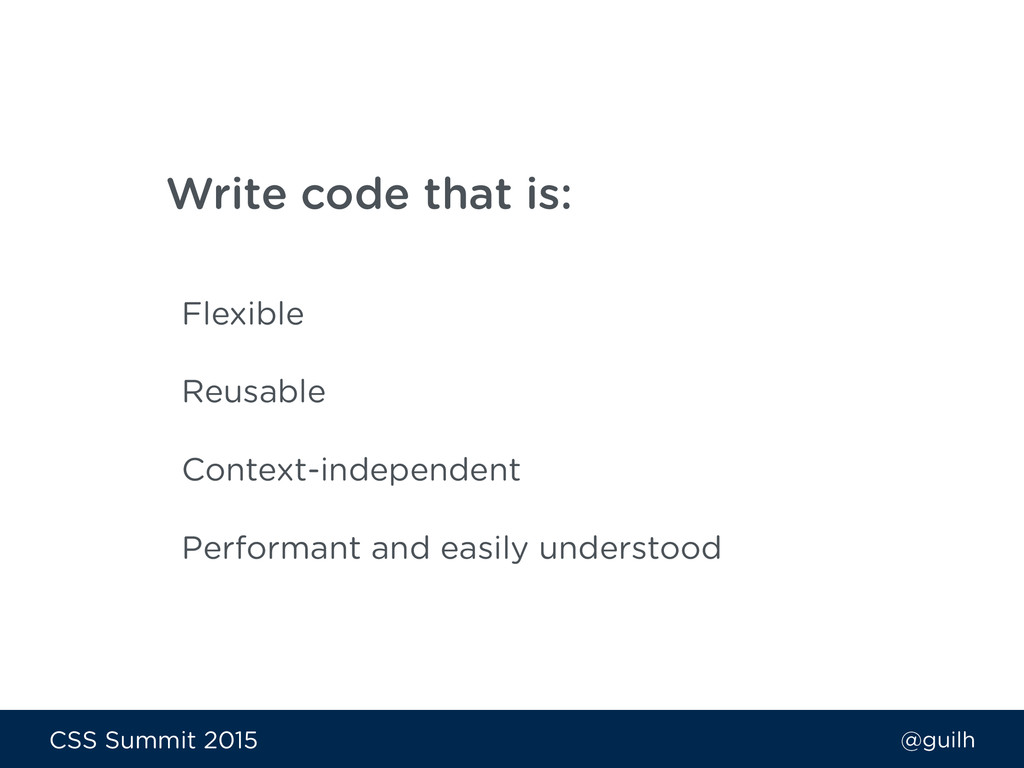
- How to write code that scales, no matter how big the project
- Writing code others can easily read and maintain
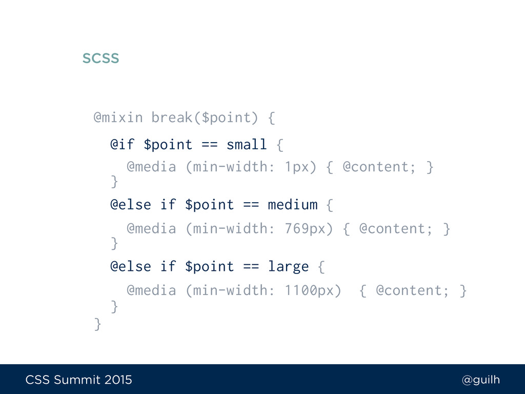
- Overview of the patterns of BEM (Block Element Modifier) and SMACSS (Scalable and Modular Architecture for CSS)
- Creating CSS components that do not rely on context
- Learn mixins and functions for writing modular code

Guil Hernandez

July 09, 2015
Tweet

More Decks by Guil Hernandez

Other Decks in Technology

Transcript

  1. @guilh CSS Summit 2015 The use of exchangeable parts or

    options in the fabrication of an object. Modularity
  2. @guilh CSS Summit 2015 The web has evolved. The design

    and development process is also rapidly evolving.
  3. @guilh CSS Summit 2015 Write code that is: Flexible Reusable

    Context-independent Performant and easily understood
  4. @guilh CSS Summit 2015 We’re going to cover: 1. Identifying

    components in a design 2. BEM with Sass 3. SMACSS and Sass 4. Tips & snippets for writing modular Sass
  5. @guilh CSS Summit 2015 Bermon Painter Let’s not be dogmatic

    about preferred methodologies ‘cause we really just want to enjoy writing Sass. Designer & Developer
  6. @guilh CSS Summit 2015 Instead of looking at a page

    as a whole, look at all the components that make up the page.
  7. @guilh CSS Summit 2015 Immutable rules focused on things we

    always, never, or only do. Road Runner Rules Rules to live and die by slideshare.net/Phase2Technology/redhatcom-an-architectural-case-study
  8. @guilh CSS Summit 2015 • A layout never affects components

    • A component never does the layout’s job • Elements only have a single class; all styles come from that class Road Runner Rules Rules to live and die by slideshare.net/Phase2Technology/redhatcom-an-architectural-case-study
  9. @guilh CSS Summit 2015 We should have some form of

    discipline in how we write our code.
  10. @guilh CSS Summit 2015 BEM provides a meaningful naming convention

    that helps make our code portable, modular, and easy to understand.
  11. @guilh CSS Summit 2015 The component’s wrapper. The root of

    the class and highest level of an abstraction. Block
  12. @guilh CSS Summit 2015 <ul class="nav"> <li class="nav__item">...</li> <li class="nav__item">...</li>

    <li class="nav__item">...</li> <li class="nav__item--current">...</li> </ul>
  13. @guilh CSS Summit 2015 Using element selectors ties the styling

    directly to the markup and makes it less re-usable.
  14. @guilh CSS Summit 2015 Benefits of BEM • Expressive class

    notation • HTML is readable & predictable • Manageable codebase • Classes do not conflict with other classes
  15. @guilh CSS Summit 2015 Break something into a block only

    if it would be useful in another context.
  16. @guilh CSS Summit 2015 We can think about our project

    modularly, then build and maintain it with a modular approach using the tools provided by Sass.
  17. @guilh CSS Summit 2015 .panel { .nav__item { … }

    .nav__item--current { … } } SCSS
  18. @guilh CSS Summit 2015 .panel .nav__item { … } .panel

    .nav__item—current { … } CSS Output
  19. @guilh CSS Summit 2015 We can write BEM selectors in

    a way that they make sense only in the context of their block.
  20. @guilh CSS Summit 2015 .nav { @include e(item) { @include

    m(current) { … } … } … } SCSS
  21. @guilh CSS Summit 2015 .nav { … @include e(item) {

    display: inline-block; padding: 10px 20px; text-transform: uppercase; color: $nav-default; @include m(current) { display: inline-block; padding: 10px 20px; text-transform: uppercase; color: $nav-current; border-bottom: 2px solid $color-secondary; } } } SCSS
  22. @guilh CSS Summit 2015 .nav { … @include e(item) {

    display: inline-block; padding: 10px 20px; text-transform: uppercase; color: $nav-default; @include m(current) { display: inline-block; padding: 10px 20px; text-transform: uppercase; color: $nav-current; border-bottom: 2px solid $color-secondary; } } } SCSS
  23. @guilh CSS Summit 2015 SCSS .nav { … @include e(item)

    { display: inline-block; padding: 10px 20px; text-transform: uppercase; color: $nav-default; @include m(current) { display: inline-block; padding: 10px 20px; text-transform: uppercase; color: $nav-current; border-bottom: 2px solid $color-secondary; } } }
  24. @guilh CSS Summit 2015 .nav { … @include e(item) {

    @extend %nav-item-base; color: $nav-default; @include m(current) { @extend %nav-item-base; color: $nav-current; border-bottom: 2px solid $color-secondary; } } } SCSS
  25. @guilh CSS Summit 2015 .callout-card { @include m(html) { @extend

    %card-base; background: orange; } @include m(css) { @extend %card-base; background: blue; } @include m(php) { @extend %card-base; background: purple; } } SCSS
  26. @guilh CSS Summit 2015 .callout-card--html, .callout-card--css, .callout-card--php, .callout-card--ruby, .callout- card--java,

    .callout-card--wp, .callout-card-- python, .callout-card--ios, .callout-card--net { ... } CSS Output
  27. @guilh CSS Summit 2015 .callout-card { @include m(html) { @include

    card-base; background: orange; } @include m(css) { @include card-base; background: blue; } @include m(php) { @include card-base; background: purple; } } SCSS
  28. @guilh CSS Summit 2015 .callout-card--html, .callout-card--css, .callout-card--php, .callout-card--ruby, .callout- card--java,

    .callout-card--wp, .callout-card-- python, .callout-card--ios, .callout-card--net { ... } CSS Output
  29. @guilh CSS Summit 2015 .my-component { @extend %foo; @extend %bar;

    @extend %baz; @extend %bah; @extend %gah; @extend %omg; @extend %wtf; background: tomato; } SCSS
  30. @guilh CSS Summit 2015 It's OK to repeat a little

    in the output to keep the code maintainable and easier to debug.
  31. @guilh CSS Summit 2015 @extends • Don’t overuse them •

    Extend within a module’s scope • Limit use to modifiers only
  32. @guilh CSS Summit 2015 Benefits of BEM & Sass •

    Selectors are easier to understand • We don’t need to nest selectors • Organized/manageable codebase • We can avoid selector misuse
  33. @guilh CSS Summit 2015 SMACSS is a style guide that

    helps organize and structure our CSS.
  34. @guilh CSS Summit 2015 Define the layout styles for all

    the major components of our project. Layout Rules
  35. @guilh CSS Summit 2015 Define styles for each module as

    standalone, reusable components. Module Rules
  36. @guilh CSS Summit 2015 <ul class="nav is-hidden"> <li class="nav__item">...</li> <li

    class="nav__item">...</li> <li class="nav__item">...</li> <li class="nav__item">...</li> </ul>
  37. @guilh CSS Summit 2015 <ul class="nav" data-state="hidden--sm"> <li class="nav__item">...</li> <li

    class="nav__item">...</li> <li class="nav__item">...</li> <li class="nav__item">...</li> </ul>
  38. @guilh CSS Summit 2015 <ul class="nav" hidden> <li class="nav__item">...</li> <li

    class="nav__item">...</li> <li class="nav__item">...</li> <li class="nav__item">...</li> </ul>
  39. @guilh CSS Summit 2015 Define different colors and images to

    give our project a different theme. Theme Rules
  40. @guilh CSS Summit 2015 Where we import and pull together

    all the partials in a directory. Manifest Files
  41. @guilh CSS Summit 2015 Allows you to import many sass

    or scss files in a single import statement. Sass Globbing github.com/chriseppstein/sass-globbing
  42. @guilh CSS Summit 2015 SMACSS is all about maintaining an

    organized and logical structure to our code.
  43. @guilh CSS Summit 2015 // Descriptive color variables $white :

    #fff; $black : #000; $grey : #878787; $fountain-blue : #52bab3; $emerald : #5ece7f; $sunglo : #e67478; $coral : #ff784f; $purple-majesty : #9279c3; $yellow-orange : #ffa949; SCSS
  44. @guilh CSS Summit 2015 // Functional color variables $color-prim :

    $fountain-blue; $color-sec : $emerald ; $color-text-light : $white; $color-text-base : $grey; $color-text-dark : $river-bed; $color-border-light : lighten($grey,35%); $color-border-dark : $yellow-orange; $color-shadow : rgba($black,.8); $color-body : $white; SCSS
  45. @guilh CSS Summit 2015 // Functional color variables $color-prim :

    $fountain-blue; $color-sec : $emerald ; $color-text-light : $white; $color-text-base : $grey; $color-text-dark : $river-bed; $color-border-light : lighten($grey,35%); $color-border-dark : $yellow-orange; $color-shadow : rgba($black,.8); $color-body : $white; SCSS
  46. @guilh CSS Summit 2015 // Functional color variables $color-prim :

    $fountain-blue; $color-sec : $emerald ; $color-text-light : $white; $color-text-base : $grey; $color-text-dark : $river-bed; $color-border-light : lighten($grey,35%); $color-border-dark : $yellow-orange; $color-shadow : rgba($black,.8); $color-body : $white; SCSS
  47. @guilh CSS Summit 2015 // UI Colors $ui-colors: ( default

    : $fountain-blue, success : $emerald, error : $sunglo, warning : $coral, info : $purple-majesty ); SCSS
  48. @guilh CSS Summit 2015 // Generate button classes @each $theme,

    $color in $ui-colors { .btn--#{$theme} { background-color: $color; } } SCSS codepen.io/Guilh/pen/RPLJWz
  49. @guilh CSS Summit 2015 .col { float: left; & +

    & { margin-left: 20px; } } SCSS blog.teamtreehouse.com/sass-tip-double-ampersand-selector
  50. @guilh CSS Summit 2015 .col { float: left; } .col

    + .col { margin-left: 20px; } CSS Output
  51. @guilh CSS Summit 2015 @mixin doubly($margin) { & + &

    { margin-left: $margin; @content; } } SCSS
  52. @guilh CSS Summit 2015 .col { @include doubly(20px); float: left;

    } SCSS sassbreak.com/double-ampersand-mixin
  53. @guilh CSS Summit 2015 .bunny { animation: hop 1s infinite;

    @at-root { @keyframes hop { 50% {...} } } } SCSS
  54. @guilh CSS Summit 2015 .bunny { animation: hop 1s infinite;

    @keyframes hop { 50% {...} } } SCSS sassbreak.com/nested-keyframe-rules-sass
  55. @guilh CSS Summit 2015 .bunny { animation: hop 1s infinite;

    … } @keyframes hop { 50% {...} } CSS Output
  56. @guilh CSS Summit 2015 @mixin break($point) { @if $point ==

    small { @media (min-width: 1px) { @content; } } @else if $point == medium { @media (min-width: 769px) { @content; } } @else if $point == large { @media (min-width: 1100px) { @content; } } } SCSS
  57. @guilh CSS Summit 2015 // Breakpoints $one-col : (min-width: 1px);

    $two-col : (min-width: 769px); $three-col : (min-width: 1100px); SCSS
  58. @guilh CSS Summit 2015 @mixin break($point) { @if $point ==

    one-col { @media #{$one-col} { @content; } } @else if $point == two-col { @media #{$two-col} { @content; } } @else if $point == three-col { @media #{$three-col} { @content; } } } SCSS
  59. @guilh CSS Summit 2015 //base font $bf: 16; @mixin tweak($point,

    $min-max: min-width) { $em: $point/$bf; @media(#{$min-max}: #{$em}em) { @content; } } SCSS sassbreak.com/flexible-media-query-mixins
  60. @guilh CSS Summit 2015 .main-nav { @include tweak(769) { display:

    block; } } SCSS sassbreak.com/flexible-media-query-mixins
  61. @guilh CSS Summit 2015 @media (min-width: 48.0625em) { .main-nav {

    display: block; } } CSS Output sassbreak.com/flexible-media-query-mixins
  62. @guilh CSS Summit 2015 .main-nav { @include break(two-col) { display:

    block; } @include tweak(1000) { margin-top: 2em; } } SCSS
  63. @guilh CSS Summit 2015 Use these guidelines to find what

    works for you, your project, and your team!